📚 Goodreads
Zaya Ganzorig
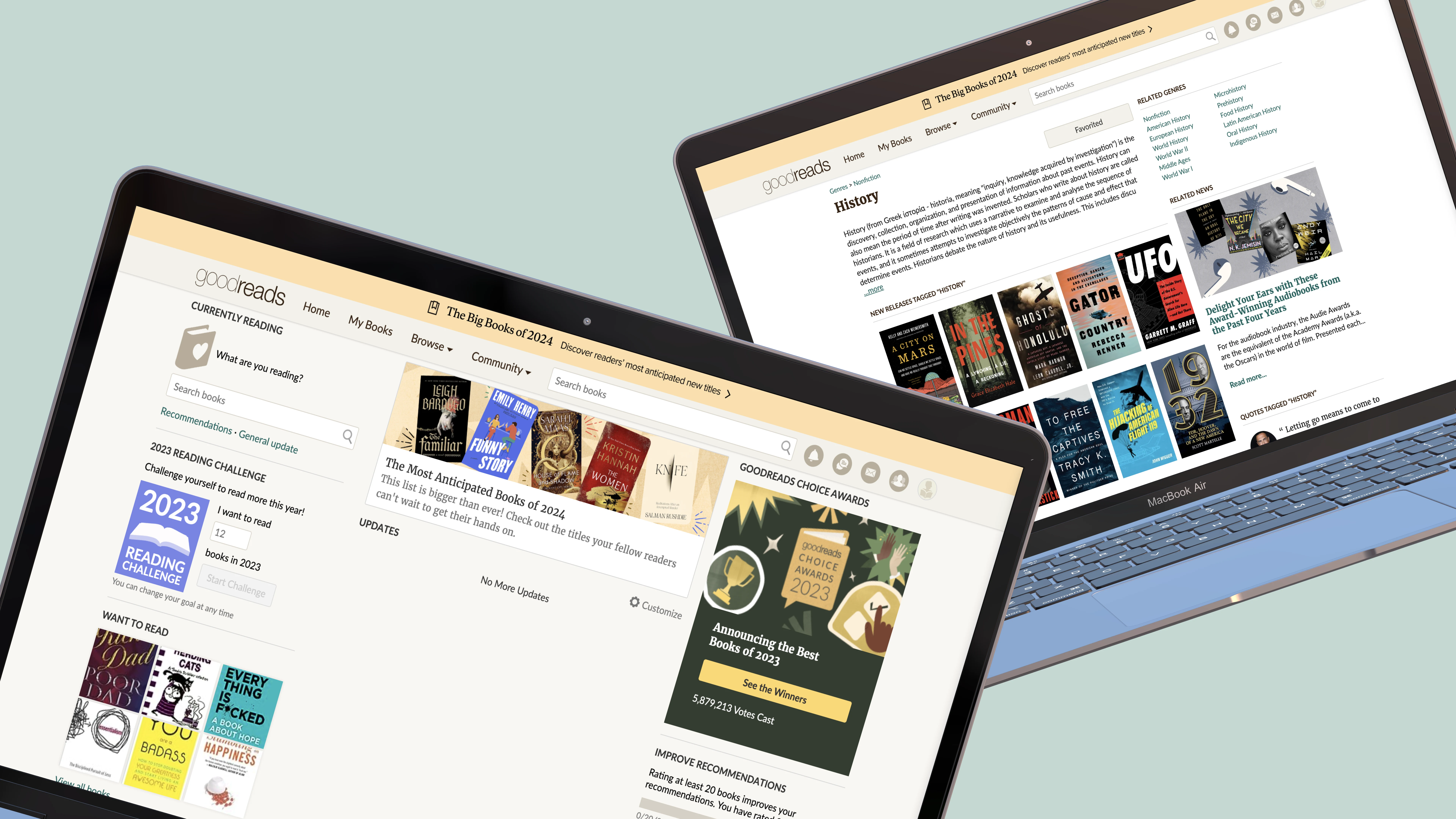
The Challenge
🚨 Usability evaluation and redesign of the Goodreads interface.
I found a UX challenge on UXTool's website. The challenge involved being a designer at Goodreads and evaluating the usability of their website to improve user experience.
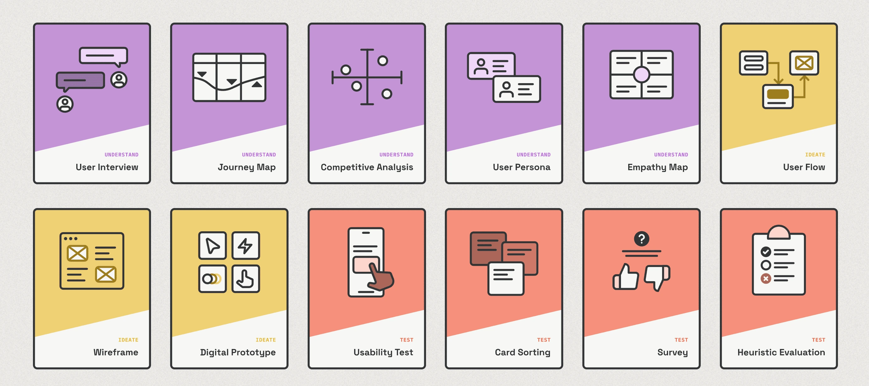
Image source:
My Approach to the Challenge
💡 Jakob Nielsen’s 10 heuristics to identify and fix usability issues, improving user engagement, experience and business metrics.
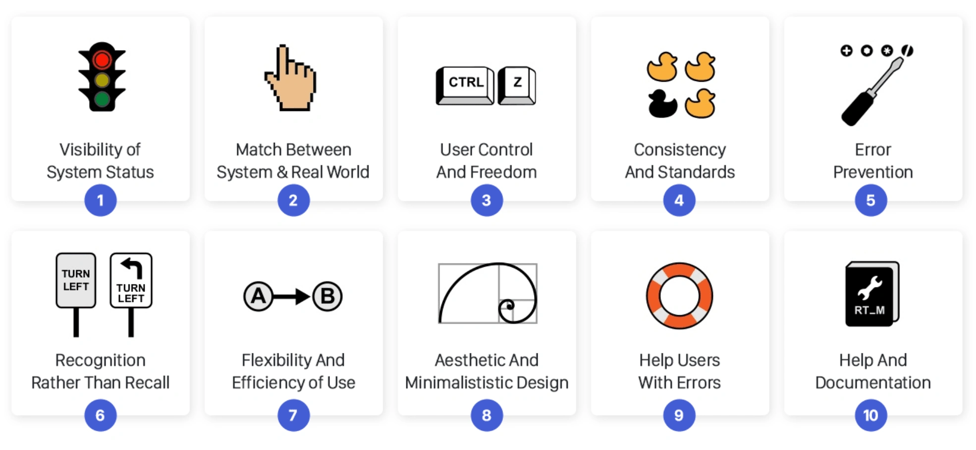
Image source:
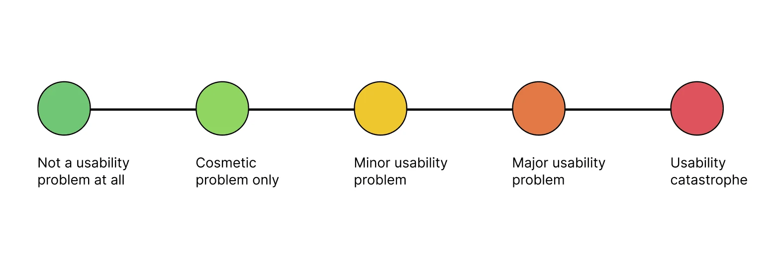
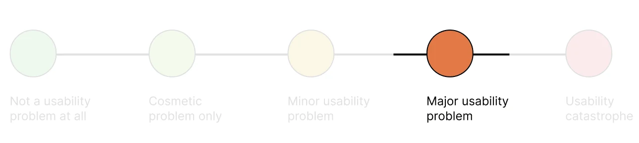
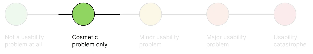
Severity ratings for usability problems
Severity ratings range from minor to major usability issues, from visual inconsistencies to functional problems.
Evaluation Report
#1 Visibility of system status
Designs should inform users about what is happening through appropriate, timely feedback.
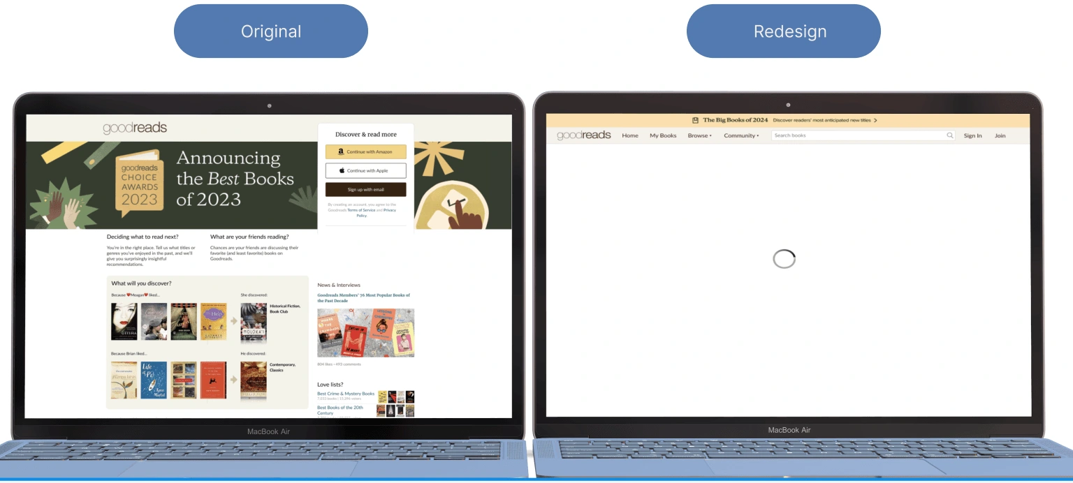
🚨 Violation:
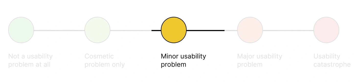
When clicking on subpages and navigation, no loader indicator(no visual feedback that an action is in progress) shows that the next page is loading.

💡Solution:
Design a loader indicator (spinner, progress bar, etc.) that will be displayed while the next page is loading.
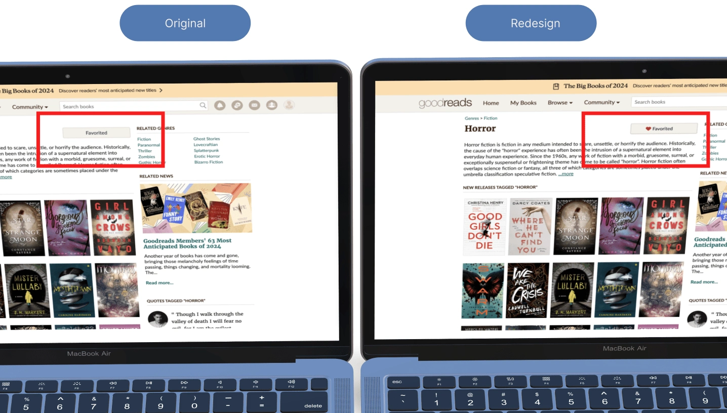
#2: Match between system and the natural world and #6 Recognition rather than recall
The system should speak the users' language, with words, phrases and concepts familiar to the user, rather than system-oriented terms. Follow real-world conventions, making information appear in a natural and logical order
🚨 Violation:
The favourite button lacks a heart icon, and upon clicking the toggle button, it only changes the text on the button.
💡Solution:
Include a heart icon alongside the text on the favourite button to visually represent the action.
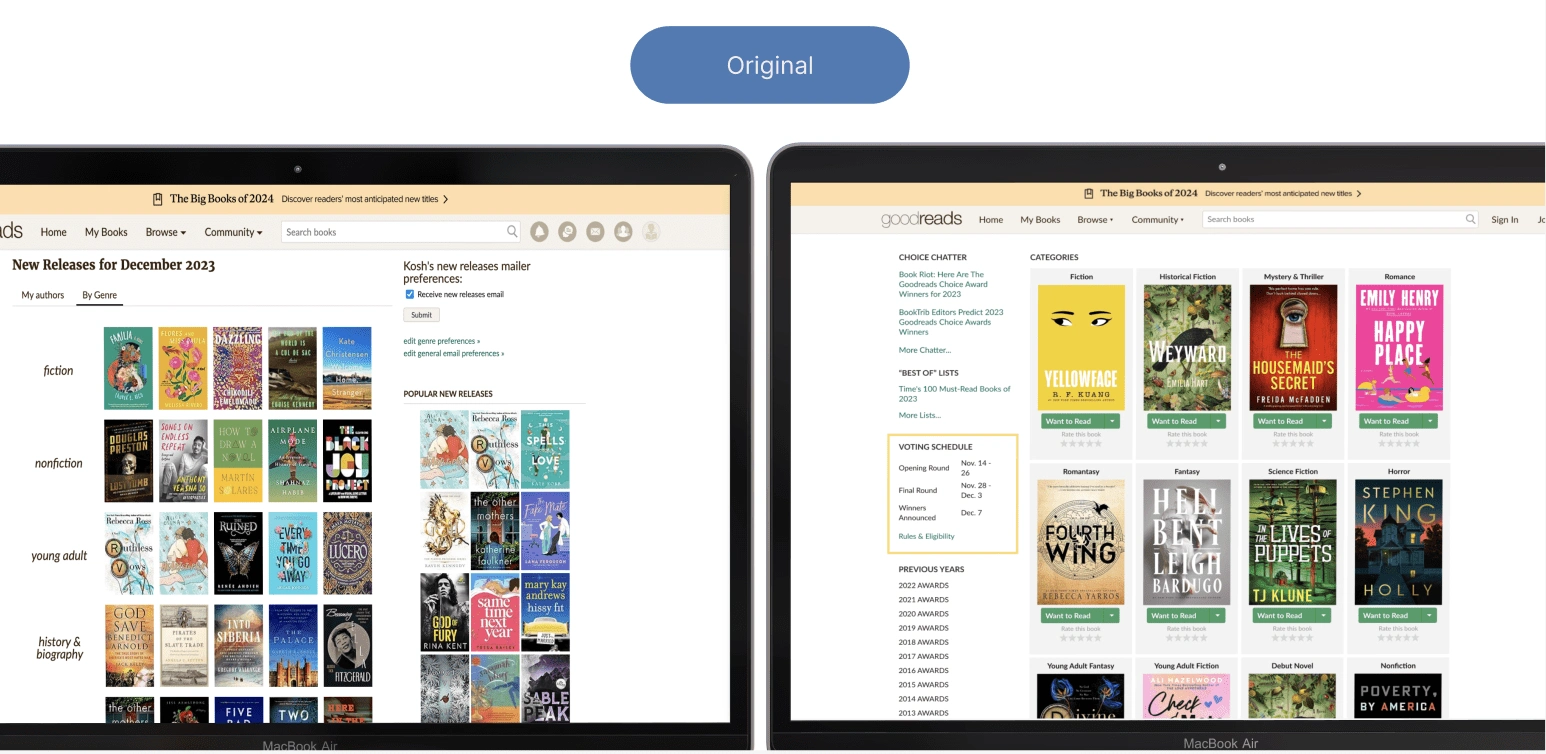
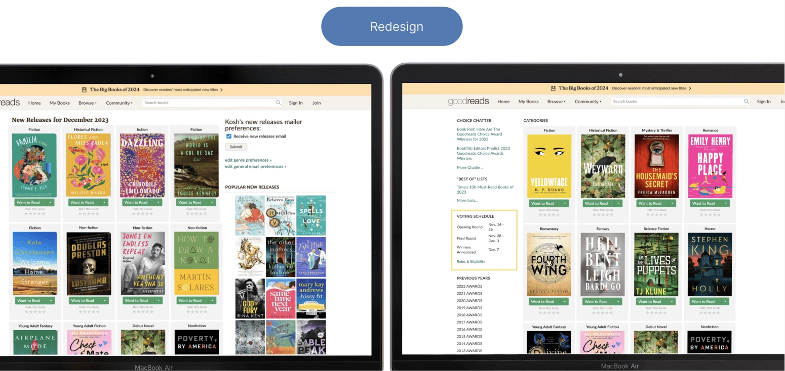
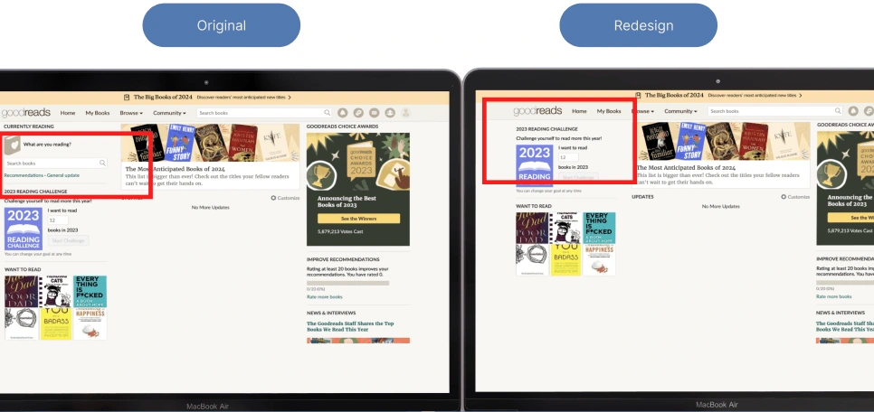
#4 Consistency and standards
Users should not have to wonder whether different words, situations, or actions mean the same thing.
🚨 Violation:
The categorization method and UI card style are inconsistent.
💡Solution:
Standardize UI components and establish design guidelines.
#8 Aesthetic and minimalist design
Aesthetic and minimalist designDialogues should not contain information which is irrelevant or rarely needed. Every extra unit of information in a dialogue competes with the relevant units of information and diminishes their relative visibility.
🚨 Violation:
They have two search fields on the home page with the same purpose.
💡Solution:
Consolidate to One Search Field.
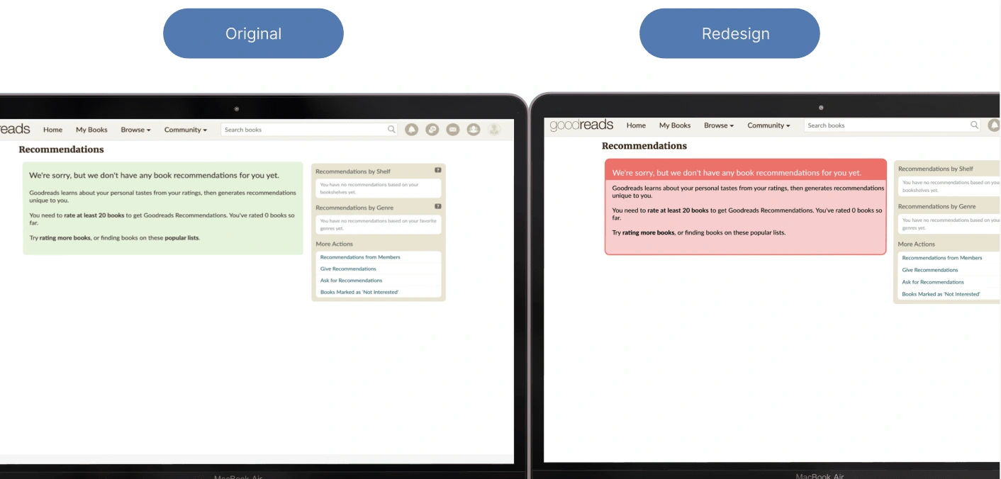
#9 Help users recognize, diagnose, and recover from errors
Error messages should be expressed in plain language (no codes), precisely indicate the problem, and constructively suggest a solution.
🚨 Violation 01:
There needs to be more consistency on the 404 pages of the website. The book recommendations page uses green, which typically signifies success, positive actions, or confirmation.

💡Solution:
Clear Error Messaging
Consider adding visual cues, icons, or imagery that reinforce the error message.
Red colour should be used instead of green.
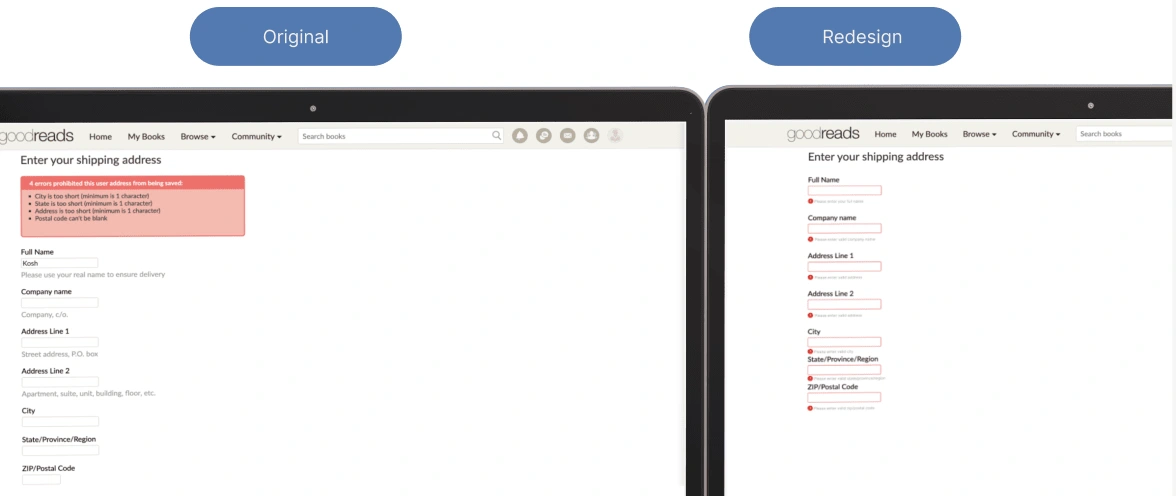
🚨 Violation 02:
The input boxes with error messages are not highlighted.

💡Solution:
Highlight the correct input boxes.
What I Learned 👏
Designing an effective user experience involves implementing solutions such as
Incorporating a loader indicator for page loading.
Recognizing the importance of loaders for feedback and professionalism.
Carefully considering colour choices for 404 pages.
Addressing inconsistency in categorization and UI card style through guidelines and testing.
Resolving confusion around the favourite button by adding a heart icon and ensuring consistent behaviour.
Designing contact form error states with clear messages and accessibility in mind.
Improving input box error visibility with inline validation and visual cues.
Enhancing the homepage by consolidating search fields and maintaining clear labelling.
Like this project
Posted Dec 22, 2023
A new tool that blends your everyday work apps into one. It's the all-in-one workspace for you and your team