🐻 BCCF
Zaya Ganzorig
At-a-Glance 👀
One of my main tasks is to establish a design system, and I have been entrusted with initiating the process. My team and I spent four months creating and customizing the website on WordPress, and We performed thorough cross-functional quality assurance checks to guarantee smooth function, meeting both client and user satisfaction.
Design thinking process
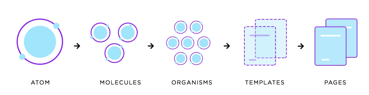
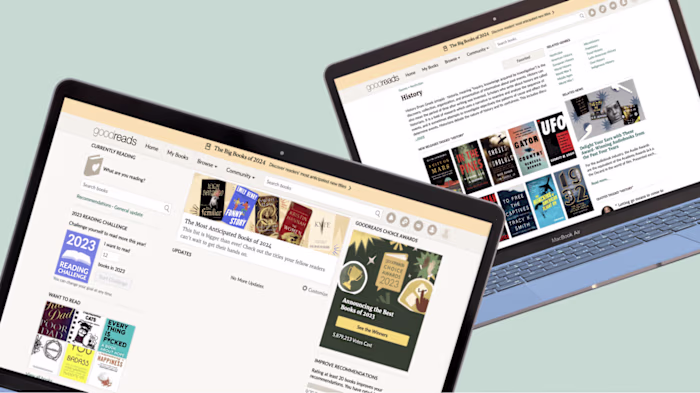
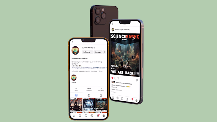
Image resource:
phase 01: Design system
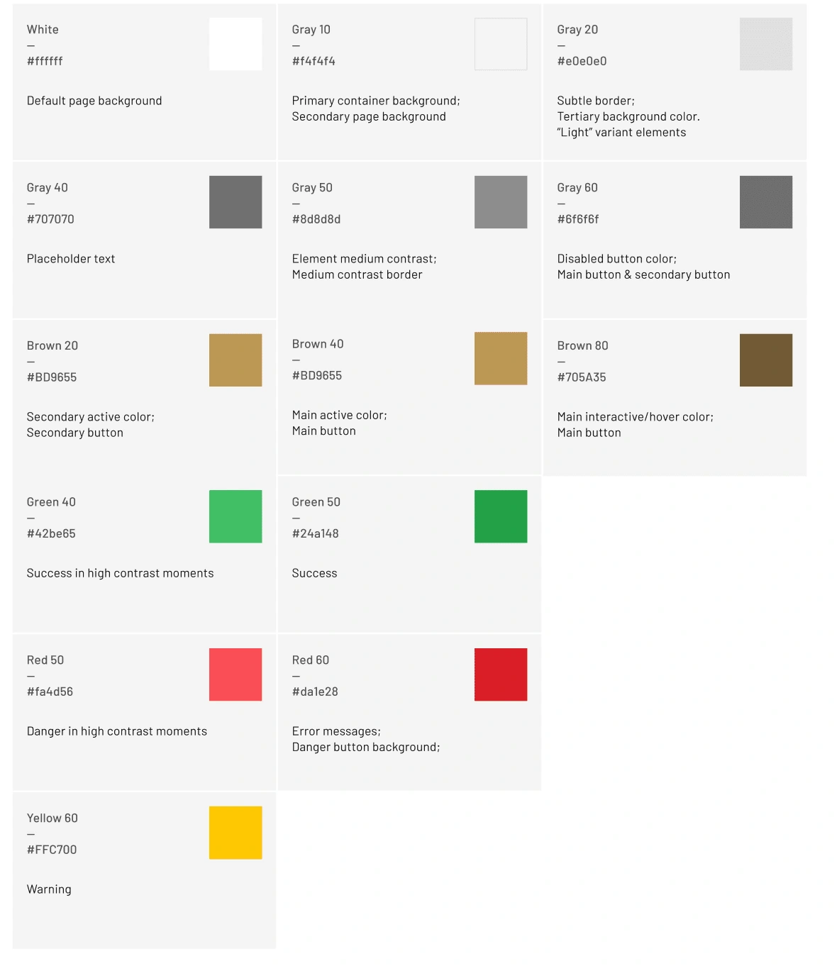
Atom Color
Maintaining consistent and engaging digital interfaces throughout, whether applications or experiences, demands extended guidance around color usage.
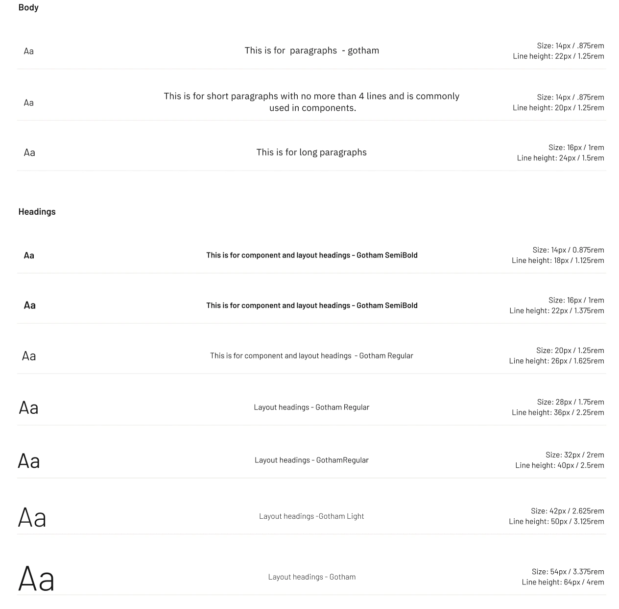
Atom: Typography
Typography can help create clear hierarchies, organize information, and guide users through a product or experience.
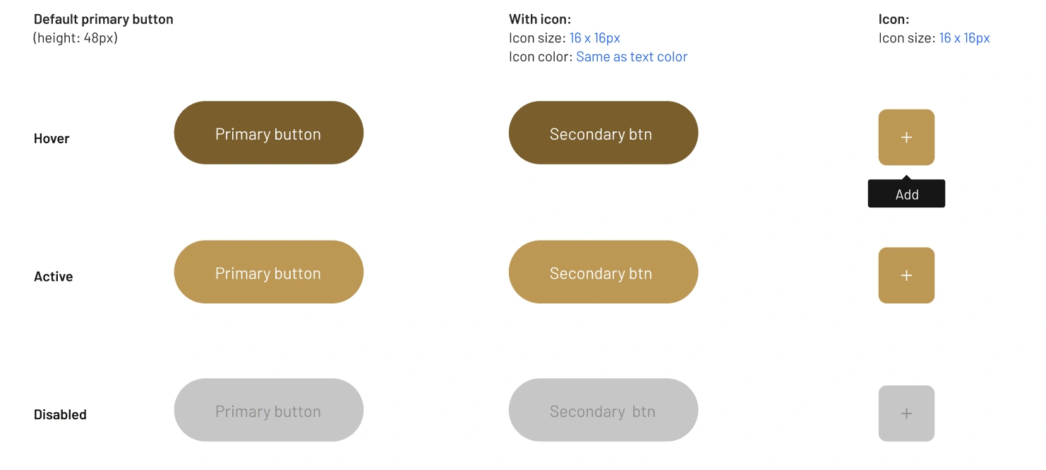
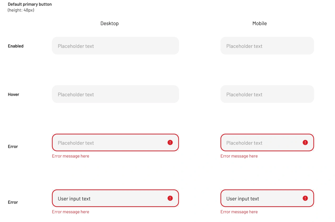
Atom: Button and input box
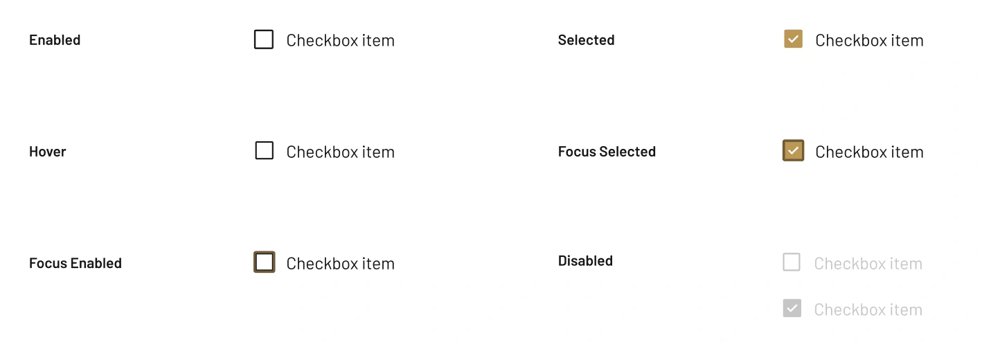
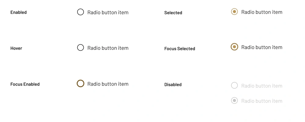
Atom: Checkbox and Radio Button
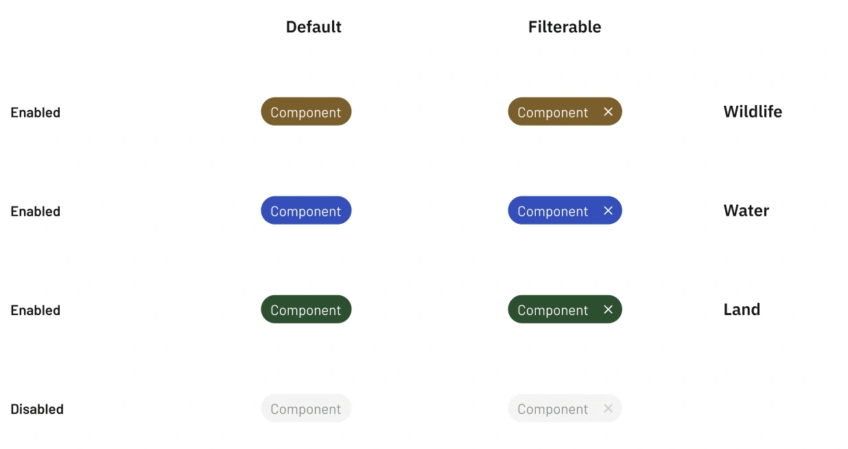
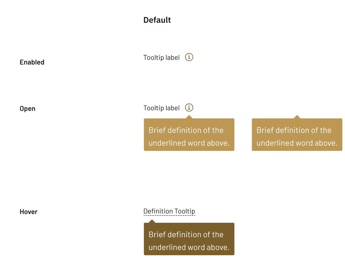
Atom: Tag and Tooltip
phase 02: Design
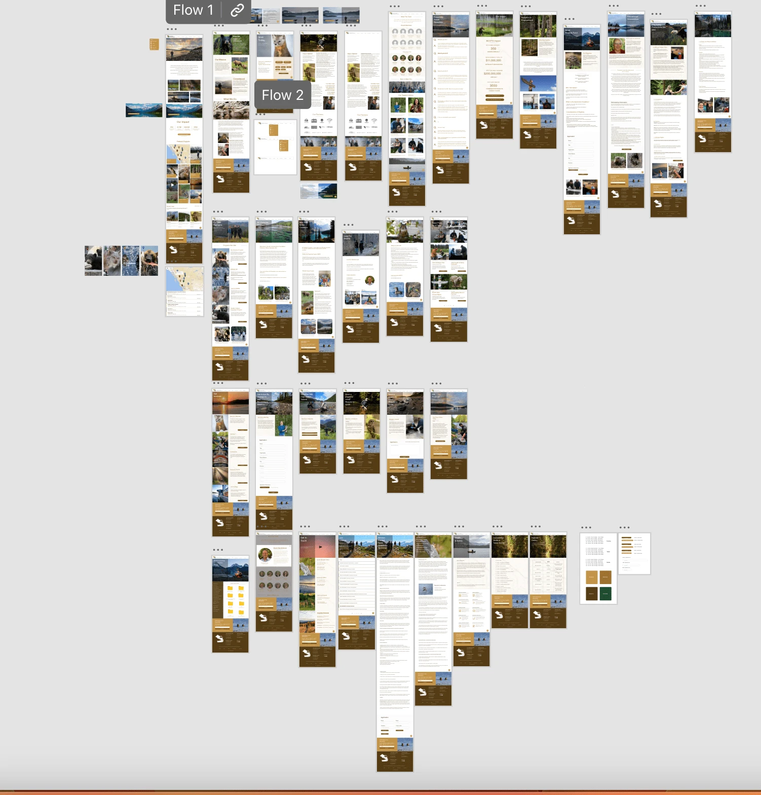
Wireframe and Interactive Prototype Creation
Senior designer and I leveraged Adobe XD to design both the wireframe and prototype, drawing from the foundational Atom UI components I previously assembled. This approach allowed us to seamlessly integrate the Atom UI elements into our design, ensuring a cohesive and user-friendly experience. This collaborative process facilitated swift iterations and comprehensive visualization of the final product, setting a solid foundation for further development and refinement.
phase 03: Development
Code
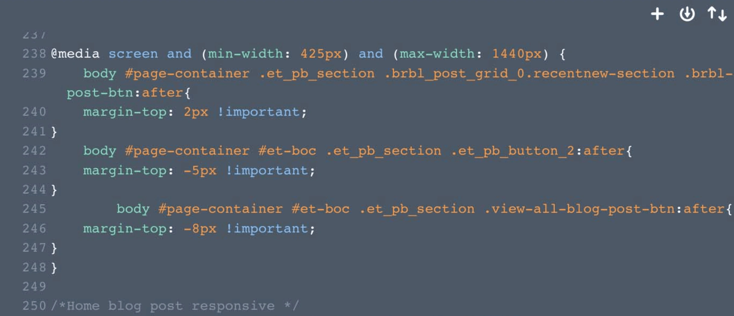
We primarily utilized a visual builder WordPress theme called Divi to develop this website. However, due to the modern and vibrant design, we had to perform custom integration frequently. Still, it was a good refresh for my responsive design and development using flex-box and grid and @media tool in CSS. The website has been designed to be responsive to different screen sizes for users' convenience. The @media has been tailored to fit breakpoints at 375px, 425px, 768xp, 1024px, and 1440px. This means that all website components, including buttons, fonts, headers, paragraphs, content, forms, maps, and dividers, will adjust accordingly for optimal viewing on any device.
Quality Assurance
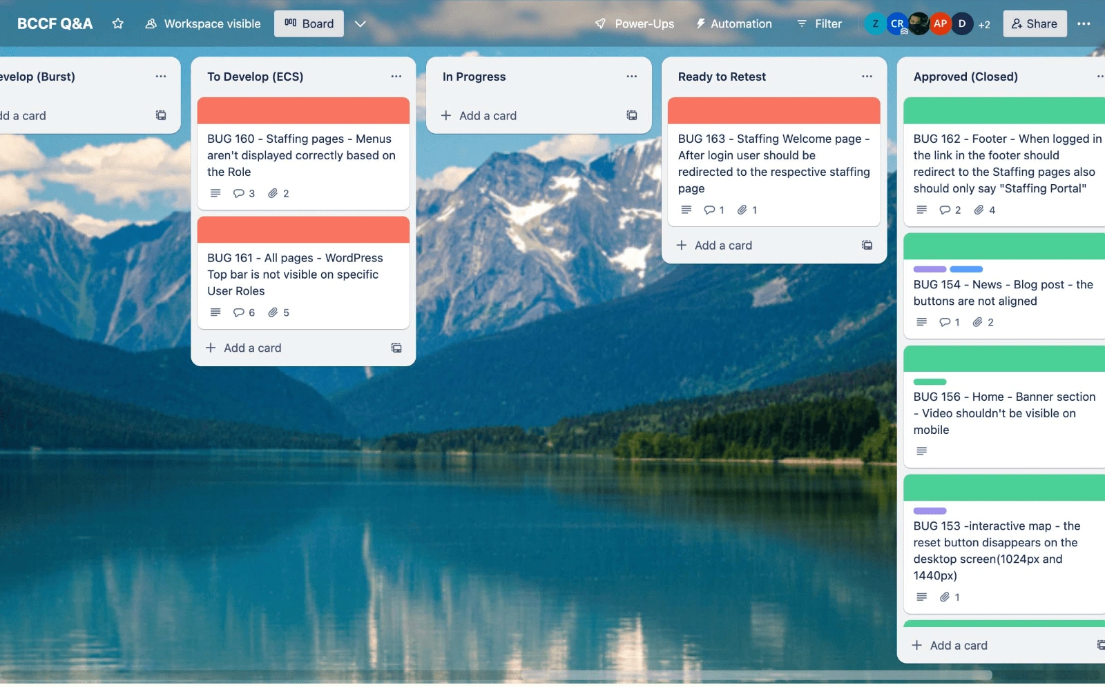
Throughout the QA phase of the project, we collaborated with an external developer due to the significant need for quality assurance. My primary duties during this stage were to identify any design or functionality issues on the website, report any bugs, retest them, fix any problems and ultimately approve or reject them. I reported over 100 bugs for the first time. This experience helped me learn valuable lessons on collaborating with other developers during the Development and QA phase and how to write effective bug reports and documentation.
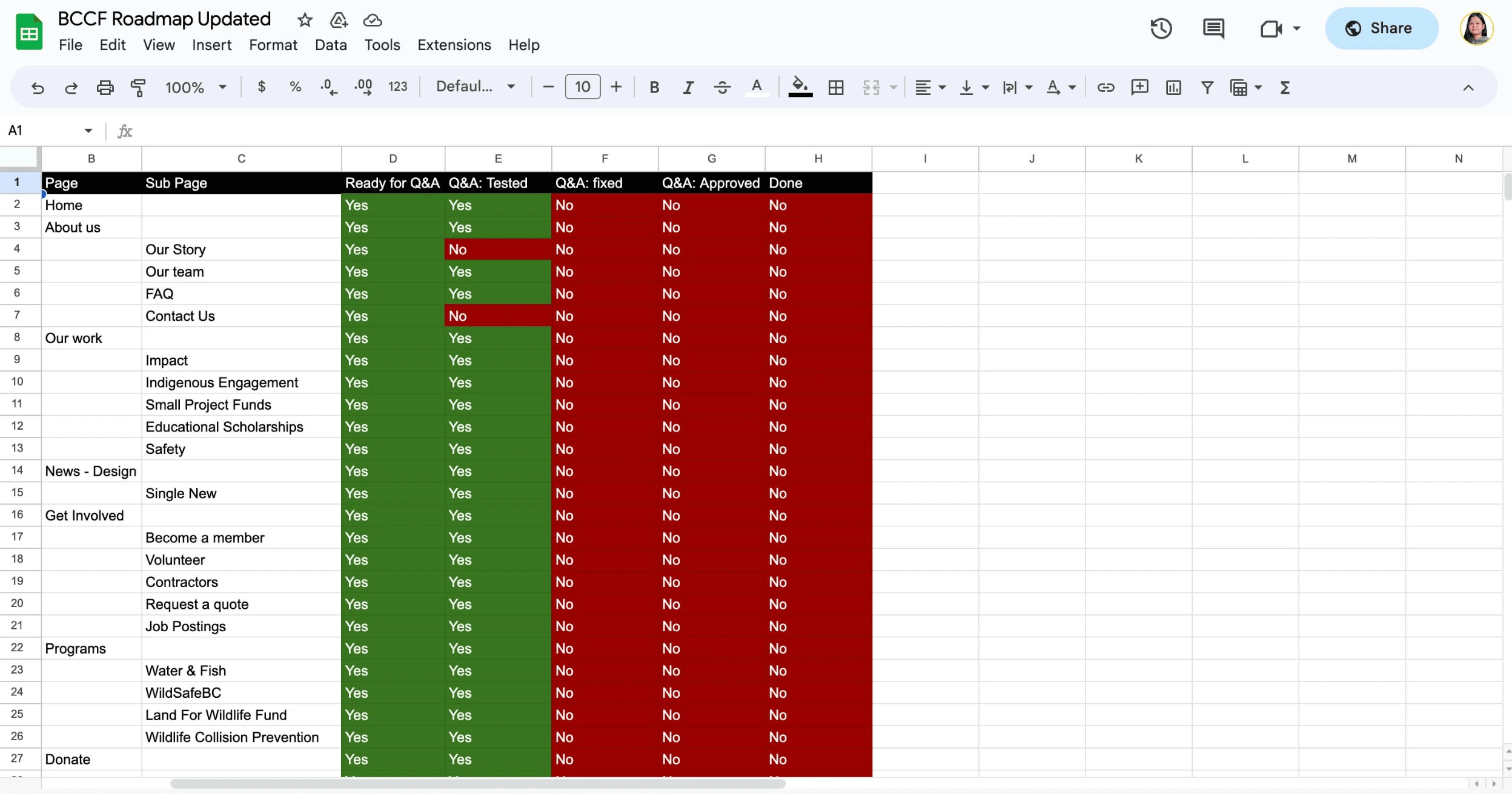
Documentations and RoadMap
I created a checklist to track completed and outstanding tasks. I would bring this checklist to meetings with senior developers and clients to discuss necessary modifications. This experience showed me the importance of thorough documentation in case of any team or task changes. Additionally, documentation is a valuable resource for future reference on how we accomplished specific tasks.
What I Learned 👏
During this project, I acquired valuable insights by creating a comprehensive style and UI component guide that can assist developers. It is recommended to document any alterations made during the development process. This documentation can be referred to by team members in the future. Providing clients with a process checklist/documentation is crucial to ensure their expectations are met, and any changes or feedback are incorporated.
Website Link:
Like this project
Posted Dec 23, 2023
I developed and designed a client website called BCCF. This project demonstrates my expertise in responsive design, development, design systems and QA.
Likes
0
Views
13
Clients
British Columbia Conservation Foundation