Redesigning Rayna UI to Convert Creators Into Customers
Gaga John
Redesigning Rayna UI to Convert Creators Into Customers
Why Rayna UI Needed a Redesign
Rayna UI started as a simple yet powerful Figma design system and component library. Its vision? To help designers, product builders, and indie hackers ship their ideas faster, like snapping Lego blocks together to create a full product.
But by the time Version 2 was ready to launch, Rayna UI needed more than just a new look.
We needed to move beyond “just a component library” and position Rayna UI as a full ecosystem.
We wanted to show existing V1 users and new customers what had changed and why it mattered.
And most importantly, we wanted the website to drive conversions, not just showcase features.
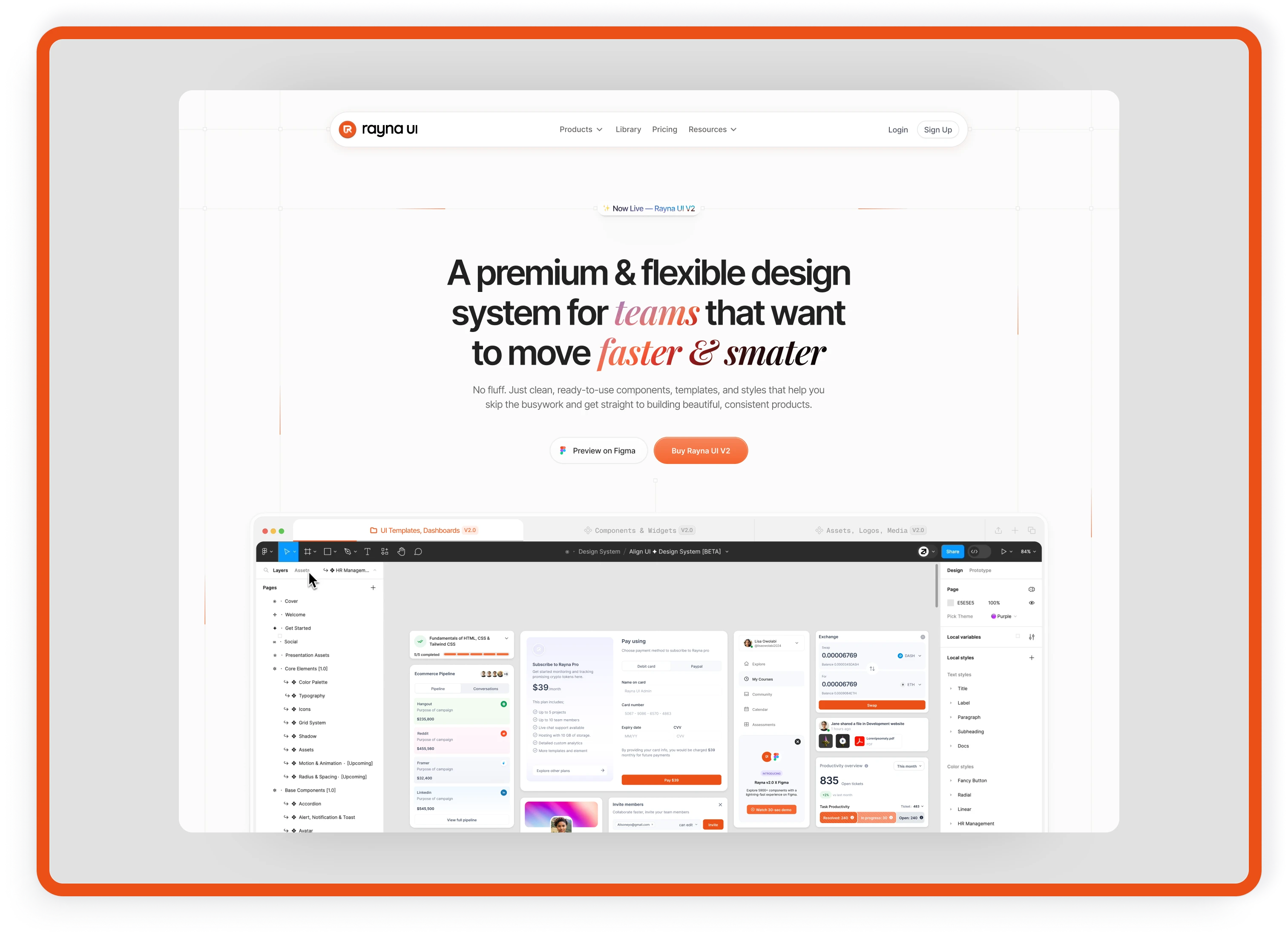
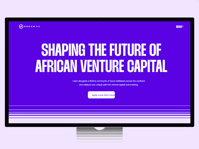
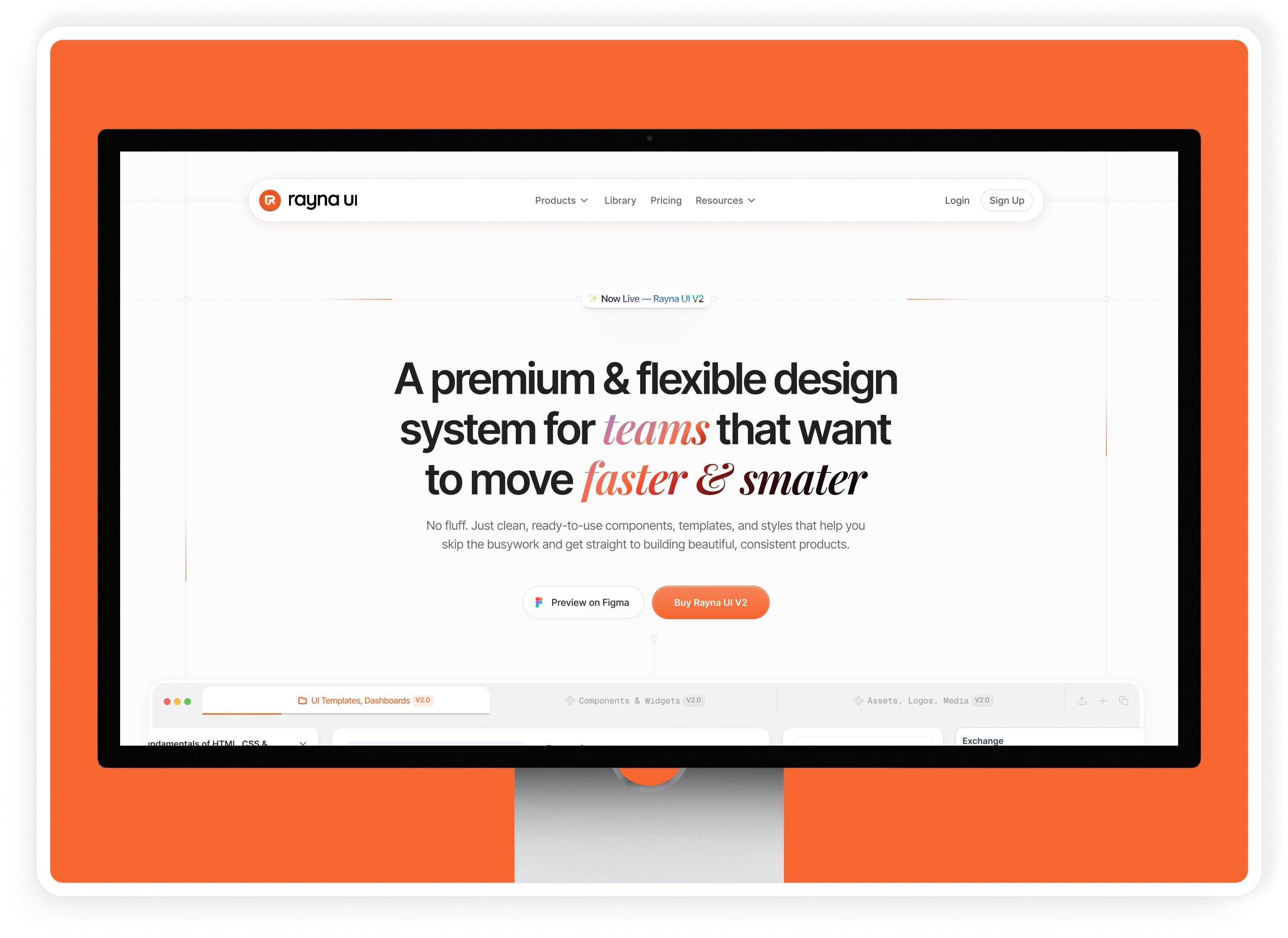
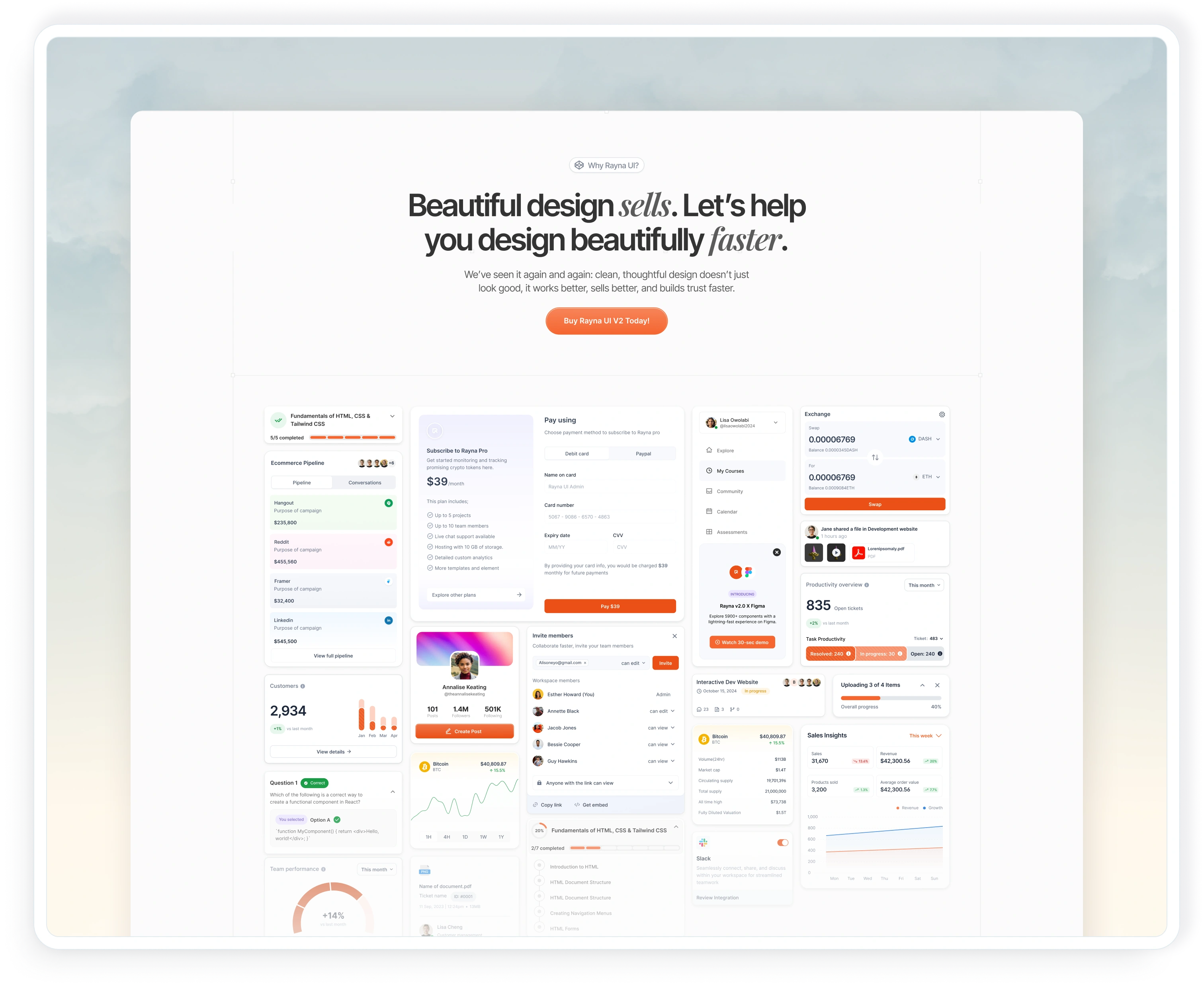
Hero section
Building the Lego Blocks: My Design Approach
As part of the design system team, I was responsible for:
Redesigning and rebuilding the website to match the bold vision of V2.
Crafting content flow and layouts that didn’t just look sleek, but guided users toward conversion.
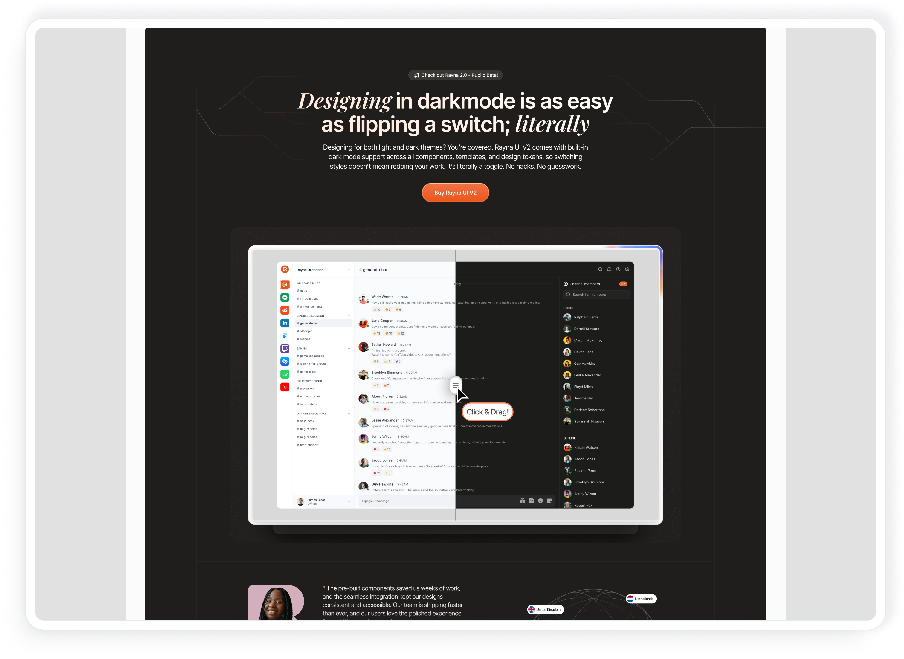
Highlighting V2’s new features:
Pre-built website templates across industries
Responsive web app components + full examples
Widgets and illustrations are ready for plug-and-play use
Expanded icon library through external partnerships
One-click dark mode toggle
It was about telling a clear story that Rayna UI isn’t just a library. It’s a shortcut to building real, production-ready products.
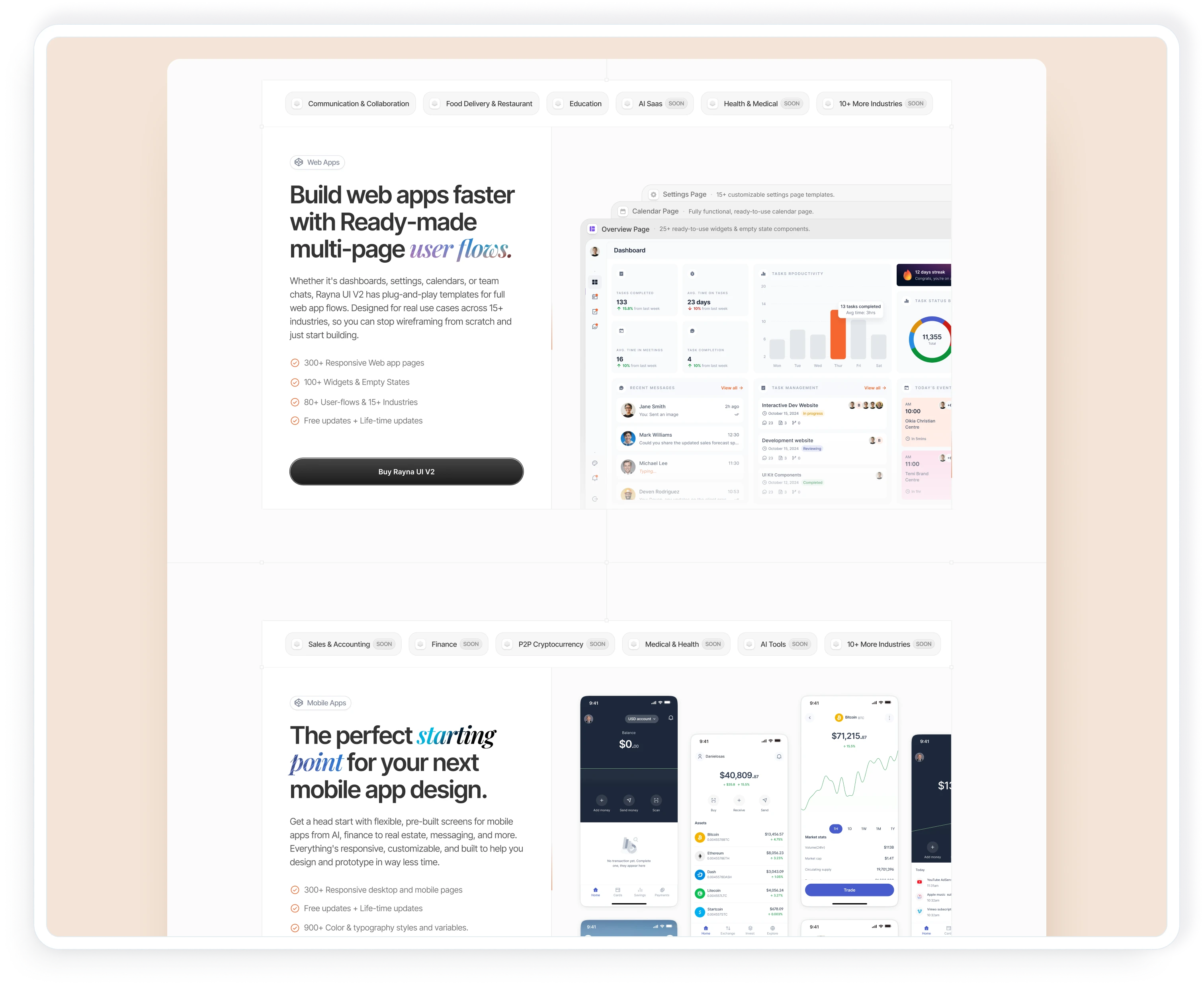
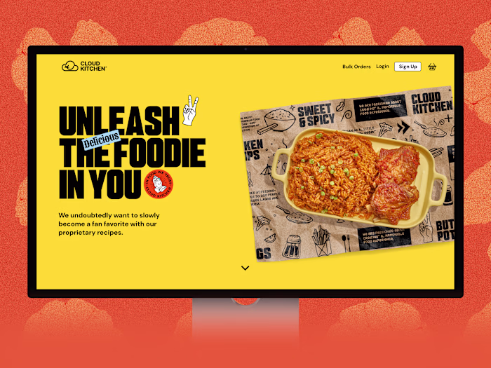
product features
From Components to Conversions
The redesigned site launched with Rayna UI V2 in Sept 2025.
Here’s the impact:
3,000+ website visitors in the first weeks after launch
3–5% conversion rate into paying users
Fully responsive, sleek site optimized for speed & accessibility
Clear storytelling that helped users instantly “get it”
By aligning content with user needs, showcasing social proof (examples, reviews), and addressing doubts with a dedicated FAQ, the site didn’t just look better; it performed better.
What This Project Taught Me
Working on Rayna UI reinforced a few powerful lessons:
Clarity drives conversion: Users convert when content directly answers what they’re looking for.
Storytelling matters: Features alone don’t sell; showing use cases and benefits builds trust.
Design is strategy: A sleek interface means little without a strategic content flow and conversion-focused structure.
Impact Beyond the Project
Rayna UI’s V2 launch wasn’t just a “website redesign.” It was a shift in how indie builders and product teams approach shipping. By lowering the barrier to prototyping and launching products, Rayna UI empowers:
Solo founders to validate ideas quickly
Designers to create polished UIs faster
Product builders to focus on core innovation instead of reinventing the basics
And for me personally, this project sharpened my approach to conversion-driven design, a philosophy I now carry into every project: design isn’t just about how it looks, but about how effectively it moves people to act
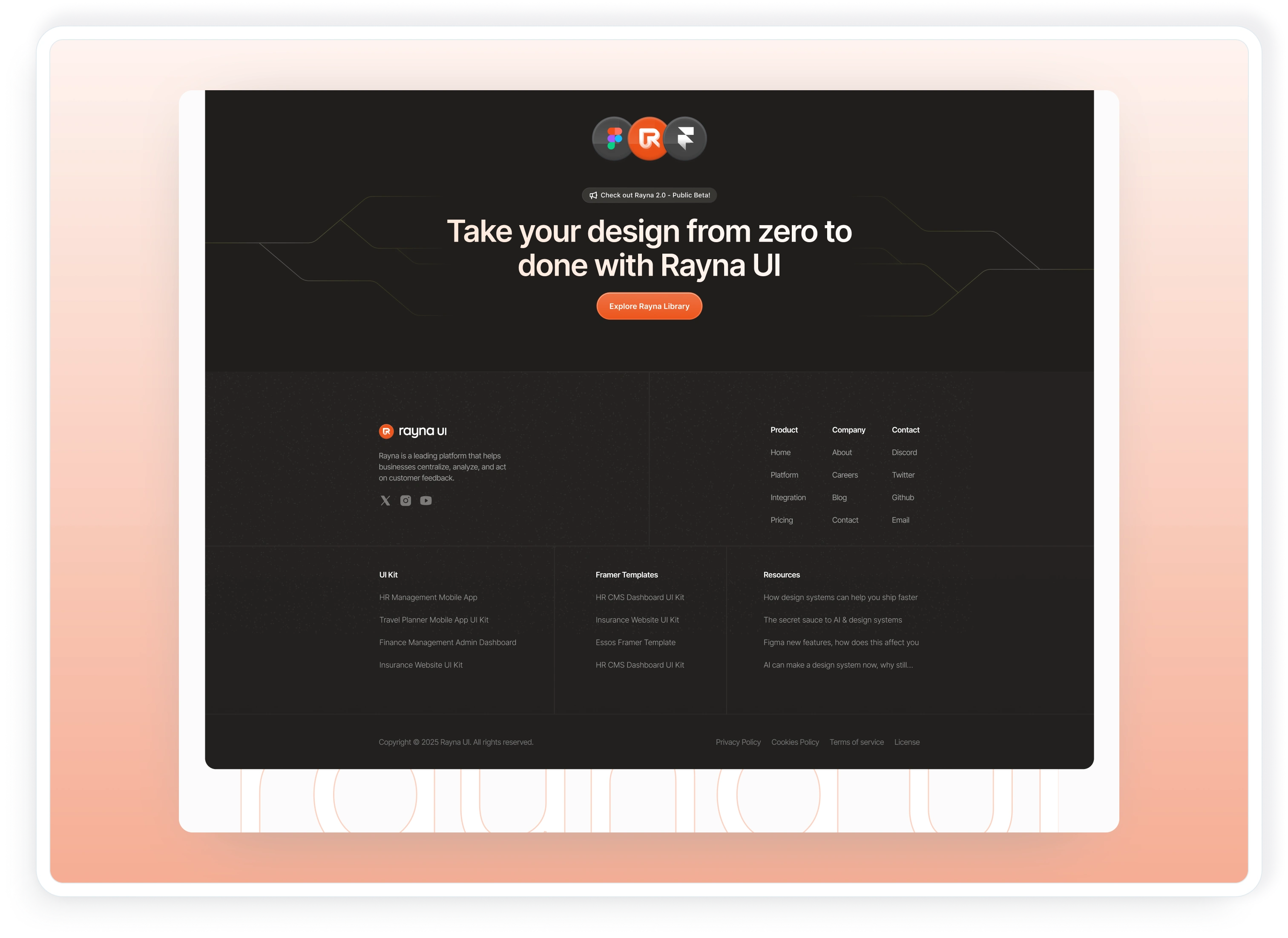
footer UI
Rayna UI V2 is built for designers, indie hackers, product builders, and solo founders who want to ship faster without reinventing the wheel.
🌐 Explore Rayna UI V2 here: https://www.raynaui.com/
Like this project
Posted Sep 22, 2025
Redesigned Rayna UI website to boost conversions and showcase V2 features.
Likes
1
Views
10
Timeline
Aug 14, 2023 - Aug 30, 2023
Clients
Rayna UI