Panacea, Responsive Webflow Adaptation with Sliders and CustomJS

Gregoire Geoffroy


Overview
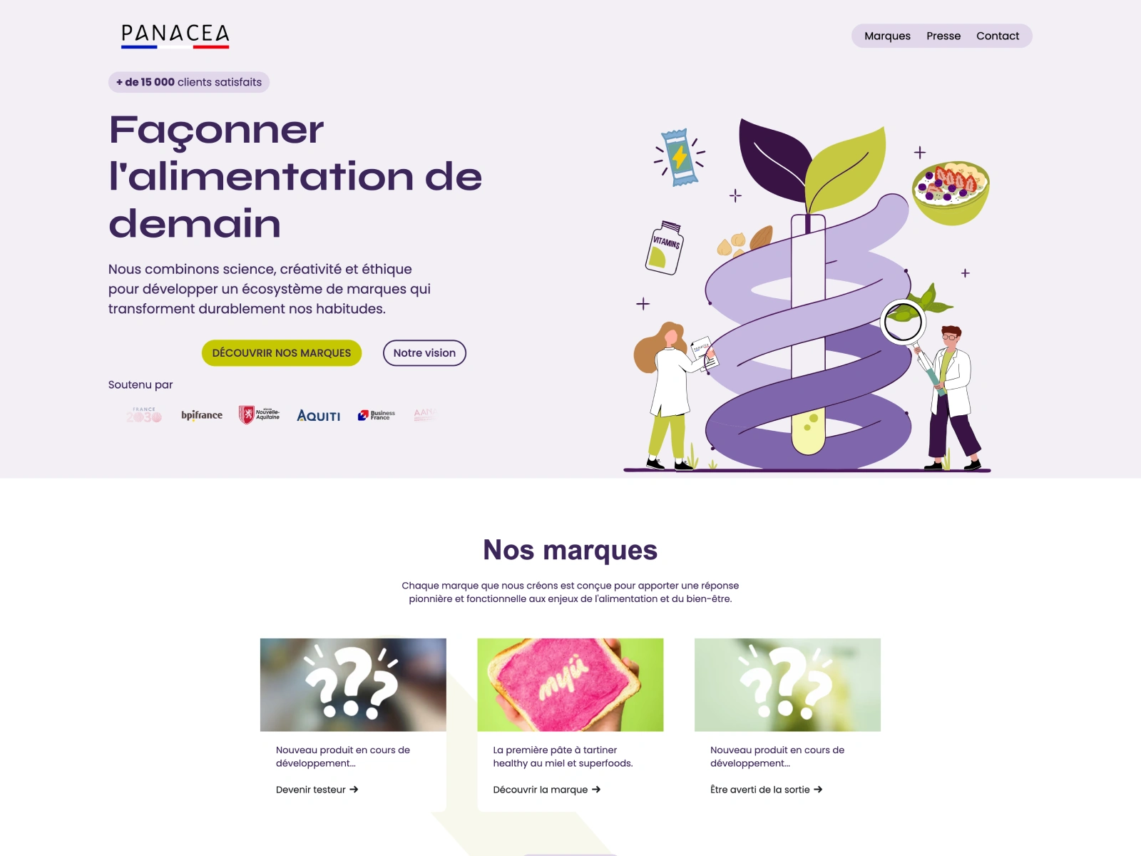
I was brought in to finalize a desktop landing page and adapt it for tablet and mobile. Scope included responsive layout, navigation UX, slider behavior, visual refinements, and basic SEO hygiene.
Objectives
Translate the desktop design to mobile and tablet with a consistent UI
Unify navigation across breakpoints and improve link behavior
Fix sliders and marquee animations for smooth, infinite motion
Address spacing, alignment, and minor desktop polish
Apply quick SEO checks on headings, images, and Open Graph basics
What I Did
Responsive and Layout
Built mobile and tablet variants, fixing overflowing images, section stacks, and spacing
Normalized the navbar across breakpoints and cleaned duplicate classes
Tuned typographic scaling to avoid line breaks on small screens
Sliders and Animations
Reworked the brand section into a proper slider with arrows and a custom JS starting slide on mobile
Rebuilt the logo marquee to loop infinitely and fixed the gradient mask in preview
Design Polish and SEO
Corrected header, logo, and button alignment and balanced spacing
Fixed heading hierarchy, optimized images, and flagged missing favicon, webclip, OG image, and meta fields
Results
✅ A seamless mobile and tablet experience with consistent navigation
✅ A smooth, infinite logo marquee and brand slider with proper controls
✅ Cleaner, more maintainable classes and spacing
✅ Better semantic structure and image performance
Keywords / Tags
Webflow Development · Responsive Design · Slider / Marquee · UI Polish · Light SEO · Custom JS
Like this project
Posted Oct 10, 2025
Adapted Panacea’s desktop LP for mobile/tablet, unified the navbar, rebuilt sliders and infinite logo marquee, fixed spacing/alignments, and applied light SEO.