RePage - Brand Identity Design
AHMAD TARIQ

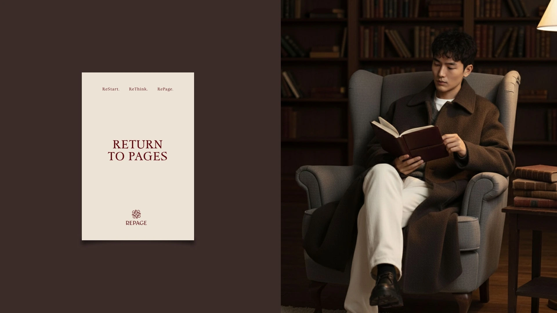
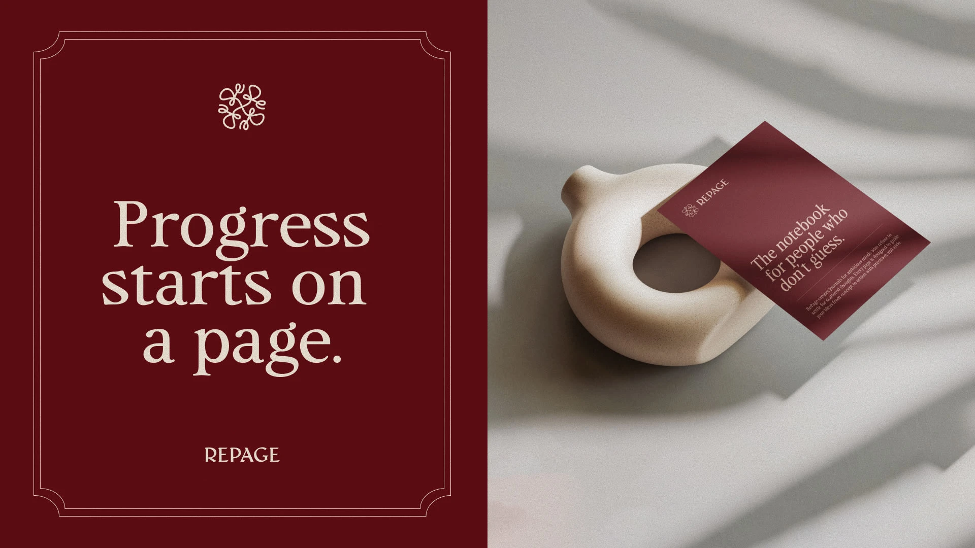
About RePage
RePage is a premium leather journal brand for ambitious professionals, designed to turn scattered digital thoughts into structured, actionable clarity.
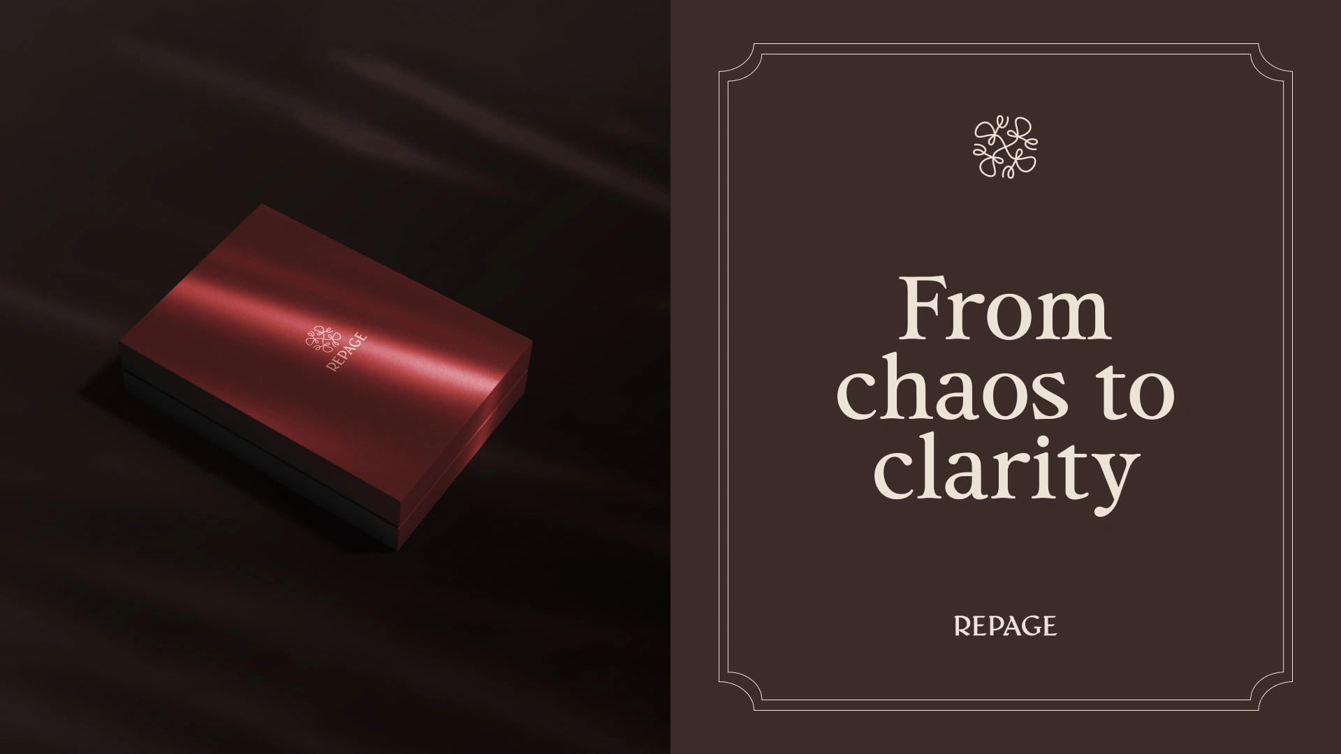
The Challenge
Create a brand that feels modern, bold, and premium, while helping users move from digital chaos to focused planning. The identity needed to be sophisticated, approachable, and reflective of transformation.
The Solution
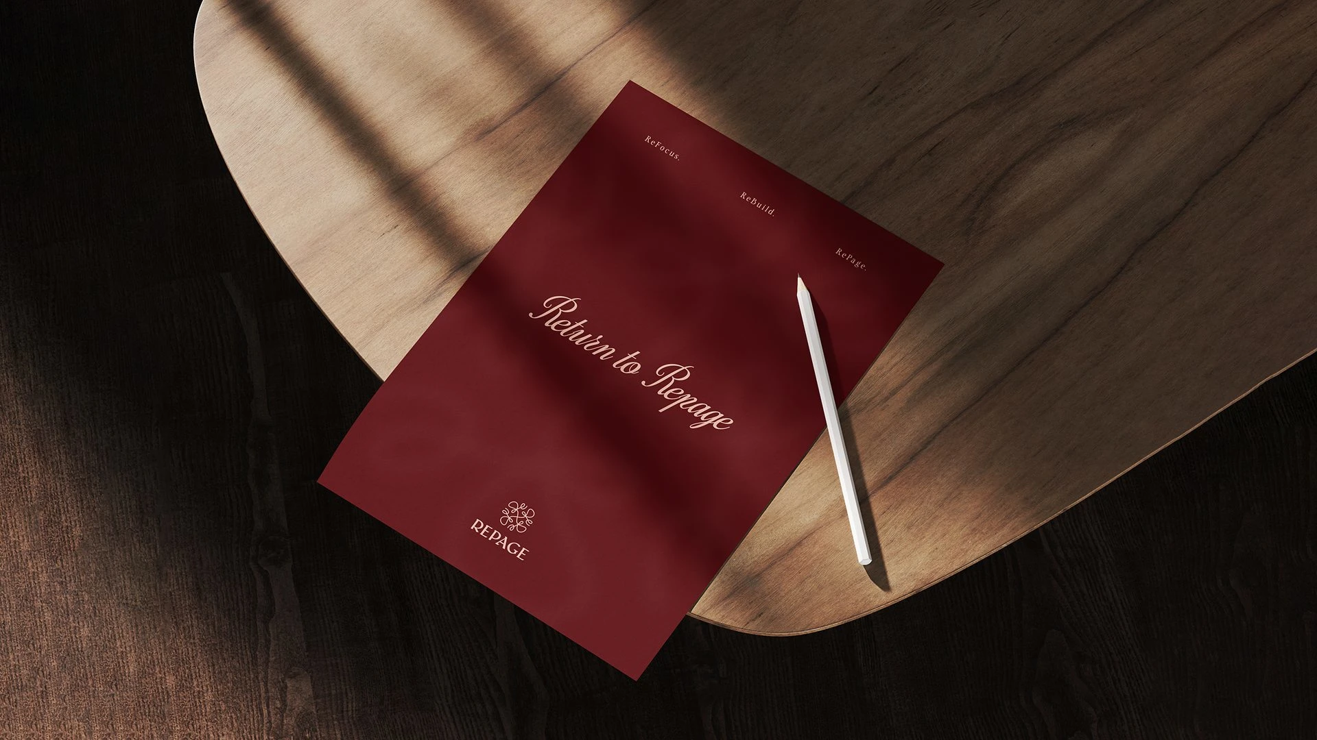
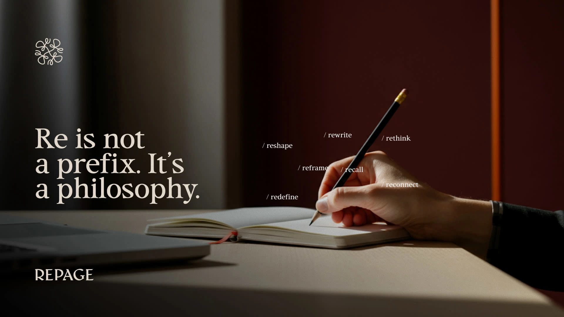
I created a visual identity built around the idea of “Re” — a reset. The highlighted Re, minimal structure, premium typography, and earthy palette all reinforce clarity and a sophisticated, premium feel. The logo and identity together position RePage as a focused space to reset your thoughts and turn them into action.
Wordmark (Primary Logo)

BrandMark (Secondary Logo)
For RePage, we wanted the wordmark to feel premium yet modern, reflecting the sophistication and clarity the journals provide. The brandmark incorporates “RE,” which is central to the brand’s concept, symbolizing the act of reorganizing, reclaiming, and transforming scattered ideas into structured, actionable clarity.
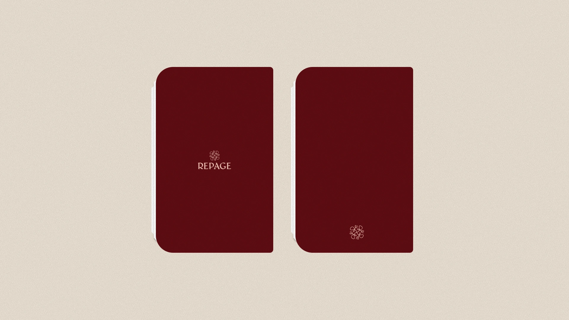
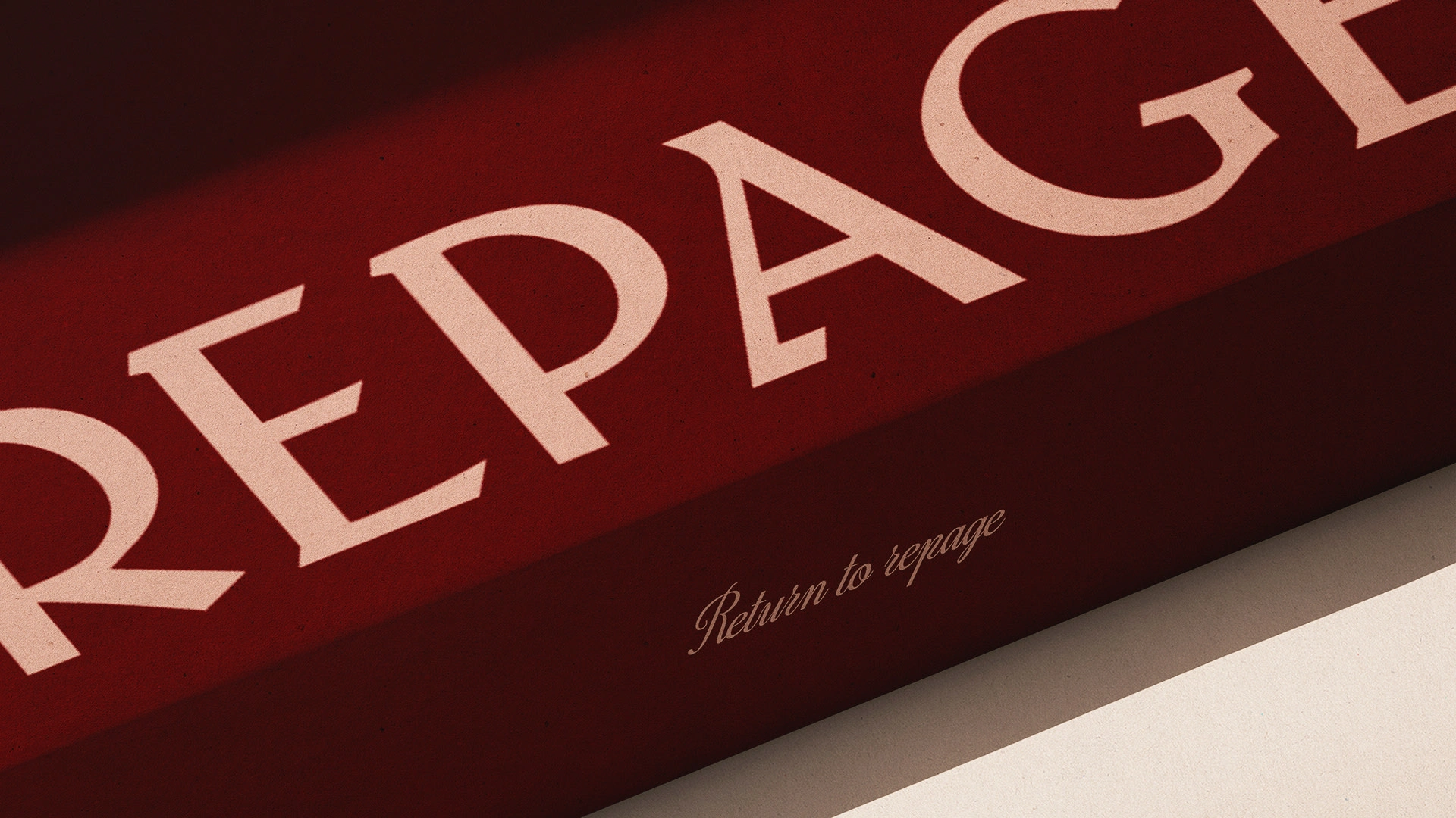
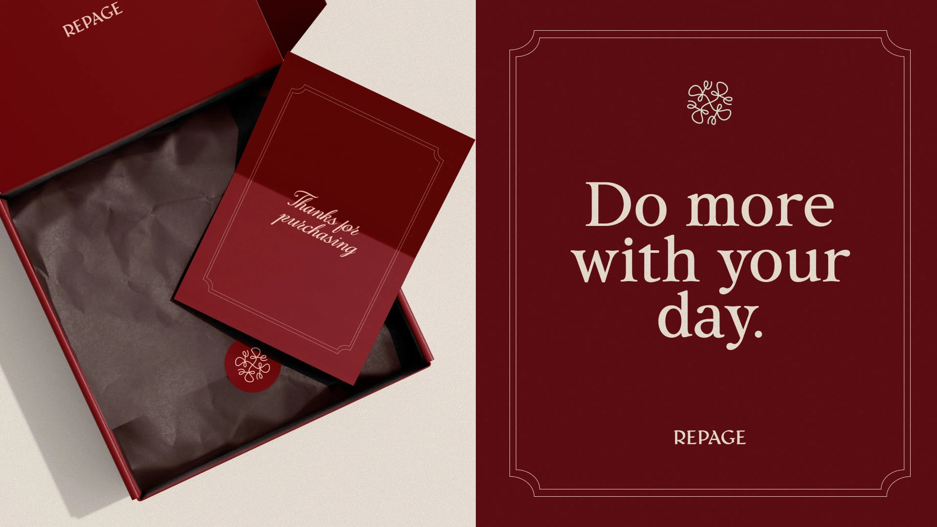
Packaging Design
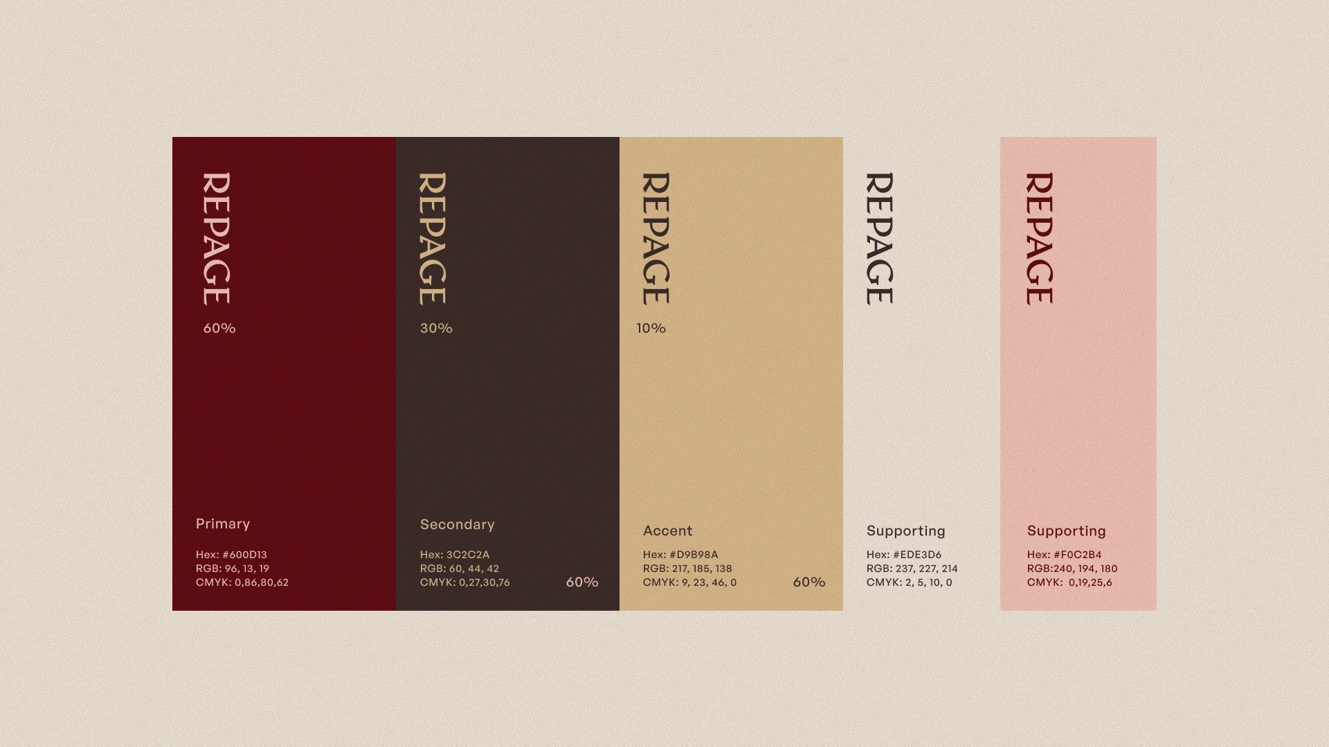
Brand Palette
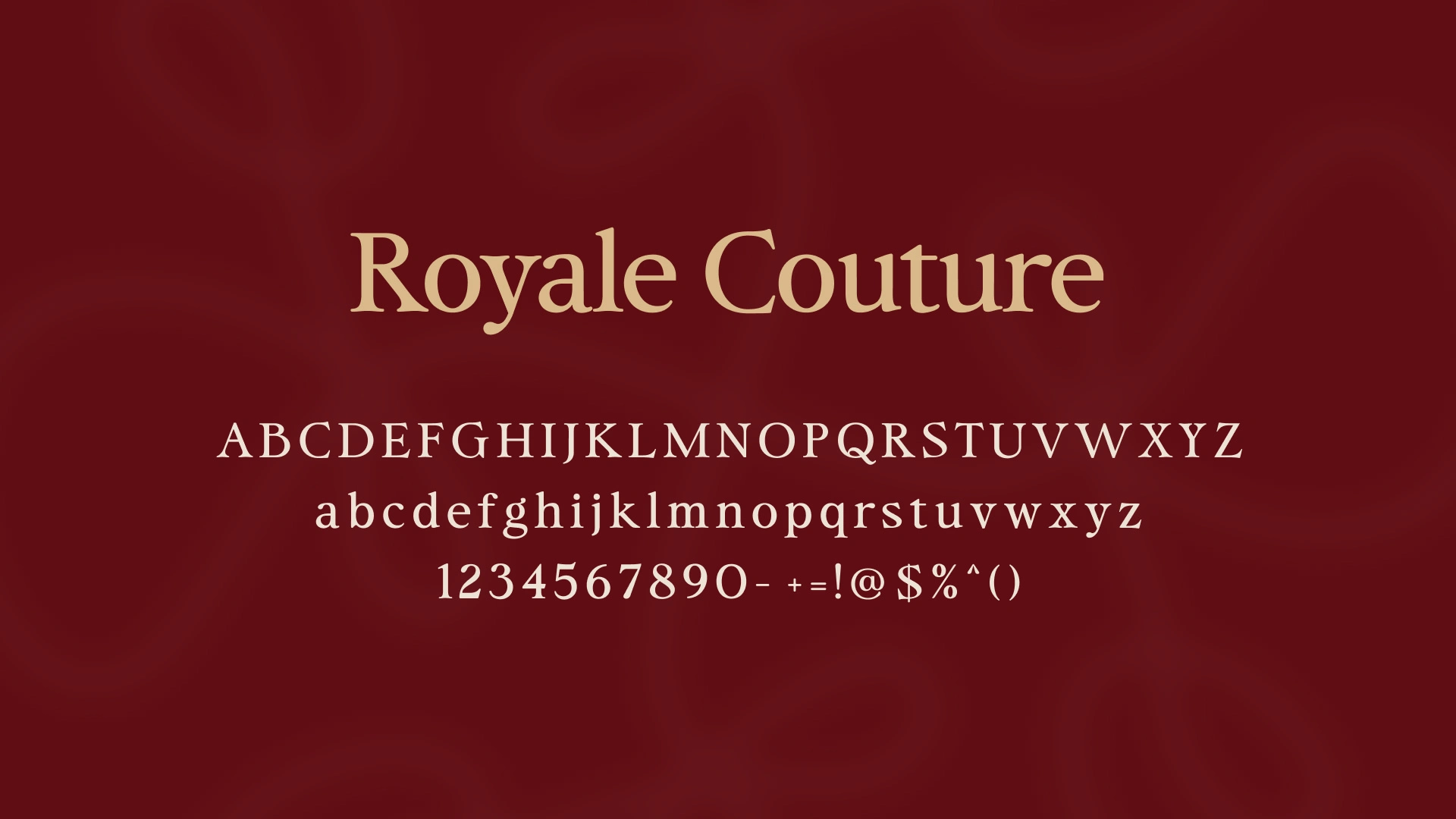
Typography
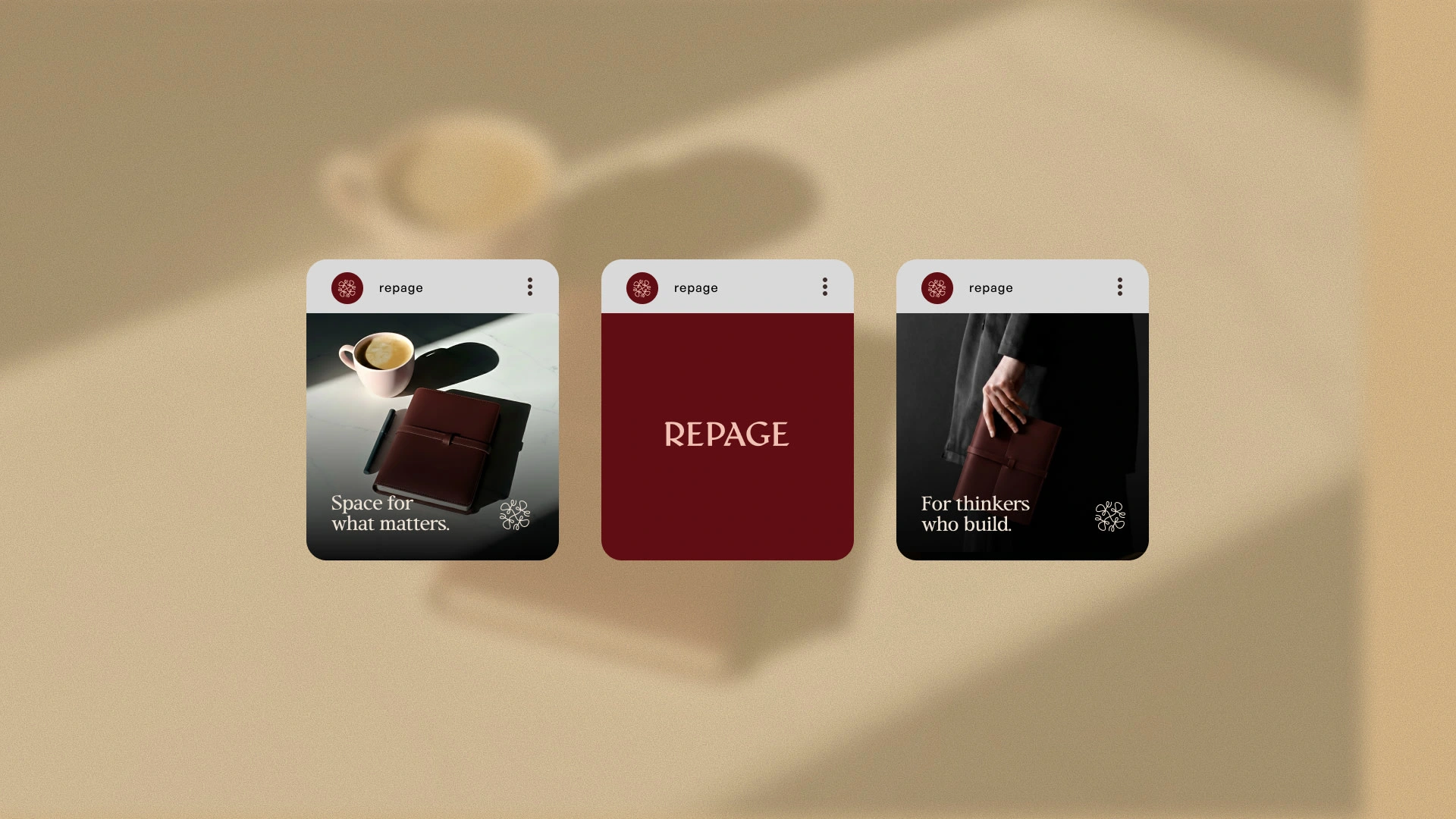
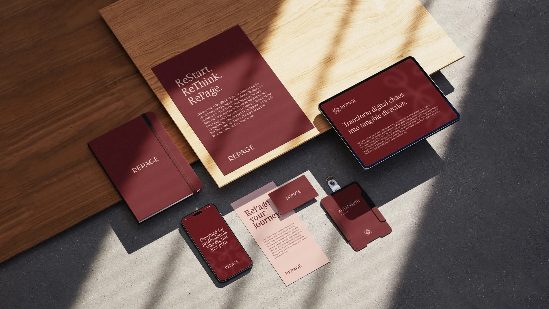
Social Media posts
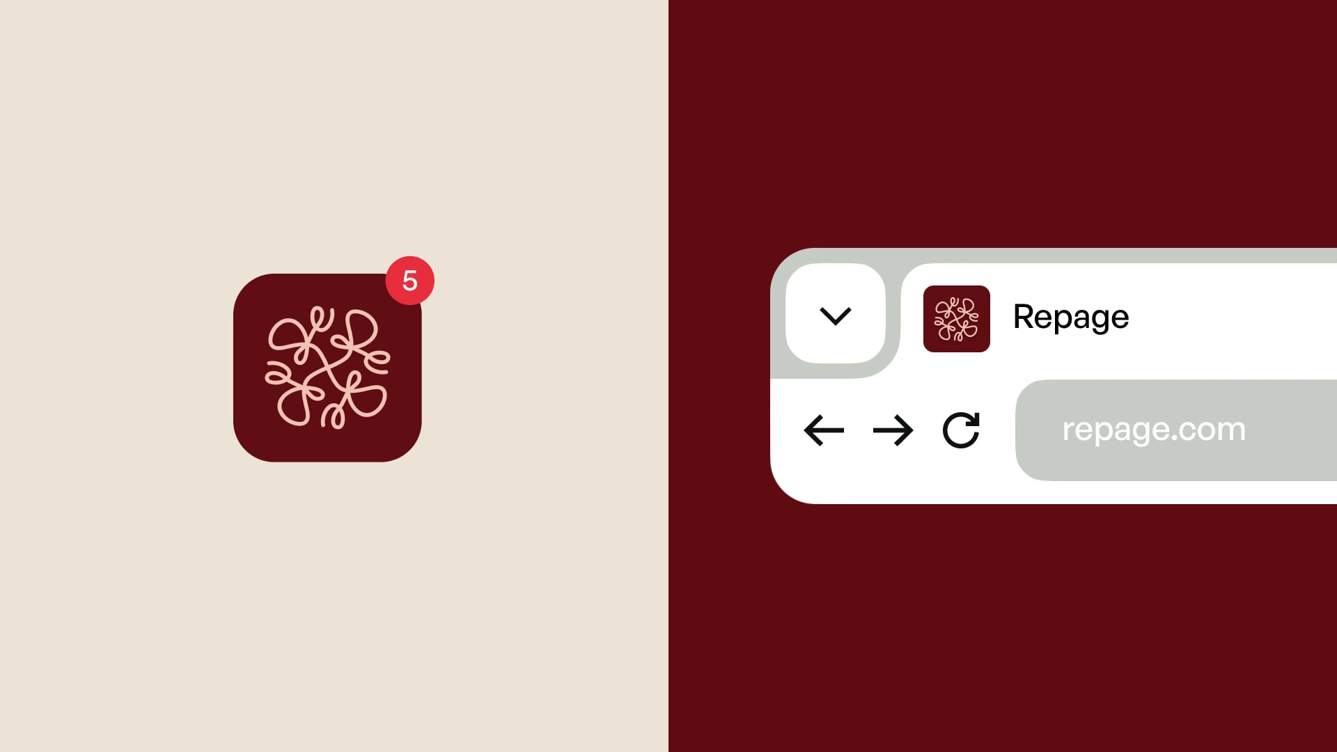
App Icon & Favicon
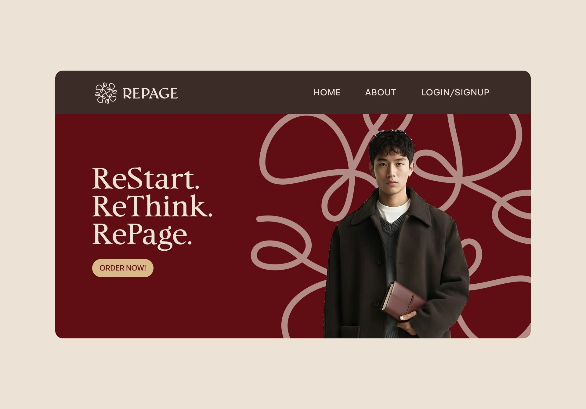
Front Page Design

Like this project
Posted Dec 9, 2025
Developed a brand identity for RePage, a premium leather journal brand.