
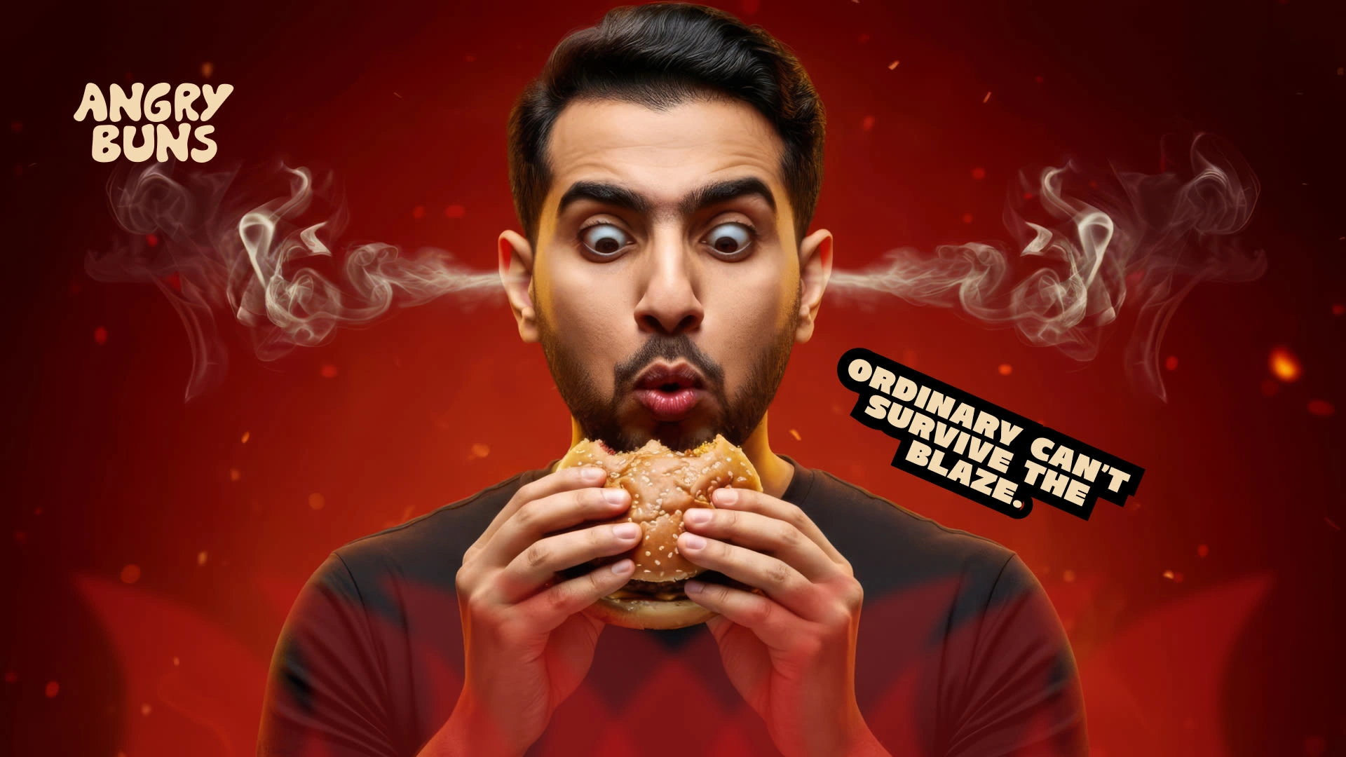
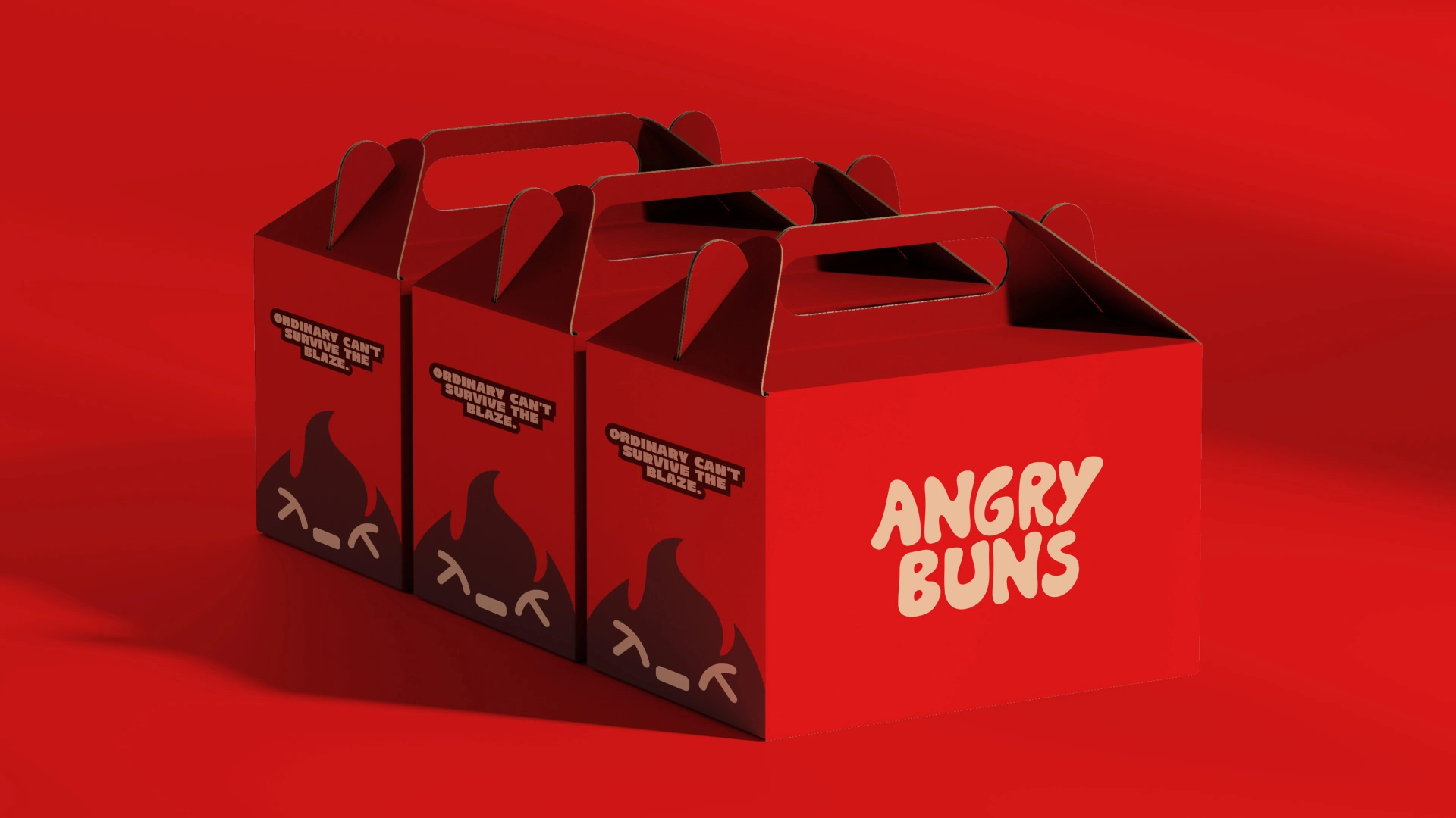
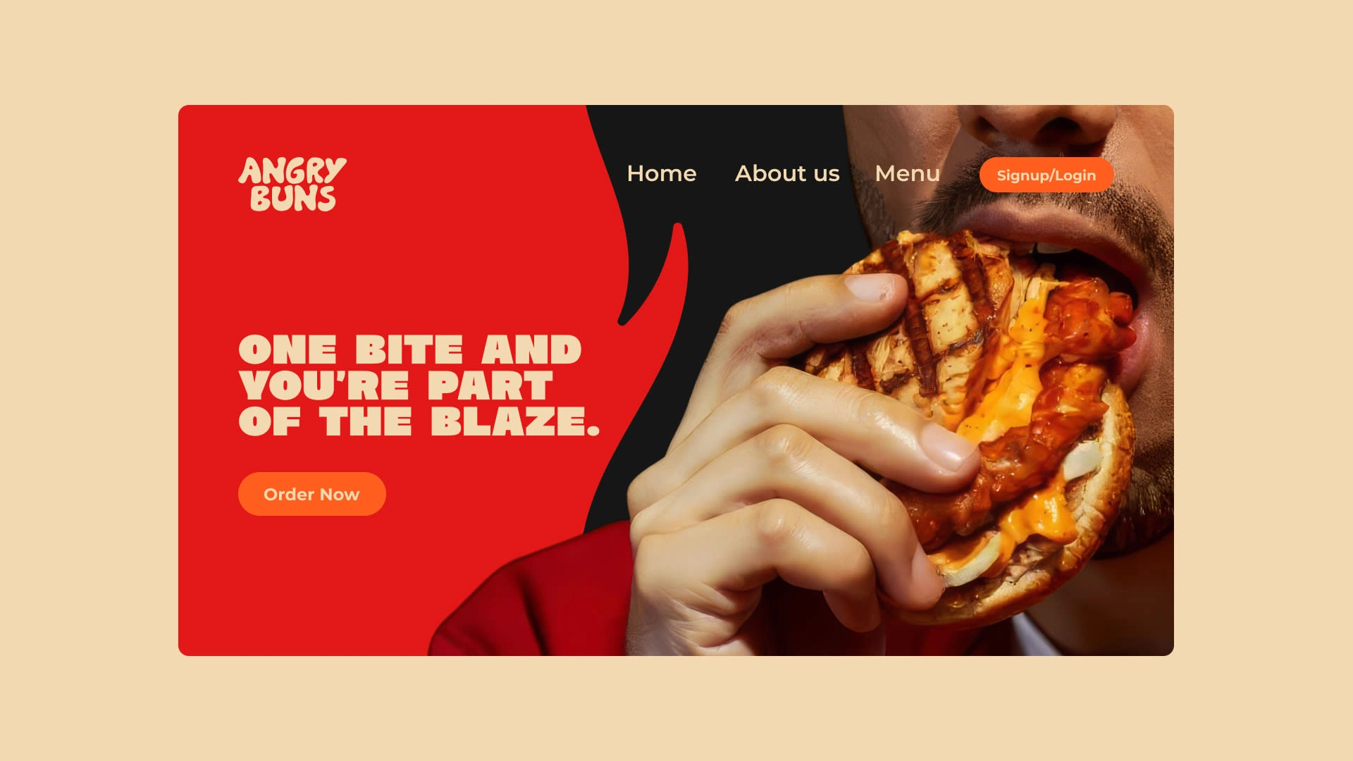
Angry Buns is a fast food brand speciallized in hot and spciy burgers. My role was to create a visual identity that captures that energy — something fiery, confident, and instantly recognizable. From the logo and mascot to the overall presentation, everything was designed to feel bold but still friendly and fun.
Project Scope
Visual Identity design · Campaign Concept
Industry: Fast Food
Author: Ahmad – Brand Identity Designer, Design Grid
Goal
The goal was to make Angry Buns unforgettable. A brand that looks fierce yet friendly — full of energy, spice, and personality. It had to connect with people the moment they see it and stand out in a market where most burger brands look cheerful and soft.
Problem
Everywhere you look, burger brands follow the same formula — bright smiles, round fonts, happy tones. They all blend together. Angry Buns needed to break that pattern — to look different, feel different, and own its attitude without being too aggressive or unapproachable.
Solution
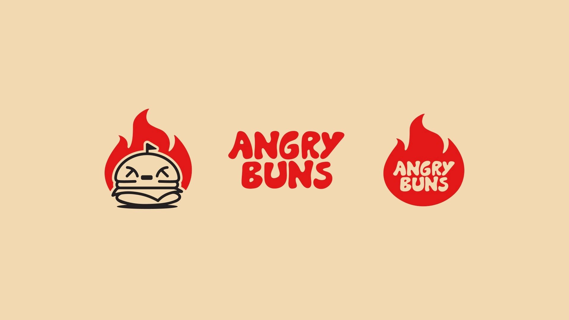
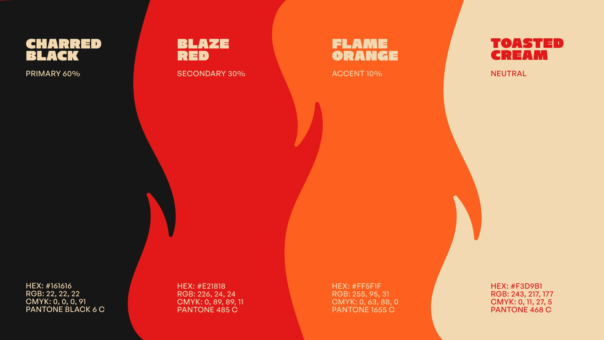
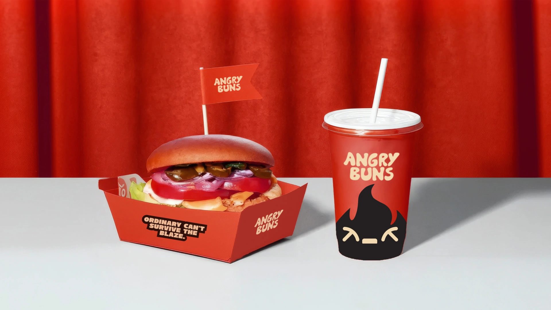
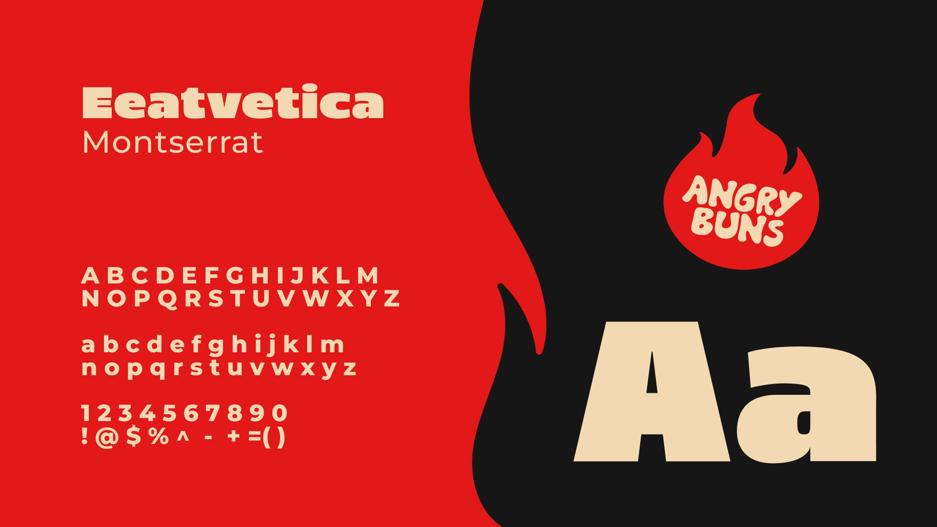
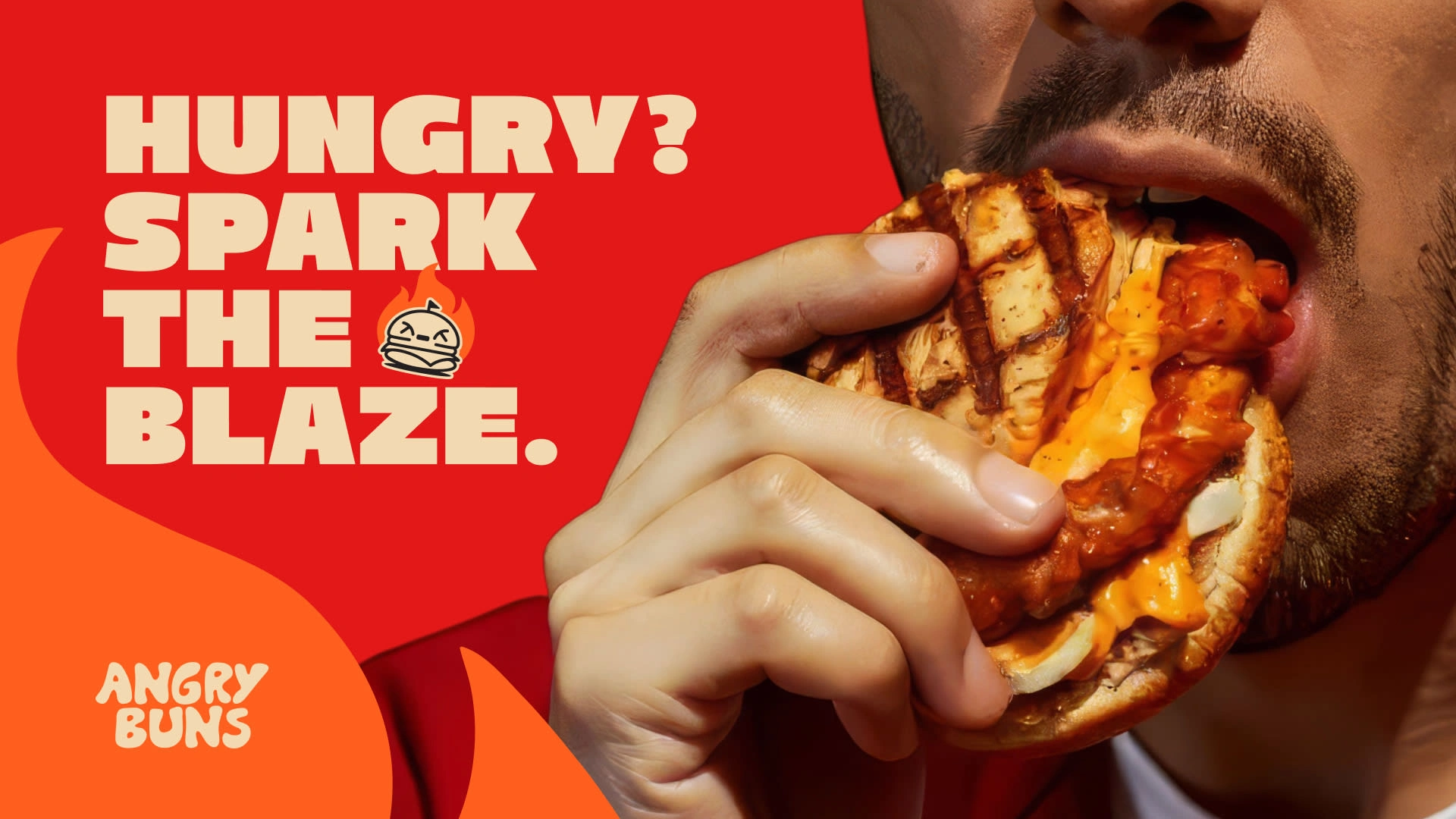
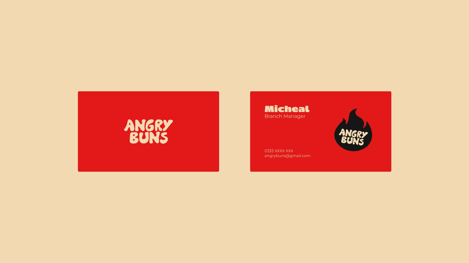
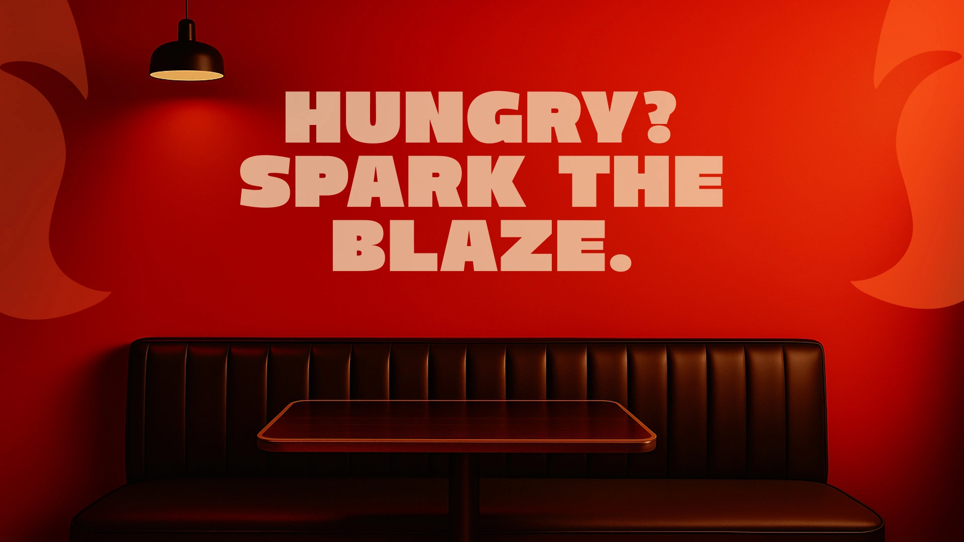
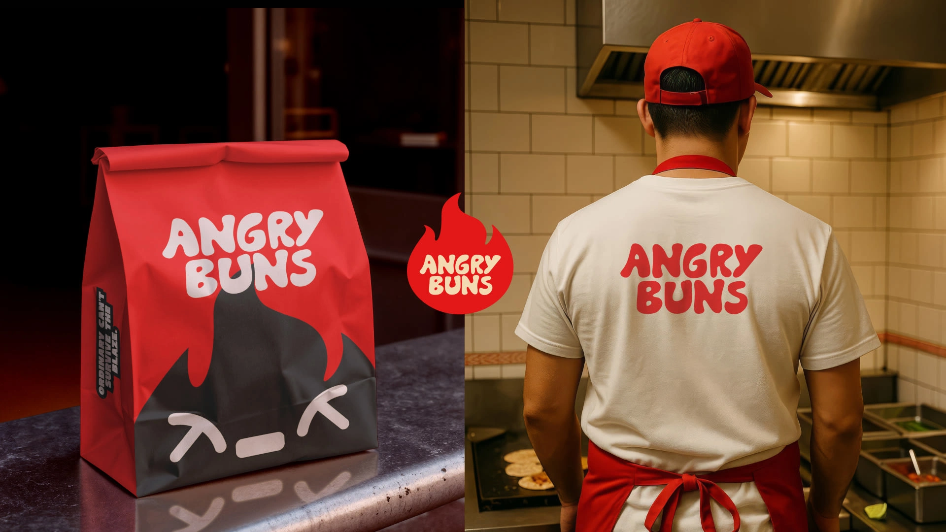
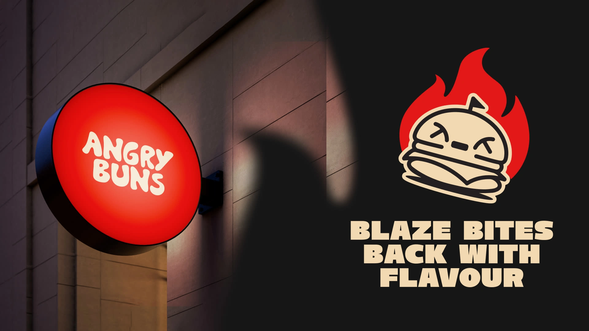
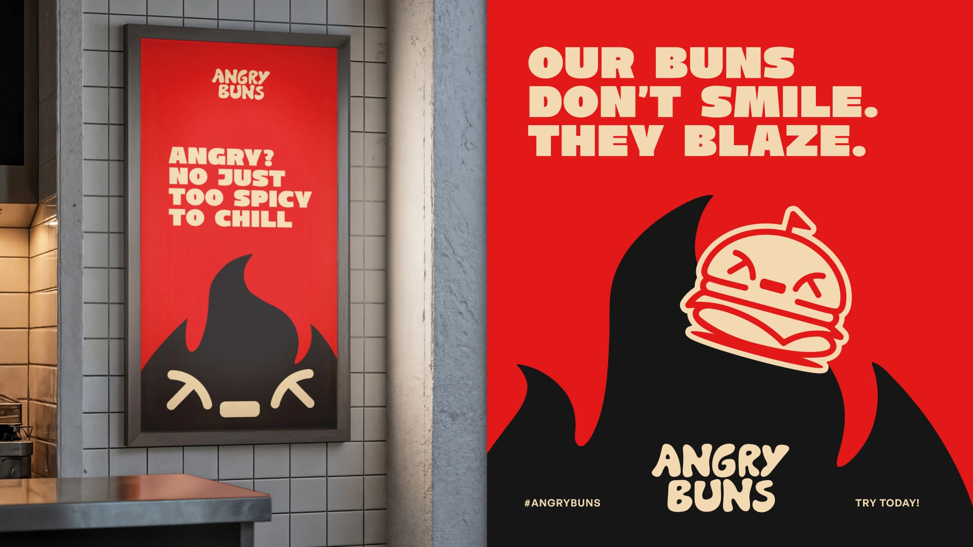
I used the Purple Cow effect — doing the opposite of what others do. That’s where the character Blaze was born, representing fire, flavor, and energy. The logo uses bold, clean typography with a red and orange palette to symbolize heat and hunger. Together, they form a brand that’s fiery but fun — a visual identity that’s impossible to miss.
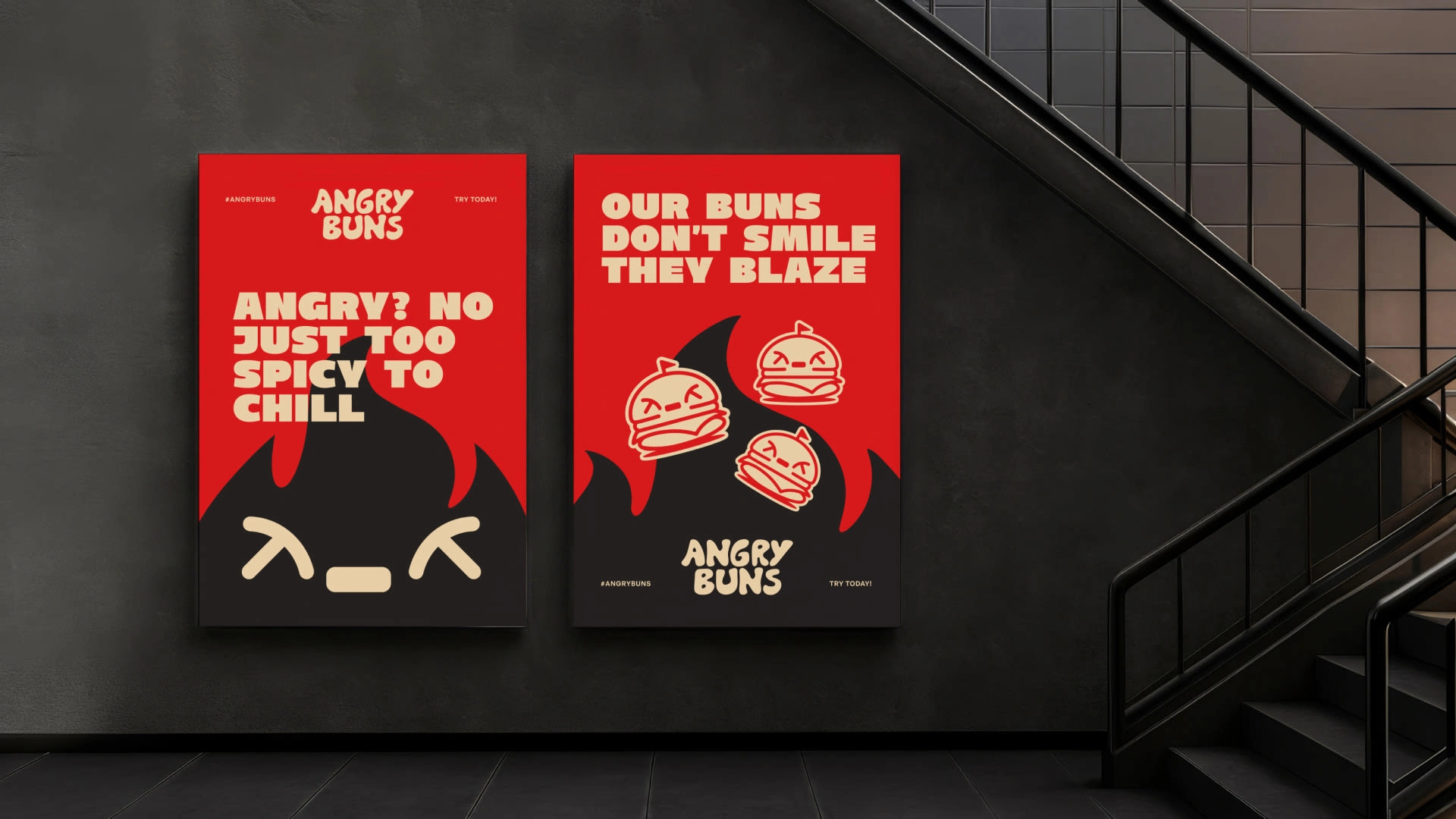
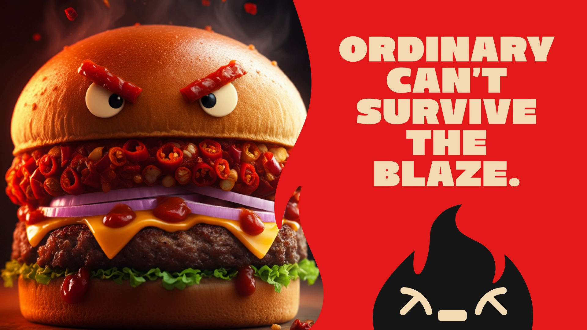
Meet Blaze — the guy who turns every bite into fire. He’s bold, fearless, and never tones it down.
0 likes · 8 views · Oct 30, 2025
Developed a bold and memorable visual identity for Angry Buns, a fast food brand focused on attitude and flavor.


