Brand Identity for a Cloud Storage Platform — Sorder™
Muhammadil Baqi Billah
Overview
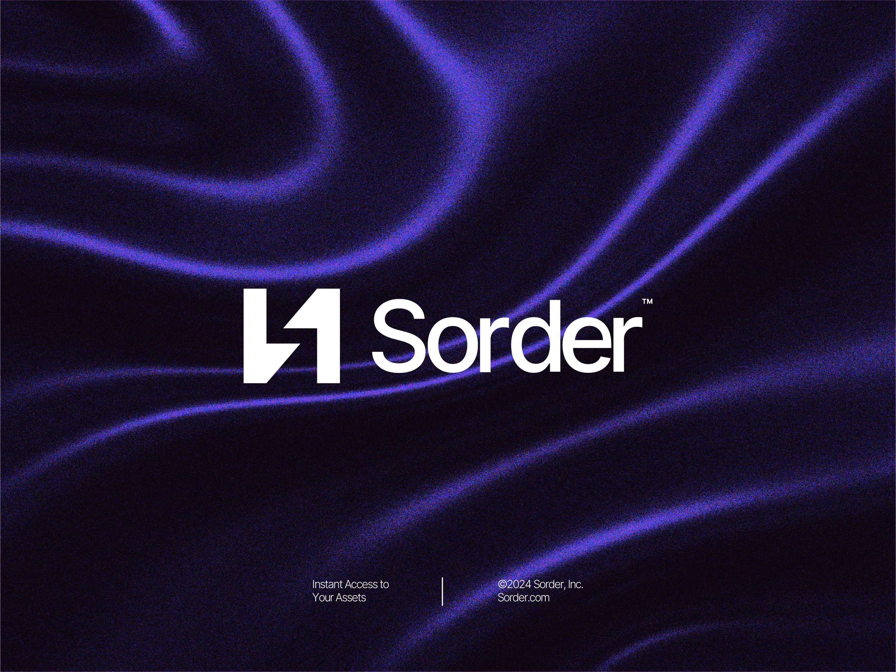
Sorder is a cloud storage platform designed specifically for church creative teams and marketing agencies. Beyond simple file storage, Sorder’s unique feature allows users to search inside files, making it easier to instantly find digital assets.
As a new startup, Sorder needed a visual identity that is minimalistic, modern, and scalable reflecting technology, speed, and ease of use.
Objective
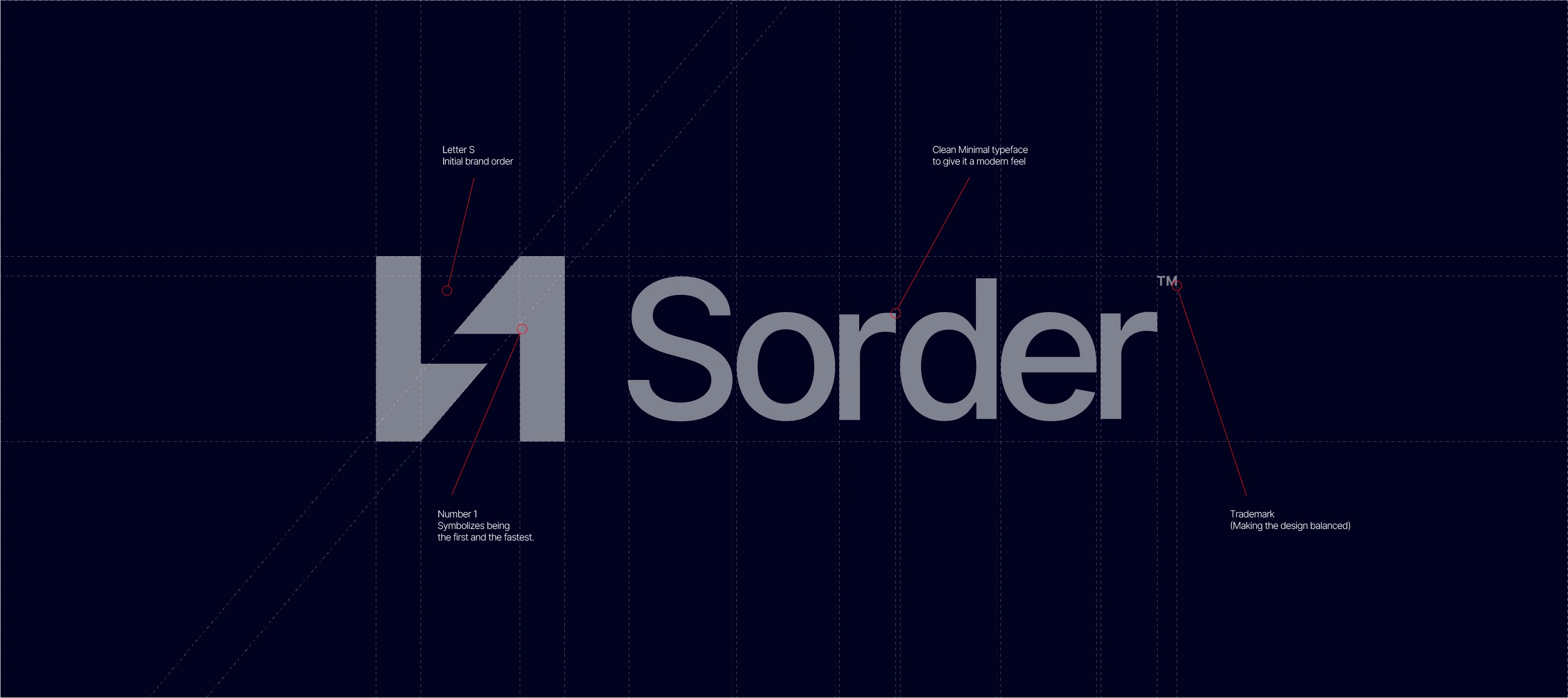
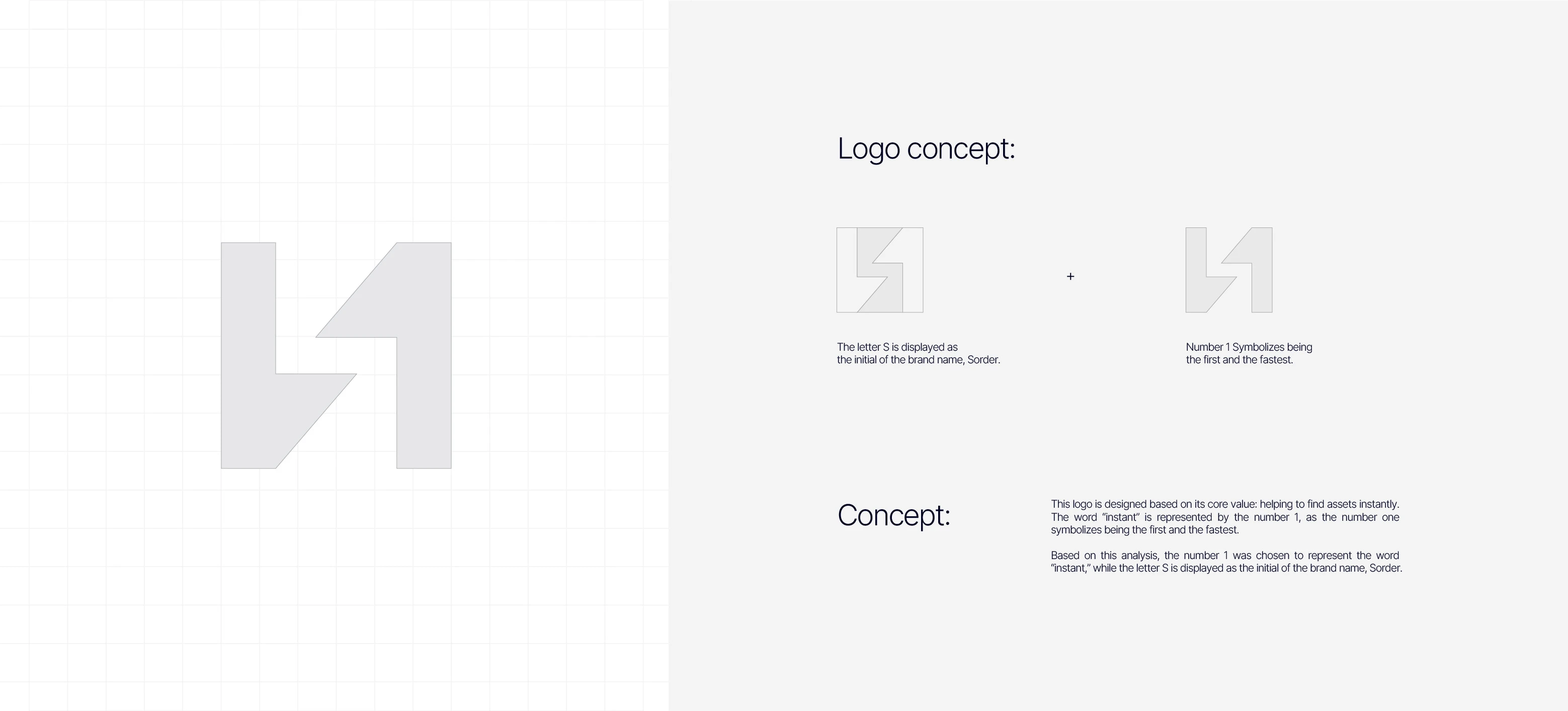
The objective is to create a simple, strong, and memorable logo that communicates the brand’s core message of helping users find their assets instantly. The design should visually incorporate the concepts of speed, organization/sorting, and cloud technology, while also building a strong foundation that can be consistently applied across digital, print, and app environments.

Design Process
Research & Ideation – Explored Sorder’s USP (instant search & file management), benchmarked SaaS brands, and identified minimalist visual elements.
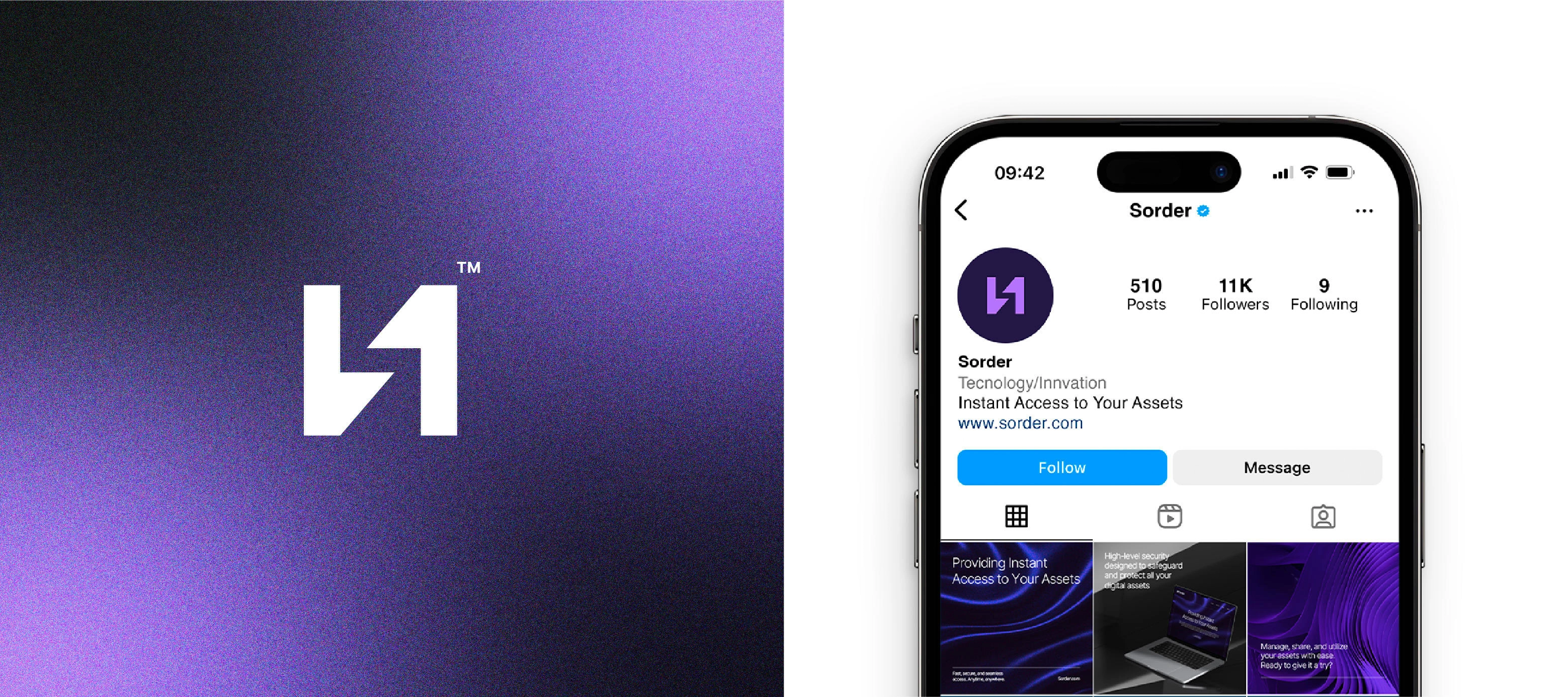
Logo Concept – Developed an abstract monogram inspired by sorting & organizing, refined for balance and legibility.
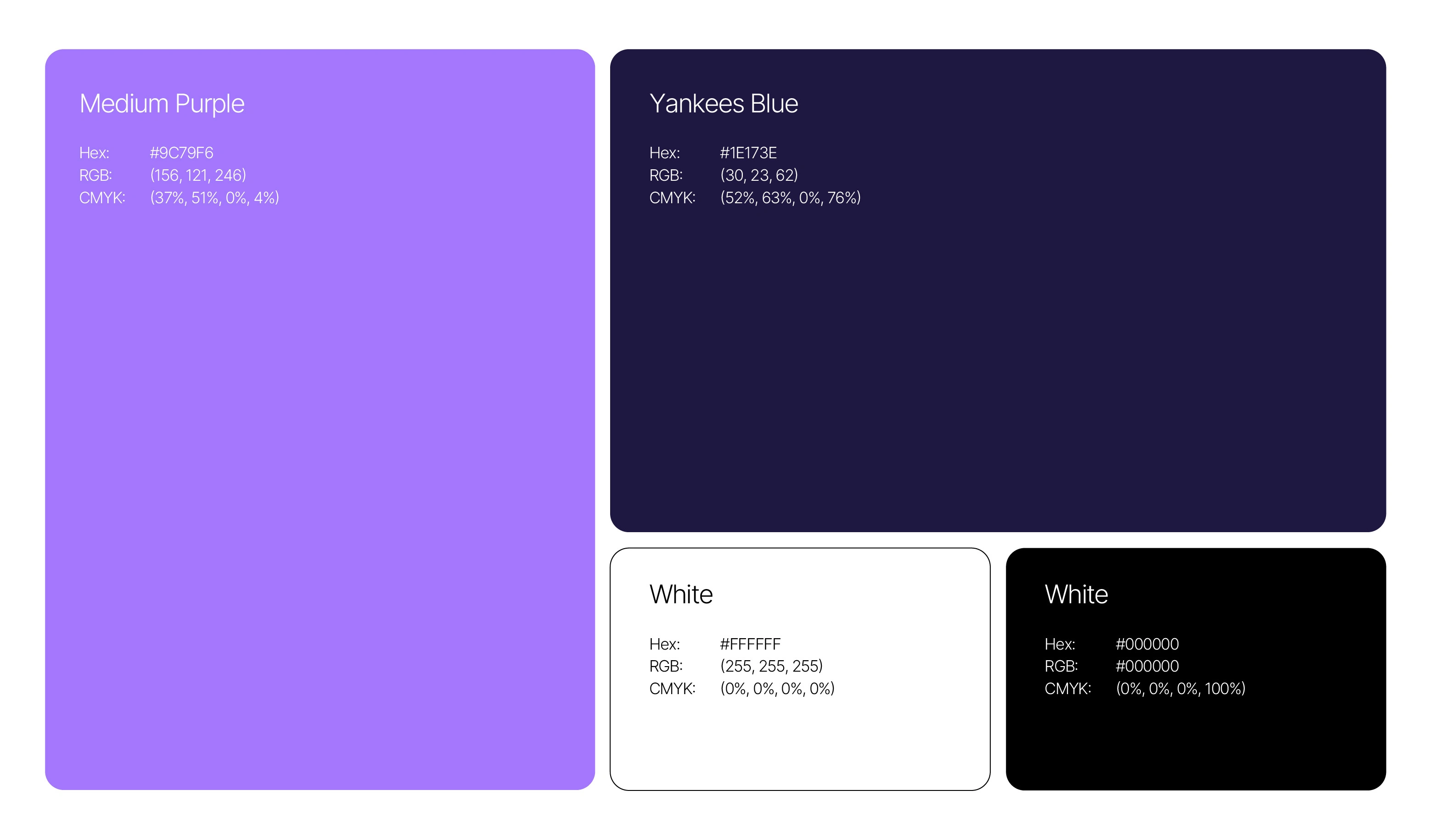
Typography & Colors – Chose a modern sans-serif font and a palette of purple, dark blue, and white for creativity, trust, and clarity.
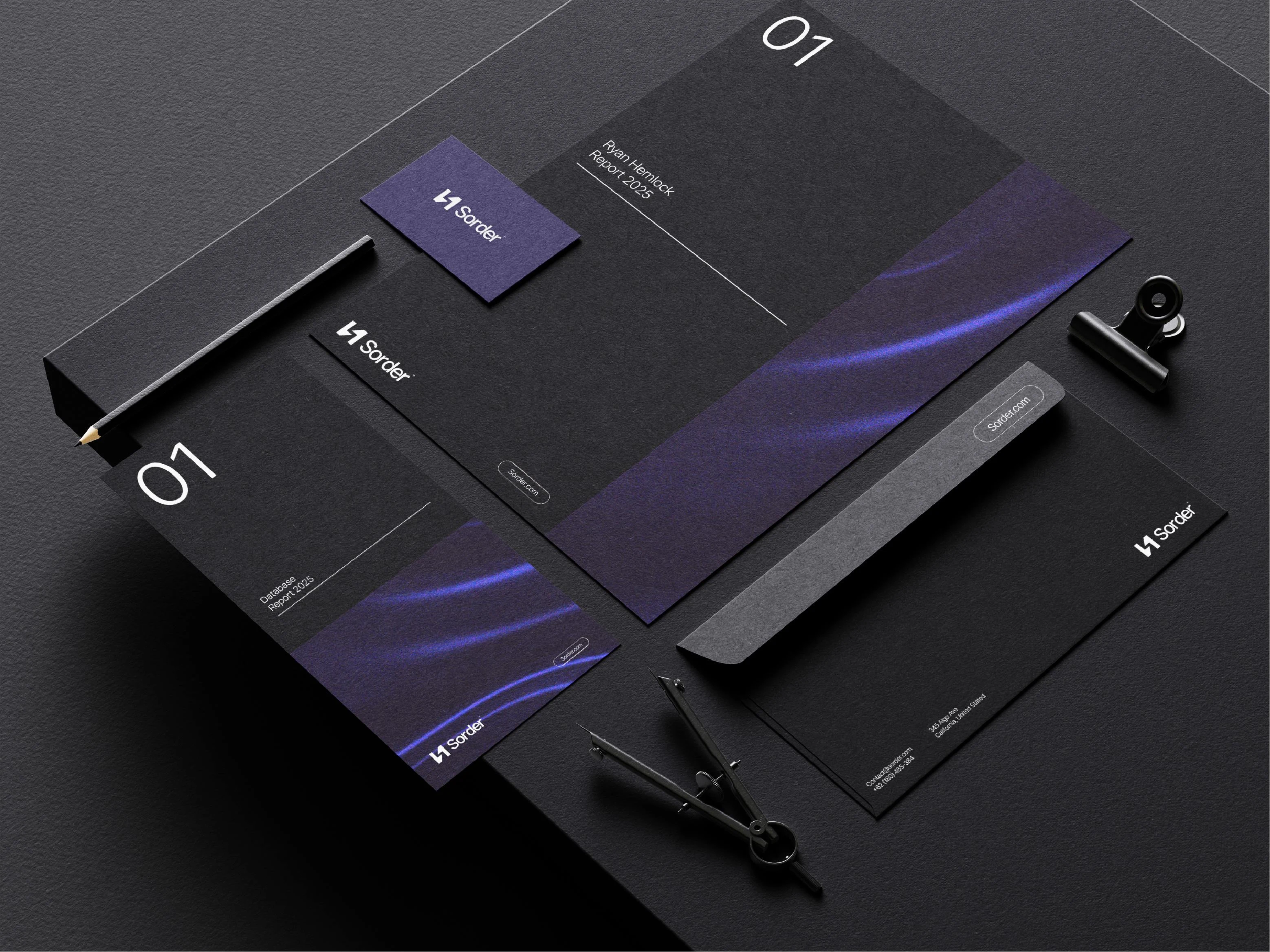
Application – Tested across digital and print, enhanced with dynamic wave graphics for a modern identity.


Result
A minimalistic icon representing sorting and instant access, paired with modern typography, creates a consistent, scalable, and versatile visual identity system.
It captures modern technology, efficiency, and speed while aligning with Sorder’s value proposition, and establishes a strong brand foundation for future expansion into asset and project management.
Looking for a brand identity that makes your startup stand out? Let’s build it together!
Like this project
Posted Aug 25, 2025
Designed a modern visual identity for Sorder, a cloud storage platform helping creative teams find assets faster and stay organized.
Likes
0
Views
0
Timeline
Aug 16, 2025 - Aug 23, 2025