ODD PAIR — Brand Identity

Praveen N


ODD PAIR — Stay weird, Snack well.
Brand identity and packaging for a snack with a different point of view.
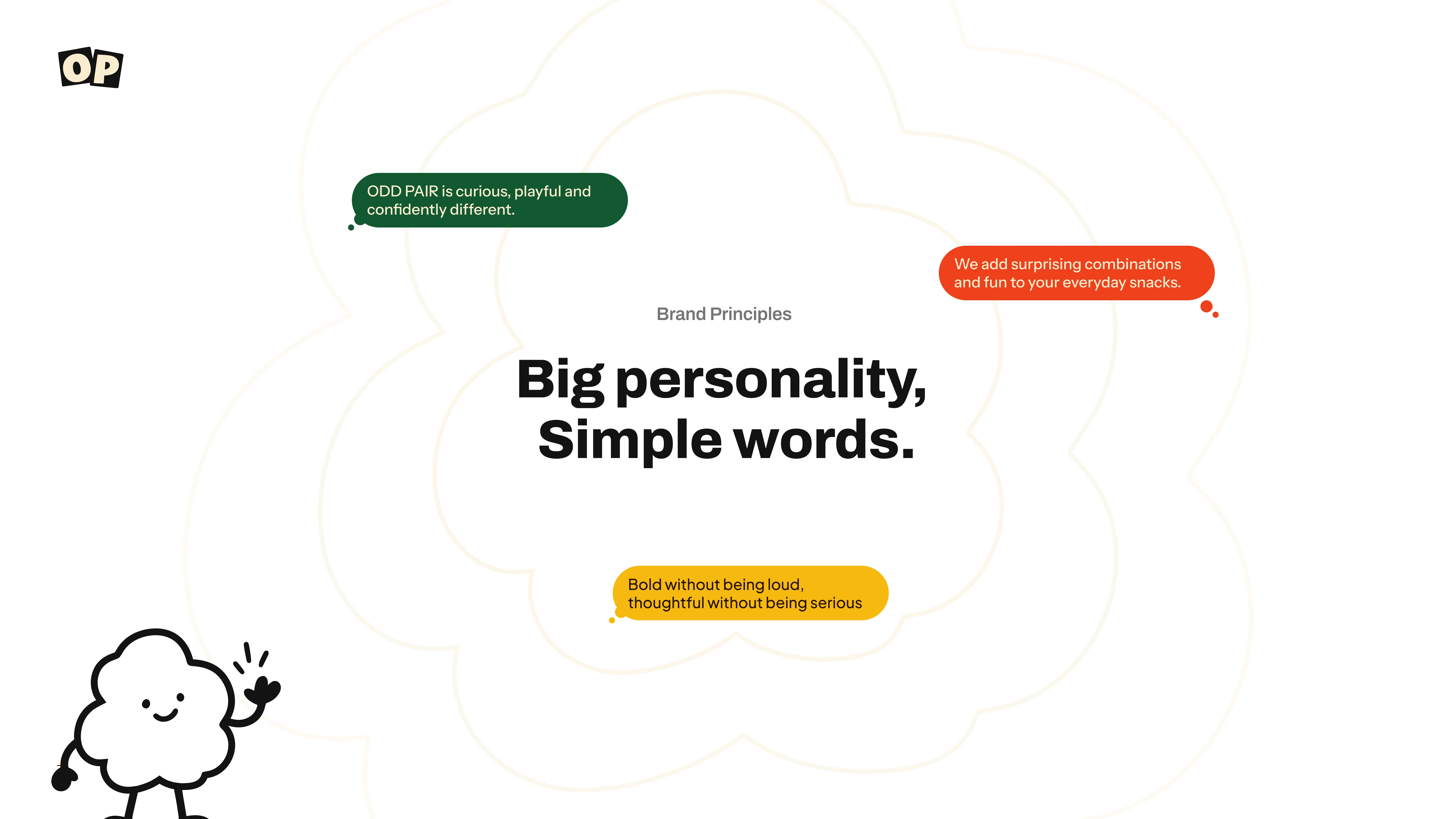
ODD PAIR is a crunchy chocolate-bite concept built around unlikely flavour combinations. Familiar ingredients meet a surprising partner, creating a brand that feels approachable, expressive and a little unexpected.
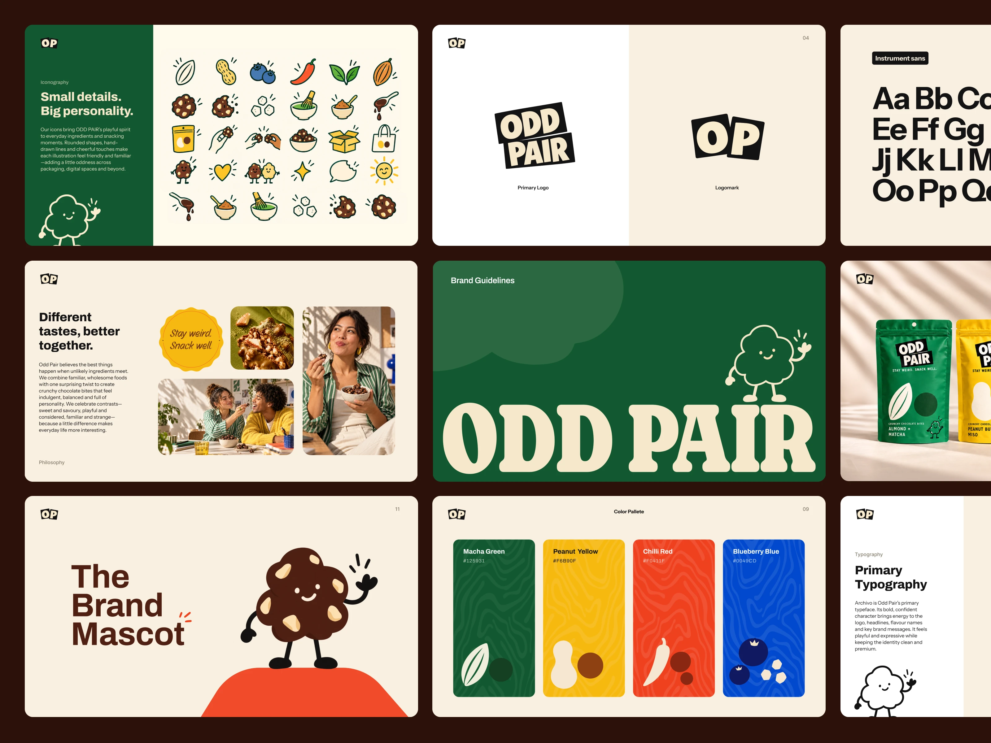
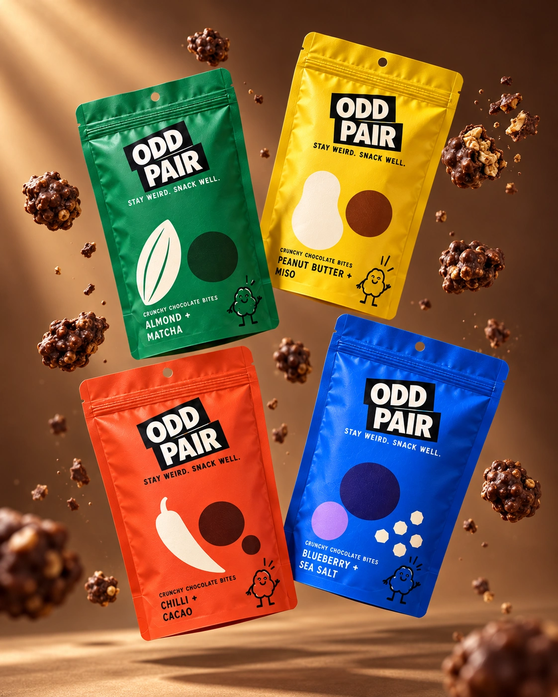
The identity brings that idea to life through offset typography, paired ingredient graphics, flavour-led colour and a chocolate-shaped character.
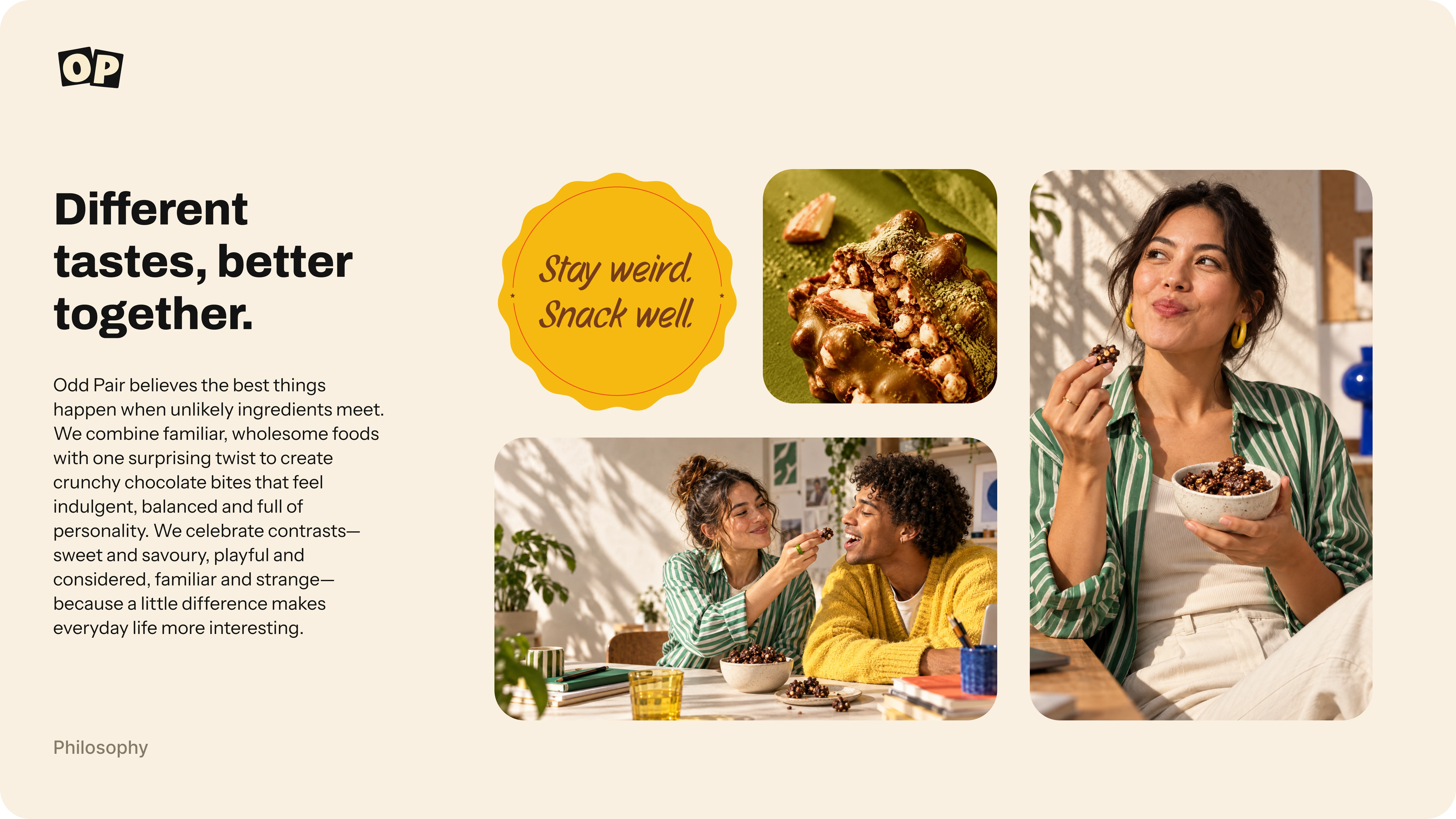
Different tastes. Better together.
Project type: Concept brand identity
Scope: Brand concept, visual identity, packaging design, illustration and campaign art direction
Ad commercial
The challenge
Make the unfamiliar feel inviting.
An unexpected flavour combination can spark curiosity—but it also needs an approachable introduction.
The challenge was to create an identity that made experimentation feel enjoyable rather than intimidating. ODD PAIR needed enough personality to invite a second look, while keeping the product, ingredients and flavour combinations easy to understand.
The ambition was a balance: playful without becoming childish, considered without feeling precious, and bold without making every element compete for attention.
Logo
The central idea
Familiar ingredients. An unexpected plus-one.
The brand starts with a simple belief: things do not have to be alike to work beautifully together.
That belief shaped both the name and the design. “ODD” introduces curiosity; “PAIR” brings connection. Together, they turn an unusual combination into an invitation.
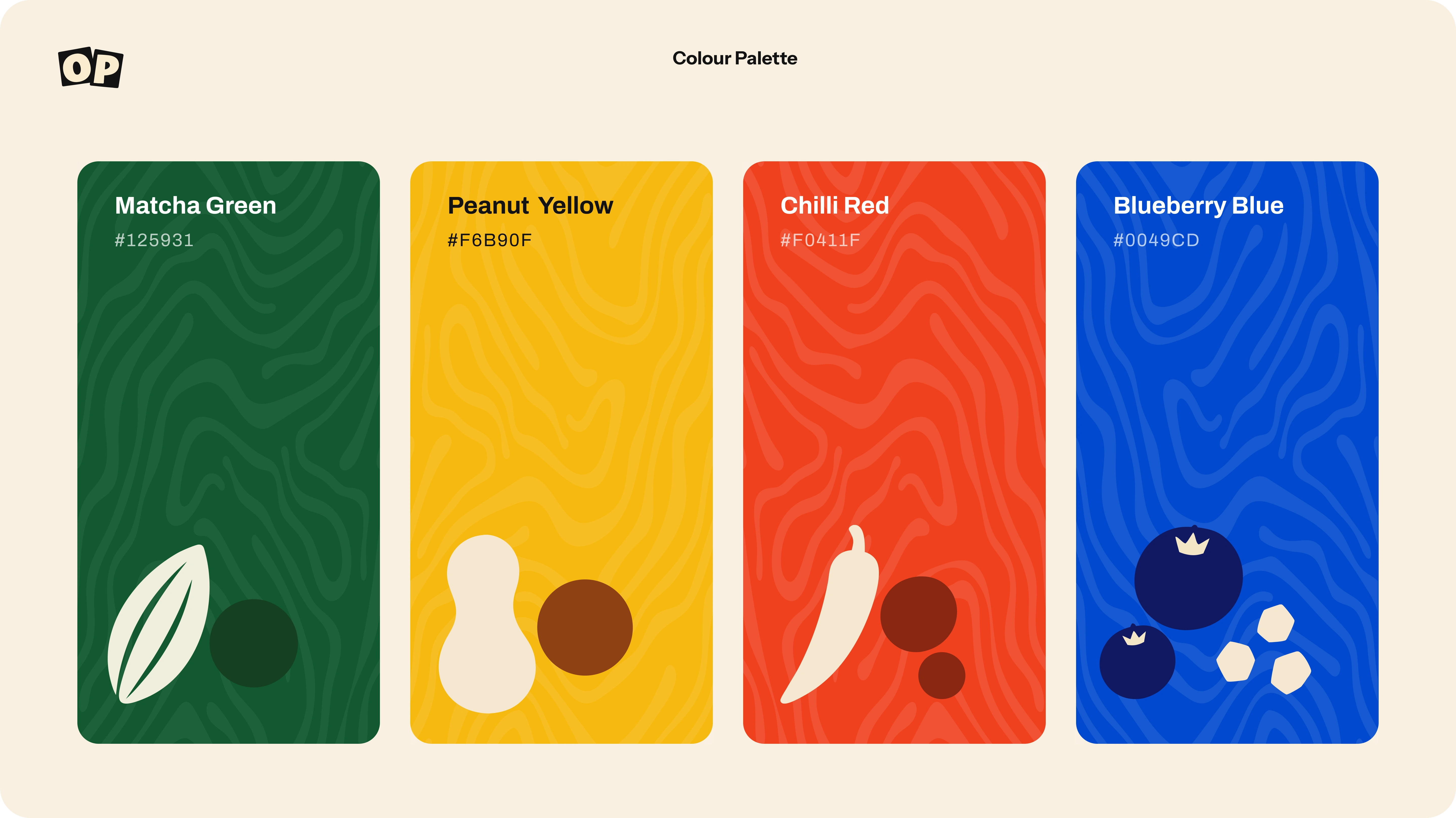
The same relationship runs throughout the identity: strong typography with relaxed illustration, saturated colour with warm neutrals, and simple layouts with small moments of surprise.
Stay weird. Snack well.
Exploration
Finding the right kind of odd.
Early explorations placed the identity in a broader snack world, using cream packaging, restrained colour accents and simplified ingredient shapes.
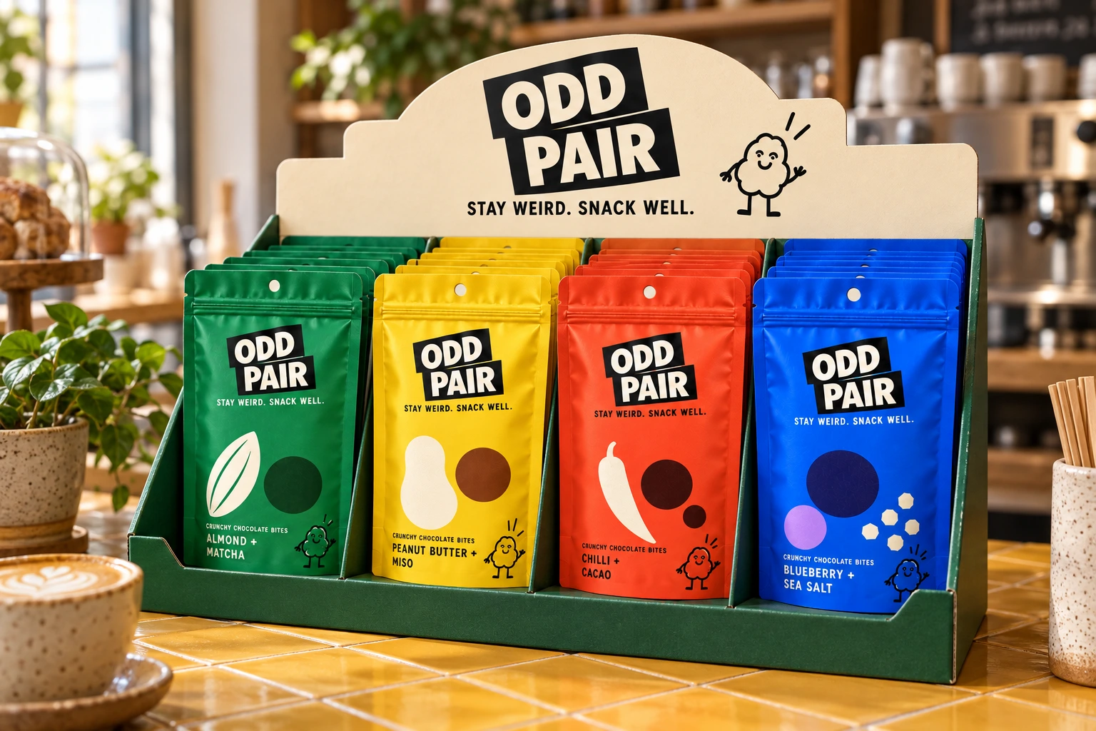
As the concept developed around crunchy chocolate bites, the direction became more focused. The paired ingredient graphics remained, while full-colour pouches gave each flavour a clearer individual presence.
The refinement was about keeping the strongest idea and making it more consistent: one product family, one recognisable layout and four distinct flavour combinations.
Creative direction
Bold on the shelf. Warm in everyday life.
The visual direction combines the clarity of graphic packaging with the warmth of food and lifestyle imagery.
Large lettering and simple shapes create immediate impact. Cream tones, tactile surfaces and natural-looking light soften that boldness. Casual illustration introduces humour without overwhelming the product.
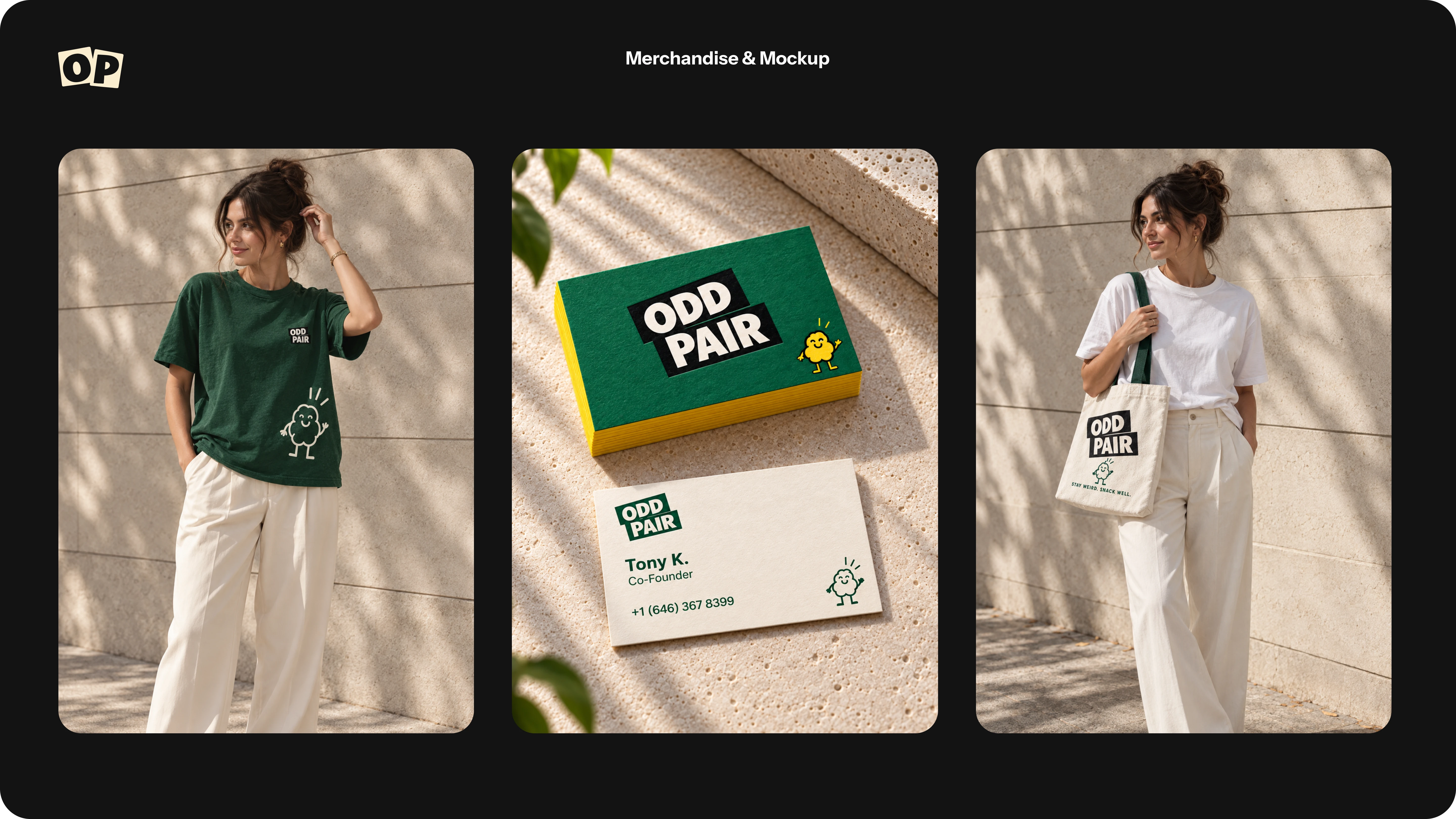
Rather than giving every image the same background, the campaign explores different settings while retaining shared cues: confident colour, visible texture and an inviting sense of everyday enjoyment.
The identity
Two words. One recognisable relationship.
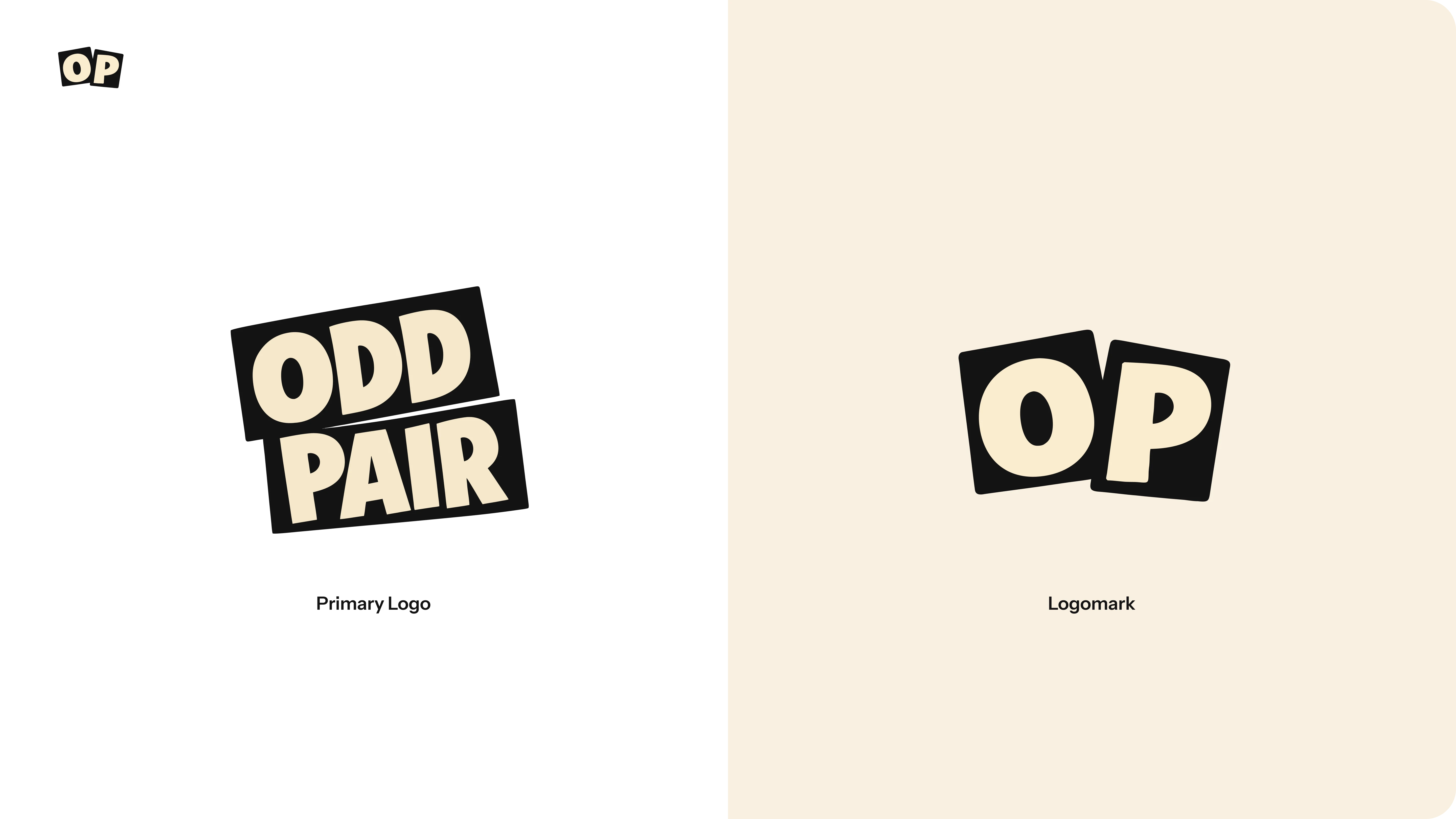
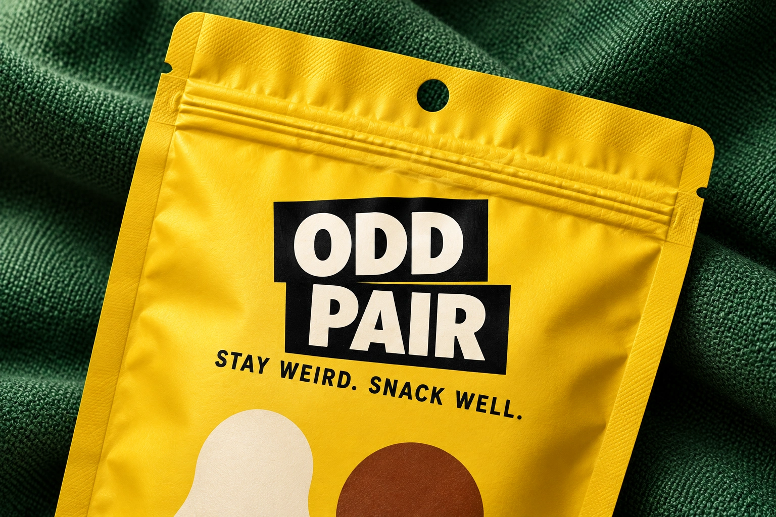
The stacked wordmark places ODD and PAIR inside offset black blocks. Their slight misalignment gives the mark movement and reflects the brand’s central idea: different elements finding a way to belong together.
Cream lettering creates a strong contrast, while the compact OP mark carries the same character into smaller applications.
The wordmark acts as a consistent anchor across the packaging, merchandise and environmental concepts.
The outcome
Different elements. A coherent whole.
ODD PAIR developed into a cohesive concept identity spanning four flavour variants, a flexible logo system, typography, illustration, packaging and campaign applications.
The project explores how a simple product idea—unexpected ingredients coming together—can inform an entire visual language.
The outcome is a brand concept with room for variety, held together by a clear point of view.
Stay weird. Snack well.
Like this project
Posted Sep 18, 2026
A playful brand identity and packaging system that turns unexpected flavor pairings into a bold, memorable snack experience. Stay weird. Snack well.