Rendall-Freak Factor Manifesto
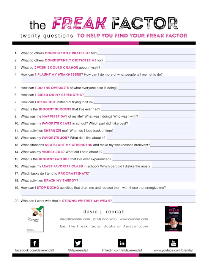
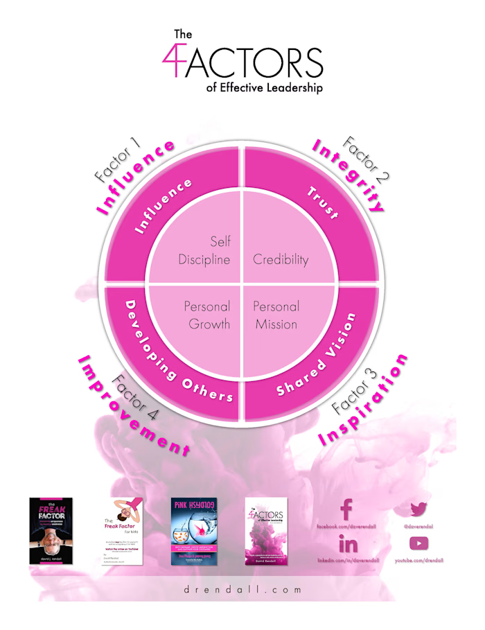
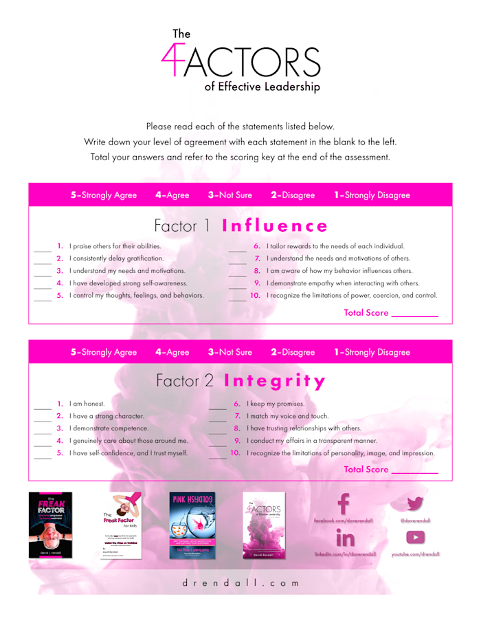
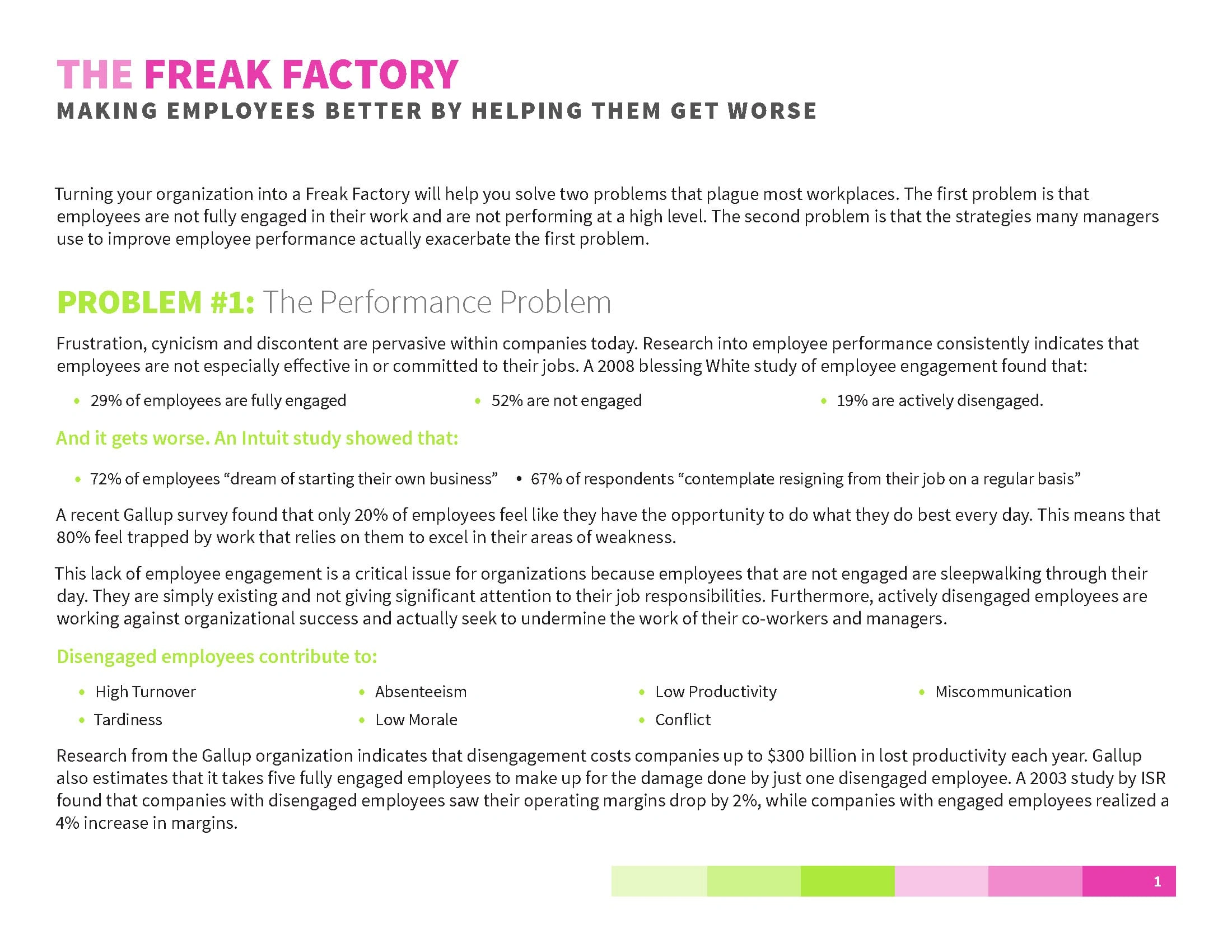
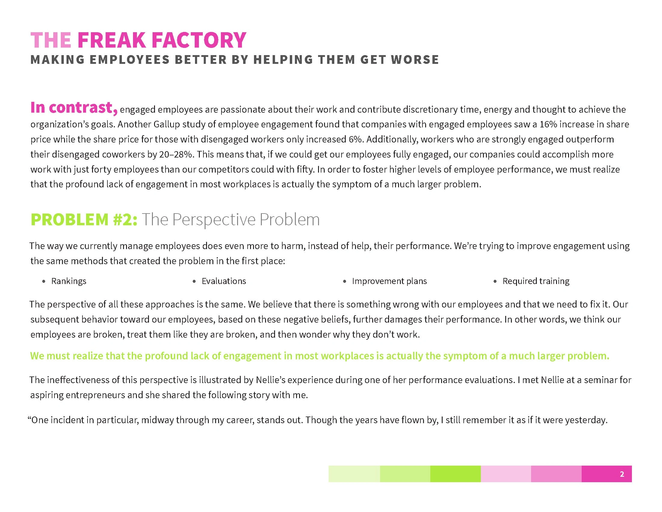
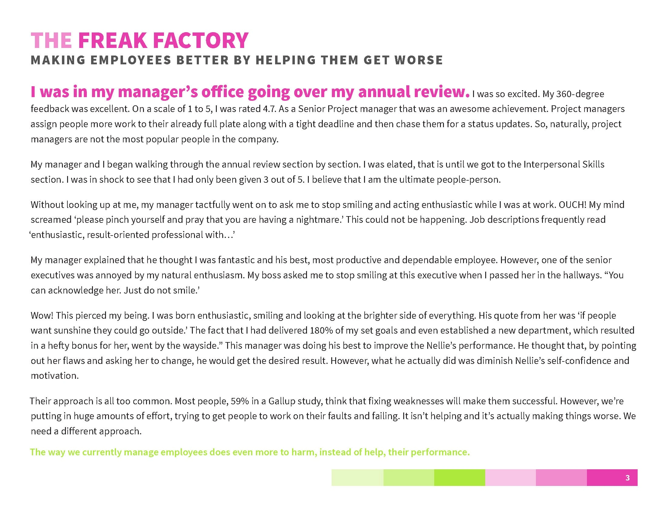
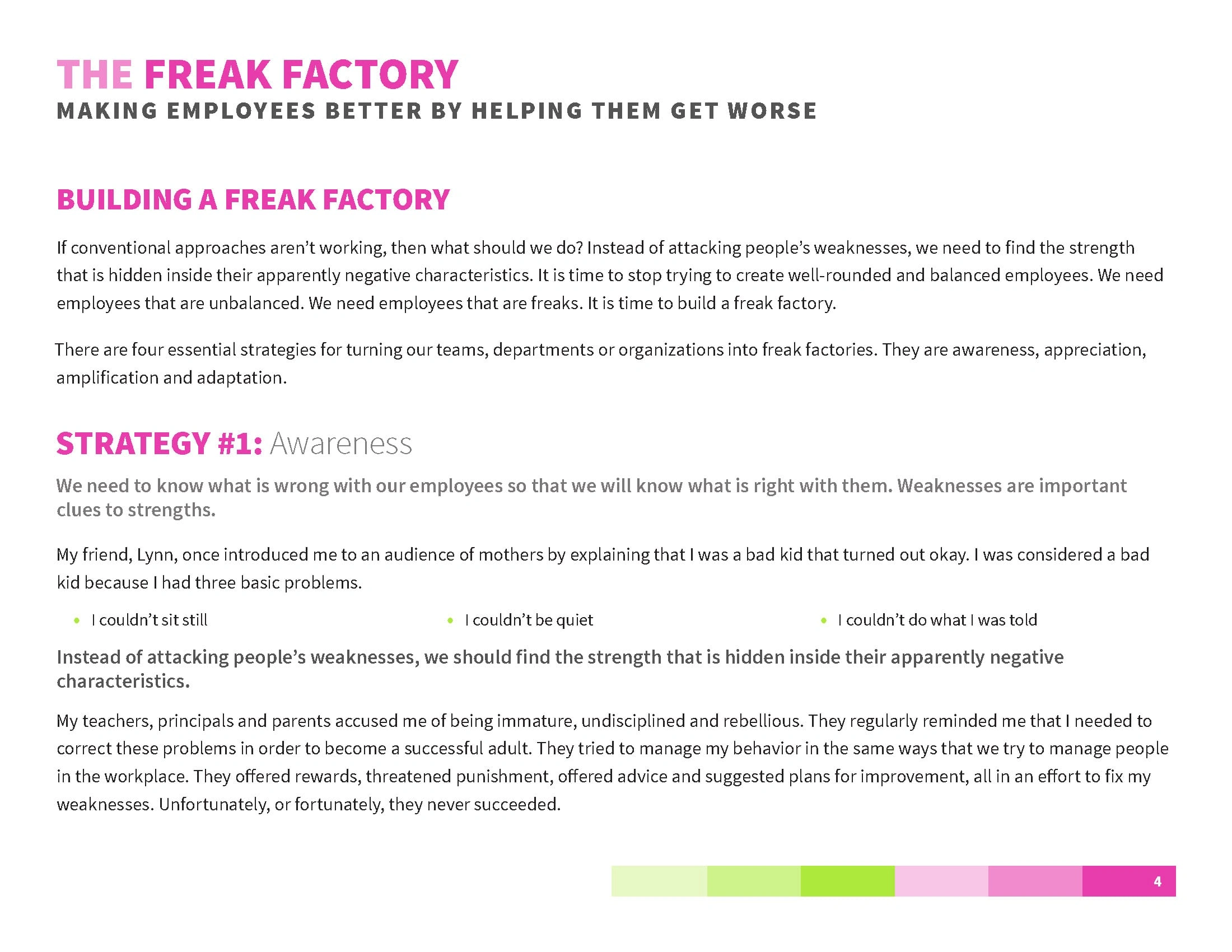
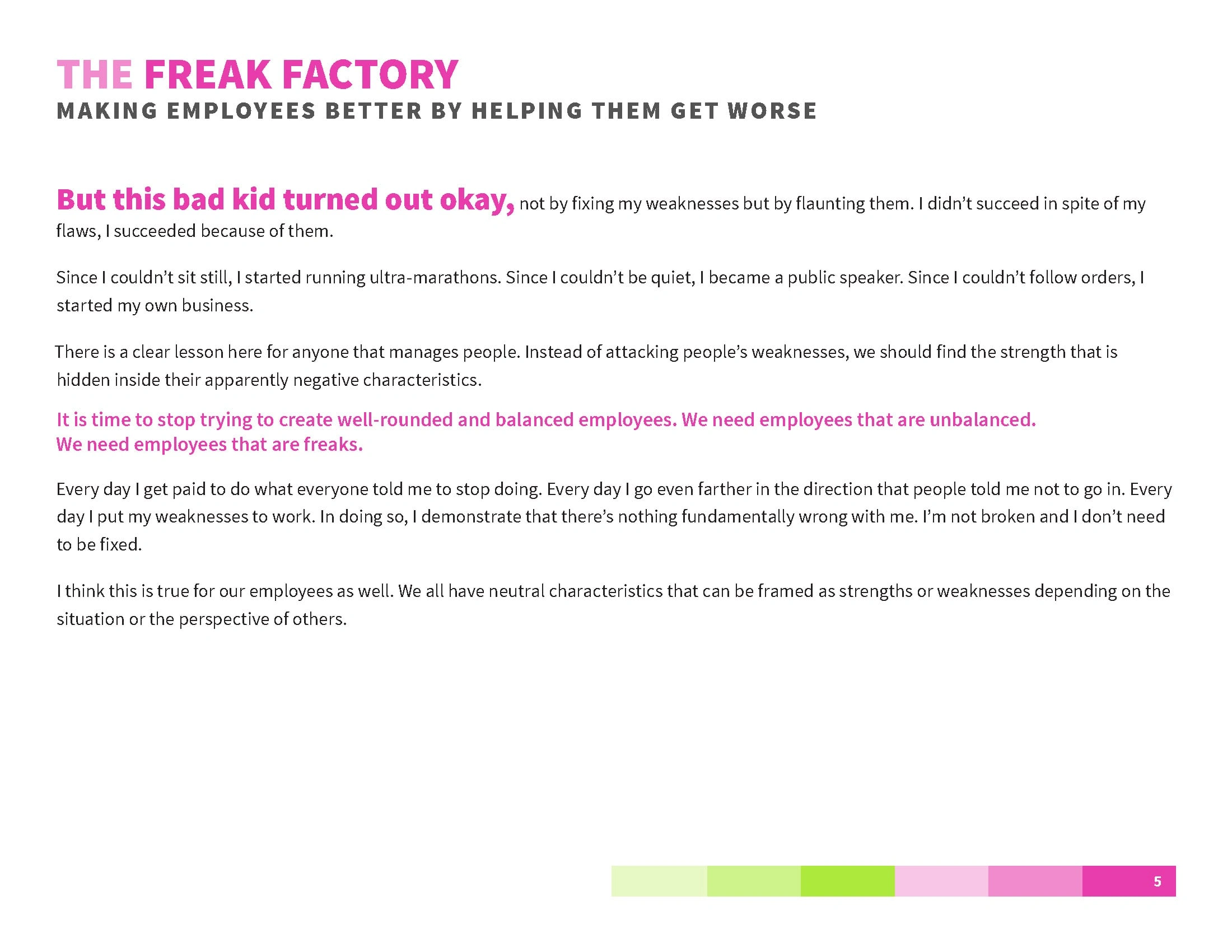
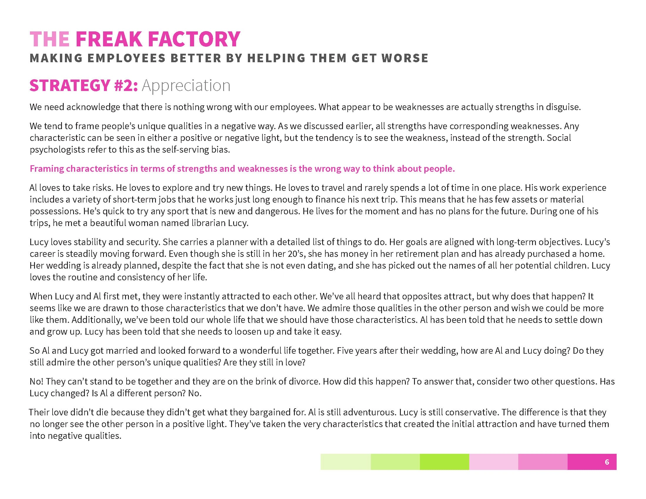
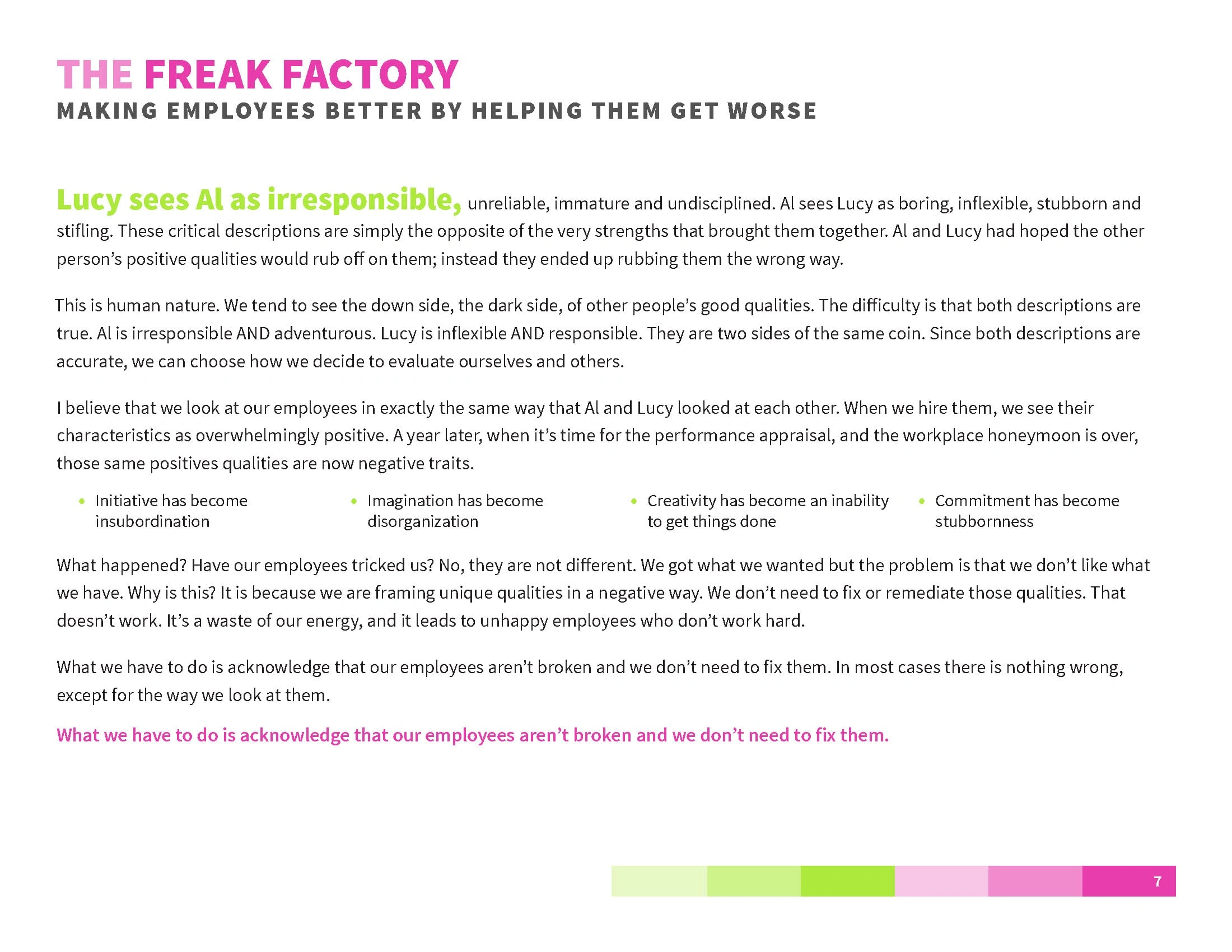
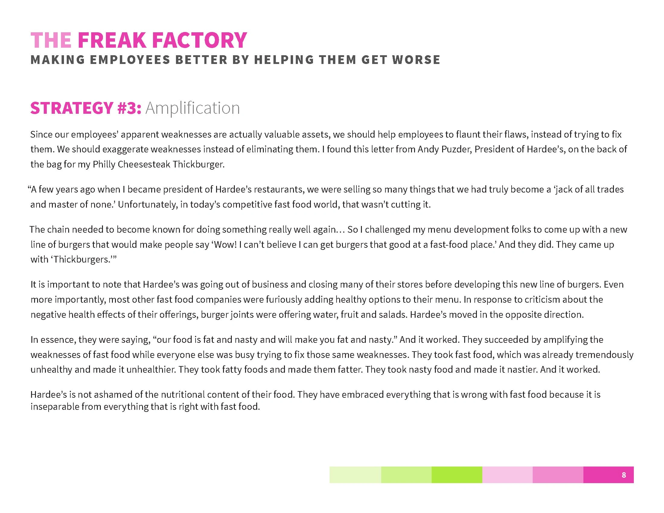
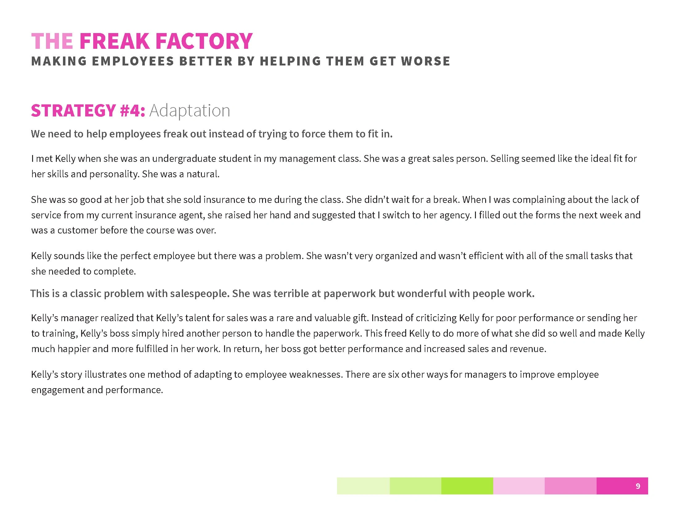
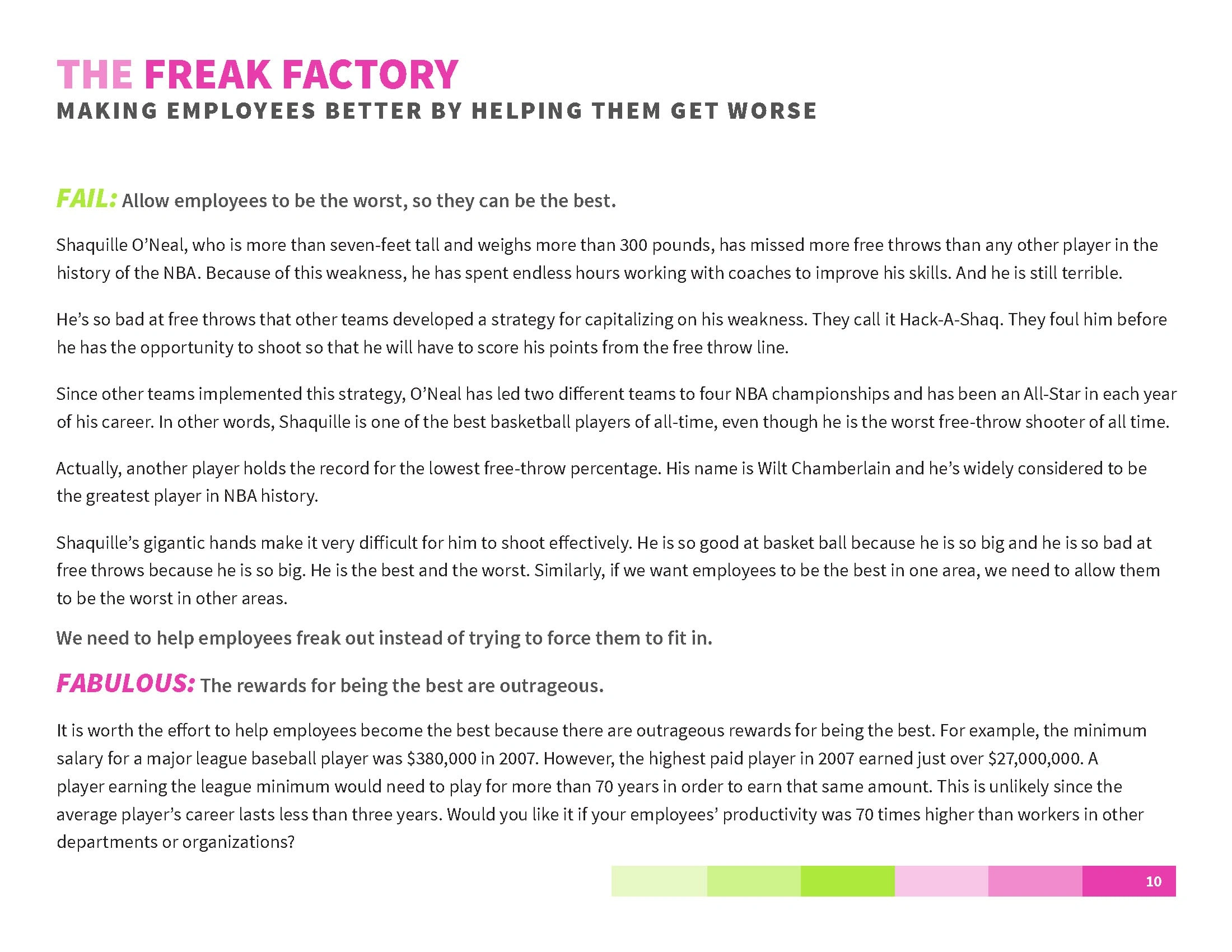
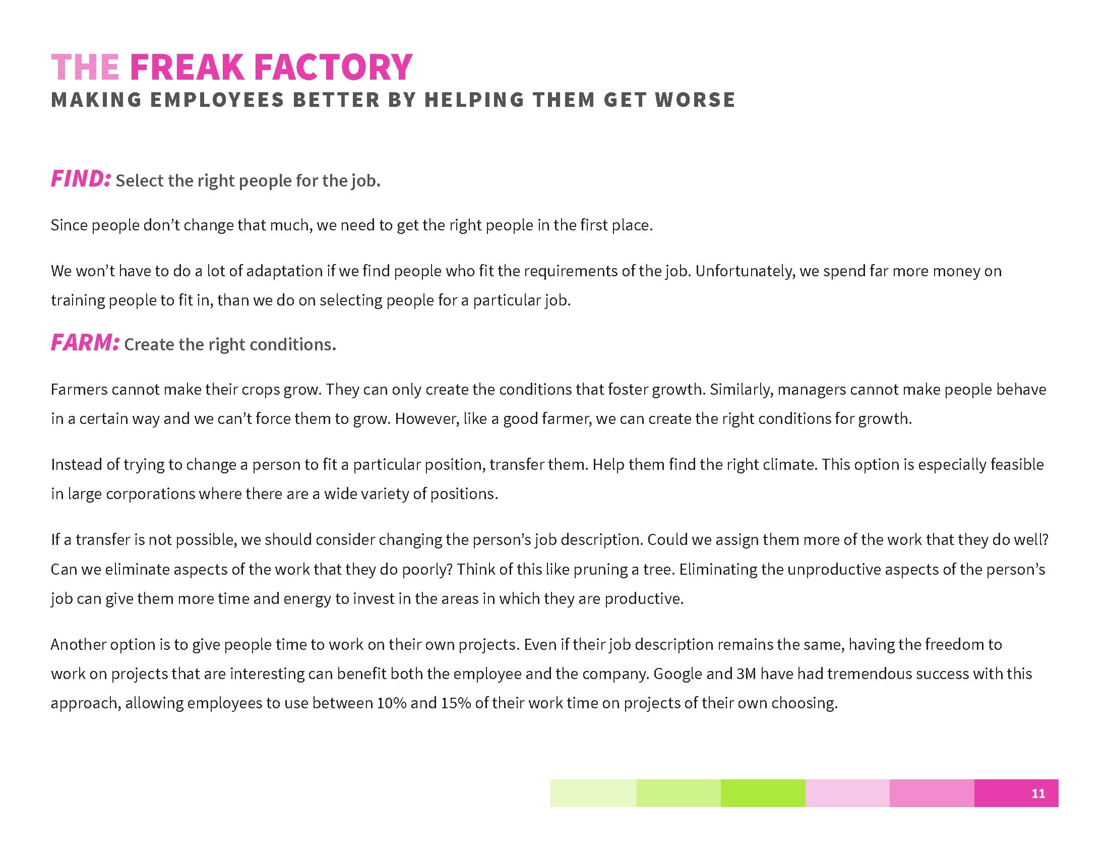
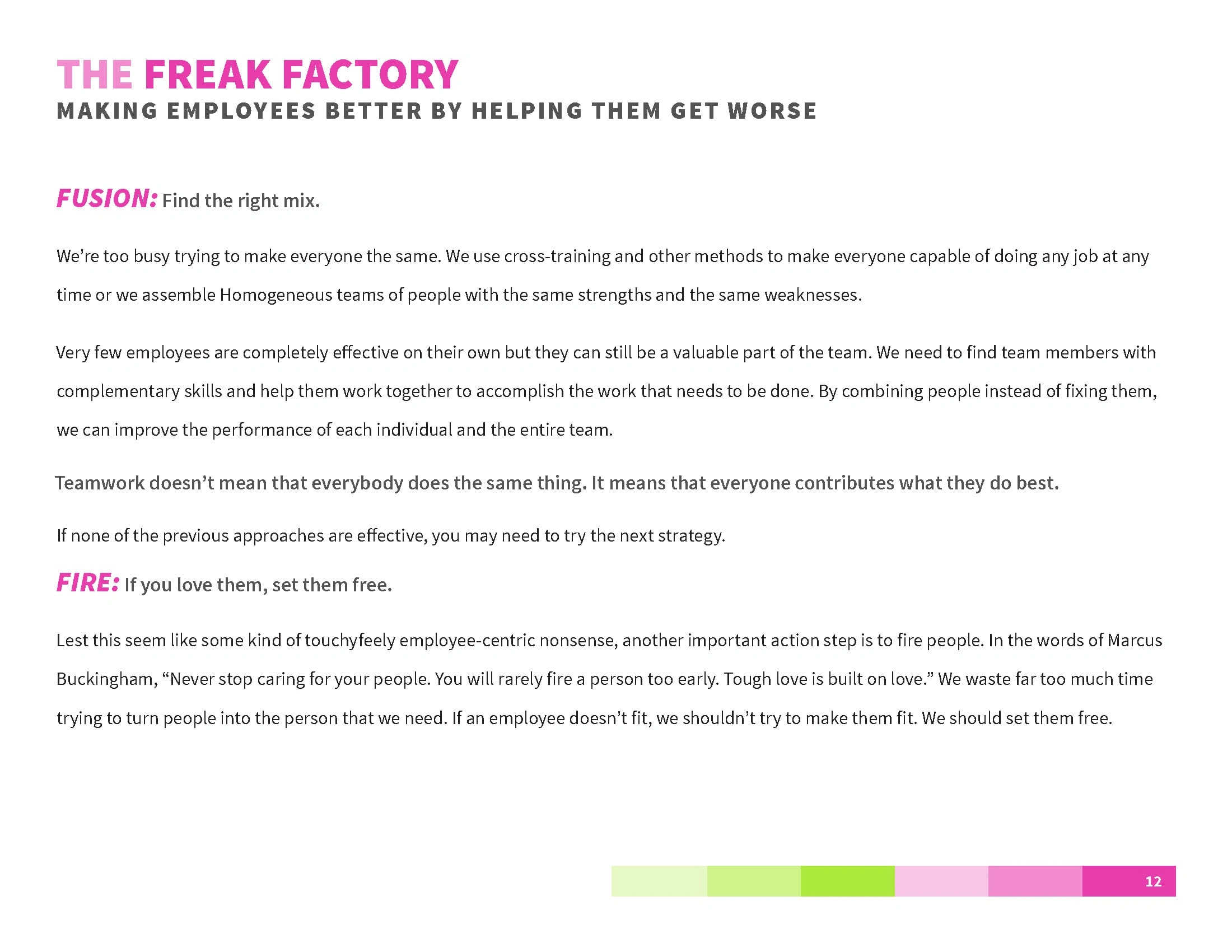
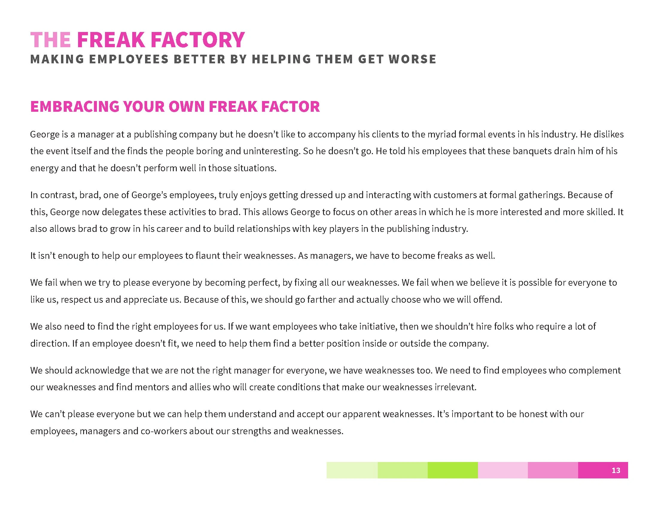
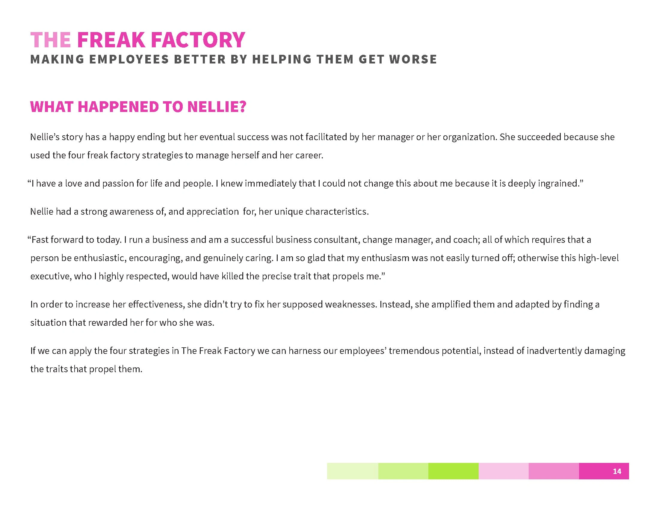
Objective: The goal of this project was to design The Freak Factory Manifesto as a visual, narrative-driven PDF. The objective was to communicate David Rendall’s approach to maximizing employee potential by embracing and amplifying individual quirks, positioning these unique traits as strengths rather than flaws.
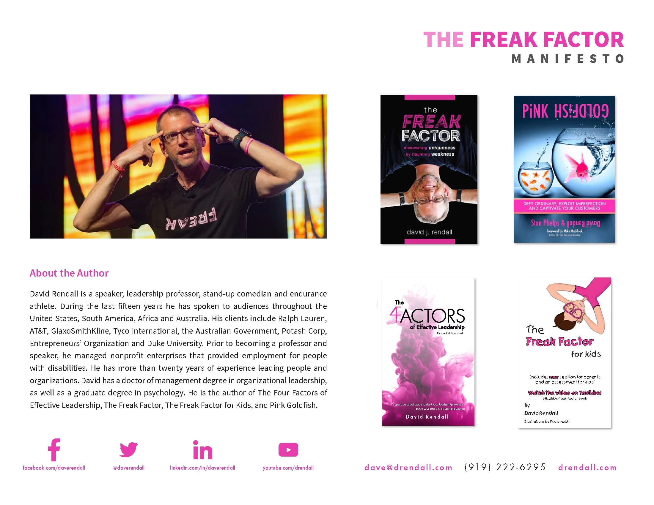
Context: The Freak Factory Manifesto was developed for David Rendall, a motivational speaker and author known for his unconventional take on personal and professional growth. This manifesto aims to introduce readers to his philosophy of embracing uniqueness in the workplace, helping managers foster a positive and productive environment by leveraging employees' unique characteristics.
Challenges: The primary challenge was creating a structured and engaging layout that effectively communicated Rendall’s core principles while remaining visually clear and accessible. Another challenge was emphasizing key ideas without overwhelming readers, as the manifesto presents a paradigm shift that requires careful framing to avoid misinterpretation.
Process: To address these challenges, I first broke down the manifesto into its key sections—awareness, appreciation, amplification, and adaptation—aligning the design with each concept’s unique tone. I used clear headings, ample white space, and straightforward typography to guide readers through the ideas seamlessly. By applying visual emphasis to the essential strategies, I crafted a layout that keeps the reader focused and engaged without losing the depth of Rendall's message.
Takeaways: This project reinforced the importance of balancing content density with visual breathing room, especially when presenting complex or transformative ideas. I gained insights into designing for clarity and structure, ensuring that each element serves to reinforce the narrative and keep readers focused on the core message.

Like this project
Posted Nov 8, 2024
Designed The Freak Factory Manifesto for David Rendall, emphasizing clarity and structure to communicate a unique approach to leveraging employee strengths.

