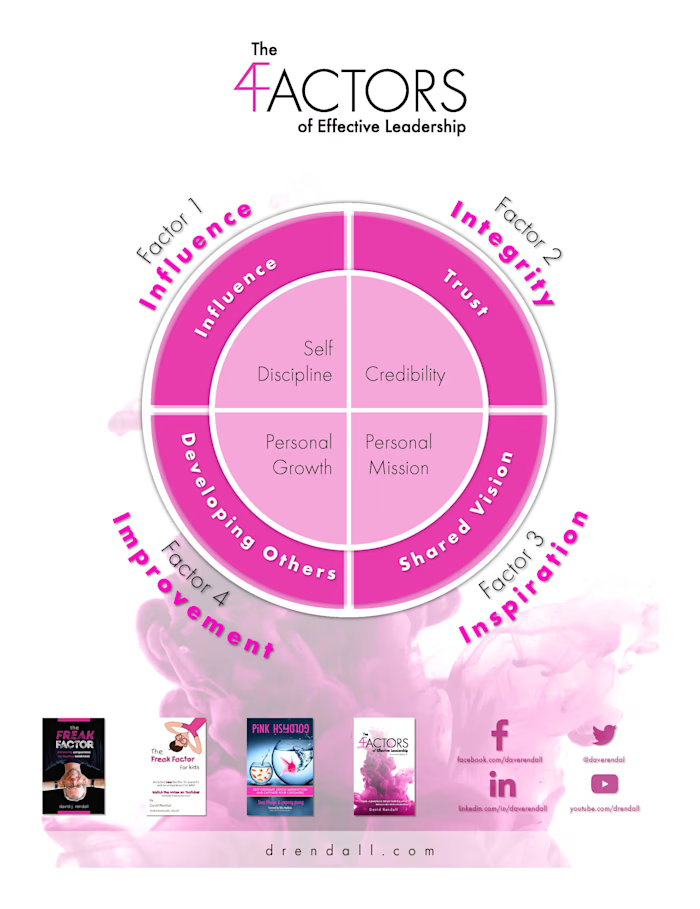
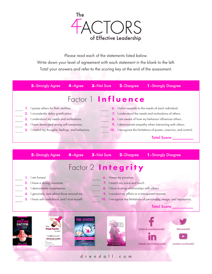
Rendall-Freak Factor PDF
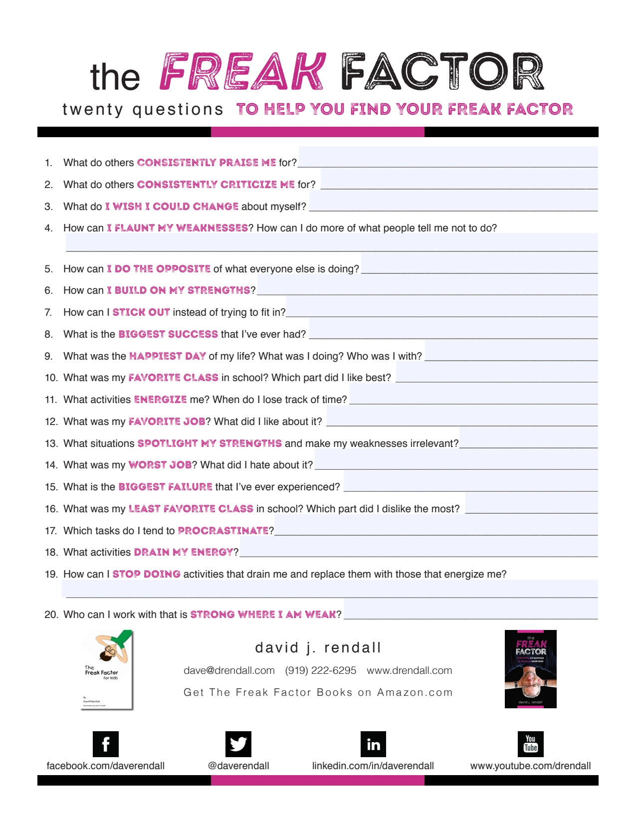
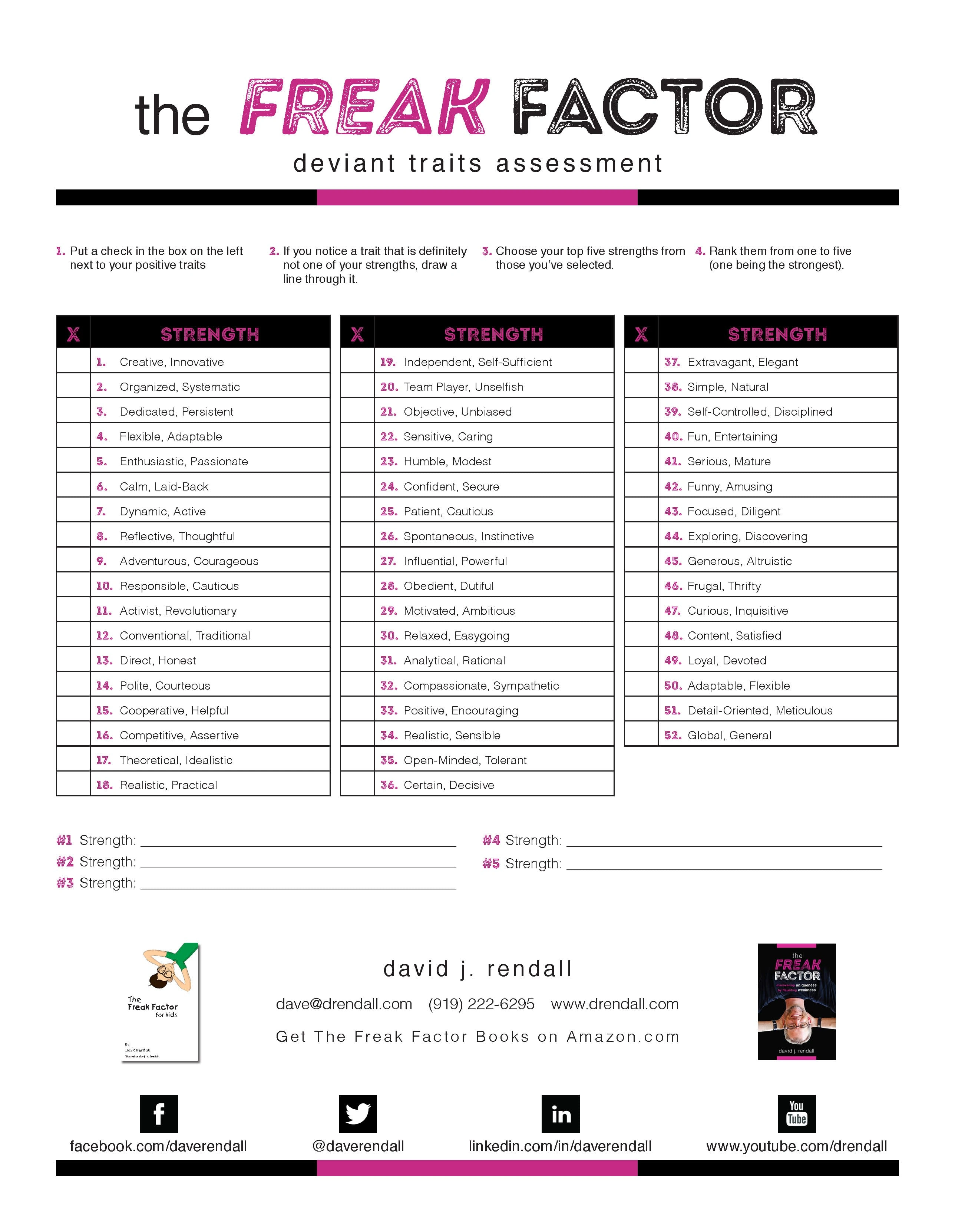
Objective: The goal of the Freak Factor Assessment project was to design a clear, user-friendly assessment tool that helps individuals identify their unique strengths and weaknesses. The objective was to encourage self-awareness and personal growth, in line with David Rendall’s philosophy of embracing individuality.
Context: This assessment was developed for David Rendall, a speaker and author known for his work on leveraging personal quirks as strengths. The assessment serves as a practical, engaging tool for users to self-evaluate in a way that aligns with the Freak Factor philosophy. It was designed to be visually accessible and straightforward, supporting both individual and group settings.
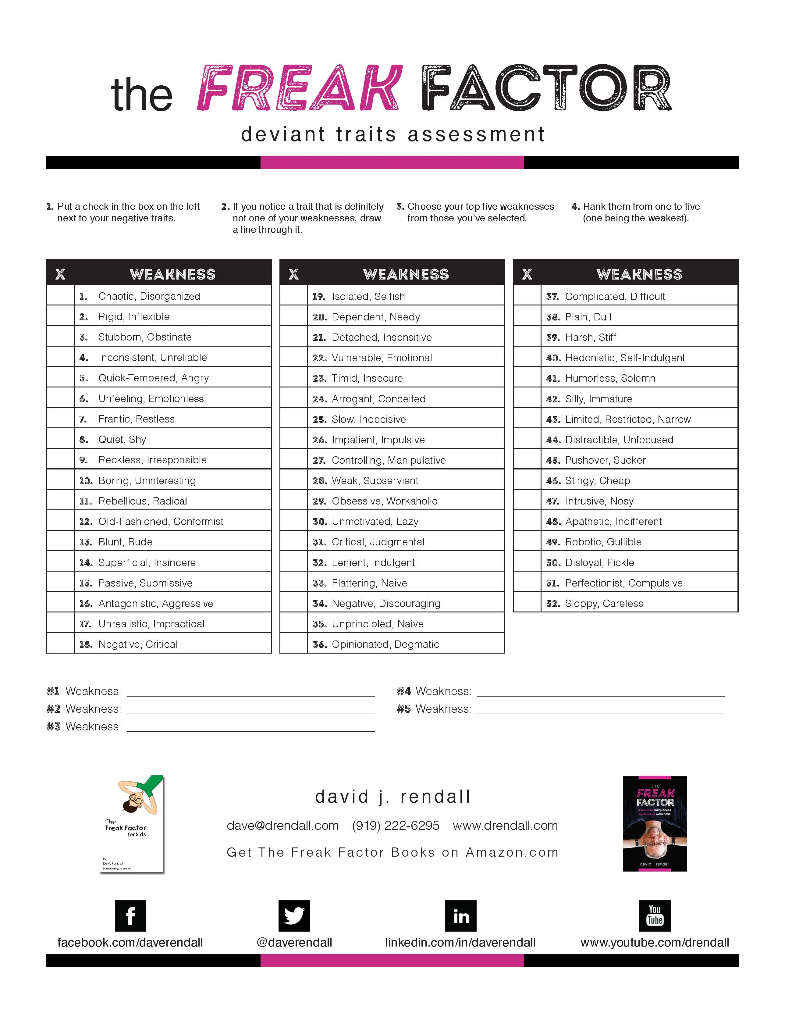
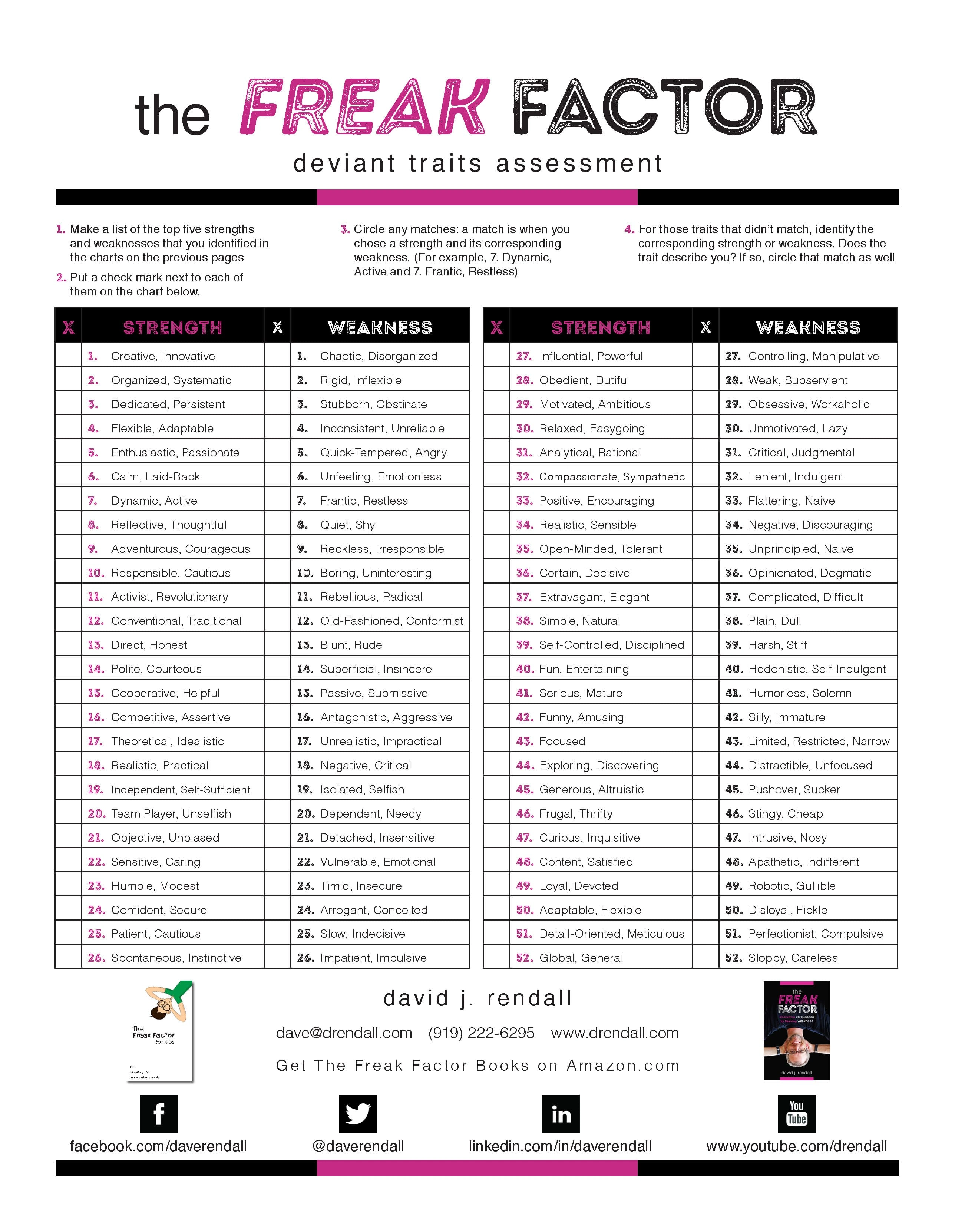
Challenges: A key challenge was ensuring the assessment format was visually simple yet engaging, as the design needed to make self-assessment enjoyable and accessible. Additionally, balancing structure with flexibility was crucial, allowing users to check off, cross out, and rank traits easily without confusion.
Process: To address these needs, I divided the assessment into strengths and weaknesses, with clear sections and checkboxes for ease of use. I used consistent formatting, bold typography, and spacing to visually distinguish each part of the assessment, helping users navigate the document quickly. Iterative testing ensured the assessment was intuitive and aligned with Rendall’s mission of making self-discovery engaging.
Takeaways: This project underscored the value of designing with the user in mind, particularly for self-assessment tools. I learned more about balancing visual clarity with functionality, ensuring the layout supported the purpose of self-reflection without overwhelming users.
Like this project
Posted Nov 8, 2024
Designed the Freak Factor Assessment for clarity and ease, enabling users to explore strengths and weaknesses with a user-friendly PDF.

