NEPA Lacrosse News: Brand Identity Revamp

Austyn McFadden


NEPA Lacrosse News: Brand Identity Revamp
Award-Winning Identity Featured in LogoLounge Book 15
NEPA Lacrosse News approached Vaughn & Co. with the goal of revitalizing their outdated identity. The existing branding lacked distinctiveness in a crowded sports media space, especially within the lacrosse community. Their previous colors and mark were typical, blending into a landscape where differentiation is key.
Our mission was to transform their brand into something modern, recognizable, and proudly Pennsylvanian, a design that not only resonates with local heritage but also feels fresh and professional across all digital and print applications.

Certification from Logo Lounge!
Discovery & Collaboration
We began with a series of collaborative workshops with NEPA Lacrosse leadership and community members. These sessions uncovered a deep pride in the heritage of Pennsylvania, and that insight became the cornerstone of our creative direction.
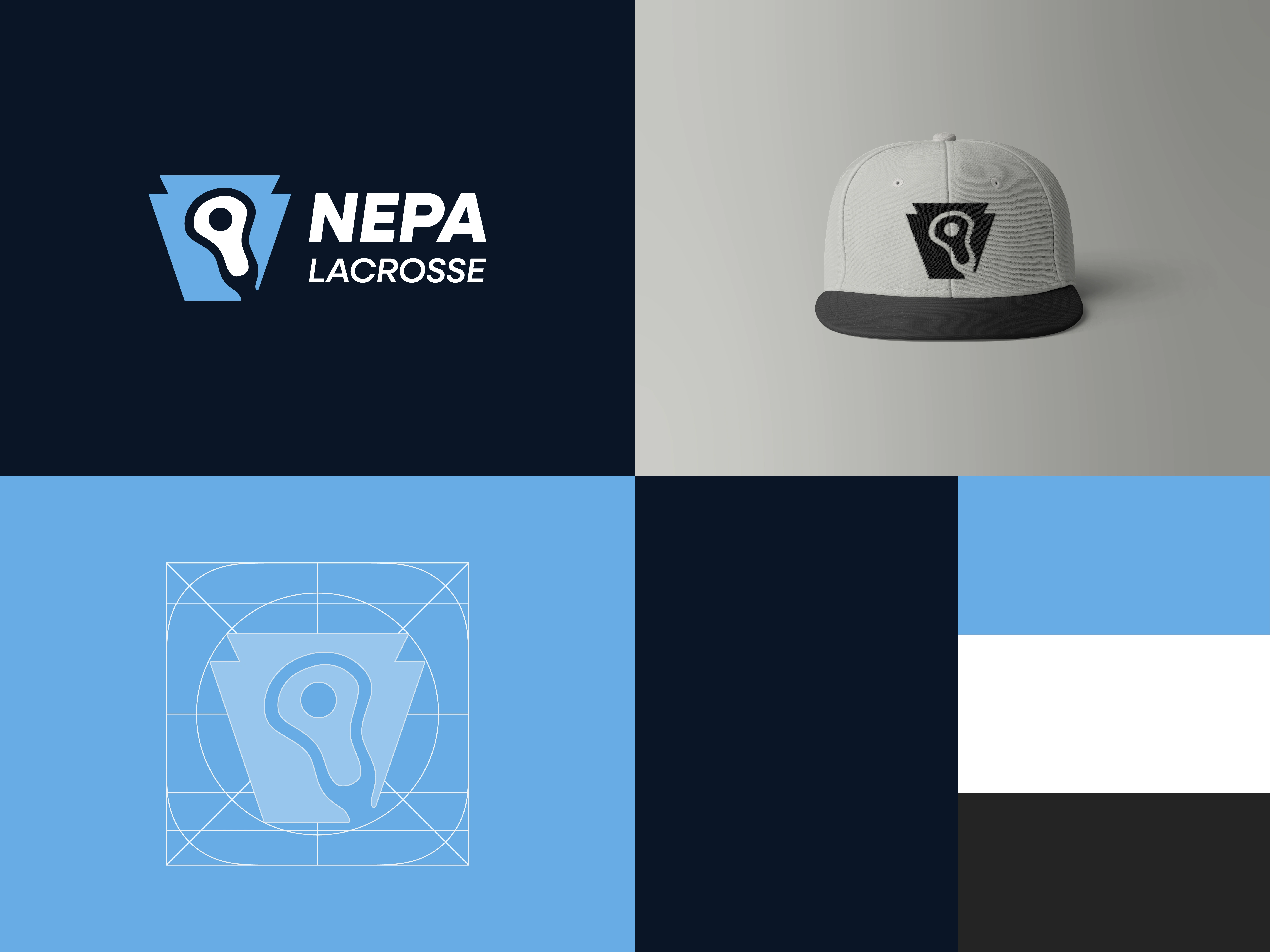
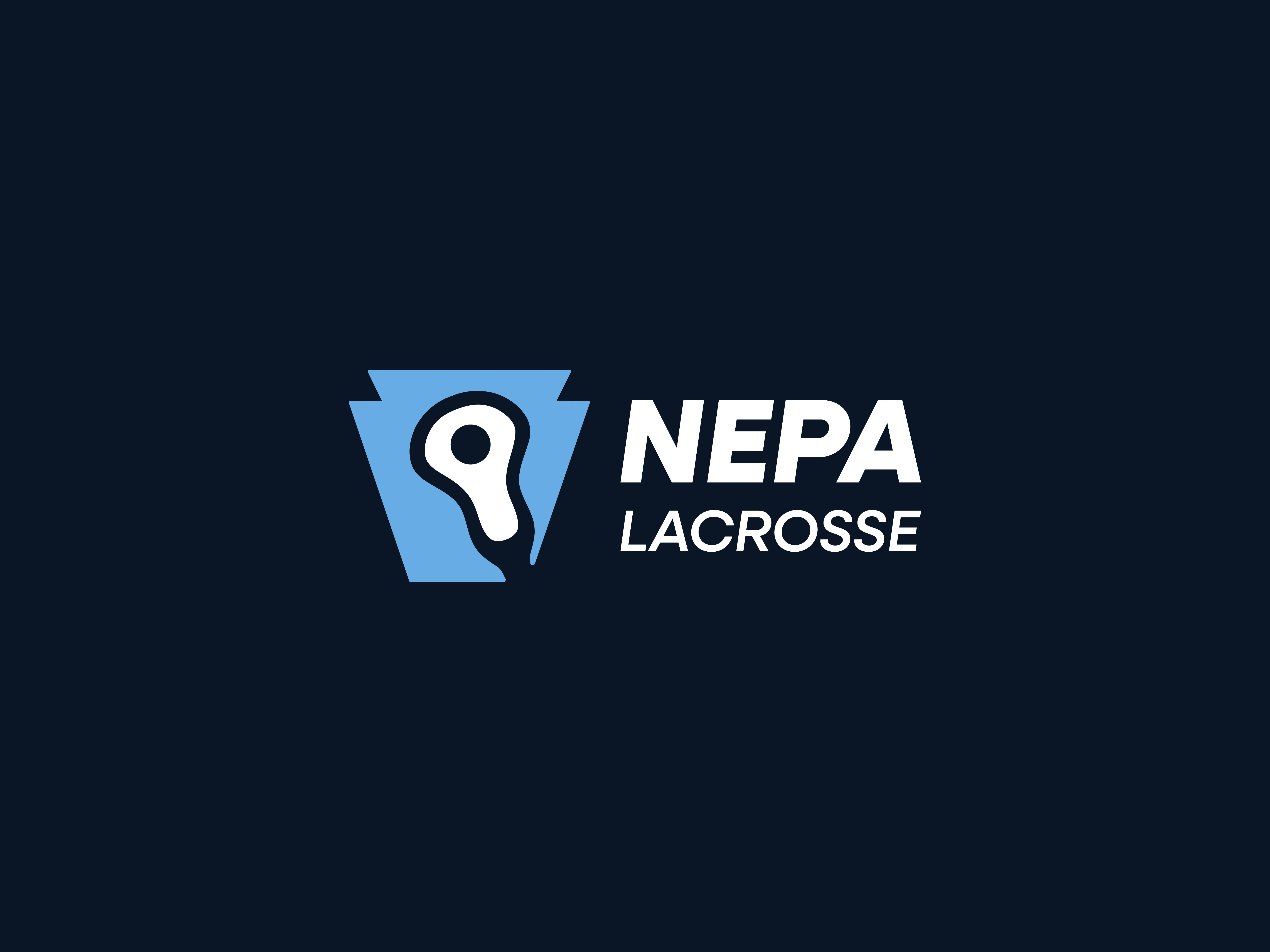
The keystone, a symbol synonymous with Pennsylvania, emerged as the perfect foundation for the new logo. From there, we developed a visual identity that merges the state’s heritage with the energy and motion of lacrosse.
NEPA LAX Combination Mark
Design Solution
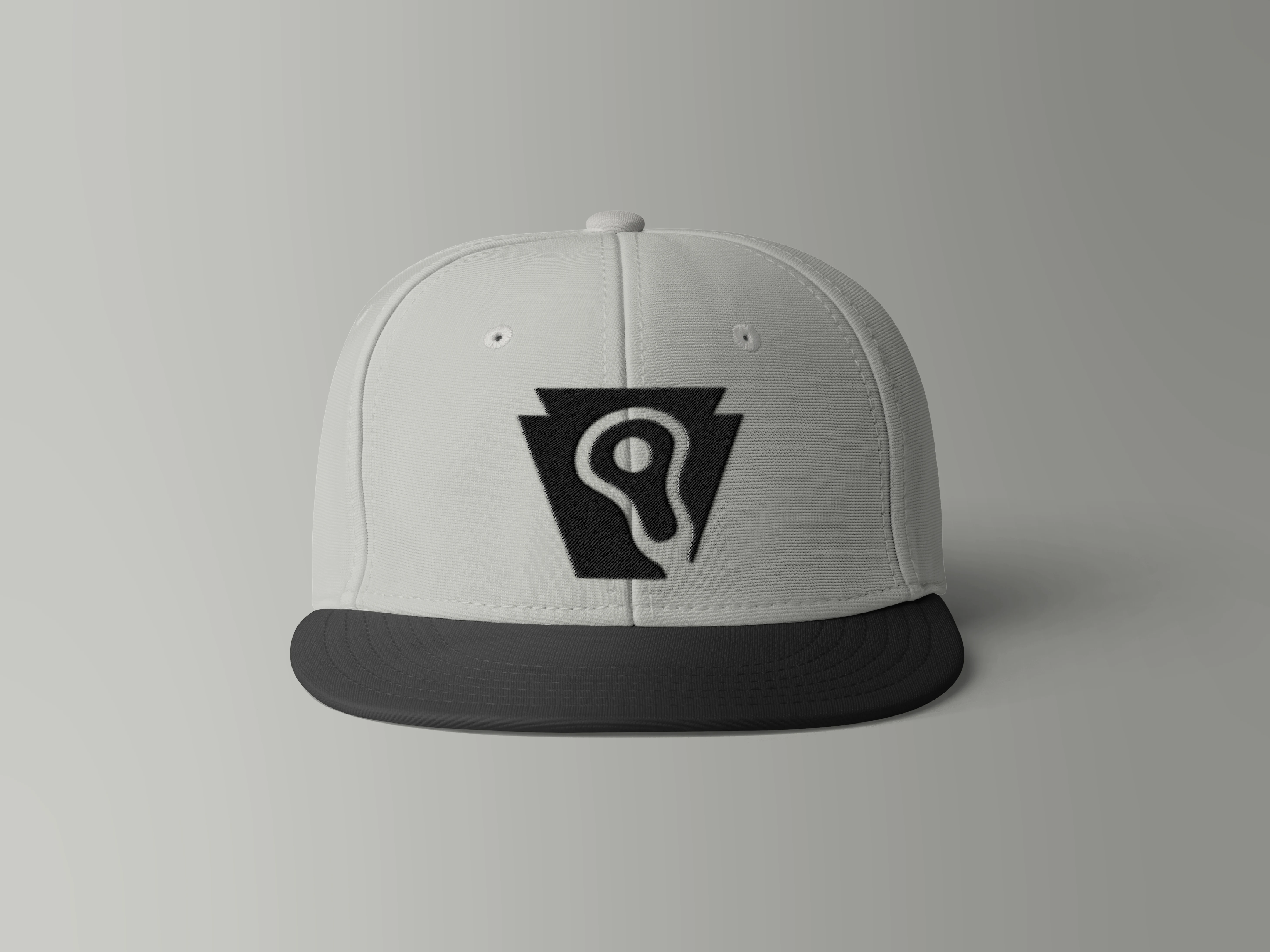
The Keystone Mark
The new logo introduces a custom keystone emblem that cleverly incorporates the silhouette of a lacrosse head within its structure. The design is fluid and balanced, symbolizing both strength and motion, key attributes of lacrosse and Pennsylvania itself.
This combination of state pride and athletic identity helped NEPA establish a powerful visual anchor that stands out in the sports news landscape.

NEPA LAX Icon
Color Palette
We evolved NEPA Lacrosse’s color system into a modern and versatile palette inspired by Pennsylvania’s geography and identity.
Keystone Navy (#0A1526): A deep, commanding hue symbolizing stability and tradition.
Susquehanna Blue (#68ACE5): A nod to the Susquehanna River, bringing freshness and vibrancy.
Pure White (#FFFFFF): For clarity and clean contrast across all touchpoints.
Steel Slate (#242424): Inspired by Pennsylvania’s industrial roots, grounding the palette with strength.
This color system ensures maximum versatility, performing seamlessly across print, web, and apparel.

NEPA LAX, Color Palette
Typography & Application
The identity system was extended with bold, modern typography to complement the geometric precision of the keystone mark. Multiple logo lockups were created including horizontal, stacked, and icon-only versions to ensure consistent visual presence across all platforms.
From digital news banners to on-field apparel, every application was considered. The brand now conveys authority, credibility, and athletic energy in every instance.
NEPA LAX Icon
Implementation & Recognition
The refreshed identity was met with enthusiasm from the NEPA Lacrosse community. Its simplicity and meaning made it instantly recognizable, an identity that feels both local and professional.
Most notably, the project was honored with a LogoLounge Book 15 "Badge of Honor", recognizing its excellence in creativity and execution among thousands of global submissions.
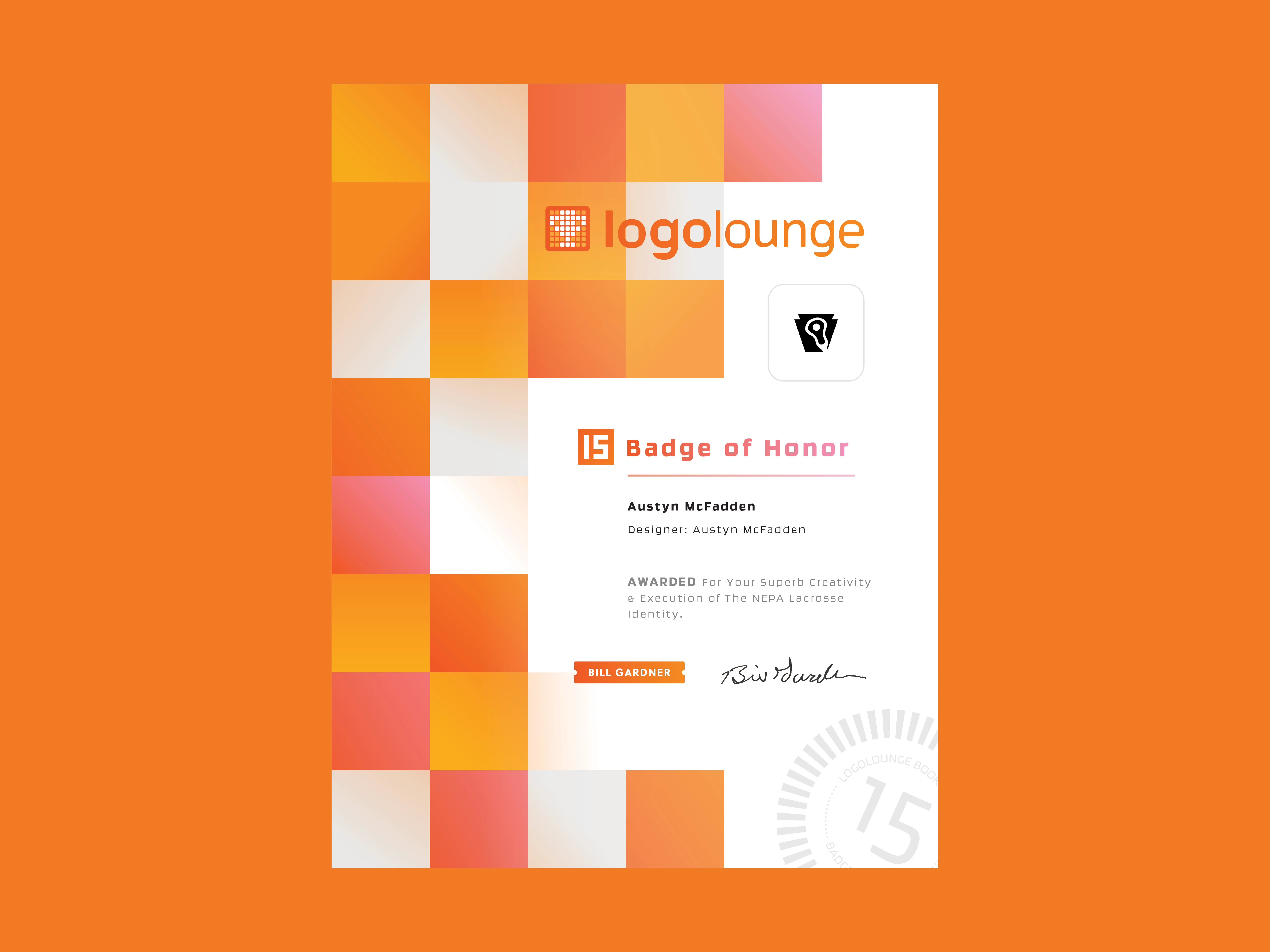
Certificate from Logo Lounge
Like this project
Posted Nov 12, 2025
Award-winning rebrand for NEPA Lacrosse, blending Pennsylvania heritage with modern design for a bold, standout sports identity.