Brand Identity Design for Topspin Racquet Club

Overview
Topspin Racquet Club is a modern sports destination that celebrates the energy and precision of racquet sports. Nestled in the heart of the city, it serves as a vibrant hub for players of all skill levels—offering tennis, squash, racquetball, and more.
When I was approached to design the brand identity for Topspin, the objective was clear: create a modern, dynamic, and instantly recognizable logo that reflects the motion and spirit of the sport.
Objective
The goal was to craft a mark that not only encapsulates the essence of racquet sports but also feels timeless, adaptable, and energetic. The logo needed to resonate with both seasoned athletes and new enthusiasts—capturing the club’s sense of community and competition.
The design had to perform across a wide range of uses: from digital platforms and signage to apparel and sports equipment.
Conceptualization
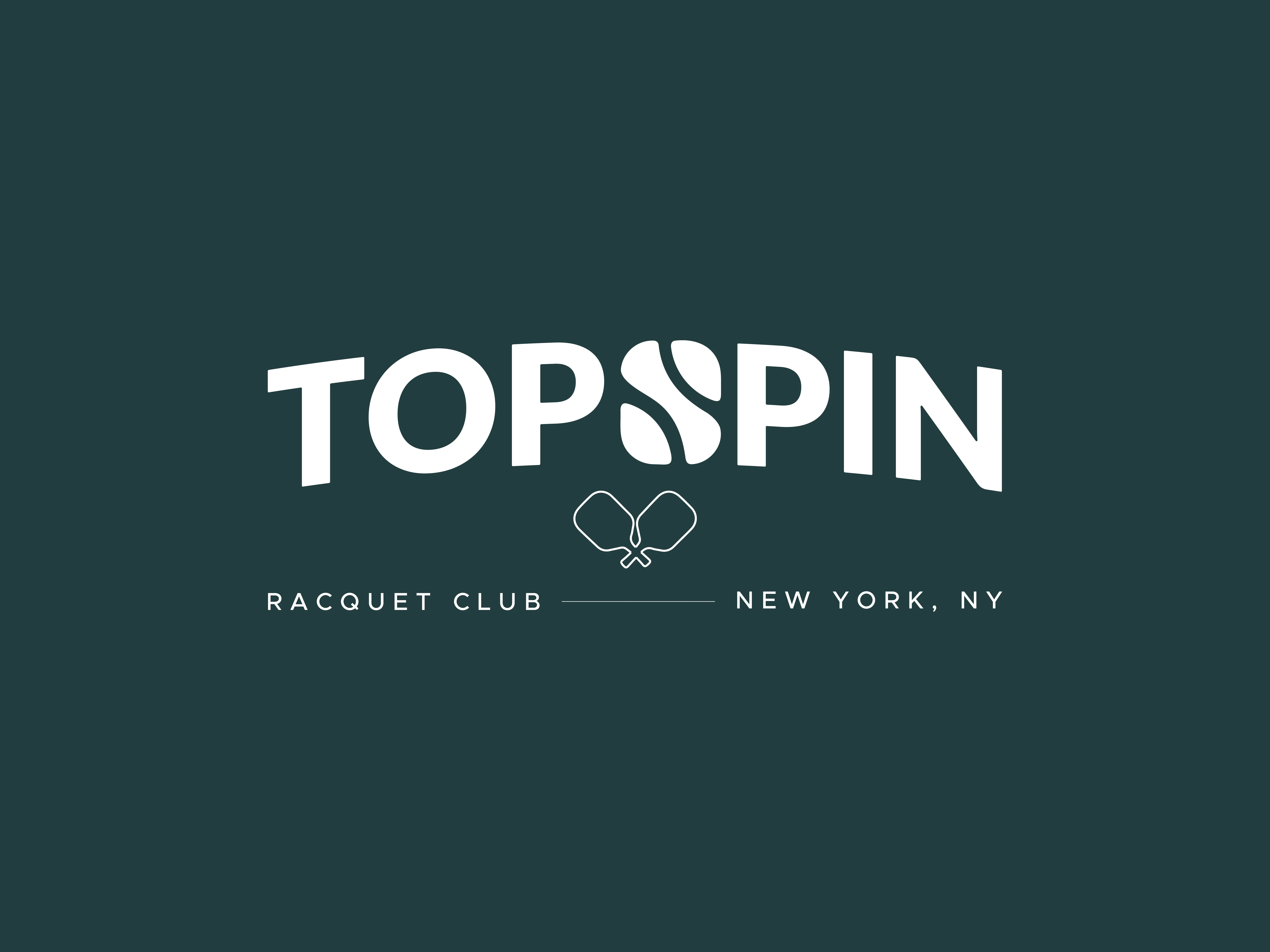
Every great logo starts with a strong concept. For Topspin, the design exploration centered around the letter “S” from the brand name.
The fluid, curving form of the letter provided a natural opportunity to express movement, spin, and control—qualities intrinsic to racquet sports.
By introducing two distinct curved lines through the top and bottom sections of the “S,” the mark began to take on the visual identity of a tennis ball in motion. This subtle but intentional link grounds the design in the sport while maintaining elegant simplicity.

Design Execution
Achieving balance was key. The “S” needed to feel iconic on its own but also integrate seamlessly within the full logotype.
Each line and curve was refined to ensure proportional harmony—avoiding excessive detail while preserving instant recognition.
The result was a custom letterform that doubles as a standalone symbol, embodying both the name Topspin and the visual energy of the sport itself.
Typography & Structure
The wordmark “TOPSPIN” was set in a bold, geometric sans serif font to convey modernity and strength.
The letterforms were subtly customized for better rhythm and balance, complementing the motion of the central “S” mark.
The slightly arched composition mirrors the trajectory of a ball in flight, further emphasizing the sense of motion.

Color Palette
Color plays a crucial role in how a brand feels.
For Topspin, I selected a deep teal green as the primary background color—a nod to classic court surfaces—paired with a vibrant tennis-ball yellow to inject energy and modern contrast.
This combination strikes a perfect balance between sporty vibrance and professional sophistication.

Scalability & Versatility
From a design standpoint, a great logo must perform across every scale and medium.
The Topspin mark maintains clarity whether it’s printed on small accessories or displayed on large outdoor signage.
Its simplicity allows it to adapt effortlessly, ensuring consistent brand recognition across all touchpoints.
Monochrome and Color Versions
A strong identity system should function beyond color.
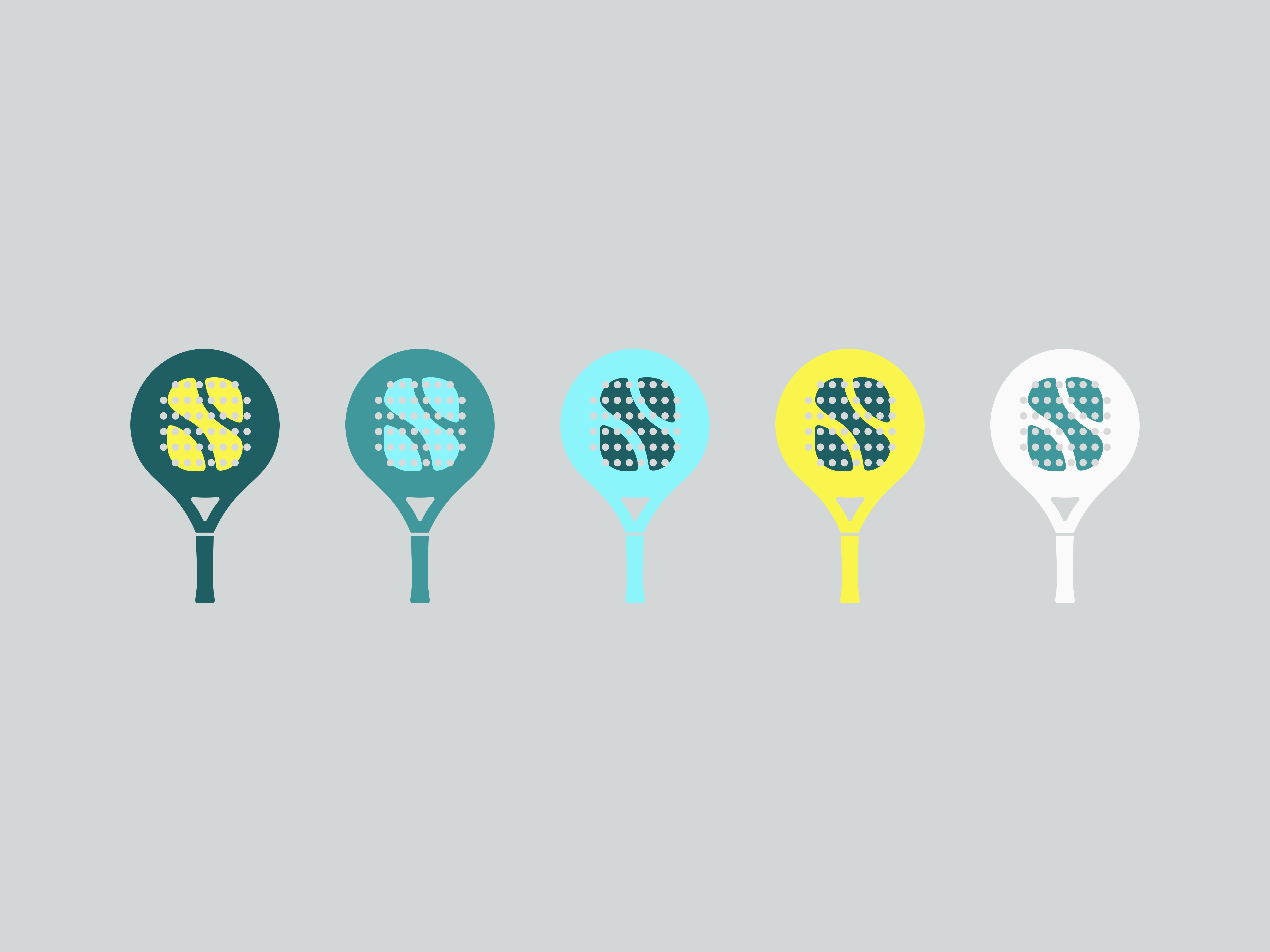
The Topspin logo works equally well in single-color and reversed applications, ensuring it retains its integrity in all branding situations—from embroidered apparel to digital icons.

Applications Across Merchandise
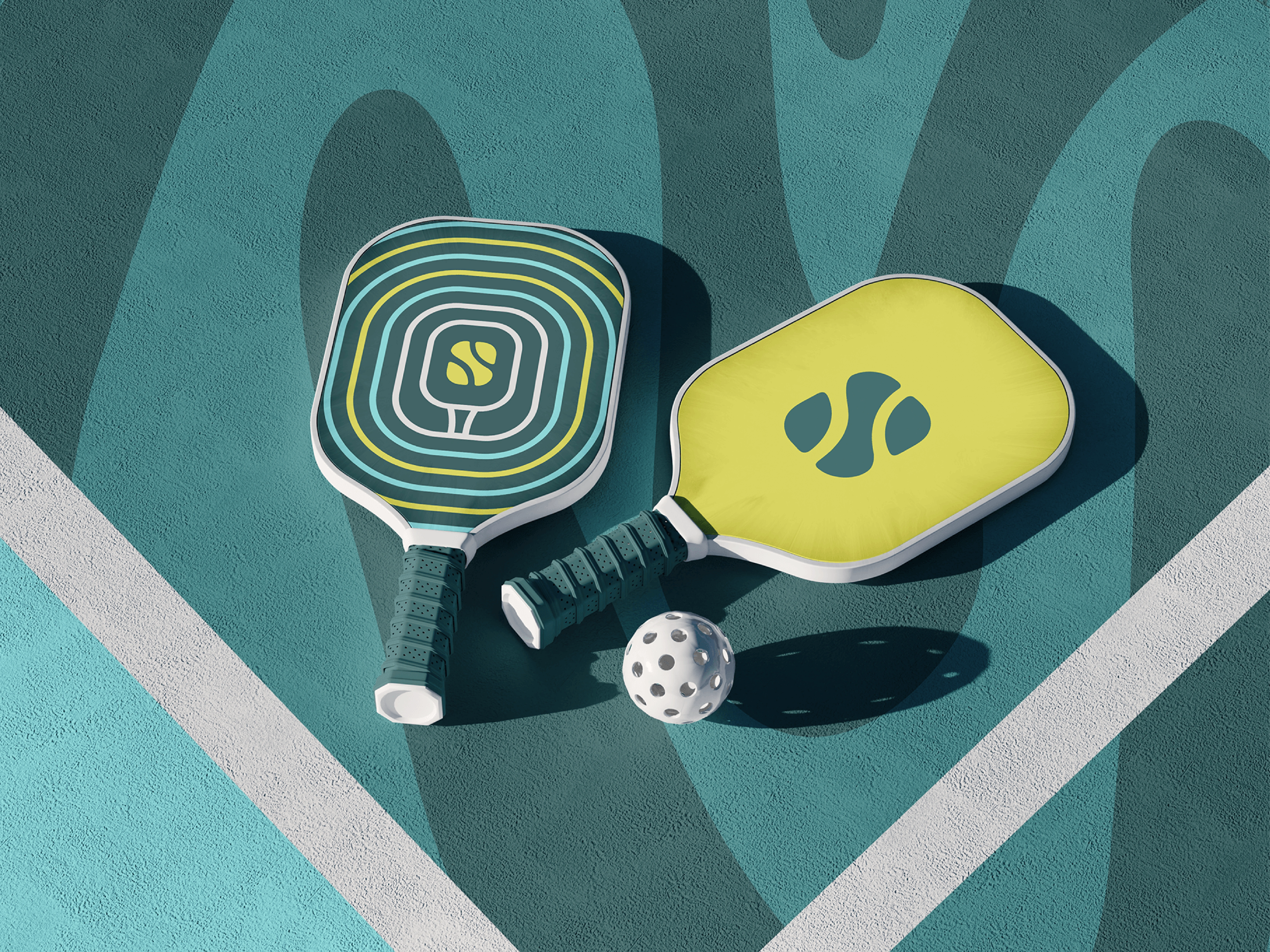
To showcase the logo’s adaptability, I developed several mockups across branded merchandise.
From rackets and bags to apparel and signage, each item reinforces the club’s fresh, contemporary image.
These touchpoints demonstrate how the visual identity enhances both member experience and brand visibility.

Digital Presence
The simplified symbol translates perfectly to digital environments.
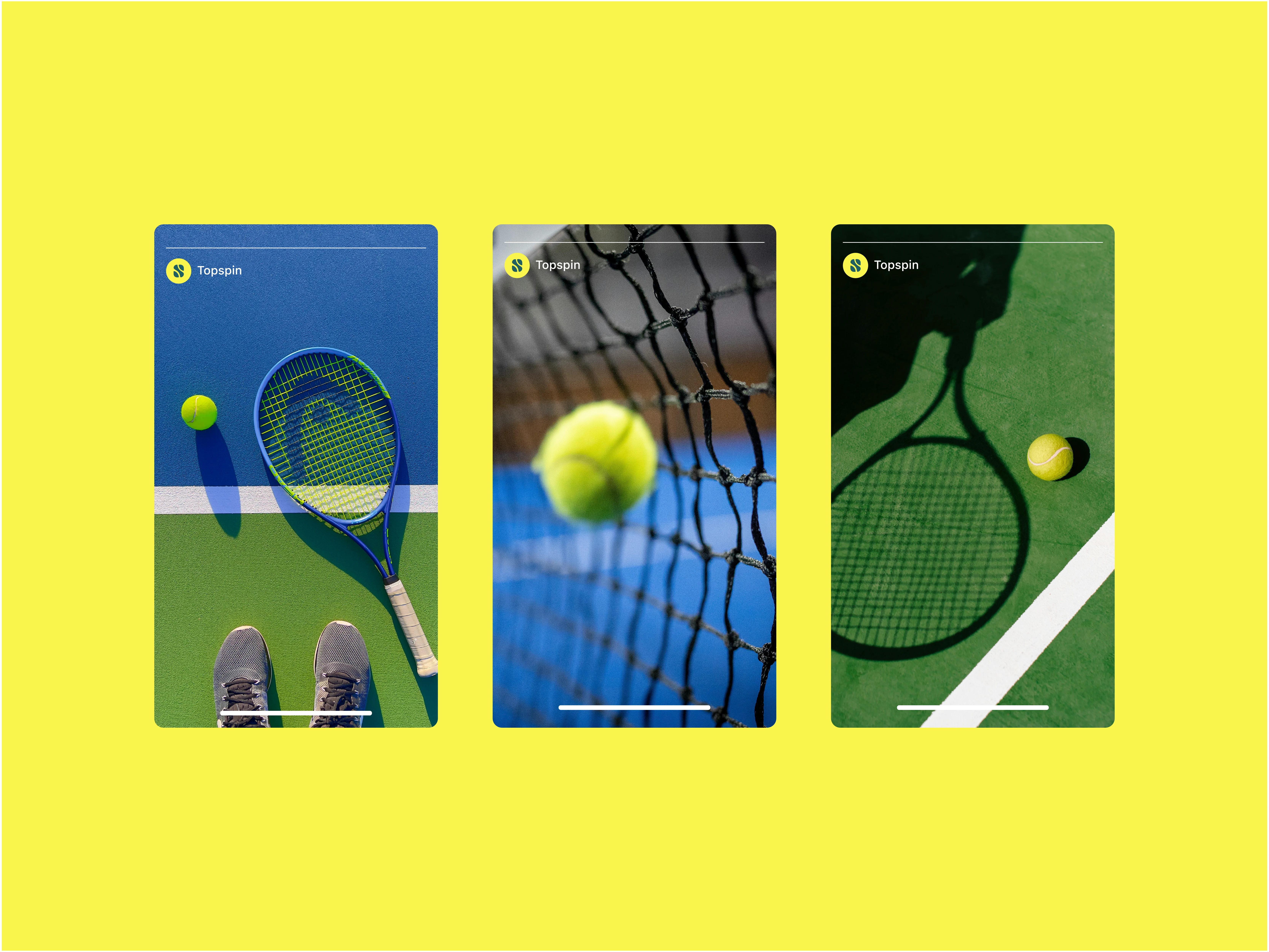
It works seamlessly as an app icon, profile image, or favicon—ensuring cohesive brand presence across screens and social platforms.
The subtle 3D rendering of the mark on app interfaces adds depth while maintaining minimalism.
Environmental Branding
Inside the club, the Topspin identity extends to physical spaces.
Signage, wayfinding, and wall graphics carry the same bold energy—creating a consistent visual language that inspires players the moment they step in.
Brand Cohesion
Every element—from typography to color and layout—was designed to work in harmony.
Together, they form a cohesive visual system that’s clean, modern, and highly functional, reflecting the essence of Topspin Racquet Club.

Outcome
The final identity captures the precision, motion, and energy of racquet sports while maintaining a timeless quality.
It’s bold enough to stand out on the court yet refined enough to represent a premier club setting.
Topspin now possesses a brand that resonates with its members and visually embodies its dedication to excellence.

Reflection
Designing for Topspin was a process of distilling movement into form—translating the spin, energy, and finesse of racquet play into a single mark.
The end result is a brand that feels dynamic yet enduring, sporty yet elegant—a true reflection of the game itself.

Like this project
Posted Oct 19, 2025
Designed a modern, dynamic logo for Topspin Racquet Club reflecting racquet sports' motion and spirit.


