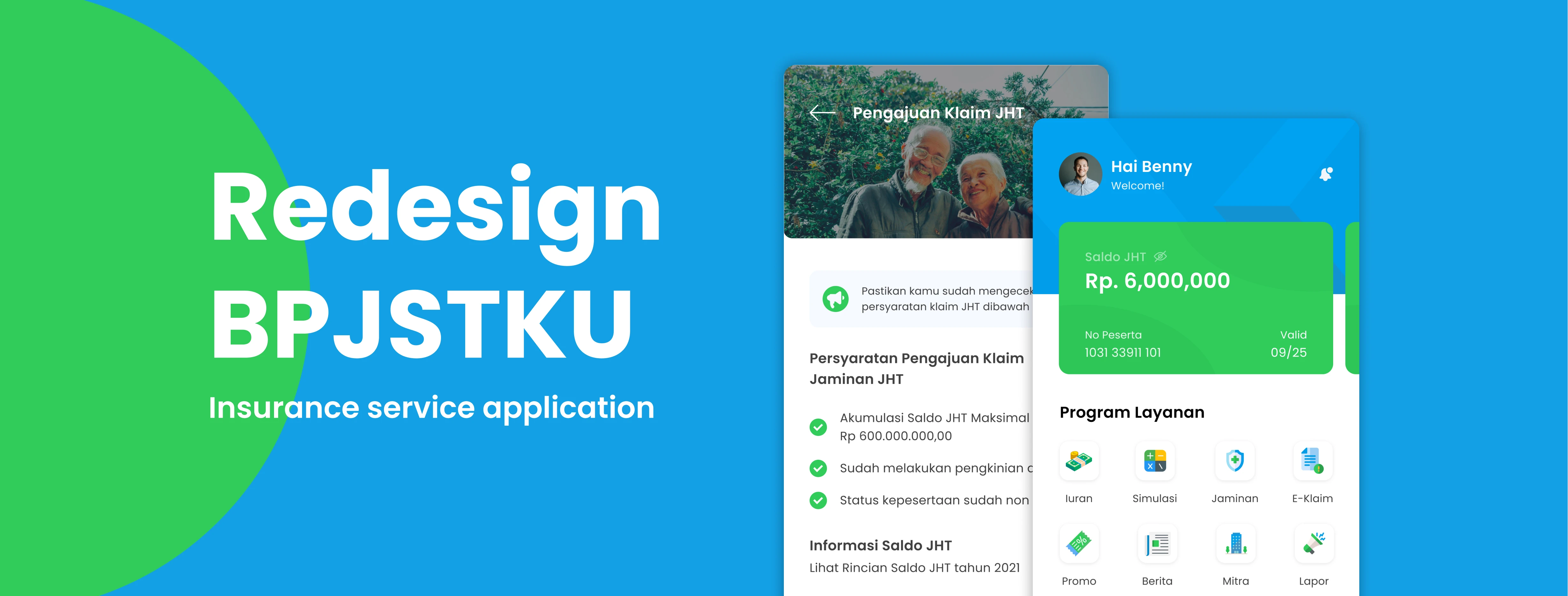
BPJSTKU App Redesign for Improved User Experience
Muhammad Ajrin
Case Study: Insurance Service Application (BPJSTKU) — Redesign
Introduction
Hello! Introduce my name is Muhammad Ajrin, I work as a Freelancer product designer. Some time ago I was challenged to make observations and redesign based on an application with a small rating in the application store, I accepted the challenge of this project with Bootcamp which I am currently participating in with the aim of honing my design thinking skills. Anyway, feel free to leave comments or feedback about this research. And also this is my first story that debuted on Medium, sorry in advance if my writing is a bit messy haha.
Overview
During the current pandemic, various efforts to limit activities have been carried out, such as several public places that have limited operating hours to reduce crowds, the same thing has been done by the BPJS (National Social Security Agency) service office. As an effort to suppress the spread of the COVID-19 virus, with this application BPJS hopes to provide convenience for users who use BPJS services, especially in submitting insurance claims, but it is necessary to first know the user’s perception of the application and the problems they face. Therefore, I am interested in analyzing this application to find out what features can be improved to support user satisfaction.
Existing App
BPJSTKU is an application created by BPJS (National Social Security Agency) Employment as an effort to provide National Health insurance for all Indonesian people. The application can be run on several devices such as Smartphones and Tablets, and this application has other variations in the form of a website that can be accessed via laptops and personal computers. The convenience offered by this application is that participants can register for BPJS Employment, get information about BPJS, report work accidents, check JHT balances, simulate JHT balances and submit insurance claims in one application.
Notes: JHT (Jaminan Hari tua) / Pension plan
BPJS ( Badan Penyelenggaraan Jaminan Sosial) / National Social Security Agency
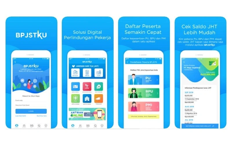
BPJSTKU Original Application
The BPJSTKU application has been downloaded by more than ten million users and has a rating of 3.5 (Google play store) and 2.2 (App store). Based on several reviews given by users, this application has many obstacles including access to information for users and others. Here are some reviews on the Appstore:
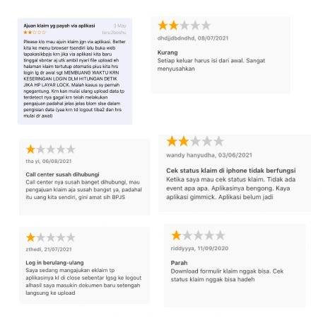
Review the application on the application store
Design Process and Approach
First, I did some user research to dig in and get deeper context into the issue at hand. Then I started analyzing and synthesizing the data to show some key insights to focus on. Then the process is continued by building a solution, and finally testing the final result.
Here is an overview of the process I did
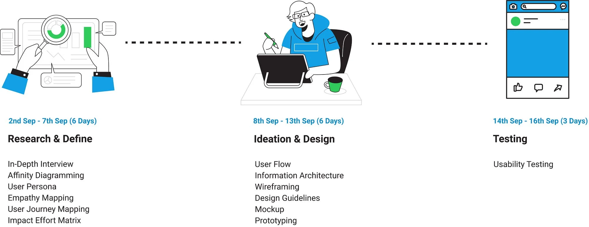
My Design Process
Approach to Users
After getting respondents who match the target and have distributed interview invitations, at this stage I explore information about user opinions when using the BPJSTKU application, because it is not possible to conduct face-to-face interviews, the research process is carried out online with the following user criteria:
Sample Spesification
BPJSTKU active users regularly pay insurance fees every month for the last 6 months
Women/Men
30–56 years old
Registered as a BPJS Employment user (Ketenagakerjaan)
So, the main objectives of doing this research are
● Find participants’ mental models, including their goals/motivations and behavior when using the BPJSTKU application
● Identify participants’ pain points when improving their skills/competencies.
● Re-validate user issues in app reviews
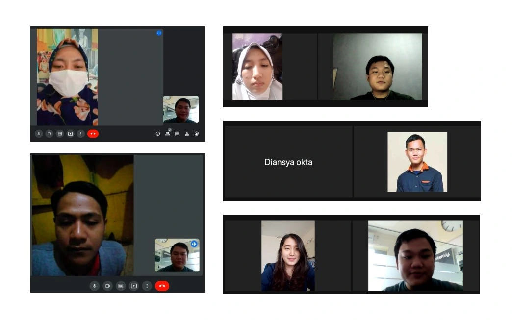
Interview Process
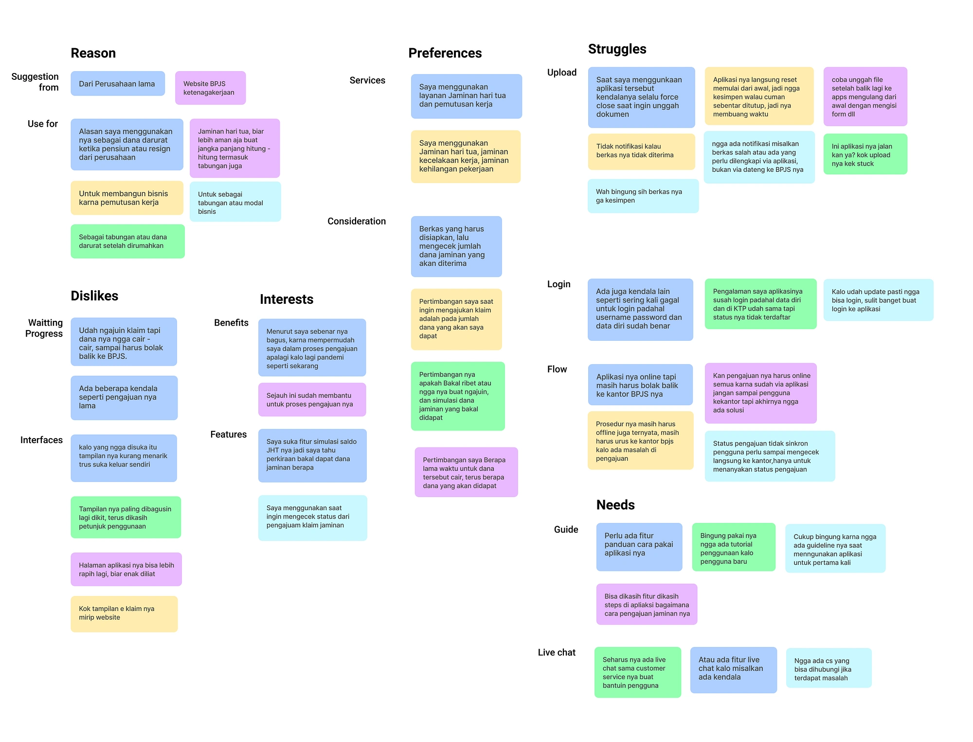
Affinity Diagram
After conducting the interview process, I also got some insights from the respondents. I also present these insights using an affinity chart to help us discover user mindsets, by sorting and grouping related insights.
From the insights I get, I can find out why users use the app, what they like & dislike when using the app, as well as the needs and problems they face.
If made into a story/takeout:
Users who know about the BPJSTKU application because it was suggested by the company, but there are also those who know from the BPJS website, besides that the reason users use the application is because it is a savings during retirement or as an emergency fund when there is a layoff.
Interview transcripts that have been grouped using affinity diagrams
To make it easier to find out the pain points experienced by users, I group these problems in the following affinity diagram below:
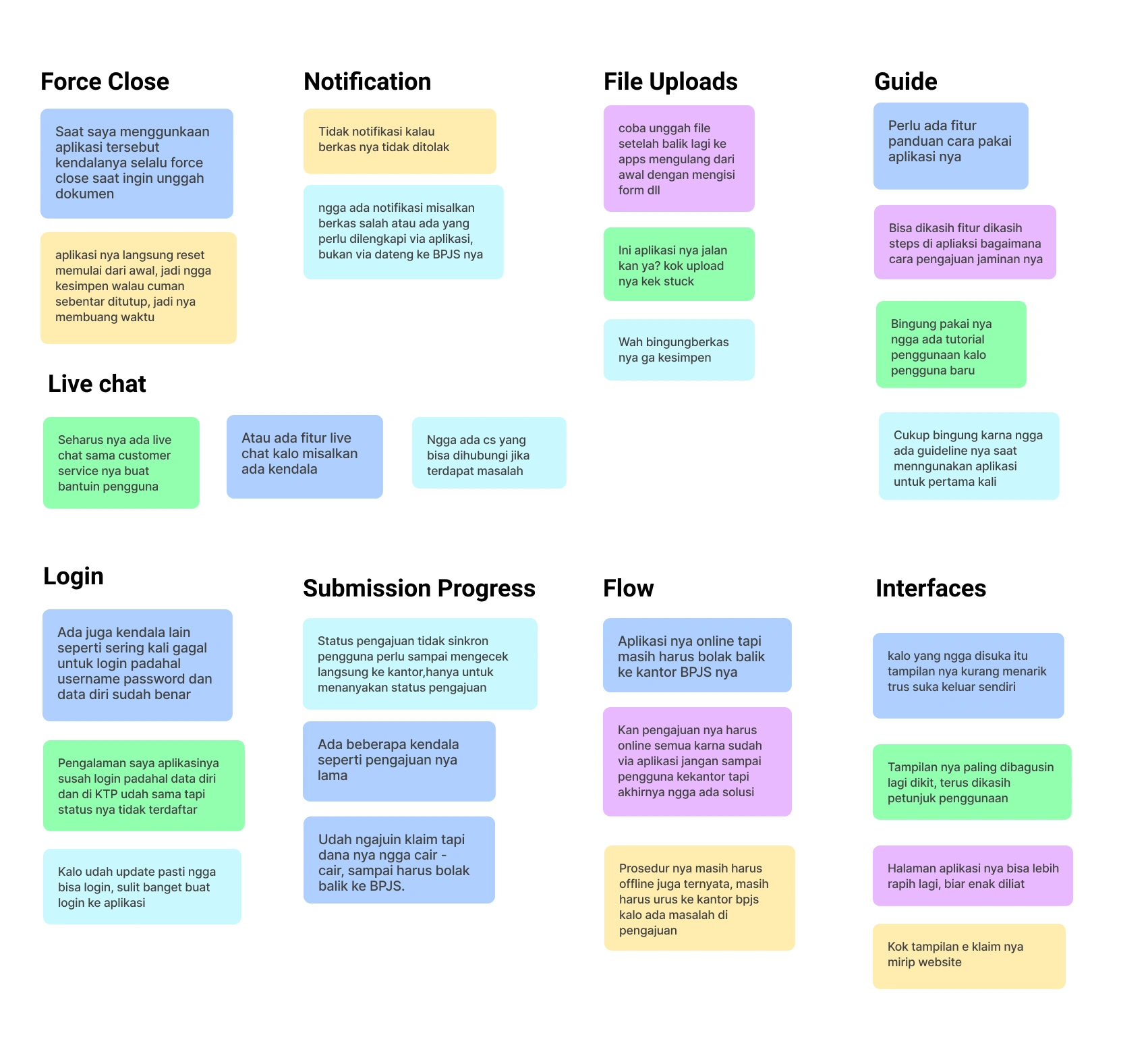
Interview transcripts based on user problems that have been grouped using affinity diagrams
If made into a story/takeout:
BPJSTKU users generally experience several main obstacles when using the application, They often experience Force close when uploading files, the submission process is complicated, there are no notifications from the submission process, there are no guidelines for new users, and the application display is not comfortable.
User Persona
After grouping the insights I got, I created User personas based on the patterns of observations I got from the interviews. This persona will help me make better design decisions. Maintaining design scope is also helpful because we will know who the users are, what issues to address, and what behavior is appropriate.
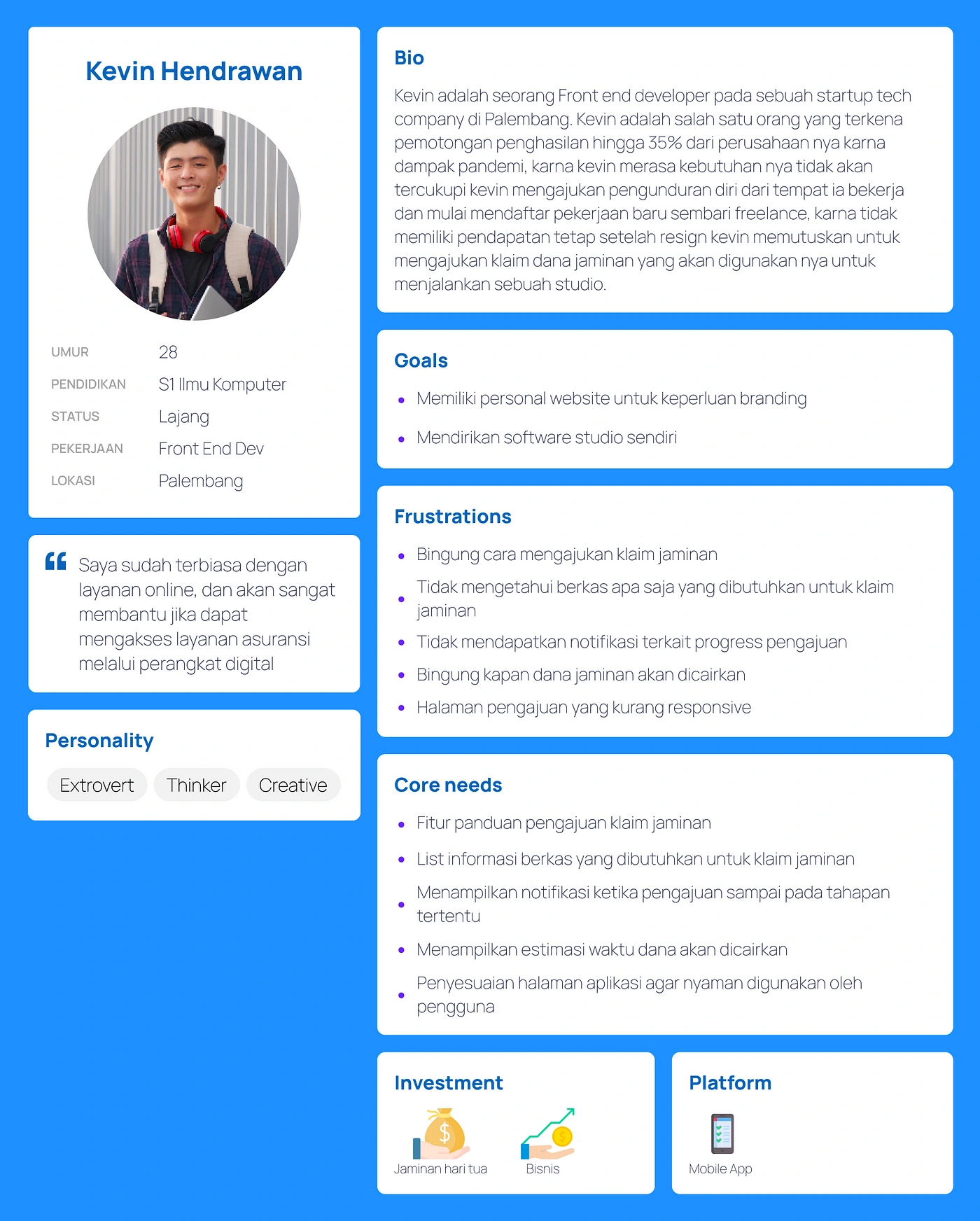
User Persona BPJSTKU
User Journey Map
The Customer Journey Map is a User Experience method that allows you to find many insights about your users. so that I can reveal more details such as emotions felt by the user, pain points and opportunities what can be done to improve the user experience. Based on the results of the analysis, users have many obstacles in the process of submitting a guarantee claim.
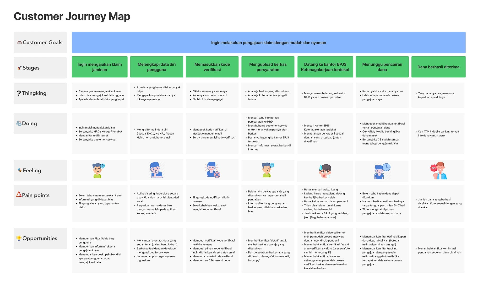
Gambar. 10 Customer Journey
Main Problems
Based on the results of the analysis using Affinity diagrams and customer journey maps, it was found 5 main problems faced by users. The force close problem in the application can be ignored in this case study because it is a technical problem. Therefore, five main problems are taken as follows:
The user does not know the steps of the claim submission process
When they want to submit a claim, some users, especially new users, don’t know what stages are needed for this submission process, this makes users confused and prone to making mistakes when they want to prepare for claim submission needs. internet, ask the company you work for or contact BPJS customer service, this is very time consuming for users, therefore users want a feature that explains the steps or guidelines if you want to make a claim.
2. User is having problem uploading claim file
Most users don’t know what files are needed when they want to make a claim, this makes users have to look for information independently, sometimes users who upload files can be refused submissions, due to lack of information about requirements for files such as having to be legalized, must be colored, file size no more than 1 megabyte, users want a preview feature to find out what files are needed to minimize errors
3. Application display that is less interactive
For some users, the appearance of the BPJSTKU application is quite confusing, because there is no icon, button or illustration information in the application, this causes the features in the application to be poorly understood by users, besides that the selection is very contrasting. colors can make the user’s eyes tired quickly when using the application
4. Users must come to the nearest BPJS Employment office for interviews and file verification
Users complain that they have to do the file verification process and interview to the nearest BPJS Employment office, this is considered troublesome for users who happen to have an interview schedule on weekdays, in addition to supporting PPKM activities (Enforcement of restrictions on community activities in Indonesia) during the pandemic, interviews and file verification expected to be done online, especially if the user is in self-isolation
5. The user is not aware of updates regarding the delivery process
The user does not know the update of the claim that has been submitted, this can raise questions for the user to know when the guarantee can be disbursed, therefore the user needs a feature that can track the submission.
Ideating Solution
The next step I took was to look for various alternative solutions that might solve the problem by creating a design mandate. This solution builds on the insights I gained earlier, both from user needs and behavior. Then I started to prioritize the use of the Impact-Effort Matrix. Mapping was done based on the impact on user needs and behavior, as well as technology implementation efforts. So that later I can narrow down those solutions into impactful and efficient products.
Impact — Effert Matrics
Key Solutions:
A mobile application whose main feature is to help workers check insurance funds and make insurance claims without having to come to the nearest BPJS branch office. Based on the results of previous research, I found that BPJTKU users have difficulty if they are still required to come to the nearest BPJS for file verification or just an interview related to personal data matching. In addition, based on the user’s journey map, users also want an application that is more efficient in terms of usage. This is more likely to be done considering the current pandemic situation by maximizing the BPJSTKU feature, users do not need to come to the BPJS office.
In addition to the application that will be more efficient, I decided to add a Guide feature for users, because this application will have many changes to this feature, it can help users to better understand the function of each feature in the application, and get an overview for new users so that it does not cause problems. confusion when first using
Maximizing the E-claim feature, based on interviews I did, users experience problems with files not being saved or suddenly having to start uploading files from the beginning again after trying to switch screens to find the file they want to upload, here it is because the E-Claim page is a page web link embedded in the application. This causes the application not to be integrated properly and to prevent this, a separate platform is needed both on the website and mobile. In addition, I added a requirement feature that the user can check before submitting the file and can see the accumulated funds that will be obtained if the user wants to make a claim.
Maximizing the file upload feature, due to the constraints I described earlier, I tried to maximize this feature by providing what file information is needed, a progress bar to find out the status of the uploaded file, the size of the uploaded document, the direct document scan feature or users can attach files from files that are already stored on the phone. In addition, I added a song submission feature, this feature can provide information to users regarding the status of their submissions, including file verification status, current shipment status, estimated date of disbursement of funds, this feature is connected to notifications so users will always get information about the status of the submission. hers
So it is necessary to add complementary features so that the previous features can run well, such as notifications, a help center in the form of live chat with the admin so that users can consult if they have problems, check history, check balances and others. feature
Experience Mapping
After having a solid understanding of the solution to be developed, I began to create an experience map. This map is a combination of Information Architecture and User Flow. which describes the information structure and workflow contained in the application. I think this method is quite efficient because I can quickly get a broad overview of the application to be built, so that later it can help me in making high fidelity designs.
Experience Map
This experience map builds on the journey map I created earlier. The flow and placement of information is adjusted to the sequence of activities that the user goes through.
Wireframes
After entering the page what I need, then I create a wireframe to get a basic overview of the appearance of the design that I will be working on. The following is the wireframe for the redesign of the BPJSTKU application:
Wireflow
Design Guidelines
Design Guidelines
The next stage is to make a system design. The color selection in the application is based on the BPJS logo (blue and green), this color is very representative of the brand and products offered, based on color psychology we know that blue symbolizes trust while green means health, this really describes insurance products. In addition, the application design is also kept to a minimum by avoiding color and font conflicts that can disrupt the balance of the application’s appearance.
Hi-Fi Design
The mockup is a representation of the product design that we have made before. At this stage, we’ll start using styles, typography, color, margins, and padding to produce the final product image. After going through several stages of research, looking for problems and developing ideas, here are the mockup design solutions that I offer in this BPJSTKU application redesign project:
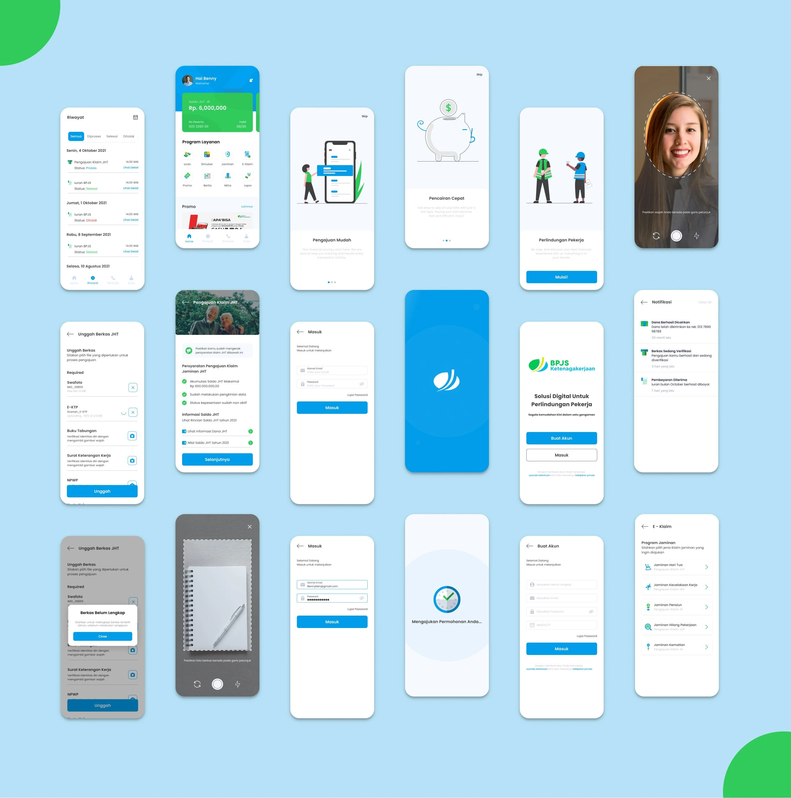
To find out what improvements I have made, I try to rephrase the existing problem points and compare the old problem/design with the new design solution. The following is an explanation of the redesign of the BPJSTKU application that has been carried out to answer the main problems in this study:
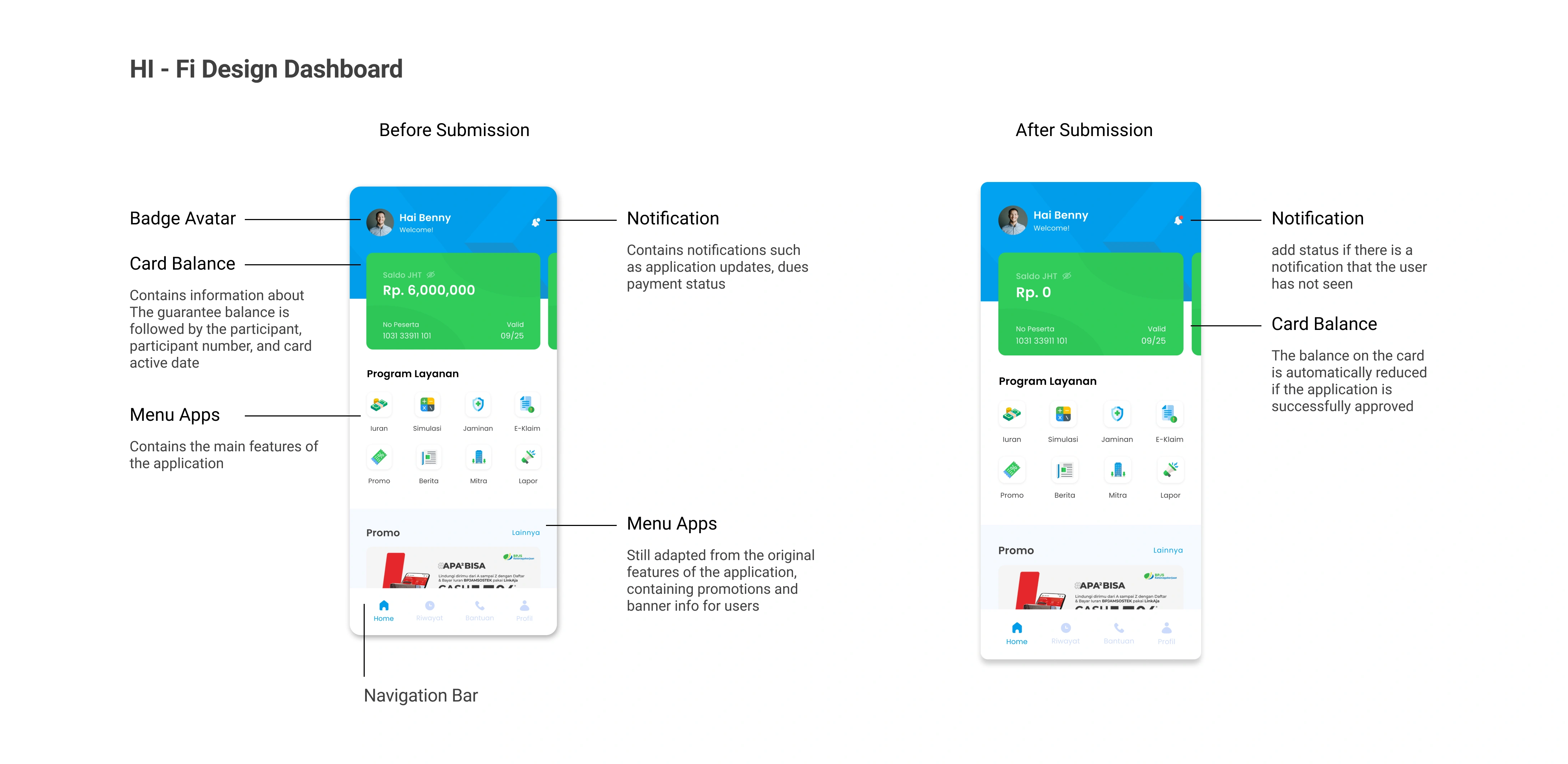
Homescreen
● Home Screen
This homescreen will appear the first time when the user successfully logs into the application, then at the top of the card balance the user can find out the balance for each guarantee that is followed and the user’s balance will be displayed on the main page but to maintain privacy the user can hide the displayed balance
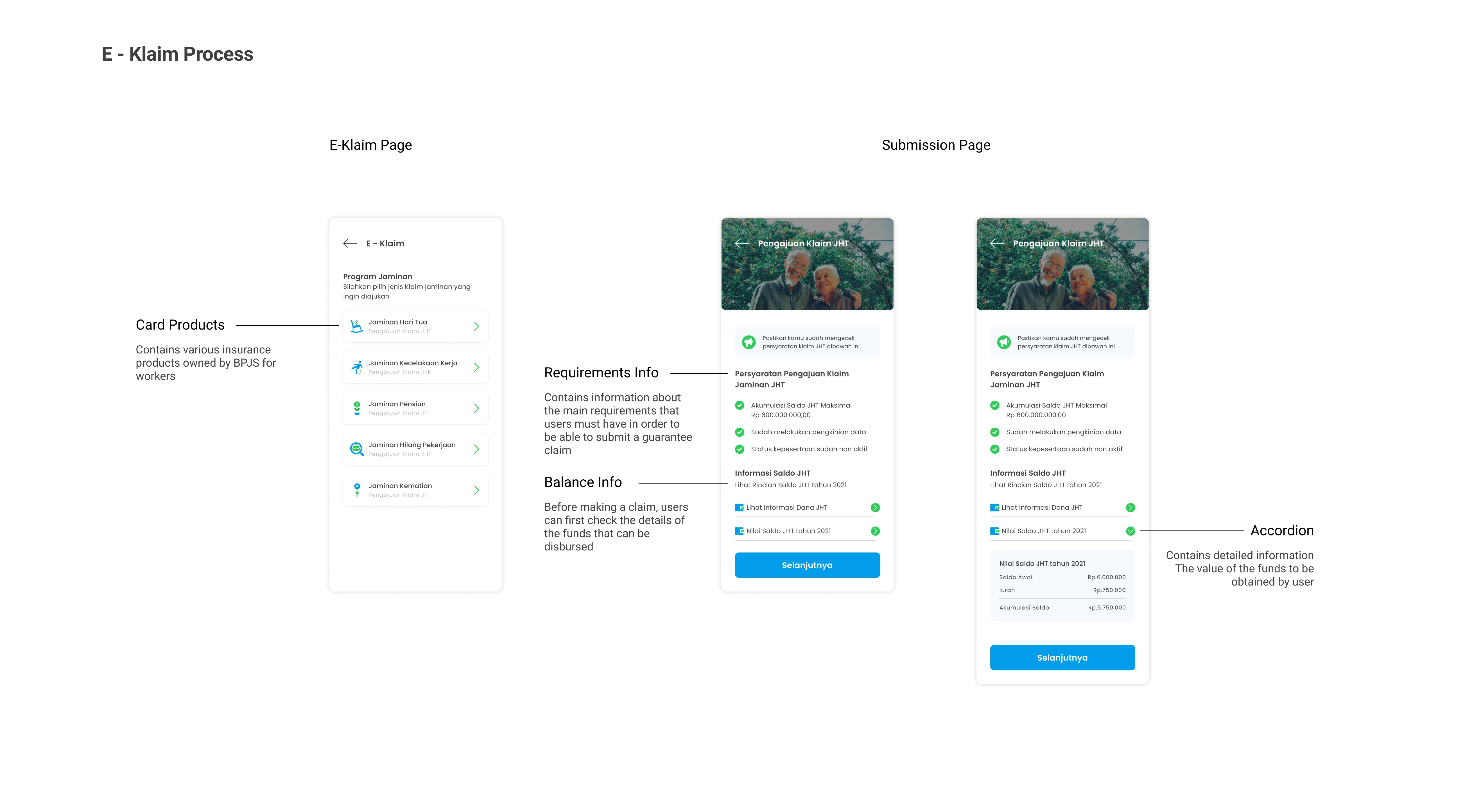
● E-klaim
As I explained in my previous research, the e-claim page in the application is a website embedded in the application, this also creates several obstacles for users such as submitting data that is not integrated, therefore I designed the claim page specifically
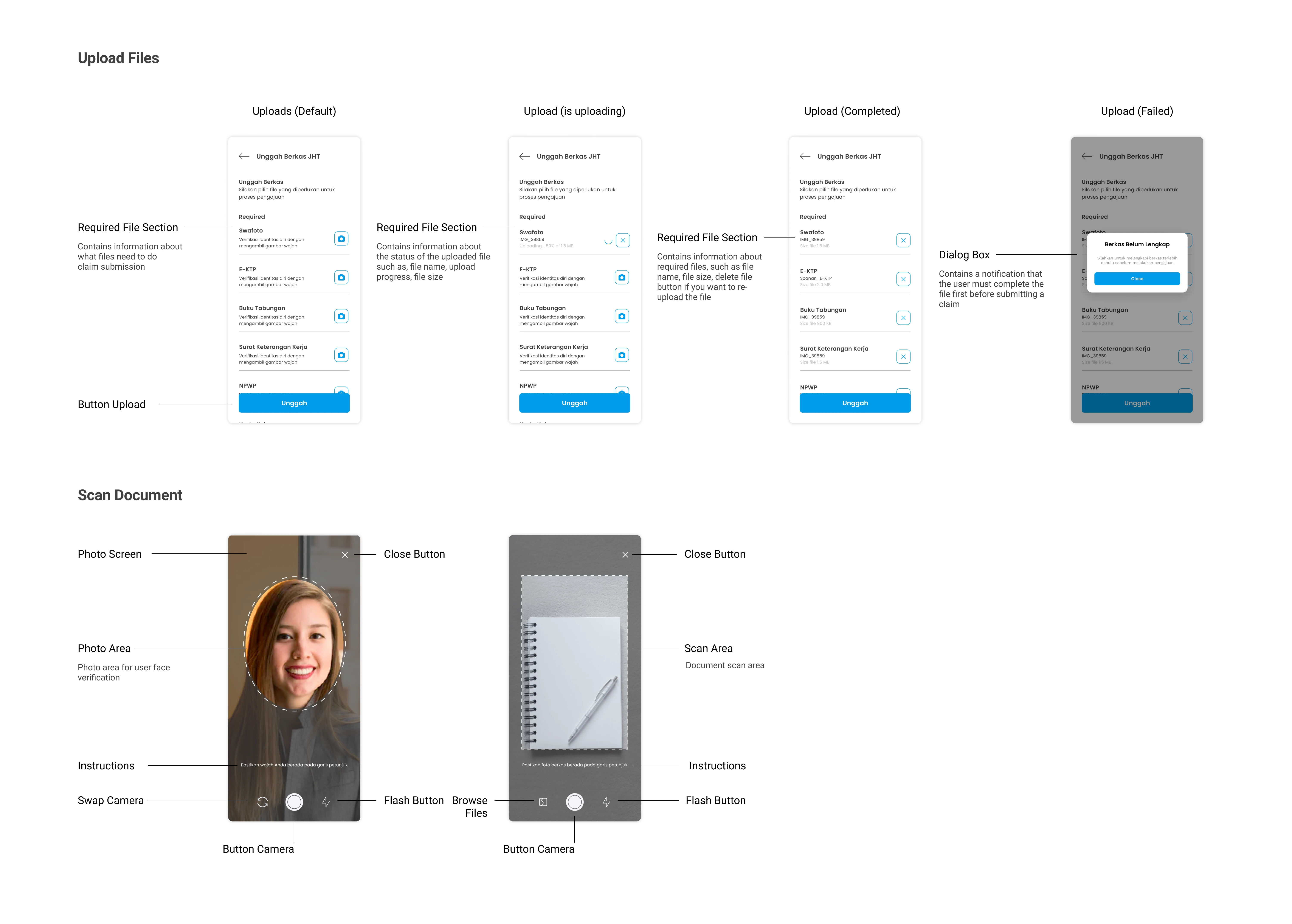
● Uploads Files
As I explained in my previous research, the e-claim page in the application is a website embedded in the application, this also creates several obstacles for users such as submitting data that is not integrated, therefore I designed the claim page specifically
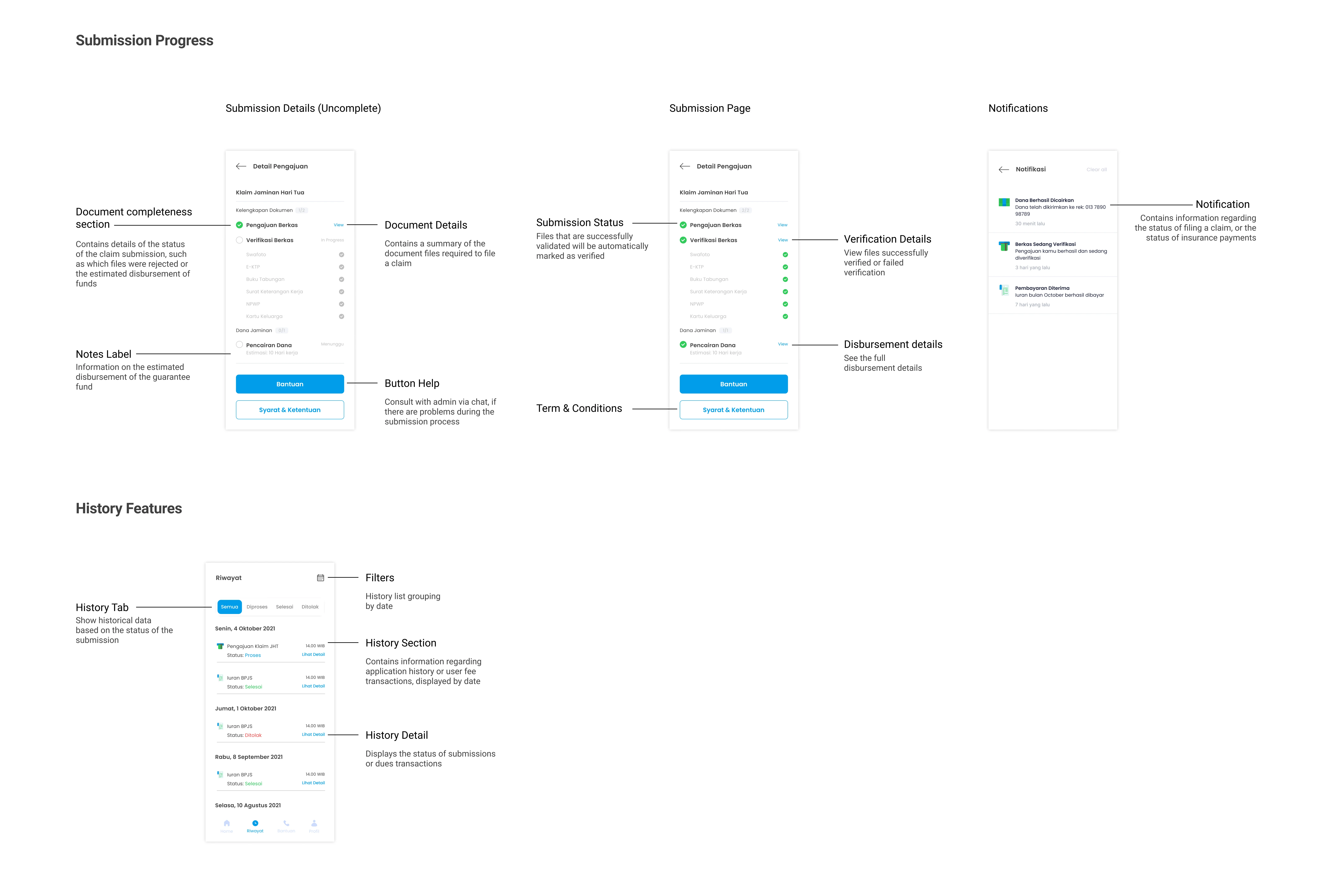
● Submission Progress
In previous research, users had difficulty knowing the status of their submissions through the application, and this is still the reason why users are asked to take care of sending applications offline, therefore I tried to add a feature that can find out the status of the user’s submission, including estimating the estimated time when the funds will be disbursed.
In addition to answering the main problems, I also redesigned several items such as Splash screen, login, and Register This change was also made based on insights from IDI (but not the main problem).
Prototyping
After the empathize, define, and ideate stages were completed, I created a Figma prototype. This prototype contains 30 screens covering the activities of filing a warranty claim, uploading files, and tracking application progress
To see the prototype of the Redesign BPJSTKU app, you can try it here:
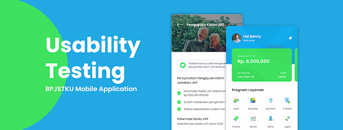
Usability Testing
After going through a long process, we finally arrived at the final stage, at this stage I conducted usability testing on several respondents, with the aim of observing whether the design ideas I created were easy to use by users, answering their problems, whether this product was well received, and are there any difficulties while using this prototype.
The test was conducted with 5 participants (done online via zoom) who had the same criteria as the previous interview, they were in the mid 30–45 years range and had filed a insurance claim.
You can see a more complete usability testing report here:
Task Given
I asked the user to perform the following tasks. I did this by giving the scenario “Imagine you are a BPJS Employment service user, and want to claim funds from the Old Age Security (JHT) guarantee. Please use this application to file a JHT claim until you are informed that the funds have been successfully disbursed.”
Each participant is given 4 tasks in completing the UT, as for the tasks scenario referred to as follows:
● Task 1: Try looking for the e-claim menu and create a JHT service application, check how much funds you will get and understand the submission requirements
● Task 2: Complete the required files by uploading files or scanning documents that will be used as a condition for submitting a claim
● Task 3: After uploading the file, check the delivery progress through the history menu and check the details
● Task 4: Check whether there has been a submission notification, whether the submission status has been successful
Summary Insight
Based on the UT results, all users successfully completed the first and second tasks well. While in the third task, some users a bit confused and for the 4th task the majority of users managed to do it well, There are several problems or confusion that users experience during the UT process, in terms of the flow after the user uploads the file, namely the user assumes the verification process should wait while the application is active and does not realize that the process has to wait. timelapse first for a few days later, and after that new users get notifications.
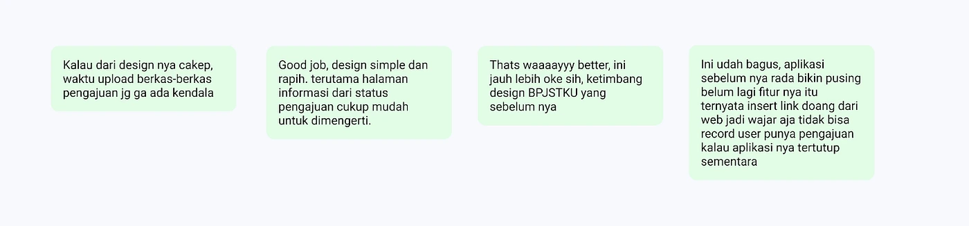
After asking some questions and asking users to perform tasks based on scenarios in the UT process, all users agreed that the new design is better and looks more modern than the current BPJSTKU design. This is because the use of fonts, a layout that is easy to understand by the user, the menus needed by the user are immediately displayed, and the visual hierarchy makes the whole interface look more modern and attractive.
Design Recomendation
After doing the UT process, I made design improvements based on the recommendations in the task.
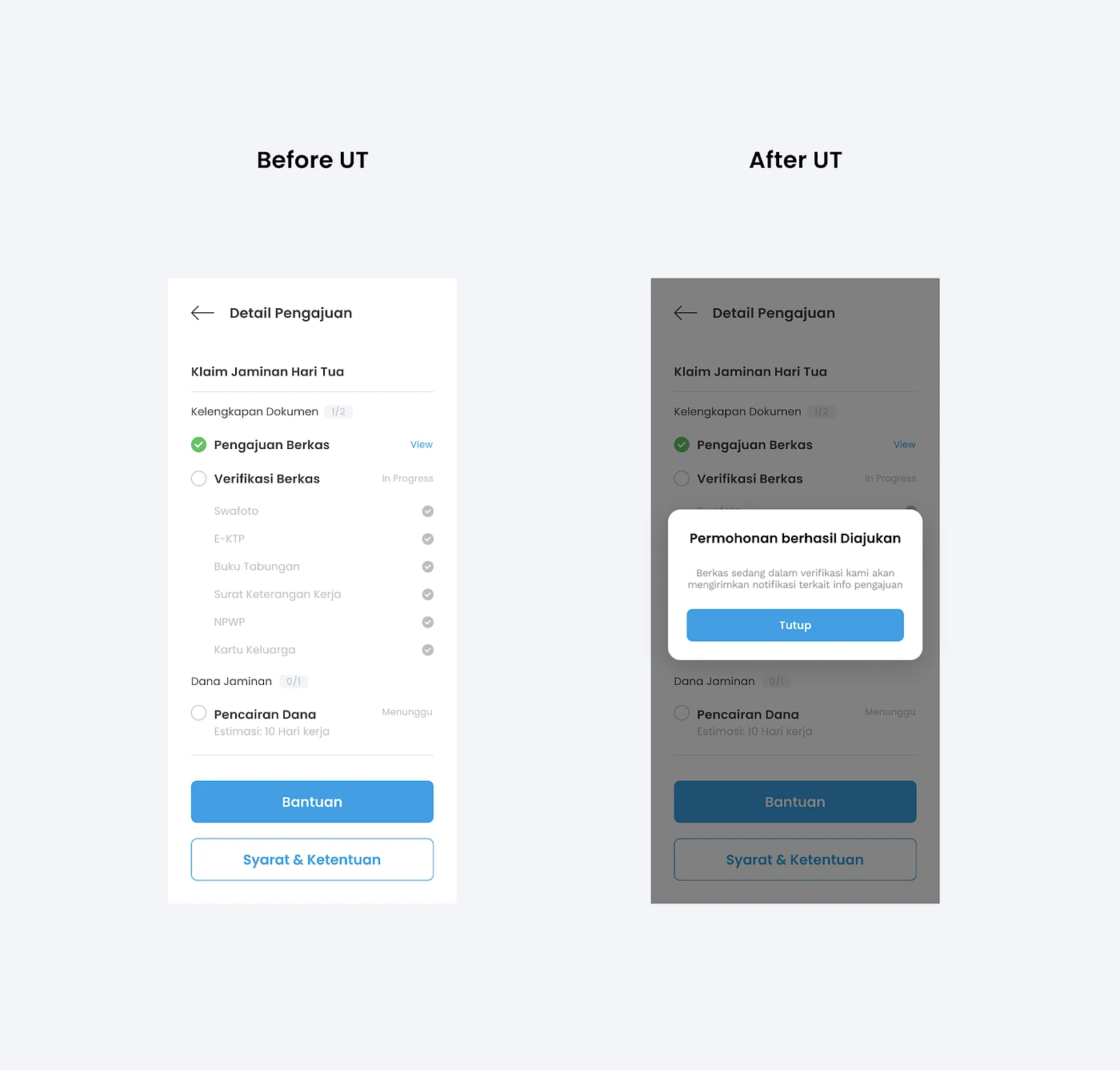
Before UT:
After the file is uploaded, it is immediately directed to the submission detail page, some users are confused about the next trip because there is no guide/instruction
After UT:
Added a pop up showing the info “The application has been submitted successfully, the file is being verified, we will send a notification regarding the delivery info” This notification explains that the user needs to wait because the file is being verified and provides an option for the user to return to the home page and wait for the notification or check application periodically via the history menu or notifications
Conclusion
BPJSTKU is a platform initiated by BPJS Employment, this application can help users to pay dues besides the main feature of this application is to help simplify the claim submission process, users can monitor the progress of the submissions they have made
That’s it, thanks for reading! Feel free to leave a like or comment. I’m also open for further discussion, just ping me out :)
Personal Site: https://ajrindesign.framer.website/
Like this project
Posted Jun 3, 2025
Redesigned BPJSTKU app to enhance user experience and streamline insurance claims.
Likes
1
Views
0