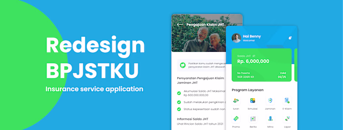
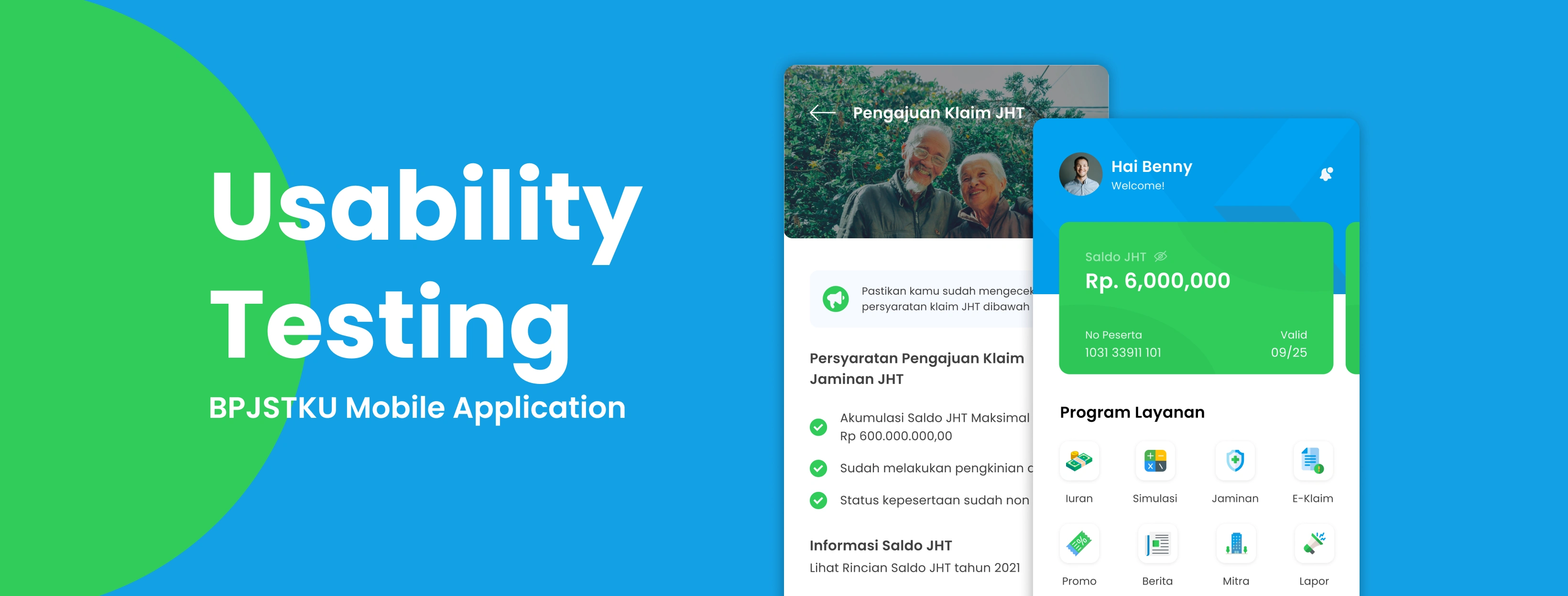
BPJSTKU App Redesign Usability Test
Muhammad Ajrin
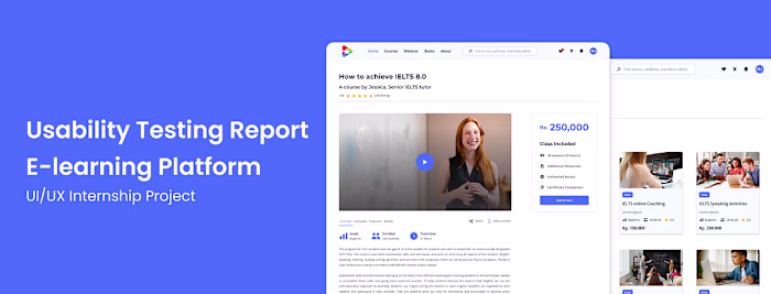
Usability Test Report: BPJSTKU App Redesign
Hello! Introduce my name is Muhammad Ajrin, I work as a Freelancer product designer. Some time ago I was challenged to make observations and redesign based on an application with a small rating in the application store, I accepted the challenge of this project with Bootcamp which I am currently participating in, in this article it is a continuation of the design process that I have done previously. Usability testing is part of my UI/UX case study. If you want to see the full UI/UX case study, you can click on the link below:
Overview
Based on the observation of app ratings on the Playstore and Appstore, some users have complained about some problems with the warranty claim submission feature. For example, the user must re-upload the file from the beginning when the application suddenly experiences a force close/close because the claim feature loaded by the application is a website, it cannot monitor the progress of filing a claim or any file information. required to file a claim, because it is a project. This research focuses on finding out what features can be improved to support user satisfaction when submitting a warranty claim.
Usability testing is carried out to evaluate new designs for claim submission activities, upload files, track status and check submission details on the history page.
The Objective
● Identify user behavior when submitting a guarantee claim on the e-claim feature and track status & check submission details on the history page
● Identify user difficulties when submitting warranty claims on the e-claim feature and track status & check submission details on the history page
● Identify whether the new BPJSTKU design has made it easier for users to submit guarantee claims on the e-claim feature and track status & check submission details on the history page
Sample Spesification
BPJSTKU active users regularly pay insurance fees every month for the last 6 months
Women/Men
30–56 years old
Registered as a BPJS Employment user (Ketenagakerjaan)
Active user of BPJSTKU Has accessed the claim submission page in the last 5 months
Usability Testing
The UT process was carried out online using zoom media during the pandemic. Participants share their screens when using the prototype we created.
Prototype
The prototype is made using Figma. To see the prototype of the Redesign BPJSTKU app, you can try it here:
Task Given
I asked the user to perform the following tasks. I did this by giving the scenario “Imagine you are a BPJS Employment service user, and want to claim funds from the Old Age Security (JHT) guarantee. Please use this application to file a JHT claim until you are informed that the funds have been successfully disbursed.”
Each participant is given 4 tasks in completing the UT, as for the tasks scenario referred to as follows:
● Task 1: Try looking for the e-claim menu and create a JHT service application, check how much funds you will get and understand the submission requirements
● Task 2: Complete the required files by uploading files or scanning documents that will be used as a condition for submitting a claim
● Task 3: After uploading the file, check the delivery progress through the history menu and check the details
● Task 4: Check whether there has been a submission notification, whether the submission status has been successful
Timeline (Session outline & timing) — 55 menit
Introduction to the session (2 menit)
Background Interview (3 menit)
Tasks (30 menit)
Post — test debriefing (20 menit)
Summary Insight
Task 1 — Accessing the submission feature via the E — claim . menu
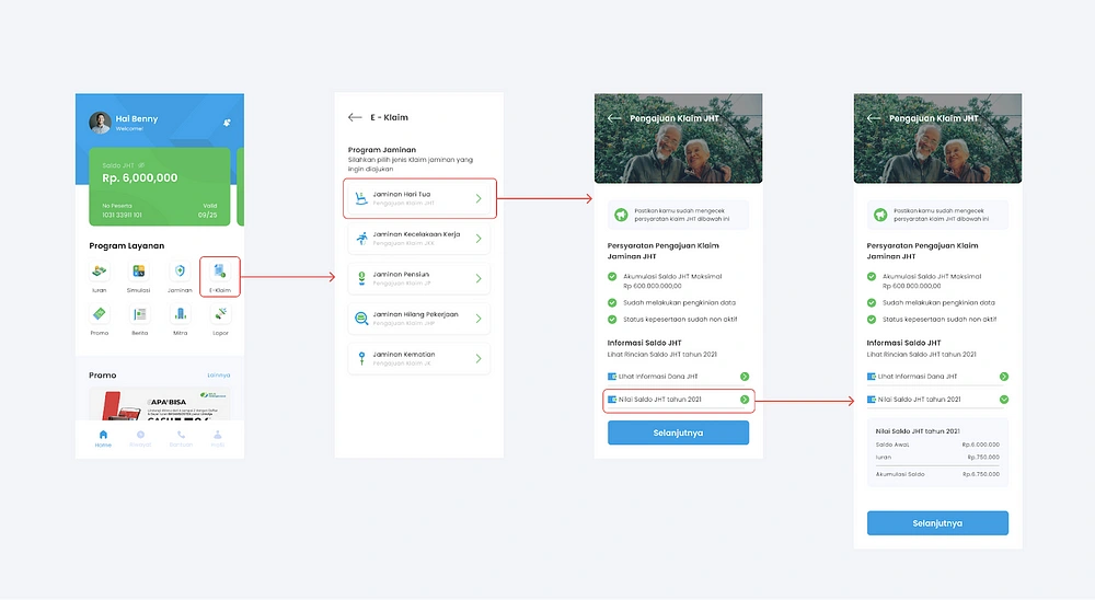
All users managed to complete the task without any problems. The layout, icons, and labels rendered in the new design view make it easier for users to complete this task. The grouping of icons based on the main features (costs, simulations, guarantees, e-claims, promos, news, partners and reports) can be easily found by users, in addition to using icons that clearly describe the purpose of these features, the use of labels also makes it easier for users to find the E-claim feature quickly.
Task 2 — Uploading application file
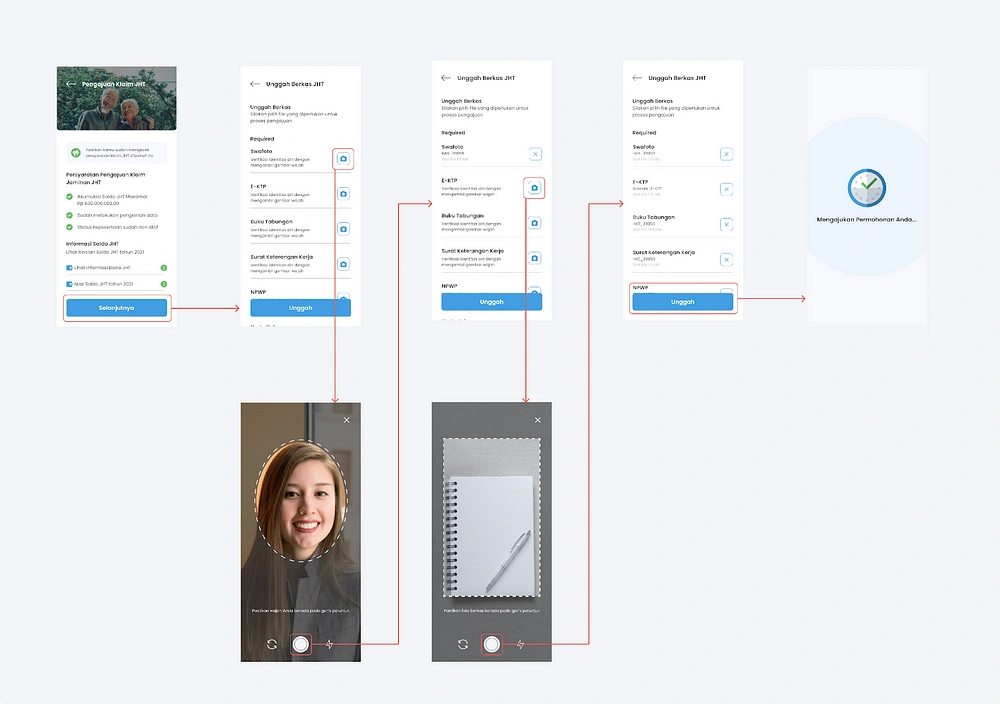
At this stage, all users can complete the task without any problems. Users like the idea of being able to see JHT fund info and JHT balance values before users continue uploading documents, besides that users can check what documents are needed for submission.
Task 3 — Memeriksa Riwayat & detail Pengajuan
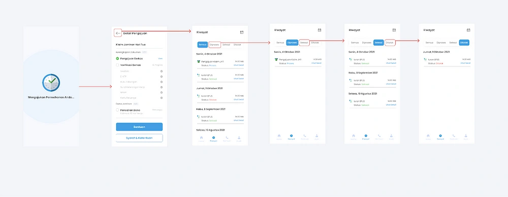
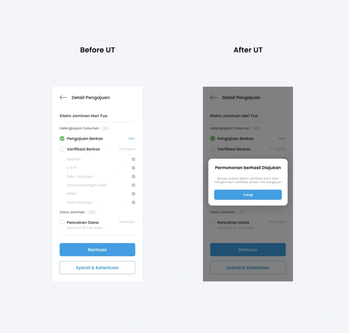
At this stage there are some users who are confused, this is because after the “submit your application” splash screen users are confused what to do when the submission details page is displayed, some users wait because it looks like loading and some select the return button as the expected journey.
Recommendation
There needs to be a popup containing the information “The application was successfully submitted, the file is currently being verified we will send a notification regarding the delivery info” With this, the user will assume that the file is being verified and the user needs to wait for notification from the application or periodic checks
Task 4 — Mengecek Notifikasi Pengajuan berhasil
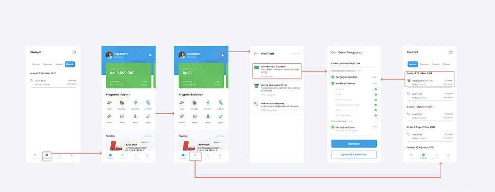
At this stage the user can complete the task without any problems, the user can check the progress of the submission or transaction made through the history menu on the navbar or on the notification feature when there is a submission or transaction in progress.
Summary
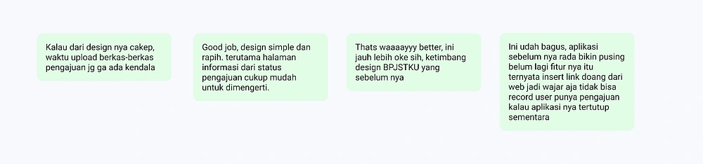
After asking some questions and asking users to perform tasks based on scenarios in the UT process, all users agreed that the new design is better and looks more modern than the old BPJTKU design. This is because the use of fonts, colors and layouts that are easy to understand by users, the selection of appropriate icons accompanied by the use of labels, and visual hierarchy make the whole interface look more modern and attractive.
Design Feedback:
Design Recomendations
After doing the UT process, I made design improvements based on the recommendations in the task.
Before UT:
After the file is uploaded, it is immediately directed to the submission detail page, some users are confused about the next trip because there is no guide/instruction
After UT:
Added a pop up showing the info “The application has been submitted successfully, the file is being verified, we will send a notification regarding the delivery info” This notification explains that the user needs to wait because the file is being verified and provides an option for the user to return to the home page and wait for the notification or check application periodically via the history menu or notifications
Conclusion
BPJSTKU is a platform initiated by BPJS Employment, this application can help users to pay dues besides the main feature of this application is to help simplify the claim submission process, users can monitor the progress of the submissions they have made
That’s it, thanks for reading! Feel free to leave a like or comment. I’m also open for further discussion, just ping me out :)
Personal Website: https://ajrindesign.framer.website/
Like this project
Posted Jun 3, 2025
Redesigned BPJSTKU app to improve user satisfaction and ease of claim submission.
Likes
1
Views
1
Timeline
Dec 23, 2021 - Dec 29, 2023