Built with Framer
Kodezi Website Redesign
Shammas Anwer
Kodezi - Turning a Powerful AI Tool into a Clear, Confident Website
Kodezi is an AI-powered debugging platform built to help developers understand, fix, and improve their code faster.
The product itself is powerful, but like many advanced developer tools, the challenge was not what it could do, it was how clearly that value could be communicated through the website.
That’s where this project began. 🚀
The Challenge
Kodezi’s previous website lacked clear content hierarchy and visual flow, making it harder for developers to quickly understand the product’s value. The interface felt busy in places, key messages were easy to miss, and the overall experience didn’t fully reflect the quality of the product.
The challenge was to simplify the layout, improve readability, and create a more confident, developer-focused presence without overcomplicating the desig
Walkthrough Video
When we started, the goal was simple but ambitious: create a website that feels as smart and capable as the product behind it. The site needed to speak to developers instantly, without over explaining or overselling. Everything had to feel intentional, fast, and credible.
We spent time aligning on what actually matters to Kodezi’s audience clarity, trust, and efficiency. From the very first scroll, the site had to answer one question: Why should a developer trust this tool with their code?
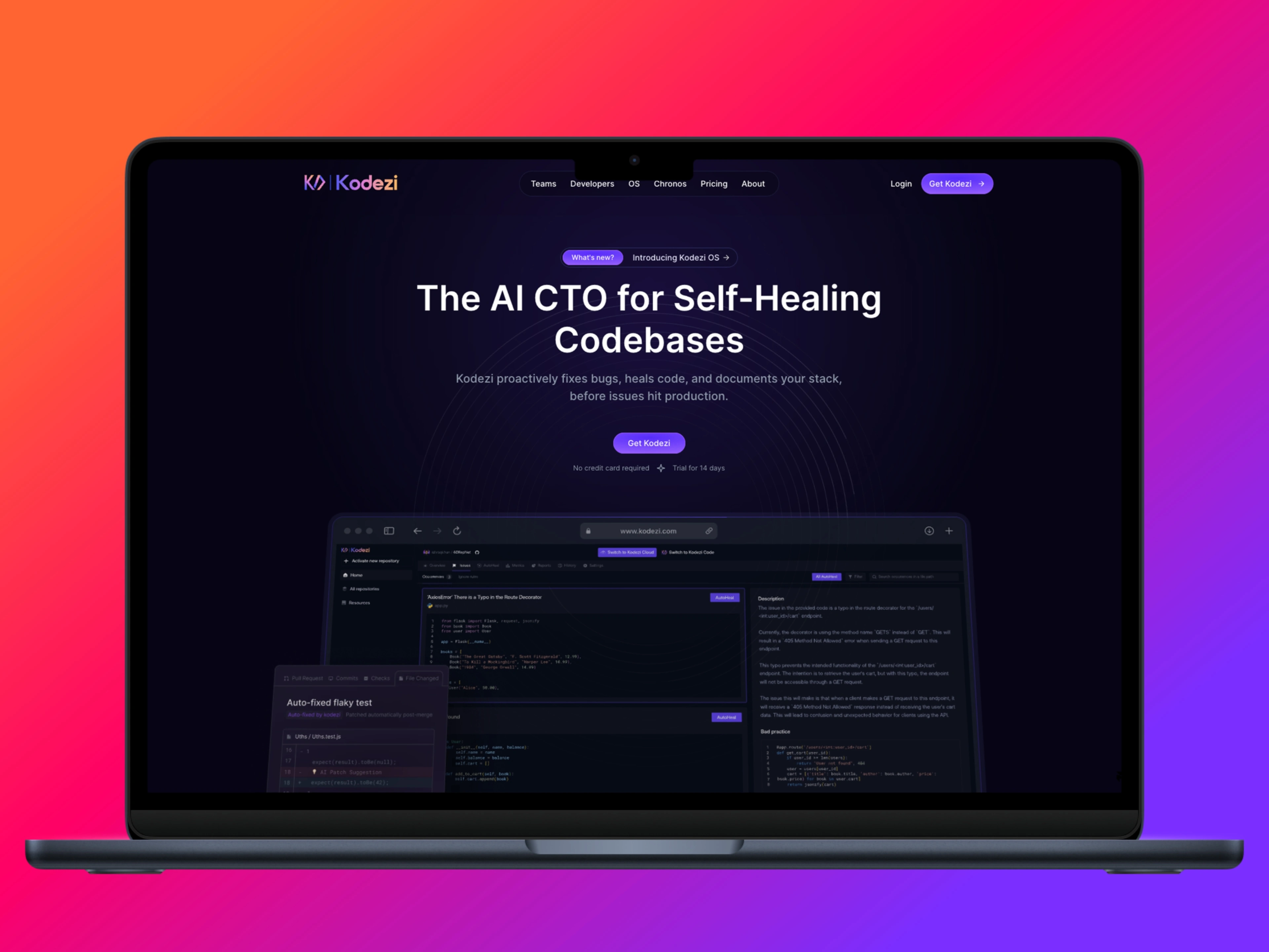
Hero Section
My Role
UI/UX design for a developer-focused SaaS website
Website rebuild and implementation in Framer
Content hierarchy, layout structure, and spacing system
Responsive design across desktop and mobile
Performance-friendly, scalable Framer setup
Hero Section OS
A big part of the process happened before any visuals were finalized. We discussed structure, messaging, and how each section should flow into the next. Instead of overwhelming visitors with features, we focused on guiding them introducing the product, showing how it works, and only then going deeper.
This approach helped shape the overall structure of the site and influenced every design decision that followed.
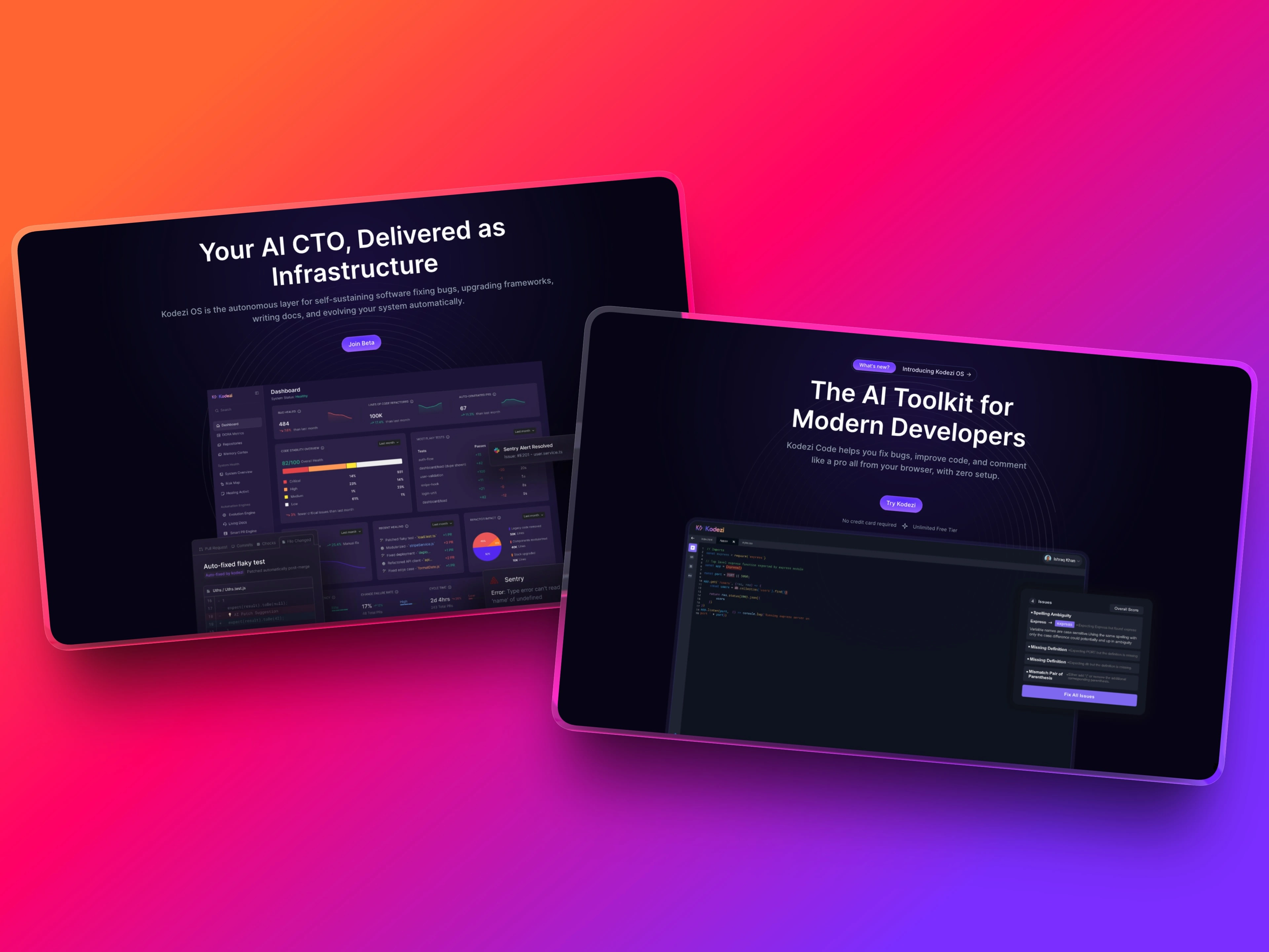
Overview of the OS and Developers Dashboard hero section
Visually, the direction leaned into a dark, developer-first aesthetic. Clean layouts, strong contrast, and subtle motion were used to reinforce the technical nature of the product without making the site feel heavy. Motion wasn’t added for decoration it was used to guide attention, highlight interactions, and add a sense of polish.
Small animations and transitions helped the interface feel alive, while still keeping performance and readability front and center.
Even small moments, like sign-up flows and pop-ups, were designed with care. These interactions needed to feel smooth and confident — reinforcing trust rather than interrupting the experience.
Signup Pop-up
Approach & Process
I started by rethinking the content structure to ensure developers could immediately understand what Kodezi does and why it’s useful. I focused on clarity first, simplifying sections, improving spacing, and creating a logical flow from hero to feature explanations.
Once the structure was clear, I translated the design into Framer using a clean, component-based setup. This allowed the site to stay flexible, easy to maintain, and ready for future updates.
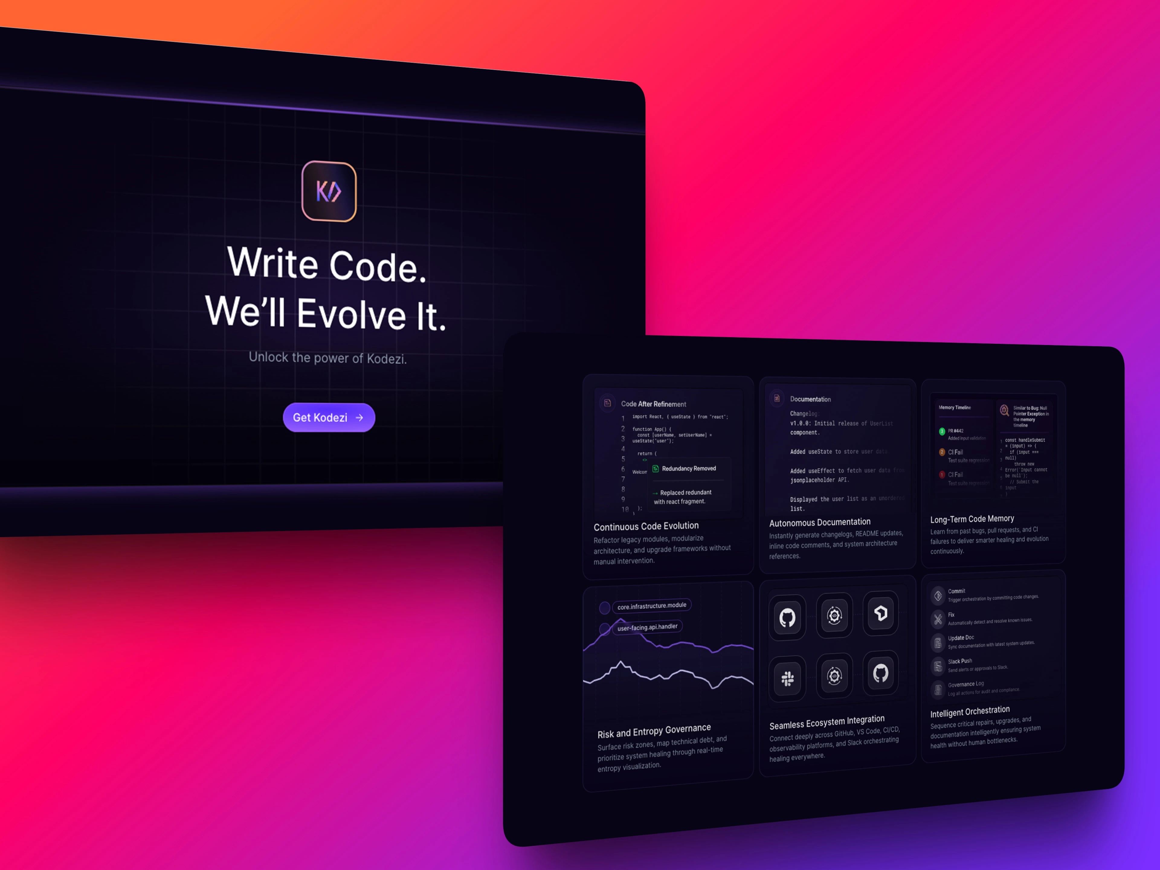
CTA & Feature Section
The Solution
A cleaner, more focused layout with clear visual hierarchy
Improved hero section to communicate the product’s value instantly
Developer-friendly typography and spacing for better readability
Consistent design system across all sections
Fully responsive implementation in Framer
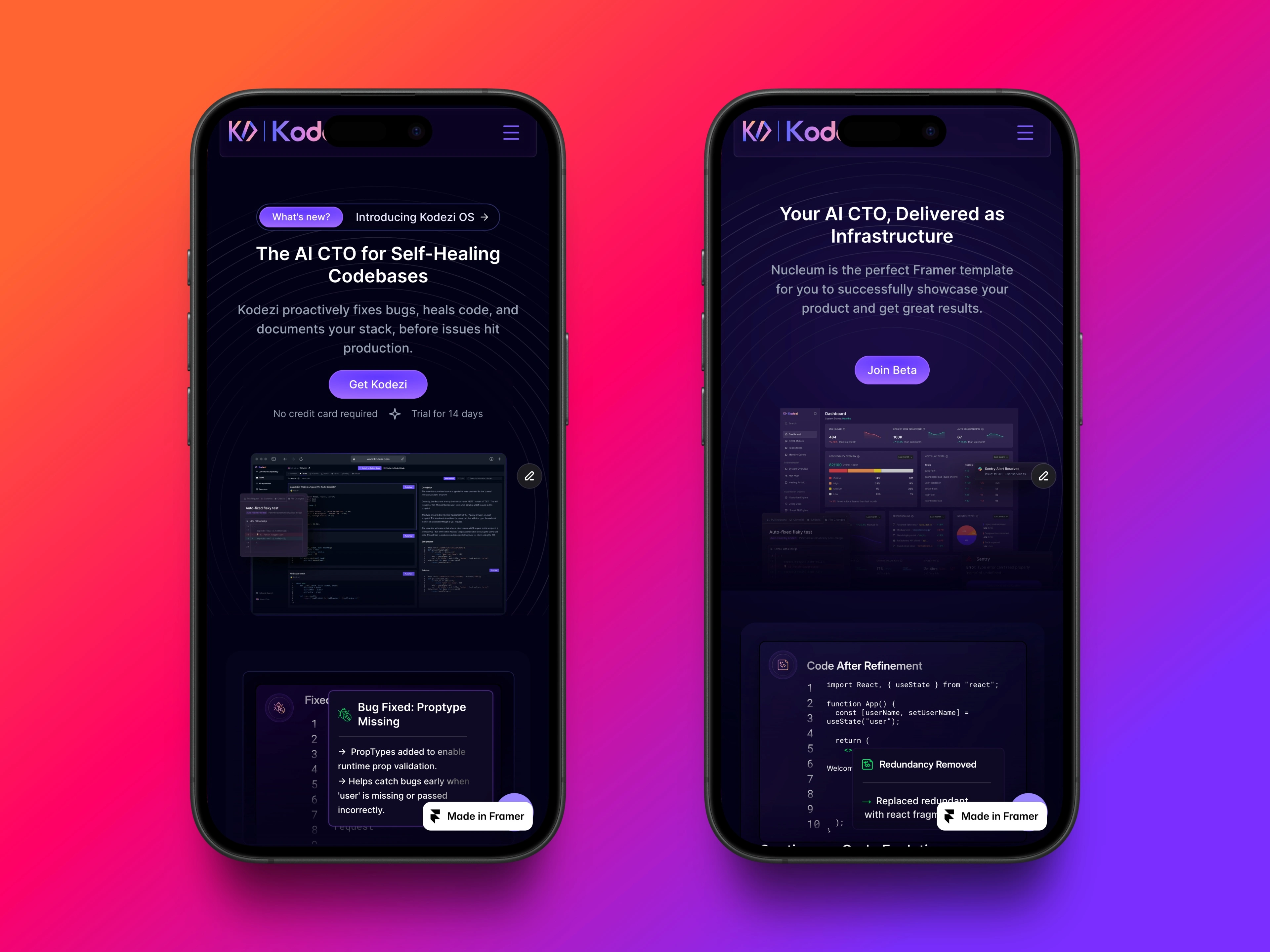
Mobile Overview
Mobile responsiveness
Mobile responsiveness was treated as a first-class experience, not an afterthought. Navigation, spacing, and calls to action were all adjusted to ensure the site felt just as clear and usable on smaller screens.
Outcome
The redesigned website presents Kodezi as a more credible and polished developer tool. The improved structure and visual clarity make it easier for users to understand the product, while the Framer build ensures long-term scalability and easy iteration for the team.
Like this project
Posted Jan 23, 2026
Kodezi is an AI-powered developer tool, and their website needed clearer messaging, stronger hierarchy, and a more trustworthy, developer-first experience.
Likes
3
Views
24
Timeline
Apr 25, 2025 - Jul 24, 2025
Clients
Kodezi