Built with Framer
Conversion-Focused Landing Page Redesign for Jadewell
Shammas Anwer
Jadewell – Chronic Pain Landing Page Optimization
Project Overview
Jadewell reached out because their landing page wasn’t doing what it was supposed to do. Traffic was coming in, but users weren’t converting. The page lacked clarity, the message felt scattered, and there was no strong flow guiding visitors toward action.
The goal of this project was to redesign the landing page with one clear focus: improve conversions by simplifying the experience and making the value immediately obvious.
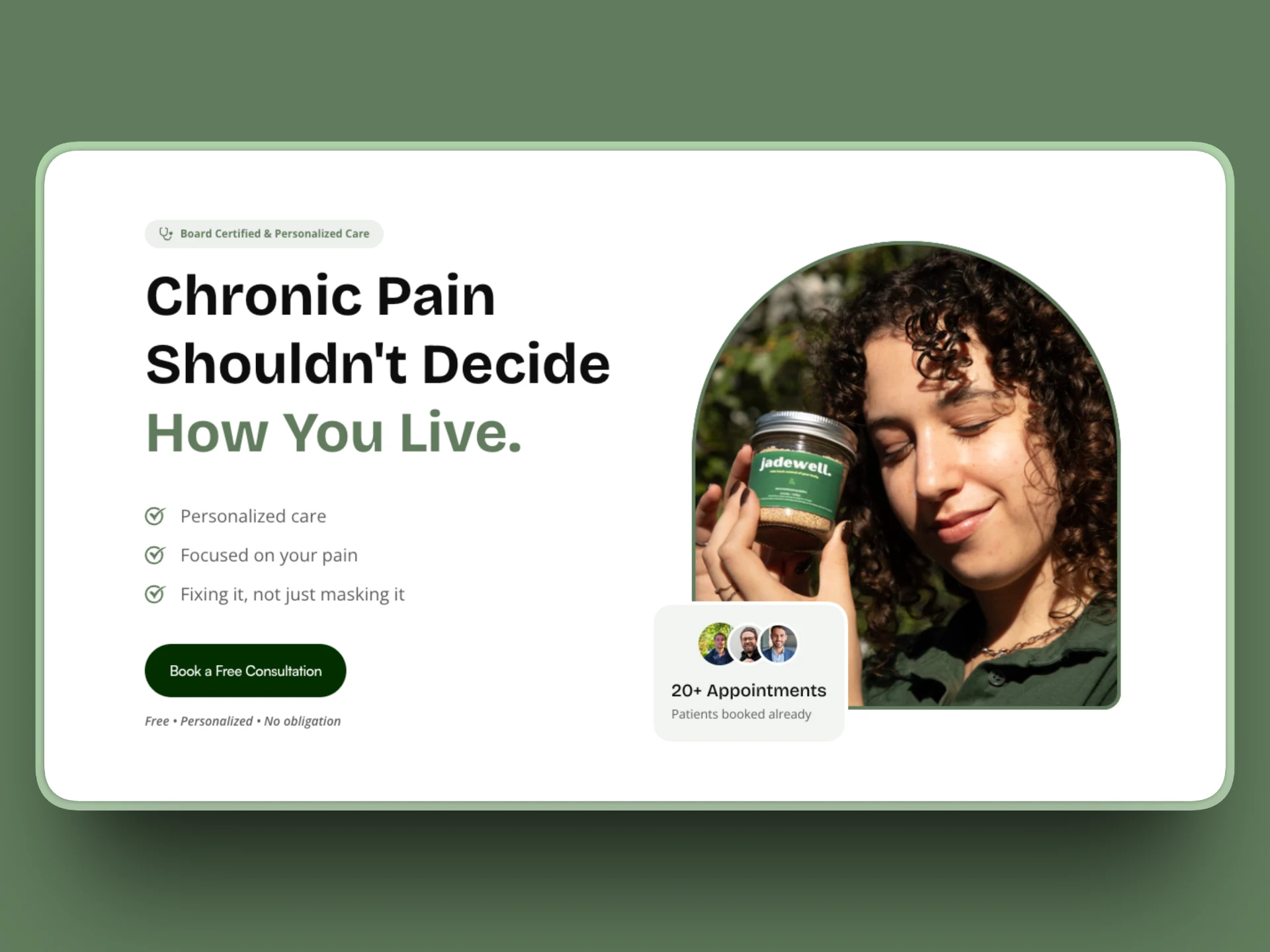
Hero Section
The Problem
The original landing page had a few key issues holding it back. The hero section didn’t clearly communicate the product’s value, the content hierarchy was weak, and calls-to-action were easy to miss. While the design wasn’t “bad,” it wasn’t working hard enough to support user decision-making.
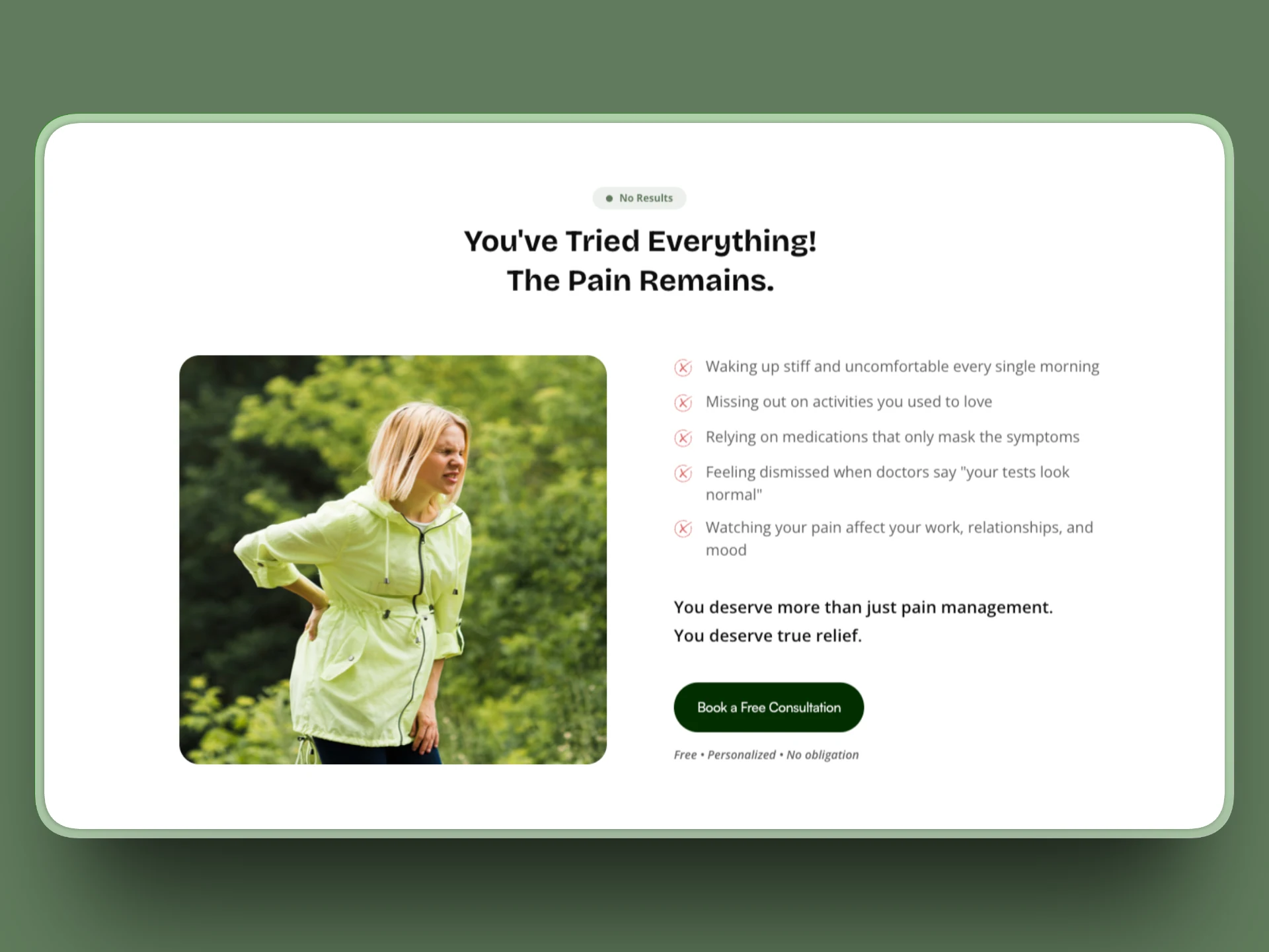
Results Section
The Strategy
I started by breaking down the user journey and restructuring the page in Figma. The focus was on clarity first, visuals second.
Key improvements included:
A stronger above-the-fold message that clearly explains what Jadewell offers
A more intentional content flow that answers user questions step by step
Clear, well-placed CTAs that feel natural rather than pushy
Improved spacing, typography, and visual consistency for better readability
After finalizing the layout, I rebuilt the page in Framer and refined responsiveness and interactions to ensure the experience felt smooth across all devices.
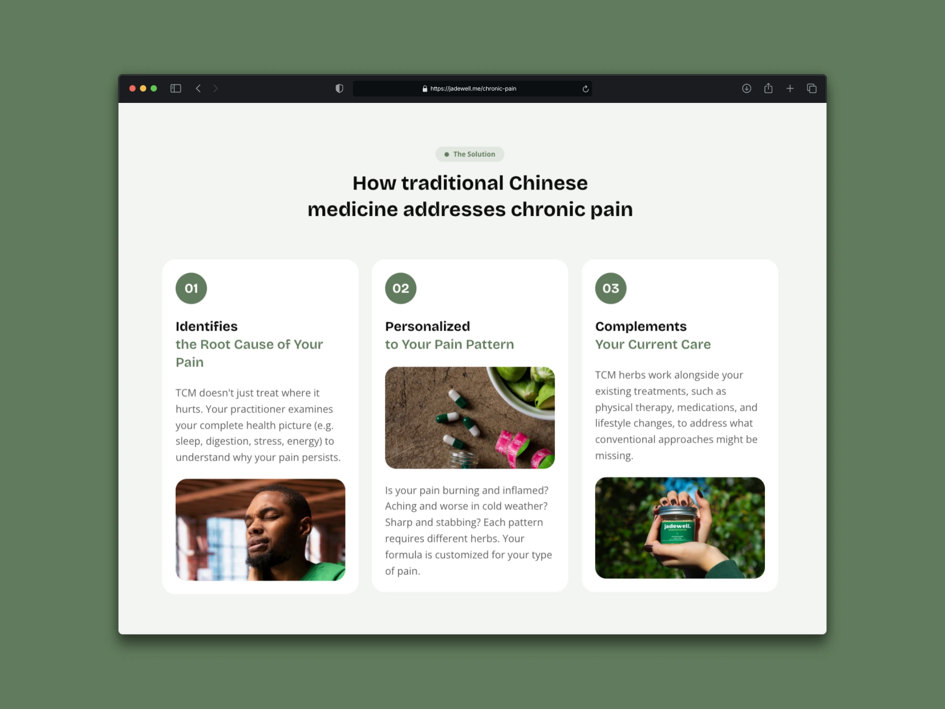
Solution
The Result
The redesigned landing page is clearer, more focused, and built to convert.
Users can now quickly understand the product, move through the page without friction, and reach conversion points with confidence. The final result is a landing page that supports Jadewell’s goals while delivering a clean, professional user experience.
This project highlights how a thoughtful, conversion-first redesign can make a meaningful impact without overcomplicating the design.
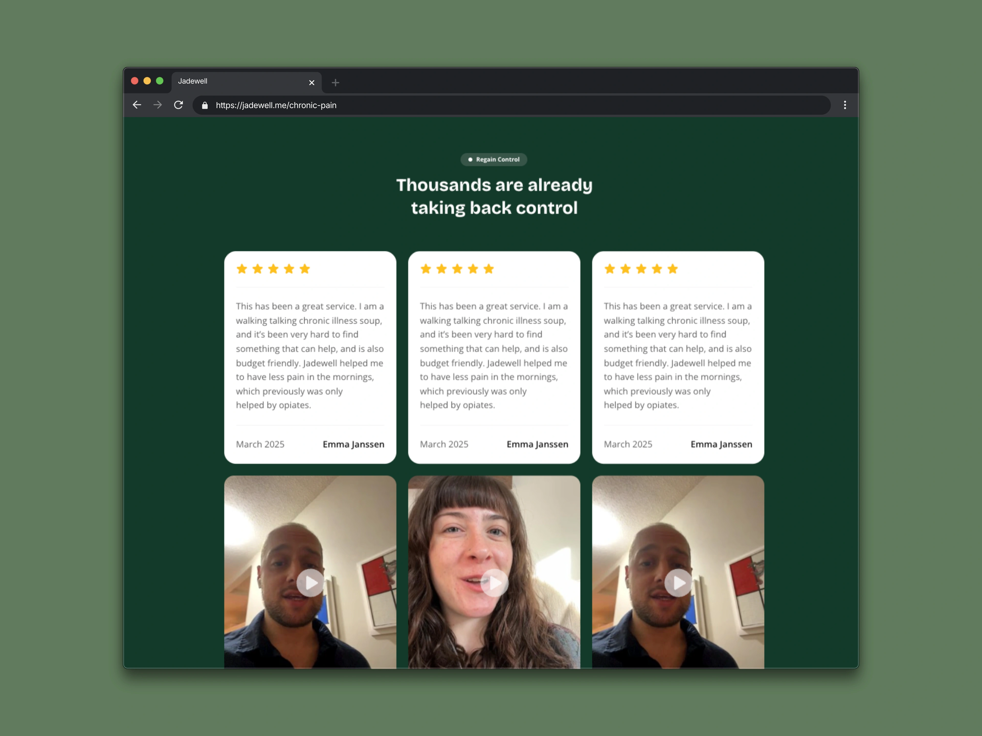
Testimonials
Tools & Skills
Web Design · Figma · Framer · Conversion-Focused UX
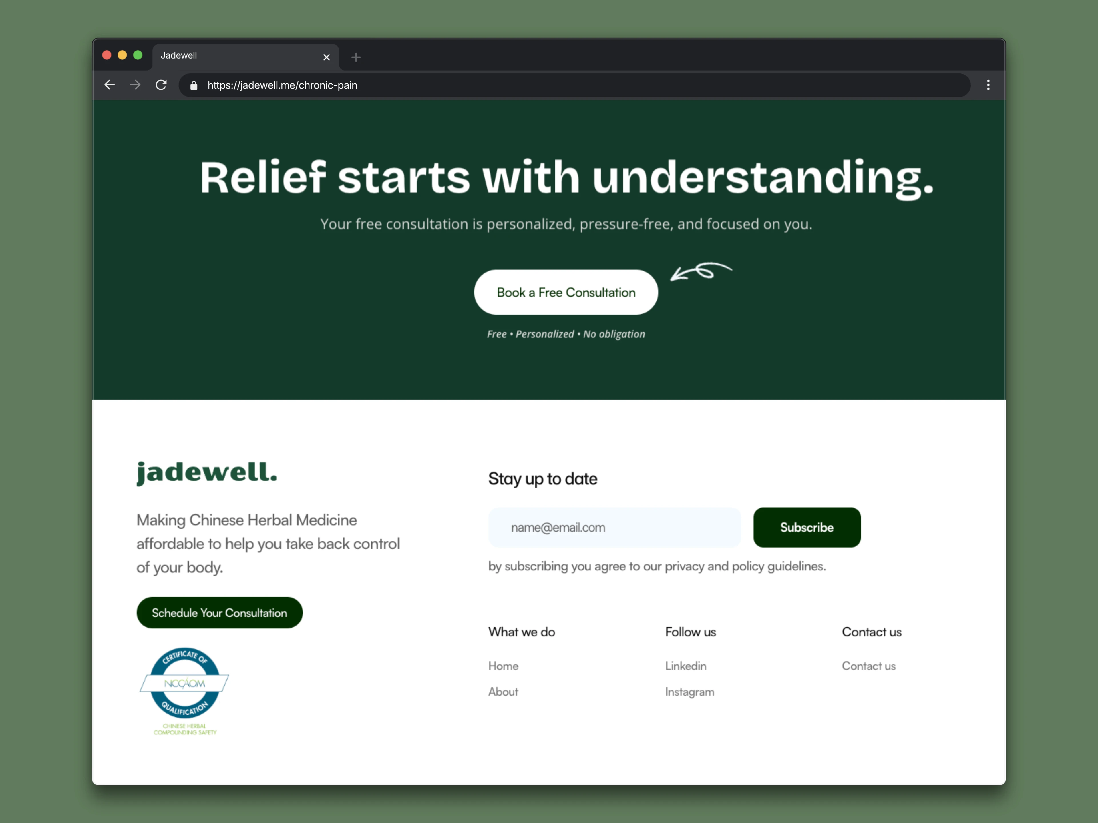
CTA & Footer
Like this project
Posted Jan 10, 2026
Led a conversion-focused redesign of Jadewell’s landing page, improving messaging clarity, user flow, and CTA effectiveness.
Likes
3
Views
9
Timeline
Jan 8, 2026 - Jan 14, 2026