Rental Platform Design

Karan Singh


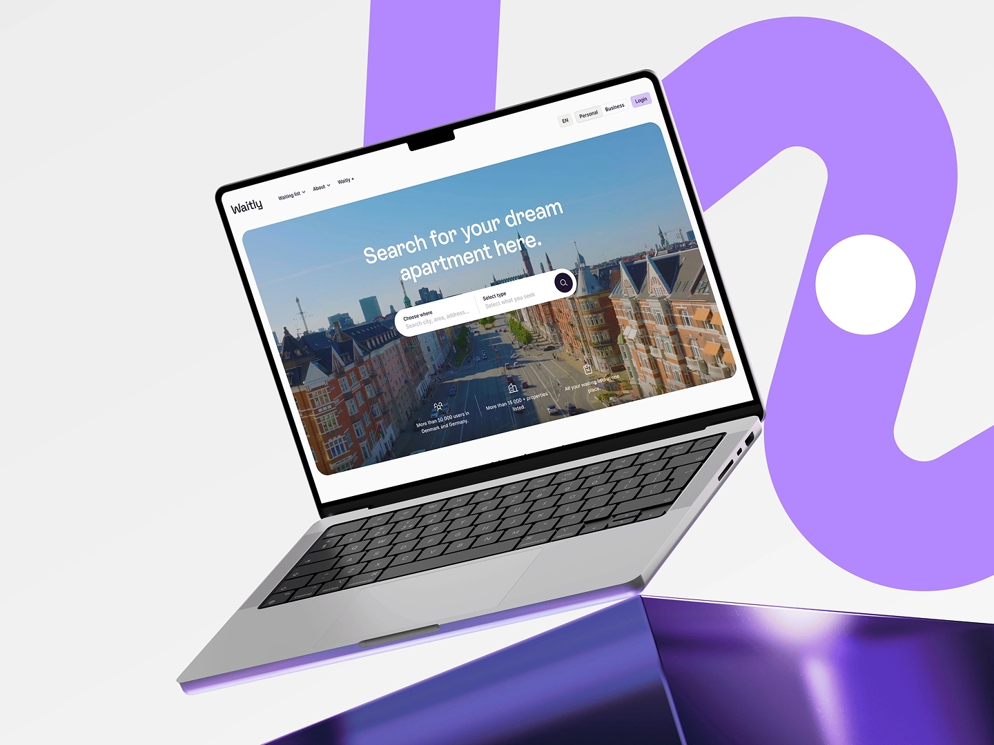
Rental Housing & Applicant Management Platform
Overview
Waitly is a digital platform designed to simplify the rental journey by connecting prospective tenants with residential properties through a seamless application experience. The project focused on creating an intuitive interface that helps users browse available homes, manage applications, and stay informed throughout the rental process while providing property managers with efficient tools to organize applicants.
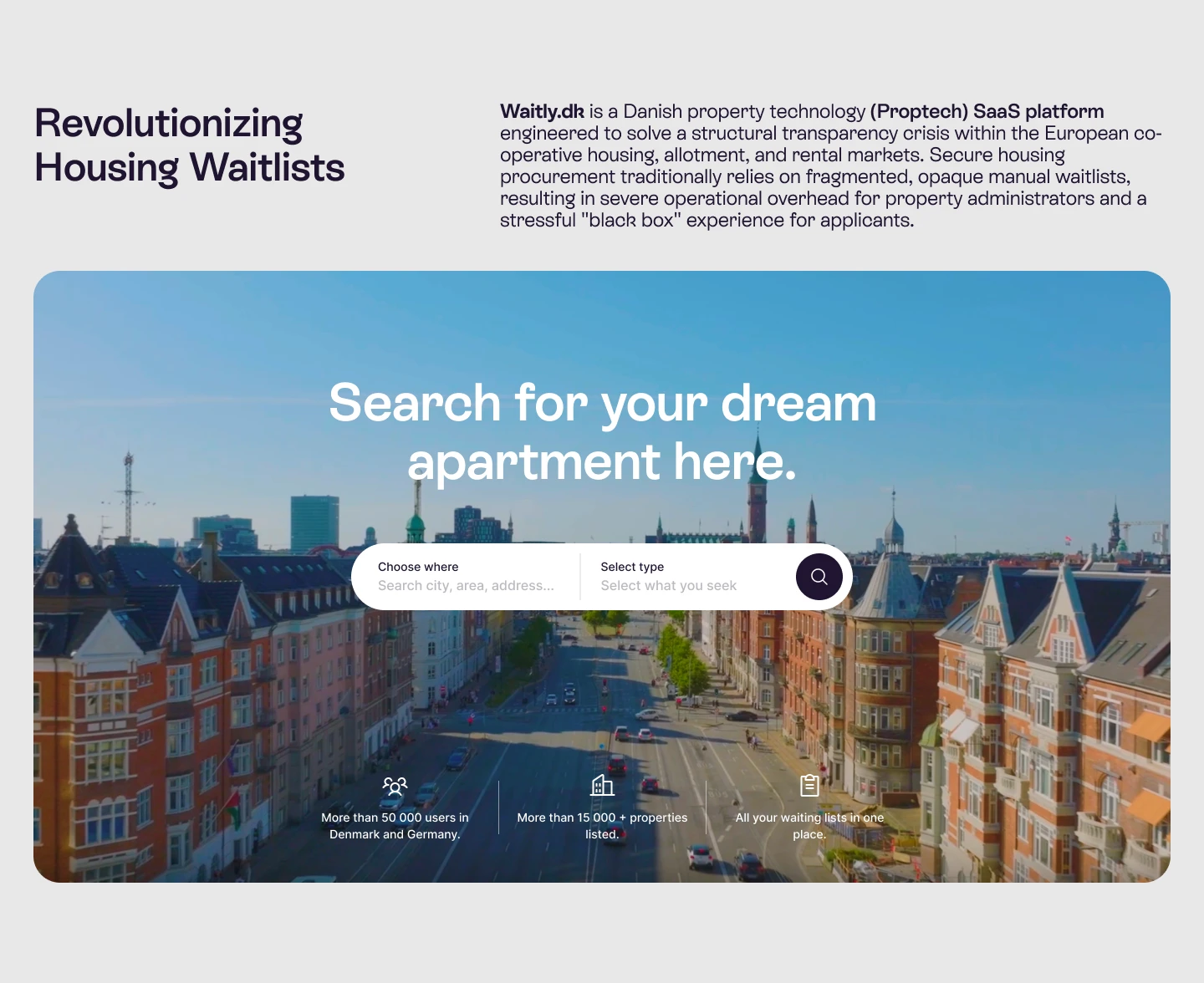
Seach Property Feature
The Problem
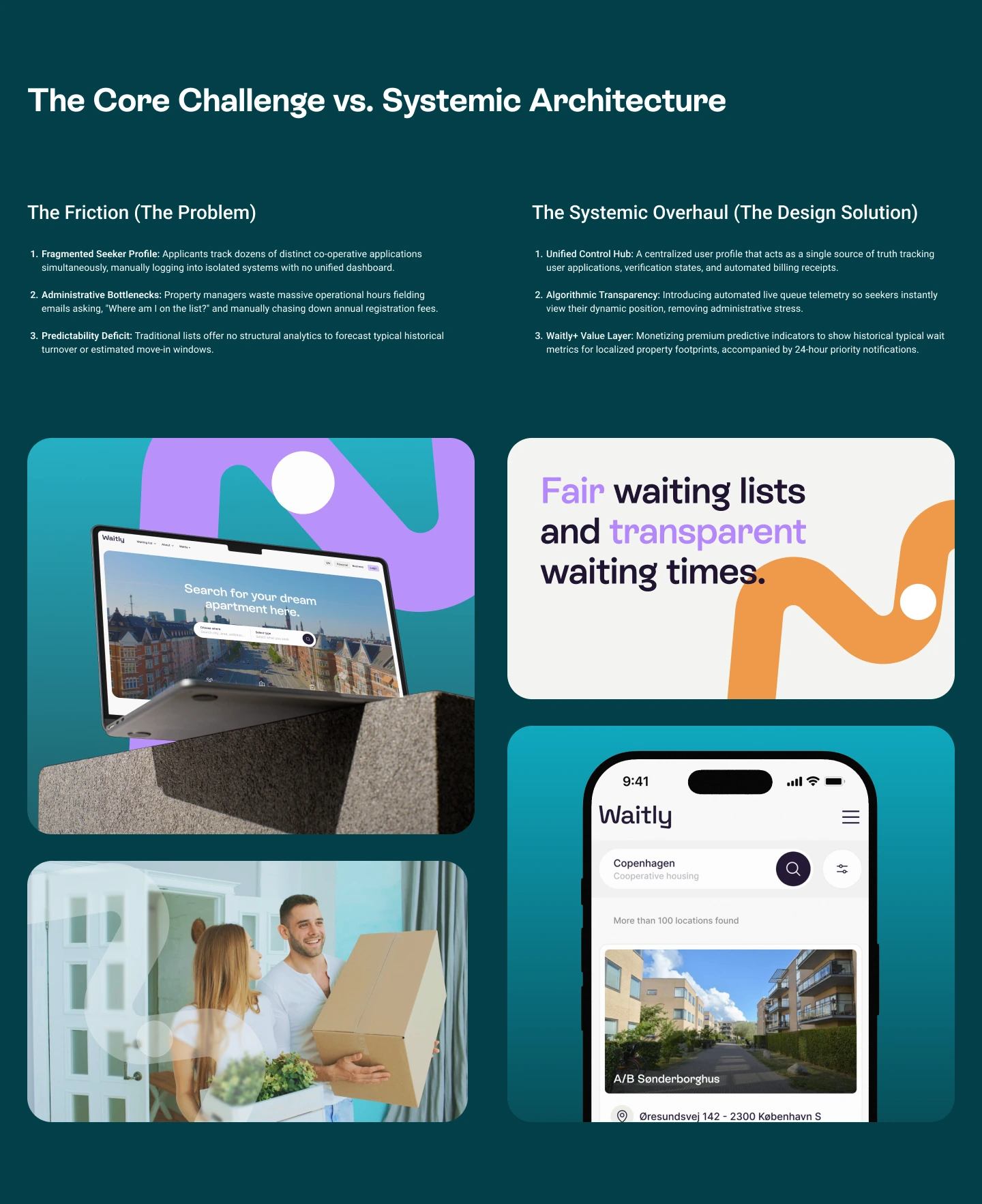
The rental application process is often fragmented, requiring users to navigate multiple websites, complete repetitive forms, and wait without clear communication about their application status. Property managers also struggle with manually organizing inquiries and applicant information.
The challenge was to design a solution that simplifies both sides of the rental experience while maintaining a clean and scalable interface.
The Solution
A unified rental platform designed to simplify the entire journey - from discovering a property and submitting an application to tracking status and managing waiting lists.
01 - One connected experience
Bring property search, applications, waiting lists, and communication into one platform.
02 - Less repetitive work
Create reusable applicant profiles so users don't have to repeatedly enter the same information.
03 - Complete visibility
Give renters clear application and waiting-list status at every stage.
04 - Smarter management
Help property managers manage applicants, properties, and waiting lists through streamlined workflows.
05 - Built to scale
Create a flexible design system that supports multiple user roles, devices, and future product expansion.
Project Goals
Improve the apartment discovery experience
Simplify the application process
Build trust through clear communication
Create a responsive experience across all devices
Develop a scalable design system for future growth
My Role
As the Product Designer, I led the complete design process from concept to final UI.
Responsibilities
UX Research
User Journey Mapping
Information Architecture
Wireframing
Interface Design
Design System
Interactive Prototyping
Responsive Design
Design Documentation
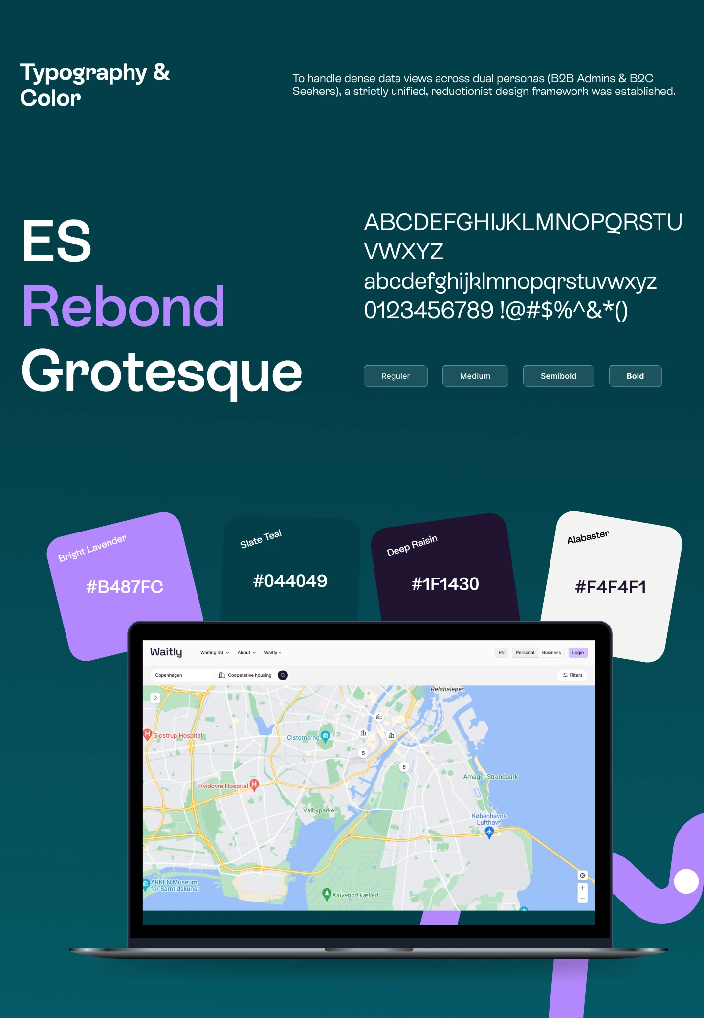
Typography
Typography & Colors
Typography
A clean, modern sans-serif typeface was selected to maximize readability and create a consistent visual hierarchy across the platform. Different font weights and sizes help users quickly distinguish between headings, property details, actions, and supporting information.
The typography system was designed with accessibility in mind, ensuring comfortable reading across desktop, tablet, and mobile devices.
Typography Principles
Clear visual hierarchy
High readability
Consistent spacing and alignment
Responsive scaling across devices
Accessible contrast and font sizing
Color System
The color palette combines neutral tones with vibrant accent colors to create a modern and trustworthy experience. Soft backgrounds reduce visual noise, while accent colors highlight important actions, navigation, and system feedback.
Each color serves a specific purpose, helping users quickly recognize interactive elements and status updates throughout the platform.
Color Usage
Primary – Main actions, buttons, links, and active states.
Secondary – Supporting UI elements and secondary actions.
Neutral – Backgrounds, cards, borders, and typography.
Success – Confirmations and completed actions.
Warning – Alerts and important notifications.
Error – Validation messages and critical feedback.
Design Principles
The visual system was built around four core principles:
Clarity – Present information in an easy-to-understand format.
Consistency – Maintain a cohesive experience across every screen.
Accessibility – Ensure sufficient contrast and readable typography.
Scalability – Support future features with a flexible design system.
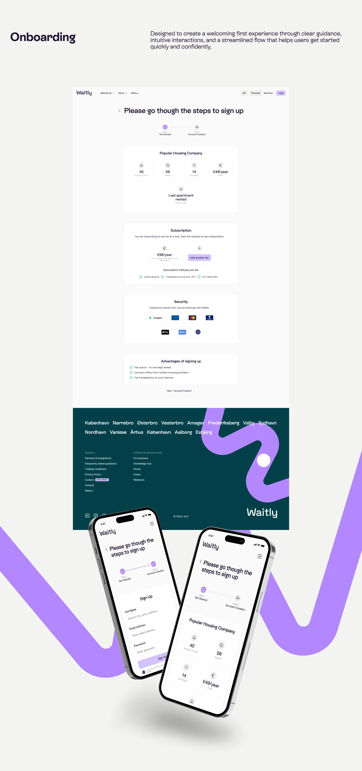
Onboarding
Onboarding Experience
The onboarding flow was designed to help new users get started quickly with minimal effort. Instead of overwhelming users with lengthy forms, the experience is broken into clear, manageable steps that guide them through account creation and profile setup.
The onboarding process introduces key platform features, collects only essential information, and provides clear progress indicators to reduce uncertainty. Thoughtful form layouts, contextual guidance, and intuitive interactions help users complete registration confidently while minimizing drop-offs.
Goals
Simplify account creation with a step-by-step flow
Reduce cognitive load by collecting information gradually
Build user confidence through clear instructions and progress tracking
Create a frictionless first-time experience across desktop and mobile
Encourage users to complete their profile and begin exploring properties immediately
Design Highlights
Multi-step registration flow
Clean and distraction-free interface
Progress indicators for better navigation
Real-time form validation
Mobile-friendly responsive design
Accessible form components and clear visual hierarchy
Outcome
The redesigned onboarding experience creates a welcoming first impression, reduces registration friction, and enables users to start browsing and applying for properties in just a few simple steps. By focusing on clarity and ease of use, the flow supports higher completion rates and a more engaging user journey.
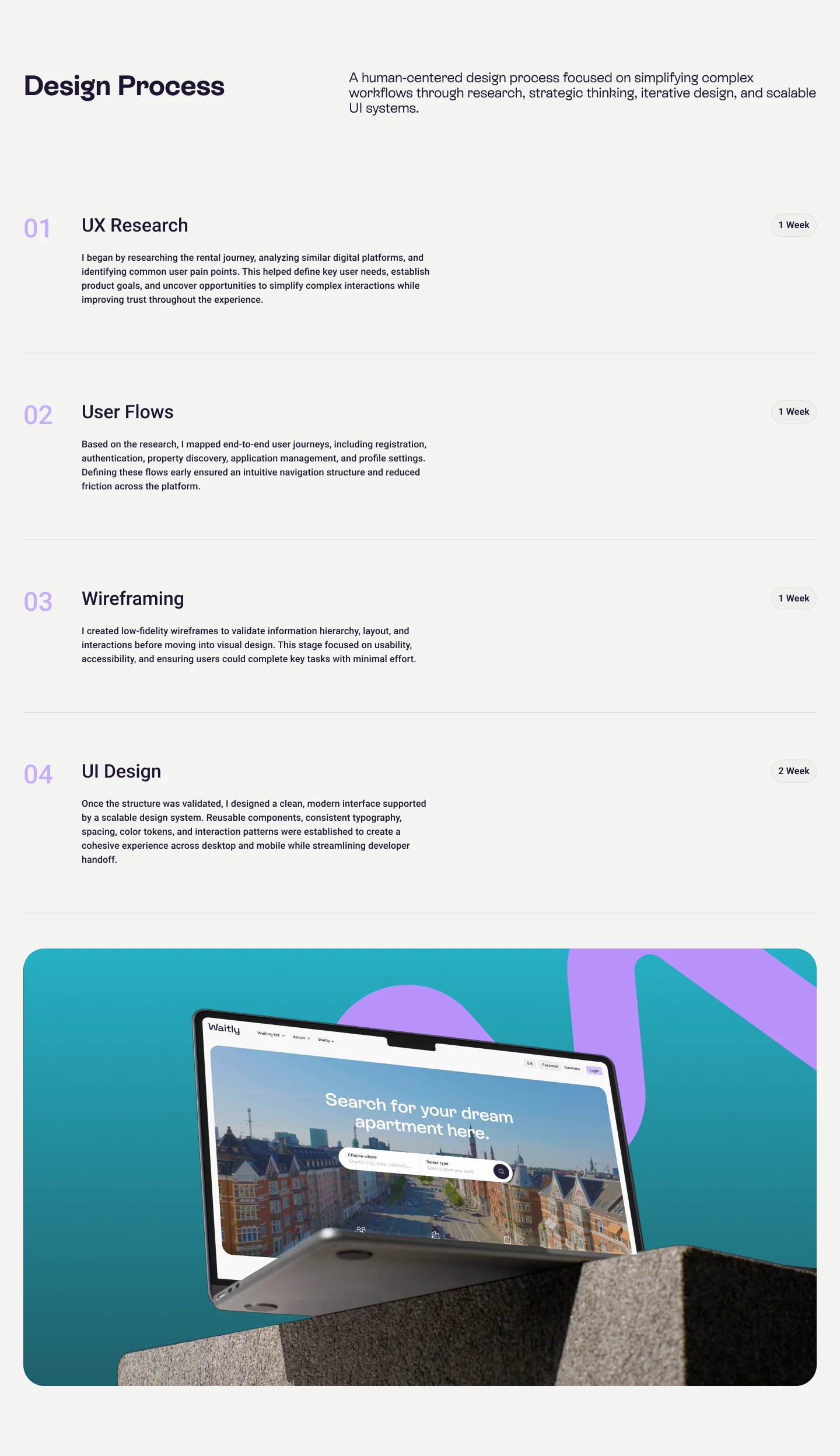
Design Process
Design Process
The design process began with understanding user needs, business objectives, and industry trends through research and competitive analysis. Based on these insights, I mapped user journeys and organized the platform's information architecture to create a seamless navigation experience. After establishing the structure, I designed wireframes and transformed them into polished, high-fidelity interfaces using a scalable design system. Finally, interactive prototypes were created to validate key user flows, refine the experience through feedback, and deliver developer-ready designs for a smooth implementation process.
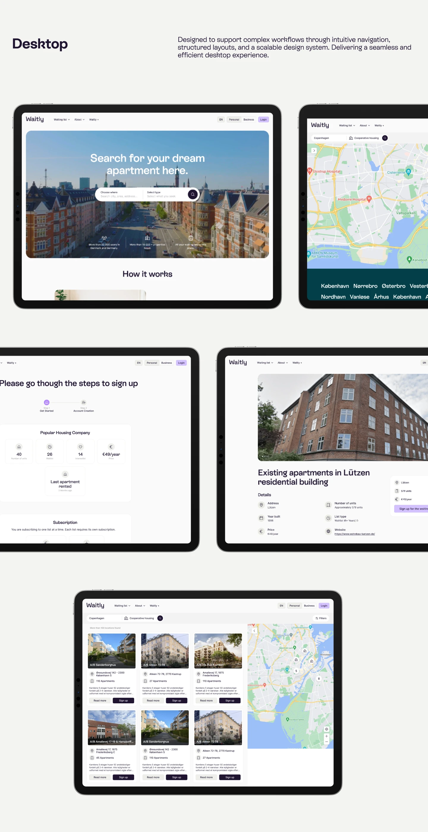
Desktop
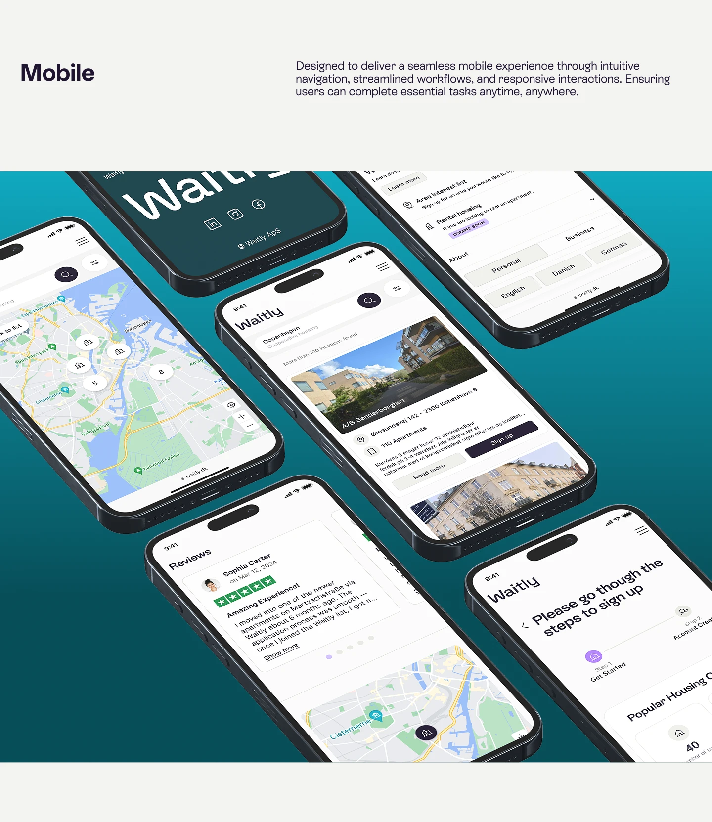
Mobile
Key Features
Property Marketplace
Browse residential listings using visually rich property cards with essential details and imagery.
Advanced Search
Filter homes based on location, budget, property type, and other preferences to quickly discover suitable options.
Digital Applications
Complete rental applications through an organized workflow that minimizes unnecessary steps.
Application Tracking
Monitor submitted applications and receive clear status updates through a centralized dashboard.
Responsive Experience
A fully responsive interface ensures a consistent experience across desktop, tablet, and mobile devices.
Its an modern rental housing platform designed to simplify property discovery, digital applications, and applicant management. The platform provides a seamless experience for prospective tenants to browse available homes, submit rental applications, and track their progress, while enabling property managers to efficiently manage listings and applicant workflows through a centralized dashboard.
Role: Product Designer
Timeline: 2 Months
Tools: Figma, Notion, Adobe Illustrator
Target Audience: Property Managers, Real Estate Companies, Housing Associations, Landlords, and Prospective Tenants.
Ready to Elevate Your Product?
From SaaS platforms and enterprise dashboards to web and mobile applications, I design intuitive experiences that solve real business problems and delight users.
Let's create something exceptional together.
Like this project
Posted Jul 22, 2026
Designed a user-friendly rental application platform enhancing tenant and property manager experiences.
Likes
1
Views
16
Timeline
Feb 22, 2026 - Mar 19, 2026