Otis Marlowe –– Brand Identity
Cerwarh _

ABOUT
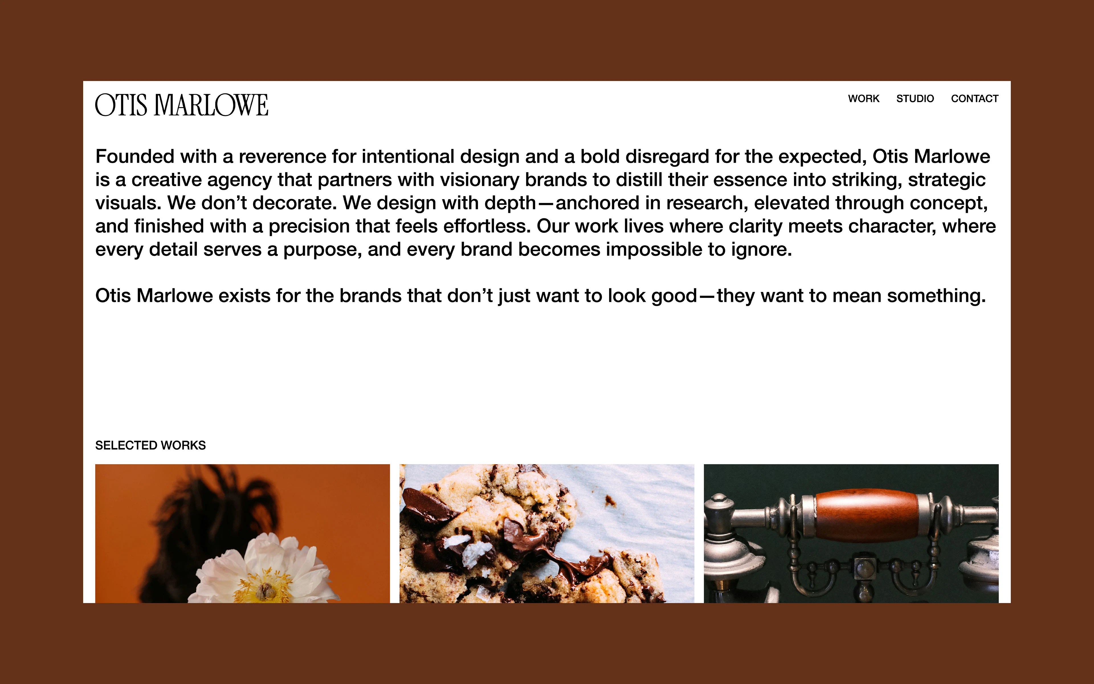
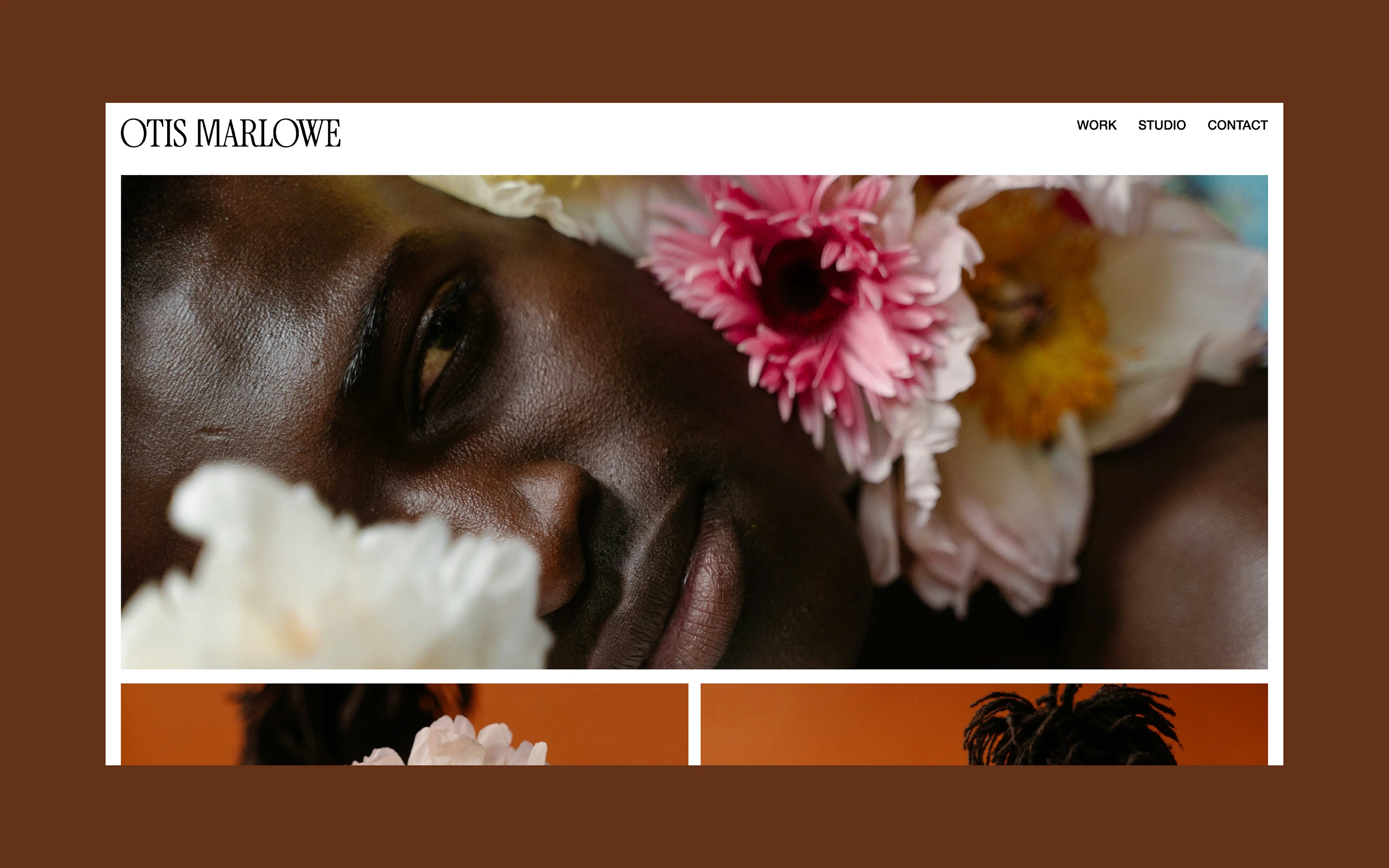
Founded with a reverence for intentional design and a bold disregard for the expected, Otis Marlowe is a creative agency that partners with visionary brands to distill their essence into striking, strategic visuals. Positioned between editorial clarity and artful provocation, the studio exists for brands that want more than surface—those who seek substance, system, and soul in every visual expression.
OBJECTIVE
The brand needed to communicate a sense of modern luxury, embodying confidence without noise, and depth. Every element was to feel deliberate, refined, and timeless.
SOLUTION
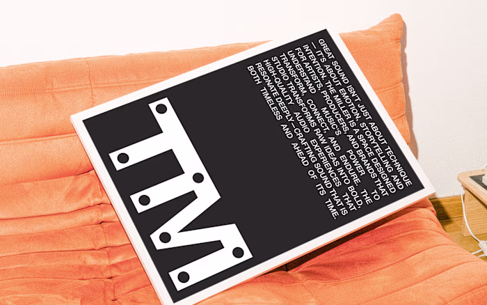
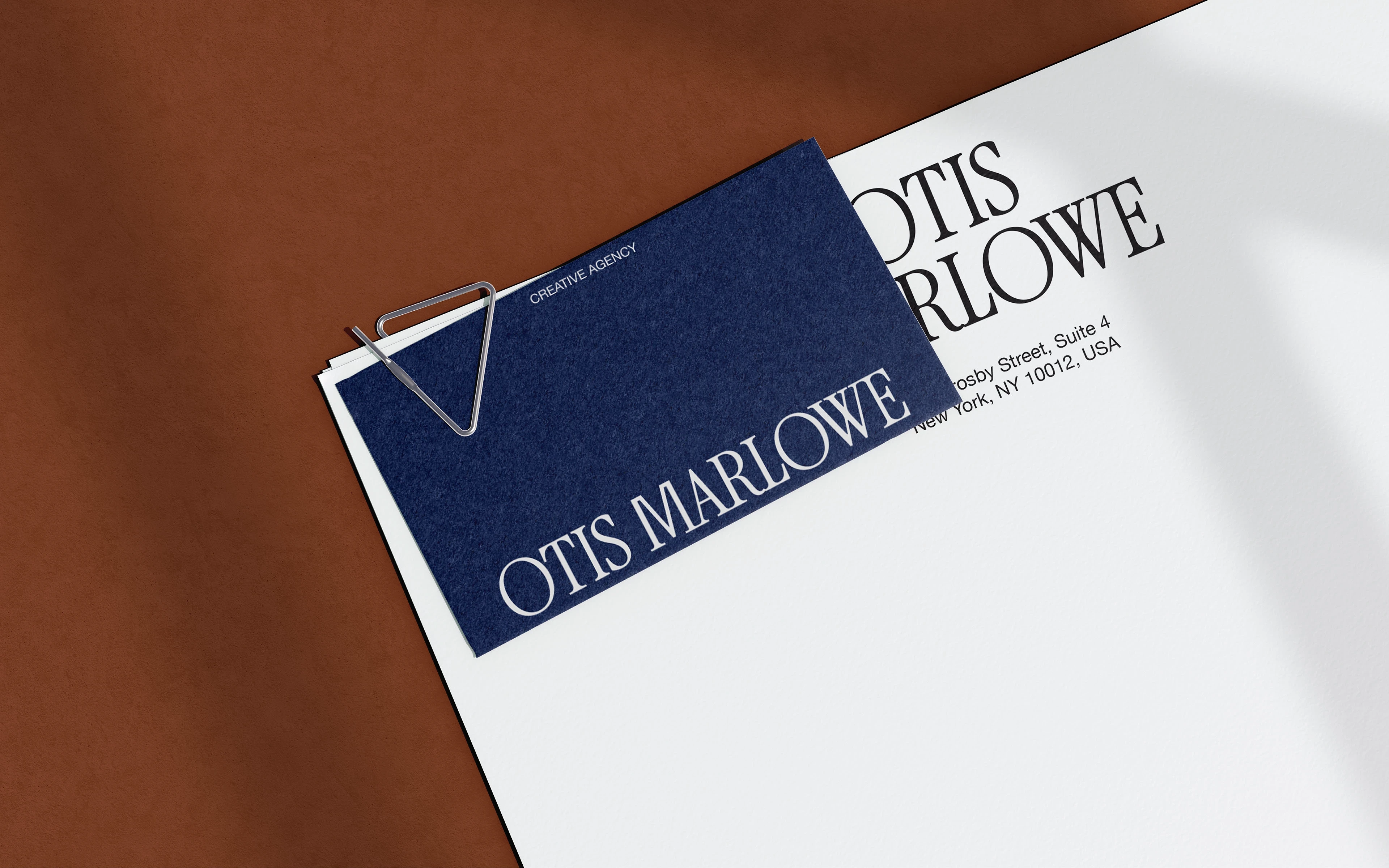
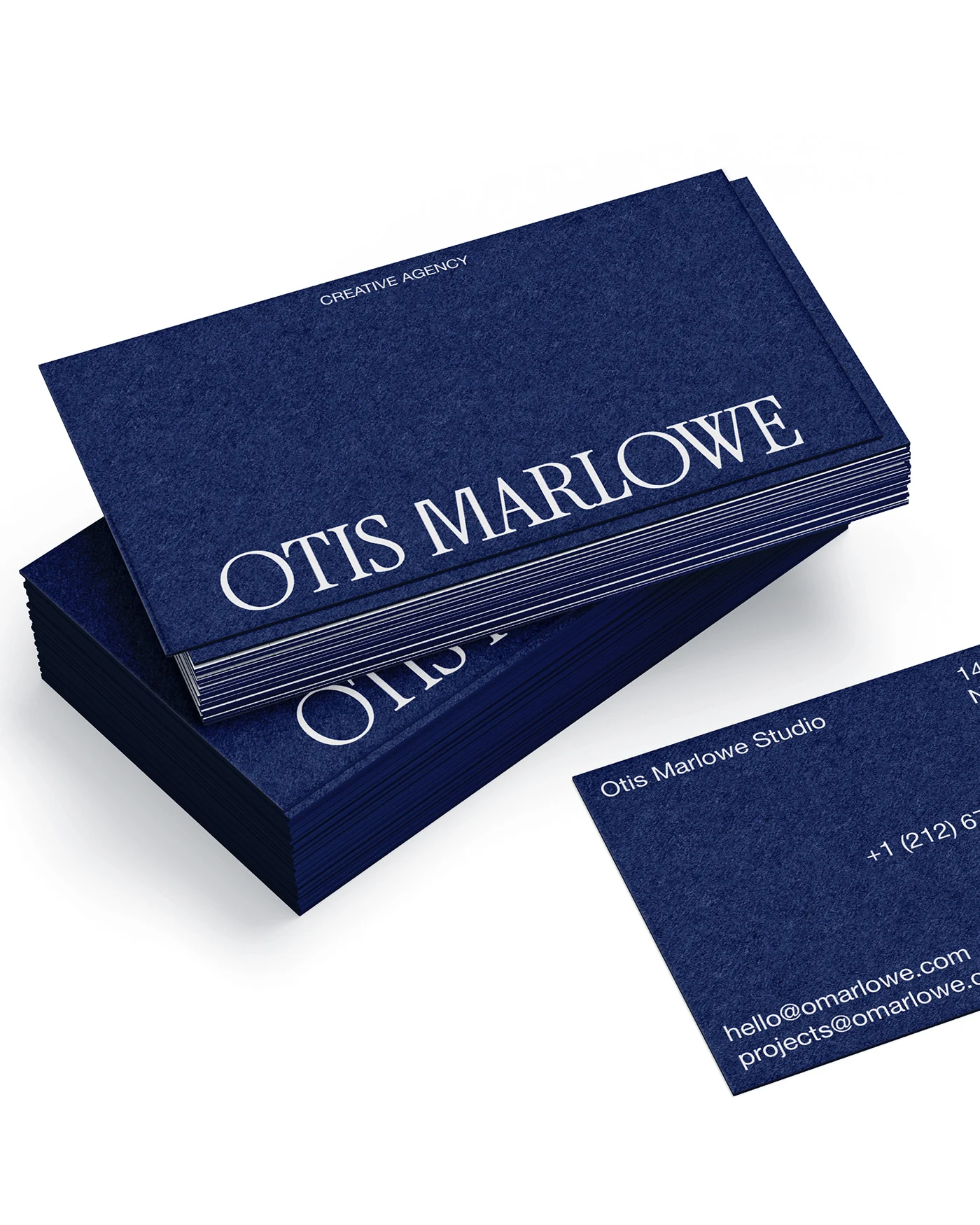
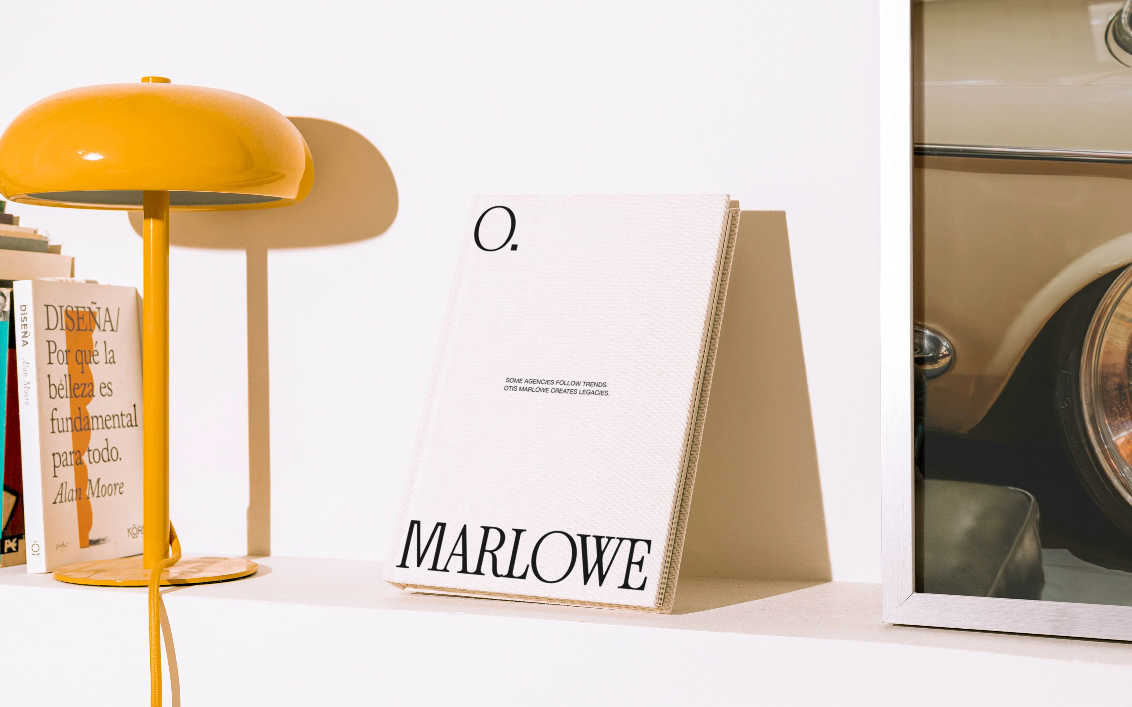
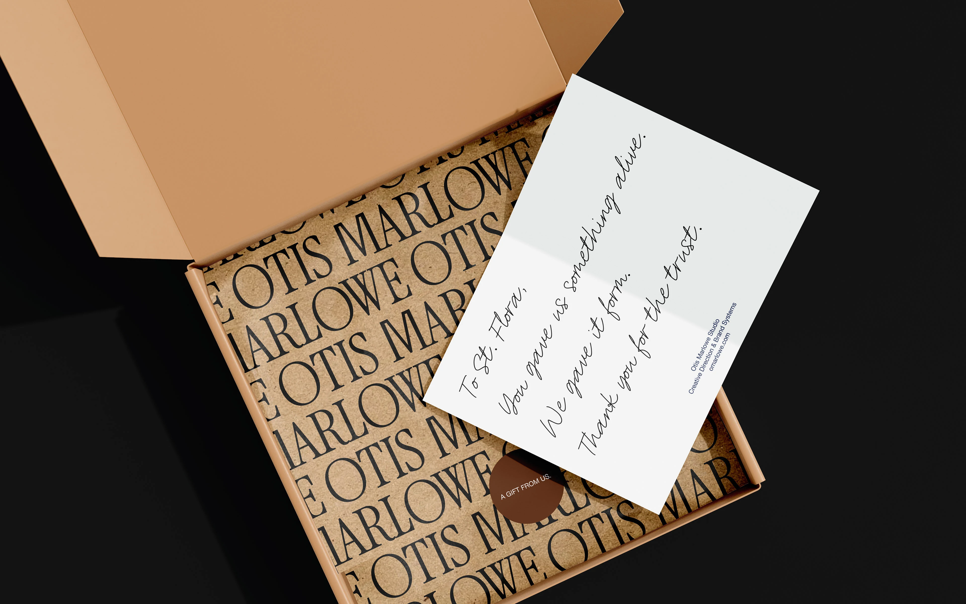
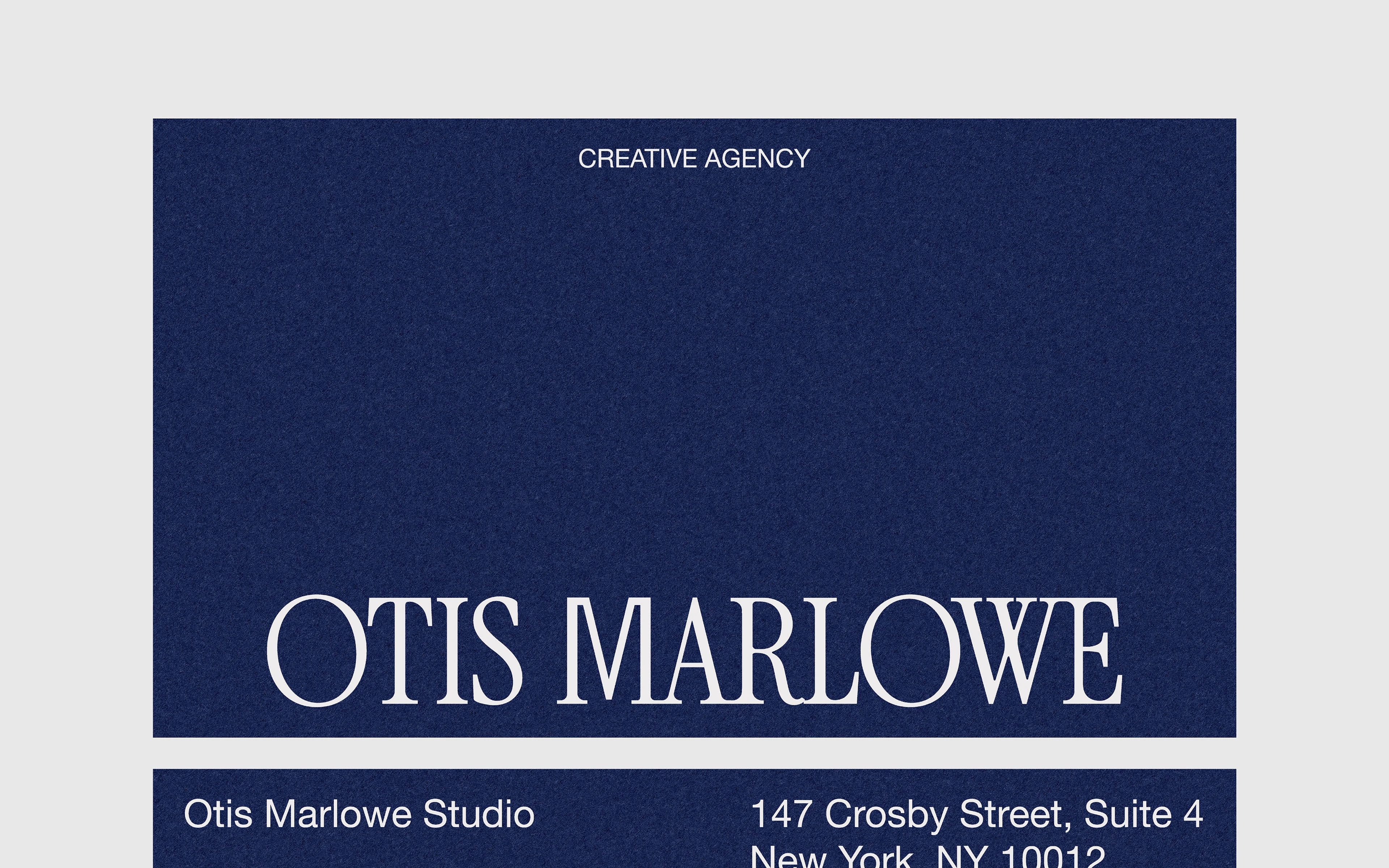
For Otis Marlowe, the goal was to express through clarity. The identity was crafted to reflect a studio that leads with intelligence and intent. It had to feel quietly commanding, editorial in attitude, and undeniably distinct. The logo is confident, balanced, and unhurried. It's sculpted form evokes class. A single, dominant hue, deep navy, anchors the system. It’s intellectual, grounded, and rich with character. The supporting tone, chocolate brown, was introduced not for vibrancy, but for depth. The sans serif used throughout the system is quietly assertive. There’s no flair. Just purpose. The visual identity doesn’t try to say everything. It says only what matters and says it well.
Like this project
Posted Jun 3, 2025
Created a refined brand identity for Otis Marlowe, embodying modern luxury and confidence. Every element was to feel deliberate, refined, and timeless.