Shire Development & Marketing | Brand Identity Design
Md Sadiqur Rahman Fahim
Story:
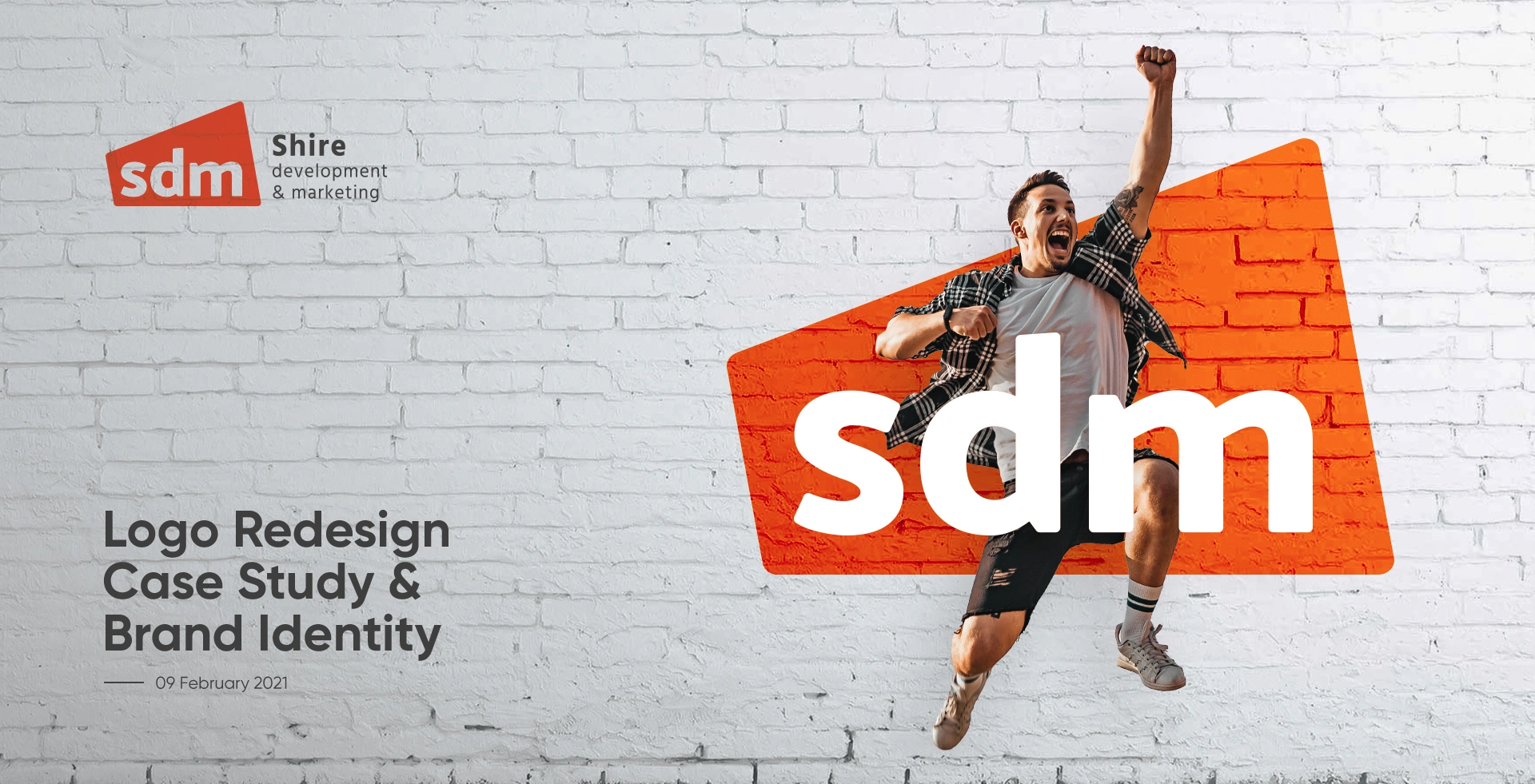
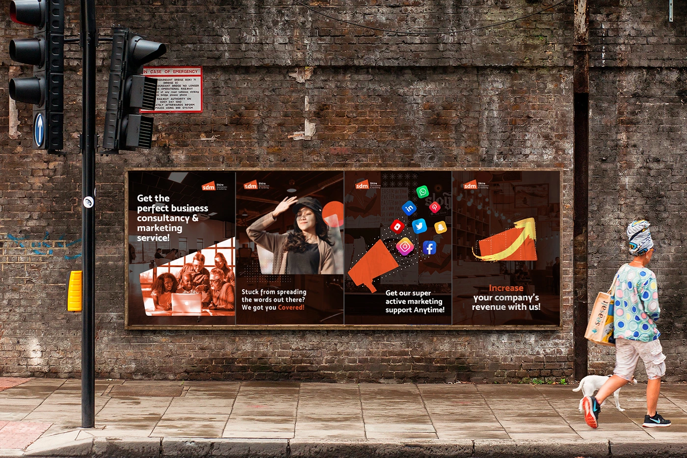
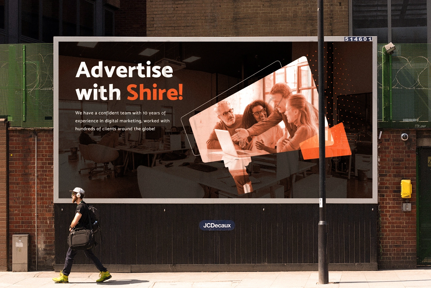
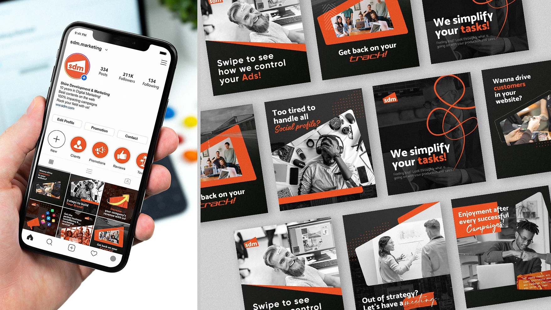
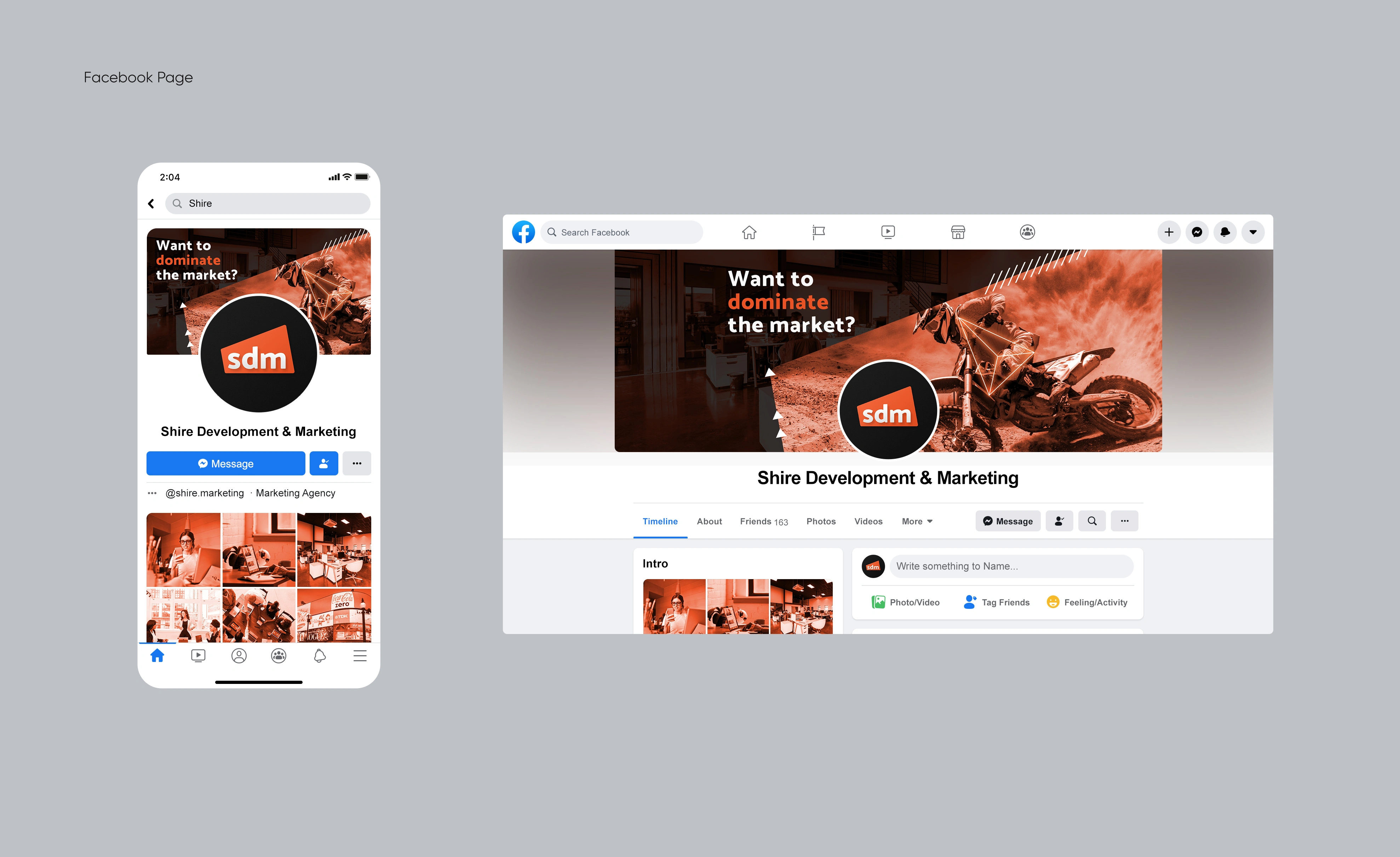
SDM (Shire Development & Marketing) is a full service marketing firm that also handles real estate development/investment.

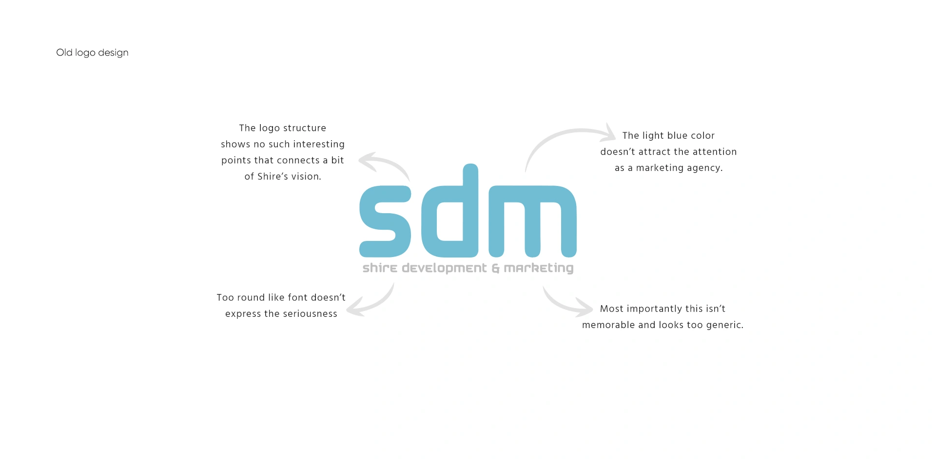
As you can see I have identified some flaws above. I reimagined the whole thing. Shire's vision, their customers, their main services, what they want the public to feel, etc. My target was to create something memorable which has great marketing potential. So, I created a shape that has a hidden connection with development and marketing, used an energetic and popping color to grab public attention, a font that is bold and looks serious and professional. The logo can be easily memorable through proper marketing.
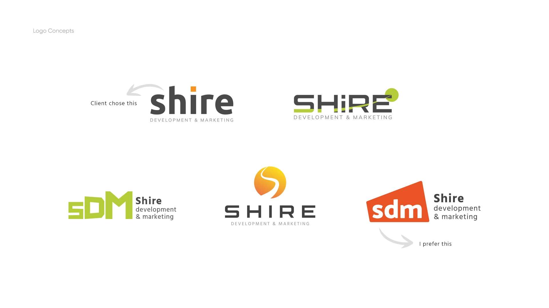
Everyone got their own design taste. But, I like designs with great possibilities!
Logo Concept:
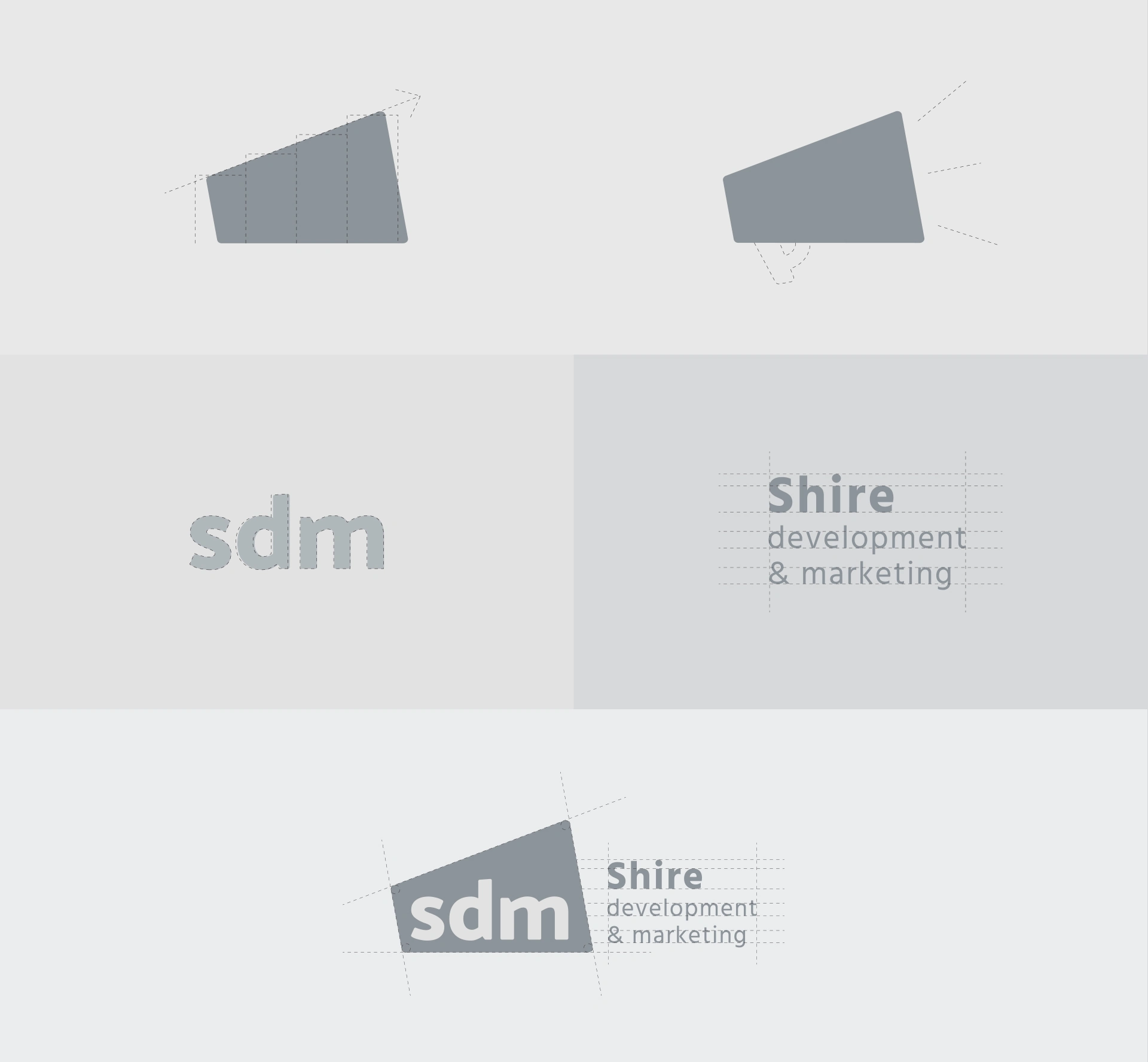
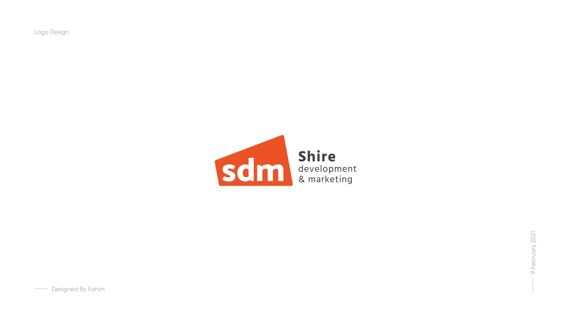
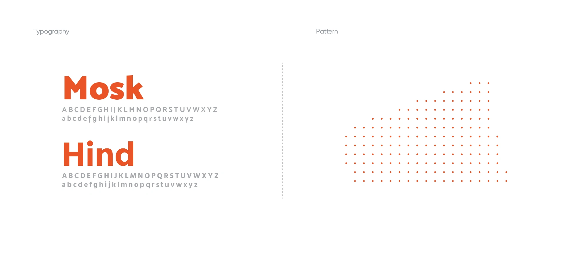
The top angled line of the shape going upwards, looks like something’s going up and being developed. We can also think of a hidden bar chart on the logo which is constantly getting higher having the same development meaning. On the other way think of a megaphone according to the right figure. Megaphone is used to spread any news, announcement and etc which relates to marketing. Then, I worked with the look and feel of the logo. To give it a serious look I chose Mosk font for the SDM text, adjusted the kerning(spacing between letters), and rounded the edges a little bit so it looks balanced and eye-soothing finally I used Hind font for the title and placed it in a suitable position and VOILA!


Thank you for watching!
Branding Designer: Md Sadiqur Rahman Fahim
Logo Animator: Shamsil Arefin Emon
Connect for projects: Skype | hellofahimdesigns@gmail.com
Casestudies: Medium
Like this project
Posted Jun 13, 2026
Brand Identity design for Shire Development & Marketing.