Space Cube Interior Studio | Branding
Md Sadiqur Rahman Fahim
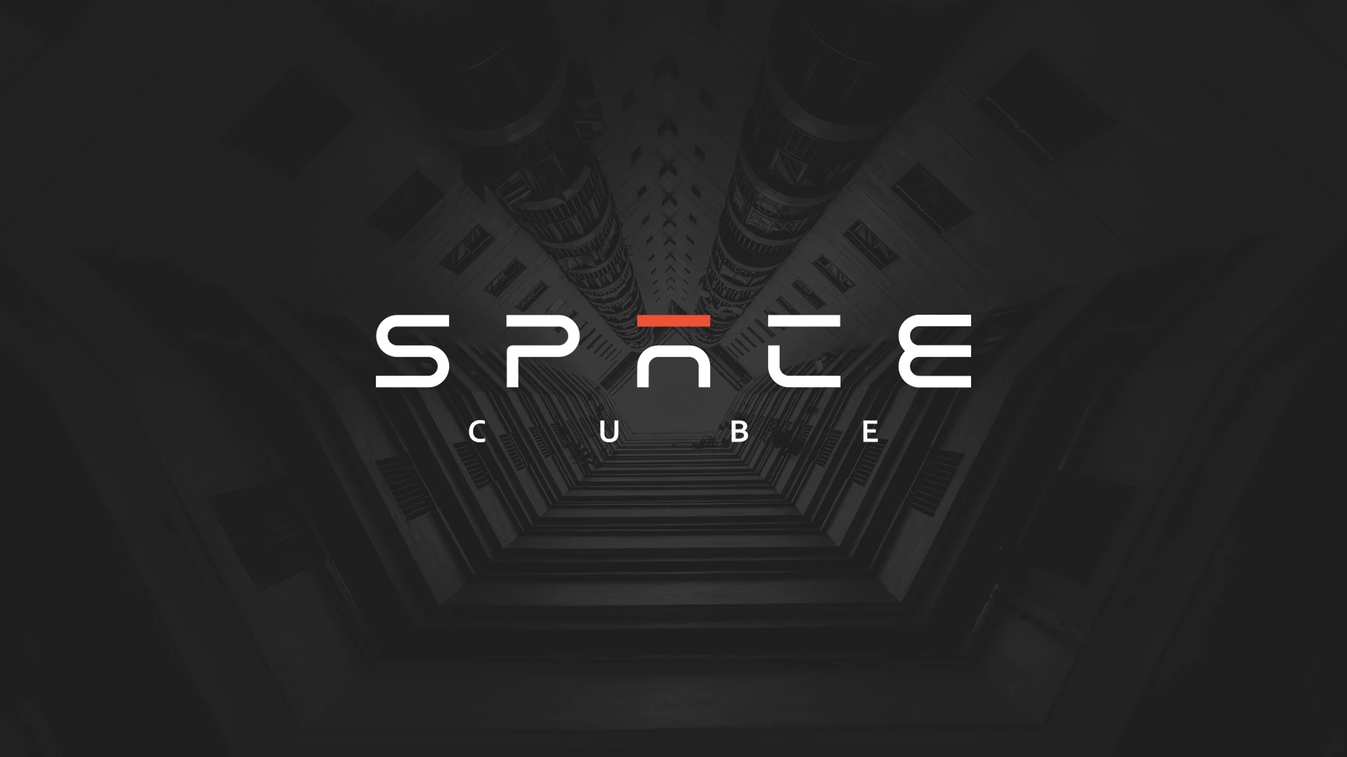
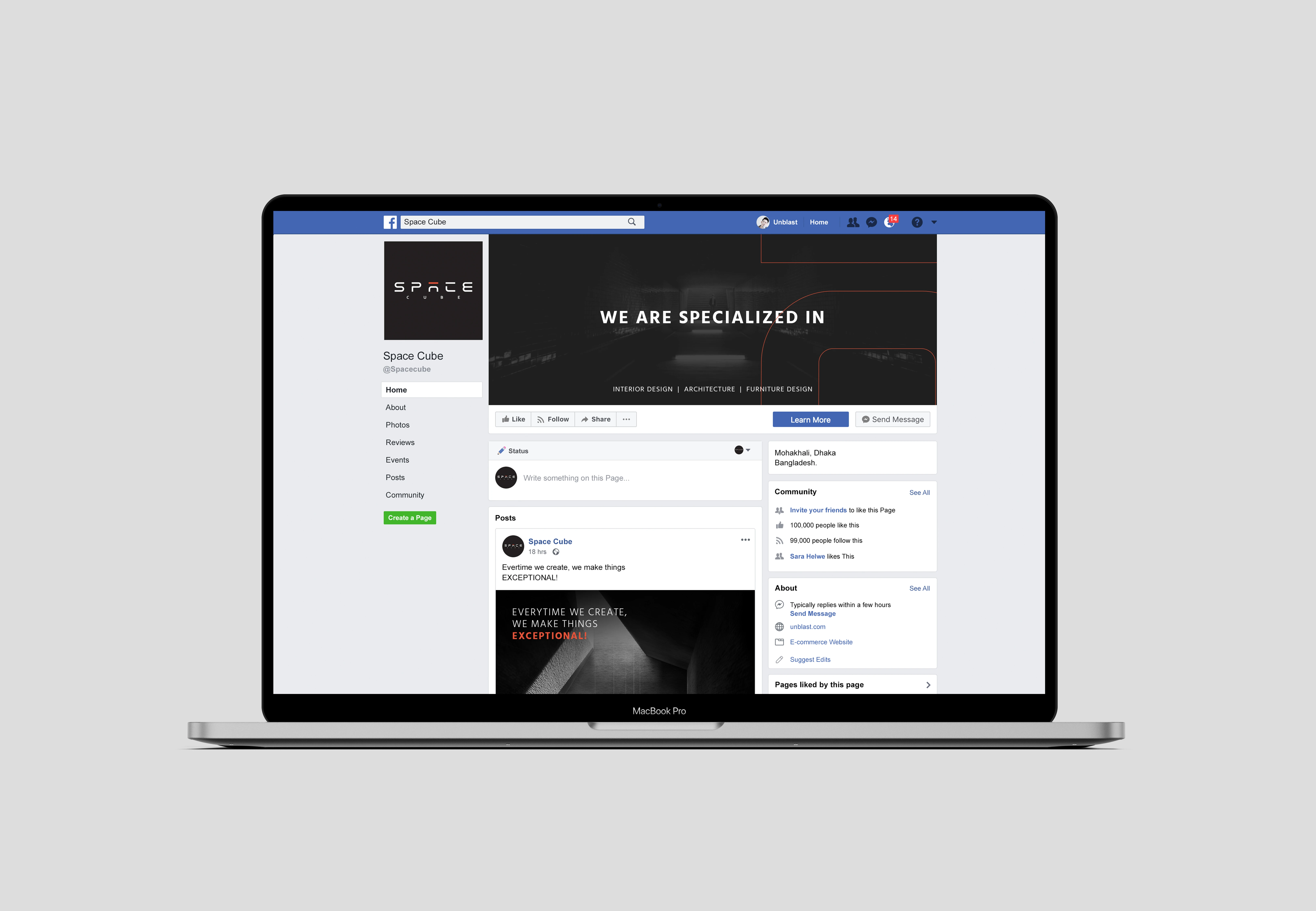
Space Cube
Space Cube is an Interior Design Studio Based in Dhaka, Bangladesh. They aim to provide top notch solutions for interior designs also works with furniture and architecture design as well.
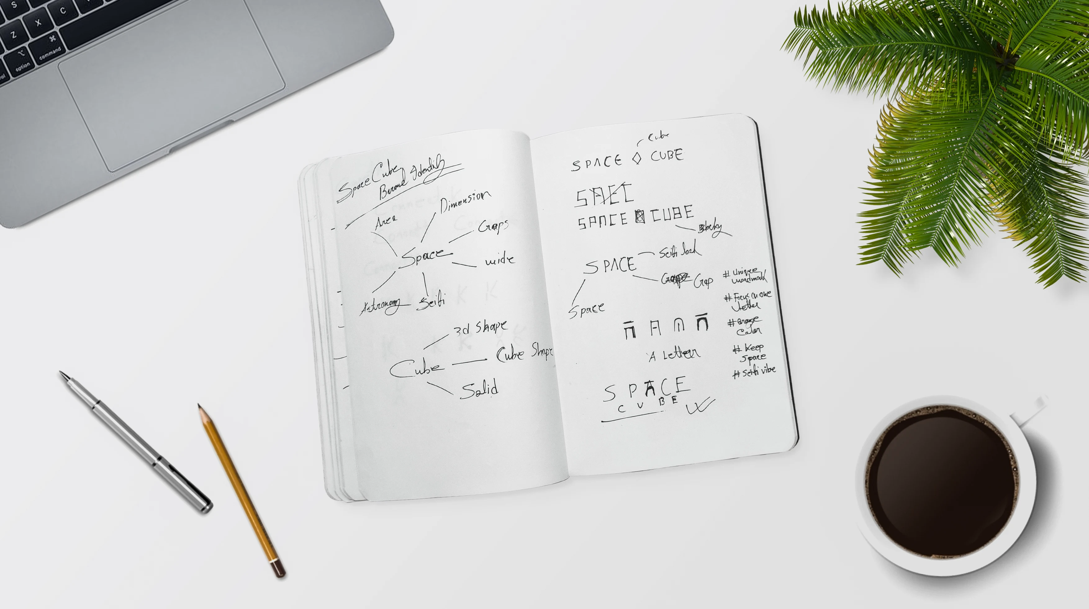
I started playing with two words ‘Space’ and ‘Cube’, on left I wrote some logo name related words which I used to plan my logo design concept and drew some scrappy linearts on right. These look scrappy but trust me these are the road to my golden treasure.
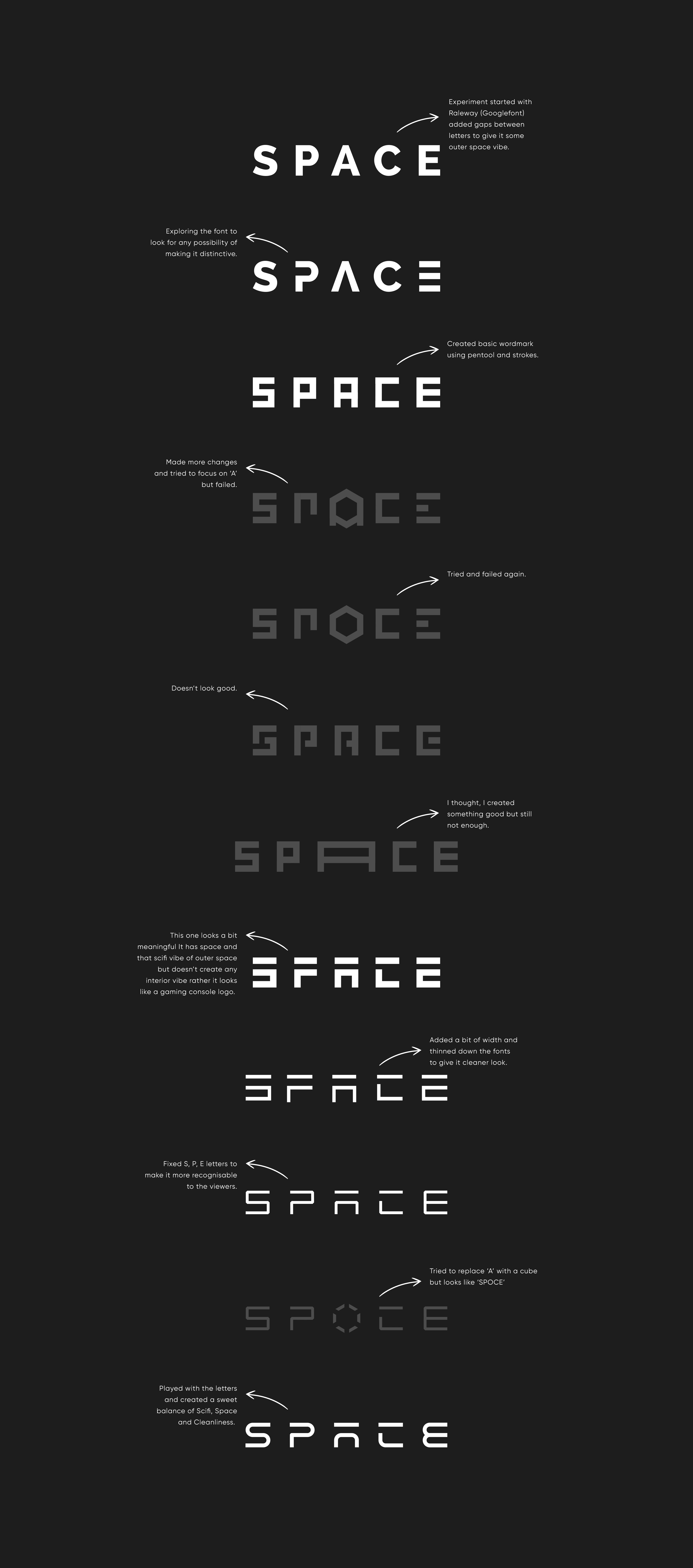
My client told me to go for a simple wordmark logo so, I planned to signify both empty space and outer space vibe. And for architecture interior feel I will go for clean and minimalism. I started looking attractive points to make the logo distinctive by experimenting with a google font. I created gaps between letters to give the empty space feel and played with them to give a scifi look which will pop the outer space vibe.
The wordmark was almost ready. Still, I wanted to do more experiments and look for a best possible way to place the ‘Cube’ text in the logo
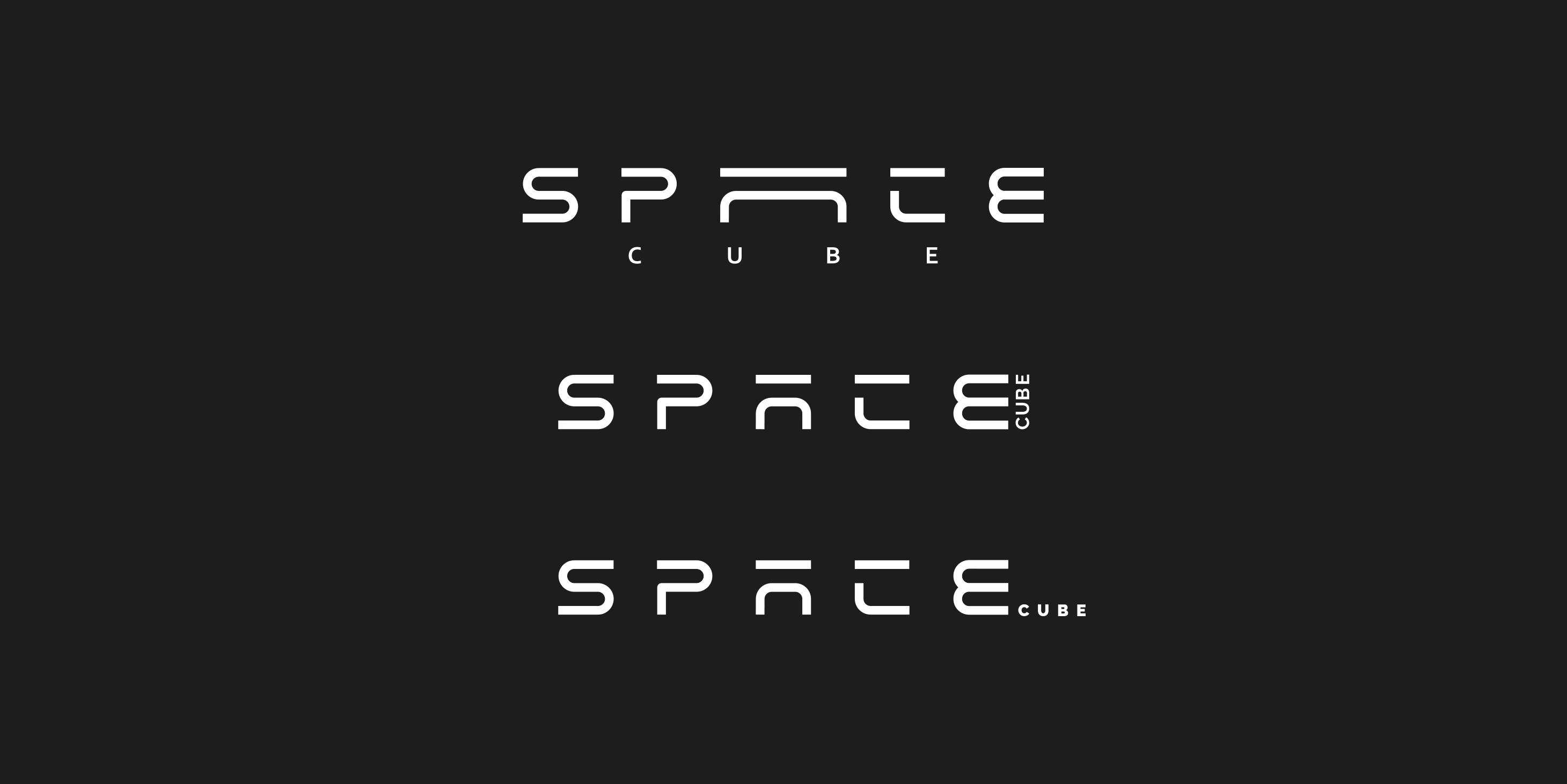
The first one was nice, it had the spacious look with the wide ‘A’ but the ‘Cube’ text position wasn’t looking good enough. So I created this

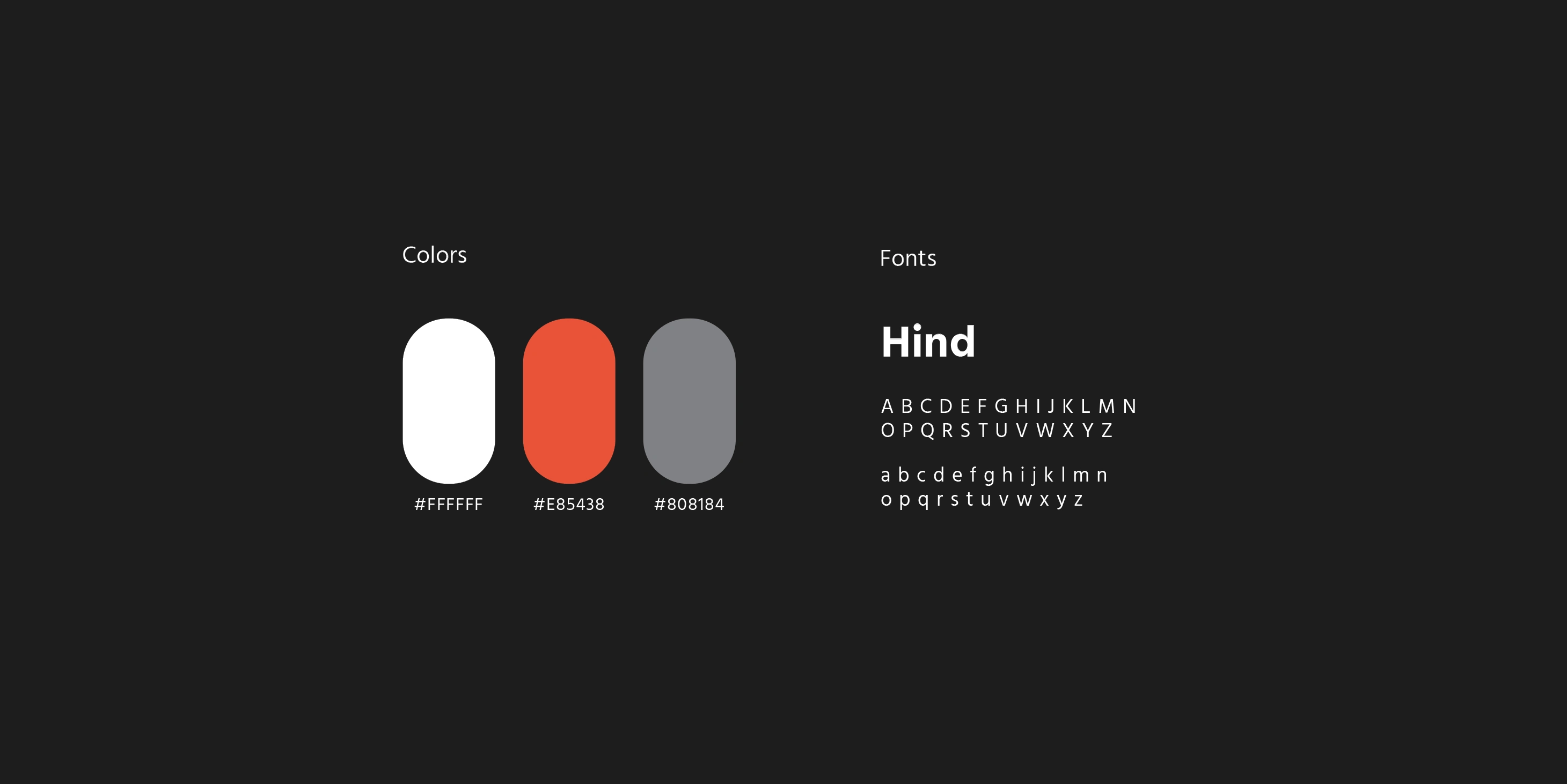
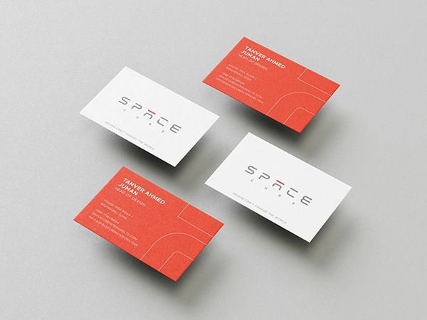
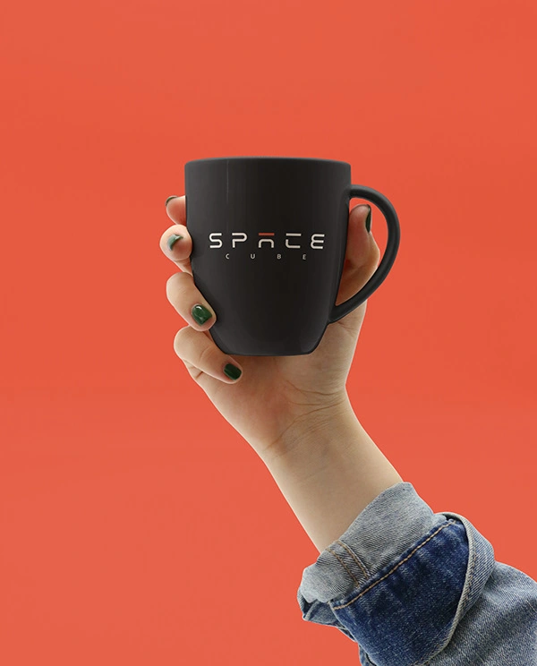
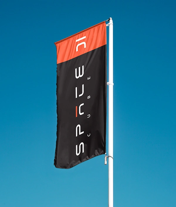
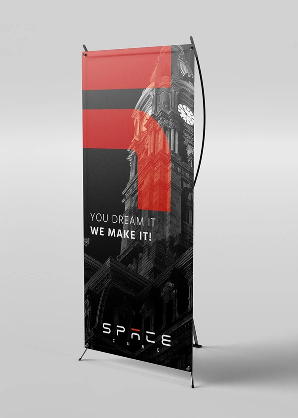
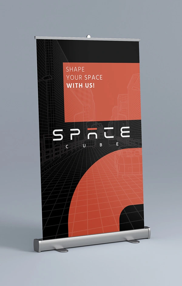
White + Orange combination for dark backgrounds and Grey + Orange combination for light backgrounds.
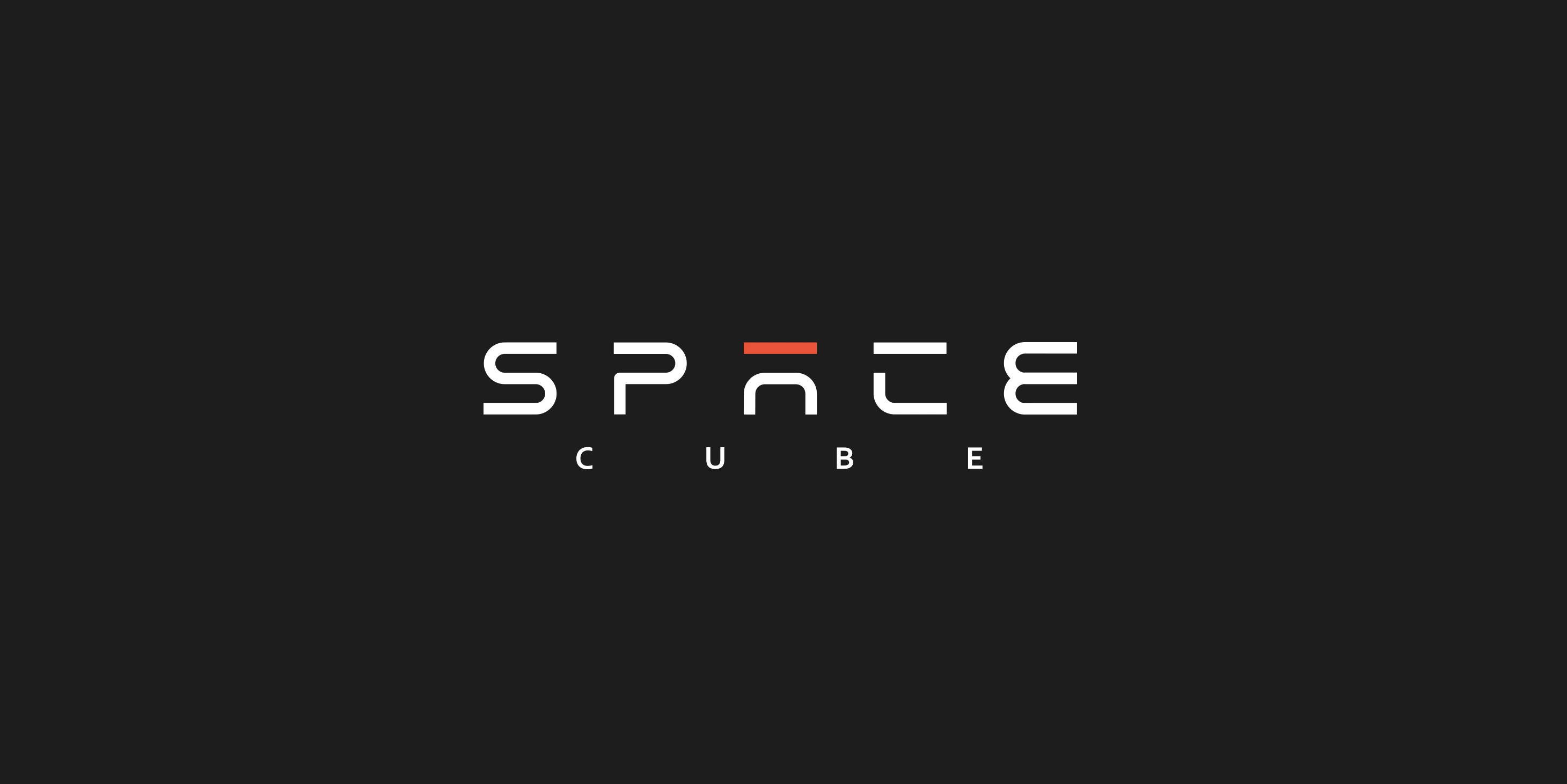
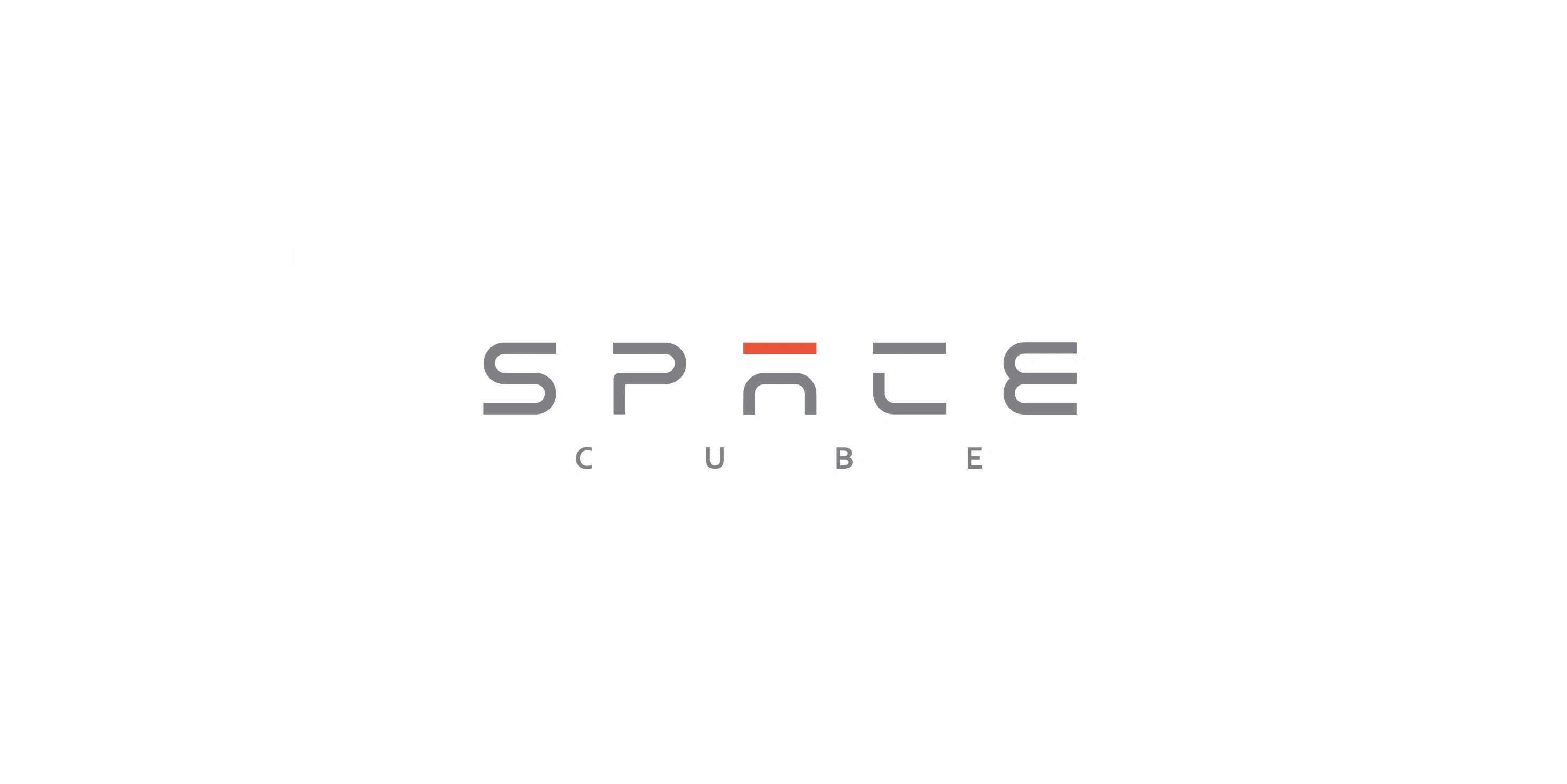
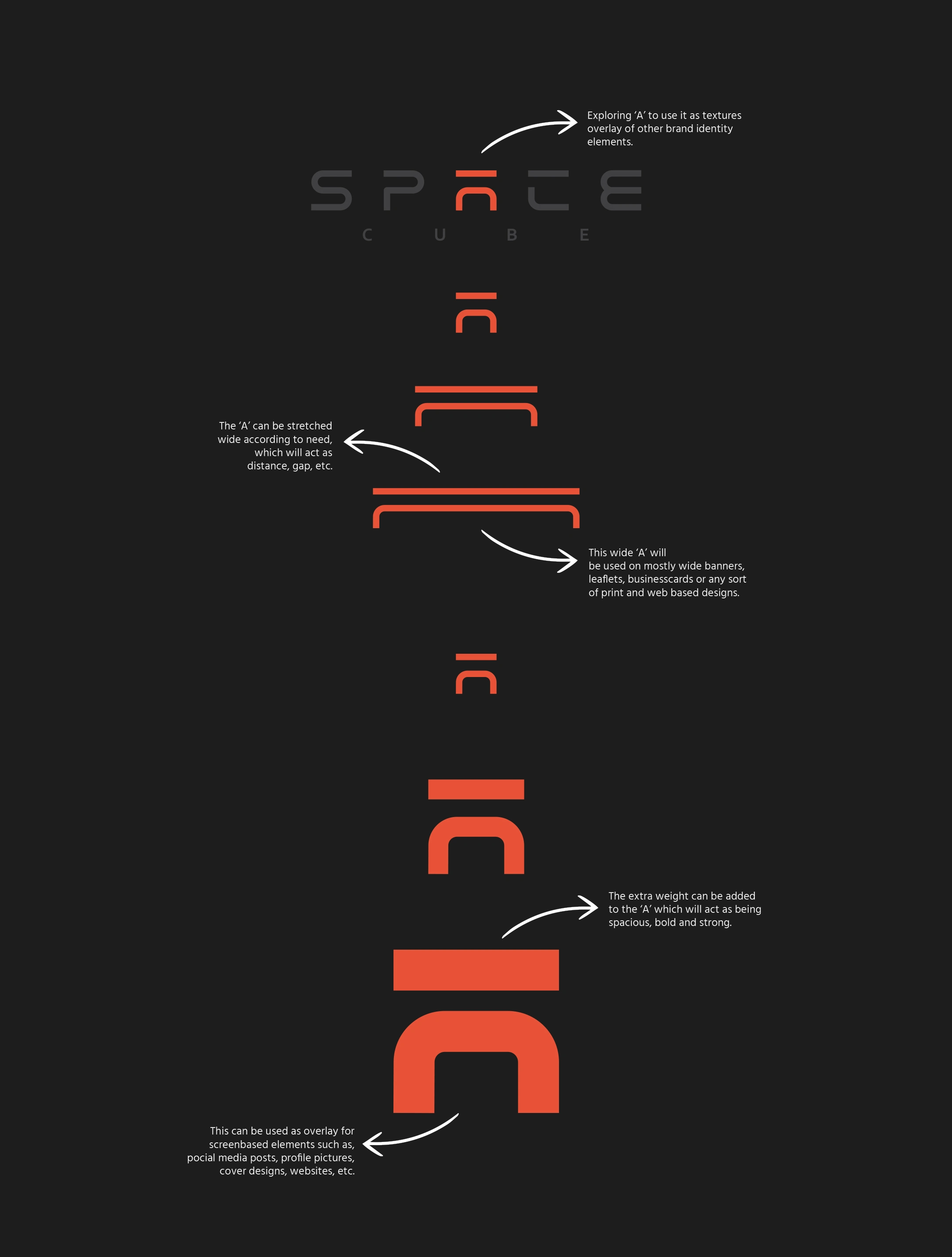
Now it looks perfectly balanced! This will be Space Cube’s main wordmark logo. I chose ‘A’ and use it as texture and pattern of the company and created two specific way to use it on stationery and marketing design elements. One is for Print based items and the other is for screen based designs.
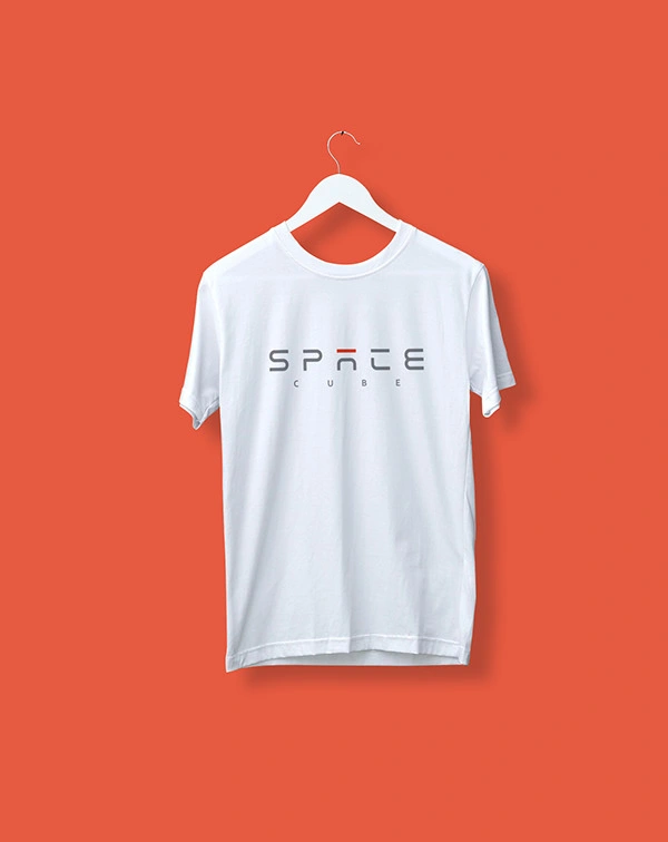
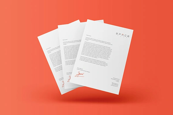
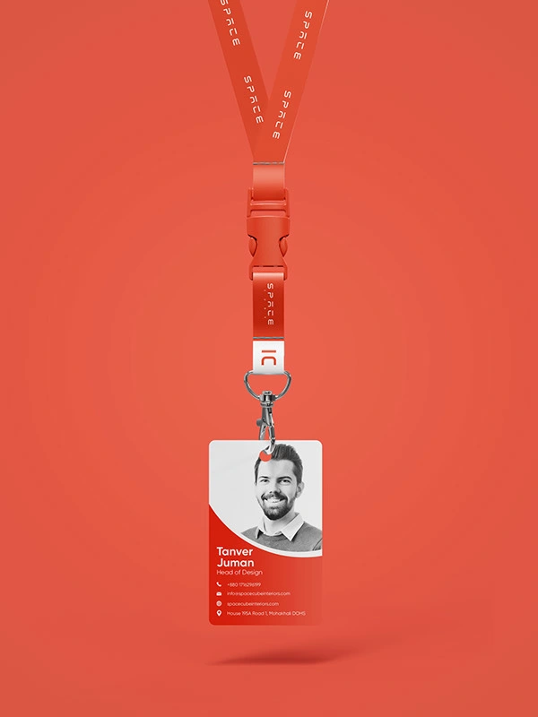
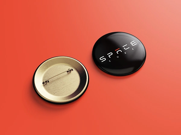
Stationery items created using the main logo as these will be used on professional situations mostly.
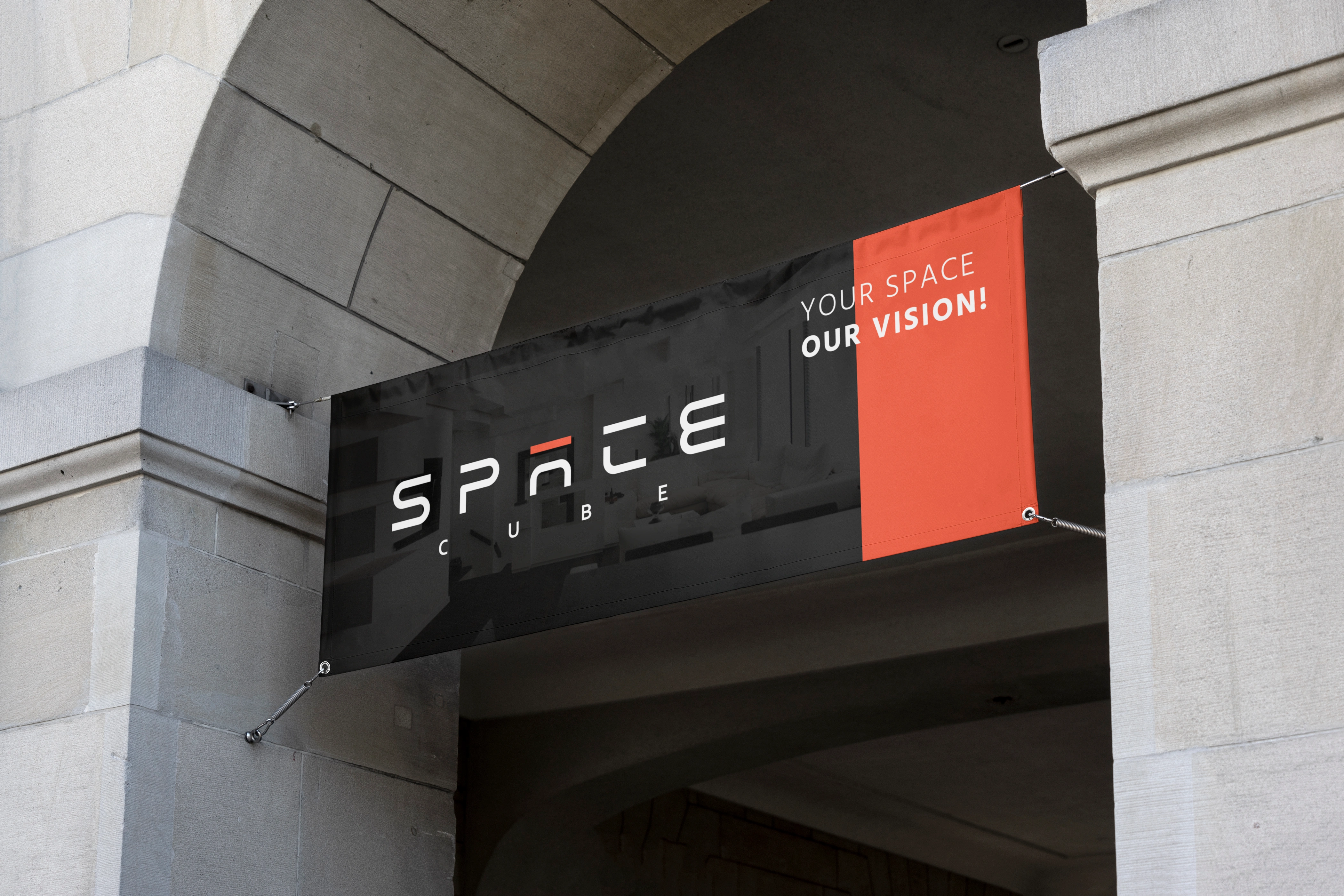
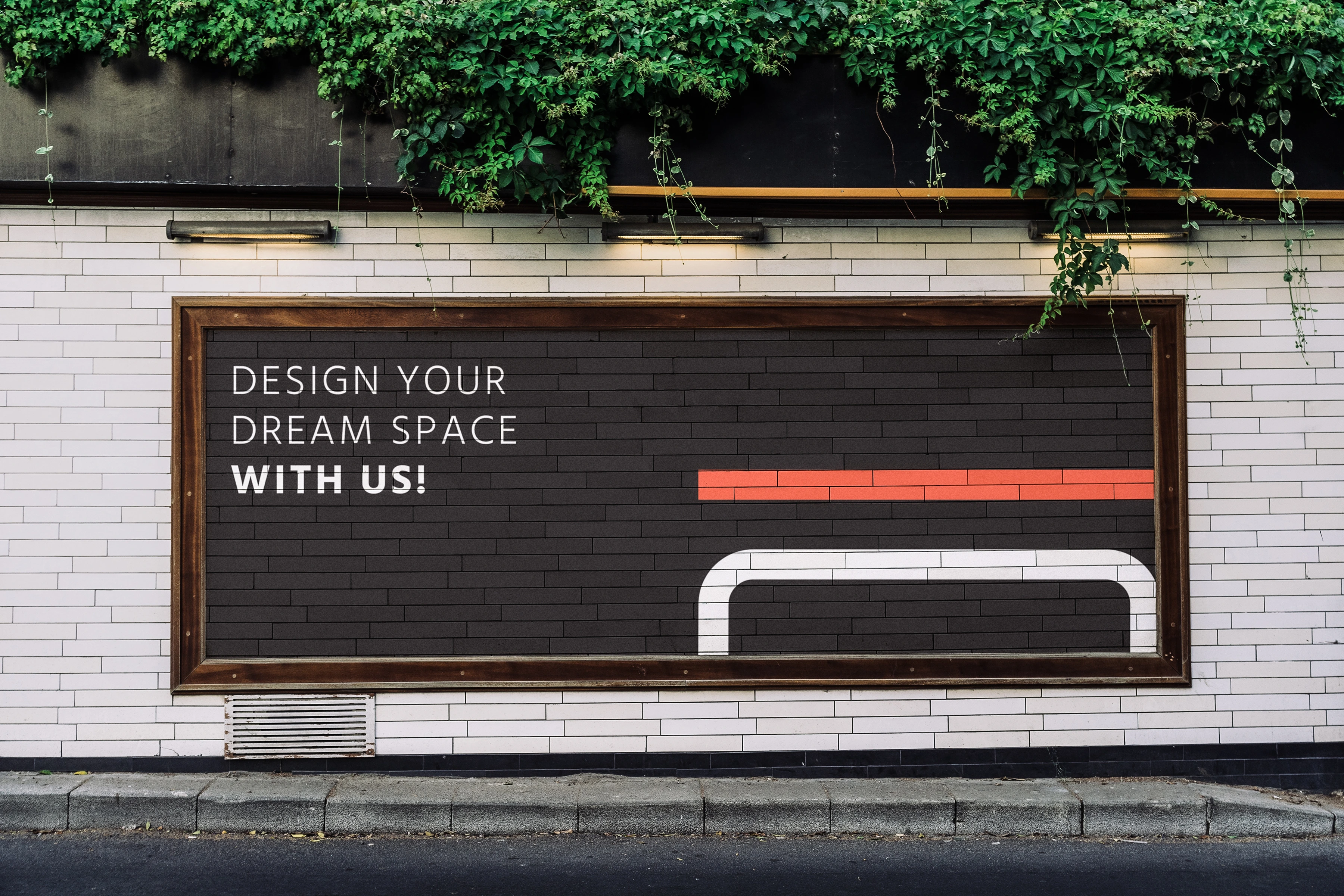
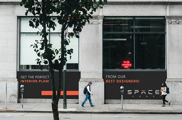
For marketing items I went with the wide and extra bolded ‘A” symbol as texture and overlay and they look amazing!!!
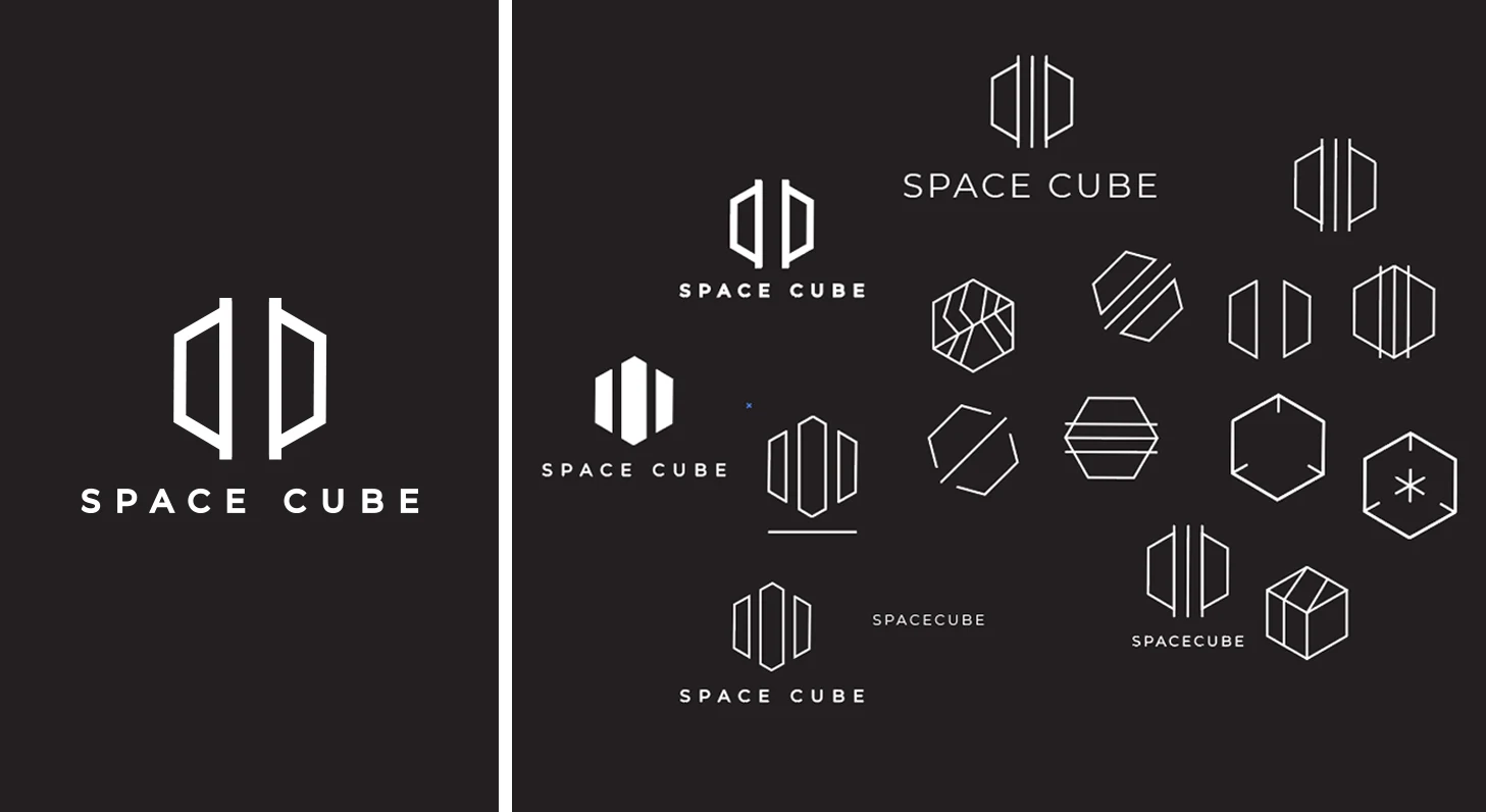
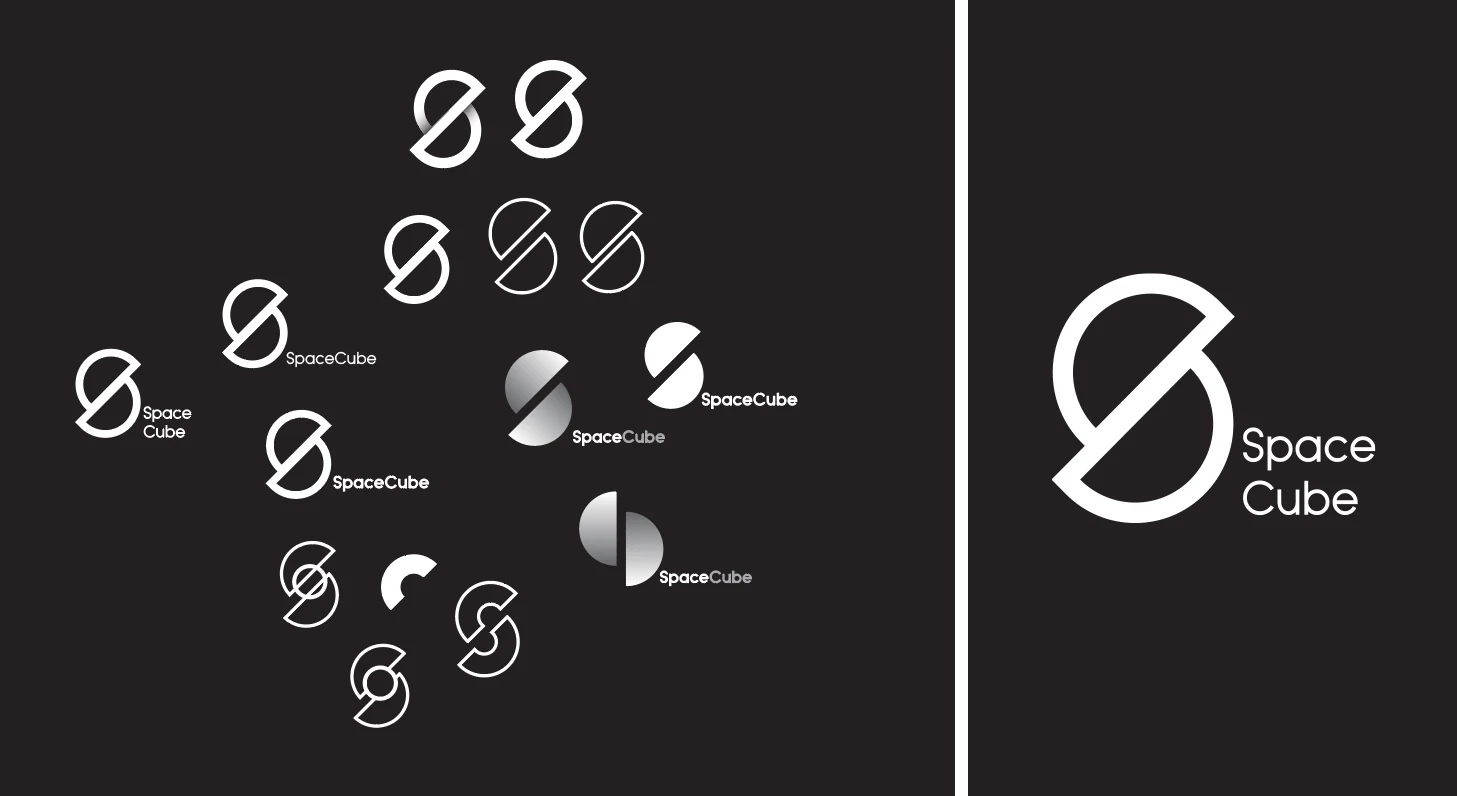
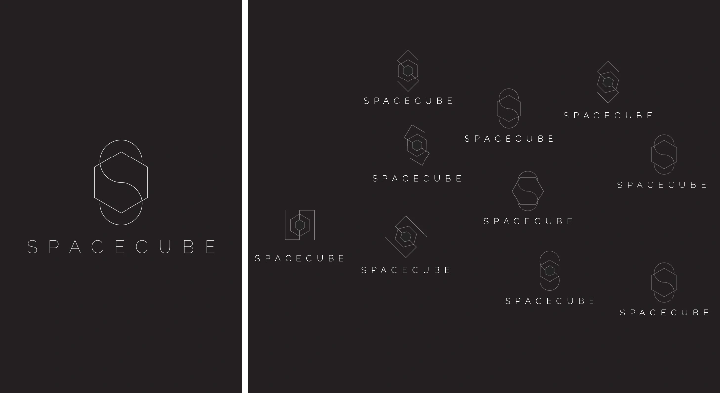
While working on the wordmark version of space cube. I also explored some symbols and got them(though they are not perfectly finished)
Thank you!
This is one of my detailed logo design processes. Thank you so much for reading this
and I hope you liked it! I am still trying to improve my writing skills and hopefully, I can share valuable content with you.
Medium Article: Medium
Dribbble shot: Dribbble
Hit a mail for project: hellounico101@gmail.com
Let’s get connected!
Like this project
Posted Jun 13, 2026
Space Cube is an interior, architecture & furniture design studio based in Dhaka, Bangladesh.