Onboarding redesign for SaaS product
✨ The Spark
In 2022 Prepr shifted to a product-led strategy. Empowering users to experience the value of their headless CMS became a key objective. This change provided a starting point for a complete redesign of Prepr's onboarding experience, supported by an extensive research effort.
💯 The Stats
Timeline: 4 months
Team: 1 product owner, 2 product designers, 2 technical writers, 3 developers
Deliverables: new signup flow, the 'guide' panel, in-app hints, a simplified UI and lots of new documentation articles.
💡 The Process
The project started out with an extensive research effort. Getting a better understanding of how people currently discover the product was key. We analyzed lots of Hotjar recordings, implemented Mixpanel for better product analytics and hosted various moderated and unmoderated research initiatives.
Outcomes from these research initiatives provided a good starting point for starting to answer the key question of 'How to make users experience the value of our product?'.
Through an iterative process we designed and optimized new flows to guide users through the platform. We shifted from 'trying to explain everything' to 'empowering users to experience key features'. This led to the introduction of a drastically simplified signup process, a new demo environment and various in-app guidance solutions.
Through numerous quick iterations we went from low fidelity designs or sketches to high fidelity UI designs, to interactive prototypes and in the end to implemented product features. We launched launched all of these changes over a couple of months, measuring the impact of each and every change while keeping the conversation with users going. Over the course of the project we have identified various potential improvements and kept improving on the solutions we designed.
We're excited to have started a new level of collaboration with our users and we keep asking ourselves; 'How do we make our users succeed?'
🚀 The Outcome
The project resulted in a large number of redesigned flows and screens. Some key screens can be seen below. While we keep improving on every aspect of the product, we're extremely pleased to see that new users spend more time on the platform, try more features and remain active for much longer.
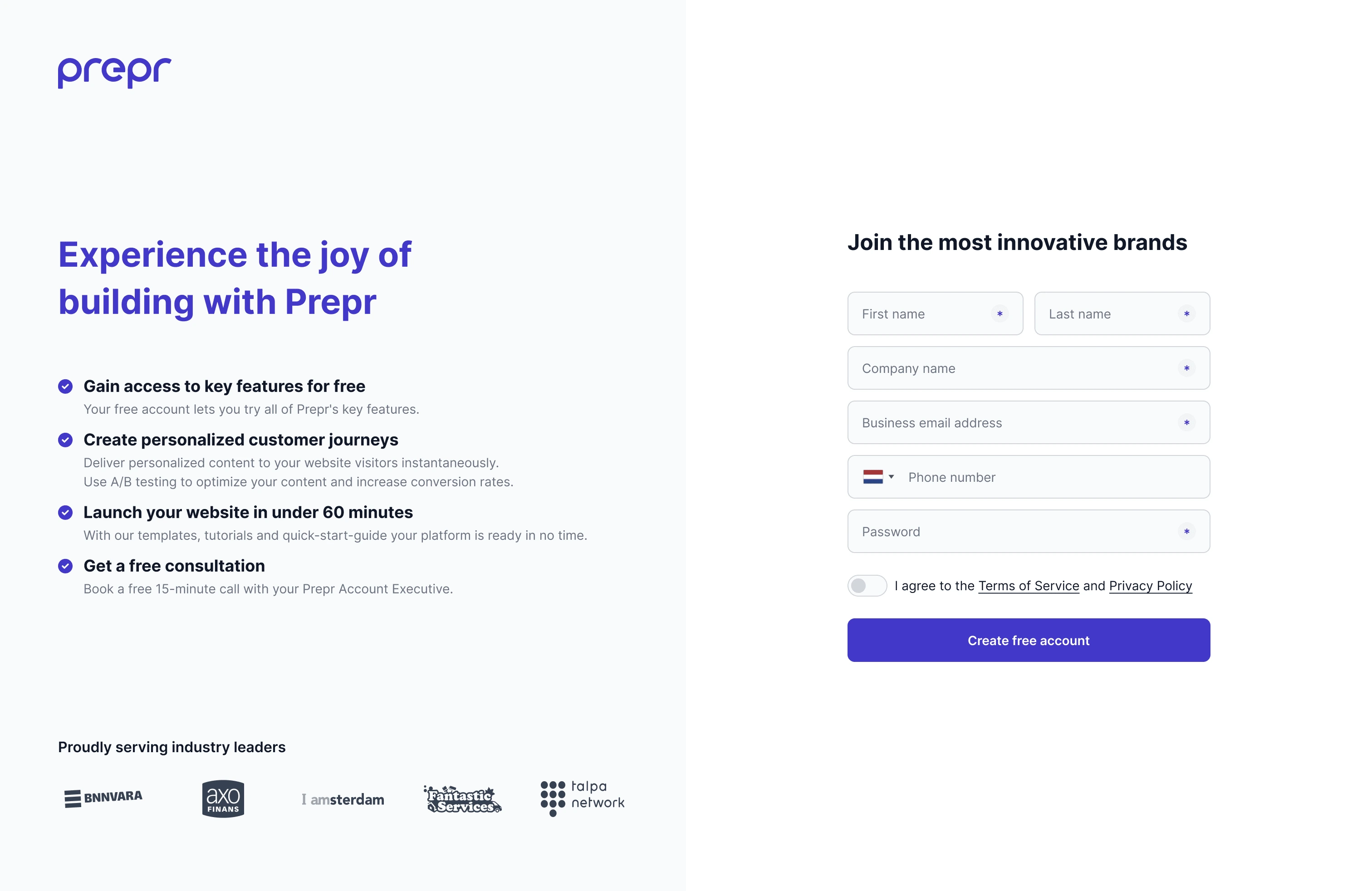
The new signup flow consists of a single form, reducing the time required to complete the process:

A new in-app guide and intelligently triggered hints guide the user through key features within the platform:
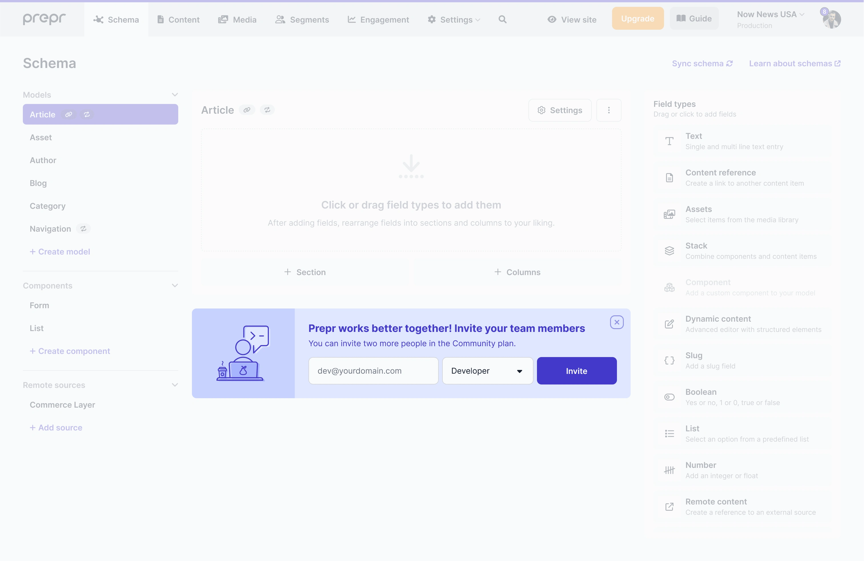
Inline prompts in key screens of the interface encourage the user to invite team mates. This increases the onboarding success rate.

Like this project
Posted Jul 1, 2023
Research into and redesign of the onboarding flow. Putting the user front and center resulted in a significantly improved product adoption rate.
Likes
0
Views
101
Clients
Prepr CMS


