Homest.az — Auth Flow Redesign (Concept)
Mustofa Al-Ameen Mustafa
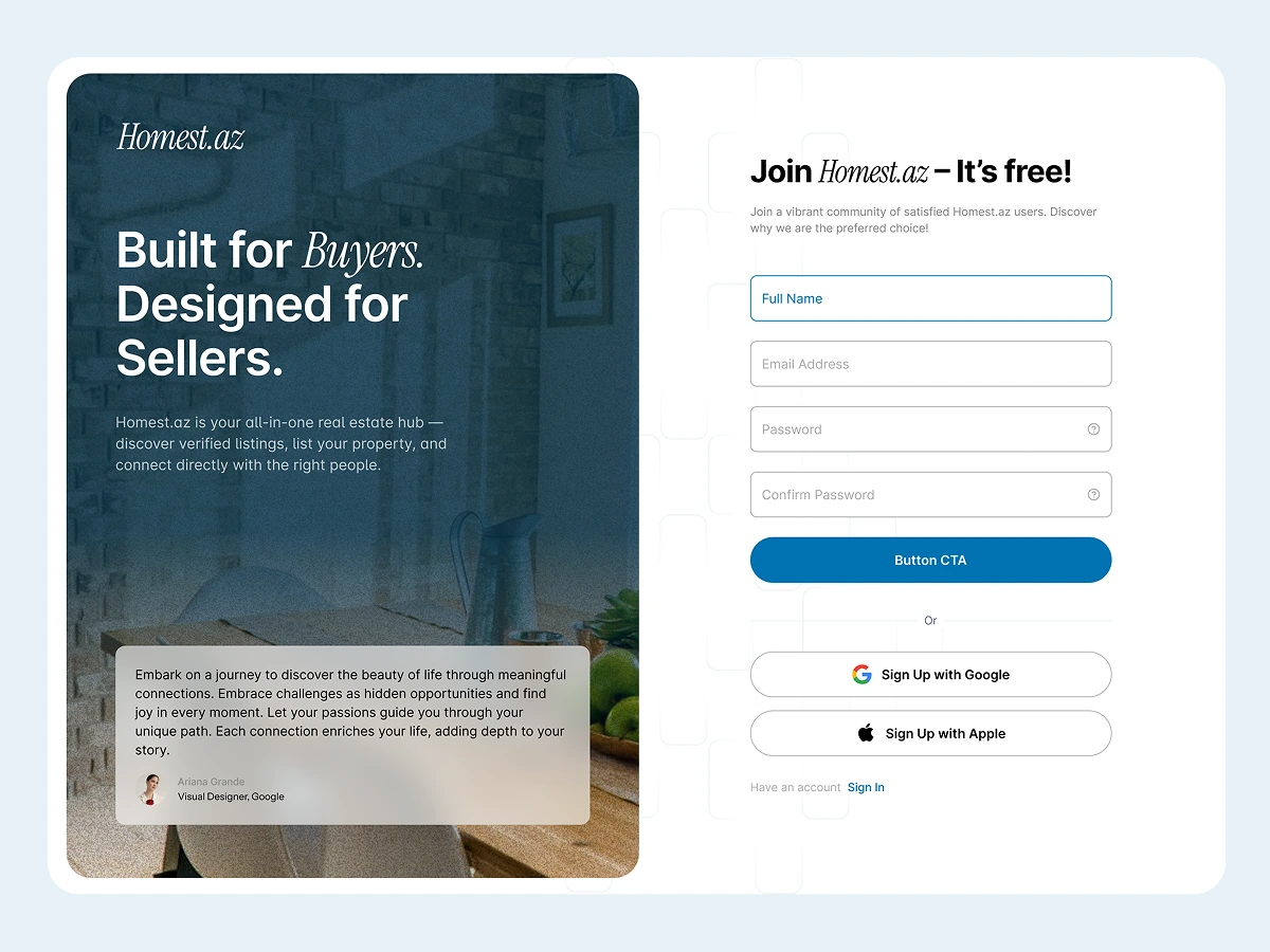
Cover
Type: Concept / spec project (not a client engagement)
Role: UI/UX Designer
Tools: Figma
What This Is
Homest.az is a real estate platform in Azerbaijan. I redesigned their authentication experience as a concept project to explore how login/signup flows can be improved for clarity, usability, and trust in a local market context.
What I Did
Audited the existing auth flow — identified issues: cluttered layouts, unclear microcopy, poor mobile spacing, and missing error/validation states
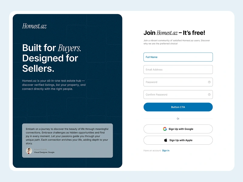
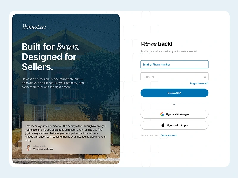
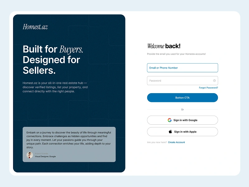
Redesigned the login and signup screens — clean, responsive forms with clear visual hierarchy, better spacing, and improved field inputs
Wrote better microcopy — encouraging CTAs like "Join Homest.az — It's free!" and "Create your free account" to reduce signup friction
Designed for both light and dark modes — balanced UI that works across both themes
Added proper error and validation states — visual cues for password visibility, inline errors, and field validation so users know exactly what's wrong
Key Design Decisions
Bold headlines with short descriptions — users understand what each screen does before interacting with any form fields
Encouraging CTAs — language that reduces anxiety about signing up ("It's free!", "Create your free account")
Mobile-first spacing — larger tap targets and better field spacing for mobile users, who make up the majority of the platform's audience
Why This Matters
This project demonstrates authentication UX design: how small improvements to form layout, microcopy, and error handling can reduce friction and build trust in a signup flow.
Login redesign
Signup flow
Validation states
Like this project
Posted Jun 22, 2025
Concept project: redesigned the authentication experience for an Azerbaijani real estate platform.
Likes
1
Views
11