Dynamic Visual Identity Design for a Creative Brand
Agneta Petruta
Project Overview
Client: Rainbow
Industry: Advertising / Creative Events / Brand Promotion
Year: 2024
Location: Bucharest, Romania
Category: Brand Identity, Visual Direction, Social Media, Print & Collateral Design
Rainbow Colorful Ideas is a design Agency that brings brands to life through creative events, conceptual branding, and custom promotional materials designed to make every idea stand out.
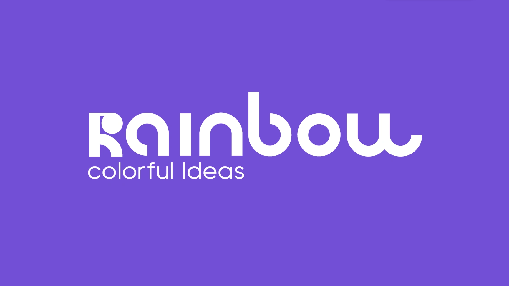
The logo reflects Rainbow’s playful and energetic spirit, with a stylized “R” grounded by a subtle rainbow detail. Its bold, friendly form captures the team’s creative approach and their belief that any idea is possible.
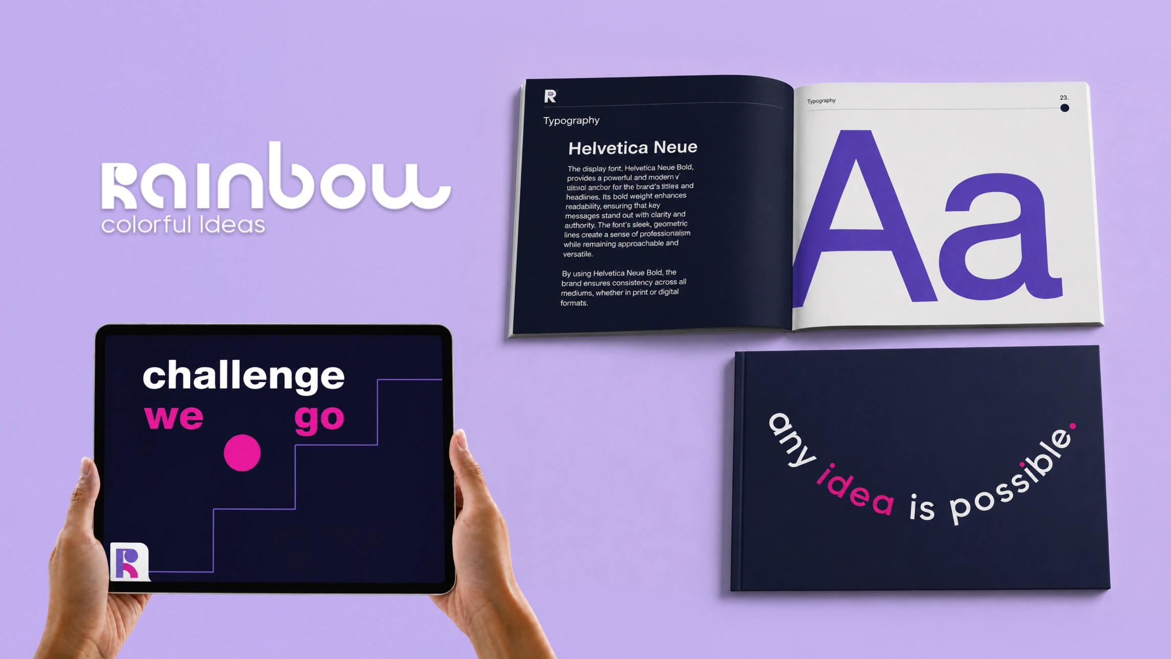
On dark backgrounds, the identity expands from the bold “R” logomark into a flexible logo system, adapting from a compact mark to the full brand name and slogan. This versatility gives Rainbow a playful yet consistent presence across different formats and touchpoints.
Rainbow’s values were translated into a visual language that feels human, energetic, and full of character. The compositions reflect the team’s playful way of working, turning ideas, challenges, and movement into simple graphic moments.
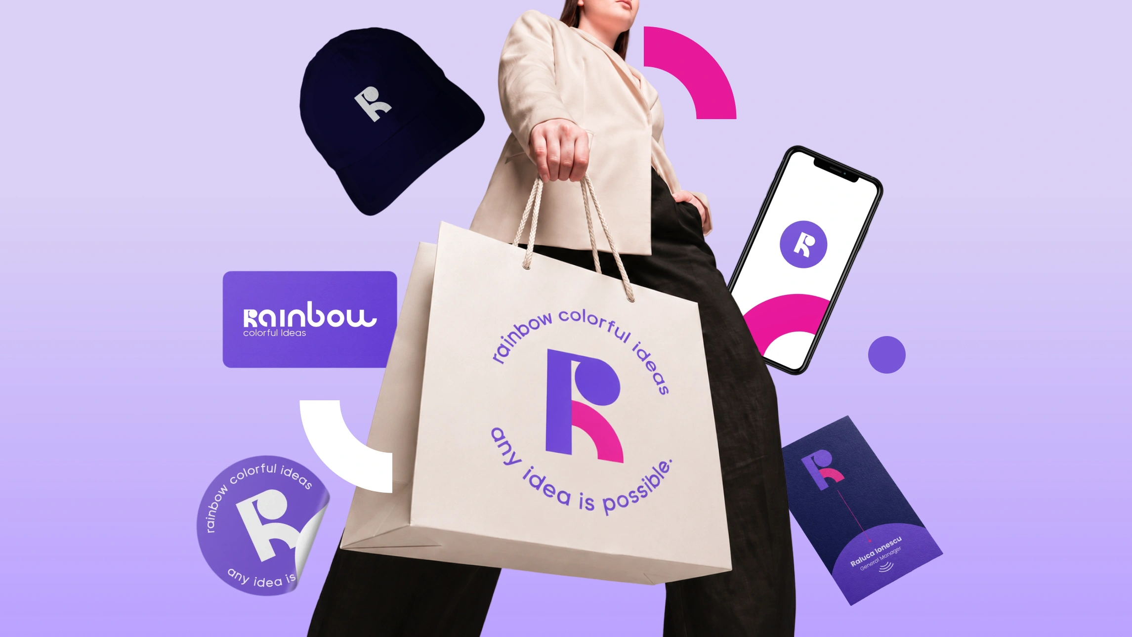
The dot from the “R” becomes part of this system, adding rhythm and flexibility while keeping the identity connected to the logo.
A bright and flexible visual identity built around movement, warmth, and optimism. The smile-shaped slogan adds personality, while the guidelines keep the brand consistent across every format.
The rainbow and dot, deconstructed from the “R” logomark, became key brand elements used across the identity. On the website, they bring movement and character, while the UX/UI keeps the experience clear, friendly, and easy to explore.
The collaterals turned the identity into something the team could truly use and enjoy. From hats and stickers to bags and digital pieces, the brand became part of their daily presence and the team was genuinely excited to wear it, share it, and bring it into the world.
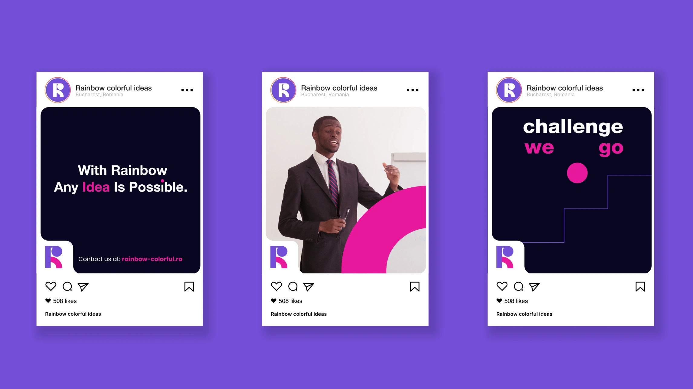
The social media templates create a clear and recognizable presence online. The recurring logomark shape anchors each layout, connecting the posts with the wider identity across print, web, and other brand touchpoints.
Working on Rainbow’s identity was a bright and joyful process from start to finish. The final brand reflects their personality, values, and positive way of approaching every idea, making it a pleasure to create and even more exciting to see them embrace it.
Like this project
Posted Nov 26, 2024
Crafted a vibrant visual identity for a dynamic design agency, blending bold colors and creativity to reflect their innovative spirit.