Business Quant Landing Page
Storm Splits
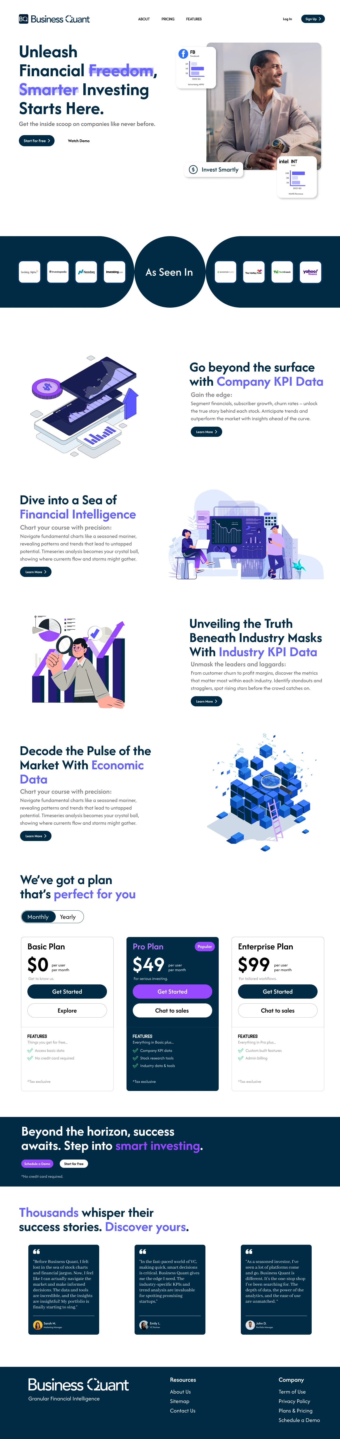
Thought Process Behind Business Quant Website Design
Color Scheme:
· Dark Navy Blue (Primary): Conveys professionalism, trust, and authority, aligning with the financial nature of the platform.
· Purple (Accent): Adds vibrancy, highlights key terms and actions, and differentiates important elements.
· White (Background): Creates a clean and spacious feel, improving readability and emphasis.
· Shades of Blue & Purple: Maintain a cohesive color palette while adding subtle visual interest.
Navigation Bar:
· Logo Placement: Positioned at the top left corner to enhance brand recognition and create a visual anchor.
· Navigation Options: About, pricing, and features are centrally located in the navbar, facilitating easy access to vital sections.
· Sign Up and Login Buttons: Placed at the top right corner, the Sign-Up button features a dark navy-blue background with bold white text, while the Login button is characterized by a white background and black bold text. This design ensures clear visibility and distinguishes between the two actions.
Landing Section:
· Rounded Corner Rectangle: Creates a modern and approachable feel.
· Custom Dummy Data: Showcases the platform's capabilities without relying on generic images.
· Punchline: Briefly summarizes the value proposition and grabs attention.
· Purple Highlights: Emphasize key terms and benefits.
Showcase Section:
· Central Circle: Draws focus to the "As seen in" message.
· Semi-circled Rectangles: Competitor logos are displayed in two half semi-circled rectangles on either side of the central circle, fostering a symmetrical and organized look.
KPI, Financial Intelligence, Industry, and Economic Data Sections:
· Bold Headings & Purple Highlights: Maintain consistency and emphasize key information.
· Rounded Corner Buttons: Mirror the landing section and offer a unified design language.
· Illustrative Art: Enhances visual appeal and reinforces section themes.
Pricing & Plans:
· Basic & Enterprise: Consistent layout and minimal grey stroke convey affordability.
· Popular Pro Plan: Differentiation through dark navy background, purple highlights, and "Popular" tag.
· Contrasting Buttons: Highlight primary action (Get Started) and secondary actions (Explore & Chat).
Demo Promotions & Testimonials:
· Dark Navy Background & White Heading: Creates a distinct section with clear hierarchy.
· Purple Button & White Button: Emphasize primary (Schedule Demo) and secondary (Start for Free) actions.
· Testimonial Cards: Dark blue background enhances readability and creates a professional image.
· Quotes Icon & Reviewer Info: Add visual interest and credibility to testimonials.
· Flex Row Alignment: Aligning the three testimonial cards in a flex row ensures a balanced and visually pleasing layout.
Footer:
· Company Logo & Tagline: Reinforce brand identity and value proposition.
· Resources & Company Options: Provide quick access to additional information.
Overall:
· The design prioritizes clarity, professionalism, and user experience, making Business Quant appear trustworthy and capable.
· The consistent color scheme and design elements create a unified and cohesive brand identity.
· The strategic use of highlights and contrasts guides users through the website and encourages desired actions.
Like this project
Posted Nov 7, 2024
Redesigned the homepage of the Business Quant website, which is an investment research platform.