Website | Tek-ture
Juliana Eisenhardt Escaleira
As part of my journey to becoming a certified Wix Studio Web Designer, I recreated the website for Tekture — a conceptual architecture studio that values sustainability and minimalist design.
Process
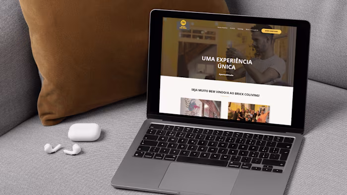
The task required me to meticulously replicate a live website using Wix Studio, ensuring that every element—from layout and typography to animations and interactions—matched the original with precision.
One of the key challenges was achieving full responsiveness across all breakpoints. I had to utilize Wix Studio's layout tools, such as Section Grid and Stack, to create a design that was not only visually accurate but also adaptable to various screen sizes. This involved careful planning and testing to ensure that the site's structure remained consistent and user-friendly on desktops, tablets, and mobile devices.
Typography consistency was another critical aspect. I paid close attention to font choices, sizes, and spacing to maintain a coherent design system throughout the site. This attention to detail was essential in preserving the visual integrity of the original design.
Performance optimization was also a significant focus. I implemented best practices for SEO and accessibility, ensuring that the recreated site was not only aesthetically pleasing but also functional and discoverable. This included optimizing images, using semantic HTML tags, and ensuring that the site met accessibility standards.
Final Web experience
Final Mobile Experience
Certification
All of these careful considerations allowed me to complete this stage of the certification with excellence. After successfully finishing the remaining requirements, I proudly earned my official Wix Studio Web Designer Certification.

This certification process was more than just a technical challenge — it was an opportunity to truly demonstrate my proficiency in using Wix Studio to deliver professional-grade websites that meet modern design standards. It allowed me to showcase my skills in design fidelity, responsiveness, and performance optimization, reinforcing my ability to build digital experiences that are both beautiful and strategic.
Like this project
Posted Apr 23, 2025
Designed in Wix Studio with full responsiveness, visual clarity, and high attention to UX and structure