Saucy

Nathalia Ultramar


The brand
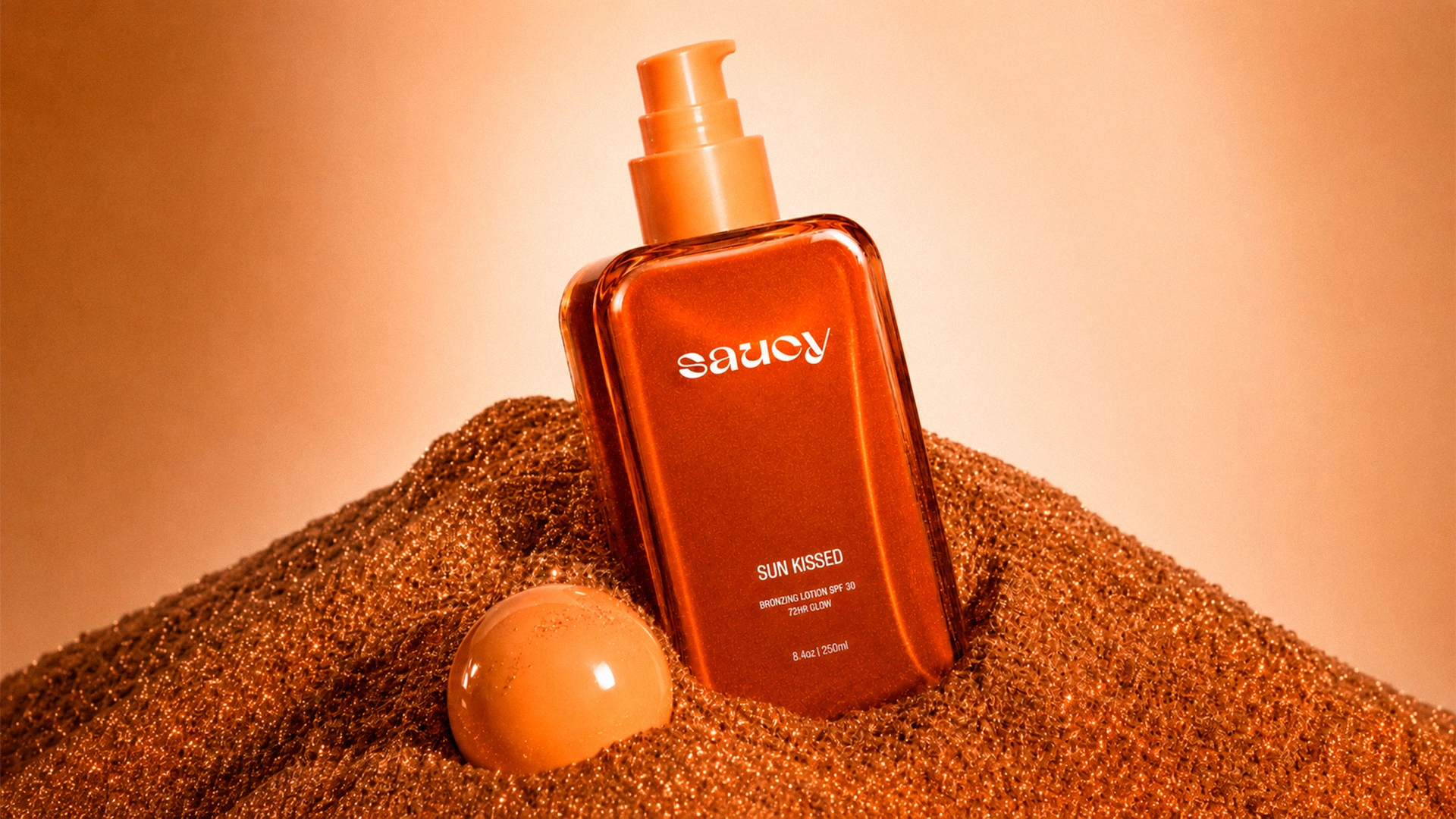
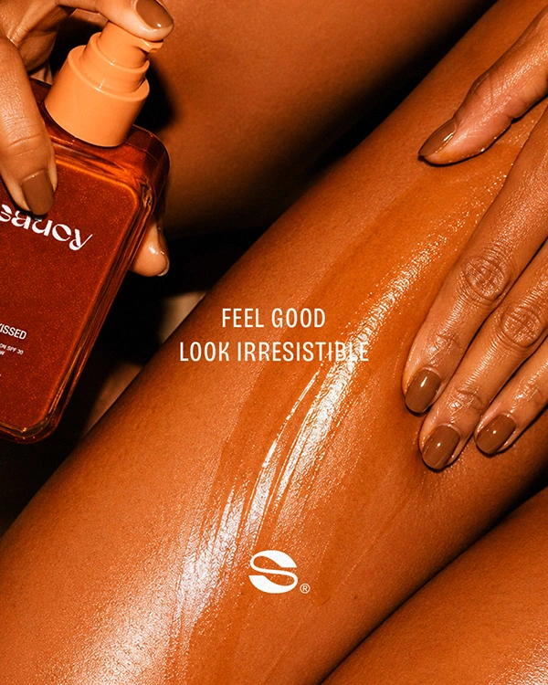
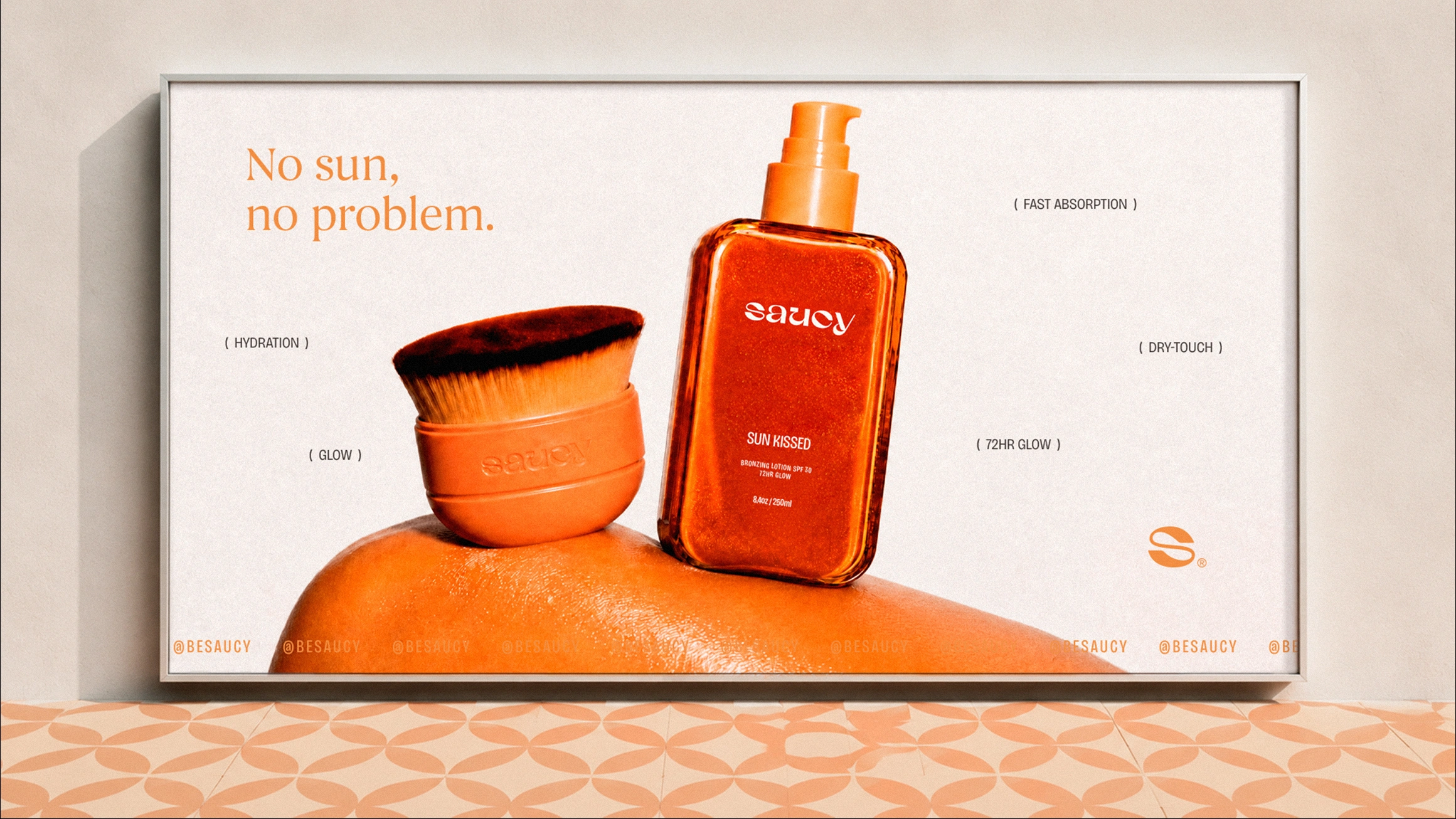
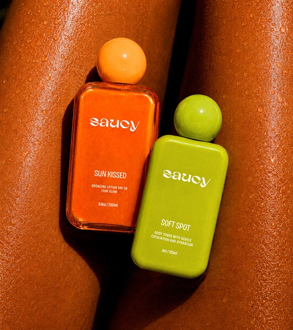
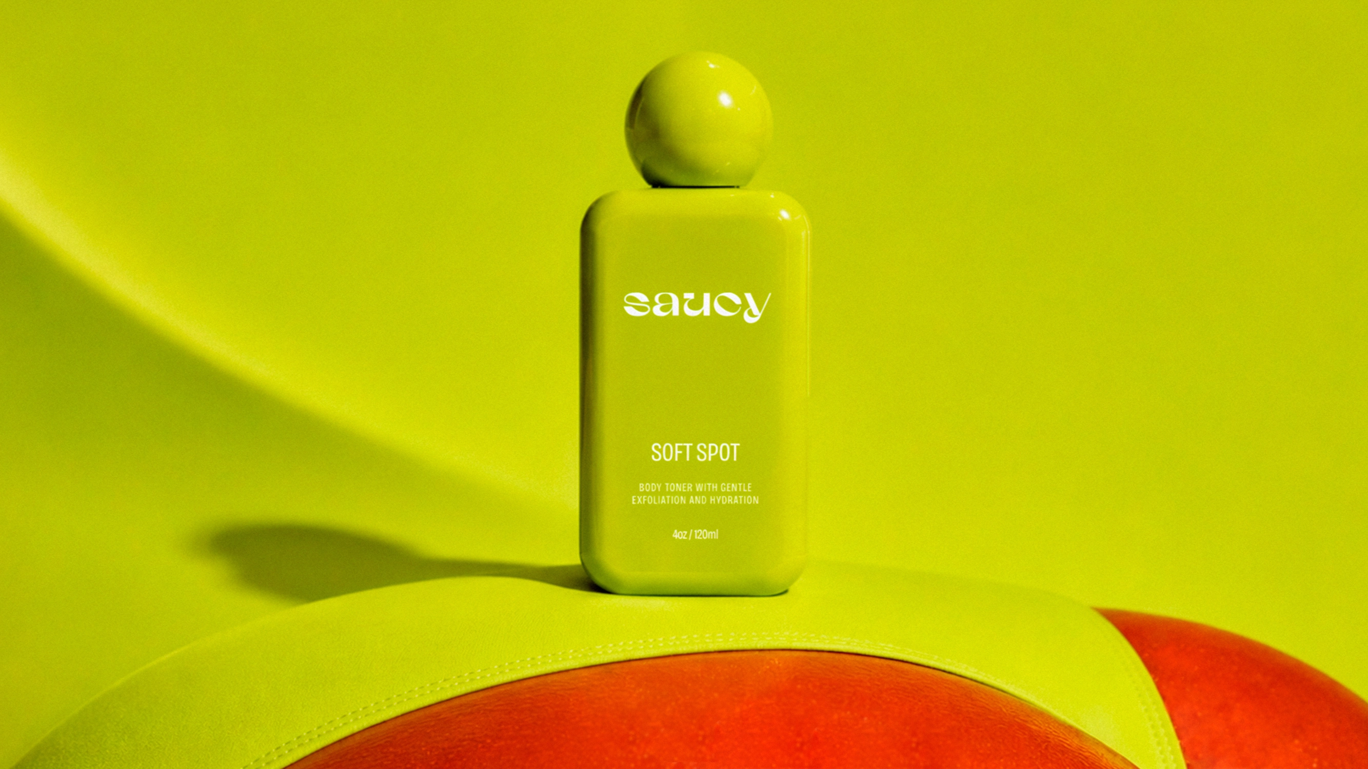
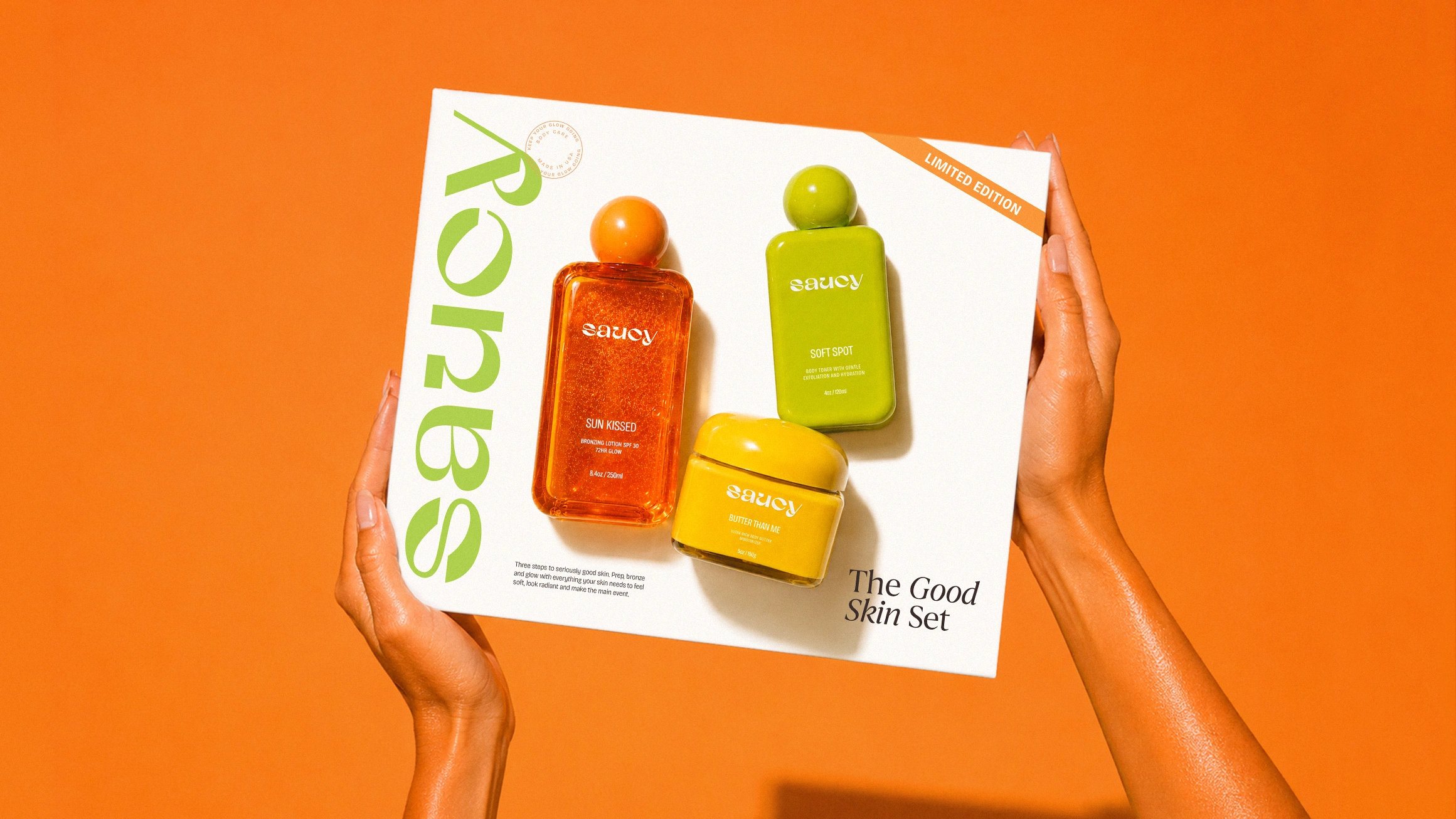
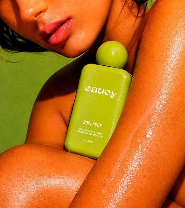
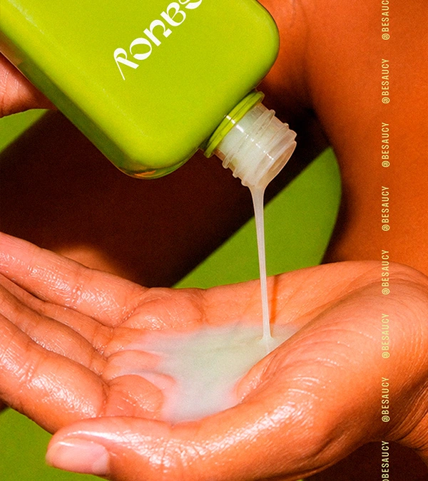
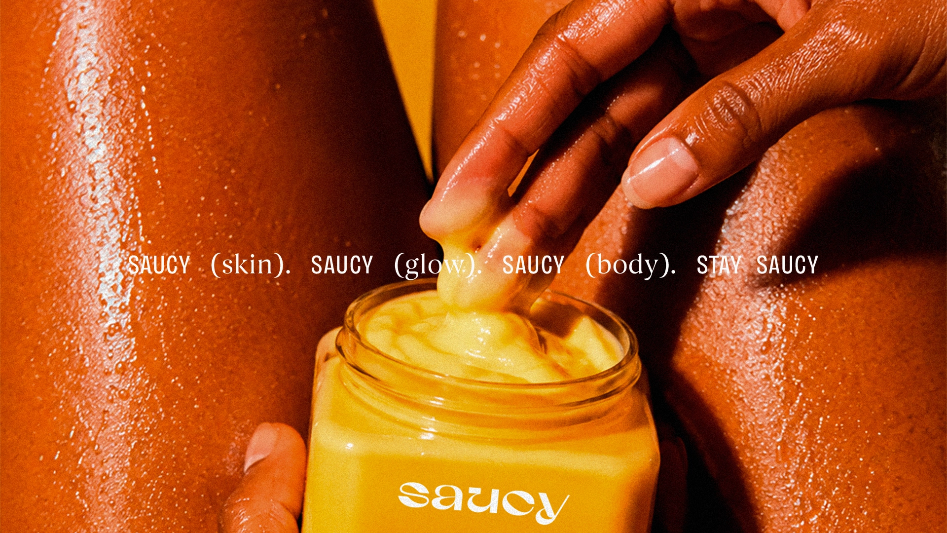
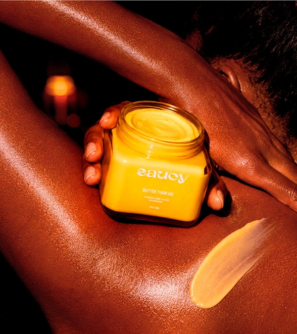
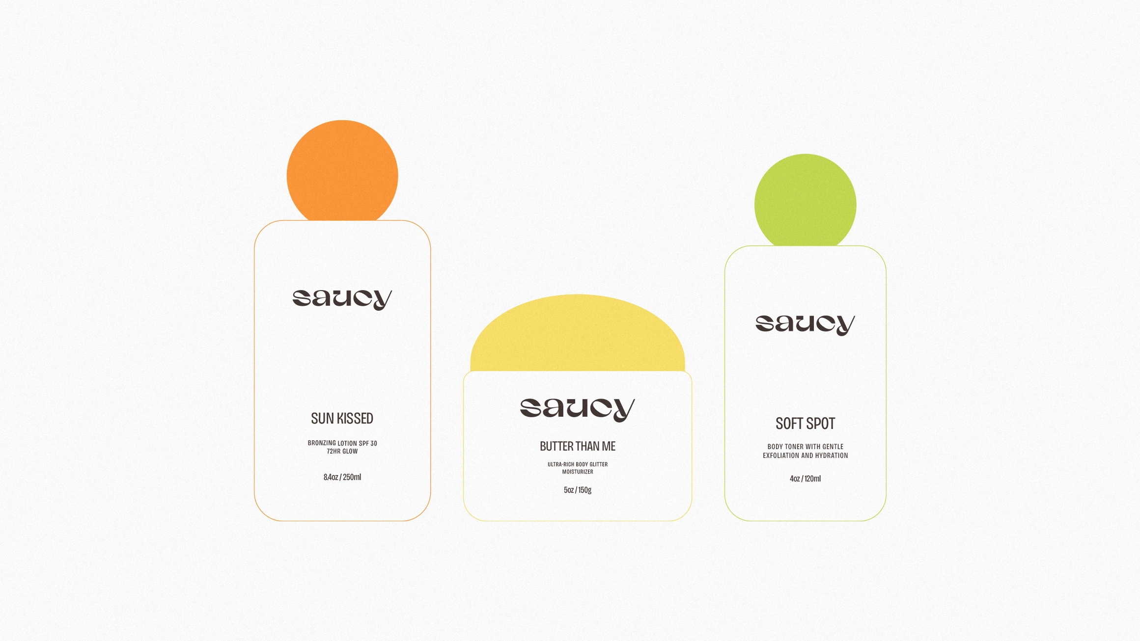
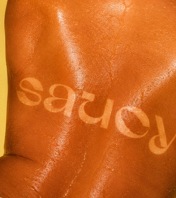
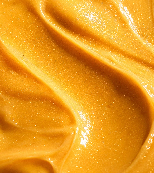
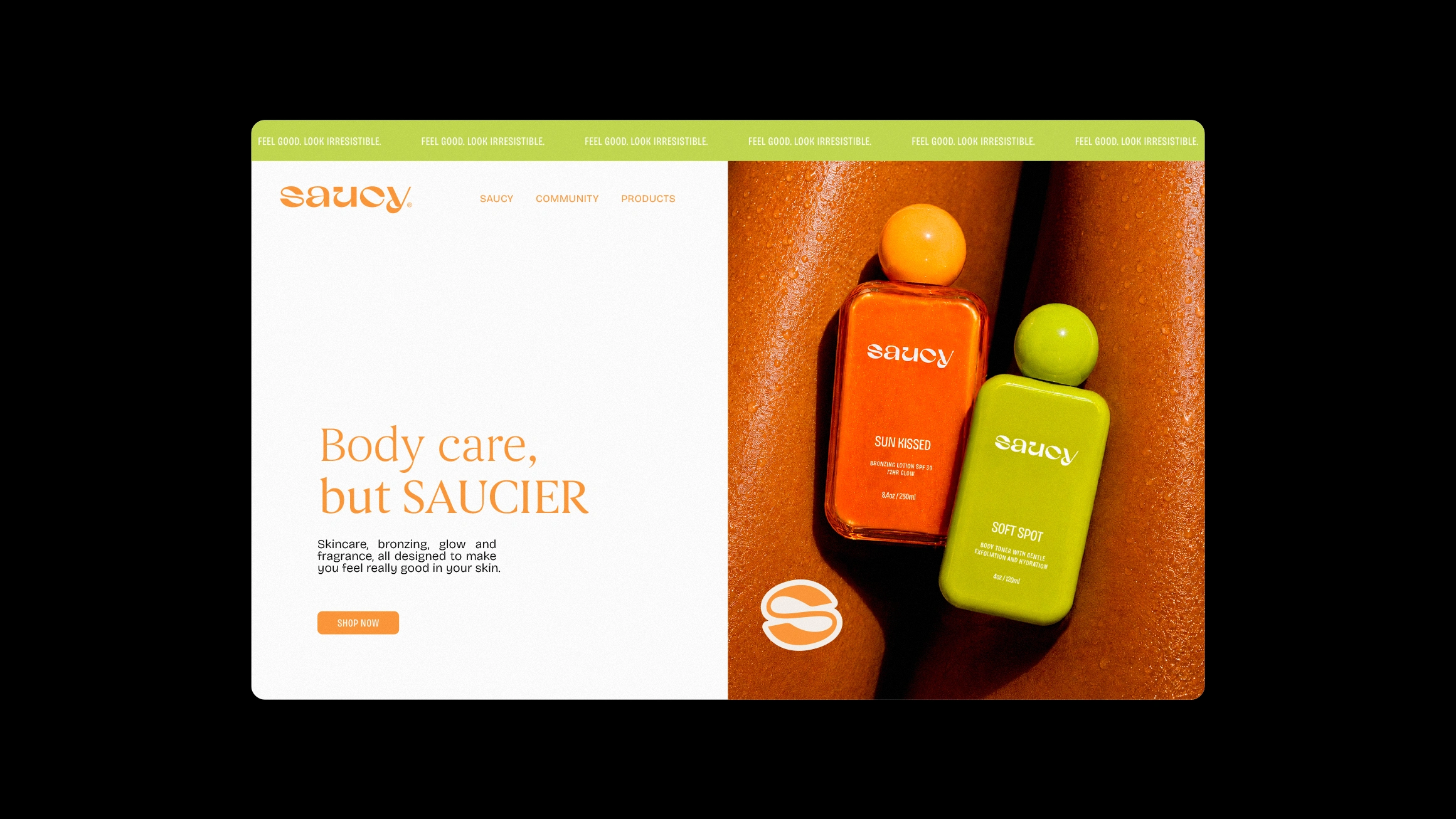
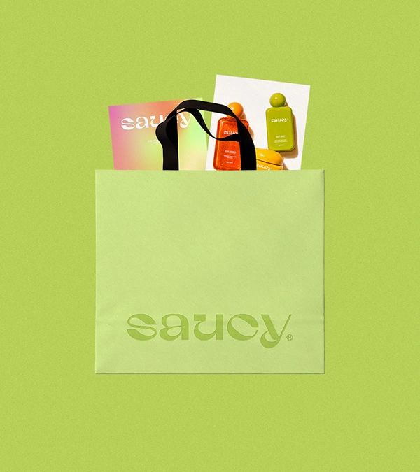
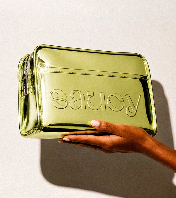
Meet your new body obsession. SAUCY isn't another tanning brand chasing the same tired glow. It's body care with real attitude: bold, cheeky, confidently self-assured, made for skin that wants to be seen, felt and remembered. While the rest of the shelf plays it safe, SAUCY turns the everyday routine into the best part of your morning or night: Soft Spot for touchable skin, Sun Kissed for that no-sun-no-problem bronze, Butter Than Me for seriously soft skin. A palette that does the talking. Photography with real polish. One line carrying it all: stay saucy. Feel good. Look irresistible.
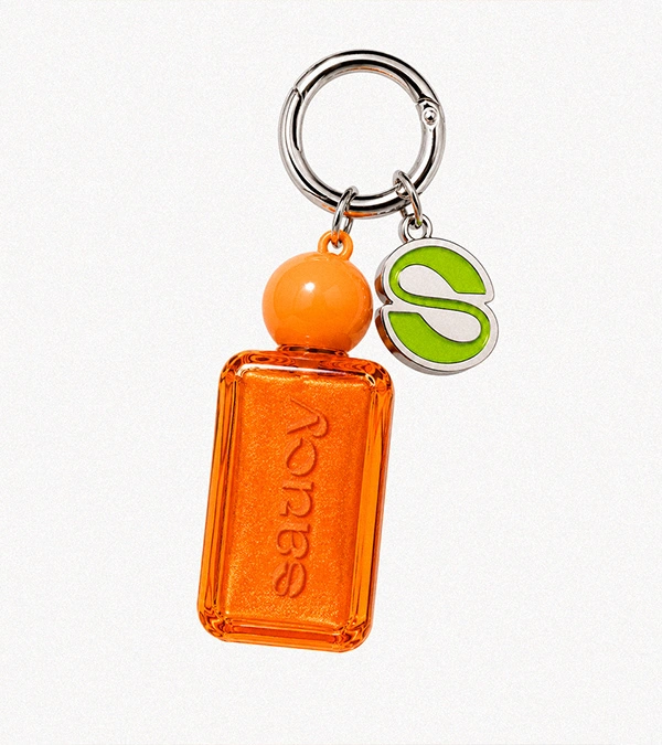
Developed from the ground up: the name, the positioning, the color palette, the product naming and the visual identity. The name set the filter for everything that followed. Every trait it carried, bold, cheeky, playful, confidently self-assured, had to show up somewhere: in the color, the copy or the packaging, or it didn't make the cut. From there came a palette built to carry the brand on its own, product names with personality instead of generic category labels, and one line, stay saucy, that ties it all together.
An Orcaah original.
Like this project
Posted Sep 7, 2026