The results are in! 🔴 First
Dima Strizhak
The results are in! 🔴
First of all, thank you all for voting on my previous post! The engagement was wild! The red version took a decisive lead, and it’s easy to see why.
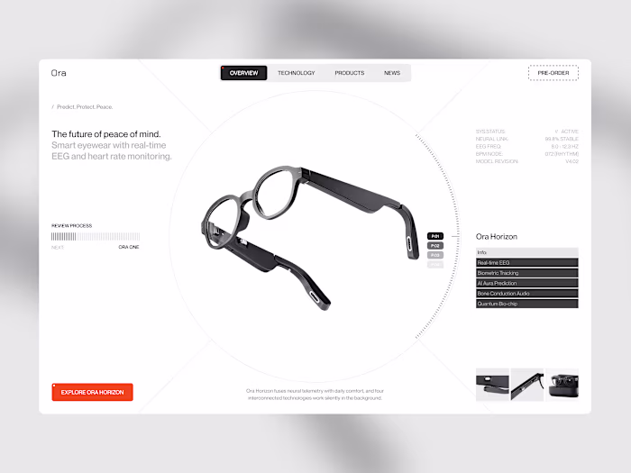
While the blue direction felt the high-contrast and mysterious, red represents a perfect balance between expressive, confidence-inducing visuals and a strict, professional layout. My goal here was to command immediate attention and give the product a strong, premium visual authority right from the first second.
I focused on strict vertical grid discipline and a tight typography layout to keep the interface structured, while the yellow framing acts as a strategic focal point that instantly captures the eye. By balancing the intense, hot gradients at the top with a grounded, rich black base for the metrics, the hero section feels incredibly impactful without sacrificing readability.
For those who voted: what specific element made the red version stand out the most for you?
Like this project
Posted Jun 15, 2026
The results are in! 🔴 First of all, thank you all for voting on my previous post! The engagement was wild! The red version took a decisive lead, and it’s ea...
Likes
0
Views
4