HearU — Mobile App & Logo Design
The concept of the HearU app was developed by me for educational platform called «Creative Practice» by Cases. The task was to create the prototype and design for the main screens of the audio notes app with voice recognition functionality on the iOS platform. It was needed to create a complete functional prototype, design all the screens, a logo, the foundation for the design system.
Competitive Audit
Studying both direct and indirect competitors, the well-known app Shazam was chosen as a source of inspiration because its interface is convenient and intuitive. I also borrowed the layout of some elements for the recording control screen from similar applications. In other aspects, due to the lack of outstanding samples on the market, I mainly relied on my own vision and universal solutions.
Ideation
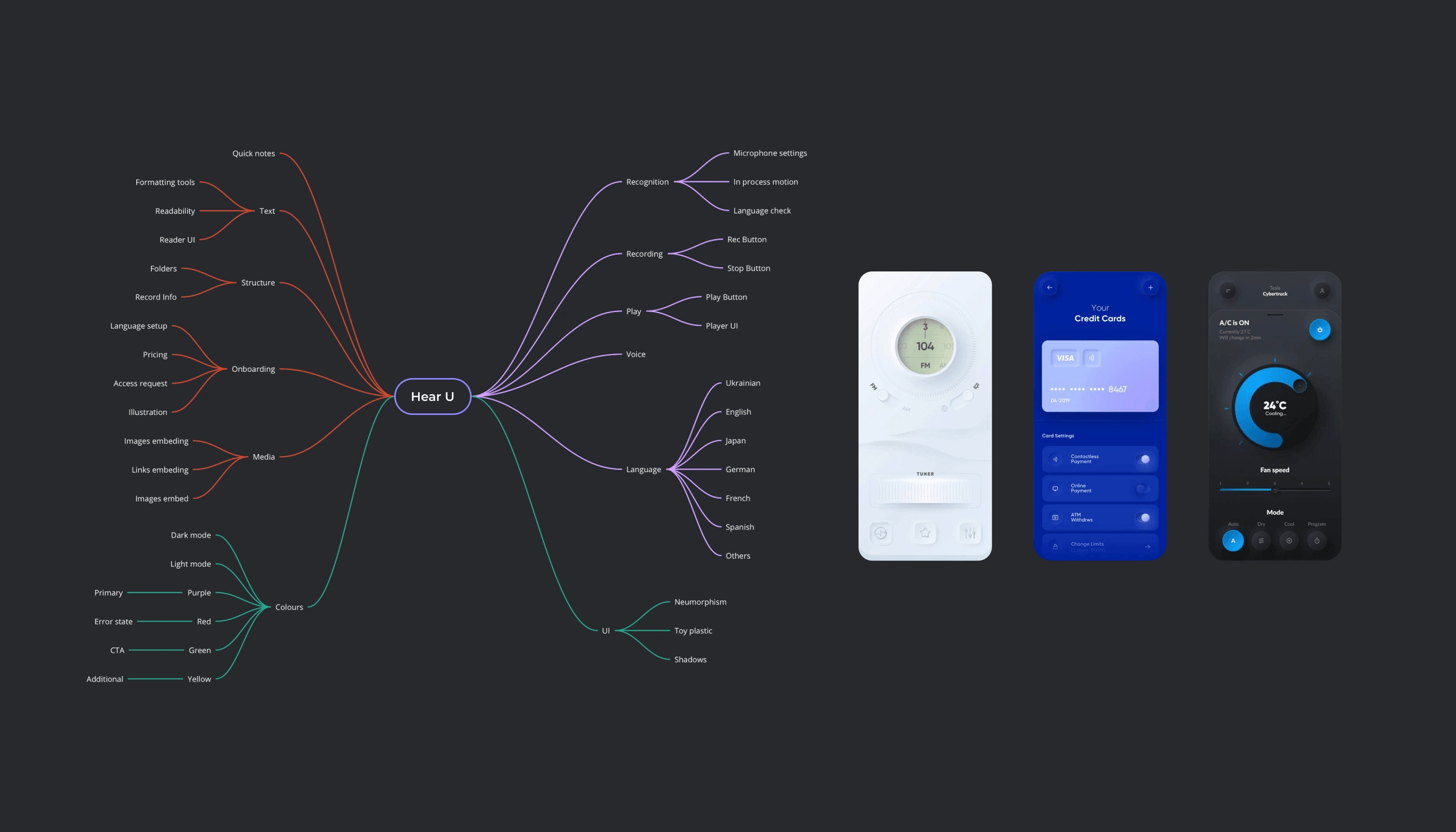
To create the core concept and structure of the app, I used mind mapping. Later on, I refined the obtained result by studying and analyzing interfaces of both direct and indirect competitors. The starting point for the visual styling was minimalist neumorphism combined with vibrant colors to highlight the main functional elements.
Prototyping
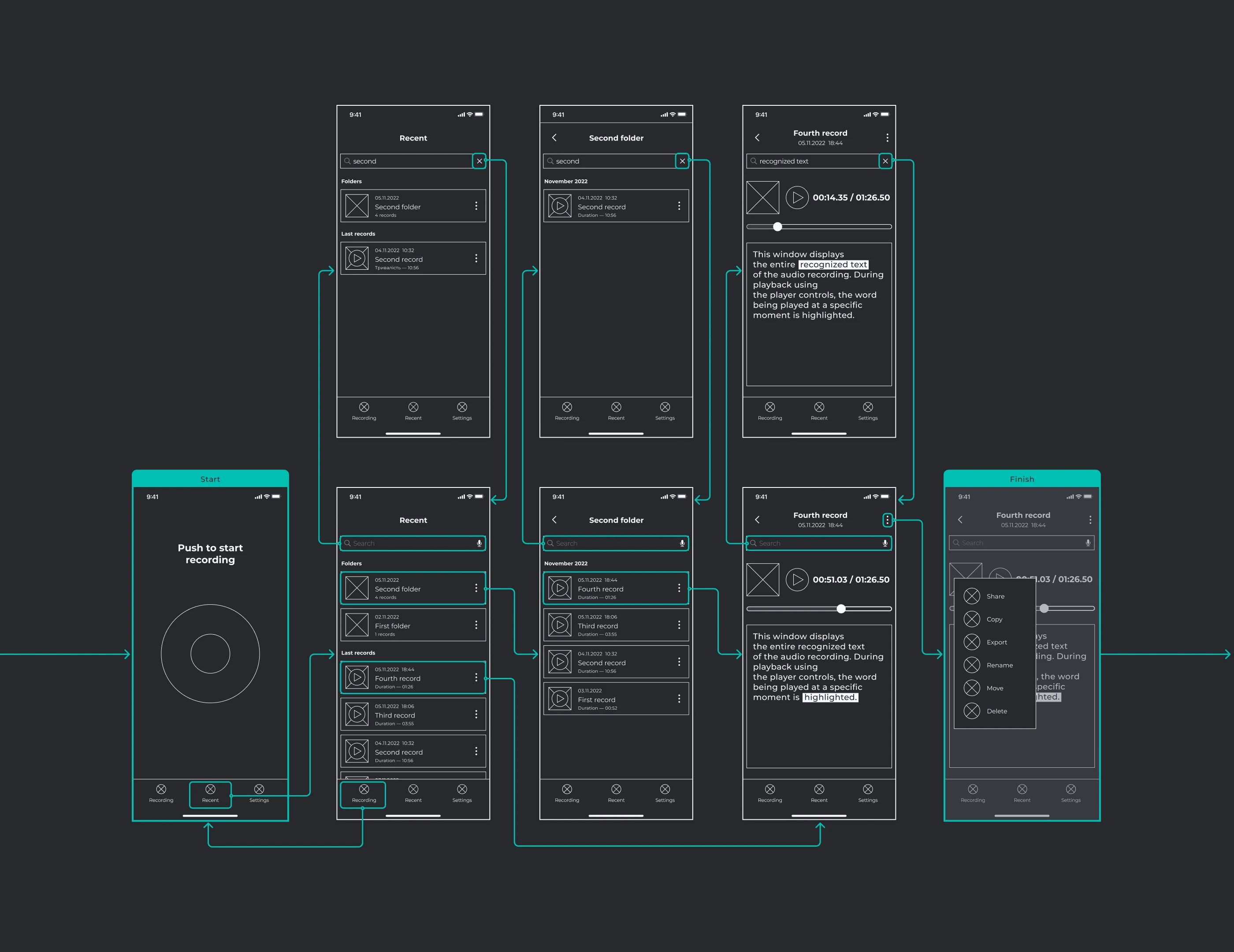
After studying the market and competitors, I started creating the prototype. Guided by examples from competitors, I aimed to design a user flow that is as simple, convenient, and concise as possible, resulting later in a product that anyone can easily use in their daily life — whether at home in a comfortable environment, at work or on the go.
Logo Design
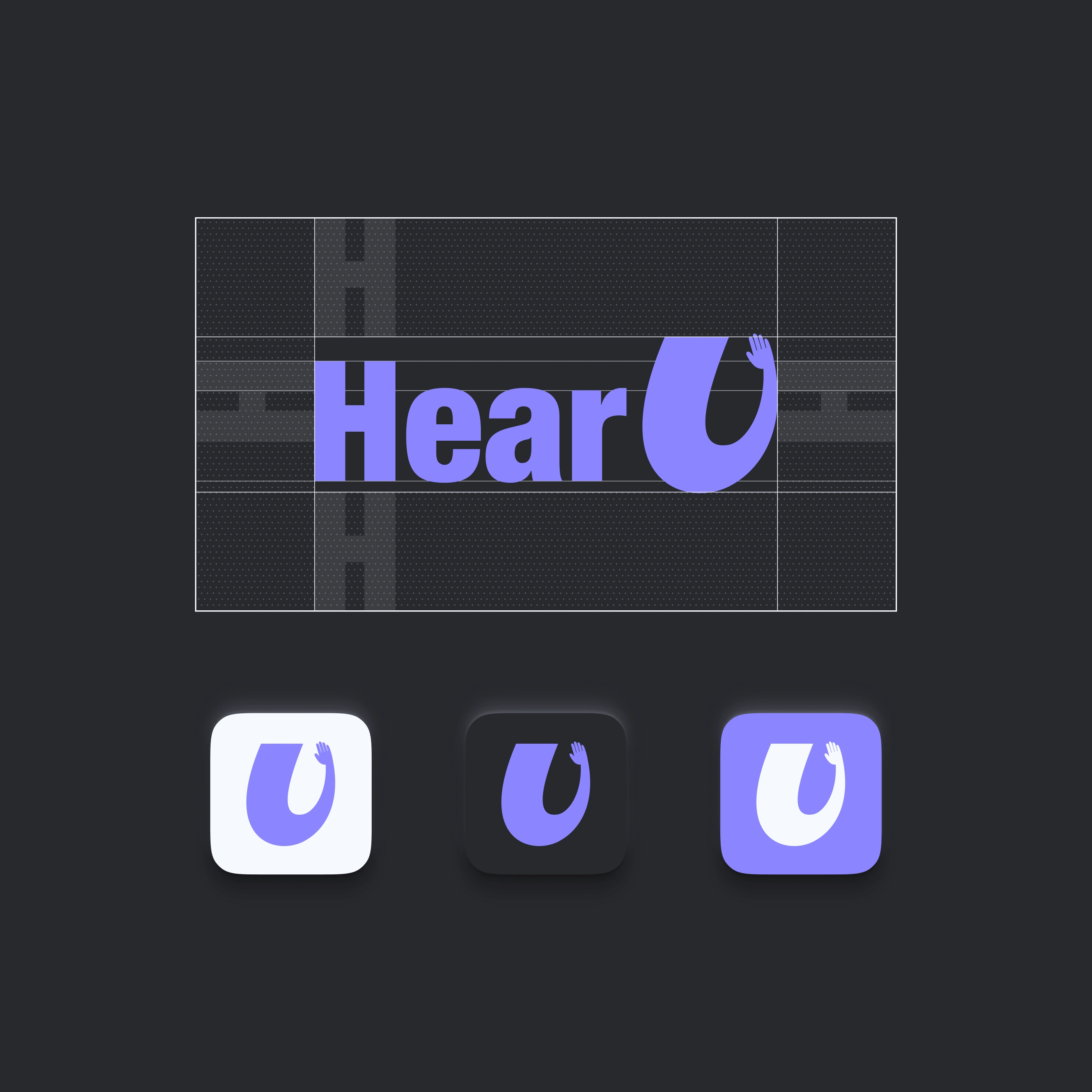
I chose a combination of a textual element and an complementing symbol. The symbol simultaneously represents the letter "U", a greeting gesture, and resembles the gesture of raising a hand to the ear listening the sound or speech. The font "Helvetica Neue" was used as the foundation of typography.
Icons
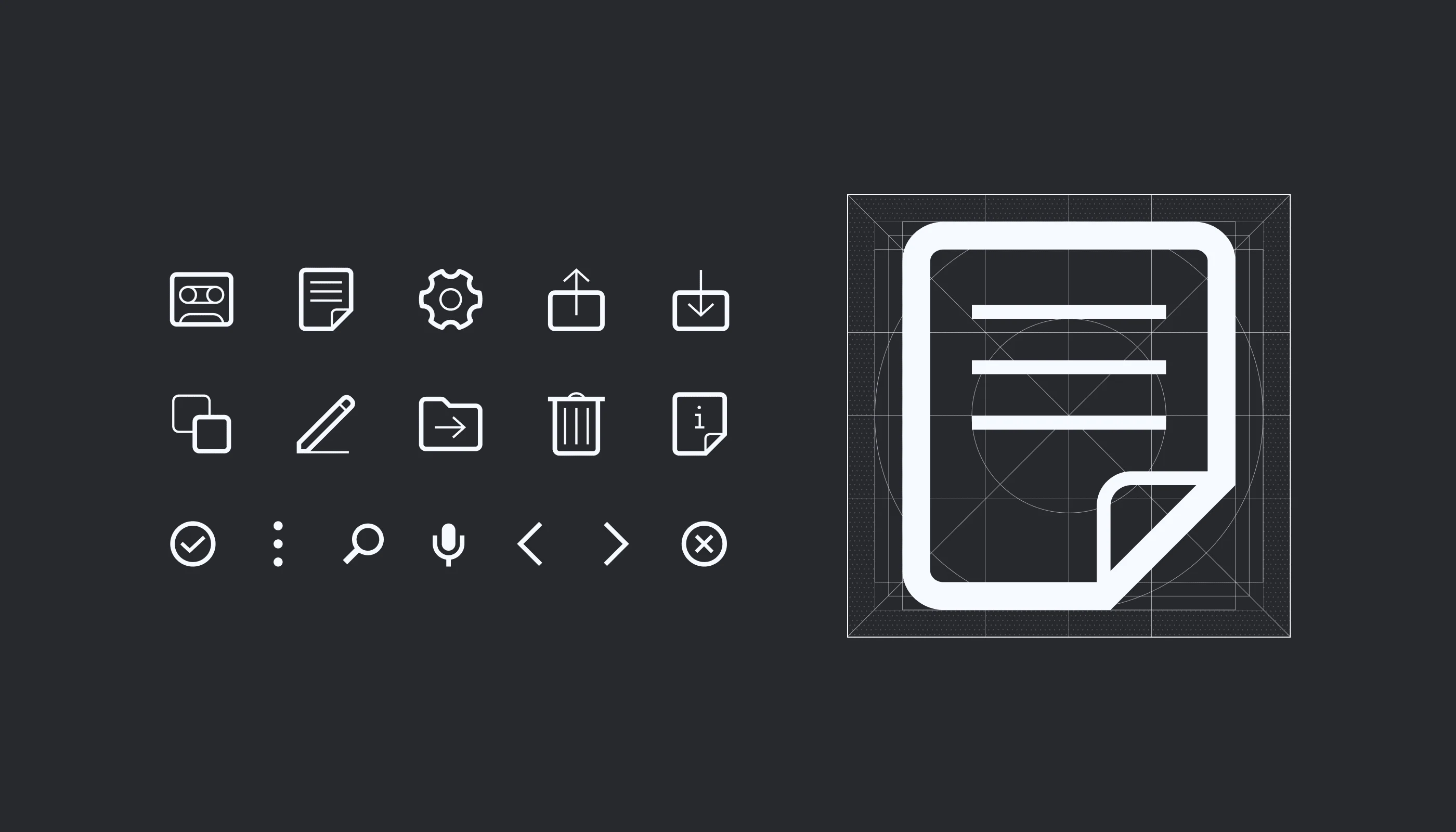
I decided to create interface icons from scratch to ensure that they align perfectly with the visual styling. This approach allowed me to obtain a set of desired images that are consistent and ready for use in the interface, taking into account screen resolution.
Colours
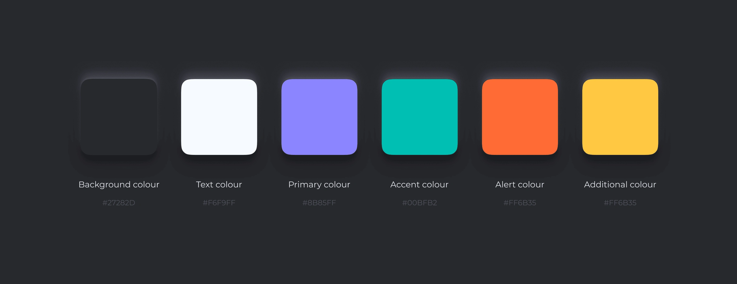
I chose a light purple shade as a primary colour that evokes associations with fine and easy to use product, intelligent transformation, and a magical atmosphere of interaction. It is complemented by secondary simple colours making interface highly understandable in the context of interacting with main functional elements. Additionally, I selected core neutral colors that serve as the base for the light and dark mode palettes.
Typography
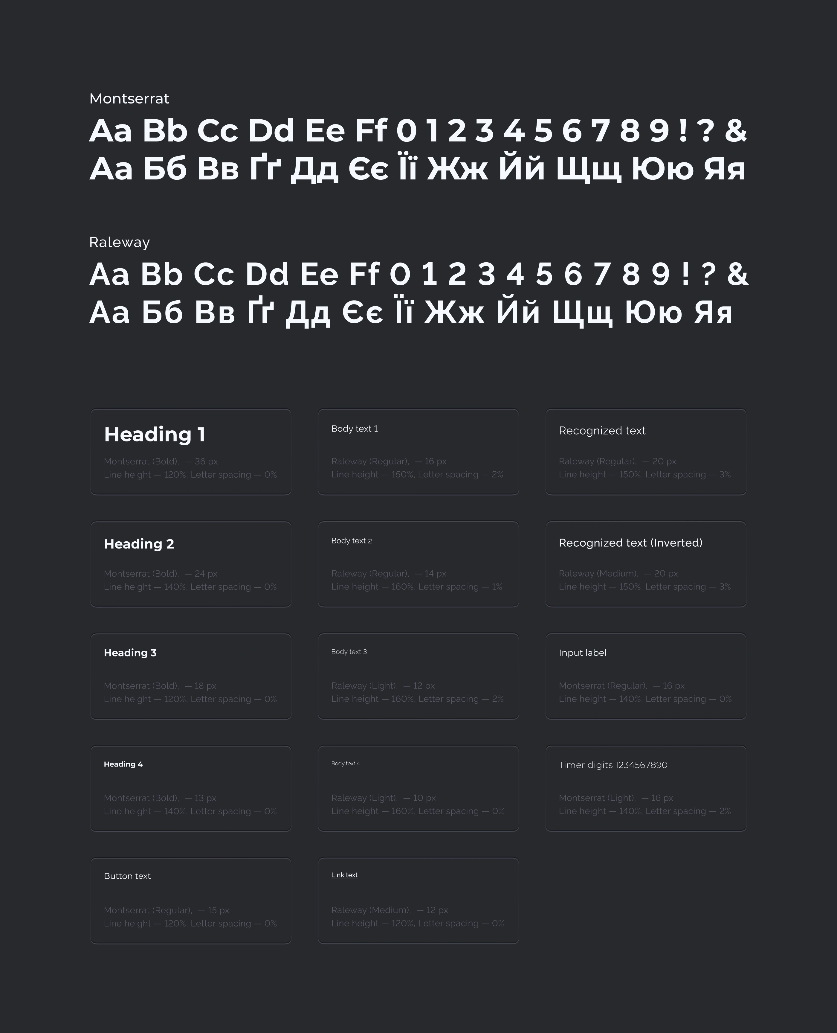
While choosing the font my goal was to find a simple and modern typeface that supports the Cyrillic script and looks good not only in the English version of the interface but also in Ukrainian. I selected the grotesque Montserrat typeface for the headings, buttons, and main interface elements. Withal I added Raleway for the body text, which complements the typography part with nuances and does not contrast with the headings, making the textual content sufficiently calm and balanced.
UI Kit
When creating the set of functional interface elements, I aimed to make them both simple and fetching, evoking the desire to touch and interact with them. At the same time, these elements should collectively create a sense of a cohesive, almost tangible system, resembling the dashboard of an intelligible and neat device, akin to gaming controllers or portable audio players from the 80s / 90s.
Login
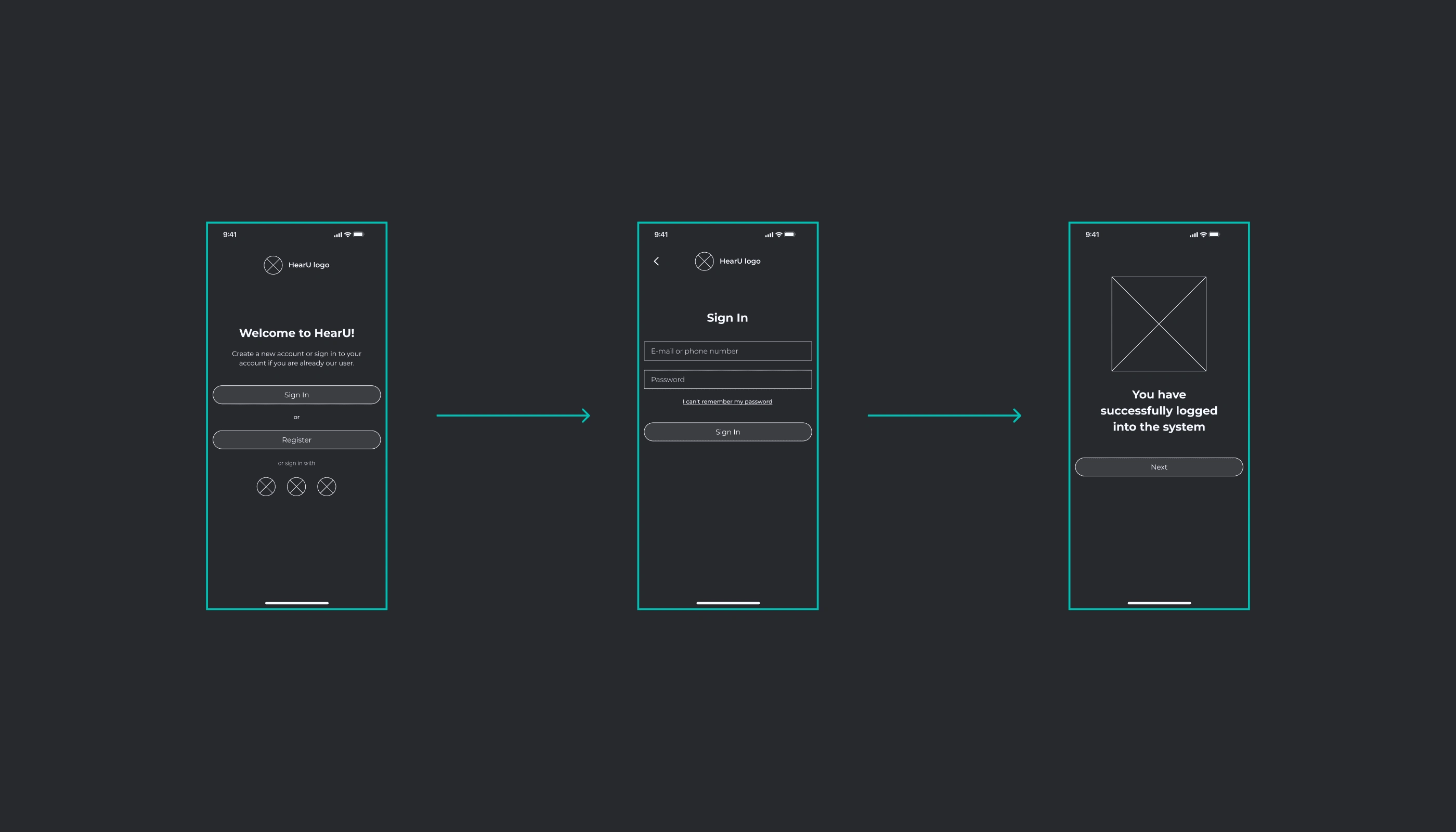
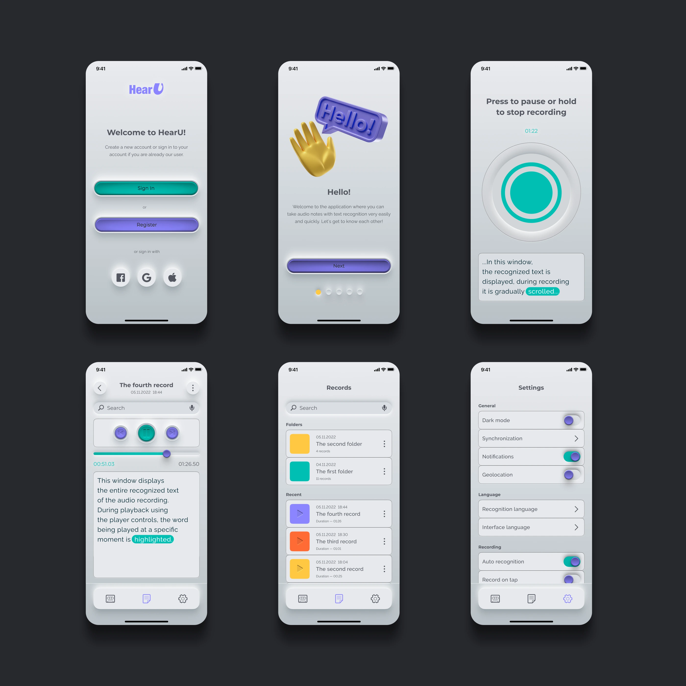
Immediately after entering the app and watching a short animated intro, the users are directed to the welcome screen, where they have the option to choose further actions: login with their username and password, register as a new user, or quickly sign in using social media. Upon successful authorization, the users are shown a message screen with an appealing accompanying illustration.
Wireframes
Onboarding
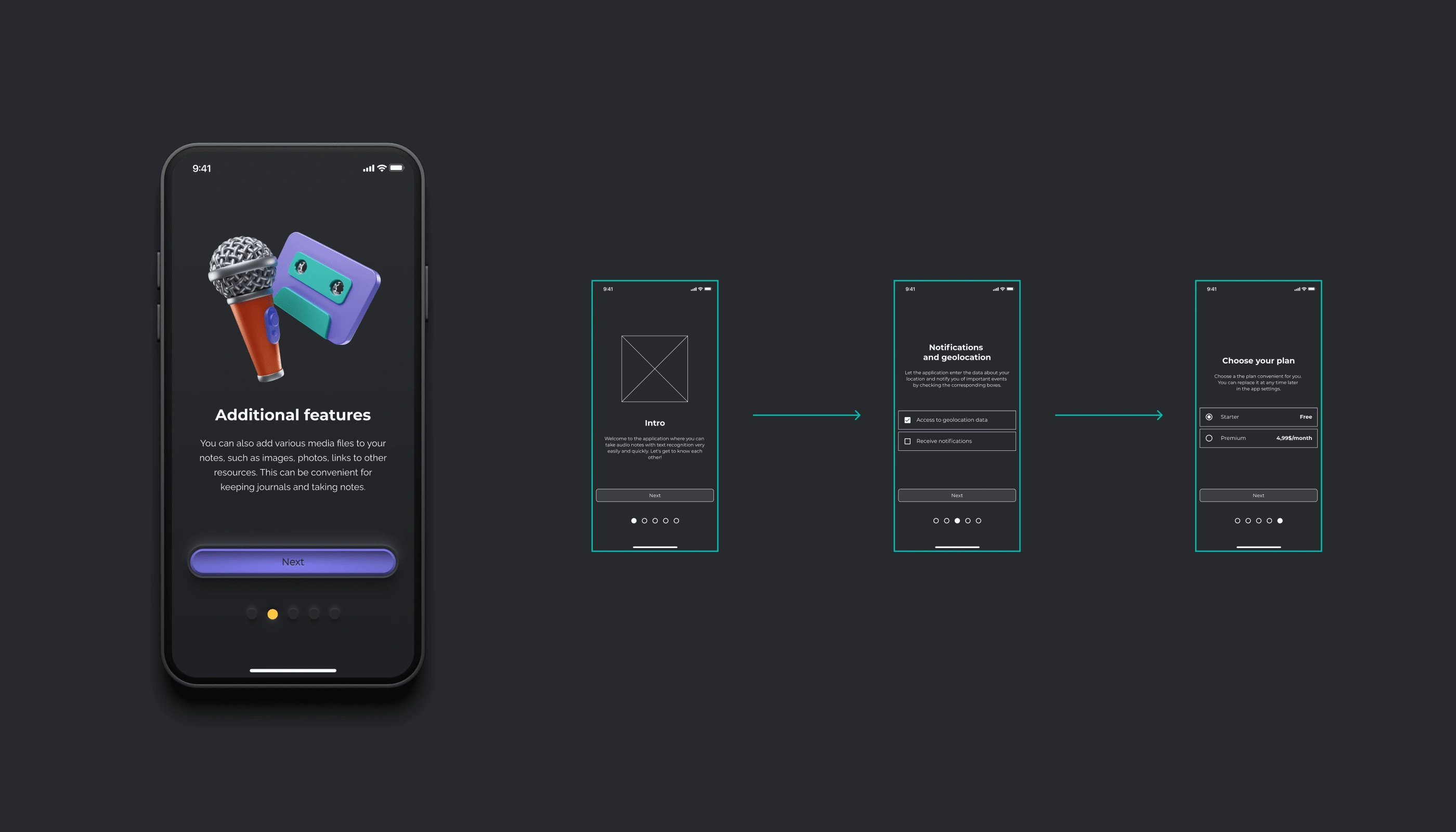
After the user's initial login, they go through a short onboarding process that explains the app's main features and helps set it up for use. Catchy illustrations are also used during this onboarding to smoothly immerse the users into the workflow and create a friendly atmosphere.
Main Function
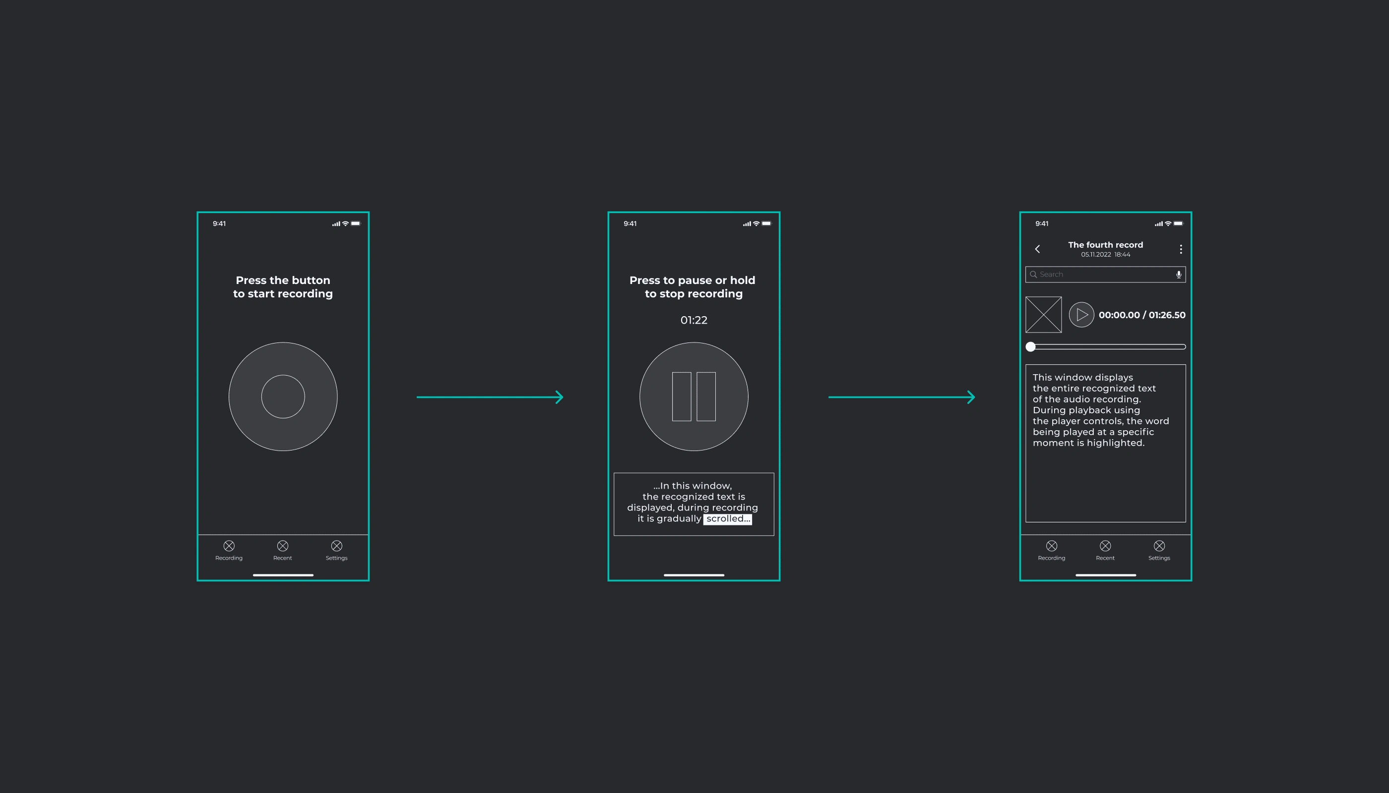
The main functional button, occupying a significant portion of the screen, allows for easy and quick control of the process: starting recording, pausing it, or stopping the recording. After completion, the user is taken to the screen for managing the current recording.
Wireframes
Navigation
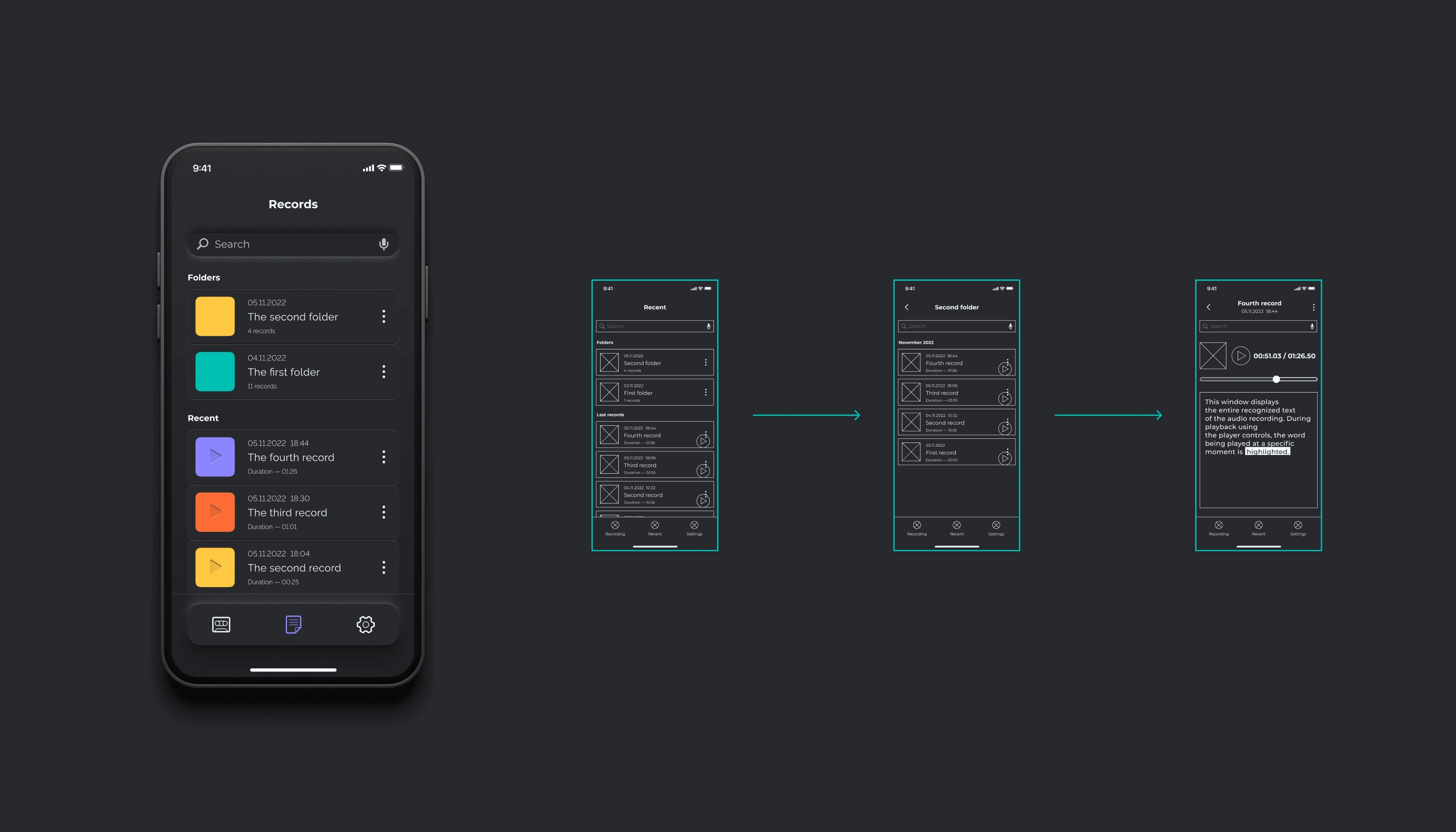
The main menu allows for quick switching between the main functional screen, the recordings manager, and the settings screen. In the recordings manager screen, there is an option for easy management of recordings and grouping them into folders. Furthermore, there is the ability to navigate to the specific recording screen for playback, editing, and other additional actions.
The Light Mode
The app offers the option to choose between a light or dark theme, which allows reducing eye strain under different lighting conditions, whether it's during the day or at night. Additionally, it adds a certain level of diversity to the interface palette.
Mockups
Interface Language
The app provides the option to choose both the language for audio recording recognition and the language for the app's interface. To do this, you need to select the appropriate option in the settings.
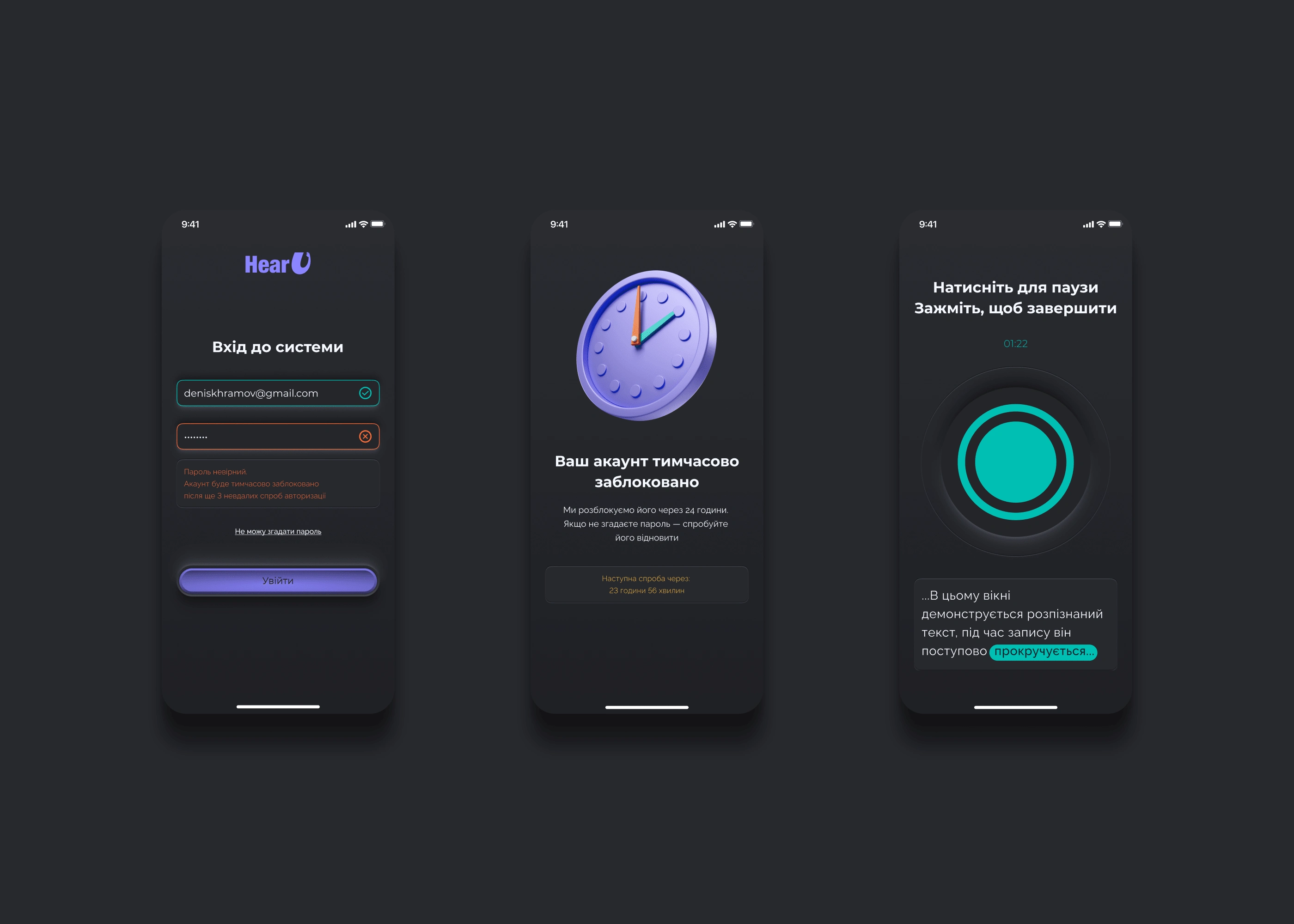
Mockups
Illustrations
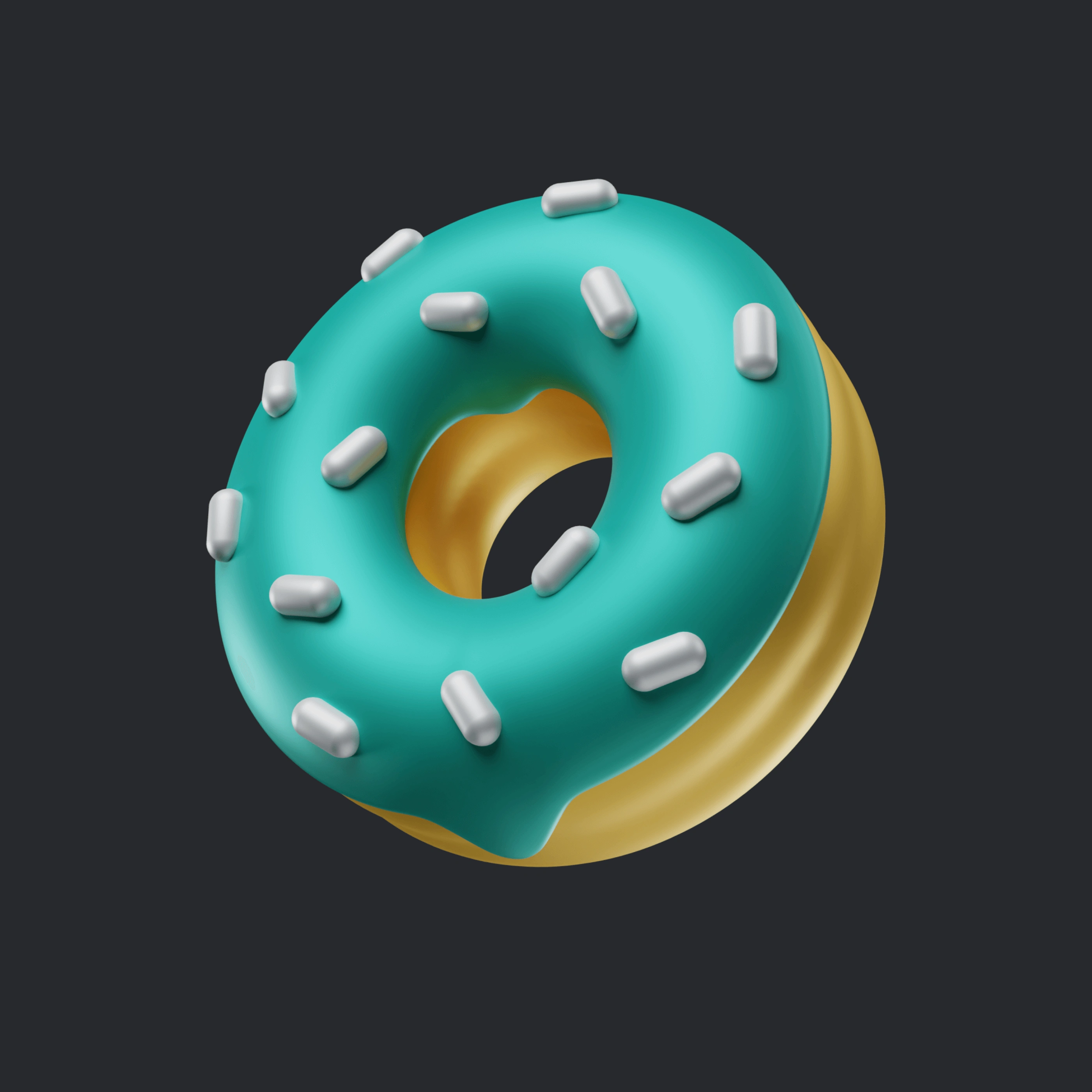
I decided to create unique illustrations for message and onboarding screens, that would stylistically complement the interface elements and use its colours. To achieve this, I made simple sketches in Procreate, which I later reproduced as three-dimensional models using Blender.
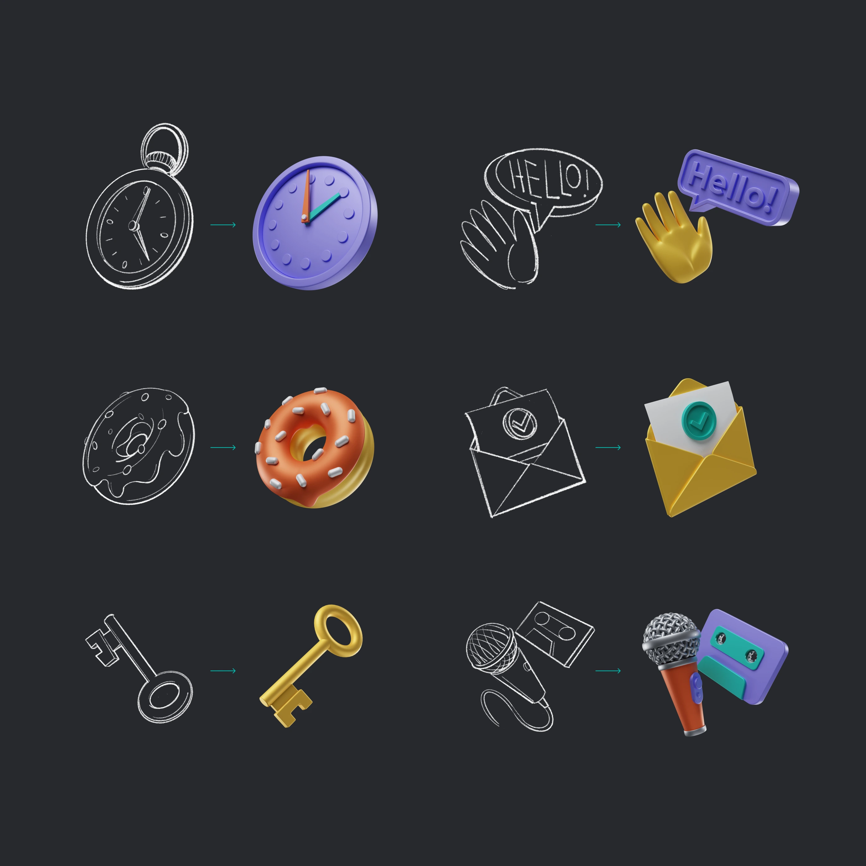
From sketch to Blender 3D
Like this project
Posted Feb 13, 2024
HearU app was developed for «Creative Practice» by Cases. The task was to create the prototype of the audio notes app with voice recognition functionality.
Likes
0
Views
8


