Getzing Landing Page — Design & Development

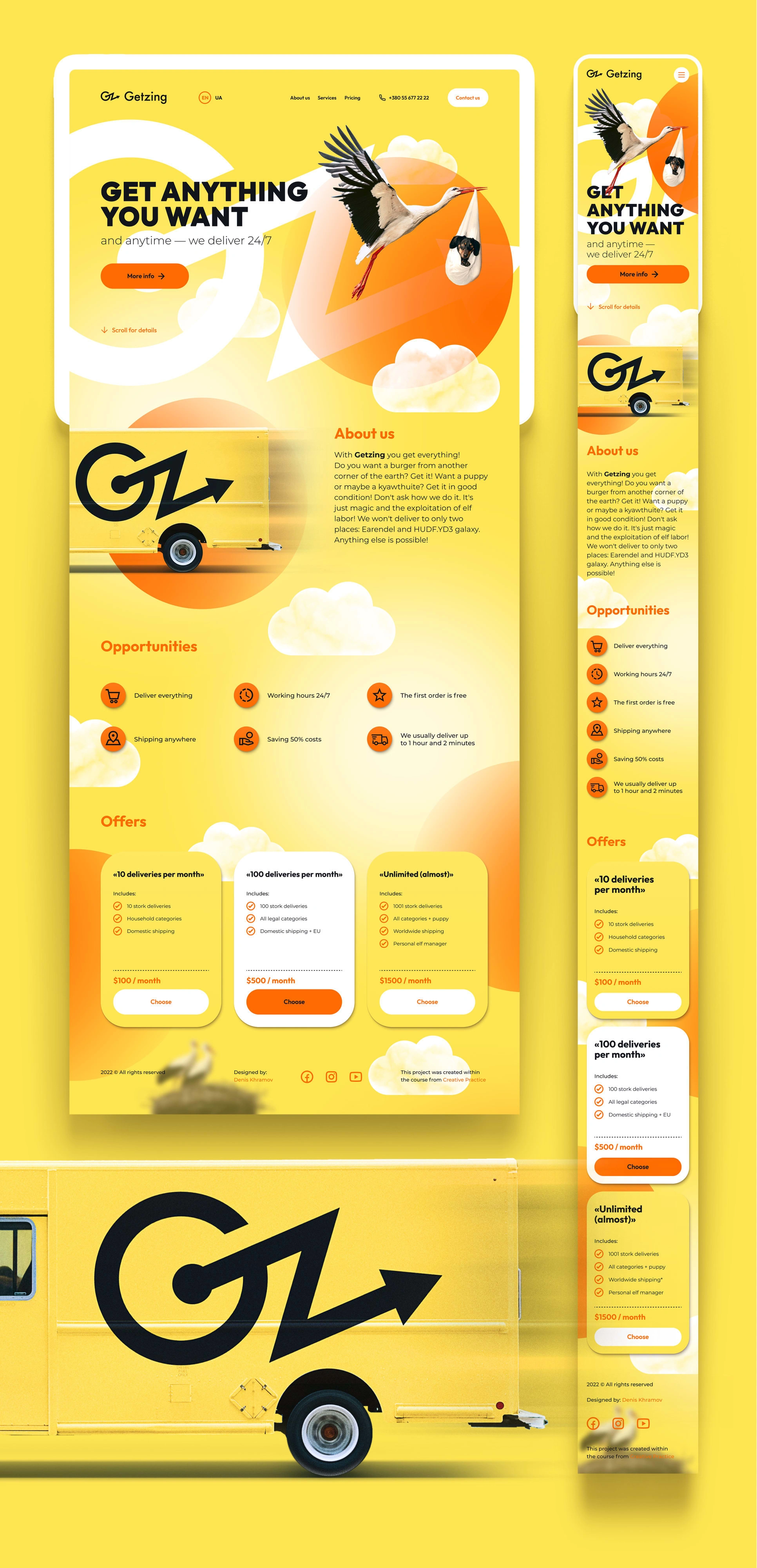
This project started with the development of brand identity and web page design for a delivery service within the Creative Practice project. Later, I implemented my design into a working website on Webflow, adding custom code, Lenis scroll, and integrating other services.
Initially, I studied the main competitors, then created a logo, basic branding, and key visuals for the website. I also wrote simple copy with a straightforward and moderately humorous tone of voice, aiming to create a friendly and light atmosphere for the visitor.
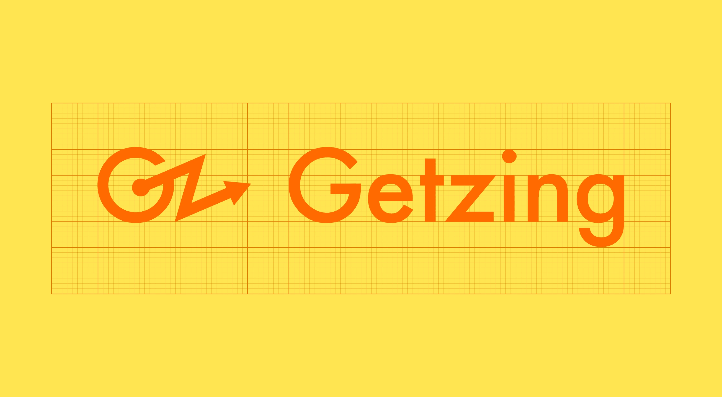
Logo
The idea behind the logo is to create an original symbol consisting of the first letter «G» and the letter «z» from the brand's name, resembling a lightning bolt or the trajectory of movement on a map. It is also associated with fast movement and logistics. The typographic part is developed based on a Futura font.
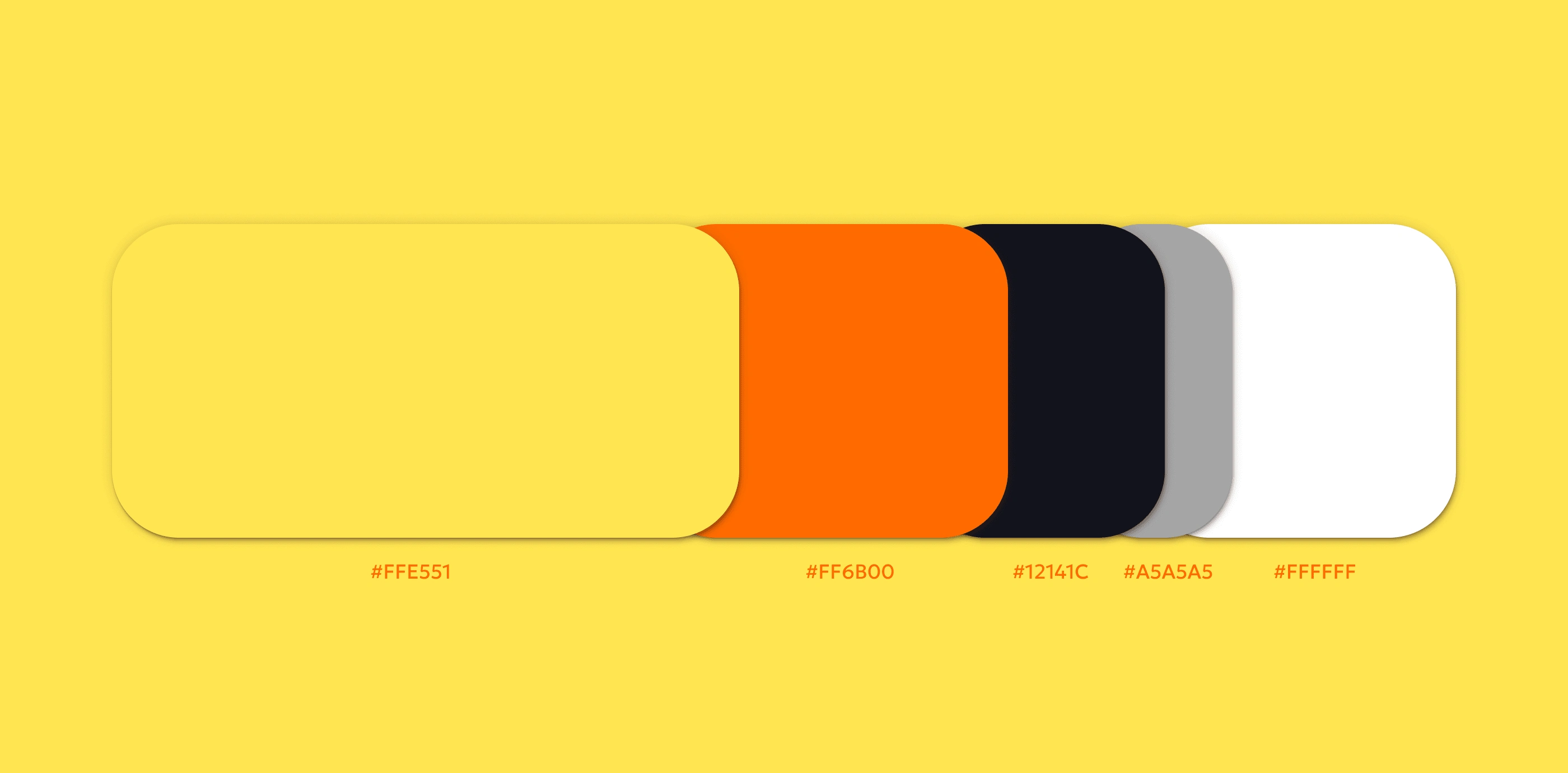
Colors
I chose an energetic yellow as the primary color. As an accent color, I added a carrot-orange color. For the main text and other neutral elements, I selected cold black, gray, and a simple white color.
Typography
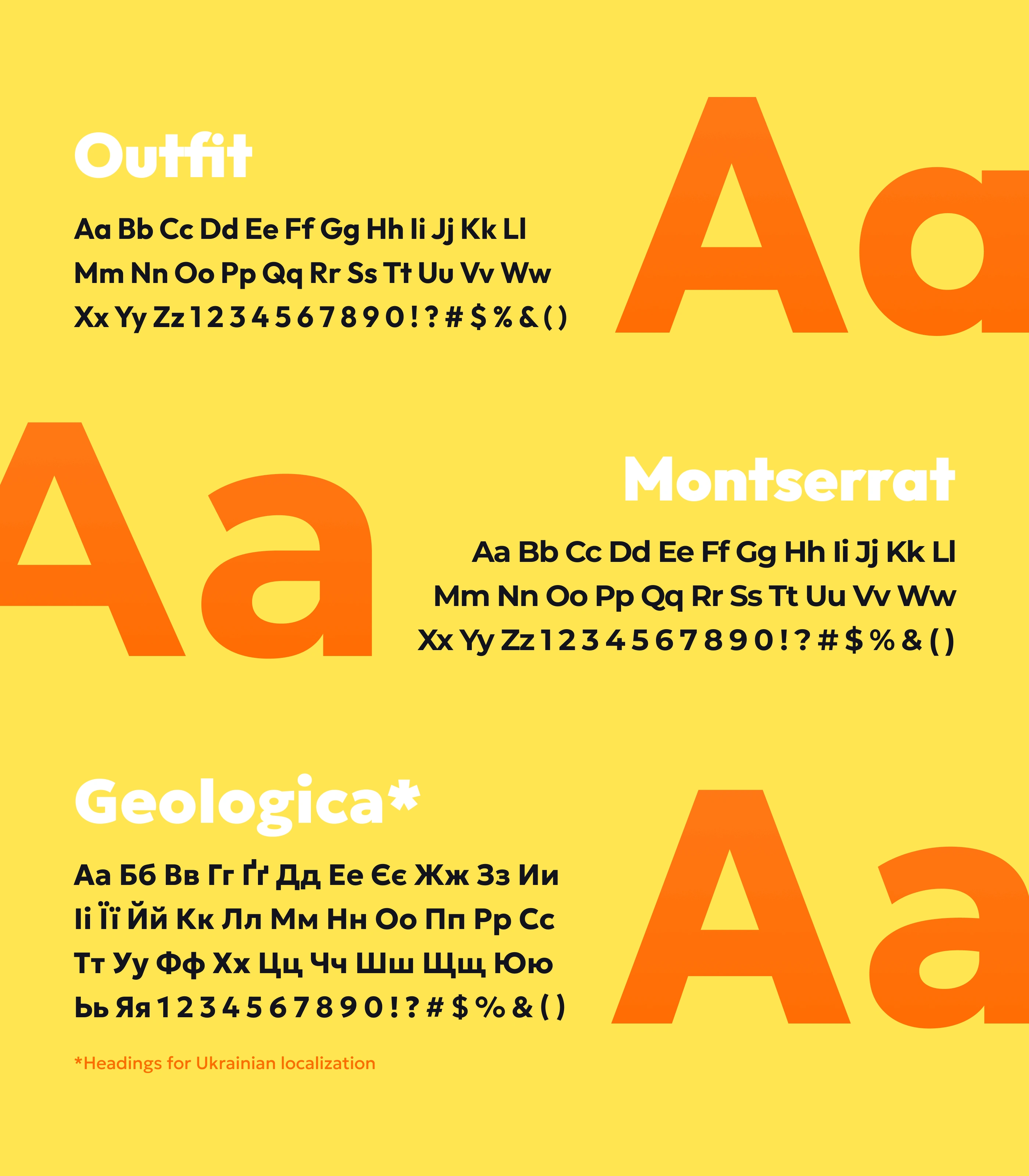
For headlines, I chose a simple geometric grotesque typeface, Outfit, and for the main text – Montserrat. Since the Outfit lacks a Cyrillic character set, I chose the Geologica typeface for Ukrainian localization of the website headlines. It has a set of fonts corresponding to the Outfit, as well as a similar boldness, character, and geometry.
UI Kit
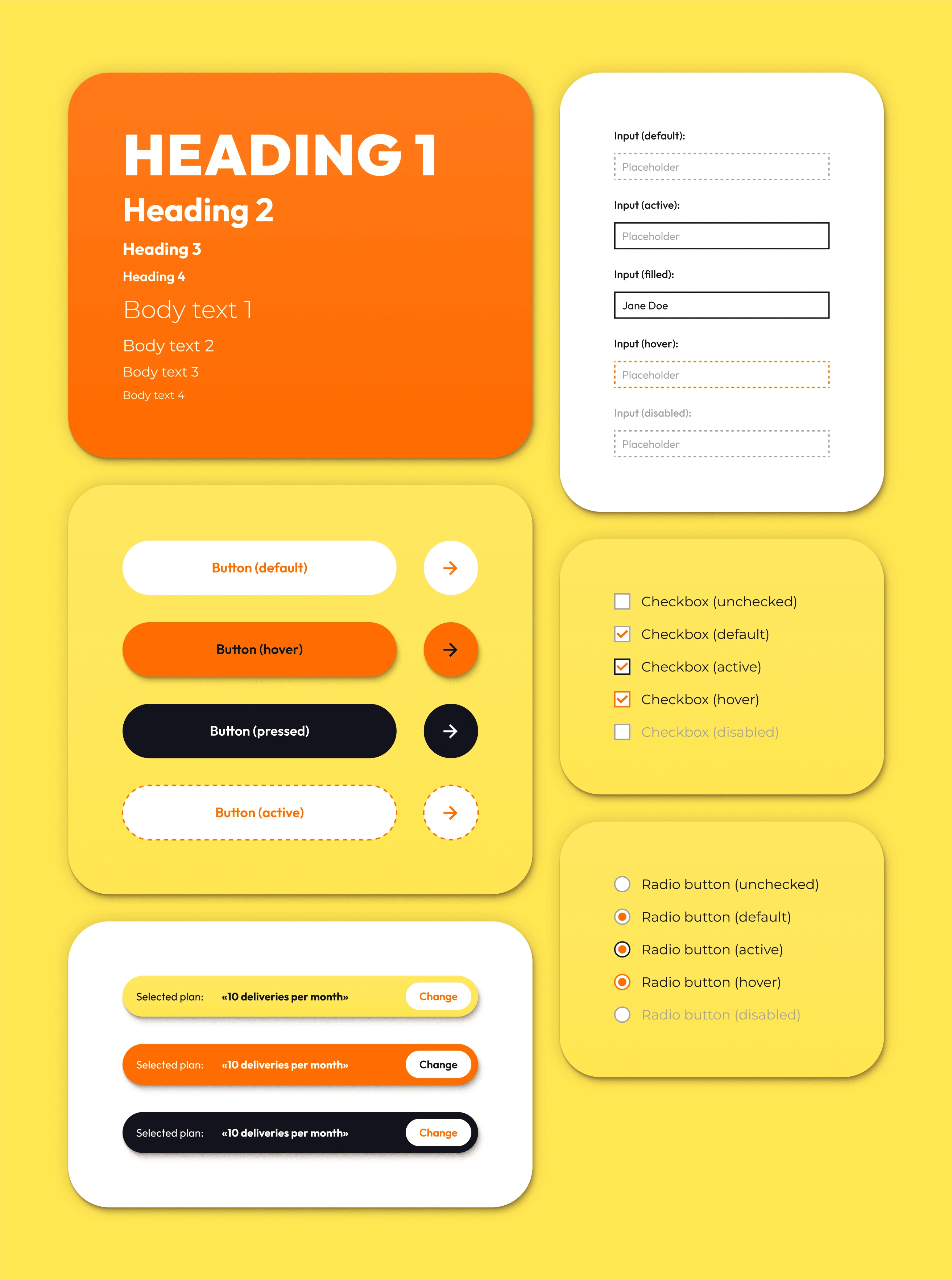
As Getzing is a single-page landing with a simple feedback form, it was enough to develop a concise UI Kit with a minimal set of elements. Later, I transferred it to Webflow, adding relevant classes and styling basic tags, significantly simplifying the layout process.
Grid
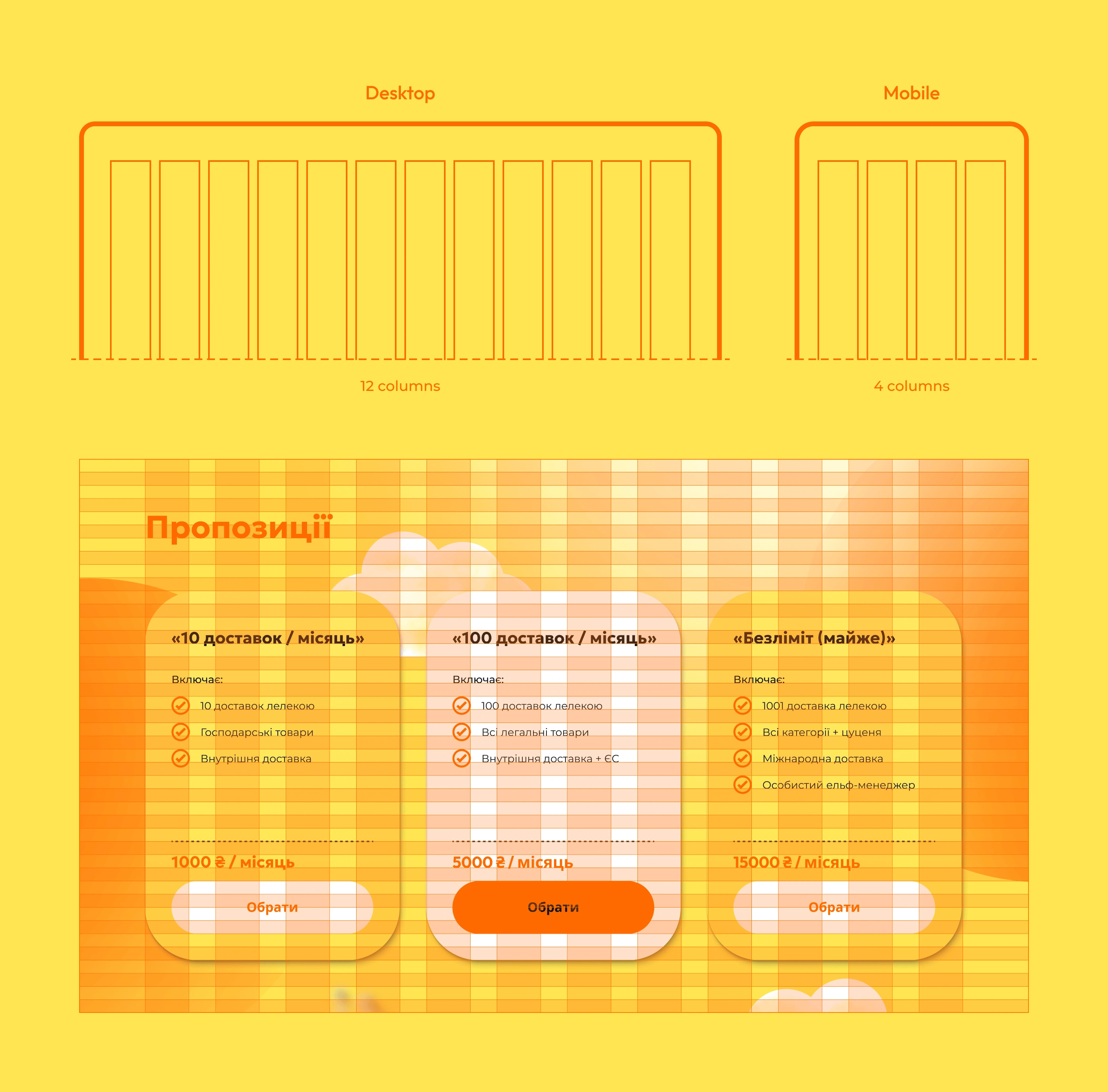
For the desktop version of the website, I used a 12-column grid; for the mobile version — a 4-column grid. I also added a grid of basic lines, which significantly facilitated the vertical layout process of the design.
Responsive layout
In addition to designing for desktop and mobile, I adapted intermediate and smaller screen sizes to ensure comfortable use on any device. I then tested it on various devices, such as tablets and mobile phones on iOS and Android, as well as in different browsers.
SEO and optimization
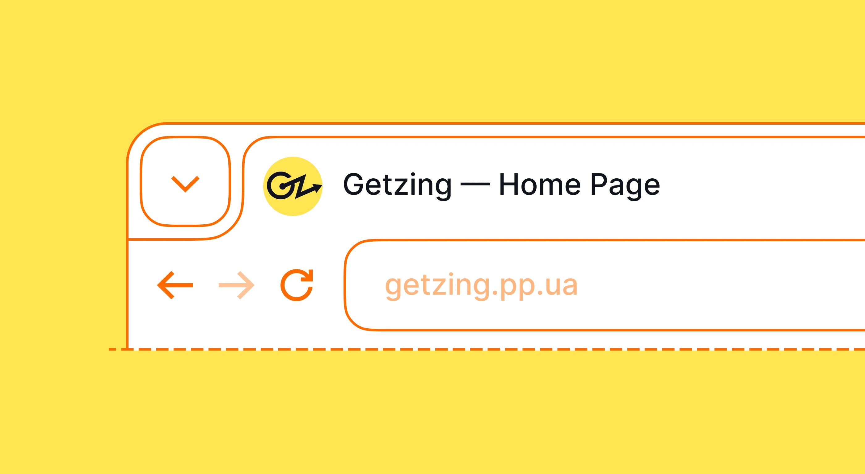
Finally, I connected a custom domain and set up basic SEO. I added all necessary metadata and media for OpenGraph and Twitter Card, alt text, favicon, web clip, etc. Then, I connected services for collecting and analyzing website data: HotJar, Google Analytics, Google Search Console. I also tested the site's speed before and after content optimization using PageSpeed Insights and GTmetrix.
Like this project
Posted Feb 13, 2024
I started with the development of brand identity and web design for a delivery service. Later, I implemented my design into a working website on Webflow.
Likes
1
Views
12

