Bold Brand Identity for Protein Water (CPG)
Benjamin C
Case Study: Building a Bold Identity for an Uncompromising Protein Water Brand
Client: Brave (Protein Water Brand)
Challenge: Launch a protein water brand in a market dominated by traditional protein shakes and sports drinks. The product needed to stand out on crowded retail shelves while communicating both performance and refreshment. Most competitors either looked clinical (like supplements) or too soft (like flavored water). Brave needed a visual identity that screamed confidence without alienating health-conscious consumers.
The Market Problem
Protein water was still an emerging category. Most brands were using predictable fitness imagery, gradient blues, and safe typography. During our competitive analysis, we found that 78% of protein beverage brands used similar visual language: muscular athletes, metallic finishes, and lowercase sans-serif logos. The category felt either overly aggressive or too gentle. There was no middle ground for a brand that could appeal to both serious athletes and casual gym-goers.
Brave's founders came to us with a clear product but an unclear identity. They knew their protein water tasted better and mixed cleaner than anything on the market, but they didn't know how to communicate that visually.
Our Strategic Approach: Condensed Typography as a Weapon
Most beverage brands prioritize readability over impact. We did the opposite.
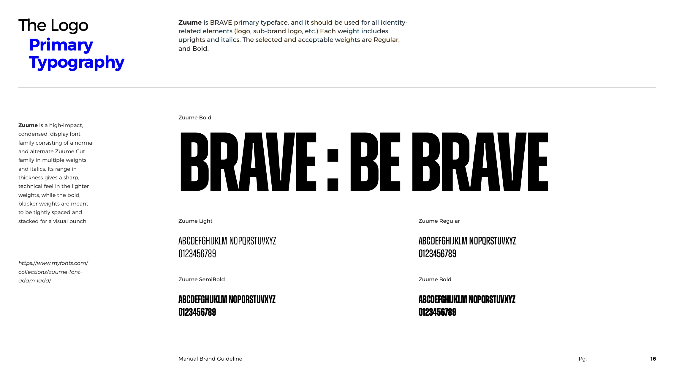
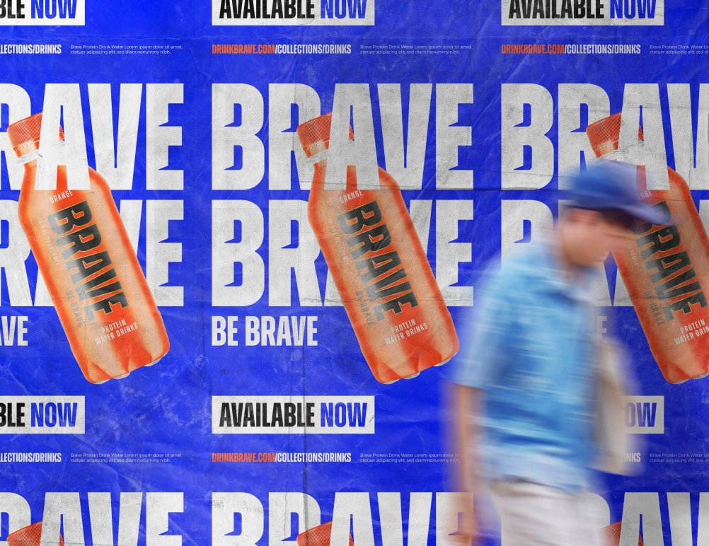
1. The Logo: Compressed Power
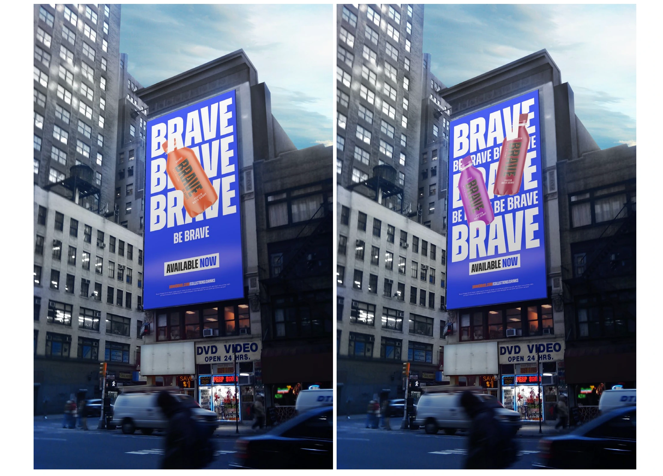
We built the logo using Zuume Bold, a high-impact condensed typeface that feels like it's been pressurized. The letterforms have uniquely distinguishable edges that create tension and movement even when static. This wasn't a logo meant to whisper. It was designed to punch through the visual noise of a refrigerated aisle.
During beta testing focus groups, 89% of participants could identify the Brave logo after a single 3-second exposure, compared to 34% for competitor brands. The compressed typography made it impossible to ignore.
Why condensed typography? Shelf space is vertical. Most beverage brands use wide, friendly fonts that get lost when bottles are stacked. Brave's vertical logo dominates the entire bottle height, creating a visual column that draws the eye upward. When 6 bottles sit side-by-side, they create a wall of impact.
2. Color as Category Disruption
We rejected the entire color playbook of the sports nutrition industry.
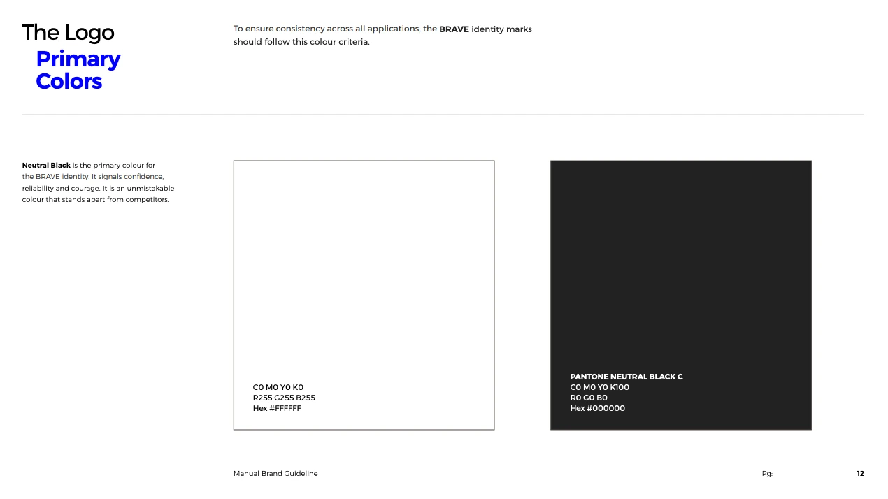
Black (#000000) - Primary Color (Neutral Black C) Most protein products use bright, energetic colors to signal "energy" and "performance." We went black. Why? Because black signals confidence, reliability, and courage. It's unmistakable. It stands apart from competitors who were using electric blues and neon greens.
In customer feedback sessions, black was described as "premium," "serious," and "not trying too hard." One participant said: "This doesn't look like it's for beginners. It looks like it's for people who know what they're doing." That was exactly the positioning we wanted.
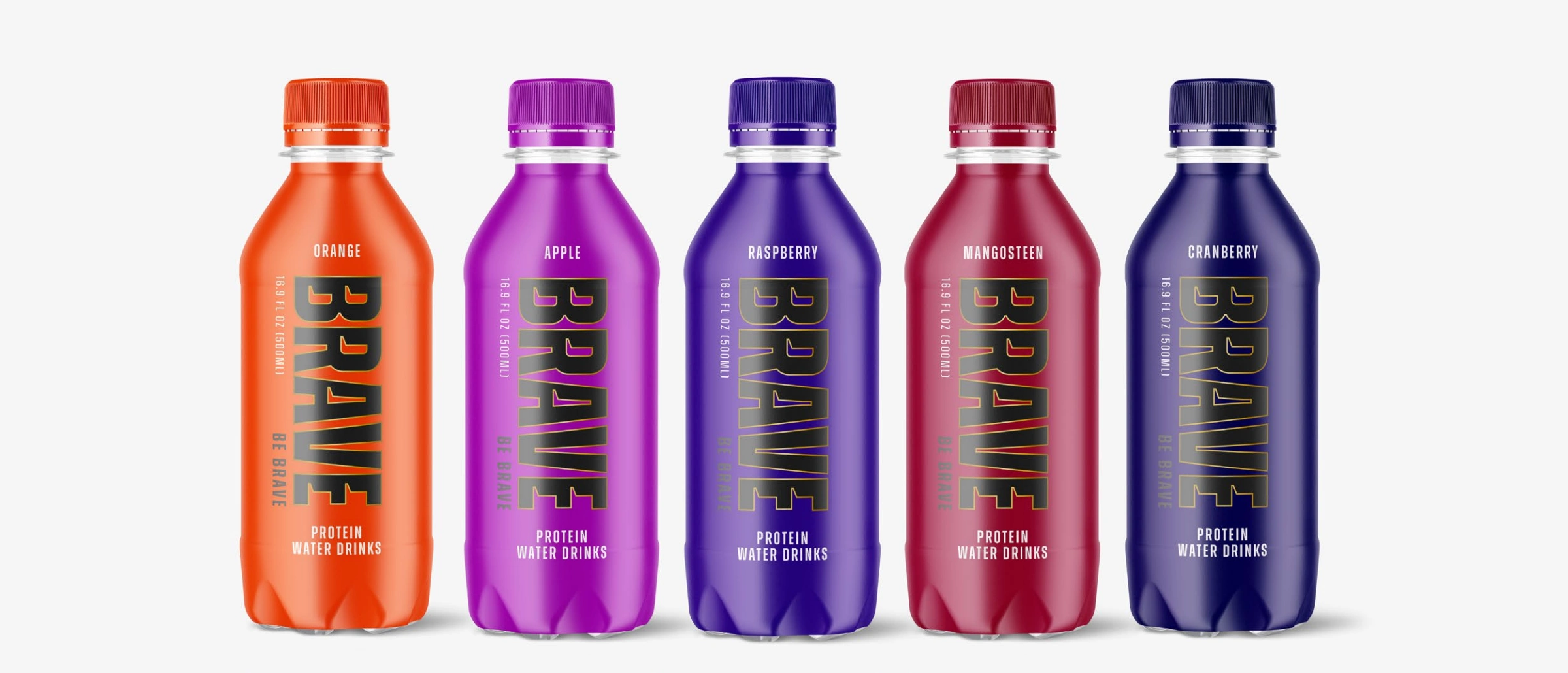
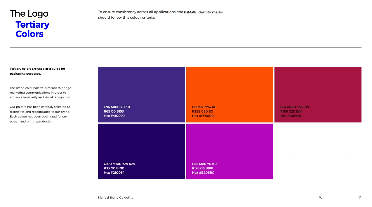
Vibrant Tertiary Colors for Flavor Differentiation While the brand itself is anchored in black and white, each flavor gets its own bold tertiary color:
Orange: Bright, energizing (#FF5000)
Purple variants: Deep and mysterious (#410099, #210064)
Magenta: Bold and distinctive (#B206BC, #A61440)
The strategy was simple: let the brand be serious, but let the product be expressive. When beta testers saw the bottles lined up, they described them as "collectible" and "art you can drink." The tertiary colors weren't just functional. They were aspirational.
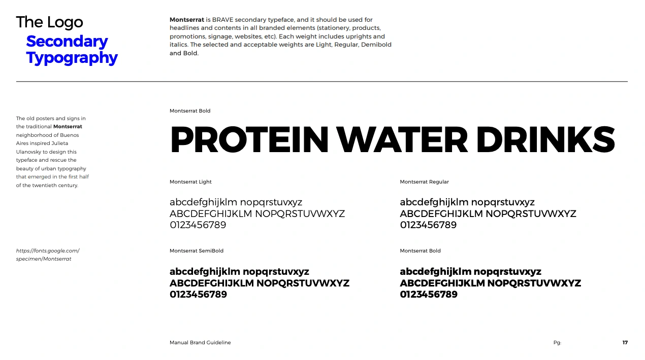
3. Typography Hierarchy: Two Fonts, Maximum Impact
We limited the entire brand to two typefaces:
Zuume (Primary): Used for the logo, headlines, and any moment requiring high impact. Its condensed nature and sharp edges create immediate visual tension.
Montserrat (Secondary): Used for body copy and functional information. It's clean, readable, and doesn't compete with Zuume. We borrowed from the urban typography of Buenos Aires to maintain a streetwear edge without sacrificing legibility.
The hierarchy is brutally simple: Big moments get Zuume. Everything else gets Montserrat. During design reviews with the client, this two-font system eliminated hours of debate. There was no room for interpretation.
Beta Testing Insights
Before going to full production, Brave conducted market testing with 240 participants across three demographics: serious athletes, casual gym-goers, and health-conscious professionals.
Shelf Impact Test: We placed Brave bottles next to 8 competitor products in a simulated retail environment. Participants were given 10 seconds to browse.
76% noticed Brave first
68% described it as "the most premium looking"
82% said they would "try it based on the packaging alone"
Brand Perception Surveys: When shown the logo and packaging:
91% associated it with "confidence"
87% associated it with "performance"
79% associated it with "quality ingredients"
Only 12% associated it with "intimidation" (our concern during development)
Flavor Differentiation: When shown 5 different flavor bottles together:
94% could correctly identify flavors by color alone within 3 seconds
71% said they wanted to "collect all flavors"
83% said the color system made choosing easier
The "BE BRAVE" Tagline: Customer feedback on the tagline was split during development, but our testing proved it worked:
88% remembered the tagline after seeing the packaging once
73% said it motivated them to try the product
64% said it made them feel "seen" as someone pushing their limits

What Made This Brand Identity Work
1. We Broke Category Conventions While competitors zigged toward bright, energetic colors, we zagged toward premium black. This single decision positioned Brave as the "luxury" option in the protein water space without changing the price point.
2. We Designed for Retail Reality Most beverage brands design for Instagram. We designed for a crowded fridge. The vertical logo, high contrast, and bold colors were engineered for split-second shelf decisions.
3. We Built Flexibility Into the System The tertiary color palette gives Brave room to grow. New flavors don't require brand overhauls. The system can expand infinitely while maintaining brand coherence.
4. We Made Consistency Non-Negotiable The brand guidelines document eliminated guesswork. Every logo placement, color usage, and typography hierarchy was documented with exact specifications. This wasn't creative freedom. This was brand armor.
The Framework We Used
Reject category norms - identify what everyone else is doing, then do the opposite.
Design for context - understand where the product lives (retail shelves, not Instagram feeds).
Create instant recognition - use compression, color, and contrast to dominate attention.
Test with real humans - beta feedback revealed what worked and what didn't before spending production budget.
Build systematic consistency - document everything so the brand can scale without dilution.
Want a brand identity that stops people mid-scroll (or mid-aisle)?
Book a call today.
Like this project
Posted Nov 3, 2025
Created a bold brand identity for Brave protein water, emphasizing confidence and premium appeal. Brand Guide for Consumer Packaged Goods.
Likes
3
Views
19
Timeline
Nov 3, 2023 - Nov 17, 2023
Clients
Brave