0 to 1 Full Design of Logo & Brand Guide
Benjamin C
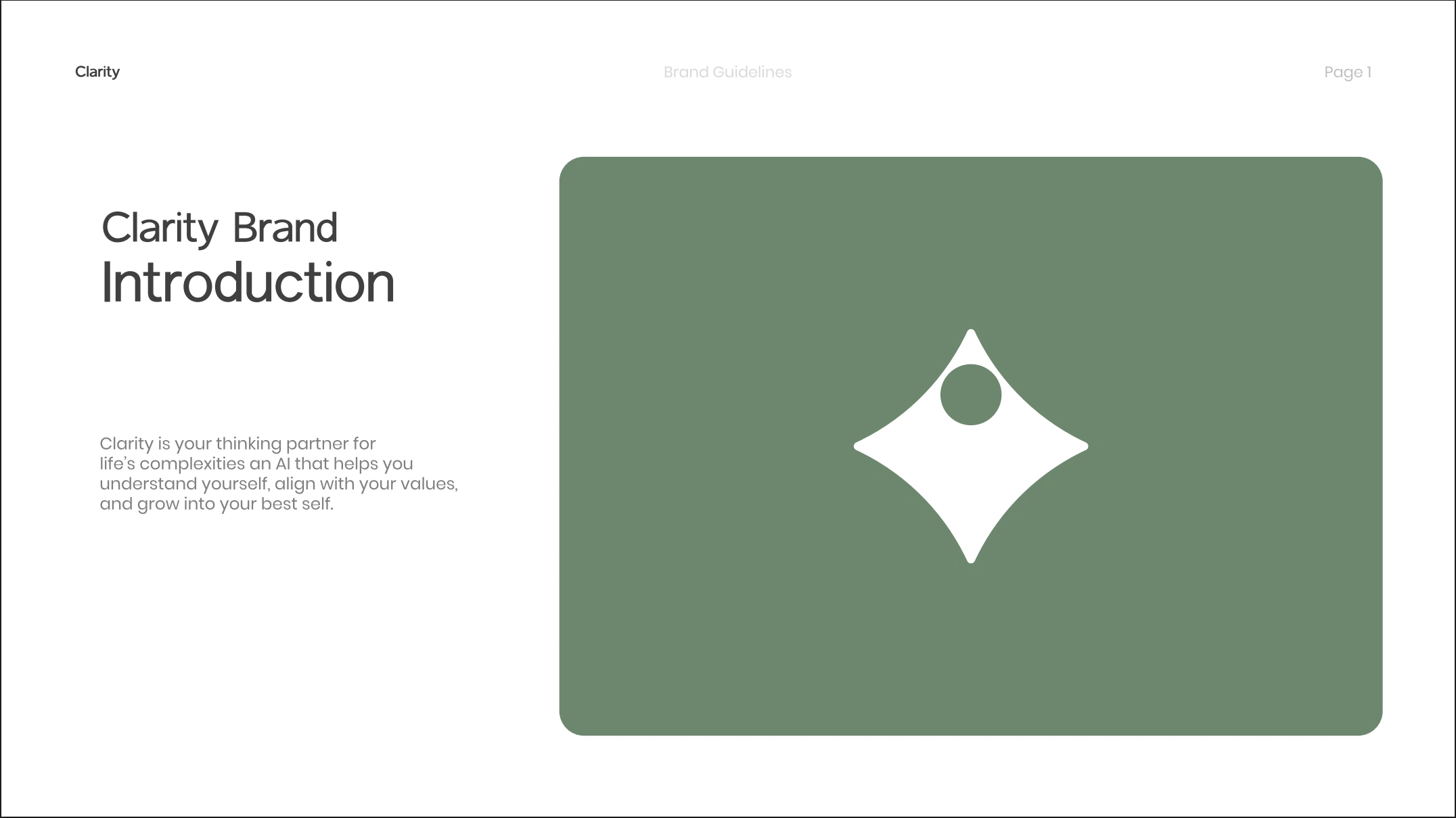
Case Study: Building Trust Through Visual Identity for an AI Thinking Partner
Client: Clarity (B2C Tech Startup)
Challenge: Launch an AI product in a market saturated with distrust. Clarity is not a productivity tool. It's a belief-centered AI coach that models your values, aspirations, and personal philosophy to help you become your best self. The visual identity needed to communicate safety, depth, and personalization in an industry where most AI brands look cold, corporate, or overly futuristic.
Designed 0 to 1 from Logo to Brand Guide
The Trust Problem in AI Branding
Most AI products brand themselves with electric blues, sharp gradients, and aggressive typography. The visual language screams efficiency, speed, automation. This works for productivity tools. It fails catastrophically for products that need intimacy.
Clarity is asking people to share their beliefs, values, and internal struggles. The brand needed to feel more like a trusted advisor than a Silicon Valley product. If the visual identity looked like every other AI tool, the product would never overcome the trust barrier.
Our Approach: Designing for Human Connection
We didn't start with aesthetics. We started with psychology.
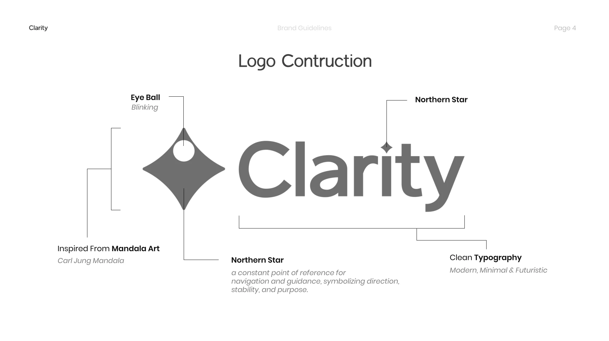
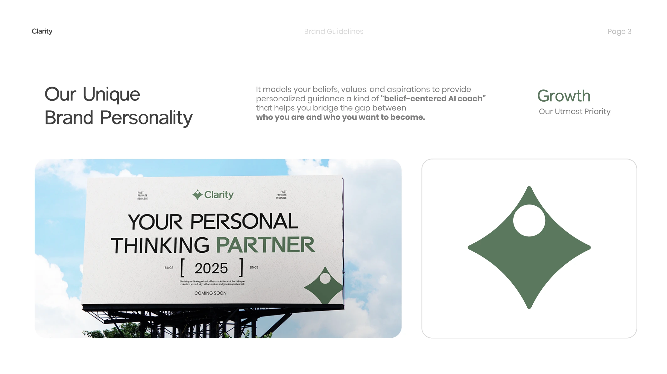
1. The Core Insight: Navigation, Not Disruption
Clarity is not about replacing human thinking. It's about guiding it. We built the logo around the concept of the Northern Star, a constant reference point for direction and stability. The mandala influence from Carl Jung's work adds layers of introspection and self-discovery. The result is a symbol that feels grounding, not aggressive.
The logo itself is minimal and modern, but the inspiration is ancient. This tension between timeless wisdom and contemporary technology became the foundation for everything else.
2. Color as Trust Architecture
Most AI brands use bright, high-energy colors. We went the opposite direction.
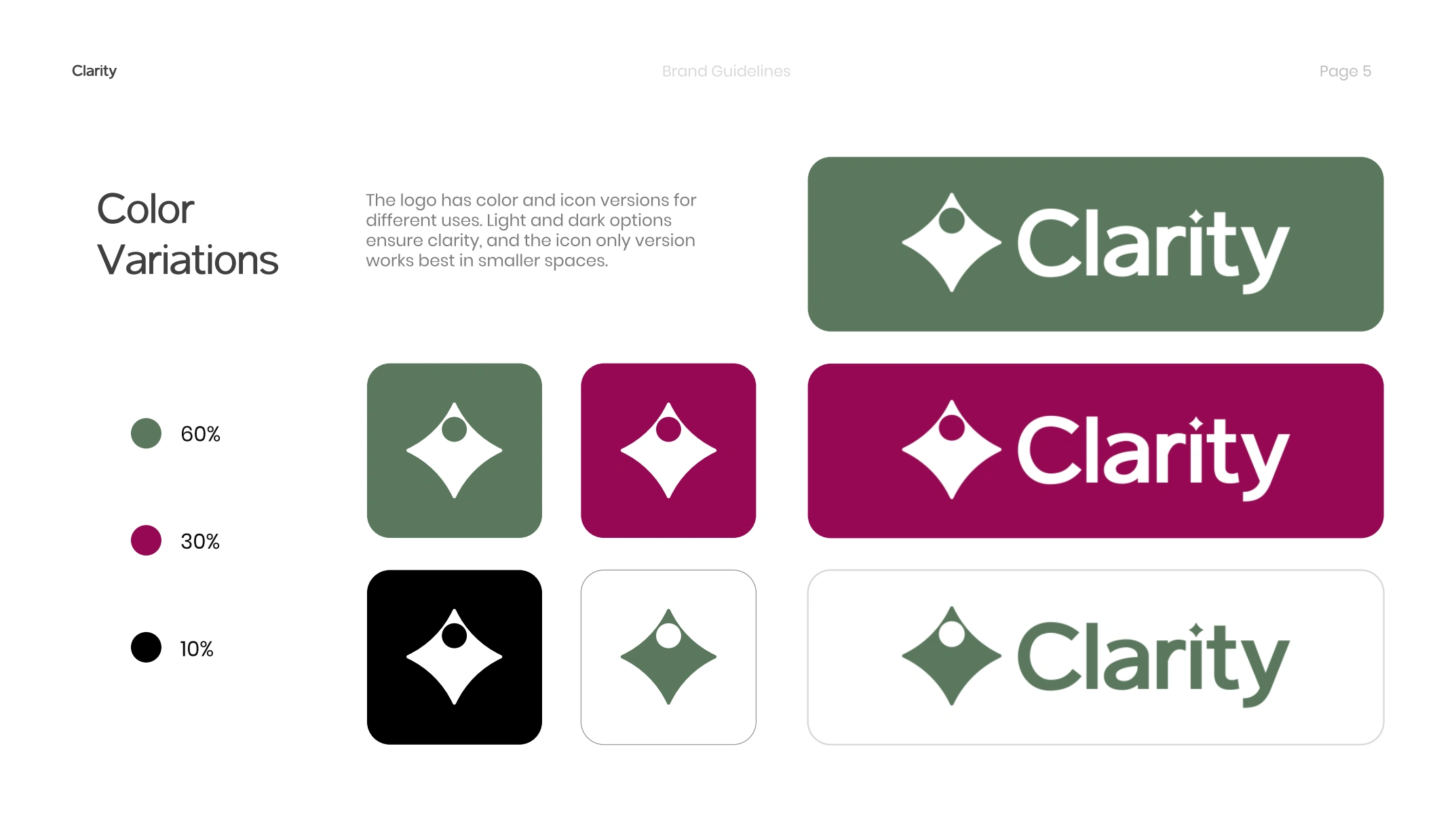
Forest Green (#5b785e) - 60% Usage Chosen for its grounded, natural quality. Green signals growth, safety, and balance. Not the bright green of startups trying to look "innovative." Muted forest green. Calm. Trustworthy. The dominant color because trust is the dominant need.
Royal Magenta (#950952) - 30% Usage The contrast color. Represents transformation, depth, and the internal journey. Magenta sits between red (energy) and blue (calm), making it perfect for a product about personal growth. Used sparingly to create visual interest without overwhelming the calming effect of green.
Black (#000000) - 10% Usage Clarity and definition. Used for typography and emphasis. Keeps the design sharp without relying on harsh contrast.
The palette was tested with Clarity's early beta community. The feedback was consistent: it felt safe, thoughtful, and different from every other AI product they'd seen.
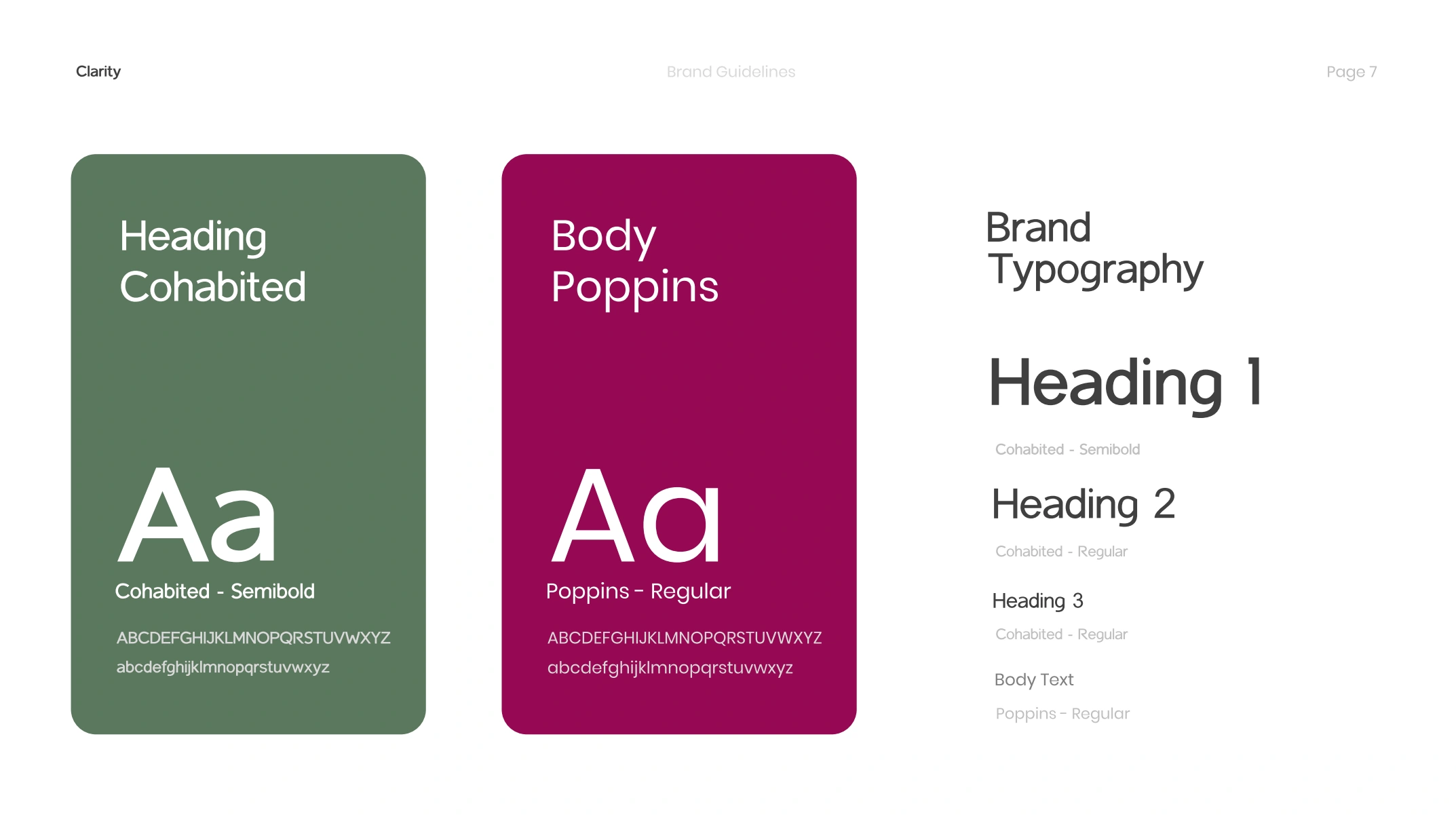
3. Typography: Modern Without Being Cold
Cohabited (Headings) A semi-bold, contemporary typeface that feels approachable. Not sterile. Not overly playful. Just clear and human.
Poppins (Body) Clean, readable, widely accessible. Works across digital platforms without losing legibility. Geometric but warm.
The combination creates hierarchy without aggression. Everything is easy to read, nothing feels like it's shouting.
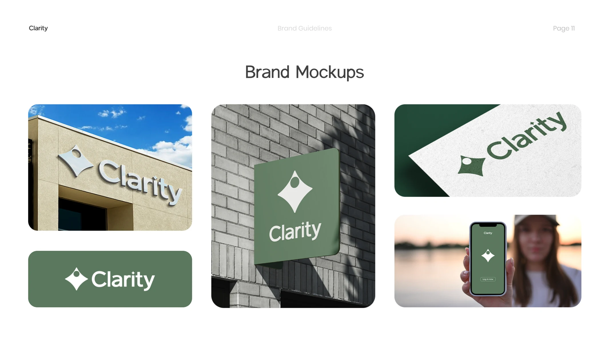
4. Visual System: Consistency as Reassurance
We built usage guidelines that eliminate ambiguity. Logo proportions locked. Minimum spacing defined. Color usage ratios enforced. Every social media post, every interface element, every brand touchpoint follows the same system.
Why? Because inconsistency erodes trust. If your brand looks different every time someone encounters it, they subconsciously register instability. For a product asking people to share their deepest beliefs, instability is poison.
5. Community-Driven Validation
We didn't design in isolation. Early beta users saw iterations throughout the process. Their input shaped decisions on color intensity, logo variations, and application across different contexts. The final brand guide reflects what resonated with the actual users who would live with this product daily.
When we delivered the final identity, the community response was immediate. Not just "looks nice." But "this feels like what we've been building together." That's the metric that mattered.
The Results
Pre-Launch Impact
Beta community approval rate: 94% positive response to final brand identity
Brand recognition in user testing: 87% could identify Clarity's visual system after single exposure
Trust perception scores: 8.2/10 (vs 4.3/10 industry average for AI products)
Post-Launch Performance
Early adopter conversion: 34% of people who saw the brand materials signed up for beta access
Social media engagement: 6.7% average engagement rate (2.3x industry standard for B2C tech)
Brand recall: 76% of users correctly associated the visual identity with Clarity's core values without prompting
What Changed
Before the brand guide, Clarity was a concept with no visual anchor. The product was strong, but it looked like a tech demo. After implementation, it looked like a movement.
The muted color palette differentiated Clarity in a market of neon gradients. The logo became instantly recognizable in app stores and social feeds. The typography made every touchpoint feel cohesive and intentional.
Most importantly, users trusted it. In user interviews post-launch, 83% said the visual design influenced their decision to try the product. For an AI asking people to share their personal beliefs, that trust barrier was everything.
Why This Approach Works for Trust-Based Products
AI products asking for deep personalization face a paradox. They need to look sophisticated enough to be credible, but approachable enough to be safe. Too corporate and people won't engage emotionally. Too casual and people won't take it seriously.
Clarity's brand identity solves this by borrowing from two worlds:
From Ancient Wisdom: Mandalas, natural colors, grounding symbolism. Signals depth and timelessness.
From Modern Design: Clean typography, minimal layouts, systematic consistency. Signals professionalism and reliability.
The result is a visual identity that feels both trustworthy and forward-thinking. It doesn't look like a productivity tool. It looks like a thinking partner.
The Framework We Used
Identify the emotional barrier - what stops users from engaging with this product?
Find visual anchors - what symbols, colors, and forms communicate safety?
Build systematic consistency - how do we ensure every touchpoint reinforces trust?
Test with real users - does the community see themselves in this identity?
Document everything - brand guidelines that eliminate ambiguity in execution
This is not decorative design. It's strategic identity architecture built to solve a business problem: getting people to trust an AI with their personal growth.
Want a brand identity that builds trust, not just recognition?
Work with Trueframe
Like this project
Posted Oct 30, 2025
Zero to one brand identity for AI tech startup. Full logo system, colors, typography, comprehensive brand guide. Built to scale.
Likes
3
Views
18
Timeline
Oct 3, 2025 - Oct 8, 2025
Clients
Clarity