Building a Scalable Design System for University of Canterbury

Nick Jones


University of Canterbury: Building a Scalable Design System
The University of Canterbury is one of New Zealand's leading Universities offering a range of undergraduate and post graduate study options.
About
The University of Canterbury had developed a new app that aimed to be a central resource for students to access information and tools during their time at university. This was a quickly evolving product that would be central to the University's digital strategy. Years of design and development had resulted in inconsistencies, mixed files, and missing documentation which made scaling difficult and created inefficiencies for both designers and developers.
Role
As a Senior UX Designer for the university I led the audit, design, and rollout the new design system built in Figma, working closely with developers to establish a shared source of truth across design and development. This also involved developing new components, user flows and user testing for the app.
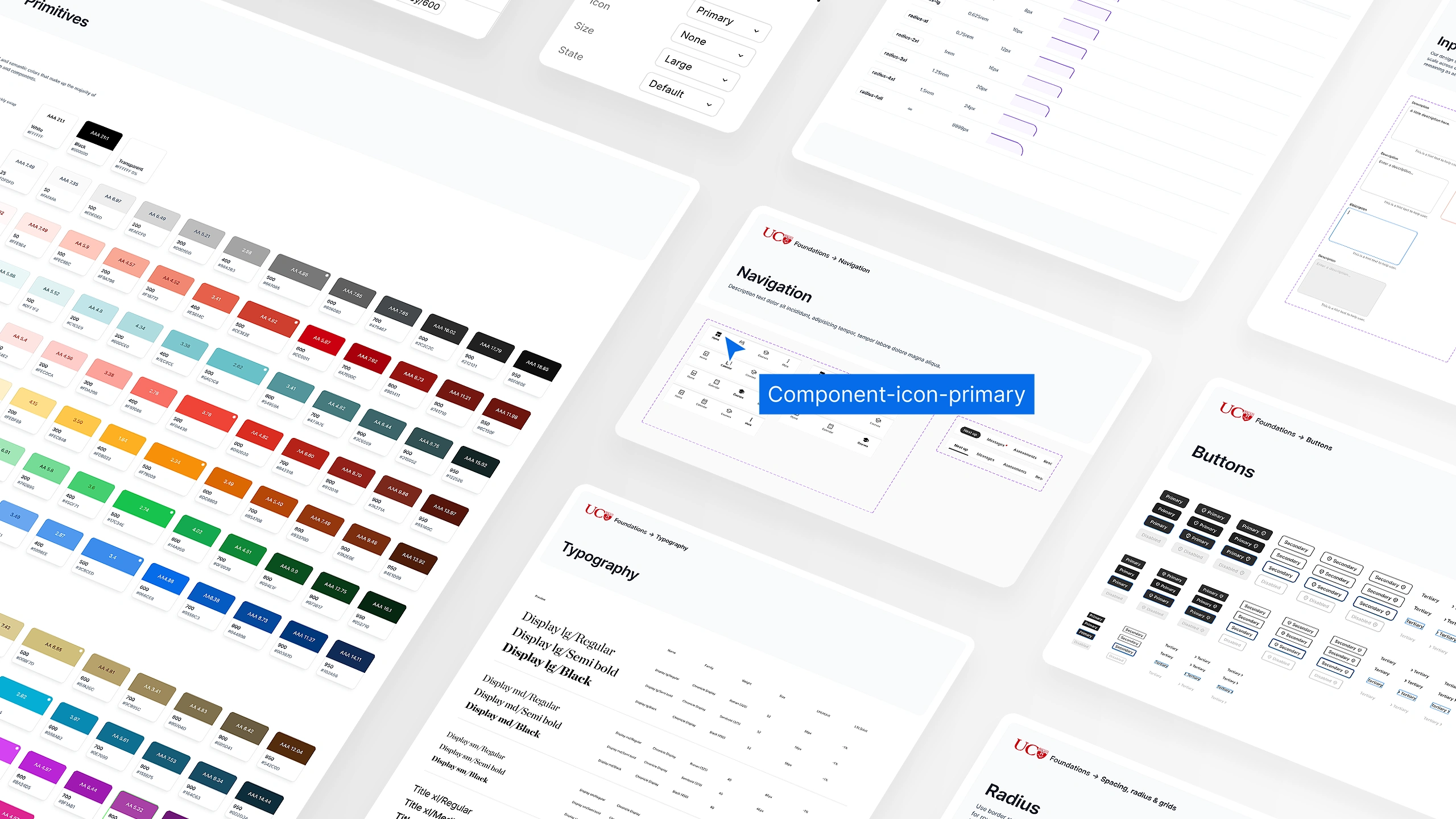
Atomic design system library and components built in Figma
Approach & Key Decisions
Started with a complete audit across years of files and development.
Audited existing styles, components, and patterns across the app first, surfacing the specific gaps between design and development before building anything new, so the new system solved real problems rather than assumed ones.
A new token architecture.
Developed a token architecture for colour, typography, and spacing, replacing the previous variant and primitive colour setup that made light and dark mode conversions inconsistent and timely. This mattered specifically because the app used dynamic dark mode, switching automatically morning and evening, so light and dark mode conversions were crucial to assess new designs and accessibility.
Structured atomic UI library.
Organised the component library using atomic UI principles and Boolean and variant component states, publishing it as a Figma library so assets were reusable, significantly reducing the design time for new work.
Accessibility built in.
Ran AAA WCAG testing across colours, typography, and interactive states as part of building the system, ensuring the app is accessible for all types of users at the university.
Closed the gap between design and development.
The audit replaced a fragmented, undocumented design process with a single, token based Figma library as the shared source of truth, enabling reliable, instant light and dark mode previews to support the app's dynamic theme switching, reducing design time on new work through reusable, well documented components, and improving designer developer collaboration through shared documentation in Storybook, built to scale as the app continues to evolve. [Add if available: adoption metrics, reduction in design/dev handoff issues, or time saved on new feature builds.
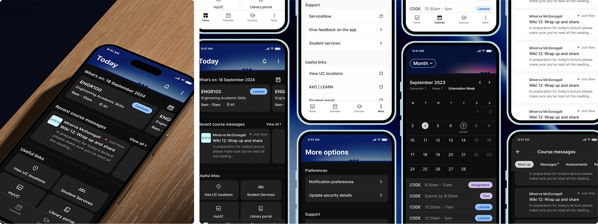
Light and dark mode screens
Results
The new design system provides clear guidelines for UI components, creating a solid foundation for the team. While still evolving, it now supports instant light and dark mode previews to reflect the app's dynamic theme switching, reducing design time on new work through reusable, well documented components, and improving designer developer collaboration.
Like this project
Posted Aug 16, 2026
Led design system overhaul for University of Canterbury app improving efficiency and accessibility.
Likes
0
Views
18
Clients
University of Canterbury