DÉRIVE | Fashion Brand Identity & Visual Direction by Murad AbdurahmanovDÉRIVE | Fashion Brand Identity & Visual Direction by Murad Abdurahmanov

DÉRIVE | Fashion Brand Identity & Visual Direction

Murad Abdurahmanov

Murad Abdurahmanov

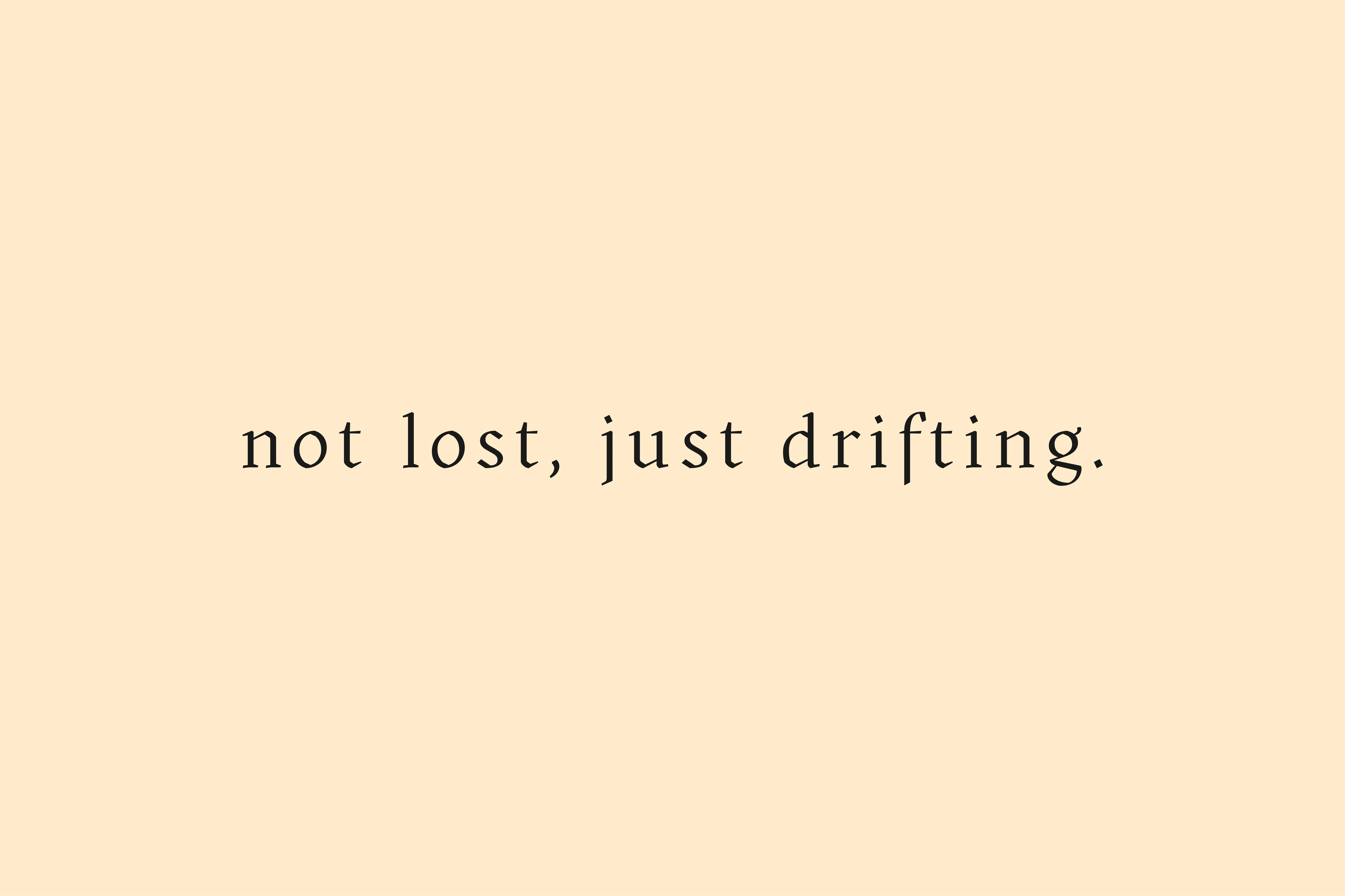
DÉRIVE is a conceptual fashion brand identity that merges refined French elegance with the raw edge of street culture. The name comes from the French word for “drift” - an instinctive, unplanned wandering that still carries deep intention. Inspired by the urban culture of the 1950s and 60s, this concept shapes the brand’s entire philosophy. That philosophy runs through every detail: a bold, sharp energy hidden beneath a calm, minimalist foundation. 
Not fully luxury, not fully street - DÉRIVE exists at the intersection of both. The project’s purpose is to turn clothing from mere covering into a form of expression. We aim to build a visual language that carries quiet strength, without confusing elegance with timidity or boldness with roughness. Every collection, every detail is part of a “drift” - unplanned, yet entirely intentional.
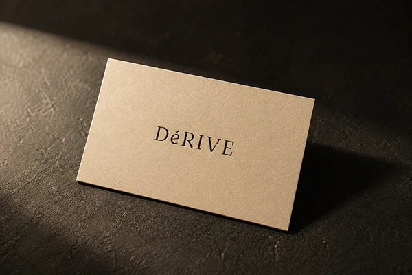
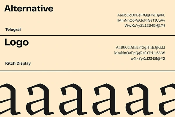
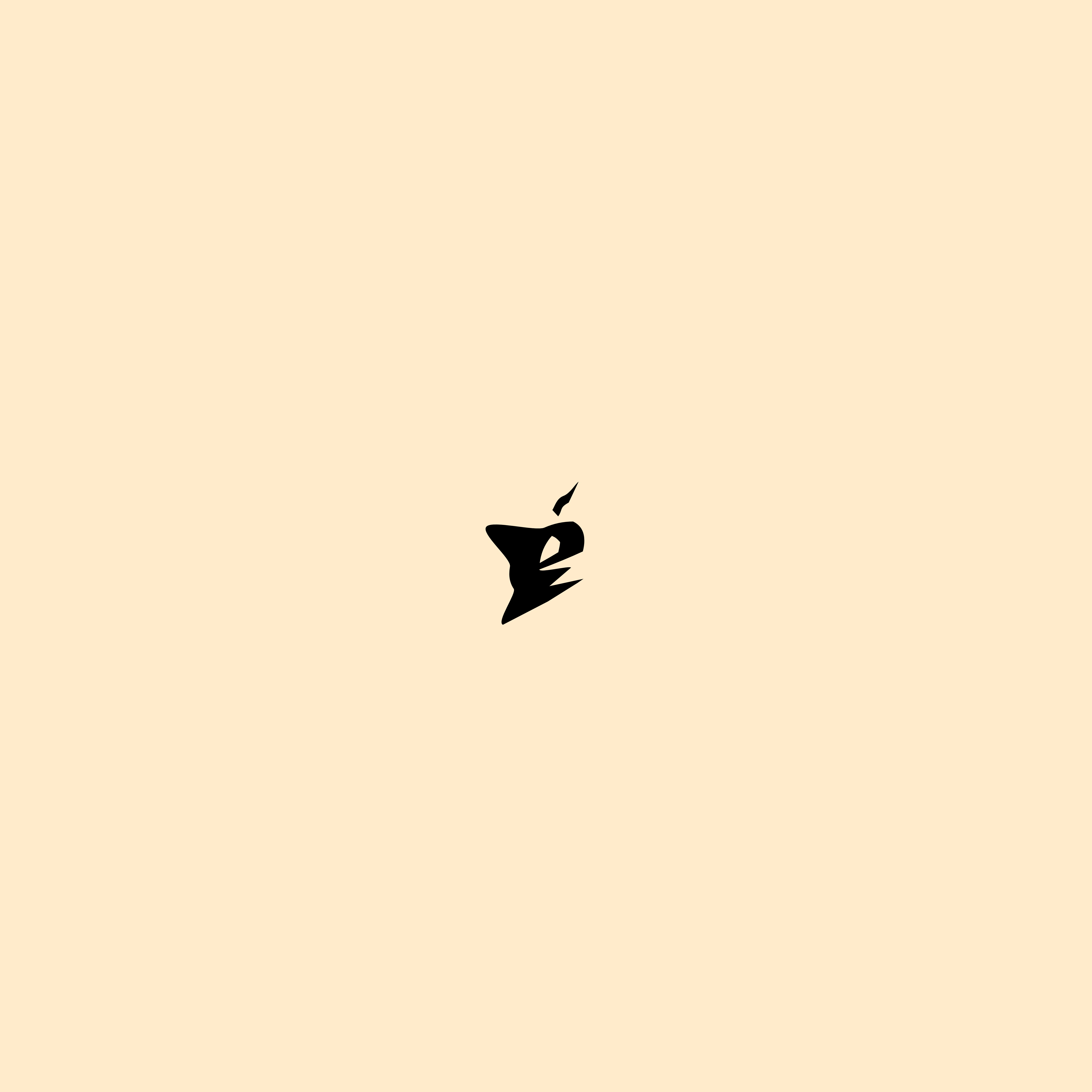
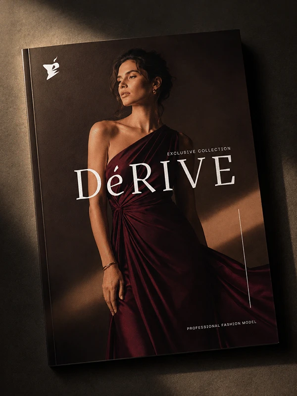
The DÉRIVE wordmark is built on a refined serif typeface with wide letter-spacing - a deliberate choice that gives the name room to breathe and reinforces the brand’s composed, editorial character. The accented “É” carries the most weight in the mark: a small but distinctive detail that turns a simple word into a signature. That same accent became the foundation for the brand’s icon - an abstract, angular symbol with sharp, broken edges. 
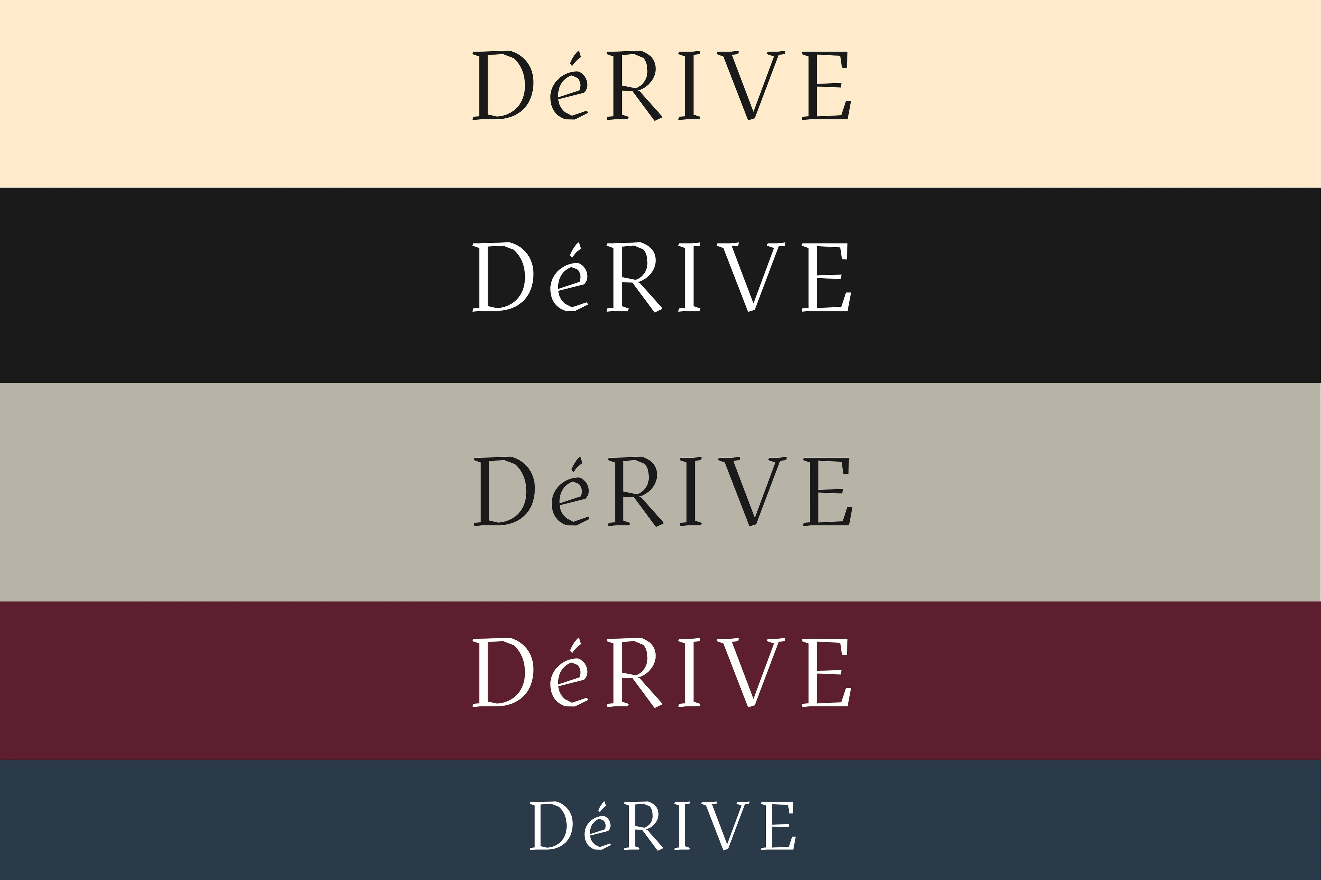
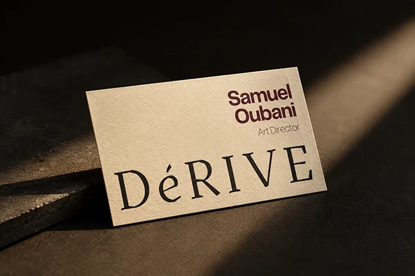
Where the wordmark speaks quietly, the icon speaks with intensity. Together they form a single system built on contrast: elegance and edge, restraint and instinct, coexisting in one identity. The logo works across a range of backgrounds - cream, black, stone, burgundy, and navy - always maintaining the same proportions and spacing, ensuring the mark stays consistent whether on a garment tag, a business card, or a campaign visual.
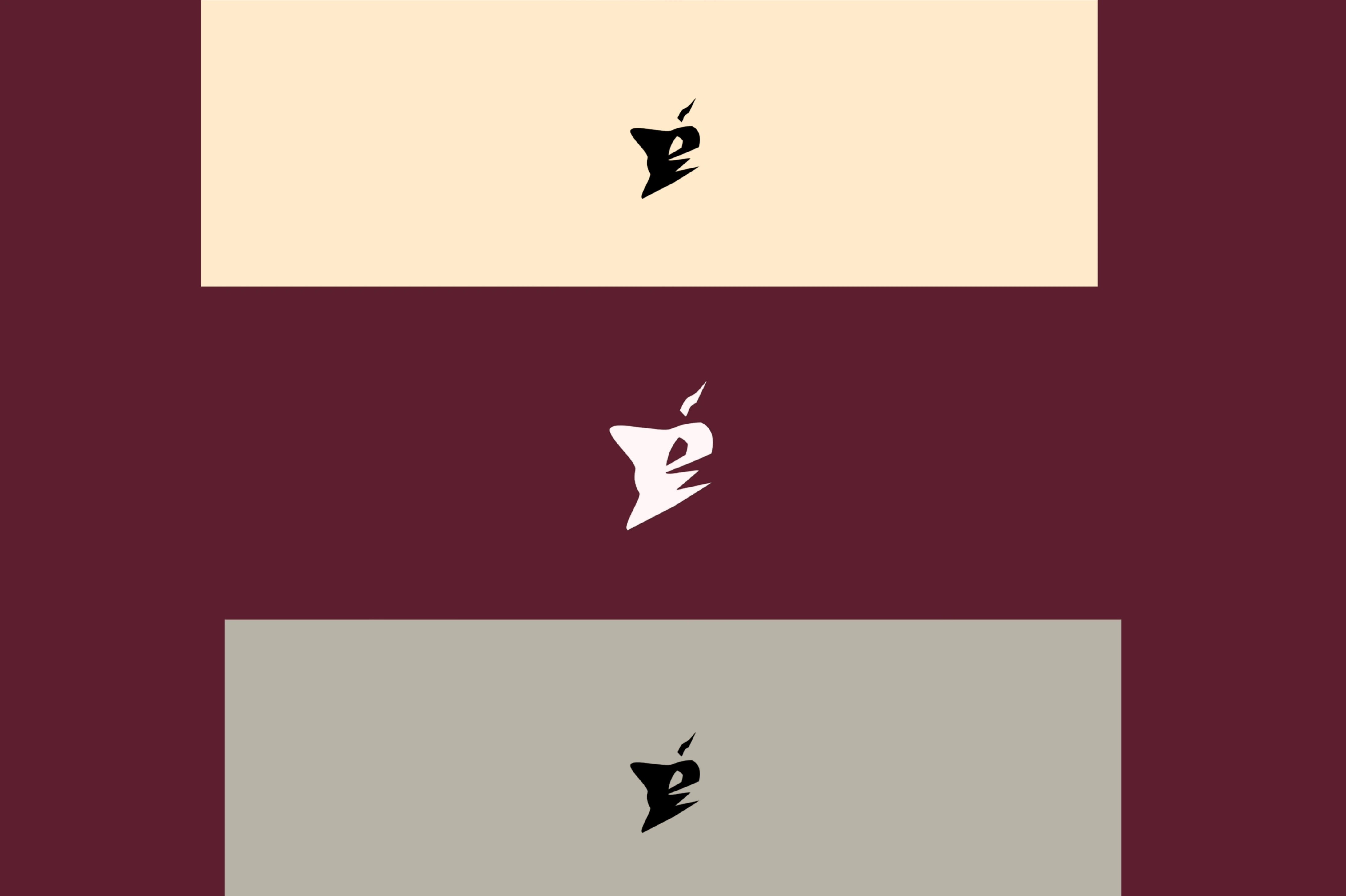
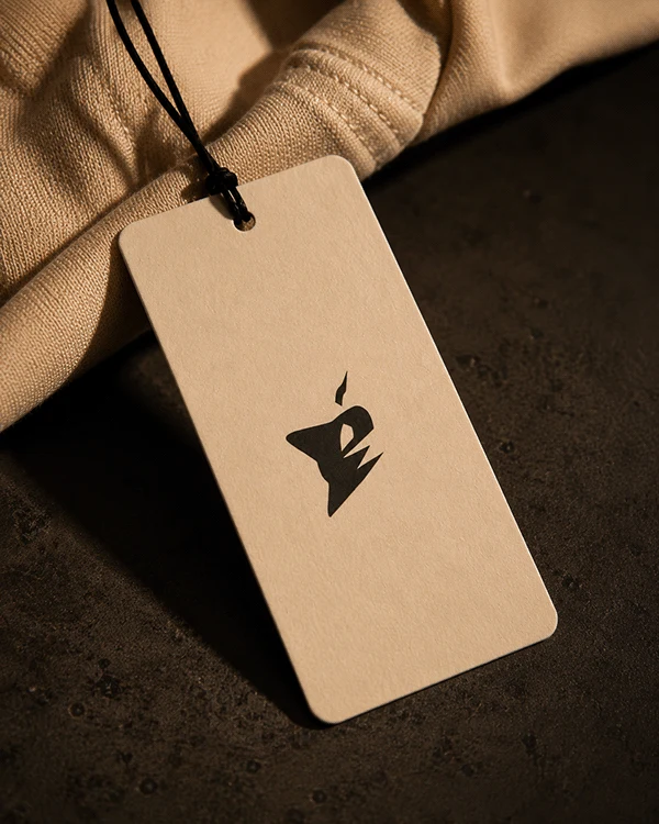
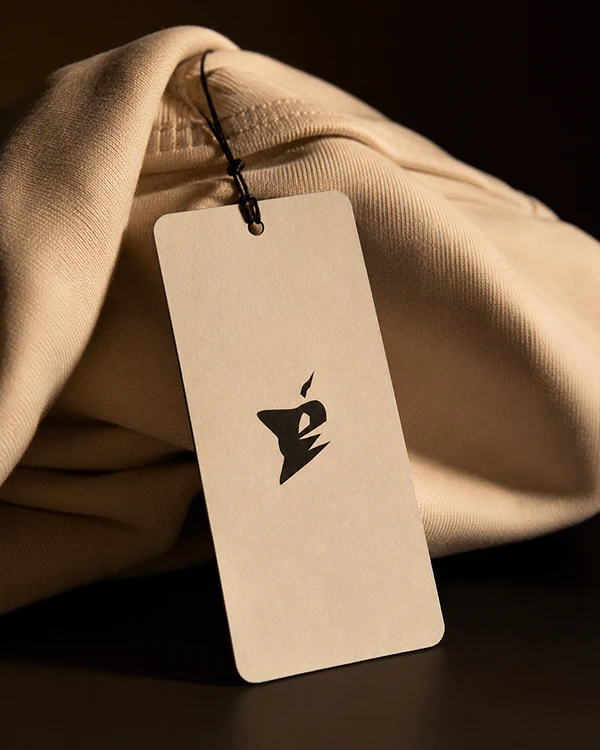
The DÉRIVE icon is drawn directly from the accented “É” in the brand’s own name - taking a small typographic detail and transforming it into a standalone mark. What began as a simple accent became a sharp, fractured silhouette: angular lines, broken edges, a shape that feels caught mid-motion. 
Where the wordmark carries elegance, the icon carries intensity. It exists as the brand’s most condensed expression - reduced to its essential form, built to work at any scale, from a garment tag to a social profile. Its jagged geometry reflects the same duality that defines DÉRIVE as a whole: refinement with an edge, composure with instinct. Minimal by design, the icon isn’t meant to explain itself. It’s meant to be recognized.
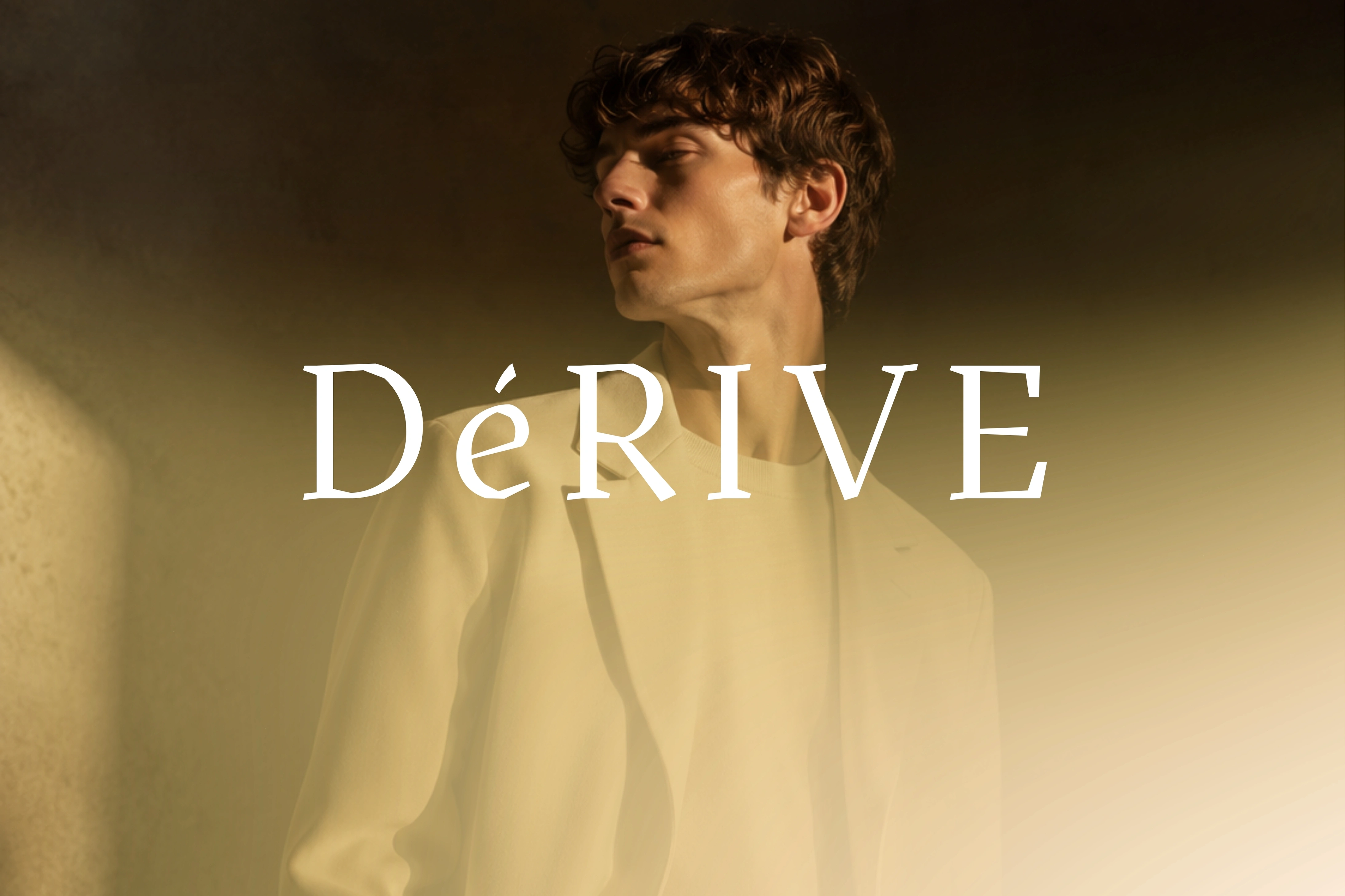
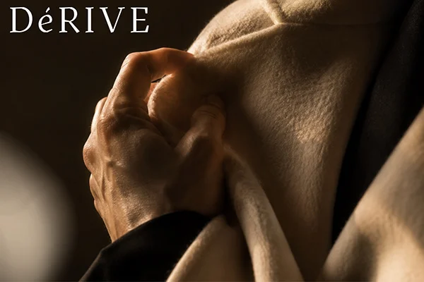
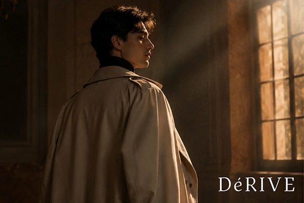
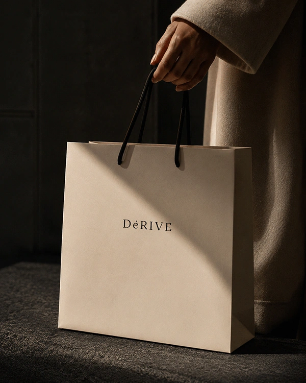
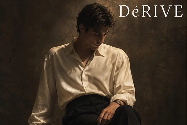
DÉRIVE’s photography language is built on stillness rather than movement - composed, statuesque poses that feel closer to editorial portraiture than campaign snapshots. Every frame is shot with dramatic, warm directional lighting against dark, moody backdrops, allowing the fabric and the subject to hold full attention. The palette stays close to the brand’s own tones - deep blacks, warm creams, and the occasional flash of burgundy - so that every image feels like a natural extension of the identity itself, rather than a separate visual world. 
Shadows are used deliberately, not just for mood but as a compositional tool, echoing the brand’s own duality of restraint and intensity. Close-up details - a hand gripping fabric, the fold of a collar, the texture of silk catching light - are treated with the same weight as full-body shots. These fragments carry the tactile, sensory side of DÉRIVE: a reminder that the brand isn’t only about how a garment looks, but how it feels.
DÉRIVE is not a finished statement - it’s a direction. Born from a single word meaning “to drift,” the brand carries that same spirit into everything it builds: quiet confidence, sharp intention, and a refusal to sit neatly within one category. 
This identity system - from the wordmark to the icon, the photography to the color palette - is meant to grow the way its name suggests: not by following a fixed path, but by moving with purpose, one collection at a time.
Thank YOU!
Like this project

Posted Aug 22, 2026

DÉRIVE is a conceptual fashion brand identity that merges refined French elegance with the raw edge of street culture. The name is drawn from the French word for “drift” — an instinctive, unplanned wandering that still carries deep intention, inspired by the urban culture of the 1950s and 60s. This philosophy runs through every layer of the brand: a bold, sharp energy hidden beneath a calm, minimalist foundation. Not fully luxury, not fully street — DÉRIVE exists at the intersection of both. The wordmark is built on a refined serif typeface with wide letter-spacing, anchored by its accented “É” — a small detail that carries the most weight in the mark. That same accent became the foundation for the brand’s icon: an abstract, angular symbol with sharp, fractured edges that speaks with far more intensity than the wordmark itself.