WordPress Web Design & Development

Farida Amin
Verified


WordPress Design & Development for Grand Electric
Grand Electric needed more than a template. They needed a high-performing, conversion-optimized WordPress website that could serve as the backbone of their digital presence, generate qualified leads from local search, and communicate trust and professionalism to every visitor within seconds of landing on the page.
This project involved a full end-to-end process: from initial discovery and wireframing in Figma, through visual design and asset preparation in Photoshop, all the way to custom WordPress development, responsive implementation, and performance optimization.
The Challenge
Grand Electric operates in a competitive local services market where first impressions are everything. Their previous online presence wasn't converting visitors into inquiries. The site lacked:
A clear value proposition above the fold
Trust signals (reviews, certifications, guarantees)
A structured service breakdown that educated visitors
Mobile responsiveness and fast load times
Local SEO foundations to capture nearby search traffic
The goal was to build a WordPress site that solved every one of these problems while staying true to the brand's identity and tone.
Discovery & Strategy
Before touching a single pixel, I conducted a competitive audit of similar service providers in the area. I mapped out:
User intent patterns — What are visitors looking for when they land on an electrician's website? Speed, trust, pricing clarity, and easy contact options.
Conversion triggers — Testimonials, service guarantees, visible phone numbers, and strong CTAs placed at natural scroll-pause points.
SEO keyword targets — Local service keywords, long-tail queries, and geo-modified terms that would feed into the site's content structure.
Content hierarchy — Prioritizing the most-searched services, structuring the page so users find answers before they even think to leave.
This research directly informed the wireframe structure and content strategy.
Design Process
The visual design phase happened entirely in Figma, with a foundation page for tokens (color, typography, spacing, grid) and screen pages for each major section of the site.
Key design decisions included:
Bold hero section with a clear headline, subheadline, and dual CTA (call now + request a quote)
Service cards with iconography and short descriptions, linking to detailed service pages
Trust bar featuring review scores, years in business, and certification badges
Testimonial carousel pulling real customer reviews with names and locations
Contact section with embedded map, phone number, email, and a short-form lead capture
Footer with structured navigation, service area list, and business hours
Every section was designed mobile-first, then expanded for tablet and desktop breakpoints.
WordPress Development
The development phase translated the Figma designs into a fully custom WordPress build. No generic themes, no bloated page builders. The approach was:
Custom theme development — Built on a lightweight starter theme, stripped back to only what's needed, ensuring fast load times and clean markup.
Advanced Custom Fields (ACF) — Used for flexible content blocks so the client can update text, images, and testimonials without touching code.
Responsive implementation — Every breakpoint tested across devices, ensuring pixel-perfect rendering from 320px mobile screens to ultrawide desktops.
Performance optimization — Lazy loading for images, minified CSS/JS, optimized database queries, and server-side caching configuration.
SEO foundations — Schema markup for local business, optimized meta structure, XML sitemap generation, and clean permalink architecture.
Security hardening — Login protection, file permission lockdown, and automated backup configuration.
Results & Impact
The final WordPress site delivers:
Sub-3-second load times on mobile and desktop
Clear conversion paths from every section of the page
Local SEO readiness with structured data and geo-targeted content
Full client editability through intuitive WordPress admin panels
Scalable architecture ready for additional service pages, blog content, and landing pages as the business grows
Video Walkthrough
Below is a full walkthrough of the completed WordPress site, showing the responsive design, interactions, and overall user experience:
Tools & Stack
Design: Figma (wireframes, UI design, component library), Adobe Photoshop (asset preparation, image optimization)
Development: WordPress, Custom PHP theme, ACF Pro, HTML5, CSS3, JavaScript
Performance: WP Rocket, Cloudflare CDN, image compression pipeline
SEO: Yoast SEO, Schema Pro, Google Search Console integration
This project is a complete example of what I deliver when a client needs WordPress done right: strategic thinking, polished design, and clean development that performs where it matters — in conversions, speed, and search visibility.
Travel
WordPress Travel + Leisure Website Design & Development
✈️ Travel + Leisure for Business: Website Design
Role: UI/UX Design · Web Design · Visual Direction
Industry: Travel & Hospitality / B2B SaaS
🌍 Overview
Travel + Leisure for Business brings the travel experiences of a well-known travel brand to companies that want to reward, engage and keep their people and customers. The site needed to feel premium and inspiring like the consumer brand, while also working as a B2B platform that turns visitors into booked demos.
We designed a website that leads with the emotion of travel and makes the business case clear.
🧩 The Challenge
🏢 Two audiences, one voice: HR leaders, marketers and loyalty managers needed to see business value, but the brand still had to feel like a travel brand.
🎯 Conversion-focused: The main goal was demo bookings, so the CTA had to stay visible without feeling pushy.
🌐 Global reach: The site had to support multiple languages from day one.
🧭 Complex offerings: Several products had to be easy to find without overwhelming first-time visitors.
🎯 Goals
Build a premium first impression that matches the Travel + Leisure name
Explain the value proposition in seconds
Make demo booking the clearest action on every screen
Create a scalable design system for future pages and languages
💡 The Solution
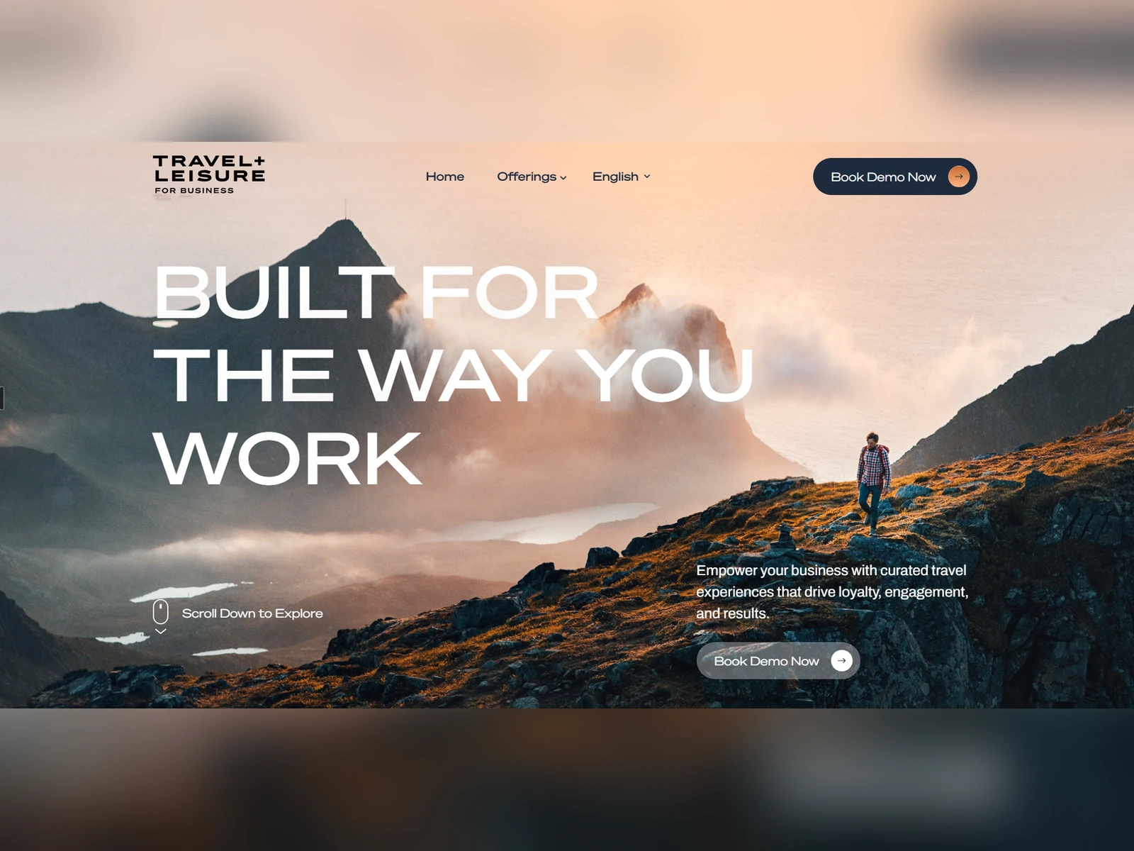
🏔️ A hero that sells the feeling
A full-bleed photo of a hiker on a mountain ridge at golden hour sets the mood right away. Warm sunset tones suggest exploration and reward, which are exactly the experiences companies want to give their teams.
🔠 Bold, confident typography
The headline “BUILT FOR THE WAY YOU WORK” uses a wide, oversized uppercase sans-serif across three lines. It works almost like a magazine cover, a nod to the brand’s editorial roots, and it frames the product as flexible and business-ready.
📝 Clear value proposition
The supporting copy sits in the lower right, balancing the headline: “Empower your business with curated travel experiences that drive loyalty, engagement, and results.” It’s one sentence with three outcomes, which is easy to scan for decision-makers.
🔘 Two-touch CTA strategy
Top nav: A solid navy “Book Demo Now” pill with an orange arrow, always visible
Hero: A frosted-glass version of the same button that blends into the photo while staying clickable
Using the same CTA twice gives visitors two chances to convert above the fold.
🧭 Minimal navigation
Just Home, Offerings and Language keeps the header clean. The Offerings dropdown holds the product range, and the language switcher supports global audiences.
🖱️ Guided scrolling
A small “Scroll Down to Explore” mouse icon invites visitors to keep going into the story below the fold.
🎨 Design System
ElementDetails🎨 PrimaryDeep Navy (CTAs, nav text)🍊 AccentSunset Orange (arrow icons, highlights)⚪ NeutralWhite (headlines and text over imagery)🔤 Display TypeWide geometric sans, uppercase🔡 Body TypeClean modern sans-serif🔘 ButtonsRounded pills with circular arrow icons, in solid and glass styles📸 ImageryWarm, cinematic, adventure-led landscape photography
📦 Deliverables
✅ Brand-aligned visual direction and moodboard
✅ Information architecture and sitemap
✅ Wireframes (low and high fidelity)
✅ Homepage UI design (desktop)
✅ Responsive layouts (tablet and mobile)
✅ Offerings dropdown and navigation design
✅ Multi-language UI system
✅ CTA and button component library
✅ Design system (colors, typography, spacing, components)
✅ Interactive prototype
✅ Developer handoff files and specs
🛠️ Tools Used
🎨 Figma · 🖼️ Adobe Photoshop · 🧪 FigJam · WordPress
🙌 Final Thoughts
This project combined inspiration with conversion. Pairing editorial-style typography and cinematic imagery with a clear B2B message produced a website that feels like the Travel + Leisure brand and works as a sales tool. ✨
🤝 Need a high-converting website for your brand? Let’s talk.
Like this project
Posted Feb 2, 2026
Built a custom WordPress real estate website with modern UI, seamless property browsing, and conversion-focused UX to generate leads and boost local presence.
Likes
7
Views
127
Timeline
Jan 16, 2026 - Feb 2, 2026
Clients
Robin Web Studio