SaaS Mobile App Design for Stush Fintech
Farida Amin
1 collaborator
Stush Fintech: Mobile App UI/UX Design
Building a Smarter Way to Manage Money, Payments, and Insurance on Mobile
Stush is a fintech mobile application designed to simplify personal finance for a generation that expects speed, clarity, and control from every digital interaction. The project required a complete UI/UX design system covering onboarding, payments, insurance management, user profiles, and a central dashboard that ties everything together.
The design challenge was clear: take a complex set of financial features and make them feel effortless. Every screen needed to build trust, reduce cognitive load, and guide users through sensitive financial actions without hesitation.
Welcome Screen: Setting the Tone from the First Tap

Stush Welcome Screen
The onboarding experience establishes Stush's identity immediately. A dark, immersive background paired with a custom illustration of a user interacting with their phone creates an approachable entry point into a financial product. The welcome screen communicates the app's core promise in a single headline, supported by a clean CTA that moves users into the registration flow without friction.
Key design decisions for the welcome screen:
Dark-mode foundation that signals a modern, premium fintech experience
Custom illustration that humanizes the product and reduces the intimidation factor common in finance apps
Single-action CTA ("Get Started") that eliminates decision paralysis at the entry point
Brand color accents used sparingly to draw attention to the primary action
Minimal copy that communicates value without overwhelming first-time users
The welcome screen functions as a trust-building moment. Users form their first impression of a fintech app in under 3 seconds, and this screen earns that trust through visual confidence and simplicity.
Home Screen: The Financial Command Center
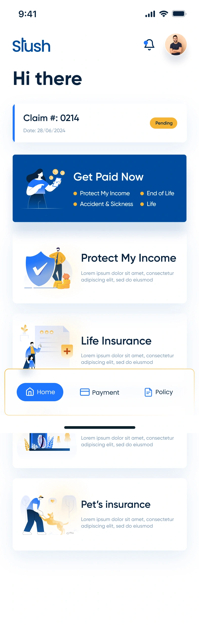
Stush Home Screen
The home screen serves as the central hub for all financial activity. It surfaces the most critical information at a glance: current balance, recent transactions, and quick-access actions for common tasks like sending money, paying bills, and checking insurance status.
The dashboard was designed around three principles:
Hierarchy of information: Balance sits at the top with the largest visual weight, followed by quick actions, then transaction history
Quick-action grid: Icon-based shortcuts for transfers, payments, insurance, and account management reduce the number of taps to complete any task
Transaction feed: A chronological list of recent activity with clear labels, amounts, and status indicators keeps users informed without requiring them to dig through menus
Card-based layout: Each section is visually contained, making the screen scannable even when packed with data
Consistent dark-mode palette: Maintains visual continuity with the onboarding flow and reduces eye strain during extended use
The home screen balances density with clarity. Users who check their balance daily see what they need instantly. Users who want to take action find the right shortcut within one tap.
Payment Screen: Making Transactions Feel Secure and Simple
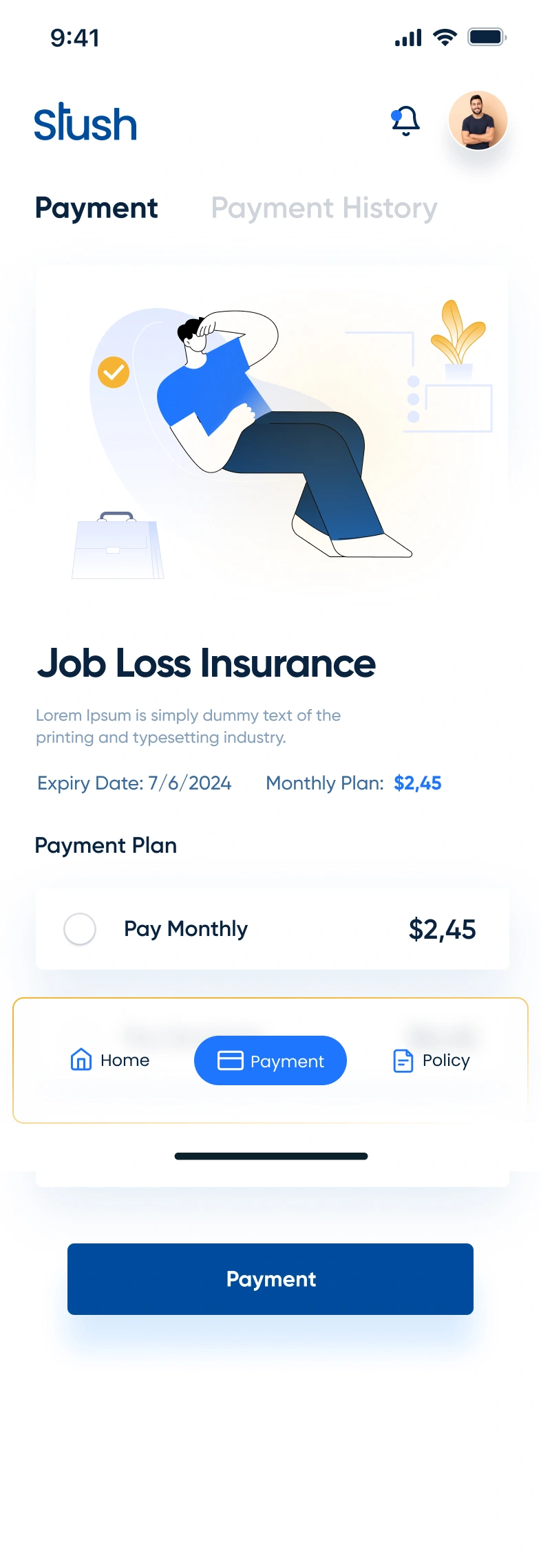
Stush Payment Screen
The payment flow handles the most sensitive interaction in any fintech app: moving money. The design breaks the transaction process into clear, sequential steps that reduce errors and build confidence at every stage.
Payment screen design highlights:
Recipient selection with recent contacts and search functionality for quick access
Amount input with a large, prominent number display that confirms the transaction value before submission
Transaction summary that shows all details (recipient, amount, fees, total) on a single confirmation screen before the user commits
Visual feedback through color-coded status indicators and confirmation animations that reassure users their payment processed successfully
Error prevention through input validation, confirmation dialogs, and clear formatting that catches mistakes before they happen
The payment experience was designed to feel as natural as sending a text message. No unnecessary steps, no confusing terminology, no ambiguity about where the money is going.
Insurance Details: Complex Information Made Accessible
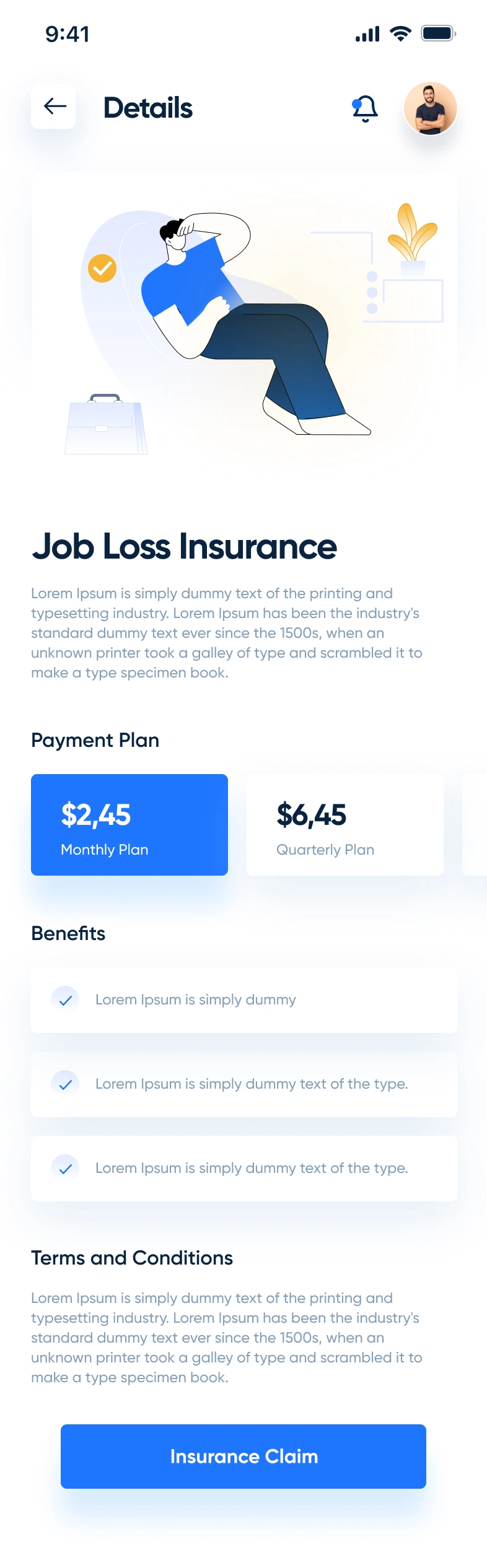
Stush Insurance Details
Insurance is one of the most information-dense features in the app, and the design treats it with the structure it demands. The insurance details screen organizes policy information, coverage breakdowns, and management options into a clean, card-based layout that users can scan quickly.
Design approach for the insurance section:
Policy overview card that displays the plan name, status, and renewal date at the top of the screen
Coverage breakdown presented in a structured list format with clear labels and values for each coverage category
Action buttons for common tasks like filing a claim, updating coverage, or contacting support, placed where users expect them
Visual hierarchy that separates policy details from action items, preventing information overload
Consistent component design that matches the rest of the app, so users never feel like they've landed in a different product
The insurance screen proves that complex financial data can be presented clearly when the layout respects the user's time and attention.
Profile Screen: Personal Account Management
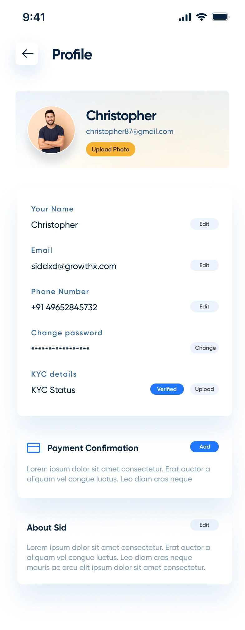
Stush Profile Screen
The profile screen gives users full control over their account settings, personal information, and app preferences. It serves as the administrative backbone of the app, organized into logical sections that make it easy to find and update any detail.
Profile screen structure:
User identity section at the top with avatar, name, and account status for quick visual confirmation
Settings categories organized into grouped list items (personal info, security, notifications, payment methods) for intuitive navigation
Toggle controls for preferences like notifications and biometric authentication that allow instant changes without navigating to sub-screens
Logout and support access placed at the bottom of the screen following standard mobile UX conventions
Clean spacing and dividers that separate each section without adding visual clutter
The profile screen prioritizes function over decoration. Every element exists because users need it, and nothing competes for attention unnecessarily.
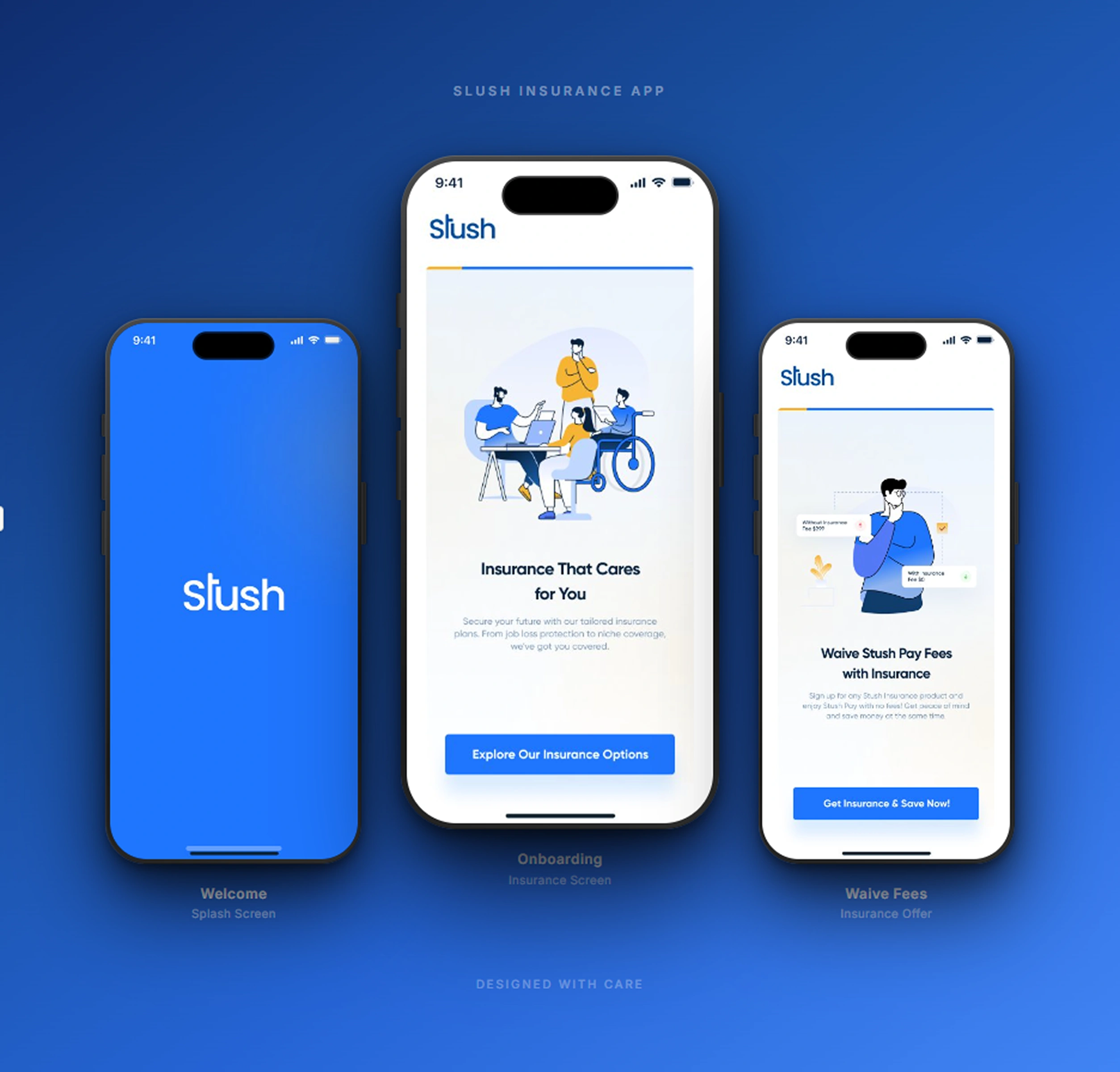
Full App Showcase: The Complete Stush Experience
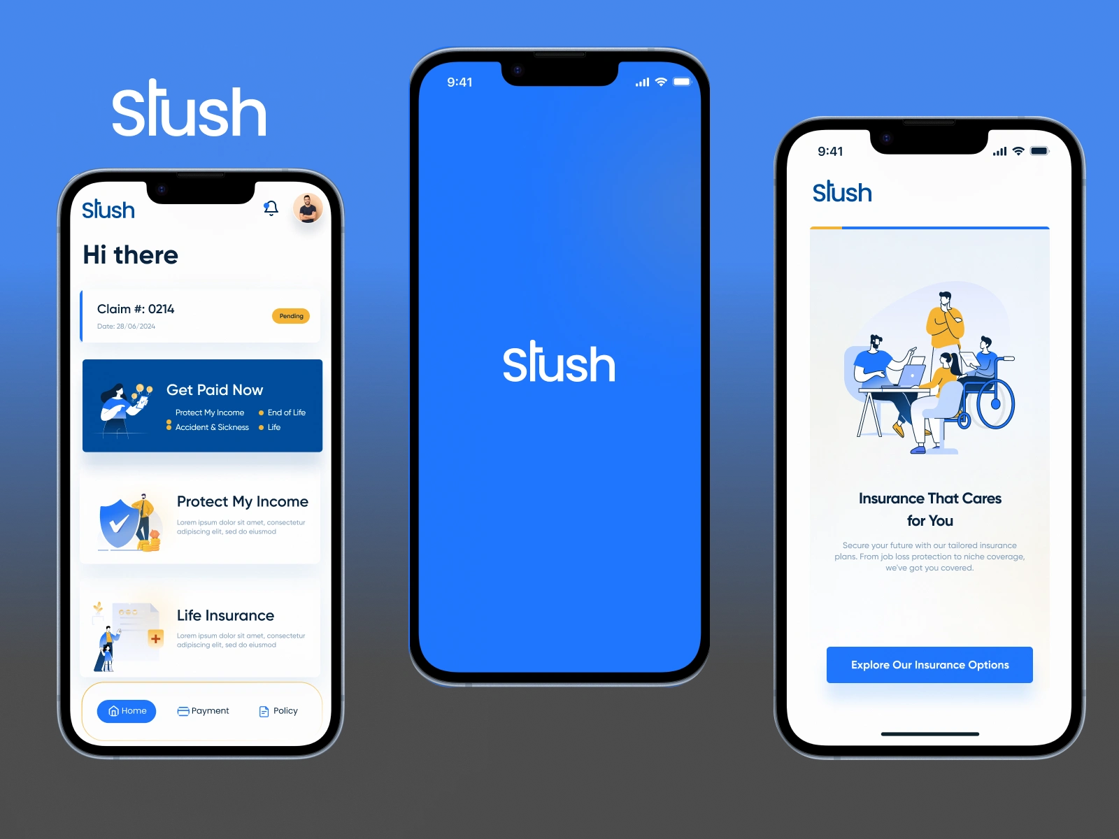
Stush App Screens
The composite views above show how every screen in the Stush app connects into a cohesive product experience. From onboarding through daily use, the design system maintains consistent typography, color usage, spacing, and interaction patterns across every flow.
Design system consistency across the app:
Unified color palette: Dark backgrounds with accent colors reserved for CTAs, status indicators, and interactive elements
Typography scale: A clear hierarchy from display headings to body text to captions, applied consistently across all screens
Component library: Reusable cards, buttons, input fields, and navigation elements that maintain visual consistency while adapting to different content types
Spacing system: An 8px grid that governs all padding, margins, and layout decisions for pixel-perfect alignment
Interaction patterns: Consistent tap targets, swipe behaviors, and transition animations that create muscle memory across the app
Tools & Technologies
Figma for complete UI/UX design, prototyping, and design system creation
Adobe Illustrator for custom illustrations and iconography
Component-based design architecture for scalability and developer handoff
Deliverables
Complete mobile app UI/UX design for iOS and Android
Onboarding and welcome flow
Home dashboard with balance, quick actions, and transaction history
Full payment and transfer flow with confirmation screens
Insurance details and policy management screens
User profile and account settings
Design system with reusable components, typography, and color tokens
Interactive Figma prototype for stakeholder review and developer handoff
The Result
Stush now has a fintech mobile app design that treats financial complexity with the clarity it deserves. Users move through payments, insurance management, and account settings with the same ease they expect from consumer apps built by teams ten times the size.
The dark-mode interface, structured information hierarchy, and consistent design system create a product that feels trustworthy and modern in equal measure. Every screen earns its place by solving a real user problem with minimal friction.
Building a fintech product that needs this level of design precision? Let's talk about your project.
Like this project
Posted Jun 12, 2025
UI/UX design for Stush, a fintech mobile app featuring smart payments, insurance management, & personal finance tools with a dark-mode built for iOS & Android.
Likes
3
Views
47
Timeline
Jul 1, 2025 - Jul 22, 2025
Collaborators