SaaS Conversion-Focused Web Design & Development
Farida Amin
Payzli
🚀 Payzli: SaaS Conversion Focused Web Design & Development
Designing a High-Converting Fintech Experience That Turns Traffic Into Users
Most SaaS websites make one critical mistake.
They explain features…
But they fail to create momentum.
And in SaaS, momentum is everything.
Because users decide within seconds:
👉 Is this platform trustworthy?
👉 Is it easy to understand?
👉 Is it worth trying?
That was the core challenge behind Finixlab — a fintech SaaS platform designed to simplify finance analytics and business management through a clean, scalable, and conversion-focused digital experience 💻📈
The objective was not just to create another modern SaaS landing page.
The objective was to engineer a website that:
• Builds trust instantly
• Explains complex products clearly
• Reduces user hesitation
• Drives demo requests and signups
• Creates a premium fintech brand perception
🧠 Understanding the Problem
Before touching design, we analyzed how users interact with most fintech SaaS platforms.
And the pattern was obvious.
Most websites were overloaded with:
• Complex messaging
• Dense UI sections
• Weak visual hierarchy
• Poor onboarding flow
• Generic layouts
• Too many competing CTAs
The result?
👉 Users feel overwhelmed instead of confident.
Finixlab needed to feel different.
The platform had powerful features, but the challenge was simplifying that power into an experience users could instantly understand.
Landing Page
✨ Designing the First Impression
The hero section became the foundation of the entire experience.
Because in SaaS…
The first screen determines whether users continue scrolling or leave.
The solution was creating a hero section that communicates:
• What the platform does
• Who it’s for
• Why it matters
• What action users should take next
All within seconds.
The hero experience included:
• Strong fintech-inspired visual identity
• Clear value proposition
• Dashboard preview for product trust
• Primary CTA for signup conversion
• Secondary CTA for product exploration
The combination of dark green gradients, clean typography, and bright accent colors creates a premium fintech atmosphere while maintaining clarity and accessibility 💚
📊 Product Visualization & Dashboard Design
In fintech SaaS, trust is built visually.
Users need to feel that the platform is stable, professional, and data-driven.
That’s why dashboard presentation became one of the strongest conversion elements in the entire project.
🎬 Interaction Design & Motion Strategy
Subtle motion design was used throughout the website to create flow and improve engagement.
But the goal was never “animation for the sake of animation.”
Every interaction had purpose.
The motion system focused on:
• Smooth scrolling transitions
• Hover interactions
• Dashboard entrance animations
• CTA micro-interactions
• Section reveal effects
This creates a more immersive and modern SaaS experience while keeping performance optimized ⚡
🧠 CRO & User Psychology Decisions
This project was heavily built around conversion-focused UX principles.
Every section was intentionally designed to guide users toward action.
Key CRO strategies included:
• Strong above-the-fold CTA placement
• Visual hierarchy optimization
• Reduced cognitive load
• Strategic whitespace usage
• Social proof and partner logos
• Simplified onboarding messaging
• Trust-focused product presentation
• Consistent call-to-action repetition
Instead of forcing users to think…
👉 The website guides them naturally.
📱 Responsive SaaS Experience
Since a large percentage of SaaS traffic comes from mobile users, the experience was optimized mobile-first.
The challenge was preserving dashboard clarity on smaller screens while maintaining usability.
This included:
• Responsive grid restructuring
• Optimized dashboard scaling
• Mobile-friendly navigation
• Touch-optimized interactions
• Performance-focused responsive layouts
The result is a seamless experience across:
• Desktop
• Tablet
• Mobile devices
⚡ Performance & Optimization
A SaaS website cannot feel slow.
Especially in fintech, performance directly impacts trust perception.
Optimization included:
• Lightweight component structure
• Optimized image delivery
• Reduced layout shift
• Lazy loading implementation
• Clean responsive architecture
• Fast page transitions
This ensures both visual quality and technical performance.
🔍 SEO & SaaS Growth Foundation
The website was also structured with long-term SaaS growth in mind.
SEO optimization included:
• Proper heading hierarchy
• Metadata optimization
• SEO-focused content structure
• High-intent SaaS keyword targeting
• Optimized internal linking
• Fast-loading architecture for search performance
The goal was not just visual success…
👉 But scalable organic growth.
📦 Deliverables
The final delivery included:
• Complete SaaS landing page design
• Responsive UI UX system
• Dashboard visualization design
• Conversion-focused user flows
• Interactive animations and transitions
• Mobile responsive optimization
• SEO-ready structure
• Performance optimization
• CTA and onboarding optimization
📈 Final Outcome
The final result is a fintech SaaS experience that feels:
💻 Modern
📈 Intelligent
⚡ Fast
🧠 Clear
🎯 Conversion-focused
Most importantly…
👉 It transforms complexity into clarity.
💭 Final Thought
The best SaaS websites don’t just explain products.
They create confidence.
They reduce hesitation.
They simplify decisions.
They guide users toward action.
That was the philosophy behind Finixlab.
Every section was designed not only to look premium
Robin Studio
🐦 Robin Web Studio - Designing a Conversion-First Website for Local Service Businesses
Client
Robin Web Studio - Productized Website Service for Local Businesses
Industry
Web Design • Local Services • Lead Generation • Productized Services
Role
Lead UI/UX Designer & CRO Strategist
Website UX/UI Design • Conversion Rate Optimization (CRO) • Productized Service Design • Responsive & Mobile-First Design
🧠 Project Overview
Robin Web Studio is a productized web design service focused on building high-conversion websites for local service businesses such as electricians, plumbers, HVAC contractors, and other trade-based professionals that rely heavily on inbound calls.
The goal of this project was to design a website that does more than explain services - it needed to sell a system, communicate value instantly, and remove friction from the buying decision.
I handled the entire website design end-to-end, including:
UX strategy and offer positioning
Visual design and brand tone
Conversion-focused layout and CTA system
Trust-building content hierarchy
Mobile-first and responsive design
The result is a clean, confident, and conversion-optimized agency website designed to turn visitors into qualified leads 🚀
🎯 Business Goals & Objectives
✔️ Clearly communicate a simple, compelling offer
✔️ Reduce hesitation through a risk-free preview model
✔️ Build trust with local service business owners
✔️ Drive demo / preview requests
✔️ Create a scalable agency website that supports growth
🔍 Discovery & Market Research
Local service business owners are busy, skeptical, and results-driven.
During discovery, I focused on:
How contractors evaluate marketing services
Common objections (cost, risk, unclear ROI)
What builds trust quickly in B2B local markets
How productized services reduce decision friction
📌 Key Insight:
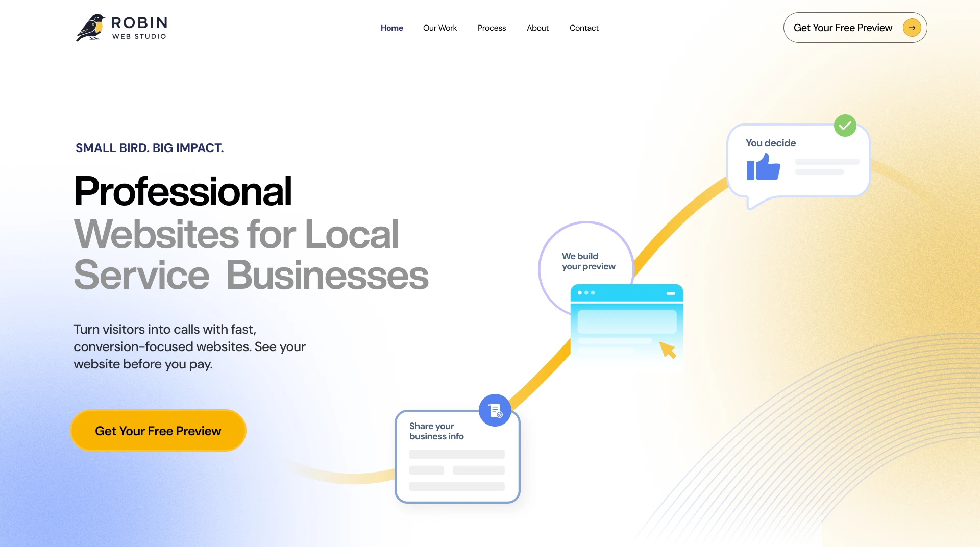
Local business owners don’t want complexity - they want proof, clarity, and speed. The site needed to communicate “We handle everything. You decide after you see results.”
🧩 UX Strategy & Information Architecture
The UX was built around a low-friction conversion journey:
Clarity → Proof → Process → Action
UX Strategy Highlights:
Strong hero section with clear positioning and benefit-driven copy
Visual explanation of the preview-based process
“What You Get” section focused on outcomes, not features
Step-by-step breakdown to remove uncertainty
Repeated, confidence-driven CTAs
Each section answers one core question:
“Is this simple, safe, and worth my time?”
🎨 Visual Design & Brand Direction
The visual identity needed to feel:
🟡 Friendly but professional
🧠 Clear and instructional
⚡ Action-oriented
📱 Modern and trustworthy
Design System Decisions:
Warm accent colors to create approachability
Clean typography for fast comprehension
Illustrated flow elements to explain the process visually
Card-based layouts for scannability
Strong contrast for CTAs and key actions
The design balances agency credibility with startup agility, making the offer feel both professional and accessible.
📞 Conversion Rate Optimization (CRO)
CRO was the foundation of every layout decision.
CRO Techniques Implemented:
✅ Single primary CTA (Get Your Free Preview)
✅ Risk-reversal messaging to reduce hesitation
✅ Process visualization to build confidence
✅ Proof through real project examples
✅ Minimal navigation to keep focus on conversion
✅ Clear pricing philosophy without complexity
The site is intentionally designed to move visitors toward one action - requesting a preview.
📱 Mobile-First & Responsive Design
Many local business owners browse on mobile 📱
The website was designed mobile-first, ensuring:
Thumb-friendly CTA placement
Easy scrolling and fast understanding
Clear section separation
Minimal text overload
This ensures the site converts effectively across all screen sizes.
🧪 Iteration & Refinement
Multiple refinement rounds focused on:
Strengthening headline clarity
Improving CTA contrast and placement
Simplifying copy without losing authority
Tightening the process explanation
Each iteration aimed to reduce friction and increase confidence.
📦 Final Deliverables
✔️ Full agency website UX/UI design
✔️ Conversion-optimized homepage
✔️ Process and offer explanation sections
✔️ Portfolio and proof layouts
✔️ Mobile-responsive design
✔️ CRO-focused lead acquisition flow
📈 Measurable Outcomes & Strategic Impact
The final website positions Robin Web Studio as a results-first partner, not a traditional agency.
It supports:
Higher-quality inbound leads
Faster decision-making from prospects
Clear differentiation through the preview-based model
Scalable acquisition without heavy sales calls
Instead of pitching services, the website lets the product sell itself.
🏆 Final Takeaway
This project demonstrates my ability to:
Design conversion-driven agency websites
Translate offers into clear UX systems
Build productized service experiences
Align design decisions with real business goals
Create scalable, growth-ready digital platforms
Robin Web Studio now has a website that acts as a sales engine, not just a marketing page - consistently turning interest into qualified opportunities 🐦⚡
Like this project
Posted Feb 4, 2026
Designed a conversion-focused, SEO-optimized website for Robin Web Studio, enhancing brand positioning, user experience, lead generation, and online visibility.