App Design for the Fourth Seat App
Farida Amin
Fourth Seat: Mobile App UI/UX Design
Bringing Mahjong Players Together Through Thoughtful App Design
Mahjong is a social game at its core, but finding a table, joining a group, and learning the rules still happens through word of mouth and scattered group chats. Fourth Seat changes that. The brief was to design a mobile app that makes discovering, joining, and reviewing Mahjong games as intuitive as booking a restaurant table.
The design challenge was layered: build an experience that serves both seasoned players who want fast access to nearby games and newcomers who need guided onboarding before they feel confident sitting down at a table. Every screen needed to feel welcoming, reduce friction, and keep the social energy of the game alive in a digital format.
Splash & Sign-In: First Impressions That Set the Mood

Fourth Seat Splash Screen
The splash screen introduces Fourth Seat's visual identity immediately. A rich teal background paired with the app's logo and a clean tagline establishes the brand's personality before the user taps a single button. The sign-in screen carries that same energy forward with a warm welcome message and straightforward authentication options.
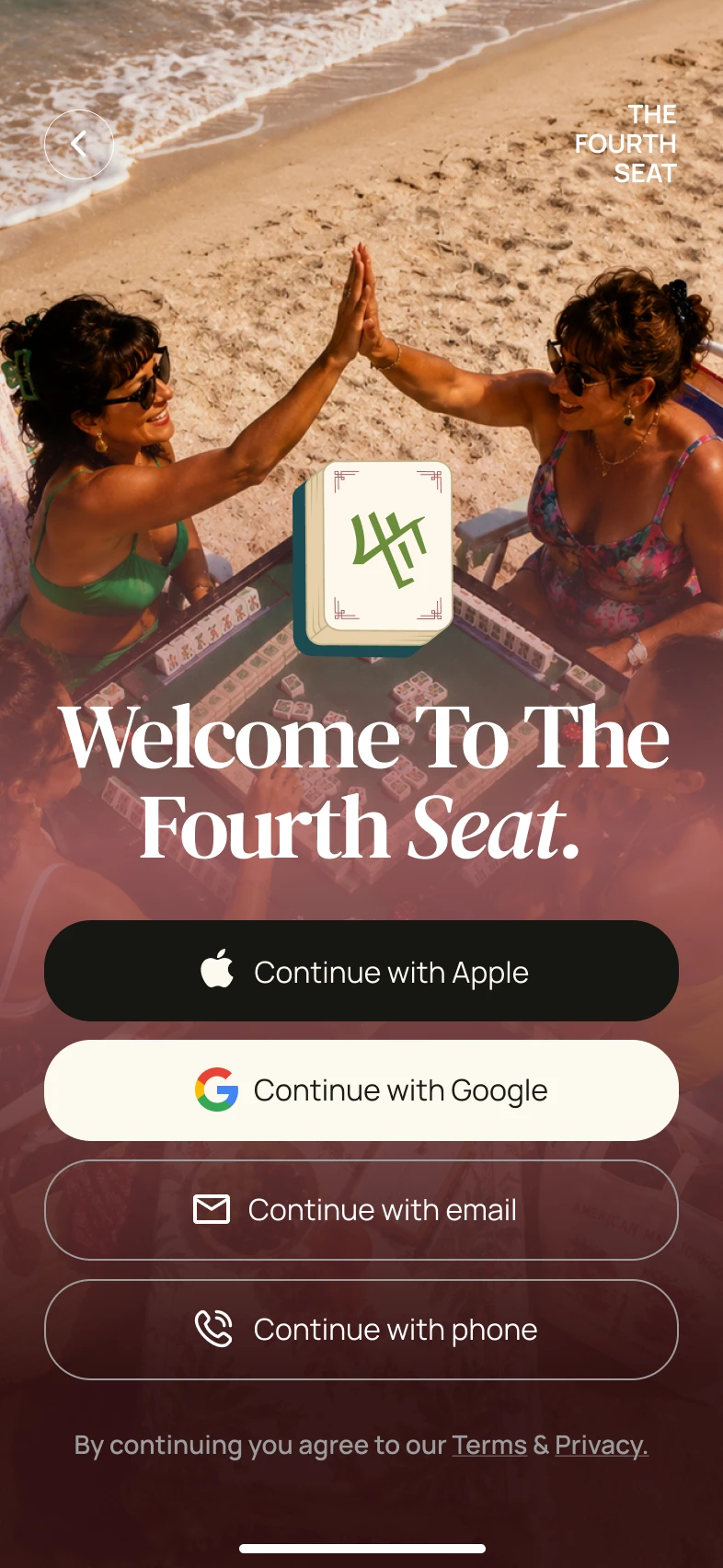
Fourth Seat Sign-In
Key design decisions for the entry experience:
Bold brand color palette that feels energetic and social without being overwhelming
Warm, conversational copy ("Welcome Back!") that sets a friendly tone from the first interaction
Multiple sign-in options (Google, Apple, email) presented cleanly to reduce registration friction
Minimal visual noise so the user's attention stays on the single action: get in
Consistent brand elements from splash to sign-in that build recognition and trust immediately
The entry flow functions as a mood-setter. Users should feel like they're walking into a game night, not filling out a form.
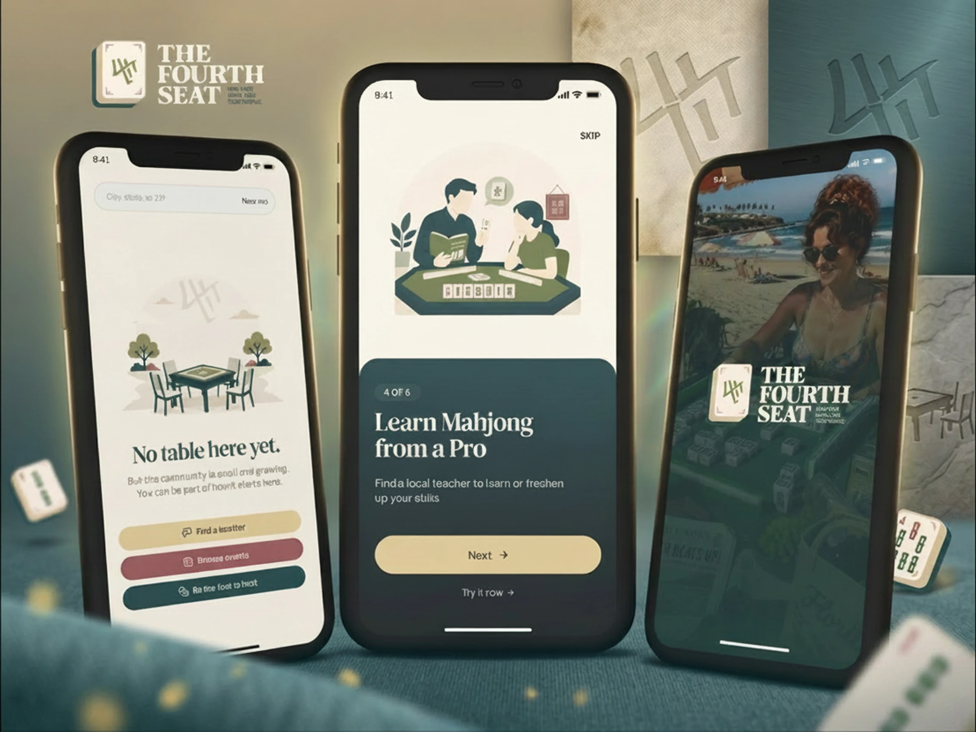
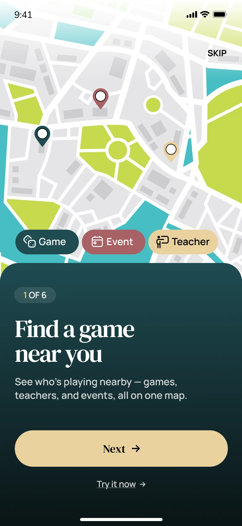
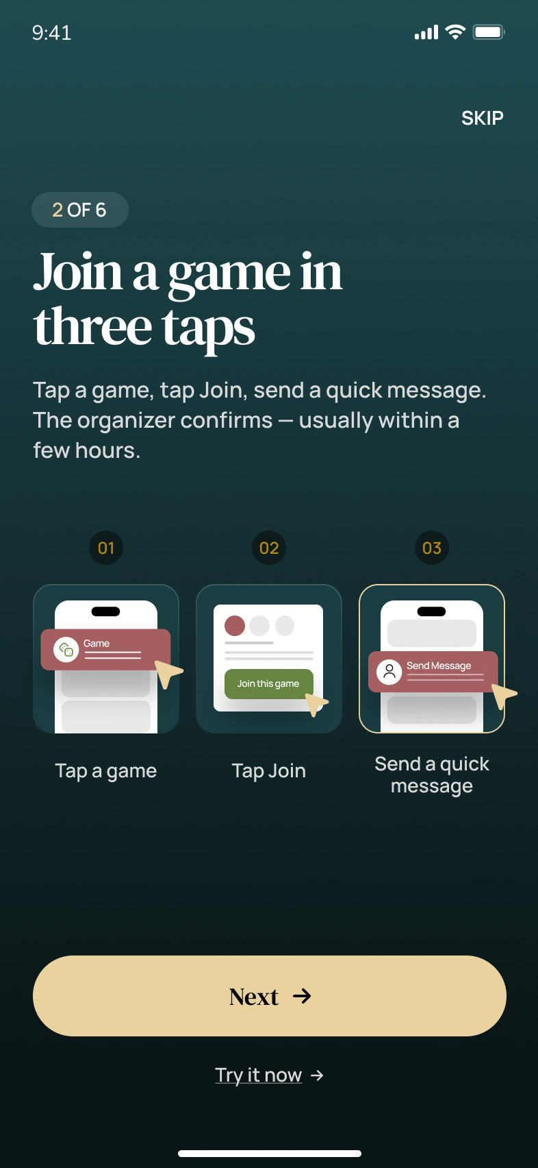
Onboarding Tour: Teaching Without Lecturing
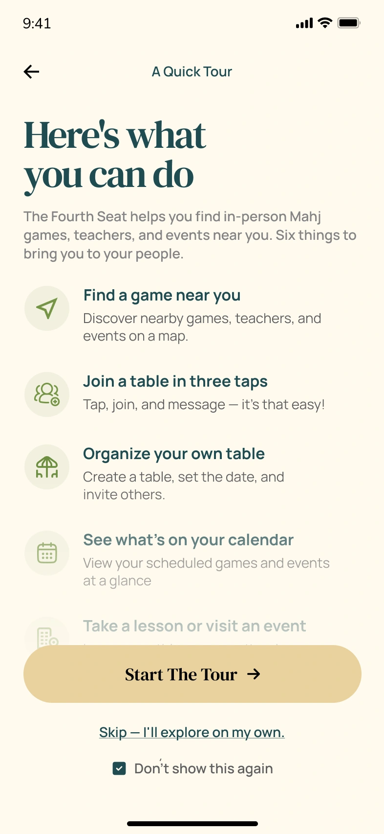
Fourth Seat Tour Hub
The onboarding tour breaks down the app's core features into digestible, swipeable cards. Instead of dumping a feature list on new users, the tour walks them through one capability at a time: finding games, joining tables, and learning from pros.
Find a Game Near You
Join a Table in Three Taps
Learn Mahjong from a Pro
Onboarding design highlights:
Progressive disclosure that introduces one feature per screen instead of overwhelming new users with everything at once
Illustration-driven storytelling with custom visuals that show the feature in action rather than describing it in text
Clear step indicators so users know where they are in the tour and how much is left
Skip option for returning users or confident players who want to jump straight in
Benefit-first copy that leads with what the user gains ("Find a game near you") rather than what the feature does technically
The tour respects the user's time. Three screens, three core promises, zero fluff.
Home Screen: The Player's Command Center
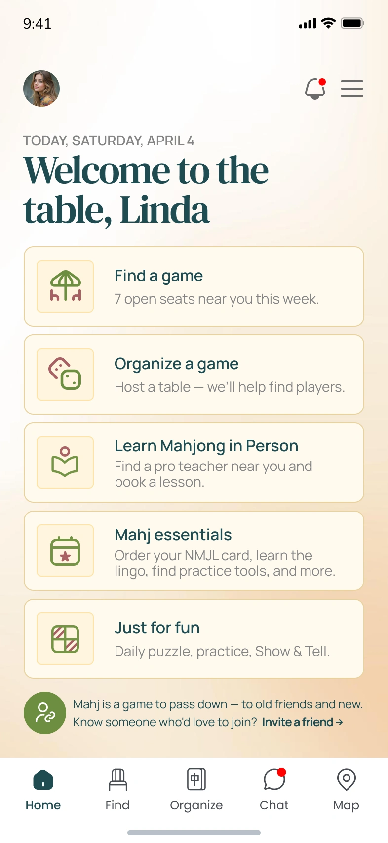
Fourth Seat Home Screen
The home screen serves as the central hub for all game activity. It surfaces the most relevant information at a glance: what to do next, upcoming games, and quick-access actions for common tasks like finding a game, hosting a table, or browsing nearby sessions.
The dashboard was designed around three principles:
Hierarchy of information: The "What do you want to do?" prompt sits at the top with clear action cards, followed by contextual content below
Action-first layout: Large, tappable cards for primary actions (Find a Game, Host a Table, Browse Classes) reduce the number of taps to get started
Contextual content feed: Upcoming games, recommended tables, and community activity fill the scroll below the primary actions
Card-based architecture: Each section is visually contained, making the screen scannable even when packed with options
Warm, inviting color system: Teal and coral accents guide the eye to interactive elements without creating visual chaos
The home screen balances discovery with action. Players who know what they want find it in one tap. Players who are browsing get pulled into the right game naturally.
Scheduled Games: Keeping Players Organized
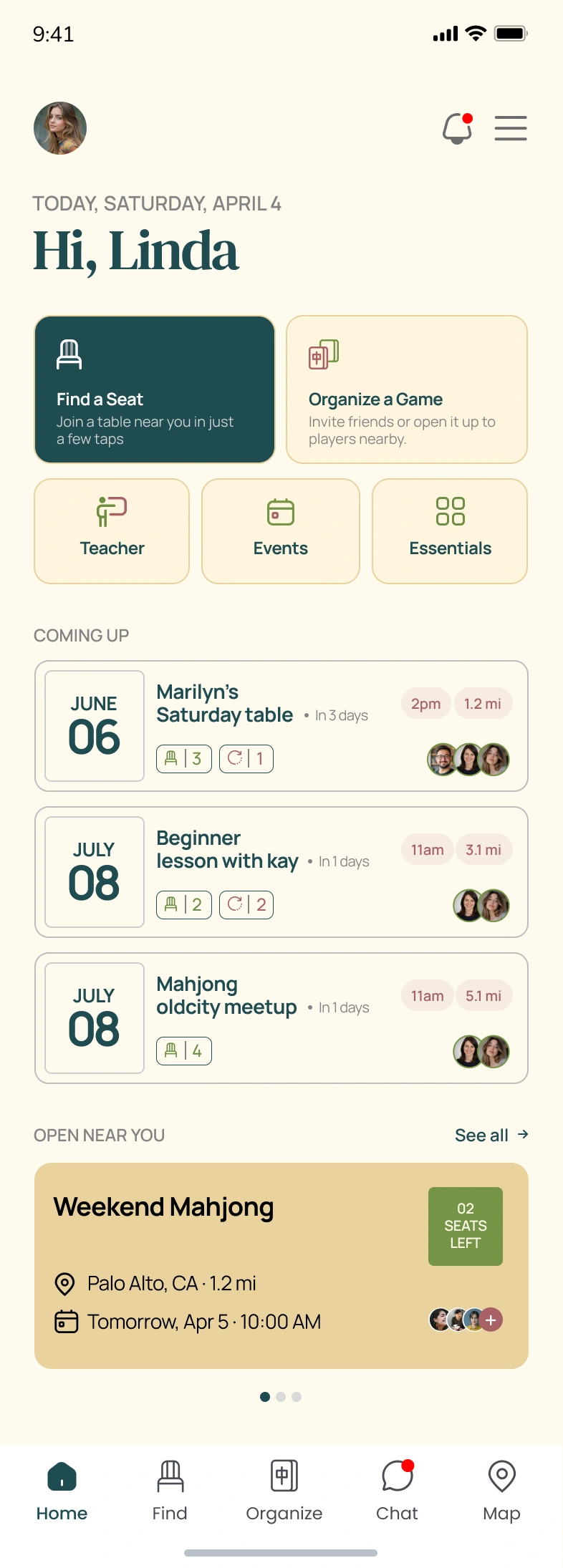
Fourth Seat Scheduled Games
The scheduled games screen gives players a clear view of their upcoming commitments. Each game card displays the essential details: date, time, location, host, and number of seats filled, so players can manage their schedule without digging through menus.
Scheduled screen design highlights:
Timeline-based layout that organizes games chronologically for quick scanning
Rich game cards showing host info, location, time, and seat availability at a glance
Status indicators that distinguish between confirmed, pending, and waitlisted games
Quick actions for canceling, rescheduling, or messaging the host directly from the card
Empty state design that encourages players to find their first game when the schedule is clear
The scheduled view keeps the social commitment visible. Players don't forget games, and hosts don't get no-shows.
Post-Game Review: Closing the Loop
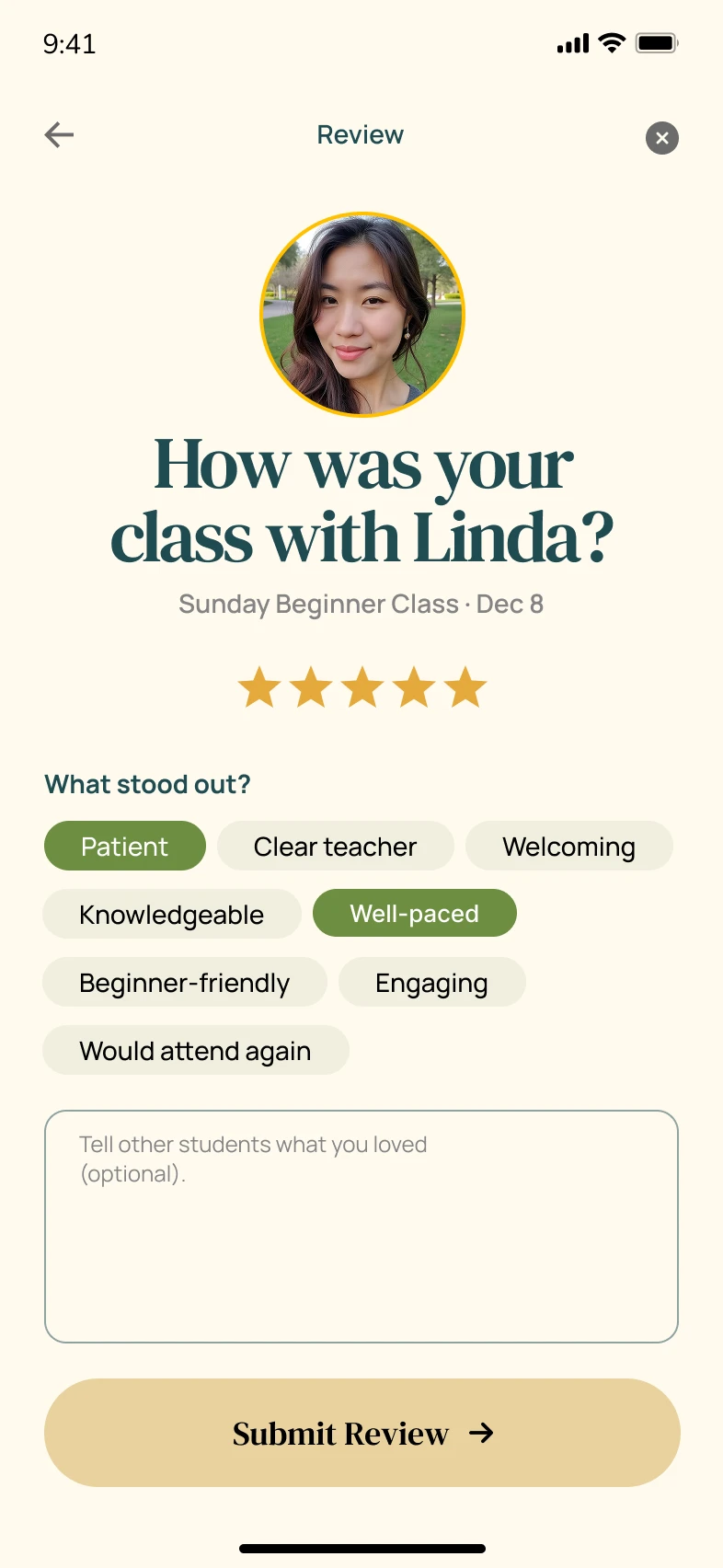
Fourth Seat Post-Game Review
After every game, players are prompted to rate their experience. The review screen breaks feedback into clear categories: overall experience, host quality, venue, and game atmosphere. A star-based rating system paired with optional written feedback makes the process fast for casual reviewers and detailed for those who want to share more.
Review flow design highlights:
Category-based ratings that capture specific feedback (host, venue, atmosphere) rather than a single generic score
Star rating system that's universally understood and requires minimal cognitive effort
Optional text feedback that doesn't block submission but encourages detailed input
Confirmation screen with a warm thank-you message that reinforces the community-driven nature of the platform
Smooth transition from game completion to review that feels natural rather than intrusive
The review system builds trust across the platform. Good hosts get recognized, and players can make informed decisions about which tables to join.
Design System & Visual Language
Every visual choice on this project was intentional:
Color palette: Teal and coral as primary brand colors, paired with warm neutrals and clean whites for a social, energetic feel
Typography: A modern sans-serif system with bold display weights for headlines and readable body weights for content, establishing clear hierarchy across all screens
Spacing: Consistent padding and margins following an 8px grid that keeps every screen feeling structured and breathable
Illustrations: Custom onboarding illustrations that humanize the app and make Mahjong feel accessible to newcomers
Iconography: Purposeful, minimal icons that support navigation and feature cards without adding visual noise
Component library: Reusable cards, buttons, inputs, and navigation elements that maintain consistency across every flow
Tools & Technologies
Figma for complete UI/UX design, wireframing, prototyping, and design system creation
Photoshop for image editing, asset preparation, and visual refinements
Canva for supplementary design assets and quick visual iterations
Deliverables
Complete mobile app UI/UX design for iOS and Android
Splash screen and sign-in flow
Onboarding tour with progressive feature introduction
Home dashboard with game discovery, hosting, and class browsing
Scheduled games management screen
Post-game review and rating flow
Review confirmation and feedback loop
Design system with reusable components, typography, and color tokens
Interactive Figma prototype for stakeholder review and developer handoff
The Result
Fourth Seat now has a mobile app design that turns a centuries-old social game into a modern, accessible digital experience. Players discover games nearby, join tables in three taps, and leave reviews that strengthen the community, all through an interface that feels as welcoming as the game itself.
The warm color system, structured information hierarchy, and consistent design language create a product that feels trustworthy and fun in equal measure. Every screen earns its place by solving a real player problem with minimal friction.
Building a gaming or social app that needs this level of design precision? Let's talk about your project.
Like this project
Posted Jun 18, 2026
Custom gaming App design and prototype featuring clean UI, patient-focused UX, responsive layouts, and conversion-optimized pages.