Komfort Packaging Redesign
Maria Stolts
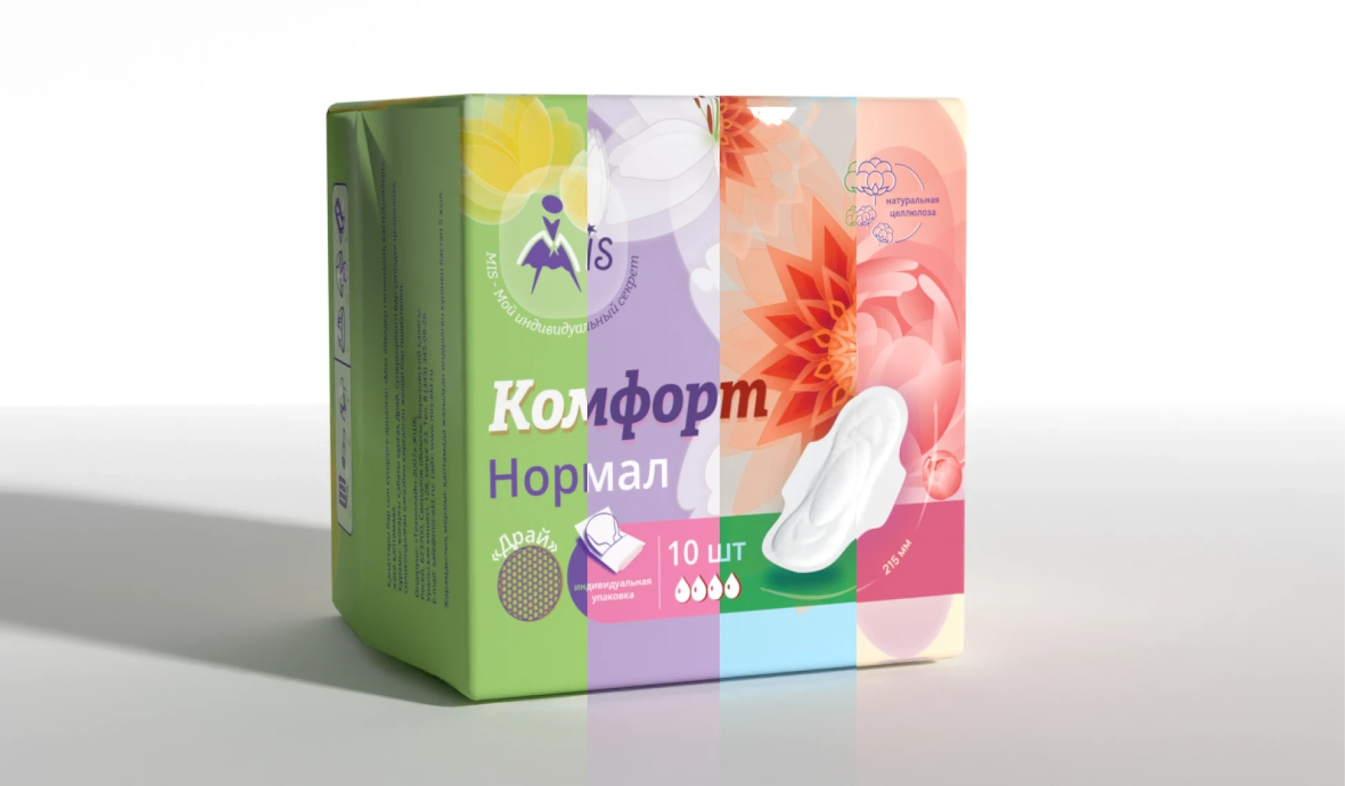
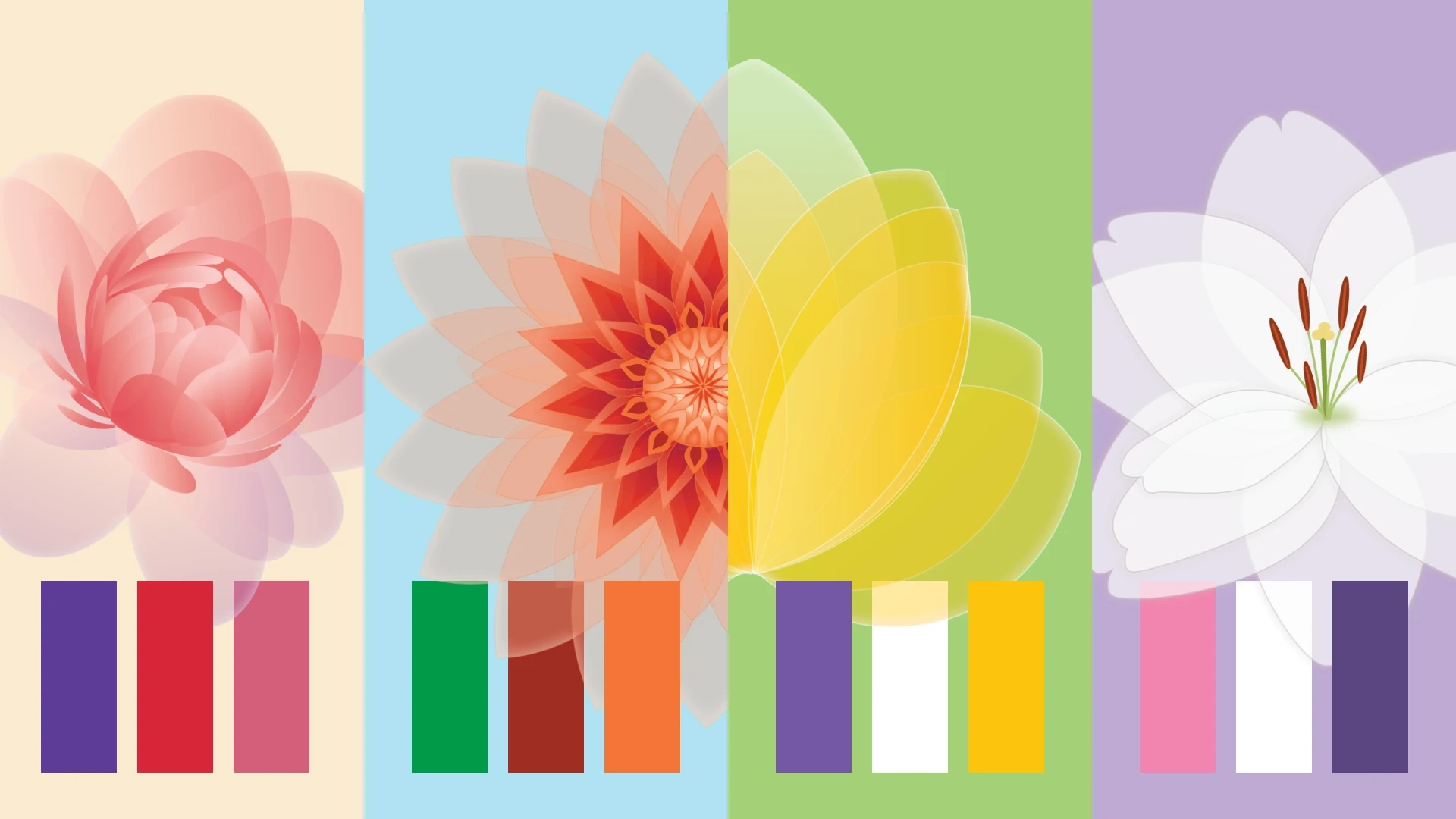
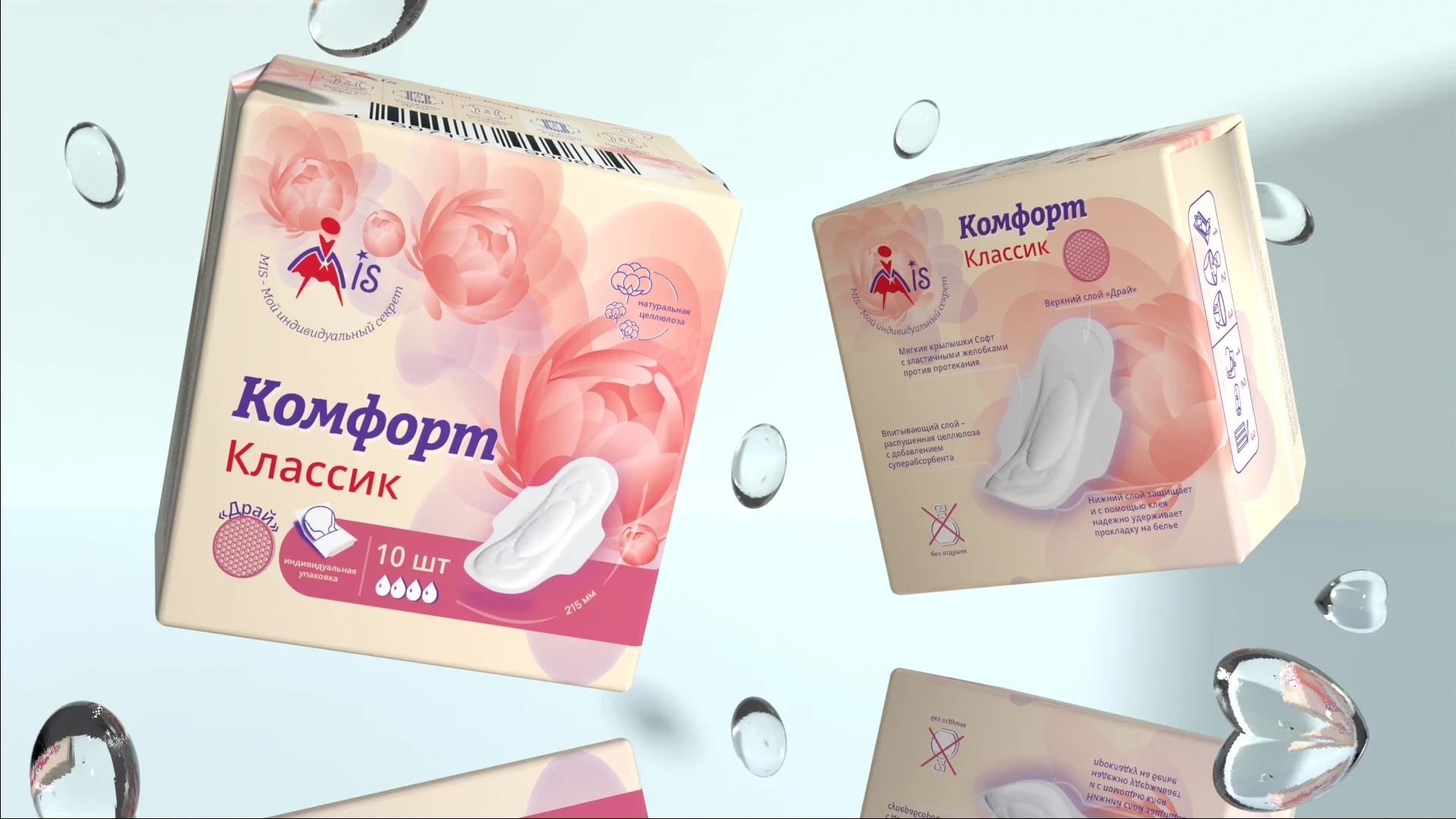
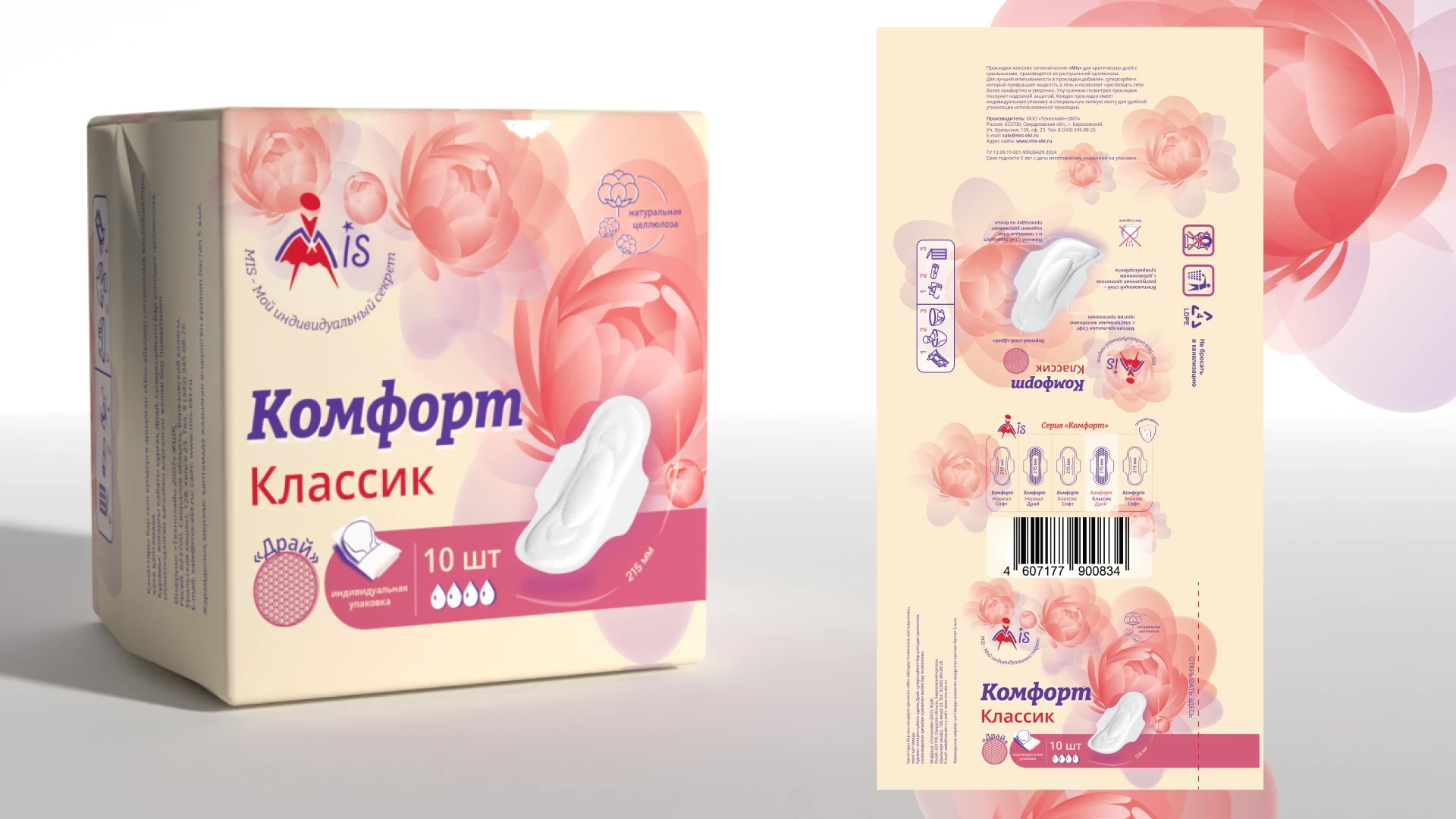
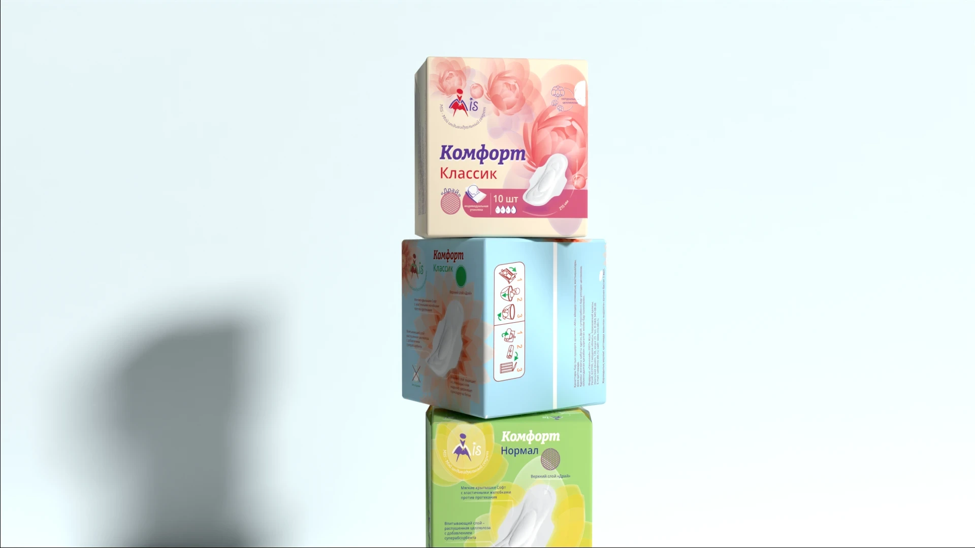
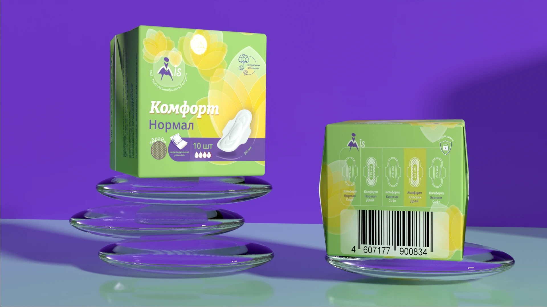
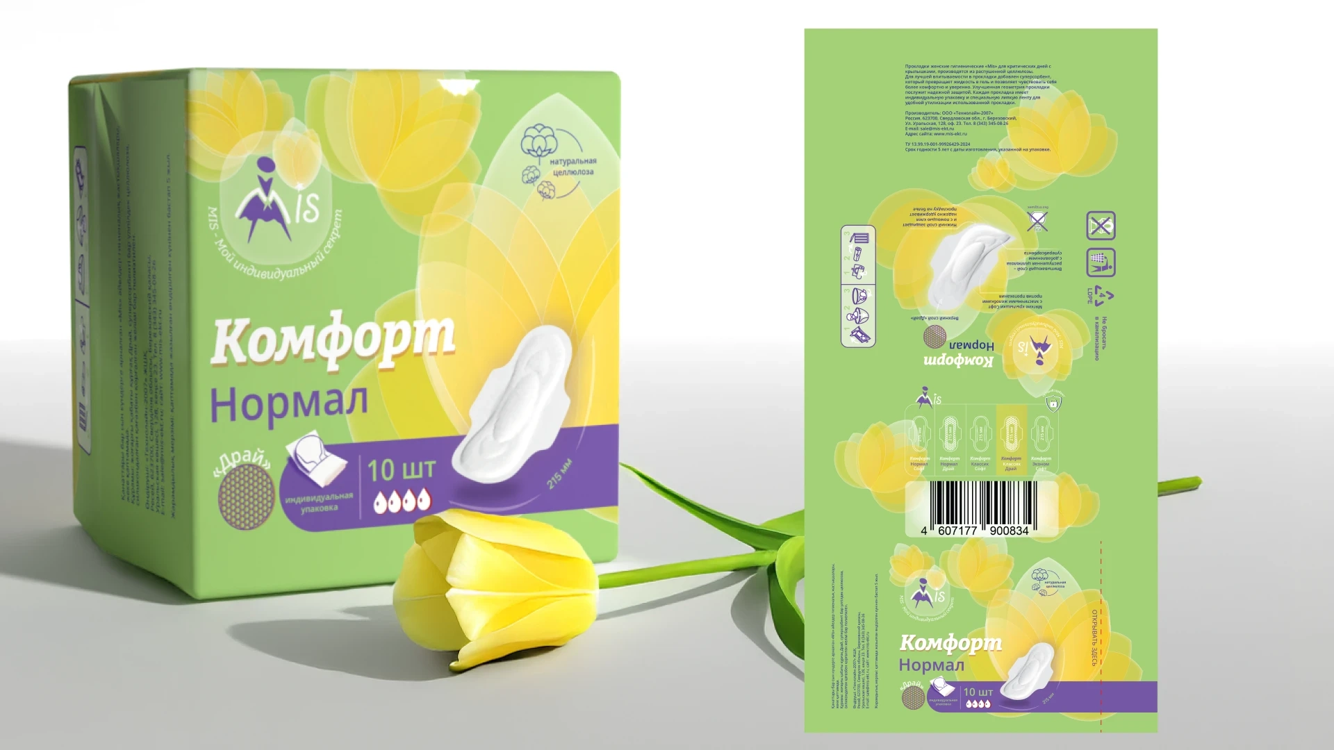
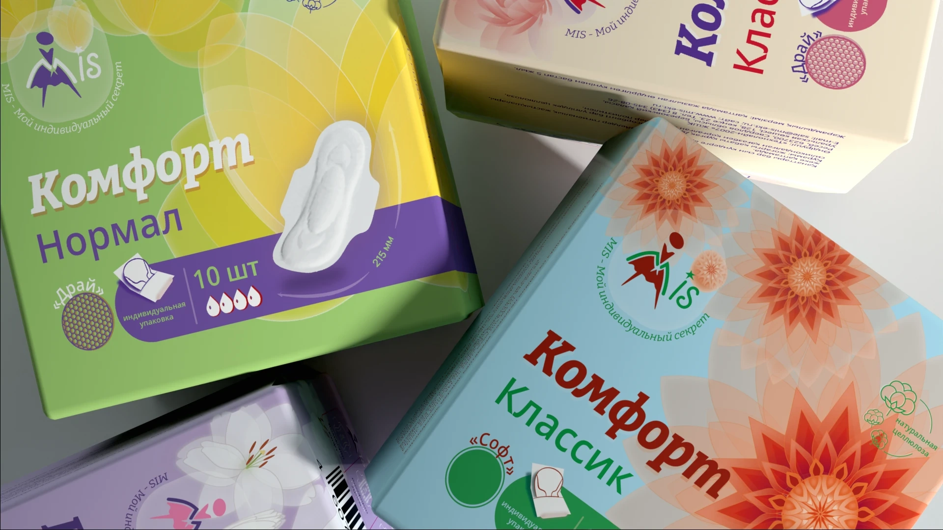
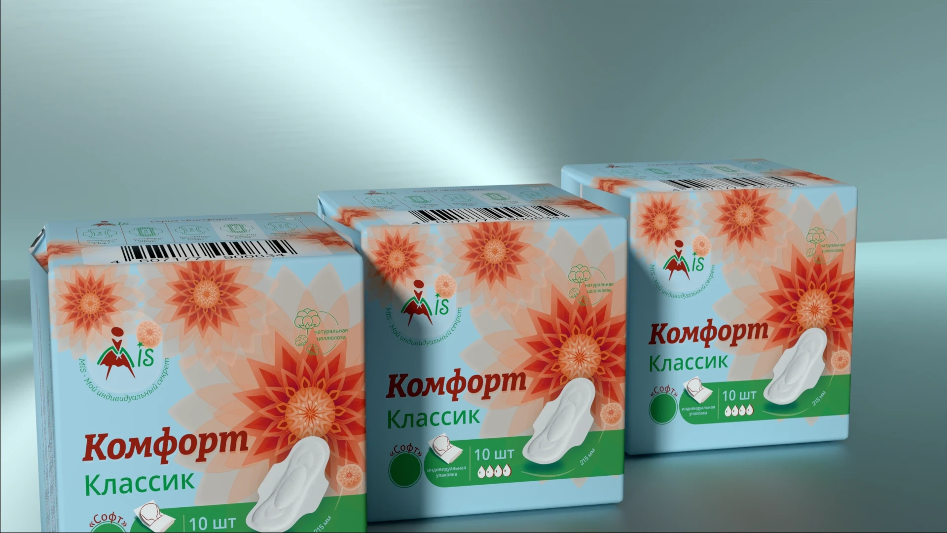
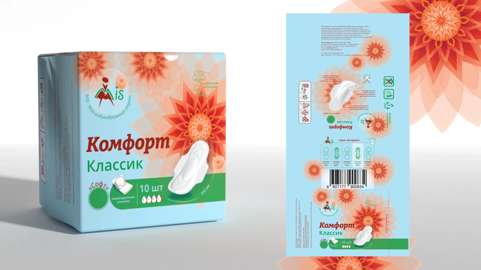
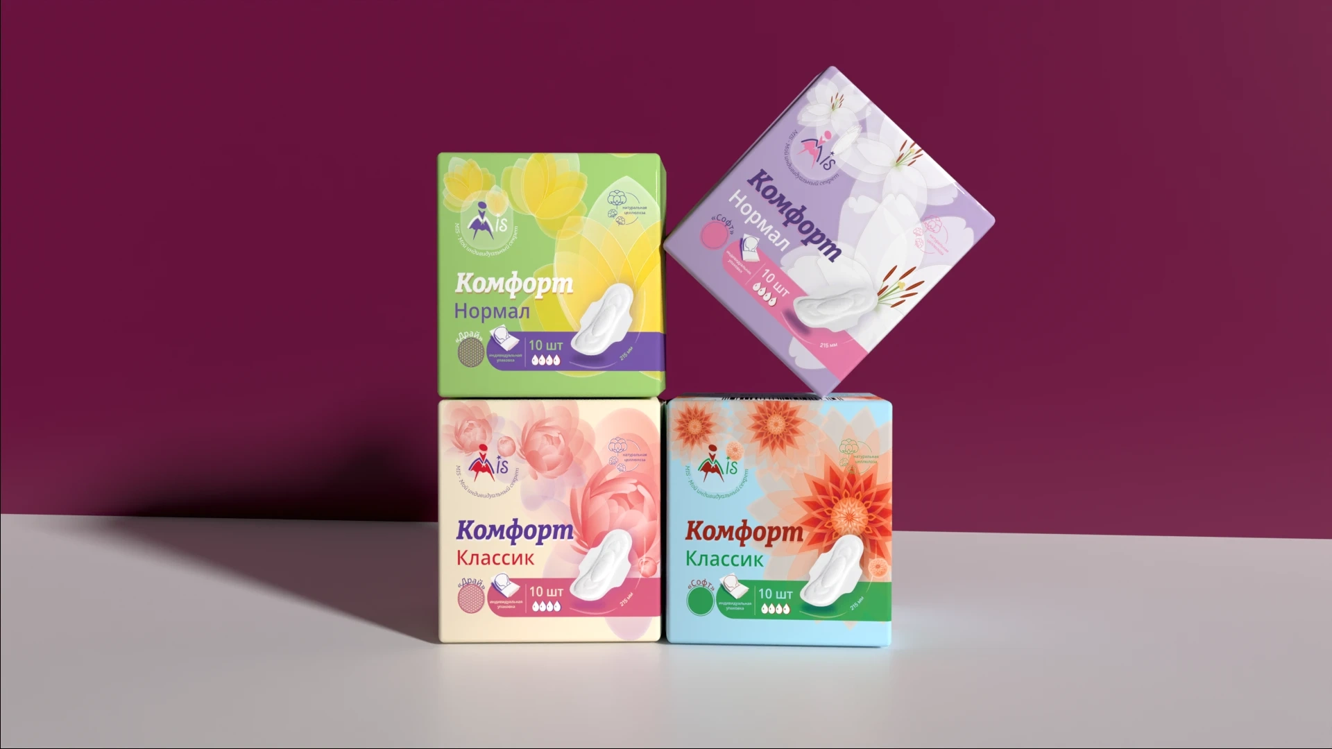
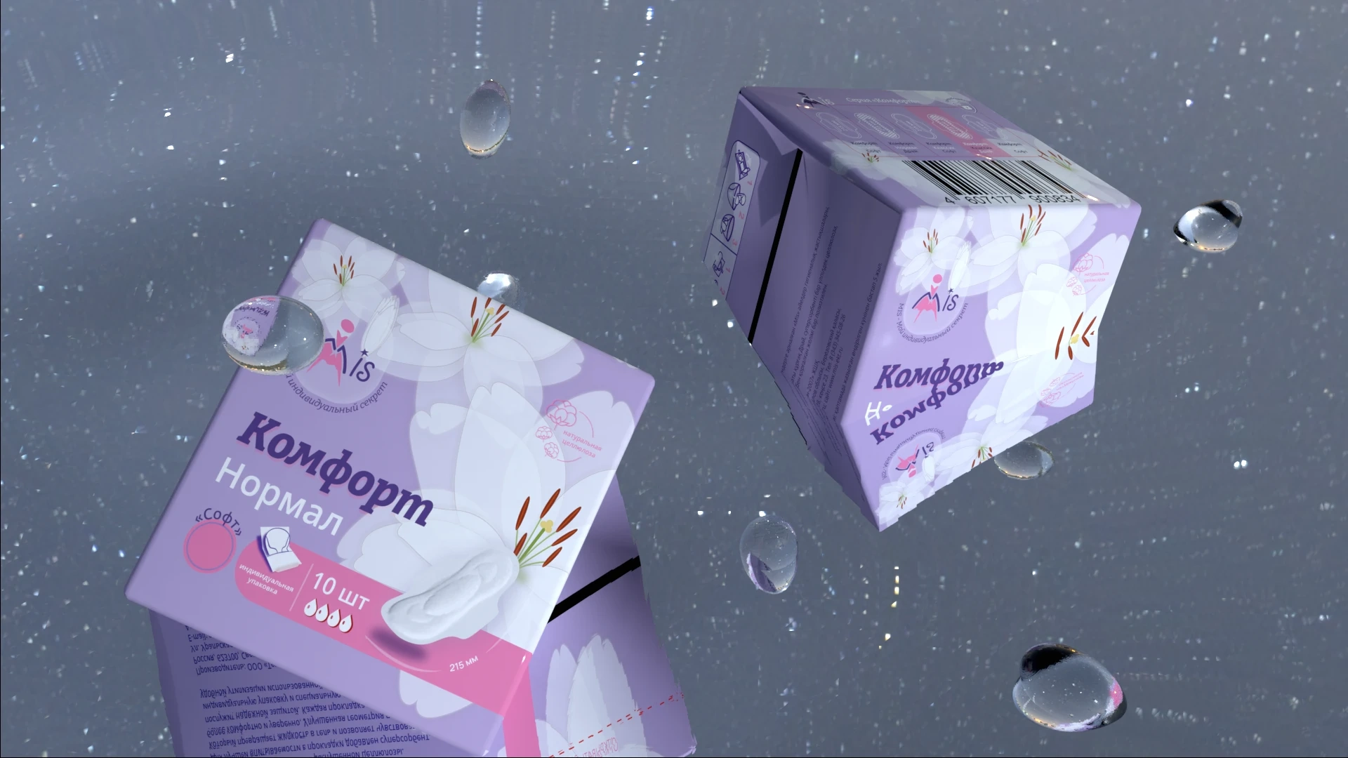
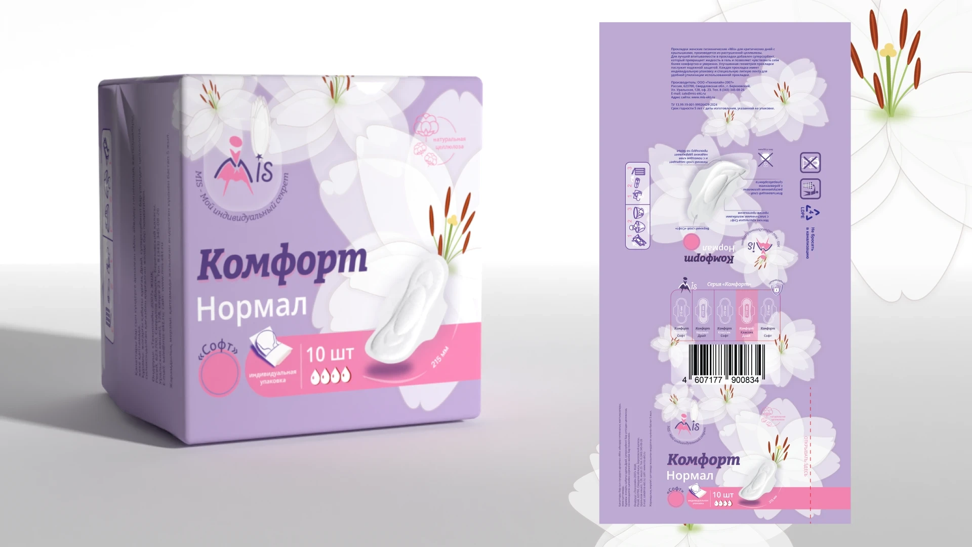
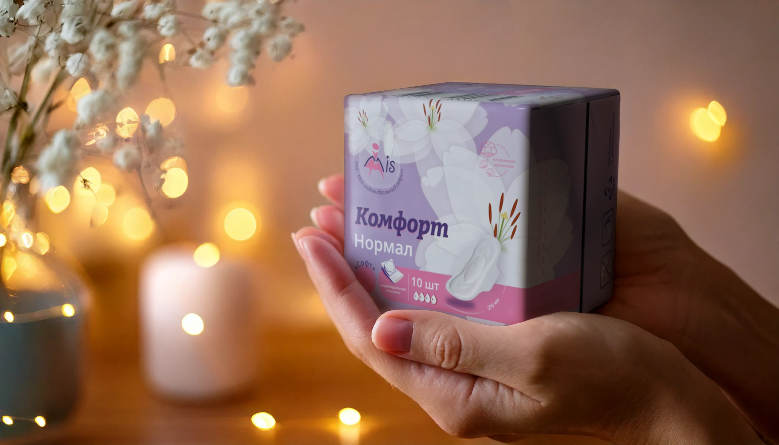
The core idea was to visualize softness and reliability through multi-petaled floral motifs. Each product in the line has a unique identity represented by a specific flower: peony, lily, tulip, dahlia. Color differentiation follows a principle of saturation and contrast for shelf impact.
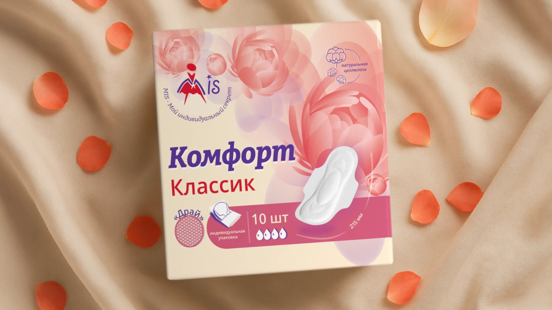
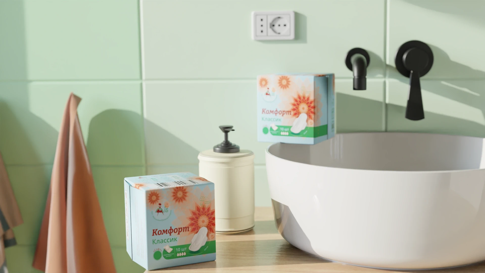
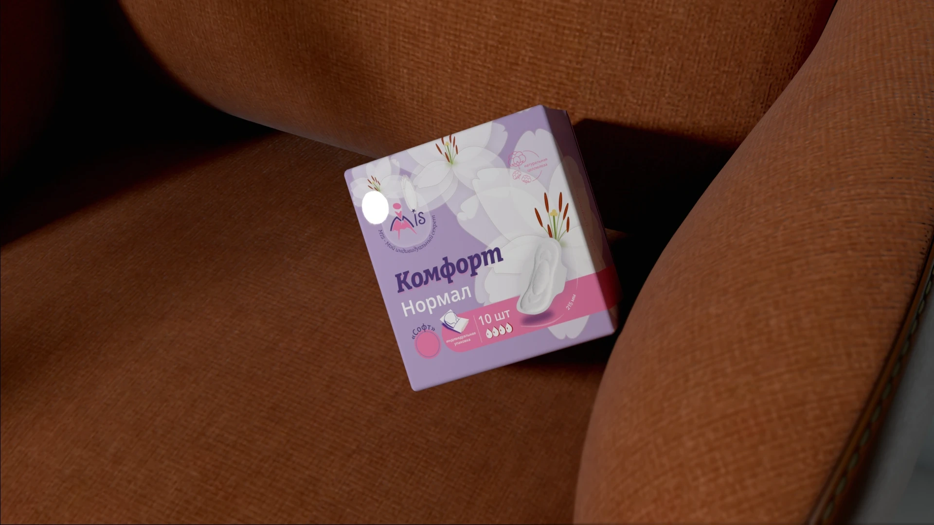
This project is an independent redesign of the “Komfort” feminine hygiene packaging line. The goal was to create a modern, visually diverse collection that reflects softness and self-care while being easily distinguishable on the shelf.
Like this project
Posted Jun 20, 2025
Redesigned Komfort feminine hygiene packaging for modern appeal.
Likes
0
Views
2
Timeline
Jan 20, 2025 - Feb 3, 2025