Vegan Chocolate Packaging :: Behance
Maria Stolts
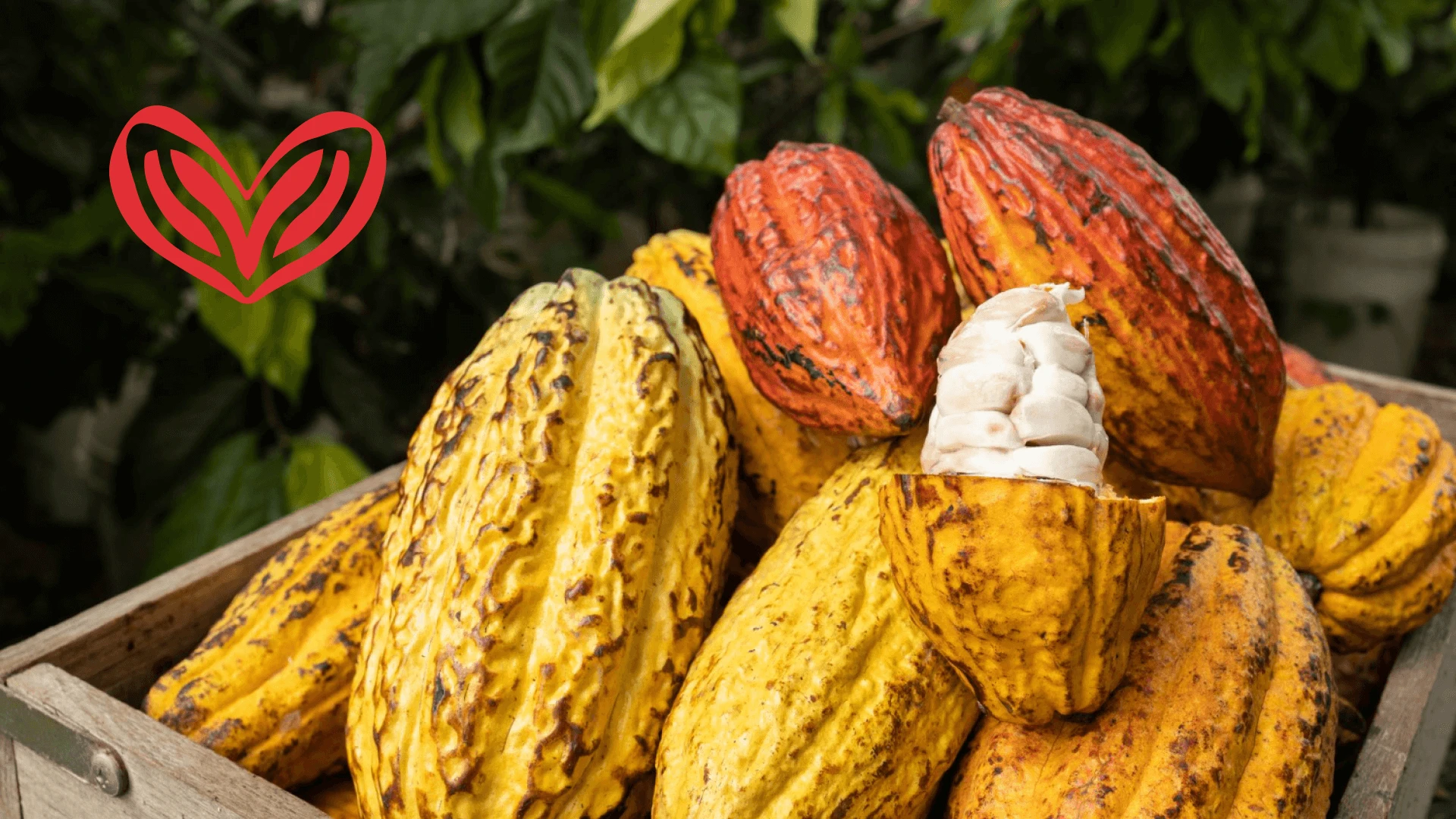
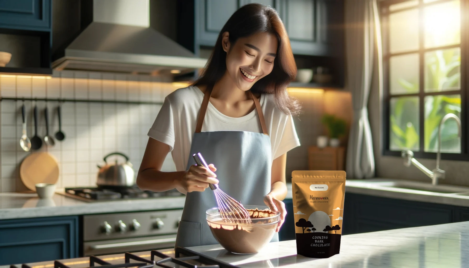
The Harmonix Vegan Chocolate logo harmoniously blends elegance with ethical values, featuring a sophisticated script that lends a luxurious aura to the brand name. At its heart, cocoa beans merge into a distinct emblem, symbolizing both the chocolate's rich essence and the brand's commitment to vegan principles.
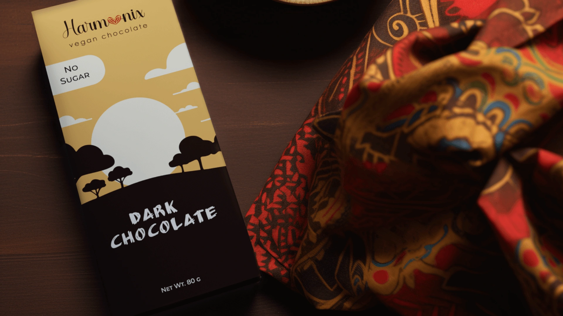
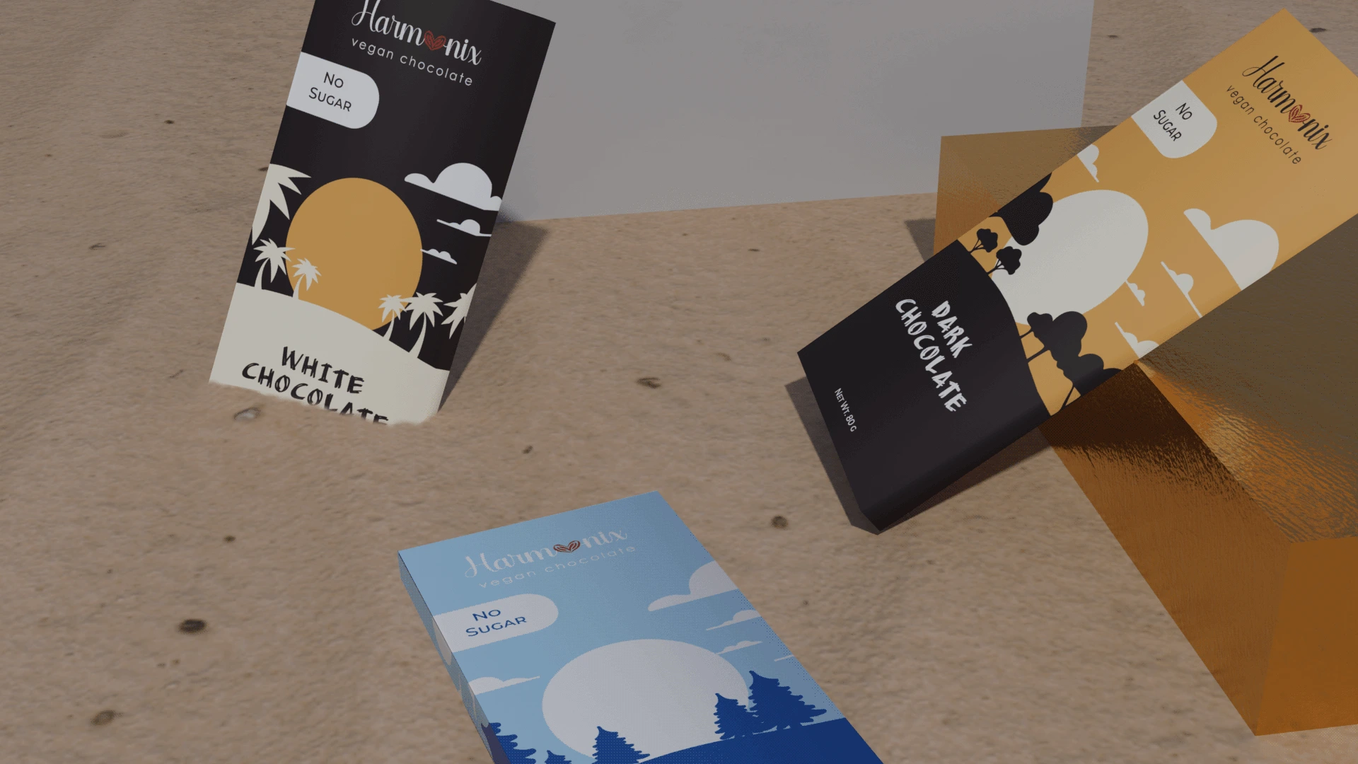
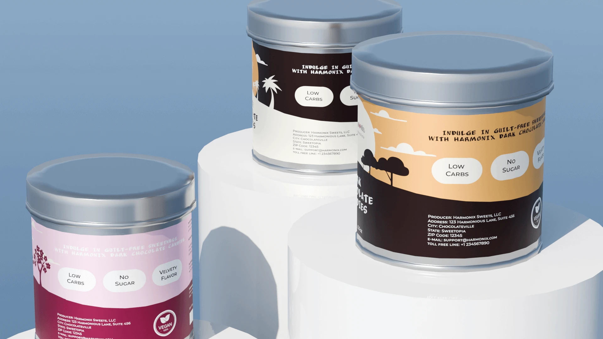
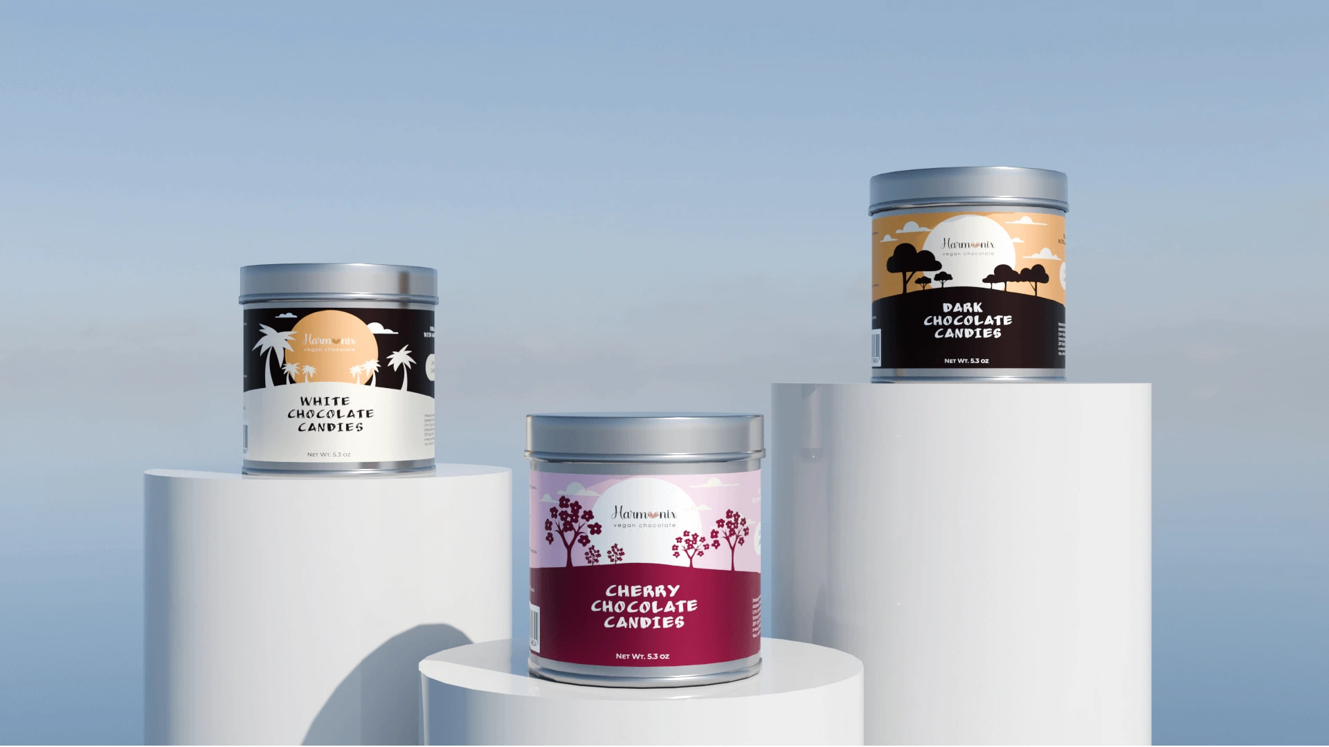
The packaging design for the Harmonix Vegan Dark Chocolate is visually striking and appears to be crafted with the intent of celebrating the beauty of African nature and the traditional color palette of African cultures. The use of a warm and earthy color scheme creates an inviting atmosphere that aligns well with the natural and organic qualities associated with vegan products. The silhouette of the African landscape against a large sun suggests the origin of the cocoa and the traditional patterns imply a connection to the rich cultural heritage.
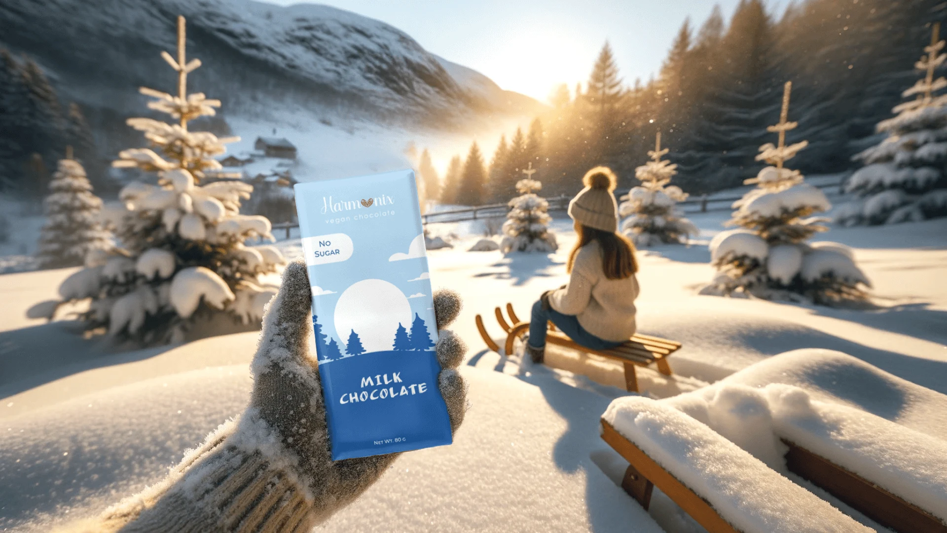
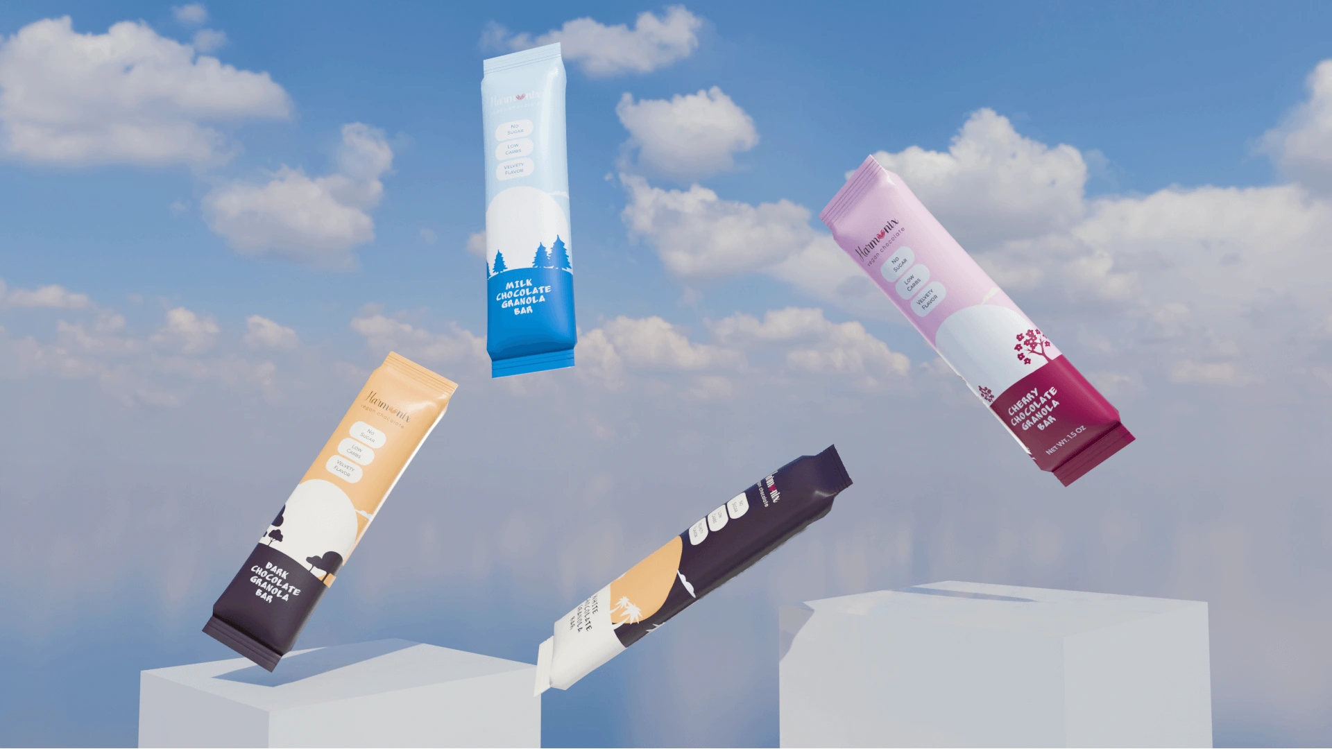
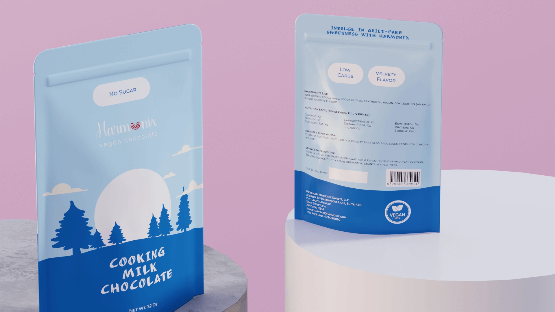
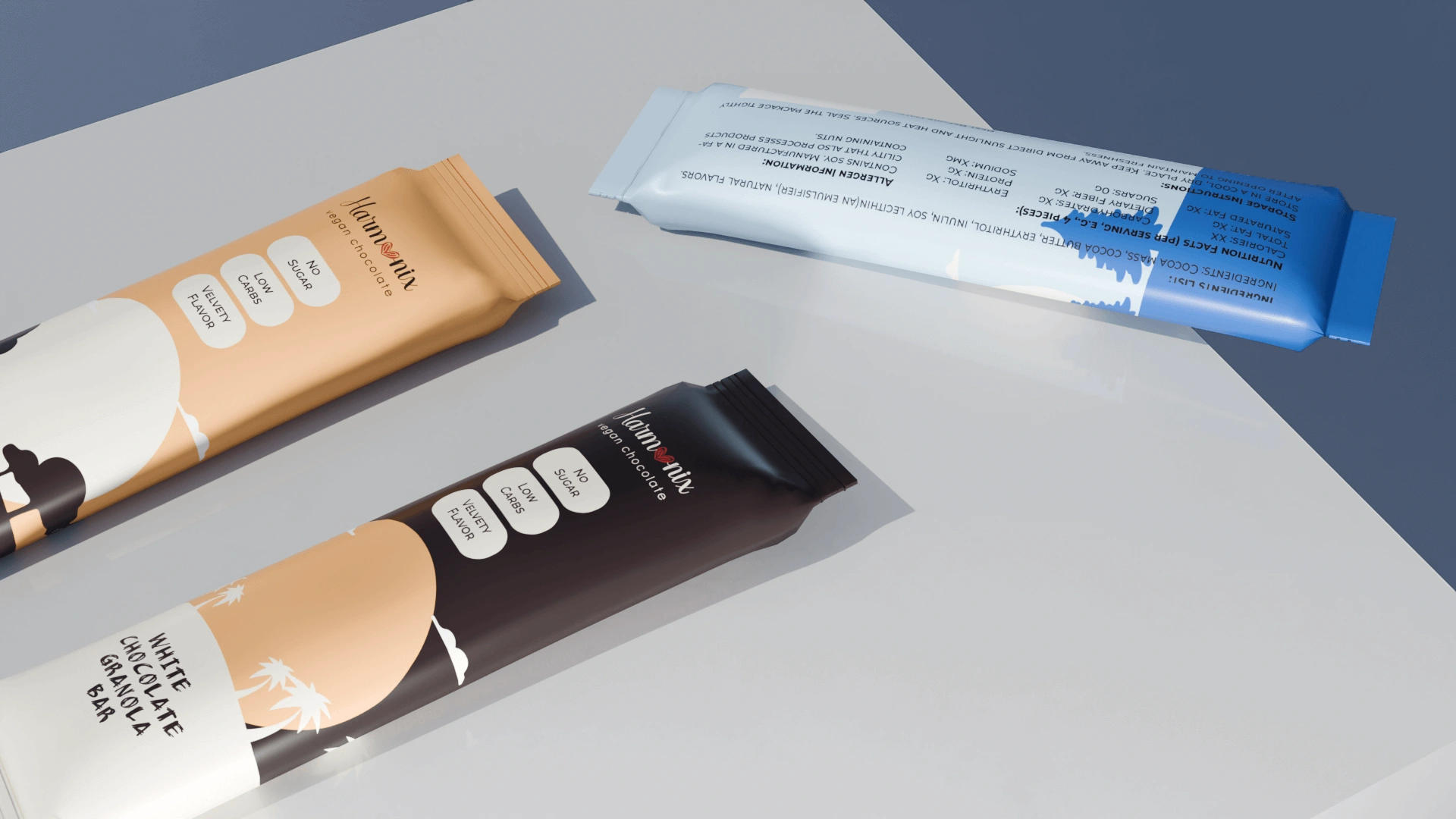
The packaging design for the Harmonix Vegan Milk Chocolate captures the serene and crisp atmosphere of a Norwegian winter landscape. The cool color palette with shades of blue and white evokes the chilly, yet peaceful feeling of winter, complementing the idea of special moments during the colder season. The image of the sun low on the horizon, with snow-covered trees and the clear sky, speaks to the quiet beauty of the Norwegian outdoors, inviting consumers to associate the chocolate with cozy winter experiences.
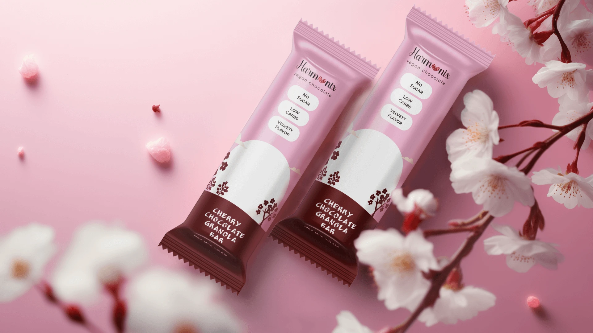
The packaging design for the Harmonix Vegan Cherry Chocolate captures the essence of the sakura blossom season. The soft pink hues and floral motifs reflect the delicate nature of cherry blossoms, symbolizing renewal and the ephemeral beauty of life. This choice of design can evoke a sense of celebration and joy that is often associated with sakura viewings, resonating with the special events and cherished moments that occur during this brief but memorable season.
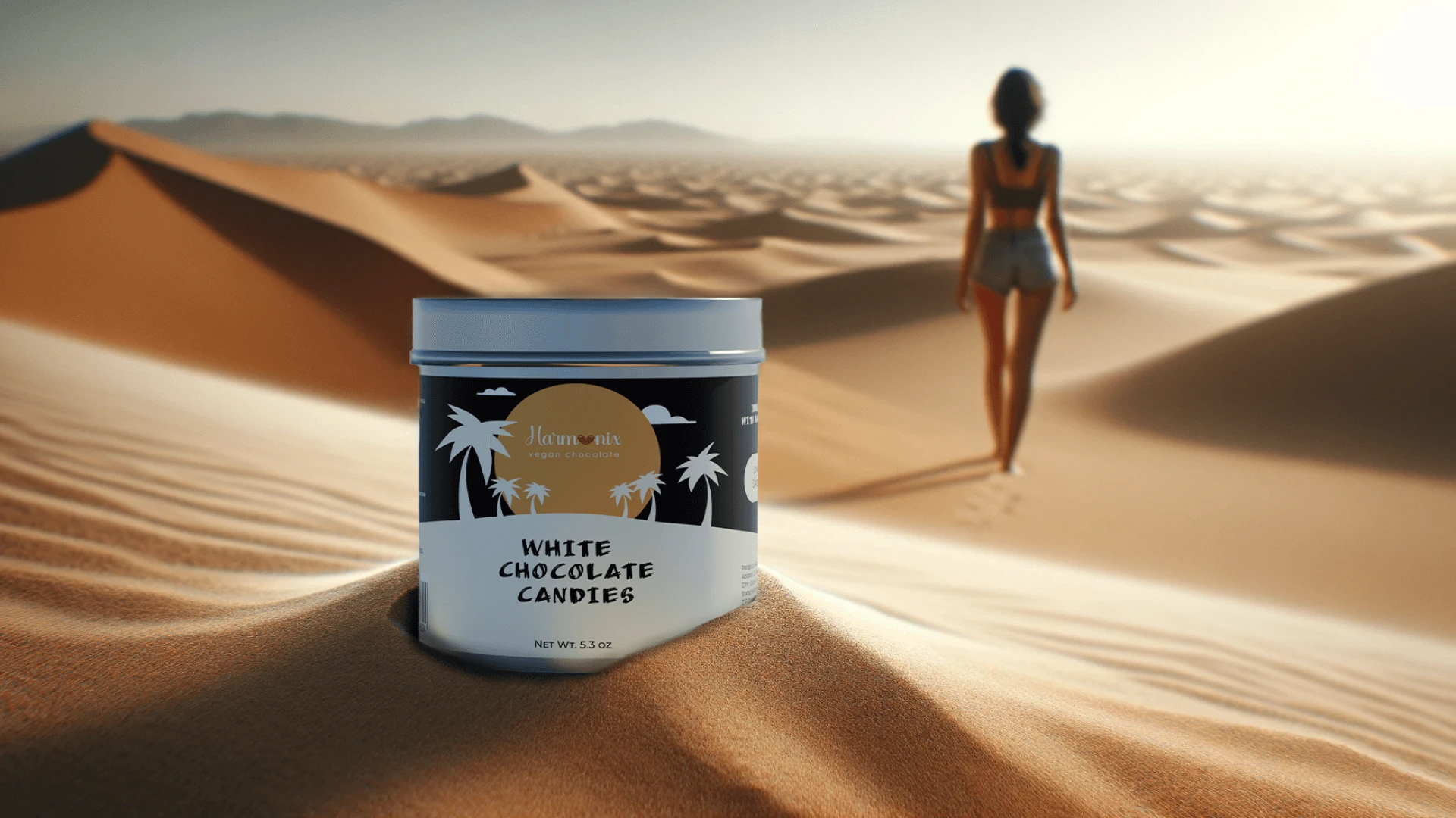
The packaging design for the Harmonix Vegan White Chocolate places the product within the vast and majestic landscape of the desert. The design draws a parallel between the purity of the white chocolate and the endless, untouched sand dunes. The palm tree motifs and the color scheme suggests an oasis, a symbol of life and sustenance in the arid desert, which could be an analogy for the chocolate itself as a source of joy and comfort in everyday life.
Like this project
Posted Apr 21, 2024
Graphic Design,Adobe Illustrator,Adobe Photoshop,Adobe Lightroom,Blender 3D,Midjourney