Pottery Logo :: Behance
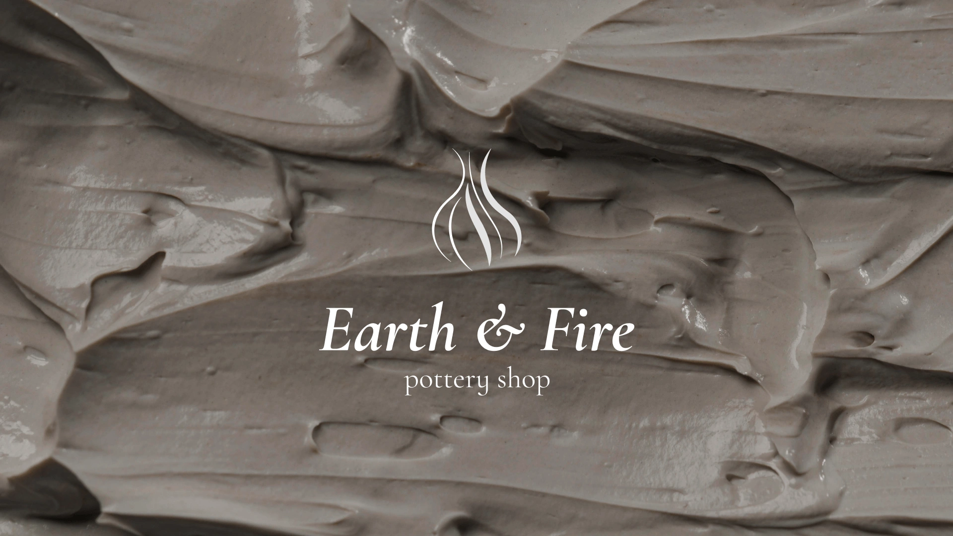
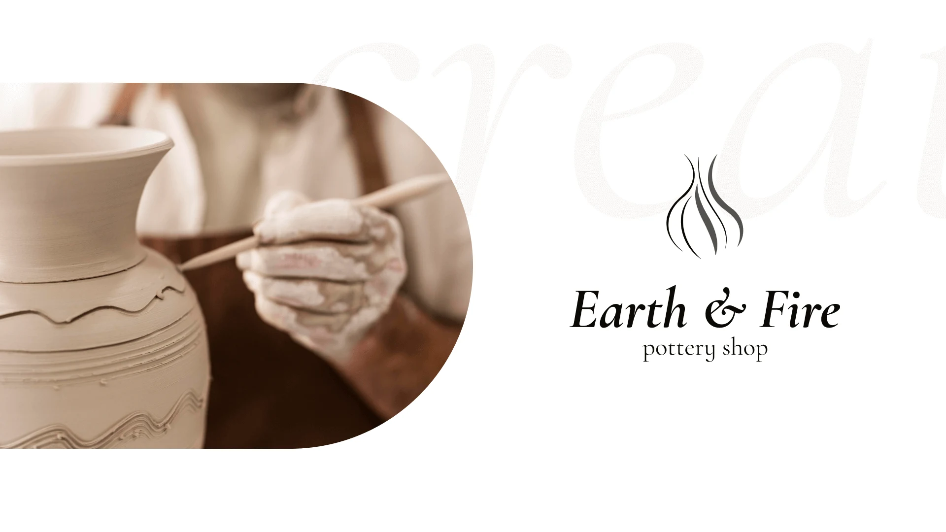
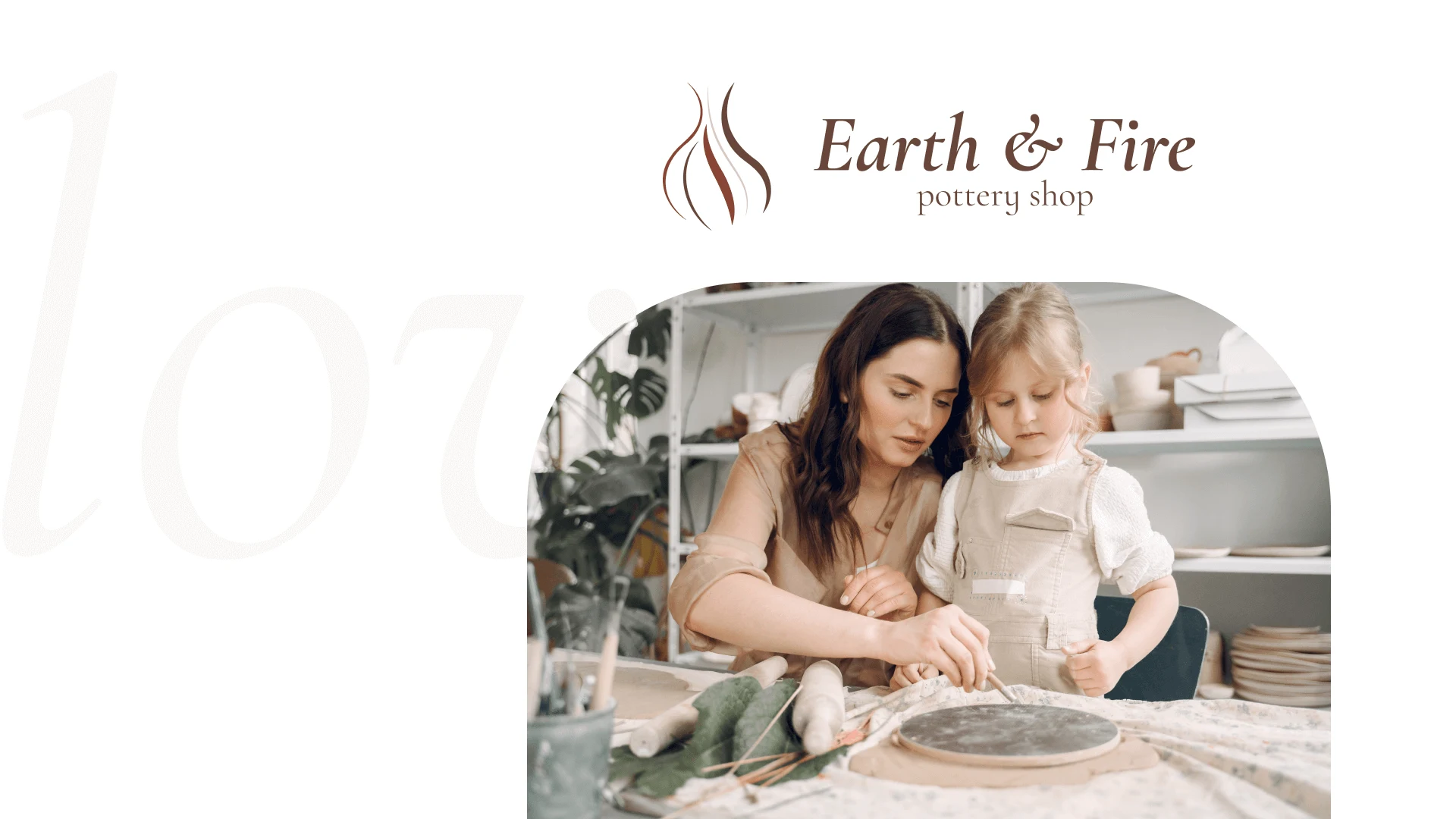
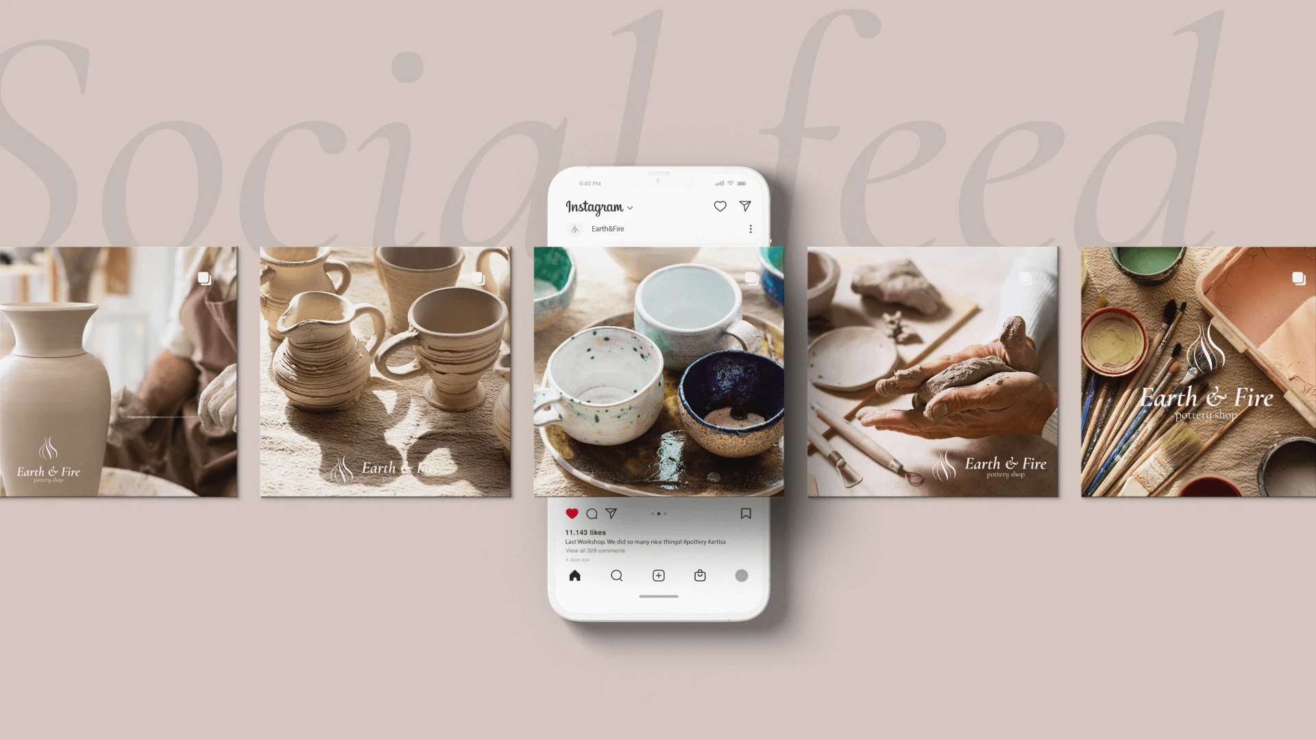
Earth & Fire Pottery is a pottery studio specializing in creating unique clayware. We offer handmade craftsmanship and individualized attention to each piece, conveying our love and passion for the art of pottery.
Target Audience: Our products are for individuals who value the uniqueness and beauty of handcrafted pieces and appreciate the art of pottery. This includes collectors, art enthusiasts, as well as those who appreciate distinctive pottery for their interior decor.
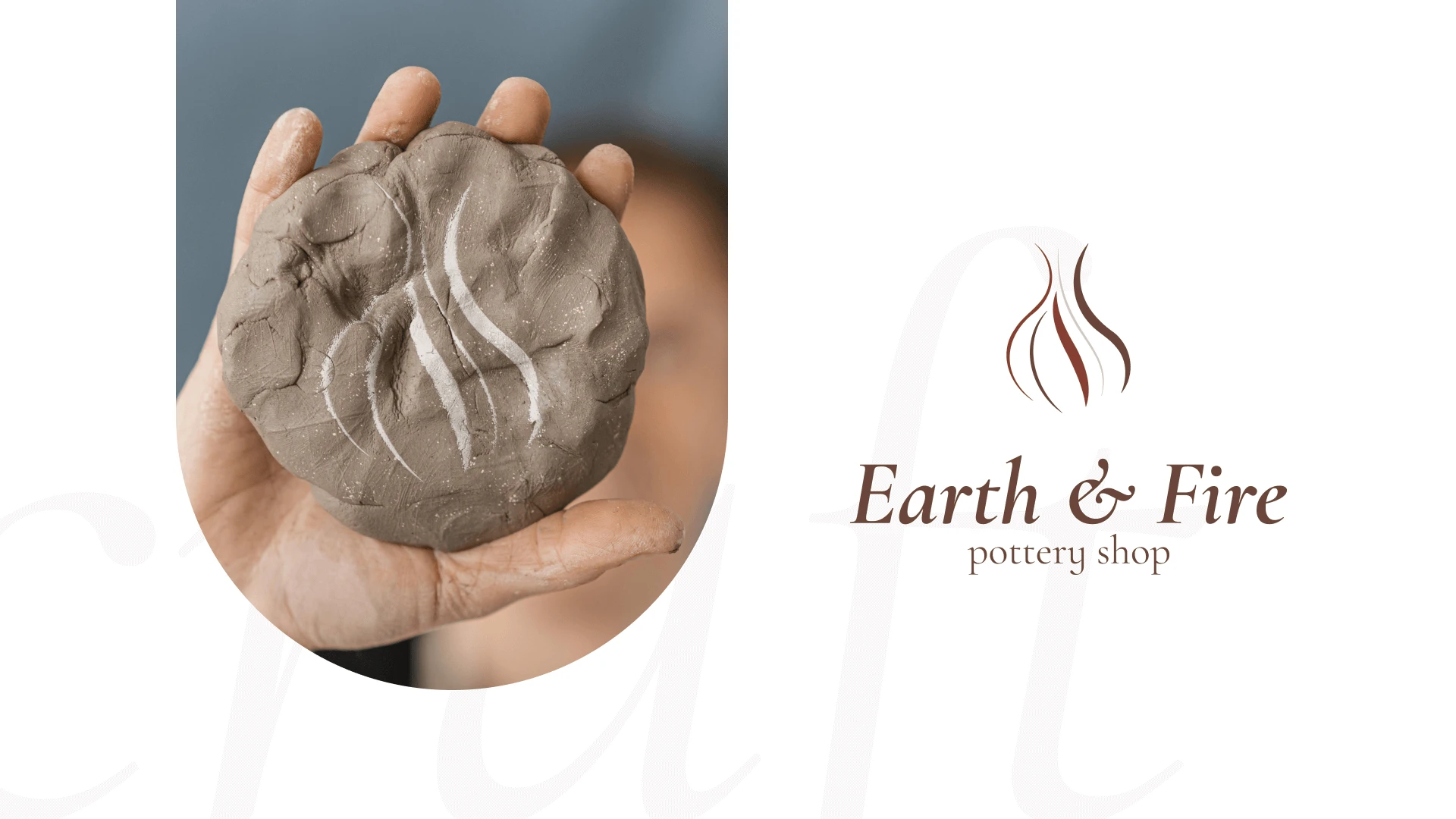
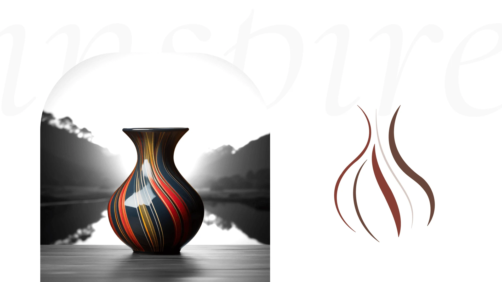
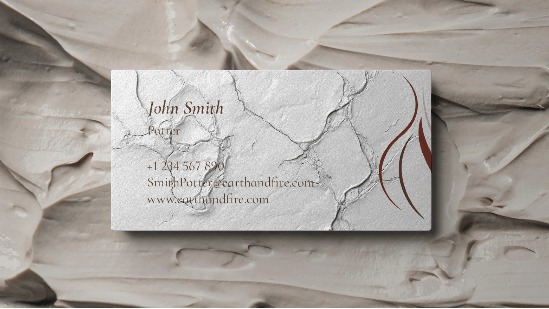
The logo features several lines that soar upwards, forming the shape of a vase and flames at the same time. The upper part of the logo is stylized to resemble the curving lines of a vase, symbolizing pottery craftsmanship and harmony with nature. The lower part of the logo embodies flames, reflecting the creative passion and energy inherent in each Earth & Fire Pottery creation.
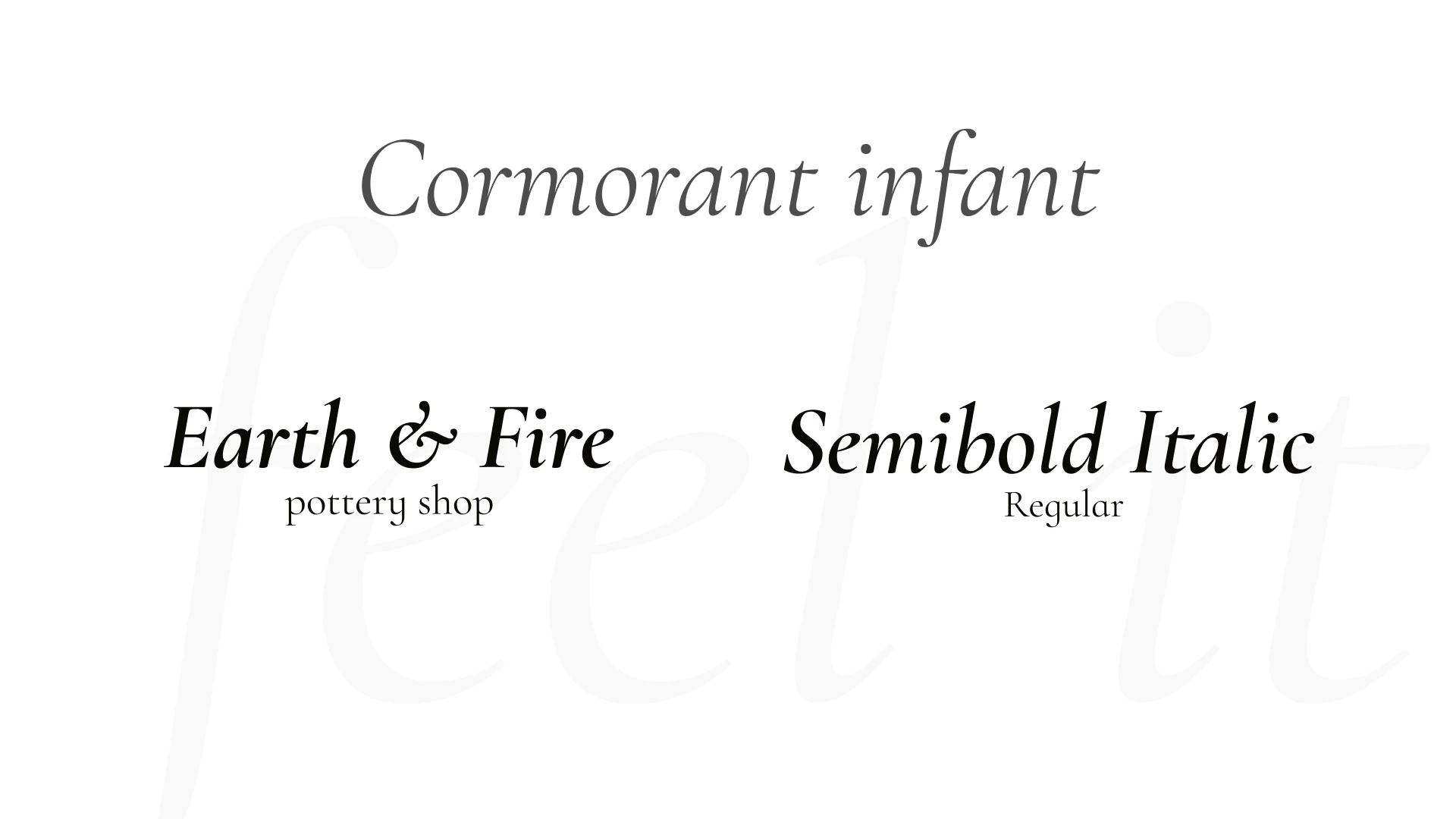
Cormorant Infant is a font with graceful and smooth lines that complement the concept of the Earth & Fire Pottery logo perfectly. Its beautiful curves and delicate forms reflect the tenderness and handcrafted nature, aligning well with the artistic character of pottery. Additionally, Cormorant Infant has an elegant and classic appearance, visually emphasizing the artistry and excellence of the studio. It's an excellent choice for the logo as it enhances the aesthetics, creative approach, and quality of Earth & Fire Pottery.
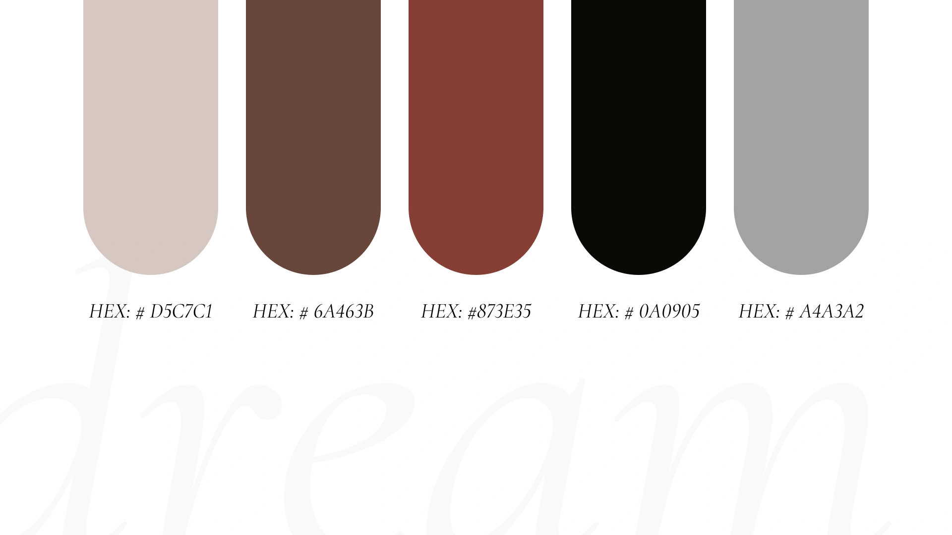
The color palette of the Earth & Fire Pottery logo is inspired by ancient elements and dominated by terracotta tones. The palette consists of earthy and warm colors, such as terracotta, beige, and clay brown.
The color scheme embodies the aesthetics of antiquity and pays tribute to traditional craftsmanship, allowing the Earth & Fire Pottery logo to stand out, attract attention, and convey the characteristic features of the company.
Like this project
Posted Apr 21, 2024
Graphic Design,Adobe Illustrator,Adobe Photoshop,Adobe After Effects,Figma

