FlexJobs Website Redesign
Samiat Adebisi
Overview
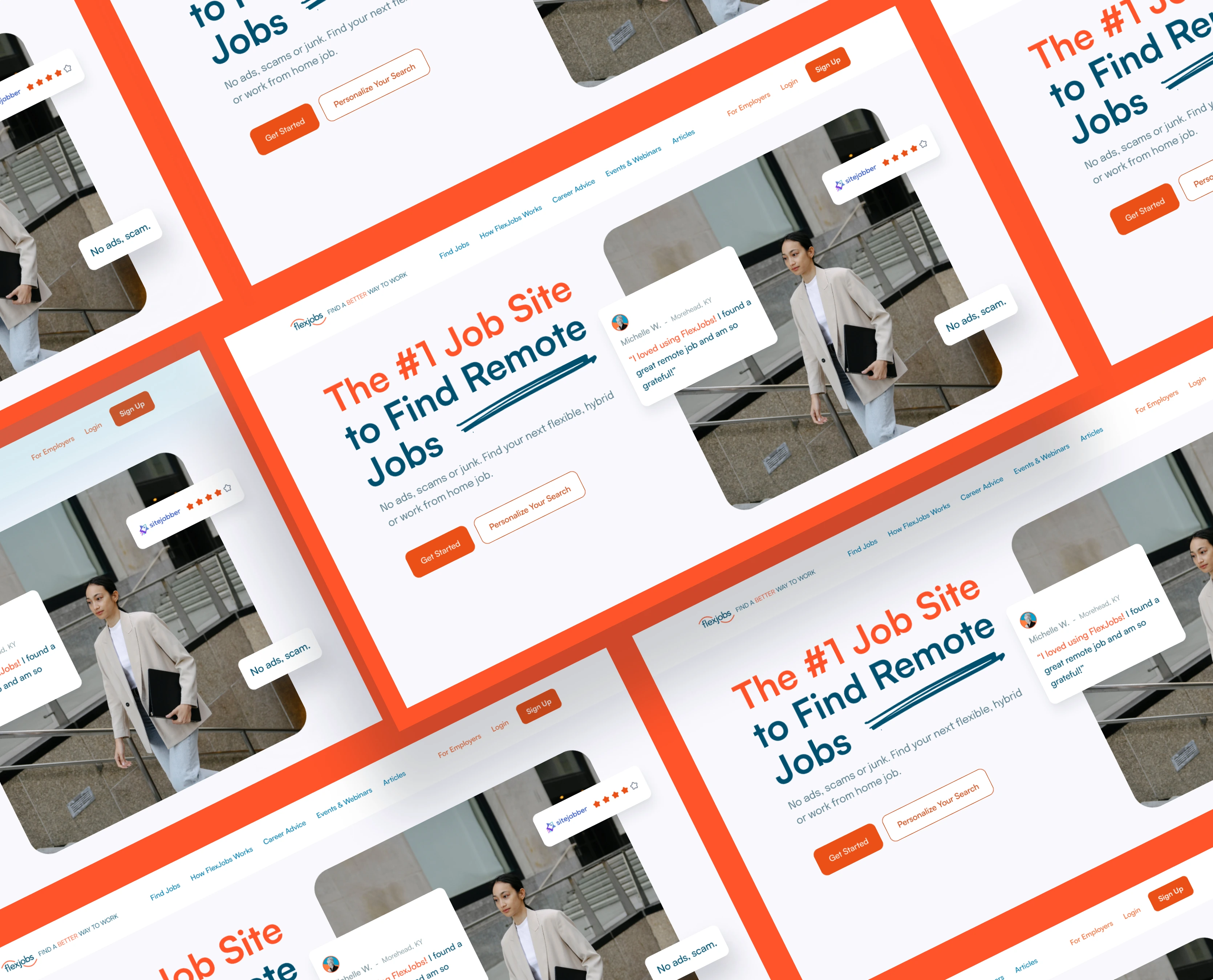
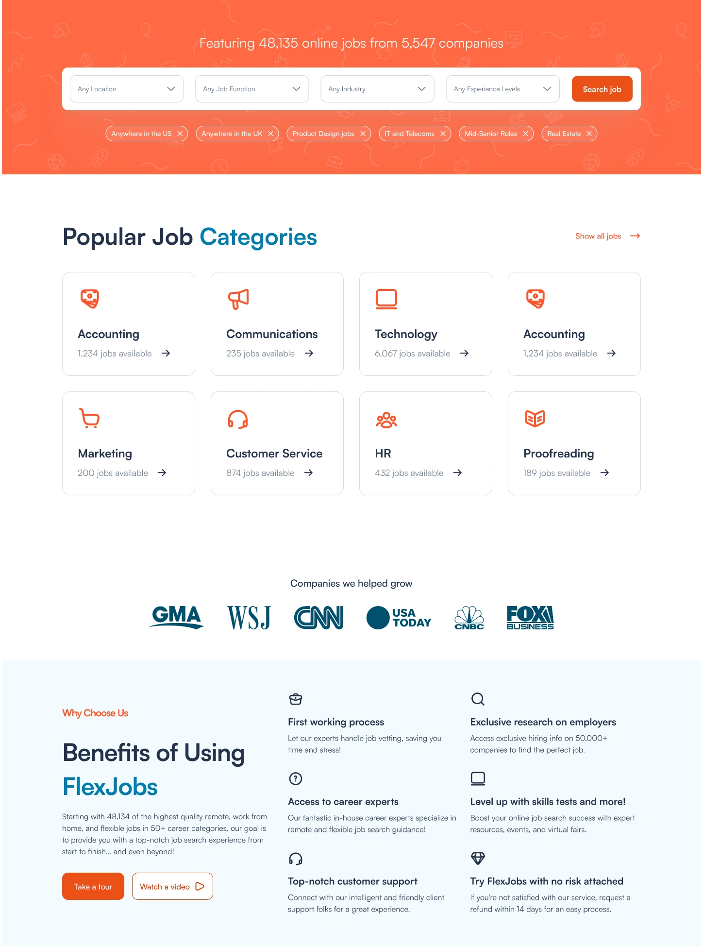
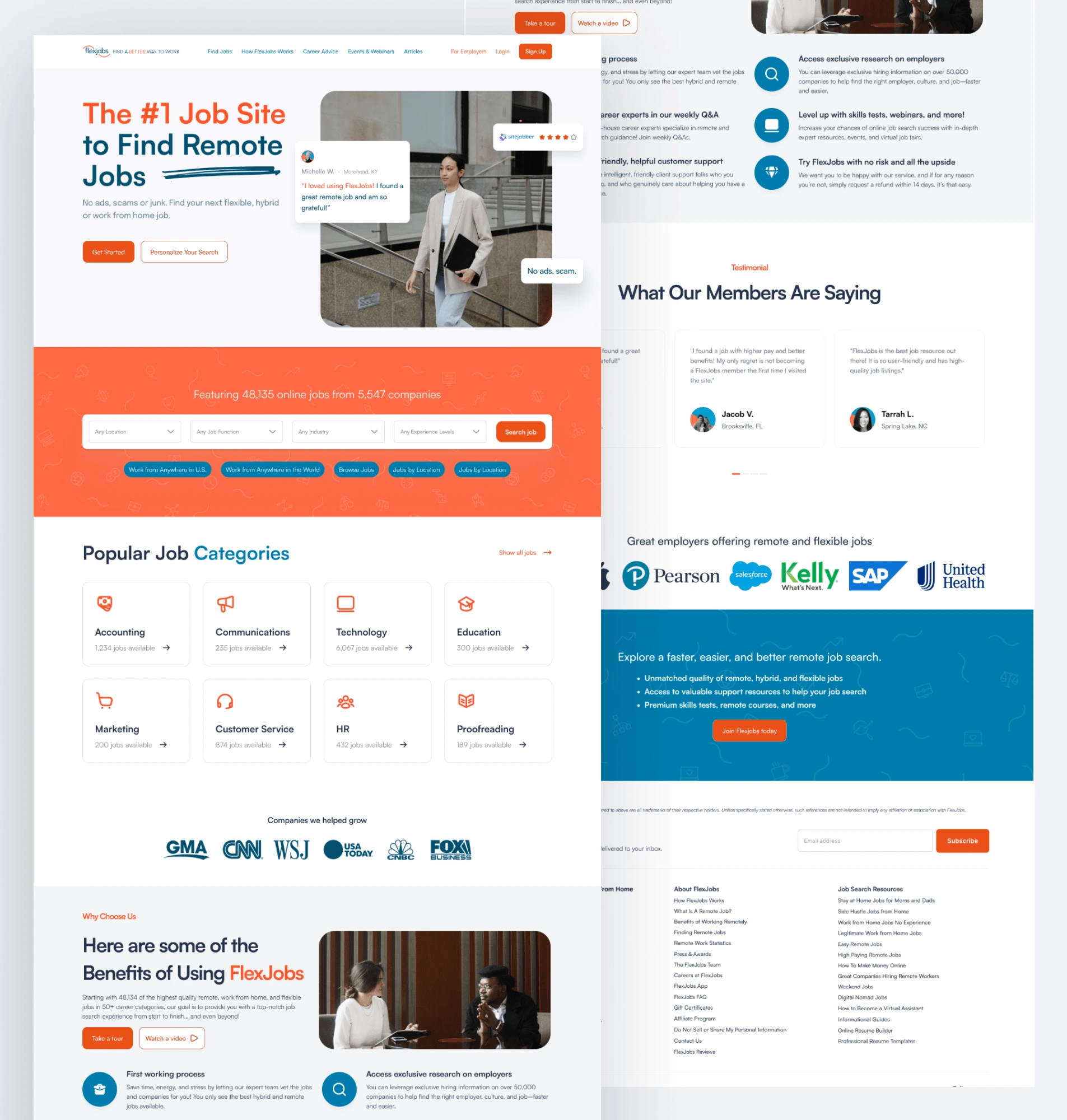
I redesigned the FlexJobs website with a modern, user-centered approach aimed at improving usability, visual hierarchy, and trust. The goal was to create a cleaner, more intuitive interface that supports job seekers, especially remote workers, by making job discovery, navigation, and membership conversion more seamless.
The Goal
To revamp the existing FlexJobs UI into a visually appealing and user-friendly design that:
Enhances user experience for job seekers
Encourages membership signups
Reduces bounce rate on key pages
Builds credibility through thoughtful layout and visual language
The Problem
The original FlexJobs interface appeared outdated and cluttered, with weak visual hierarchy and unclear calls-to-action. Users often struggled to navigate job listings or understand the value of FlexJobs’ paid features. This led to low user engagement and conversion friction.
Solution
I redesigned the platform with a focus on clarity, accessibility, and modern visual design. Key improvements included:
Clean and Scannable Layouts: Simplified the homepage and job board structure to reduce overwhelm and improve readability.
Stronger CTAs: Highlighted signup buttons and premium benefits clearly to boost conversion.
Improved Visual Hierarchy: Used consistent typography, whitespace, and iconography to guide users' attention naturally.
Trust & Credibility Elements: Added testimonials, feature highlights, and value propositions prominently to reduce hesitation.
Refined Mobile Experience: Designed for responsiveness and smoother navigation on smaller screens.

Like this project
Posted May 6, 2025
Redesigned the FlexJobs website to enhance usability, streamline navigation, and improve conversion rates.
Likes
5
Views
8
Timeline
Feb 2, 2024 - Feb 8, 2024
Clients
FlexJobs