Leading the Design of a QR Ordering App
01. Overview
Picture this, you're out with your family for dinner. At the restaurant, you try to call the waiter, but you just can't seem to get his attention. Wouldn't that be frustrating? Also, when the waiter arrives, and they are simply a pain to communicate with, how would you feel. Personally, I would go through the frustration, because the food is great. But I might think twice before going there a second time. This also could be the case for many people out there. Experience at a restaurant is the second most important factor in customer retention. (Bonus points if you guessed food is the prime factor😉).
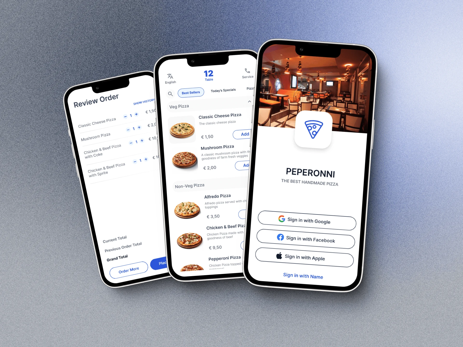
The QR Ordering application is designed to allow the restaurants guests to quickly place an order simply by scanning a QR code kept on the table. The application runs directly on the mobiles default browser (no installation required! YAY!!). The guests can place an order, make changes and update their order, view order summary, and even make payments without any intervention of waiters.
02. The Problem
The company I worked for focused on delivering Point of Sales Systems to Restaurants in Germany, Austria and Spain. Some of the customers we cater to, have a tough time managing the guests orders during peak hours. Some guests find it difficult to catch the attention of the waiters, who might be busy with other tasks. Adding to this, the loud environment of a restaurant during peak hours can complicate matters, especially with impatient guests.
03. The Design Process
Leveraging my skill as someone who is good with research, I first tried to understand the system environment. Understanding the following was key in formulating certain rules to be followed during the design process
Who are the user of the application?
What & How is the environment where the application will be used?
When using the application, what are the expectations of the user?
What does the user want to achieve by using the application?
The next key step, was to analyze existing applications that cater the niche and understand its highs and lows. Three key insights I discovered is as follows
Users want the ability to review/update their order after placing them.
Users wanted the ability to make a payment without the need to wait long enough to interact with a waiter.
Users preferred to use the application in their local/native language, enabling them to use the application better.
I took these insights and coupled them with a few more takeaways and presented my findings before the stakeholders and my colleagues. This ensured that, we, as a company, were all on the same page on - 'What' we were designing, 'Who' we were designing for, and 'Why' we were designing this application.
During Ideation, I leveraged my skills in using Draw.io to quickly draw up flow charts that resonated my ideas with user needs. I converted these ideas into wireframes using Balsamiq. During each step of the way, each and every idea, decisions and wireframes were documented in Confluence. This ensured that everything was documented, and any team member could read, provide feedback or challenge anything.
Due to time constraints, I took the decision to use Tailwind CSS, and use it as a base (design system) for the app. However, the components were customized to match our brand guidelines. Whenever, I wanted opinions between two different design solutions, I ran A/B testing using Maze. The final designs were handed off to the developers using Zeplin.
I followed an agile methodology coupled with user story mapping to bring this project to life. Considering the scale of the features we wanted to build in the application, I broke down each feature set into its own User Story Map and used it for design. Due to the agile approach, the project was broken into different phases, and emphasis was placed on building the application one feature at a time. This promoted a culture of continuous collaboration with the Devs, QA and PMs.
04. Solution & Results
When I started the design process, I focused my efforts on solving the three key insights.
1. Users wanted the ability to review/update their order.
When I first heard about this request, I could not fathom the importance it would have in our application. While story mapping, I stumbled upon the use case:
What if the user wants to add additional items to his order?
What if the user wants more quantities of the items they have already ordered?
Would the user have to start from scratch to place an order from scratch?
Would it be intuitive for the user to try to remember the order quantities already placed?
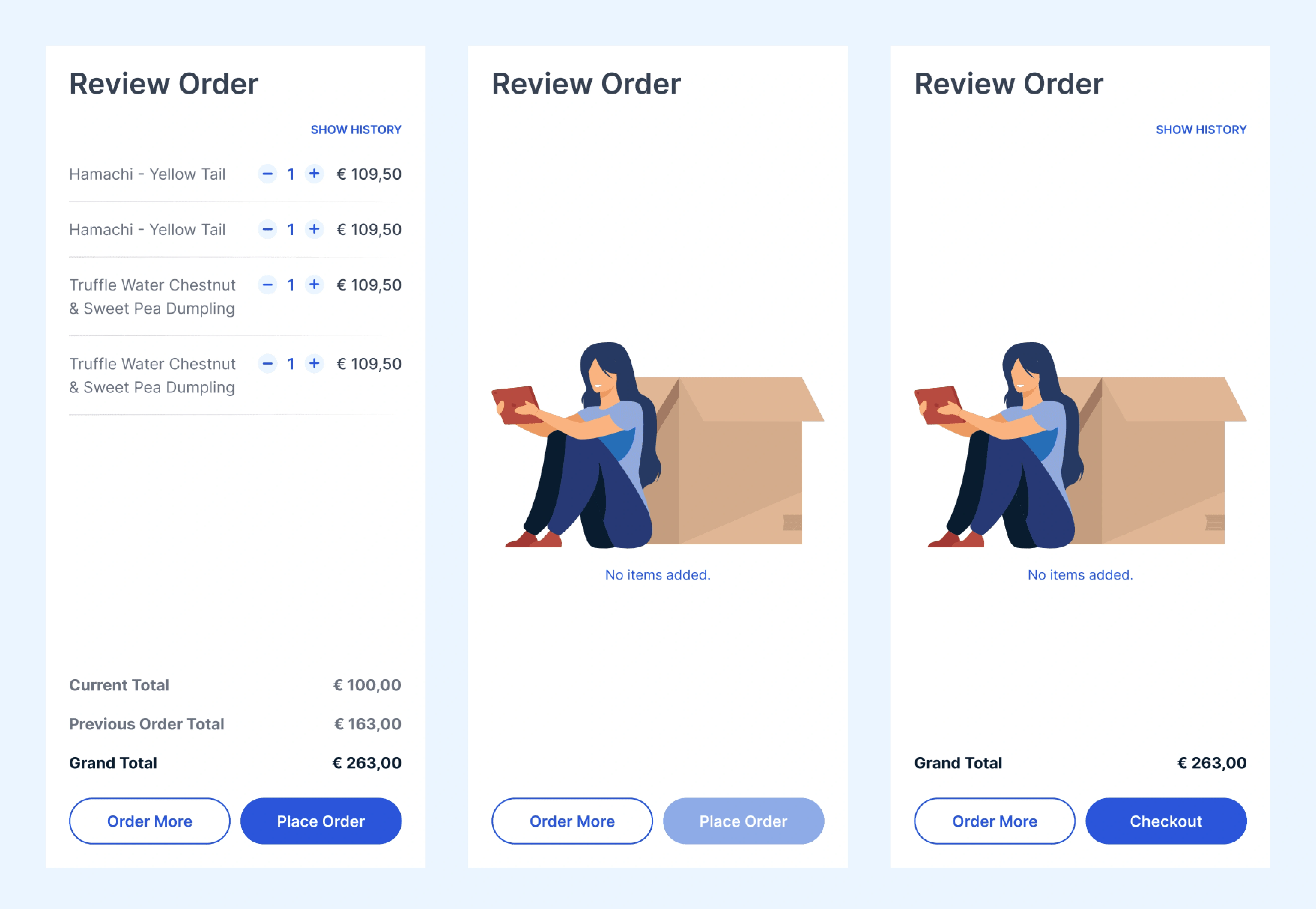
When I tested this feature with the users, some users simply loved the fact that they could directly send an order update to the kitchen. No hassle in waiting for the waiter, explaining their needs, making sure the order quantities are correct.
2. Users wanted the ability to make a payment without the need to wait long enough to interact with a waiter.
This was the a major pain point I discovered when I spoke with users. When I looked at our competitor products that cater to the same market, I discovered that, most of these applications do not enable the user to complete a payment. The user had to wait for the waiter to provide a bill and make the payment.
In the application I designed, we ideated on a workflow that would enable the user to make the payment without leaving the application. However, due to time constraints, we pivoted to a different solution. The application (for now) only alerts the waiter and front-of-house that guests are ready to make the payment. The guests could choose to inform the waiter / front-of-house about their payment method too.
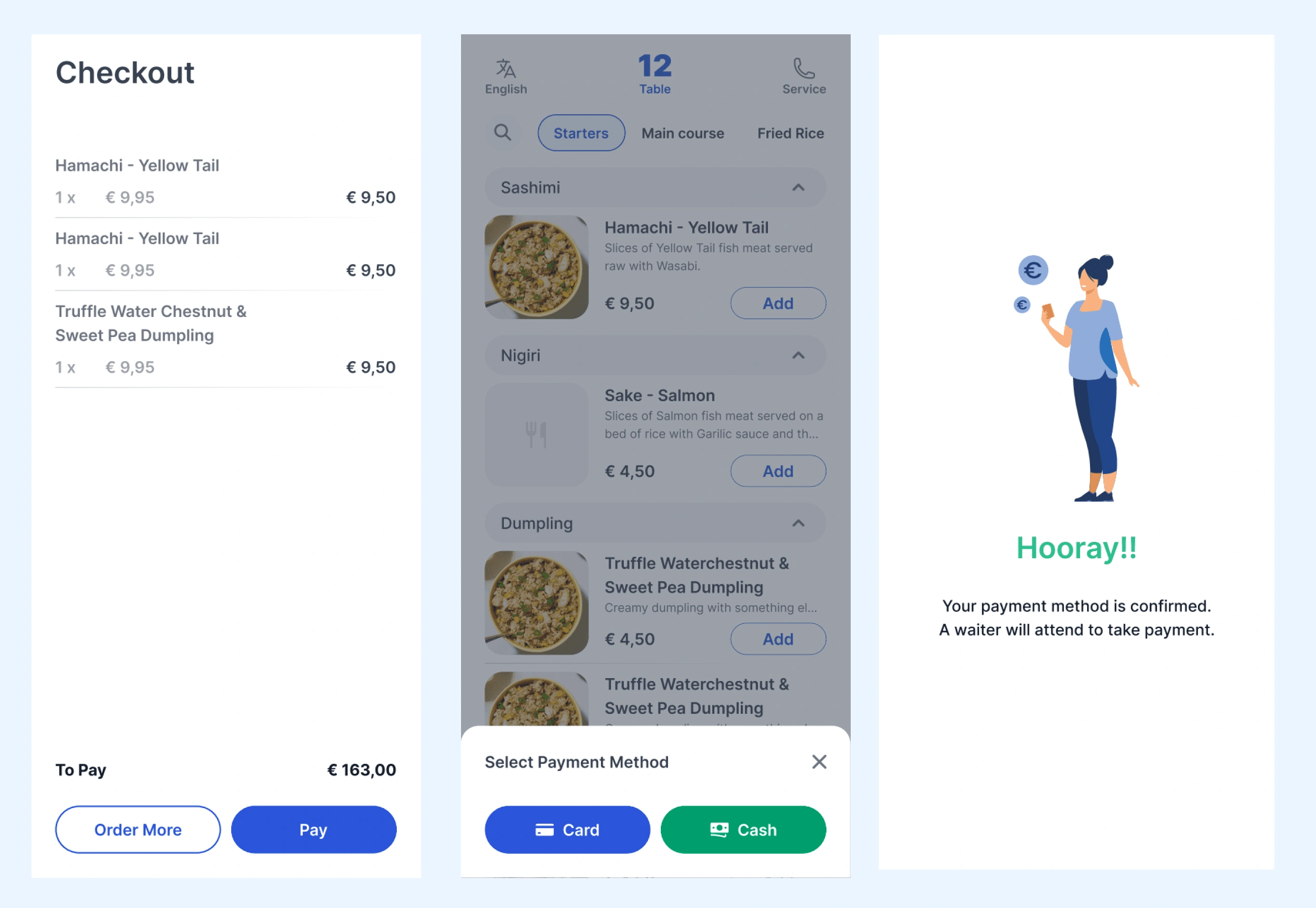
After we talked about this feature and showed it to some beta testers, we discovered that this was a feature loved by every single tester. They wanted to see us implement the full payment feature and even gave assurance that they would proceed with buying the product, if we could integrate the same.
P.S. The full payment feature was designed and implemented in the post MVP release version of this app. Case study coming soon.
3. Users preferred to use the application in their local/native language, enabling them to use the application better.
When talking with some users, I understood, some of the guests feel more lively when they see apps in their native / local language. I asked a few users, if they would be delighted to use an app, which was in their local language.
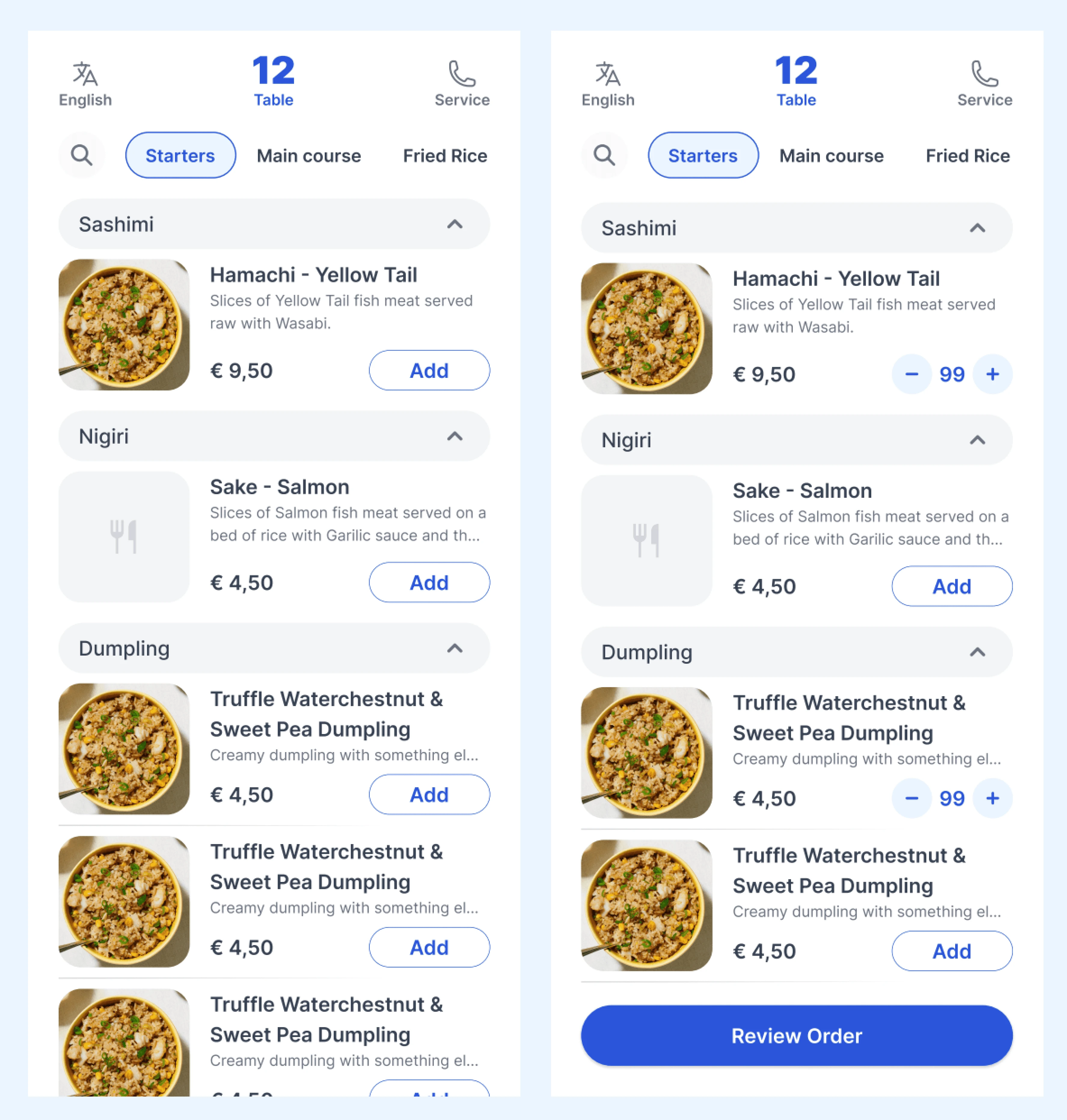
The idea of changing the language of the app is not new. However, such accessibility options are hidden away in settings. The entire purpose of an accessibility option is lost - a. the user does not know such options exist, b. the user is not able to easily find these options.
In the design I created, the option to switch language is shown on the header of the first page they see after logging in. This way, the user knows they can switch the language of the application easily.
05. Reflections
This was the first project where I handled the entire end-to-end design process - right from Research to Final Dev Handoff. I am extremely proud of this project, because it enabled me to use all my skills in terms of discovery, understanding the user, planning an approach to solving user needs, etc. The use of User Story Mapping coupled with Agile methodologies, taught me how to design a product keeping the business goals in mind.
Beta testers of the product, loved the application for two simple reasons
Minimalism
Simple User Flows
I must credit my PM, Devs and QA for learning with me and teaching me at the same time.
Like this project
0
Posted Jul 27, 2024
The QR Ordering application is designed to allow the restaurants guests to quickly place an order simply by scanning a QR code kept on the table.


