Foundational Design of a Talent Assessment Platform

01. Overview
Imagine this scenario; You're an HR working at some company XYZ and looking to hire a developer. After posting a job ad on a platform of your choice, you are overwhelmed with hundreds of responses. Shifting through each candidates would become a time consuming and cumbersome task. Further complicating the recruitment processes is the need to send, receive and assess, assessment of potential candidates.
Testlify is an application that is designed to solve these problems. The application allows recruiters to set up pre-determined or customized assessments, to assess potential candidates. Based on the assessments, the application ranks the candidates and automates 90% of the tasks involved in the recruitment process.
02. The Problem
When setting up an assessment, the recruiters I interviewed, put forward the following issues
Need to rely on technical teams to set up / create assessments
Miscommunication with candidates on assessments, submission medium, timelines etc.
Scoring assessments and ranking candidates based on their assessment submissions.
Filtering out scores of applications who don't even meet basic criteria
Insecurity about 'Who solved the assessment?' / 'Did the candidate get someone else to solve the assessment?"
Matching jobs with deserving candidates
I put forth these issues which I uncovered before the stakeholders and some senior management. Discussing each issues in detail, helped us to understand the wants and needs of recruiters. A separate team analyzed some competitor apps features and functionality, and realized the issues I raised were not fully addressed.
03. The Design Process
Unconventionally, my team and I spoke about this problem with one of our clients. This was a stroke of genius move, as they proposed to fund the project and pool us with the needed resources (they were a recruitment firm). Being the junior UI UX designer at the company, I was to assist a senior designer in setting up the Design System and create the foundational designs that would form the MVP of the application.
This is where my love for design systems originate. It was my first experience creating it; and at scale. I first got to setup the atomic elements of the design system. Basic molecular elements were also created. We knew that some molecules and organisms needed in the design system could only be created after finalization of certain components. This alleviated concerns of the design system being too rigid and enabled the flexibility and potential to scale.
Once the design system was set, I looked at the wireframes that were prepared concurrently. I worked closely with my senior designer to convert the wireframes to hi-fidelity designs. Though I did make visible errors in contrast and hierarchy, I quickly learnt from my mistakes and delivered a beautiful product.
Once the final designs for MVP was ready, I orchestrated a handoff meeting with the devs. I learnt how to properly conduct a handoff meeting ensuring that the devs understand the design system, its interactions, states etc. Meanwhile, I lead usability testing of the product along with the funding client. One of the flows that was created was revised and updated.
04. Solution & Results
When I started the design process, my main goal was to make the application user-centric. I used the Design Thinking Methodology from the start (under guidance of my Sr. Designer) to make sure that the application stayed true to its functional requirements (of being an enterprise product) while being user centric. To achieve this, I compared some business goals set by stakeholders and the client along with the needs and wants of actual recruiters. This ensured the design delivered was user-centric while meeting business goals.
Speaking about the application designed, we implemented a way for the recruiters to set up an assessment in less than 7 clicks. The secret sauce - pre defined assessments that the application ships with.
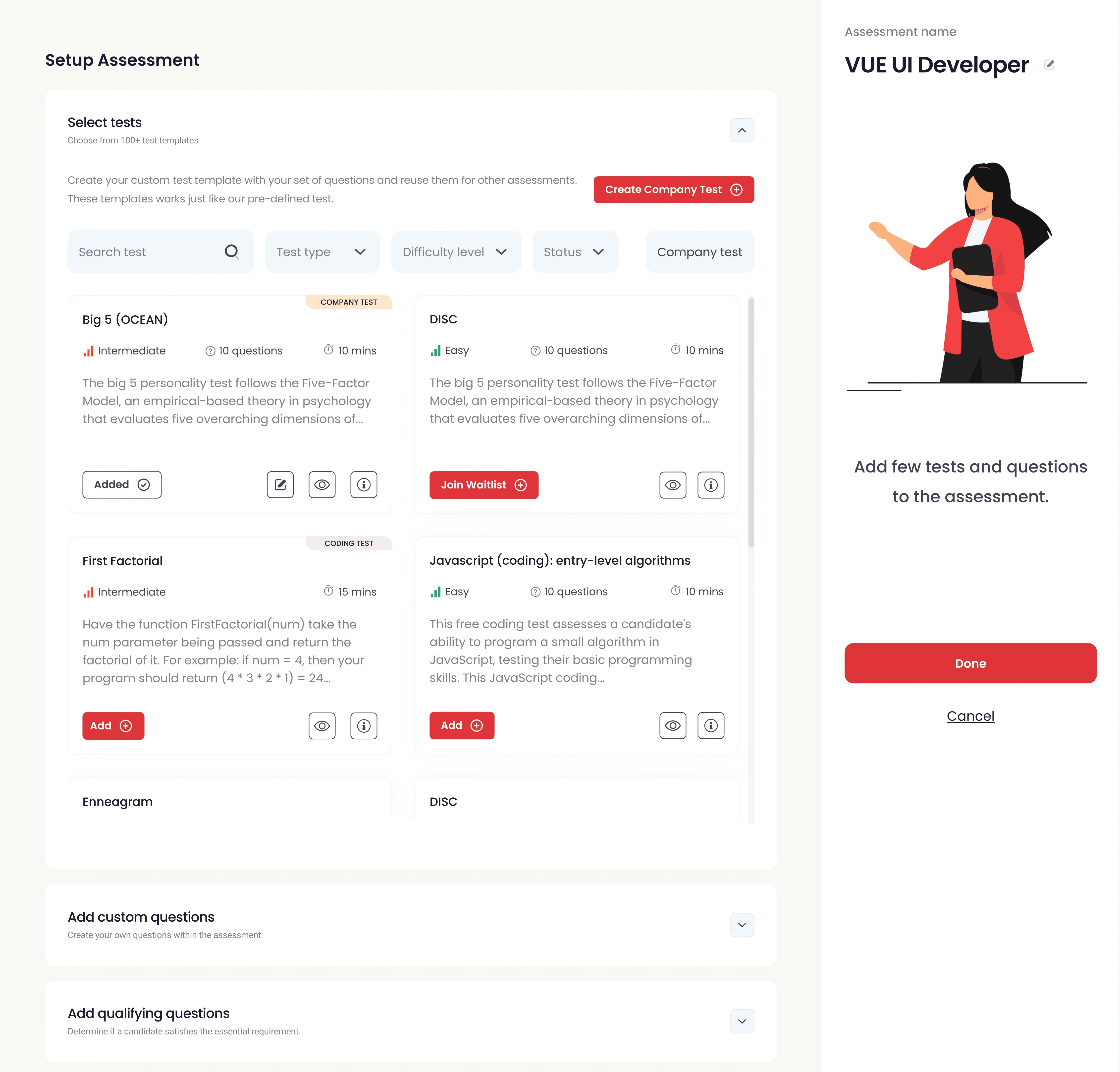
Creating an assessment
The application allowed recruiters to setup multiple assessments for a single candidate or for a specific job role. We added functionality to add custom questions polished the way recruiters setup the assessments.
Further on the recruiters side, once they receive an assessment, the application provides features to score the answers and rate the candidate.
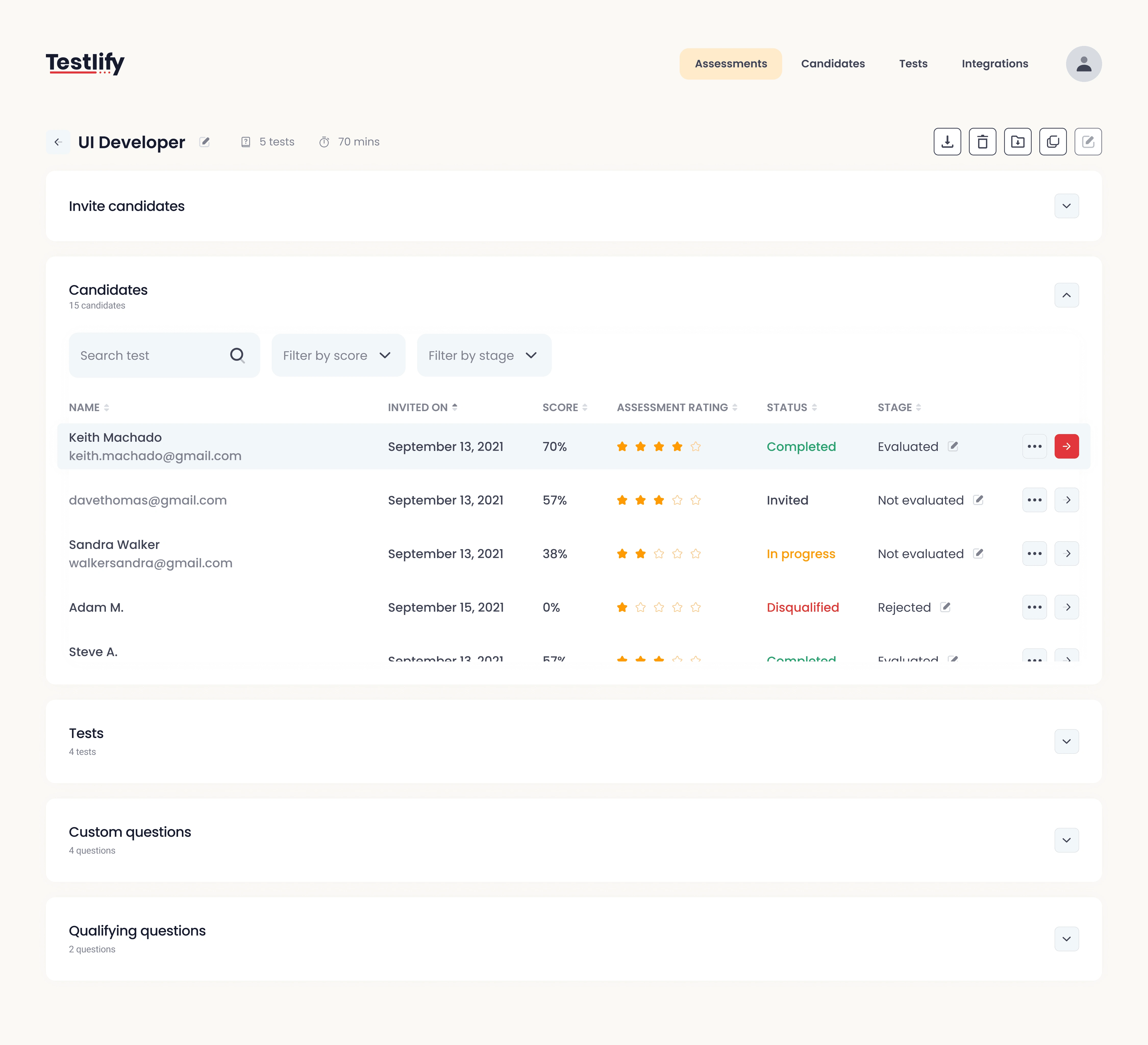
Candidates rating
Once rated, the app automatically, sorts the candidates from highest rated to lowest.
To solve the filtering issue, it was decided to implement a set of pre-qualifying questions. Candidates who passed these pre-qualifying questions were only allowed to further carry on with their assessments.
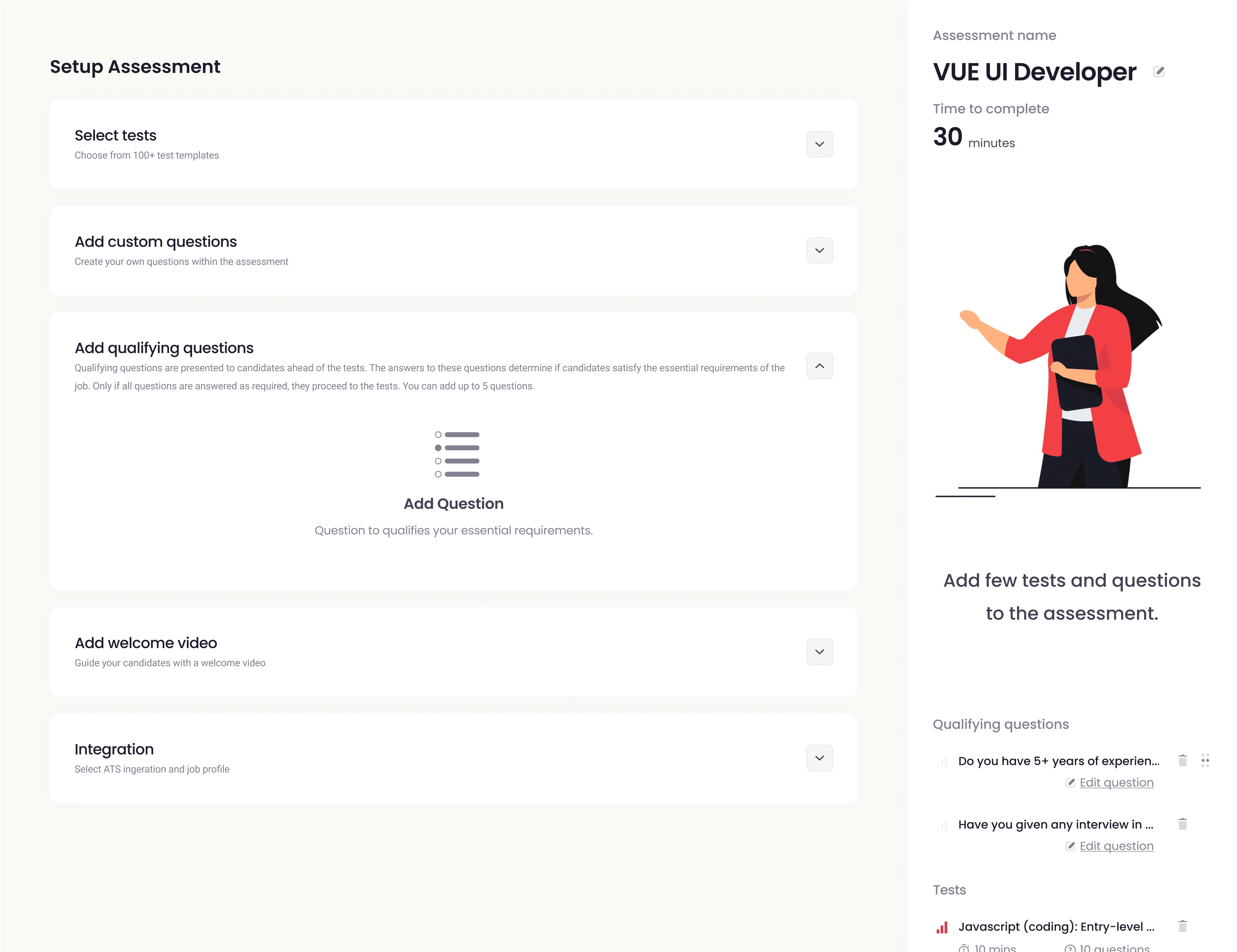
Creating Qualifying Questions
On the candidates side, the application allowed them to login using a code they received on their email.
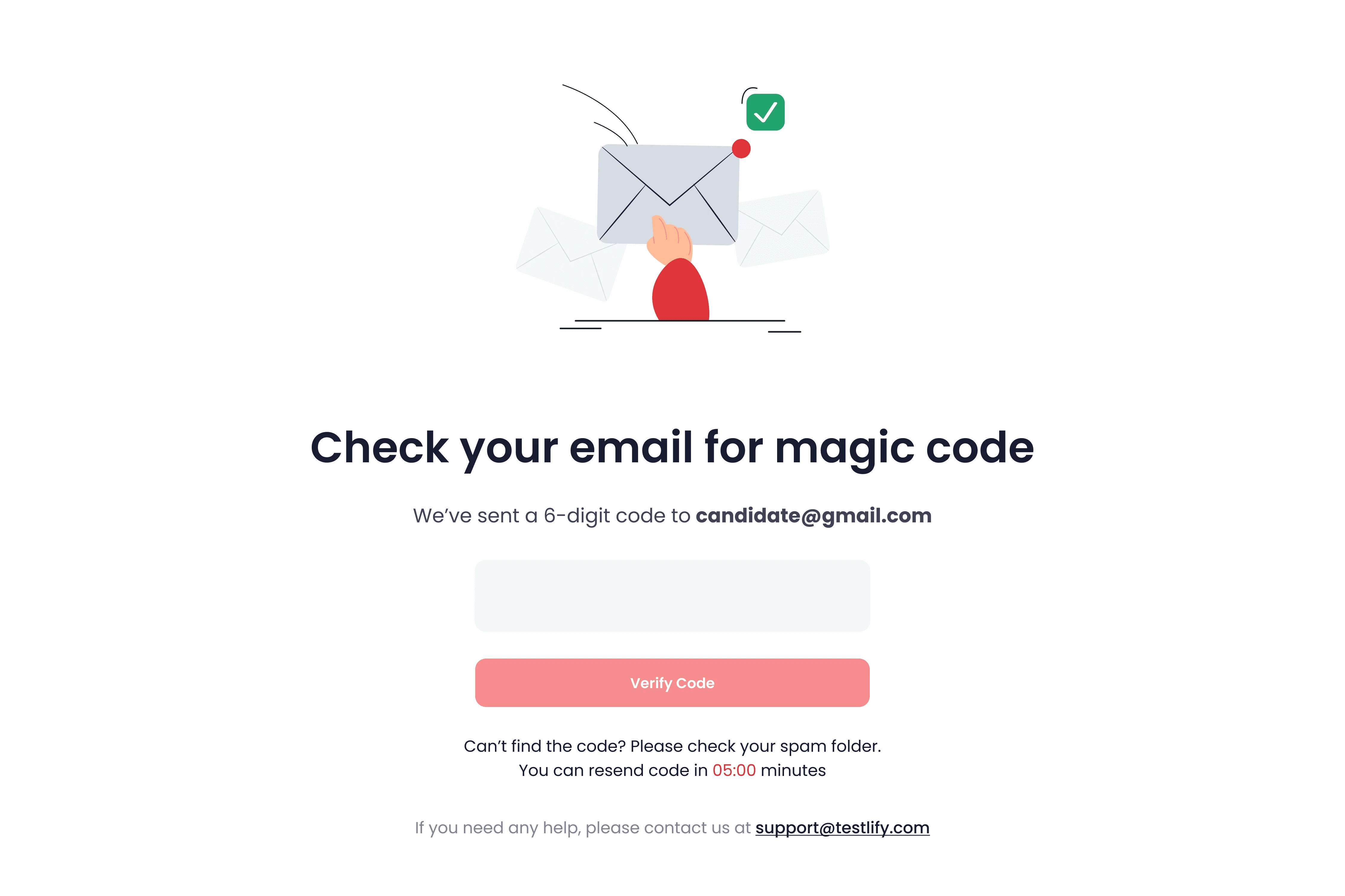
To combat cheating, the app requests access to the camera and mic. Additionally, the app detects if a different browser is opened, or if the cursor has left the screen. These details are recorded during test duration only.
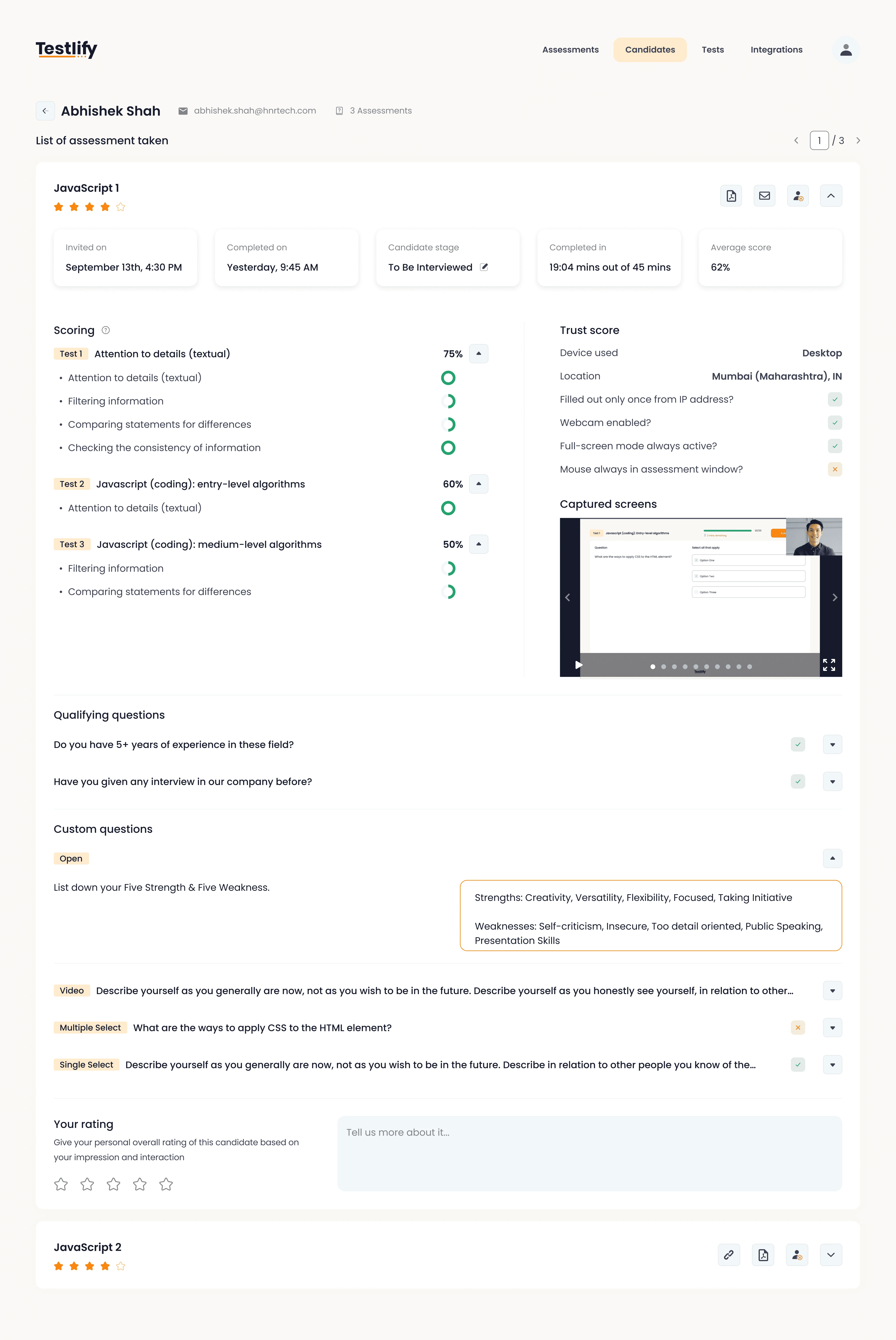
Candidates assessment
The privacy of the candidates is maintained at all times.
05. Reflections
Looking back, I am always grateful for this project, as this was the one project that taught me a lot about UI UX and product design. I grew and honed my craft in UI design. Setting up the entire design system from scratch was only something I dreamed of, till this point. The project allowed me to understand how good design is not just about aesthetics, but also about User Experience. I learned how to defend my design decisions and clearly articulate the 'WHY" behind those decisions.
Like this project
Posted Jul 27, 2024
Testlify is an application that allows recruiters to set up pre-determined or customized assessments. It automates 90% of the tasks involved in recruitment.
Likes
1
Views
23
