Optimizing UI Design to Enhance User Satisfaction

Augustina Ambrose

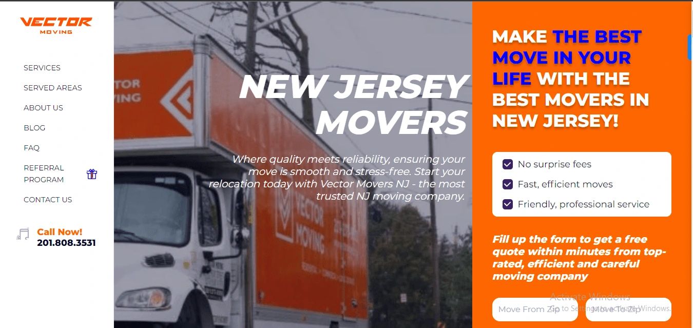
Before
Here are the changes I made
1. Visual Layout
📌 Old Design: The old design had a picture of a truck, but it felt a bit dull. The page was split into two, with text on one side and the image on the other.
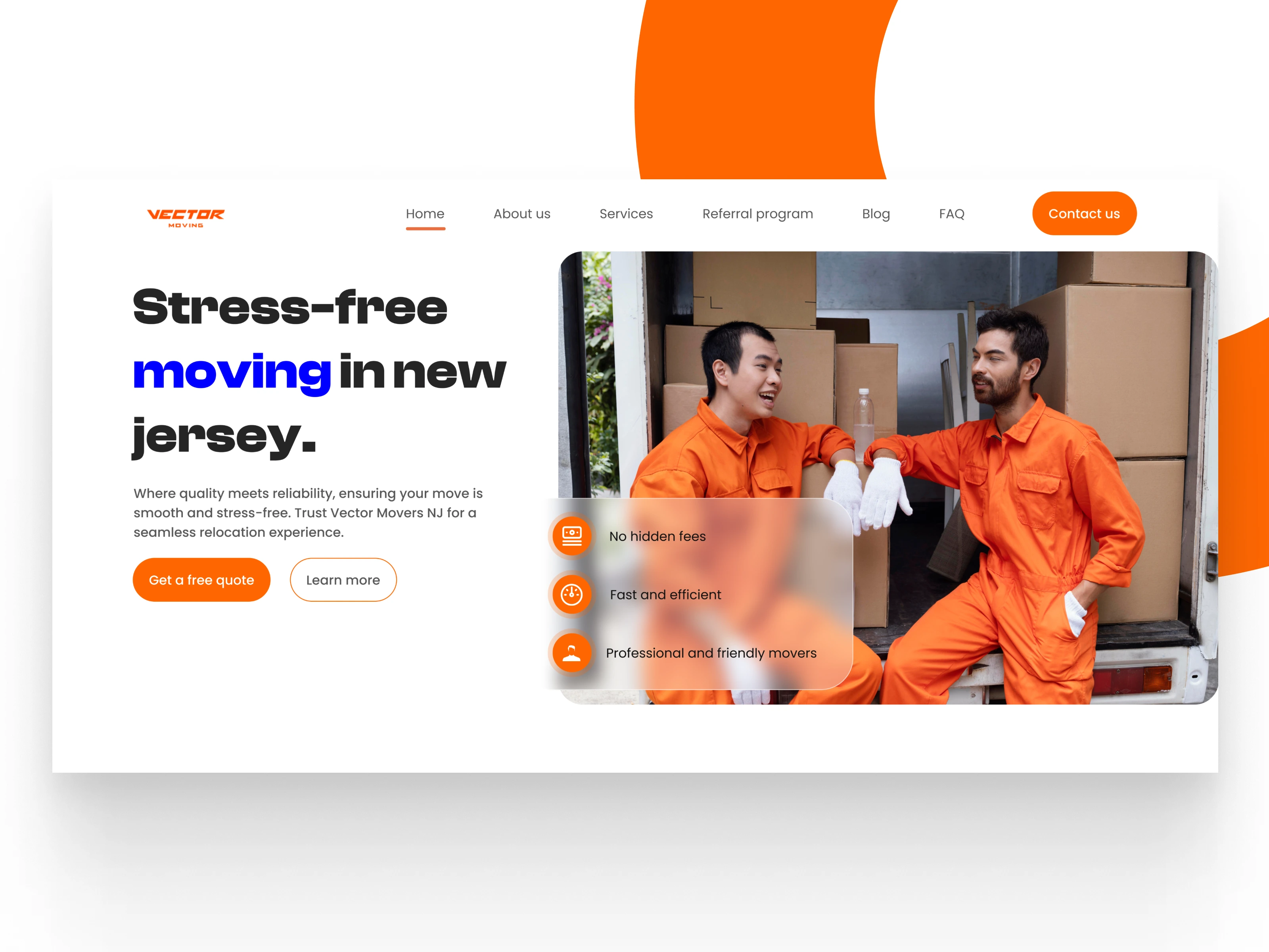
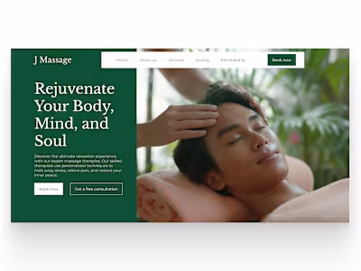
📌 New Design: The new layout is clean and modern. It has a large, bold headline on one side and a friendly image of movers on the other. It looks more professional and inviting.
2. Branding & Logo
📌 Old Design: The logo was present but didn’t stand out much, and the colors were not used well to make the brand look strong.
📌 New Design: The logo now pops out more, and the colors (especially the orange) are used consistently, making everything feel more connected to the brand.
3. Headlines & Subheadings
📌 Old Design: The headline “NEW JERSEY MOVERS” was plain and didn’t catch much attention.
📌 New Design: The new headline “Stress-free moving in New Jersey” is more engaging. It speaks directly to how customers feel about moving and promises a solution. The blue color on “moving” grabs attention.
4. Calls-to-Action (CTAs)
📌 Old Design: There was a “Call Now!” button, but it didn’t offer more ways for people to interact.
📌 New Design: There are now two clear buttons: “Get a free quote” and “Learn more.” The orange button stands out and encourages people to take action. The other button lets users explore more if they’re not ready to commit yet.
5. Navigation Menu
📌 Old Design: The vertical menu on the left side was outdated and not very exciting.
📌 New Design: The new top navigation bar is modern and easy to use. It’s simple and fits with the overall clean look.
6. Typography & Readability
📌 Old Design: The text in the old design was bold but a bit hard to read because the layout wasn’t great.
📌 New Design: The new design uses fonts that are clear and easy to read. The headline stands out, and the black and blue colors against the white background make the text pop.
7. User Experience
📌 Old Design: The old design was okay, but it didn’t grab users’ attention or make them want to explore the site.
📌 New Design: The new design feels more welcoming. The movers in the picture look friendly, which makes the service feel more trustworthy. The clean design also makes it easier for users to stay on the site and learn more.
8. Conversions (Getting Customers)
📌 Old Design: The old design didn’t offer many options for users to take action, which might have led to fewer inquiries.
📌 New Design: The new design will likely lead to more customer inquiries. It offers more options to get a quote or learn more, and the clear, friendly messaging (No hidden fees, Fast and efficient) builds trust.
9. SEO Benefits
📌 Old Design: The old design wasn’t bad for SEO (search engine rankings), but it lacked engaging content and a fresh look.
📌 New Design: The new design will help improve SEO. The simple layout and clear text will work better on mobile devices, which can boost the site’s rankings on Google.
Conclusion The new hero section design is a big upgrade. It looks cleaner, more modern, and more user-friendly. It will likely help the business attract more customers by making the site easier to use and more trustworthy.
After
Like this project
Posted Dec 21, 2024
Utilized UX research techniques to identify pain points and improve the UI design of a moving company and increase customer retention.
Likes
0
Views
3


Redesigning the hero page for improved conversion
Designing a high converting landing page for a jewelry brand
Revamping the hero page to showcase brands quality offering
Redesigning the hero page section of a dental practice website