JaceMccord Brand Presentation
AHAMED SAFWAN
Case Study: JaceMcCord Identity & Motion System
01. The Overview
JaceMcCord is a brand built on the intersection of content creation and strategic design. The project objective was to develop a cohesive visual identity that feels modern, tech-forward, and highly professional, capable of living across digital platforms—from podcasting and social media to formal brand guidelines.
My Role: Brand Designer & Motion Animator
Deliverables: Logo Design, Color Strategy, Typography System, Motion Language, and Brand Guidelines.
02. The Challenge
The "Content Creator" space is often cluttered with generic aesthetics. The challenge was to create a mark that felt precise and engineered (reflecting the technical side of video/audio) while remaining dynamic and fluid (reflecting the creative process).
The identity needed to be versatile enough to work as a small social media avatar, a professional ID badge, and a high-fidelity motion graphic.
03. Visual Strategy
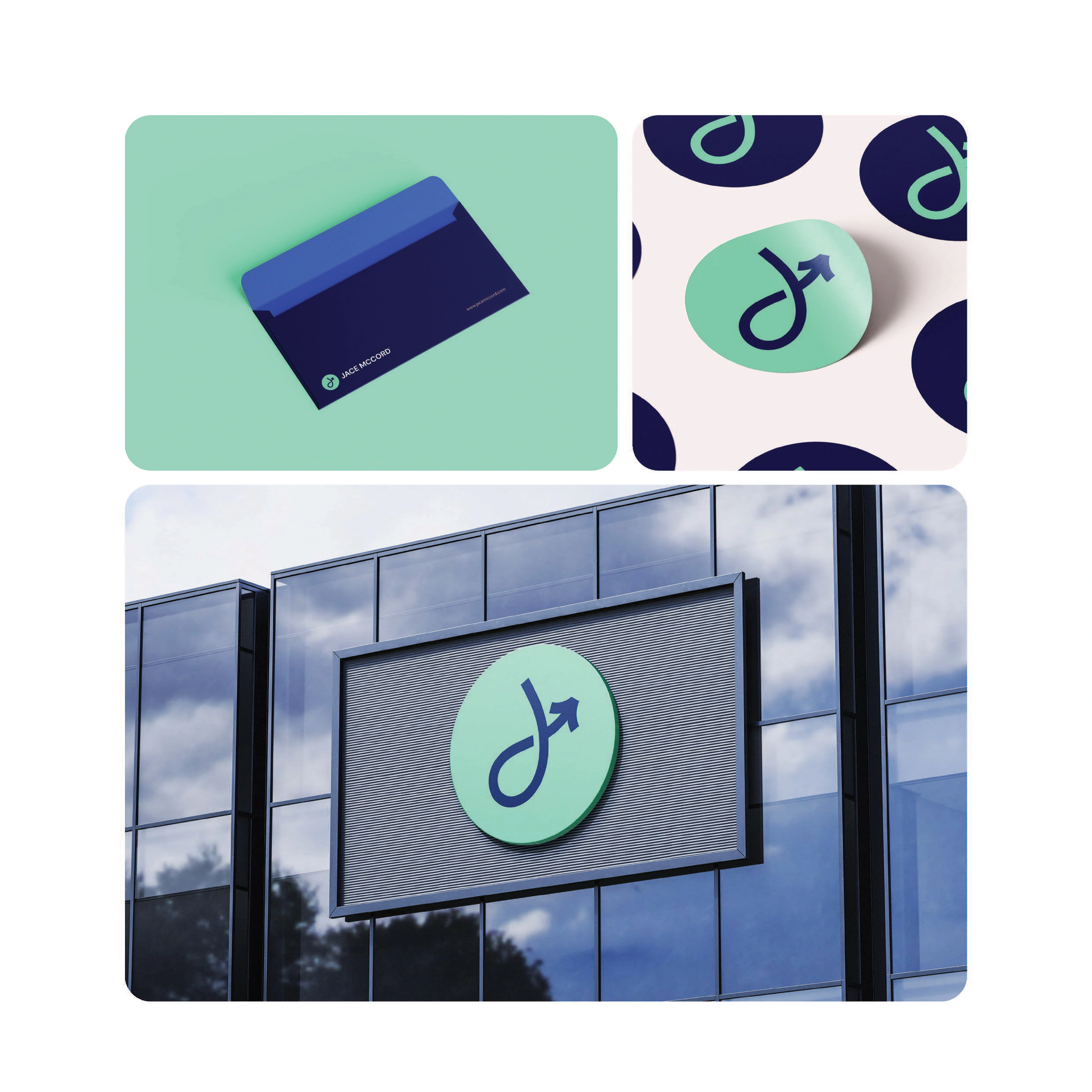
The Logo Mark (The "J-Hook")
The logo features a custom-designed "J" that evolves into a directional arrow.
Symbolism: The "J" represents the founder, while the arrow signifies growth, direction, and the forward motion of storytelling.
The Grid: Built on a precise geometric grid to ensure balance and scalability.
Color Palette: "The Digital Deep"
We moved away from standard "tech blues" to a more sophisticated, high-contrast palette:
Midnight Navy (#002365): Grounding, professional, and authoritative.
Electric Mint (#7CFFC6): For high-energy accents and digital call-to-actions.
Cobalt Blue (#1257D8): Provides depth and brand recognition.
Soft Cloud (#F4E8E8): A warm neutral for backgrounds to reduce eye strain.
Typography
Primary Typeface: DM Sans
Rationale: A geometric sans-serif that offers high legibility. The choice to showcase the full weight range (Light to Black) demonstrates the brand's flexibility in communication, from subtle captions to bold, "loud" headlines.
04. Motion Design: "Designs That Connect"
The motion system is the heartbeat of this brand. Rather than static images, the identity uses fluid bezier curves and elastic transitions to mimic the editing process itself.
The "Reveal": The logo is introduced through a drawing-path animation, emphasizing the "craft" behind the design.
Mobile-First Application: Mockups demonstrate how the brand lives on smartphones, featuring high-impact "Videos That Speak" and "Designs That Connect" taglines.
05. The Results
The final identity successfully bridges the gap between a personal brand and a professional agency.
Unified Presence: A consistent look across ID badges, YouTube/Podcast cover art, and internal documentation.
Scalable Framework: The "Brand Guidelines v.1.0.0 2025" provides a roadmap for future sub-brands and content extensions.

Like this project
Posted Feb 10, 2026
Showcasing my latest work for JaceMcCord: A fusion of sleek motion, bold DM Sans type, and a tech-forward palette. Precision branding for the modern creator.