
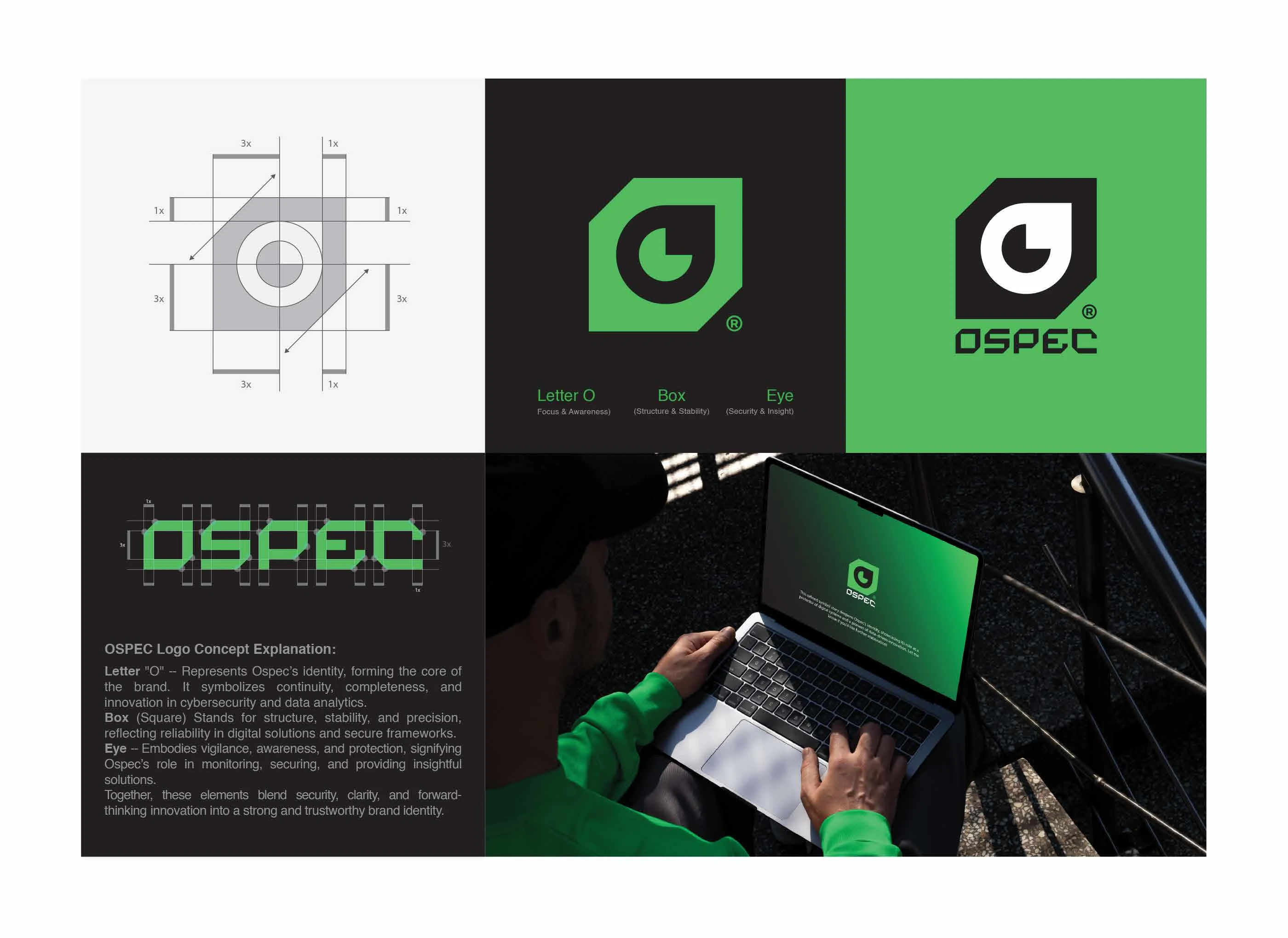
Case Study: OSPEC Identity Design
01. Executive Summary
OSPEC is a forward-thinking brand positioned at the forefront of data analytics, cybersecurity, and digital innovation. The goal of this branding project was to create a visual identity that communicates a "powerful narrative of stability, clarity, and vigilance". The resulting system anchors the brand as a reliable protector of digital systems and a leader in data-driven solutions.
02. The Brand Story & Symbolism
The identity is built upon a "harmonious blend of stability and adaptability" through two core geometric elements:
The Square (Structure & Reliability): Represents the foundation of OSPEC's robust systems. Its symmetrical design and sharp edges symbolize a meticulous approach to solving complex digital challenges.
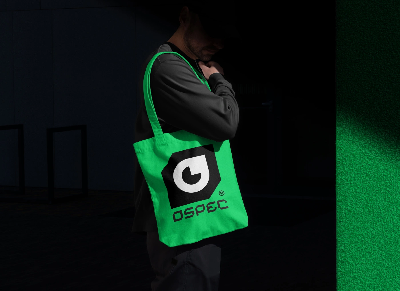
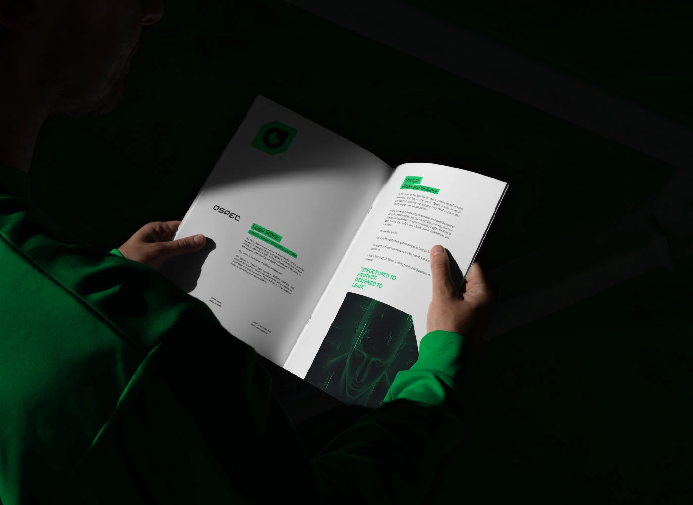
The Circular Eye (Focus & Vigilance): At the core of the logo lies a circular "O" forming an eye. This embodies foresight, transparency, and a "promise of vigilance"—constantly monitoring and safeguarding systems to uncover meaningful insights.
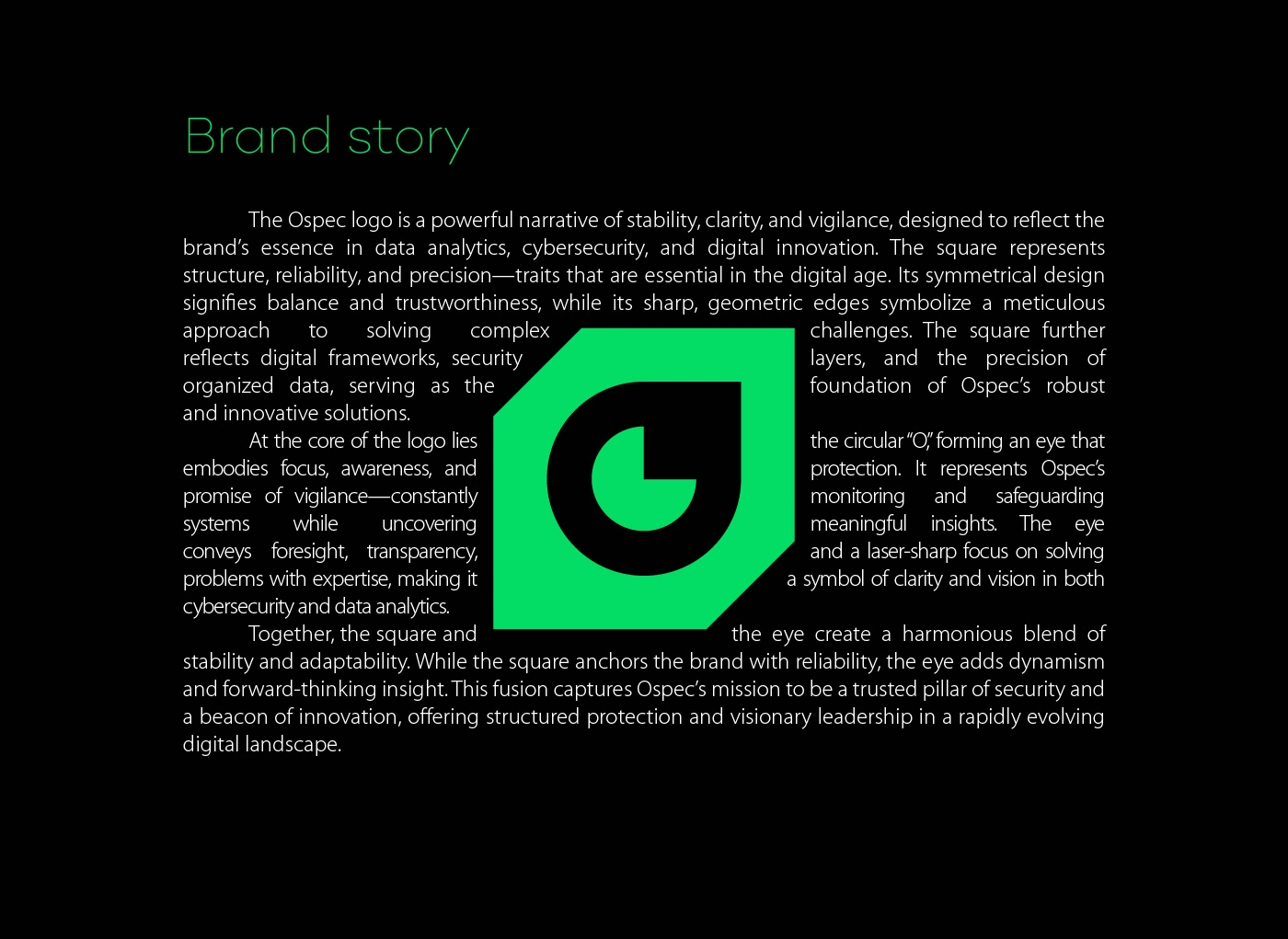

03. Design Philosophy
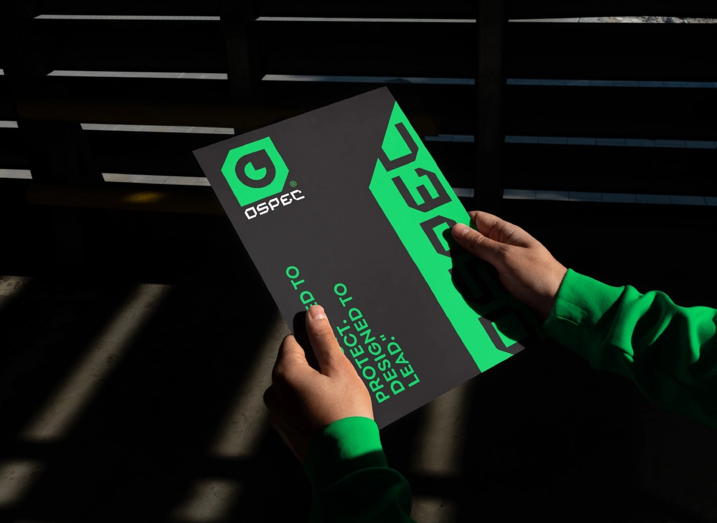
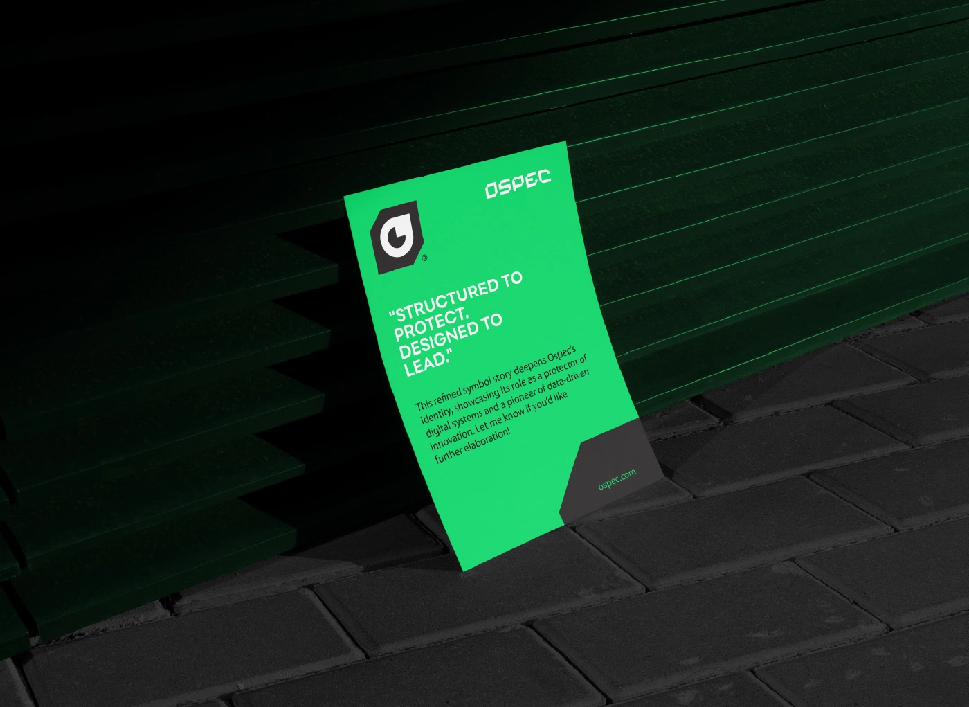
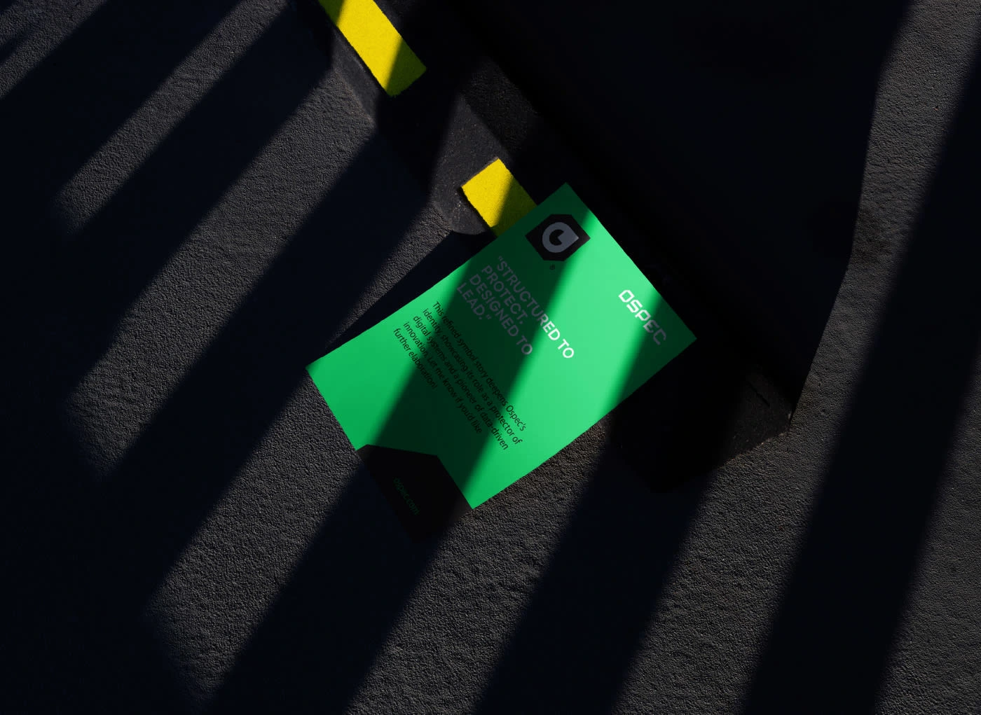
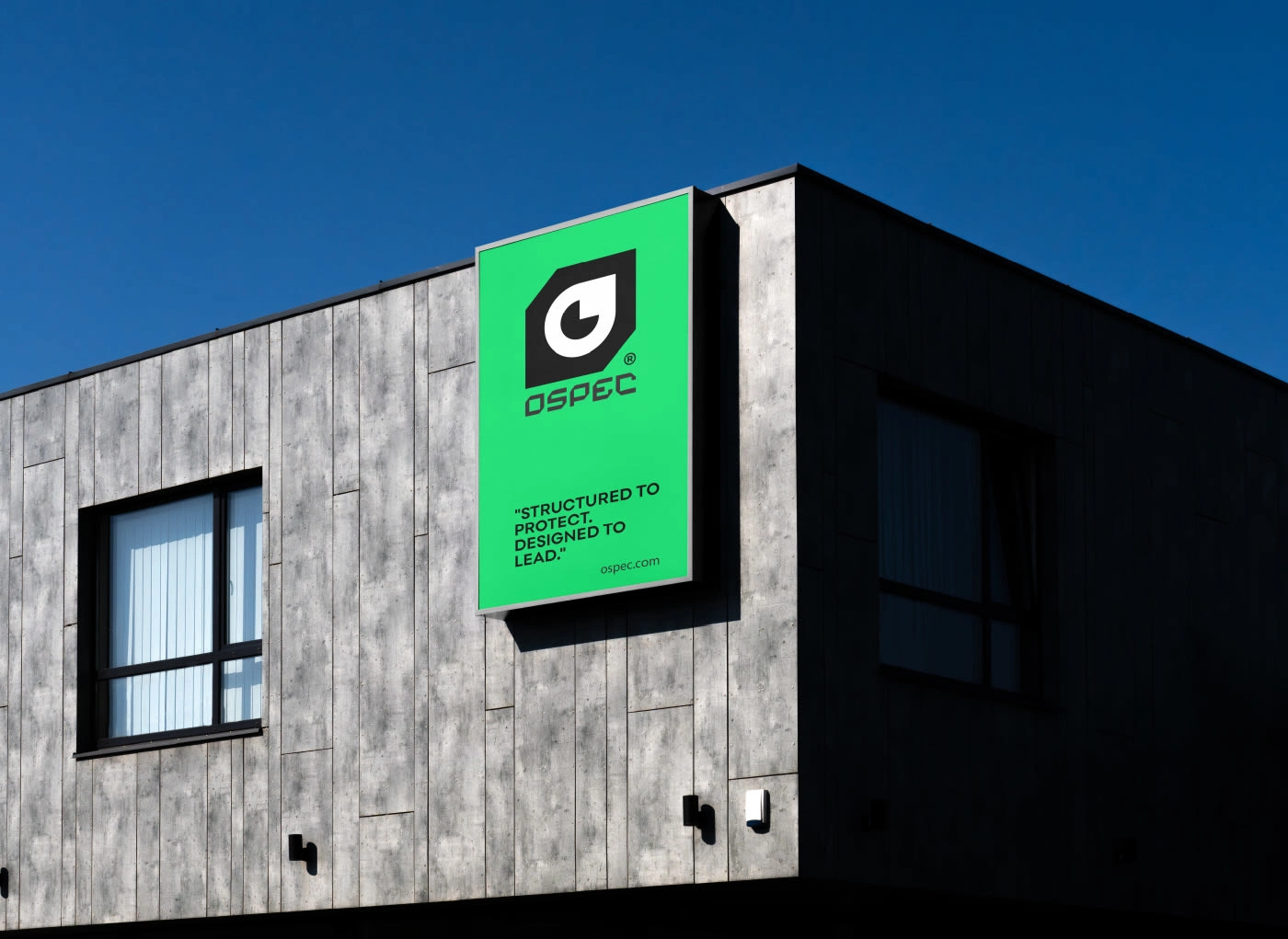
The visual language is defined by the slogan: "Structured to Protect. Designed to Lead.". This duality is reflected in the logo's construction:
Precision Engineering: The logo and logotype are built on a precise grid system, ensuring mathematical balance and digital scalability.
Visual Clarity: The use of high-contrast green and black reinforces the brand’s focus on cybersecurity and digital frameworks.
04. Brand Mission
OSPEC’s identity showcases its dual role in the tech landscape:
The Protector: Acting as a trusted pillar of security in an evolving digital world.
The Pioneer: Serving as a beacon of innovation and visionary leadership in data analytics.

9 likes · 25 views · Feb 10, 2026
OSPEC Branding: Where data meets vigilance. A precision-grid identity featuring a symbolic "Eye" to represent foresight in cybersecurity and digital innovation.


