Creating an Intuitive Dashboard for Data Analysis
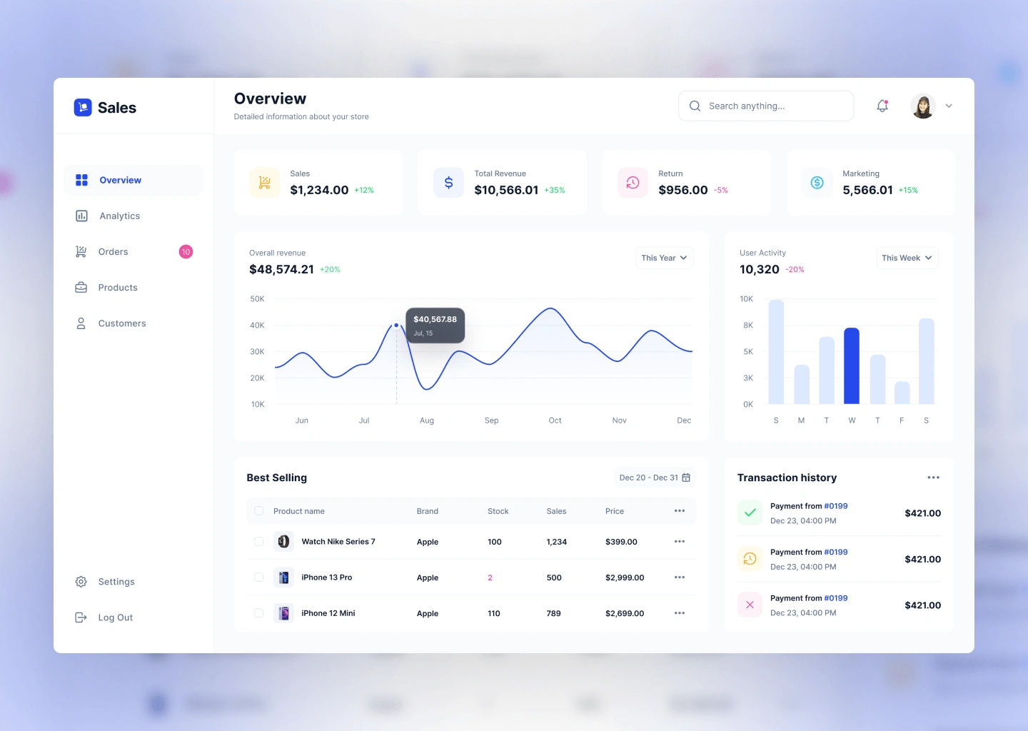
Goal: To design a sales analytics dashboard that provides real-time data insights, simplifies decision-making, and enhances productivity for sales managers and executives.

Problem Statement
Sales teams struggled with disjointed data systems, making it challenging to track performance metrics and make data-driven decisions. Existing dashboards were cluttered, difficult to navigate, and lacked actionable insights. The goal was to create an intuitive dashboard that consolidates data, highlights key metrics, and offers predictive insights.
Design Goals
Create a clean, user-centric interface with clear hierarchy.
Provide customizable views to cater to diverse user needs.
Use data visualization to simplify complex metrics.
Ensure the design is responsive and works seamlessly across devices.
Design Process
1. Wireframing and Ideation
Designed low-fidelity wireframes to outline information hierarchy and navigation flow.
Focused on creating a logical layout with clearly defined sections:
KPI Summary
Sales Trends (Graphs & Charts)
Team Performance
Predictive Insights
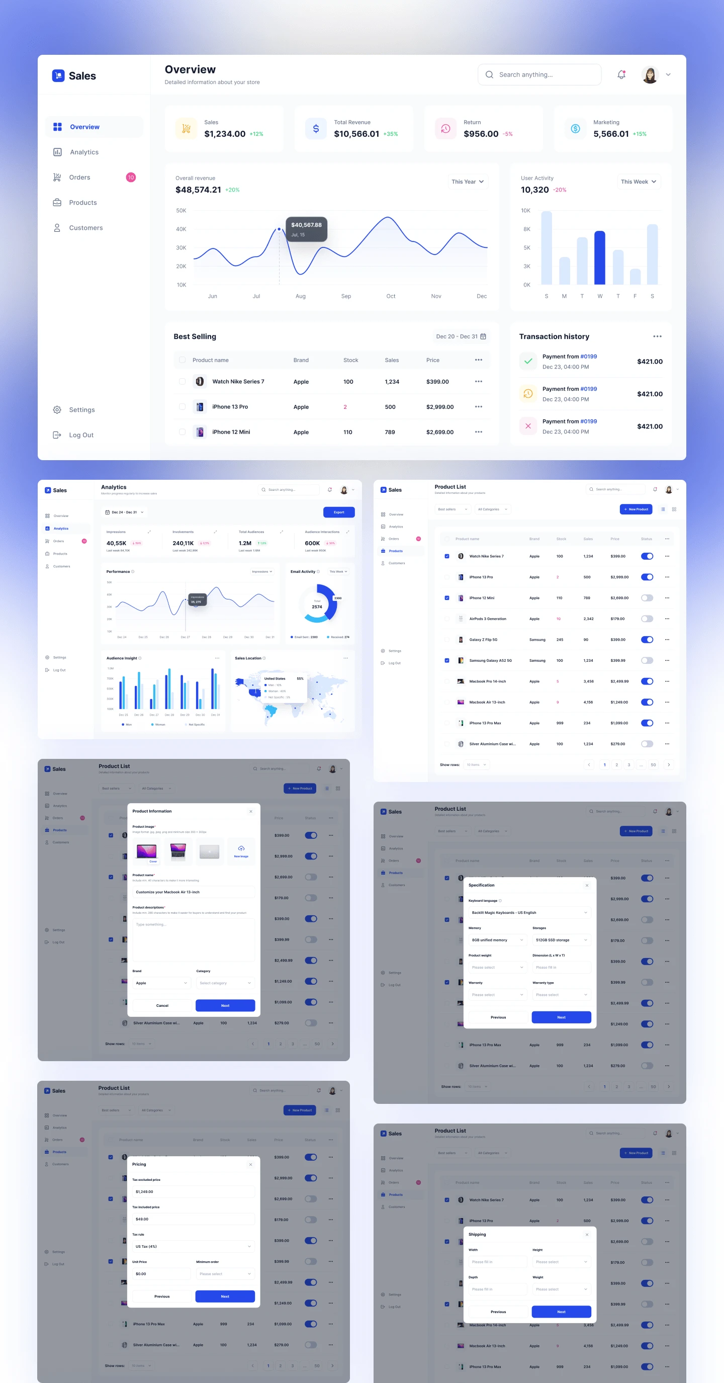
2. High-Fidelity Mockups
Developed polished mockups in Figma.
Used a clean color palette with a focus on contrast for readability.
Incorporated icons and interactive elements to make data engaging and easy to interpret.
3. Interactive Prototypes
Built interactive prototypes to test user flows and interactivity.
Simulated actions like filtering data, customizing widgets, and drilling down into detailed reports.

The Sales Analytics Dashboard transformed the way sales teams accessed and analyzed data. By focusing on user-centric design and leveraging advanced visualizations, the dashboard empowered users to make faster, data-driven decisions.
Like this project
Posted Dec 10, 2024
Developed a user-friendly dashboard design for data analysis, improving usability and workflow efficiency.


