Shelter, Online Pet Adoption
Project Overview
This is the case study I made when I doing an intern at a Software House Company as a UI/UX Designer
Problem Research
I interviewed some friends about their buying and pet adopting experience during the pandemic. Some through chat and some participants from an online survey I made with Survey Monkey.
Then I found the following information:
The number of respondents is seven people. Four boys and three girls
Four respondents are under 18 years old, two people are between 18 and 24 years old, and one person is between 25 and 34 years old.
All respondents have a desire to adopt a pet.
Respondents are interested in finding adoption info through the nearest pet shop, social media, relatives, and online stores.
Respondents experienced several difficulties: limited types of animals, the seller's location is far, taking a lot of time and effort, little information, and the shop's quality and the animal is not clear.
All respondents are more interested in buying pets online.
User Persona
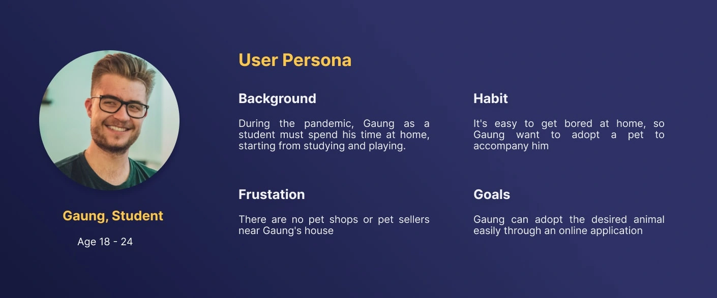
Furthermore, it is easier to determine our user scope and answer, "Who am I making this application for?" I created a User Persona "card" containing the target user profile for this problem.
Pain Points
After being analyzed, several core problems experienced by users were found, namely:
Users have to find the location of the animal adoption shop and information about the opening and closing times of the shop, which are sometimes not written on the internet/newspapers.
The user does not know the store's quality, so there are doubts about the quality of the animals in each store.
The user says that some pet buying and selling applications mostly look uncomfortable, and sellers are quiet.
The user has to give up a lot of time and energy to go to the store one by one until there is a match.
User doesn't get the animals they want due to limited resources.
Action Points
Then, I change the Pain Point earlier into an Action Point in the form of questions about what I should do to deal with the various problems above. The Action Points I get are:
How do you get buyers to know firsthand all the pet shops in the surrounding area and information about the store without looking from other sources?
How can you make shoppers have no doubts about the quality of the animals in each store?
How to shorten the buyer's time in the pet buying process?
How do you get buyers to get the animals they want?
How to make this application crowded with users
How to make it easy and comfortable for users to use the application
Solution
After collecting various kinds of ideas, it was decided some of the most solution ideas, namely:
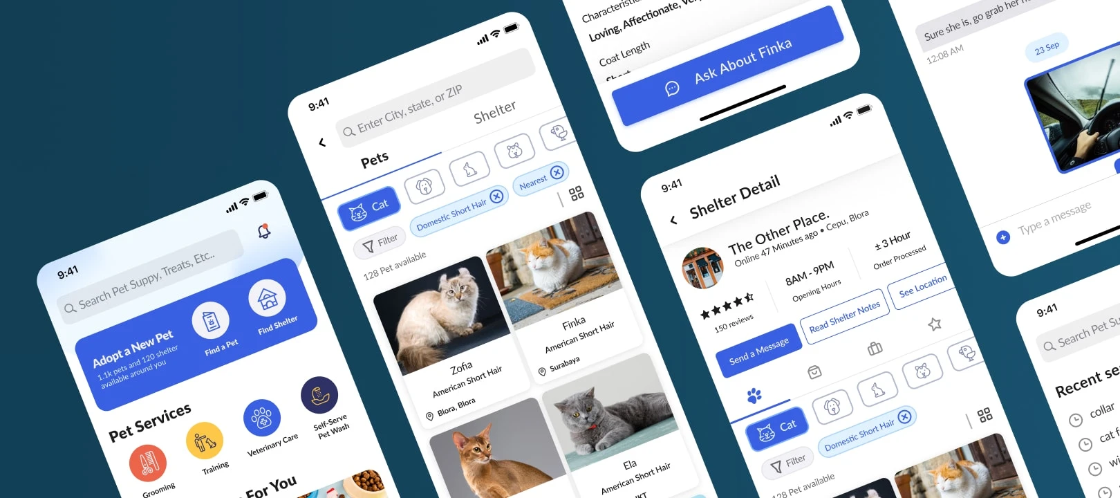
We make an online pet adoption application for smartphones. Not only that, I give features in the form of :
Included are reviews and ratings of buyers at the pet shop so that other buyers know the quality of each store.
There is a list of animals in each store that are ready for adoption, along with their characteristics.
There is a list of any pet shops in the surrounding area without having to search for too long.
Individual sellers can sell animals or their equipment for delivery, which can be delivered to the buyer's location.
Buyers can communicate via chat with buyers via the application.
Create user-friendly applications and easy to use
Presenting articles, news, and tips & tricks related to the pet world
Besides selling animals, shops or individuals can also sell animal needs, accessories, and equipment such as cages and food.
User Flow
To help map the user flow when using this application later and make it easier for users to achieve their goals, we created this application User flow. Here I use the whimsical.
Sketching
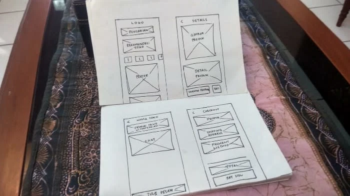
Here I need paper and a pen to sketch what the design will look like. Explore as much as possible from various layouts to content hierarchies.
Moodboard
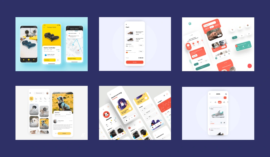
It would be nice if I explore existing designs to add inspiration to the ideas of design styles, layouts, colours from our application later. Usually, I search on Dribble and Behance.
UI Guideline
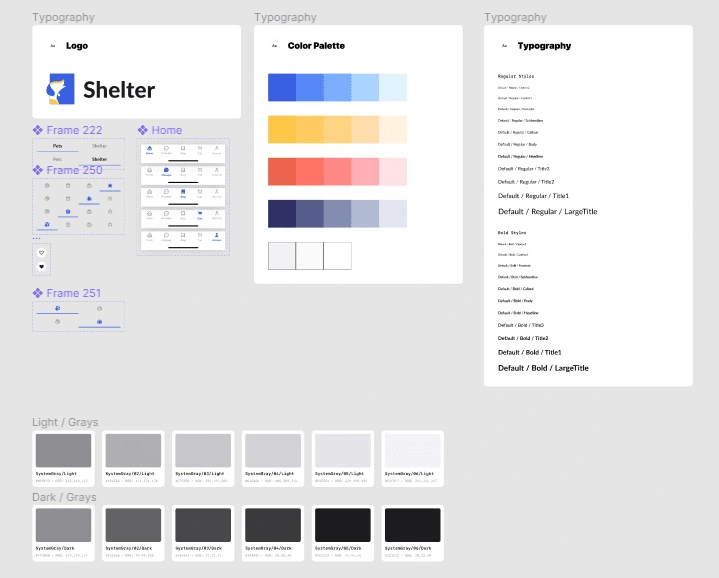
This is the step that determines the branding style of our application, from colours, typography, margin sizes, logos, etc. This makes it easier for us to be consistent in using resources and maintain the Branding DNA of our application.
High Fidelity
Next, I start visualizing the rough design into a Hi-Fi design. And from here later, I can consider our design to enter the production stage because I can say that our design is quite mature.

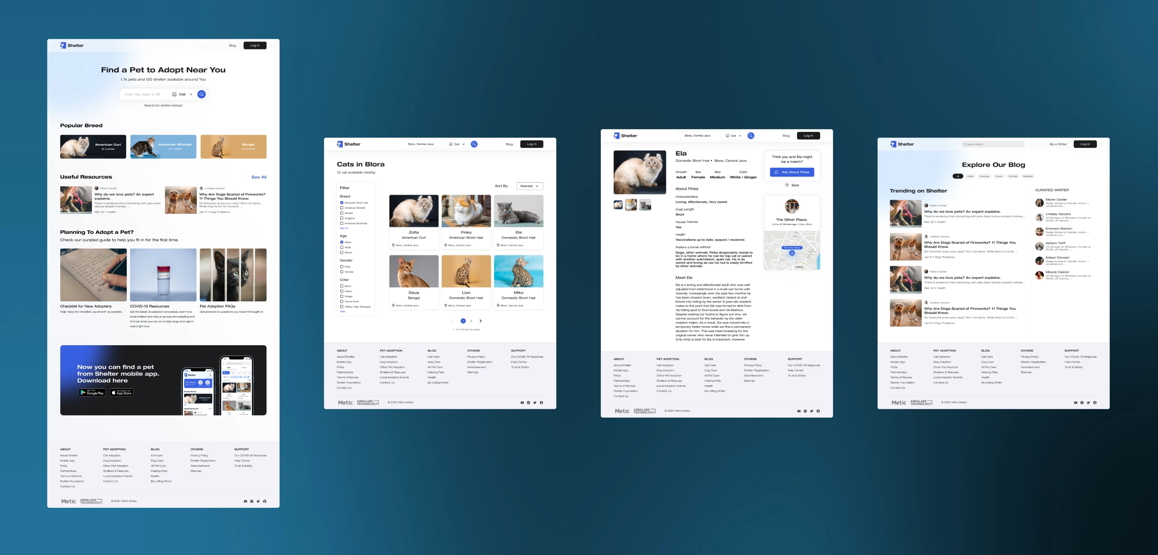
**Update: I made a web app design for Shelter a couple of days ago to enter an internal school UI UX competition (did not win, haha)
User Testing
At this stage, I validate the prototype earlier to our users, so I get an insight into whether the prototype is suitable and whether the user's problem is resolved correctly?
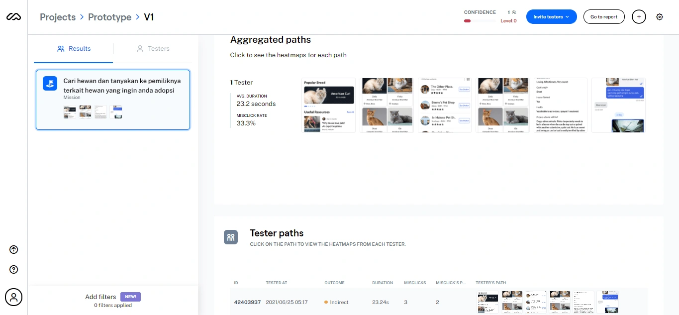
I will do Usability Testing, where I will prepare several scenarios that the user needs to do with our prototype. Here I use a testing tool called Maze.
Test Outcome
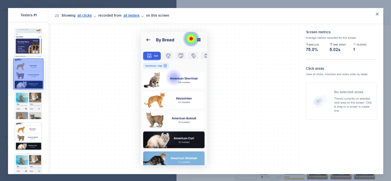
Some users are still having problems using this application from the test results. I do a checkup on the path interaction that the user goes through. Then it was found that the user could not interact with one of the features, in this case, the filter feature.
So, what needs to be improved is the prototype. Also, try testing all the existing features for those who want to try Usability Testing. Because I also don't know which one the user will interact with, I can't force the user to do testing through the flow. That I create lets the user naturally use the prototype. From the prototype that I made, there are many paths that the user can take to achieve the goals of a testing scenario. You can see the user heatmap on how the result failed so that it is clear what the user interacts with, and I can also quickly inspect what needs improvement from our application prototype.
Conclusion
You can see that i use design thinking when building this case study. Design Thinking IMO is precious in solving problems because each stage of this method is mutually sustainable. I cannot proceed to the next step because I need to complete each step coherently. So for this Online Pet Adoption problem, I can find out and analyze the problem thoroughly because the stages that need to be passed are coherent and structured. As a result, I can understand the user's situation, identify the right solution, evaluate our solution, and achieve the goals.
Thank You! 🙌
Like this project
Posted Mar 24, 2022
This is the case study I made when I doing an intern at a Software House Company as a UI/UX Designer
Likes
0
Views
31

