SMI Project - DJK & DPP
Project Overview
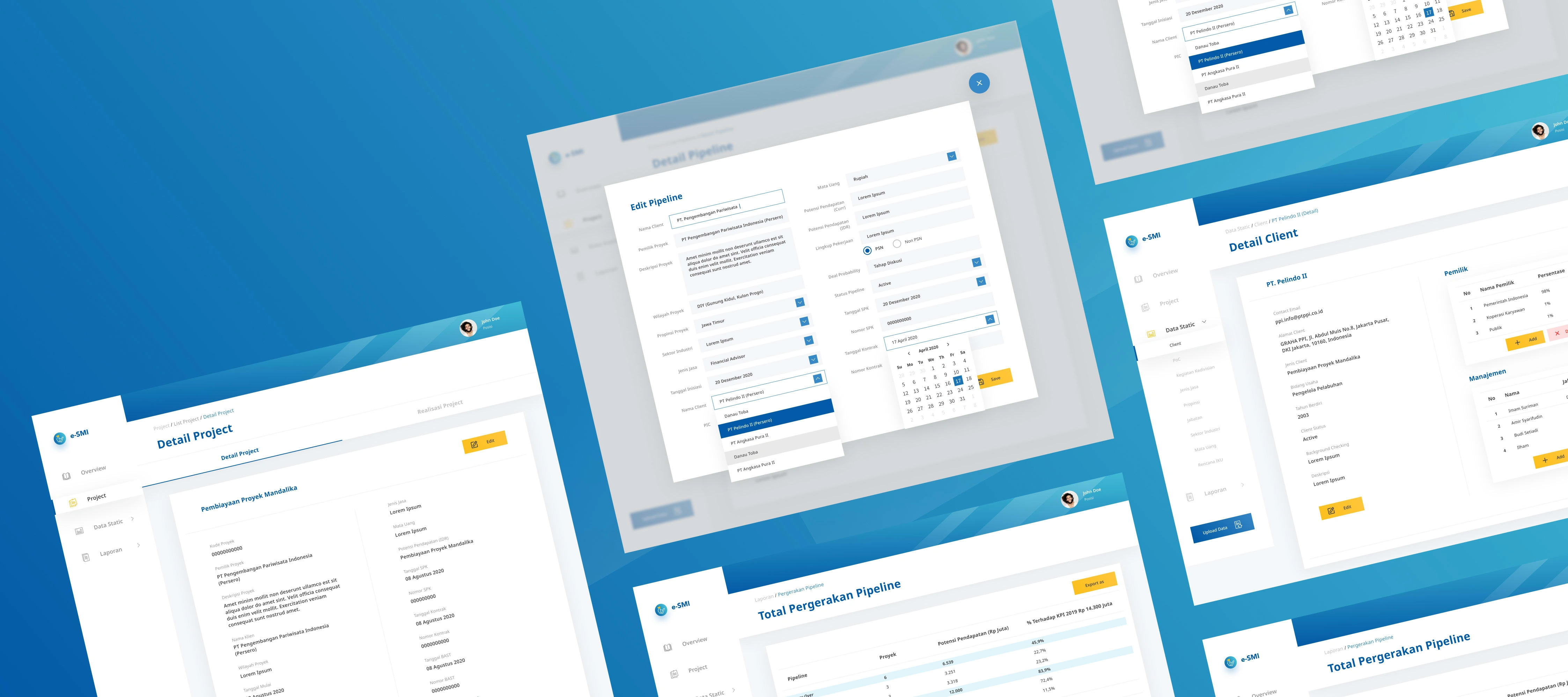
Here's one of a few preproposal projects I collaborate to make with my UI/UX Designer team when I conduct an Intern at a Software House Company.

The Process
We were given a marvel prototype about what the client wants the app to look like, and then a spreadsheet filled with information about how this app works, etc.
On this occasion, our Team Design Lead made us (four UI/UX designer interns) as two teams that will design this app, so in the end, there will be two design styles to be presented at the proposal.
Challenge
How to interpret the brief into a good design
My colleague and I spent a little time understanding the spreadsheet file, the flow, style and started digging inspiration before making the high fidelity design. It's quite a lot of screens we made because of how complex the sitemap of this app is, and not all of the screens I made myself, my colleague and I share the task 50/50, so here I will post a few screens that I made myself.

What have I learned from this project?
I made a mistake in the design process. I didn't make an initial sketch as a first step to facilitate the creation of a user flow which I can later discuss with the team to understand between my thoughts and the team about the flow and features on this WebApp later.
Like this project
Posted Mar 24, 2022
Here's one of a few preproposal projects I collaborate to make with my UI/UX Designer team when I conduct an Intern at a Software House Company.
Likes
0
Views
15


