Built with Framer
Tillered - Website & Brand Design
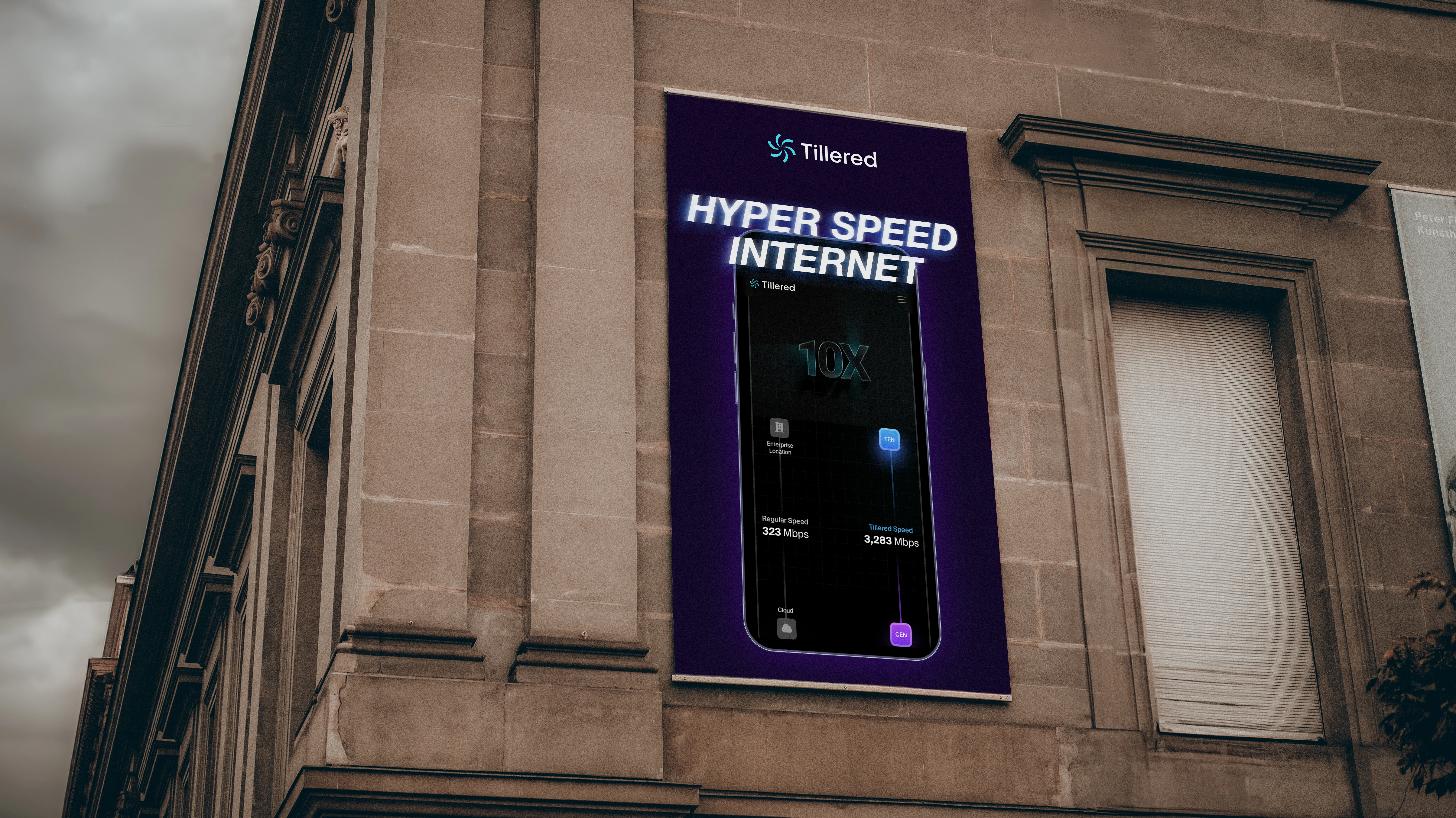
Tillered is a pioneering SaaS company that enhances internet performance for businesses by accelerating data transfer speeds to global networks by up to 10 times. Their innovative network edge solutions seamlessly integrate with existing infrastructures, eliminating the need for additional hardware investments or complex software management. (Tillered)
New Website
New Website
Old Website
Old Website
Project Scope
The project encompassed a comprehensive redesign of Tillered’s digital presence, including:
• Logo Refresh: Modernising the existing logo to reflect Tillered’s cutting-edge technology and forward-thinking approach.
• UI Mockups: Developing user interface mockups for the website and client portal, emphasising usability and a sleek aesthetic.
• Website Development: Building a dynamic, interactive website using Framer, incorporating modern design elements and ensuring responsiveness across devices.
Design Approach
The design strategy focused on creating a dark, modern aesthetic that aligns with Tillered’s technological prowess and innovative solutions.
• Logo Refresh: The updated logo features a minimalist design with clean lines, utilising a monochromatic color scheme to convey sophistication and modernity.

• UI Mockups: The user interface designs prioritise intuitive navigation and a seamless user experience. Interactive components, such as animated data visualisations and hover effects, were incorporated to engage users and effectively communicate complex information.
• Website Development: Leveraging Framer’s capabilities, the website was developed with a focus on interactivity and responsiveness. The dark theme is complemented by vibrant accent colors to highlight key information and calls to action. Animations and transitions were implemented to enhance user engagement without compromising performance.
Implementation
The project was executed in the following phases:
1. Discovery and Research: Understanding Tillered’s brand identity, target audience, and business objectives.
2. Design and Prototyping: Creating initial design concepts and prototypes for the logo, UI mockups, and website layout.
3. Development: Building the website in Framer, ensuring compatibility across browsers and devices.
4. Testing and Launch: Conducting thorough testing to identify and resolve any issues, followed by the official launch of the redesigned digital assets.
Outcome
The redesigned digital presence successfully reflects Tillered’s innovative solutions and technological expertise. The modern, dark-themed design with interactive components enhances user engagement and effectively communicates the brand’s value proposition. The responsive website ensures a seamless experience across devices, catering to Tillered’s diverse client base.
Conclusion
This project demonstrates the impact of thoughtful design and development in elevating a brand’s digital presence. By aligning the visual identity with the company’s core values and technological offerings, the redesigned assets effectively support Tillered’s mission to revolutionise internet performance for businesses.
Like this project
Posted Nov 1, 2024
B2B SaaS making internet speeds 10X quicker - Tillered needed a fresh brand and website inline with their new product development and fundraising round.
Likes
0
Views
17

